10,000 search results
(0.024 seconds)
- Jungle Fever Shaded NF by Nick's Fonts,
$10.00Here’s a different take on my face Jungle Fever, patterned after Neuland Black, originally designed by Rudolph Koch for Gebr. Klingspor in 1923. A “sunrise” shading pattern has been employed to add visual impact and warmth to headlines. Best used in sizes of 48 point and above. All versions of this font include the Unicode 1250 Central European character set in addition to the standard Unicode 1252 Latin set. - Caslon Fina Stencil EF by Elsner+Flake,
$35.00 - One Good Urn NF by Nick's Fonts,
$10.00J. M. Bergling, in his 1914 masterwork Art Alphabets and Lettering, offered this face as suitable for all occasions Greek, and we couldn't agree more. Both versions of this font include the complete Unicode 1252 Latin and Unicode 1250 Central European character sets. - Hi Ho Steverino NF by Nick's Fonts,
$10.00 Here's a hipster face that evokes the Beat era, taking its name from Louis Nye's catchphrase on "The Steve Allen Show." Both versions of this font support the Latin 1252, Central European 1250, Turkish 1254 and Baltic 1257 codepages.
 - Maple Leaf Rag NF by Nick's Fonts,
$10.00The book Modern Alphabets, published in 1930, called this diamond in the rough from Continental Typefounders Nova Bold. Well, it’s neither new nor modern anymore, but it’s a warm, friendly face that’s sure to please. Both versions of this font contain complete Latin 1252 and Central European 1250 character sets. - Boeuf Au Joost NF by Nick's Fonts,
$10.00Another in a series of typefaces (Joost a Gigolo and Modern Art) based on the works of comic-book artist Joost Swarte, which continues in a long-standing Dutch tradition of unconventional lettering design. - Zapf Renaissance Antiqua EF by Elsner+Flake,
$35.00 - Wooden Nickel NF Pro by CheapProFonts,
$10.00 A nice, black display face - for a retro/western poster look. I have kept the quirky “t”, increased the dot above “i” and “j” slightly, improved the spacing/kerning and modified/added all the usual diacritics. A pretty easy reworking of a good quality font. Nick Curtis says: "An old favorite, Bernhard Antique Bold Condensed, cleaned up and fattened up. Warm, charming, personable … suitable for any occasion." ALL fonts from CheapProFonts have very extensive language support: They contain some unusual diacritic letters (some of which are contained in the Latin Extended-B Unicode block) supporting: Cornish, Filipino (Tagalog), Guarani, Luxembourgian, Malagasy, Romanian, Ulithian and Welsh. They also contain all glyphs in the Latin Extended-A Unicode block (which among others cover the Central European and Baltic areas) supporting: Afrikaans, Belarusian (Lacinka), Bosnian, Catalan, Chichewa, Croatian, Czech, Dutch, Esperanto, Greenlandic, Hungarian, Kashubian, Kurdish (Kurmanji), Latvian, Lithuanian, Maltese, Maori, Polish, Saami (Inari), Saami (North), Serbian (latin), Slovak(ian), Slovene, Sorbian (Lower), Sorbian (Upper), Turkish and Turkmen. And they of course contain all the usual “western” glyphs supporting: Albanian, Basque, Breton, Chamorro, Danish, Estonian, Faroese, Finnish, French, Frisian, Galican, German, Icelandic, Indonesian, Irish (Gaelic), Italian, Northern Sotho, Norwegian, Occitan, Portuguese, Rhaeto-Romance, Sami (Lule), Sami (South), Scots (Gaelic), Spanish, Swedish, Tswana, Walloon and Yapese.
 - Jeu De Mots NF by Nick's Fonts,
$10.00A 1970s Photolettering catalog indentified the pattern for this typeface as "Exotique" ...from France, no less. Named for a French expression meaning “pun,” this face is, indeed, witty and playful, with nary a groan in sight. Both versions of this font include the complete Unicode 1252 Latin and Unicode 1250 Central European character sets. - EF Remember Irme R by Elsner+Flake,
$35.00 - Foo Bar Inline NF by Nick's Fonts,
$10.00One of countless variations possible from the modular lettering system called "Super Veloz", developed by Spanish type designer Joan Trouchut-Blanchard in the 1930s. The name is a play on the old G.I. acronymn FUBAR, translated politely as "fouled up beyond all recognition". Both versions of this font contain the Unicode 1252 Latin and Unicode 1250 Central European character sets, with localization for Romanian and Moldovan. - Fire Down Below NF by Nick's Fonts,
$10.00The letterforms for this typeface are pretty much standard block gothic, but its prismatic treatment features a twist: the letters appear to be lit from below rather than above, which is usually the norm. The result is a perfect choice for dramatic headlines. This font contains the complete Latin language character set (Unicode 1252) plus support for Central European (Unicode 1250) languages as well. - Baskerville Old Face EF by Elsner+Flake,
$35.00 - Super Bob Triline NF by Nick's Fonts,
$10.00One of countless variations possible from the modular lettering system called "Super Veloz", developed by Spanish type designer Joan Truchut-Blanchard in the 1930s. This particular variant, for whatever reason, was called "Bob" in the style sheet announcing the system, and it seemed particularly apt. Both versions of this font include the complete Unicode 1252 Latin and Unicode 1250 Central European character sets. - East Coast Frolics NF by Nick's Fonts,
$10.00A rollicking fun face based on lettering on a poster for Britain's LNER steamship lines, which featured a piano-playing mouse and a dancing goose. The Postscript and Truetype versions contain a complete Latin language character set (Unicode 1252); in addition, the Opentype version supports Unicode 1250 (Central European) languages as well. - Neue Luthersche Fraktur EF by Elsner+Flake,
$35.00 - Big Tent Players NF by Nick's Fonts,
$10.00A WPA poster announcing the latest production by—guess who?—the Big Tent Players inspired this eye-catching, if somewhat unconventional, typeface. Both versions of the font include the 1252 Latin and 1250 CE character sets (with localization for Romanian and Moldovan). - Slam Bang Theater NF by Nick's Fonts,
$10.00This ultrabold headline font is basically patterned after the font Nubian Black, designed by Willard T. Sniffin for American Type Founders in the 1920s, but includes an unusual inline treatment of the caps. Named for the local television show on KFJZ-TV (later KTVT) in Fort Worth, Texas, that introduced a whole new generation of kids to the Three Stooges, and hosted by the erstwhile Icky Twerp. Both versions of this font contain the Unicode 1252 (Latin) and Unicode 1250 (Central European) character sets, with localization for Romanian and Moldovan. - EF Garamond Rough H by Elsner+Flake,
$35.00 - Gotham Rail Company NF by Nick's Fonts,
$10.00An Italian travel poster from 1931 provided the inspiration for this attention-getting headline font with a strong architectural feel. The Opentype version of this font supports Unicode 1250 (Central European) languages, as well as Unicode 1252 (Latin) languages. - Old Number Ten NF by Nick's Fonts,
$10.00 Here is a faithful revival of Gothic Number Ten, released by the Cincinnati Type Foundry in the late 1800s. Not your garden-variety sans-serif, its quirky caps will warm up your headlines. Both flavors of this font feature the 1252 Latin, 1250 Central European, 1254 Turkish and 1257 Baltic character sets.
 - Bundle Of Joy NF by Nick's Fonts,
$10.00This in-yer-face kinda face is based on a broad brush font from "The New ABC of Showcard & Ticketwriting" by C. Milne, published in Australia in the late 1930s. Brought to my attention by Ms. Kat Black, and named in honor of Ms. Kat's grannie, to whom the book originally belonged. The Postscript and Truetype versions contain a complete Latin language character set (Unicode 1252); in addition, the Opentype version supports Unicode 1250 (Central European) languages as well. - Wooden Shoe Revue NF by Nick's Fonts,
$10.00A poster for a Dutch stage revue from the nineteen-teens, designed by Willy Sluiter, provided the template for this warm, wavy and whimsical headline font. The Opentype version of this font supports Unicode 1250 (Central European) languages, as well as Unicode 1252 (Latin) languages. - Autograph Script EF Pro by Elsner+Flake,
$165.00 - Skittles N Beer NF by Nick's Fonts,
$10.00Handlettering on a 1929 brochure for the P&O British-India Steamship Line inspired this tiddly typeface. Art Deco sensibilities combine with a playful attitude to yield a delightful and amusing headline font. The PC PostScript, TrueType and OpenType versions contain the complete Latin language character set (Unicode 1252) plus support for Central European (Unicode 1250) languages as well. - Century Old Style EF by Elsner+Flake,
$35.00 - EF Bodoni No 1 by Elsner+Flake,
$35.00 - Caslon Rough H EF by Elsner+Flake,
$35.00 - Loo Snoo Roman NF by Nick's Fonts,
$10.00Here's a fresh version of an old favorite, Loose New Roman, from the Schaedler Studio of New York. Easy, breezy and carefree, it's a natural for happy headlines. Both versions of the font contain the complete Unicode Latin 1252 and Central European 1250 character sets. - Page Wood Borders NF by Nick's Fonts,
$10.00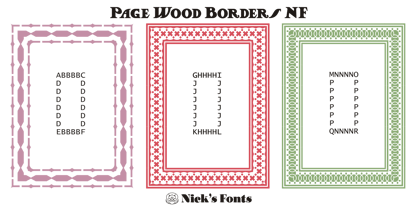
- TR-909 - Unknown license

- Advanced Pixel-7 - Personal use only

- Binary X BRK - Unknown license

- PTL Spekta by ProtoType,
$42.00 Spekta is an unorthodox Neo-Grotesk typeface devoted to versatility and beauty. Originally designed as an all-caps display typeface influenced by Bauhaus and early grotesque forms, Spekta switched priorities and evolved into a well-equipped 8-weight workhorse boasting 667 characters and italics to boot. Spekta’s focus on condensed forms and a greater x-height and cap height difference compared to typical Grotesque types allows for increased legibility at smaller sizes while utilising less horizontal space. Despite this, Spekta respects its display-type roots with elegant forms influenced by a mix of early and modern Grotesque typefaces and countless trial-and-error. Additionally, two sets of diacritics (marks such as acutes, graves, circumflexes, and so on) have been designed to further improve readability and reading flow, an atypical feature for most typefaces. Spekta is devoted to versatility, handing control to the designer with 8 stylistic sets (that only affect a single character and not a group of them), 4 number sets, true superscript, subscript, and scientific subscript characters (unlike what design softwares generate), ordinals, alternative and full-width characters, and much more.
 - Sempione by CAST,
$45.00 Sempione is a spanking new sanserif family suitable for publishing and advertising that looks great in small and large sizes. Its two main styles, Grotesk and Modern, are inspired by the early grots and 20th-century sanserifs. They come in seven weights with the matching italics, Grotesk Cursive and Modern Slanted. The considerable variety of letterforms and styles, along with some peculiar stylistic sets, will be appreciated by designers looking for more freedom of choice.
 - Hermaphrodite by Volcano Type,
$29.00Hermaphrodite was developed for the Bastard Project and had its origin in the idea of applying the process of an Antiqua on a Grotesque. In other words, a Grotesque font was drawn calligraphically and then digitized. Some inconvenient corners were simply cut off. - Quarion by René Bieder,
$39.00 Quarion is a clean, neo-humanist sans with a contemporary geometric approach. Its design started as an exploration of geometric fonts from the early 20th century, like Futura, Neuzeit Grotesk or Recta which allows the typeface to generate an inviting but sophisticated feel on the page. Although, less contrasting, geometric designs have been quite popular around type designers until today, Quarion finds its niche by combining circular elements with a medium stroke contrast, resulting in a versatile and robust workhorse for any analog or digital application.
 - Arbeit by Studio Few,
$12.00 Arbeit is a functional Neo-Grotesque typeface.
 - Armin Soft by W Type Foundry,
$25.00 As a graphic designer, sometimes it’s impossible not to be inspired by the Swiss Style, specifically the work of Armin Hofmann, who is one of its best exponents. Grids and grotesk and neo-grotesk typefaces are a fundamental part of the tools that make this aesthetic possible. A visual language that has caused full admiration since we were students. Therefore, we decided to design Armin as an homage to Hofmann’s work. Technically, we added stylistic sets applied to the letters –G, R, a, g, h, l, m, n, r, t, u, y– to make Armin more eclectic and suitable for the creation of any visual language. Armin Soft is the softest version of Armin Grotesk with its Variable file.
 - Motrhead - Unknown license


