10,000 search results
(0.018 seconds)
- The White Moon by Just Lett,
$15.00 The White Moon feels equally charming and elegant. This stunning script font is a stylish homage to classic calligraphy. It features a varying baseline, smooth lines, and gorgeous glyphs. Get inspired by its authentic feel and use it to create gorgeous wedding invitations, beautiful stationary art, eye-catching social media posts, and cute greeting cards.
 - Travel Plans JNL by Jeff Levine,
$29.00 A 1930s travel poster from American Airlines had the airline’s name in a classic thick-and-thin Art Deco design of hand lettering. With the addition of angular spurs, some of the characters become semi-serif in nature. This type style is now available as Travel Plans JNL, in both regular and oblique versions.
 - Sonrisa by CastleType,
$59.00 Sonrisa is a design that evolved from my sketches of the skeletal structure of Jakob Erbar’s Koloss, trying to discover its underlying essence without all the contrast and bulkiness of the original design. Sonrisa Thin was the resulting font, from which the other weights of the family were developed. Gentle curves, open counters, generous x-height, and sleekly tapered terminals give Sonrisa a very legible, modern, elegant appearance. When she saw the first draft of this typeface, the smile on my friend Jennifer’s face gave me the idea to call it “Sonrisa” (Spanish for “smile”). Jennifer, a clinical psychologist, described Sonrisa’s personality as: "happy, clean, clear, open, joyful, spacious, playful, calm. I can see it being used for body product lines such as oils and lotions. Can see it being used in home/travel magazines or even Architectural Digest. Yoga magazine, definitely." Sonrisa is what some foundries call a “Pro” typeface family with all the bells and whistles that provide typographic versatility: true small caps, oldstyle numerals, arbitrary fractions, discretionary ligatures, and other powerful OpenType features. All fonts in the family, except Sonrisa Titling, support most European languages, including modern Greek and languages that use the Cyrillic Alphabet. (Cyrillic glyphs designed in consultation with Ukrainian type designer, Sergiy S. Tkachenko.) Sonrisa is available in the original Thin, monoline version as well as six weights (Light, Regular, Medium, Bold, Extra Bold, Black), and a Titling font that is essentially a display font construction kit. If you enjoy using Sonrisa even half as much as I enjoyed creating it, then I know you will have a “sonrisa” (smile) on your face!
 - Kingthings Lickorishe Pro by CheapProFonts,
$10.00 Kevin King says: "When I started this font it was called Pestle... It didn't run - it didn't even walk. At some point I thought, Hmm! Looks a bit like Liquorice! And now... Voila! I remember being able to buy about a yard of Liquorice rolled round a central comfit - how fab! Tuppence worth of sticky afternoon! You could also buy bundles of Liquorice root - which looked like black twigs with bright yellow wood - they left my teeth full of black twiggy bits... The past is a strange Lady - Bless her! This was almost Kingthings Leechy... just another one of my bulbous shiny things - I have always liked letter-shapes with 'bottom', probably a 70's thing, as many a seventies thing did indeed possess it - including the fabulous Chaka Kahn... Oooh, Diva!" ALL fonts from CheapProFonts have very extensive language support: They contain some unusual diacritic letters (some of which are contained in the Latin Extended-B Unicode block) supporting: Cornish, Filipino (Tagalog), Guarani, Luxembourgian, Malagasy, Romanian, Ulithian and Welsh. They also contain all glyphs in the Latin Extended-A Unicode block (which among others cover the Central European and Baltic areas) supporting: Afrikaans, Belarusian (Lacinka), Bosnian, Catalan, Chichewa, Croatian, Czech, Dutch, Esperanto, Greenlandic, Hungarian, Kashubian, Kurdish (Kurmanji), Latvian, Lithuanian, Maltese, Maori, Polish, Saami (Inari), Saami (North), Serbian (latin), Slovak(ian), Slovene, Sorbian (Lower), Sorbian (Upper), Turkish and Turkmen. And they of course contain all the usual "western" glyphs supporting: Albanian, Basque, Breton, Chamorro, Danish, Estonian, Faroese, Finnish, French, Frisian, Galican, German, Icelandic, Indonesian, Irish (Gaelic), Italian, Northern Sotho, Norwegian, Occitan, Portuguese, Rhaeto-Romance, Sami (Lule), Sami (South), Scots (Gaelic), Spanish, Swedish, Tswana, Walloon and Yapese.
 - Space Armada by Wing's Art Studio,
$10.00 Space Armada - A Science-Fiction Font for Out of this World Designs! Space Armada is inspired by a 1980s interpretation of the future, referencing blockbuster sci-fi action movies of the period, along with the emerging video-game consoles and home computer technologies. It's nine unique fonts are designed to work together in a variety of ways, so you can layer it's different styles on top of each other to retro-futuristic effect!* Here's an example of how it works: Start by placing the Regular font on top of the Bold for a simple base outline. Add contrasting gradients to both fonts for an instant metallic or chrome effect. Take it a step further with one of the readymade Outlines for an embossed look. Overlay the Wireframe font for a glimpse inside the machine! This looks particularly good when you apply a glow effect and reduce it's opacity so the other layers show through. That's just one way to use it. Check out my visuals for more usage ideas! You can also follow my short tutorial! Space Armada is an all-caps font with unique uppercase and lowercase characters, along with a range of alternatives for experimentation with different looks. It also includes punctuation, numerals and language support, plus a selection of underlines and symbols. It's a highly customisable font, perfect for retro designs such as movie titles, posters, games, book covers and more! Every care has been taken to ensure that all fonts align perfectly when layering. Due to the variations in how different software handles text tracking, some minor tweaking may be required for pixel perfect alignment.
 - Halogen by Positype,
$29.00 Who doesn't want or need an expansive contemporary extended sans that has a sense of style and swagger… what if it had a lowercase, small caps and various numeral options… how could you say no? This was the foundational argument I made for myself when I drew the initial alphabet on my birthday last year (something I do each year, draw a new font, kind of a fun OCD thing). I wanted to see a wide, utilitarian sans that had more to it than just a basic character set and didn't resemble standard geometric models. As I continued sketching, the letterforms were being influenced more by my 'lettering tendencies' than the normal mechanical trappings of drawing flat, wide letters. The letters have retained aspects of letters created by hand — stresses, modulation, naturally ending terminals. Truncation and quick clipping of strokes became antithetical to the letterforms I drew, so I continued this once I brought the design into the computer. I kept it precise and dependable, but made every attempt to keep a conscientiously crafted typeface and not let it devolve into a grid-based drone. As such, it works just as well looking back in time as much as it does assuming a lead role in a sci-fi movie. Halogen does deliver and opts not to take a short cut and provide an anemic offering of glyphs — a modern typeface offered today must provide more than just the basics and this one does — lowercase, smallcaps, old style numerals, tabular forms, stylistic and titling alternates, fractions, case-sensitive features, and even an alternate uppercase ordinal set is included. So go make cool print and digital things with it, now.
 - Air Superfamily by Positype,
$29.00 In B-movie awesomeness, Air began as Grotesk vs. Grotesque. I was trying to unify the prevailing traits of German and English Grotes(que/k)s in order to make something different but familiar. I am NOT trying to reinvent Helvetica (snore), so get that out of your system. From the onset, I intended this typeface to be a true workhorse that offers infinite options and flexibility for the user. At its core, it is the maturation of the Aaux Next skeleton I developed years ago. I worked out Aaux Next to settle my issues and love for Akzidenz. With Aaux Next, I strove to be mechanical, cold and unforgiving with it. I was single, young, cocky and it fit. Now I'm married, kids, dog and have found that I've turned into a big softy. When I look at Aaux Next (and have for the past few years) I see another typeface trying to eek out. I wanted it to avoid the trappings of robotic sans, quick tricks and compromises. The typeface’s DNA needed to be drawn and not just generated on a screen — so I set aside a year. I love type. I love working with type. I hate when my options for a slanted complement is only oblique or italic. I set out to produce both to balance usage — there are more than enough reasons to prepare both and I want the user to feel free to consciously choose (and have the option to choose) the appropriate typeface for print, web, etc. That flexibility was central to my decision-making process. The Oblique is immediate and aggressive. The Italic was redrawn at a less severe angle with far more movement and, as a result, is far more congenial when paired with the Uprights. Condensed and Compressed. Yep, why not? I know I would use them. There are nine weights currently available. The logical progression of weights and the intended flexibility demanded I explore a number of light weights and their potential uses — this has produced a number of ‘light without being too light’ options that really work based on the size. The result is a robust 81-font superfamily that is functional, professional, and highly legible without compromising its personality. Pair that with over 900 characters per font that includes ligatures, discretionary ligatures, stylistic alternates, fractions, proportional/tabular lining and proportional/tabular oldstyle figures, numerators, denominators, ordinals, superiors, inferiors, small caps, case-sensitive functionality and extensive language support and you have a versatile superfamily well-suited for any project.
 - ITC Astro by ITC,
$29.99ITC Astro is the typeface that proves you can get your work done while watching cartoons. “It all started as a series of doodles while I was watching The Jetsons,” recalls Sasa Petricic. “The show's impossibly simplistic vision of the twenty-first century cried out for a font that fit into that world -- a world where everyday objects can carry far more fun and personality than they should.” ITC Astro is the first commercial typeface design from Petricic, whose “day job” is working as a reporter for the Canadian Broadcasting Corporation. Petricic has filed stories from across Canada and around the world for CBC's flagship evening newscast, The National. His reports have also appeared on CNN and BBC Television. Petricic's work as a correspondent and video journalist have taken him to six continents, covering everything from famine and genocide in Africa to the war in Iraq. With such serious matters filling the hours of Petricic's day as a journalist, it's not hard to see why he conceived Astro as a welcome blast of whimsy. “As I began to draw the design,” he says, “I decided that every part of Astro should be a cartoon character unto itself.” Each character has its own baseline shadow (or coaster, or circular antigravity generator, depending on how you look at things). The angular caps dance jauntily, rocking from left to right, while a suite of companion small caps provide backup. The end result is a design quite unlike any other, with surprising charm and versatility. ITC Astro comes in a two-weight family of White and Black. - CAL Bodoni Terracina by California Type Foundry,
$47.00 Bodoni Terracina is a legible, fun-formal script face, with lots of curls. Sometimes script faces are hard to read. Sometimes being formal means that there’s no personality and there’s no fun. Enter Terracina: one of the masterpieces of font design. Some of the most personable italics ever carved. Includes powerful new features for: • Dates • Pricings • Addresses Not is only Terracina formal but fun, it’s also fun to use! In a program like Adobe Indesign or Illustrator, just highlight a word and see lots of fun options. Bodoni himself etched these symbols, and his fun-loving personality shines through. As a semi-script, it can go together with many script fonts, but it is more readable. When you need something equal parts elegant and whimsical, Terracina strikes a perfect balance to let the fun shine through, such as for holiday designs or fairytales. Terracina is a subheads font, but Bodoni also used it for paragraphs. So Terracina works well doing subhead paragraphs, especially when contrasting with the mood of the first font. And because of the swash variety, it works well for setting German and other European languages. CAL Bodoni Terracina is a member of our Origins Series. Origin Fonts are designed to be true to the original designer's intentions and fonts. Our Bodoni origin fonts ARE Bodoni fonts, not imitations or interpretations. They were drawn by Bodoni, our team just expanded it for modern use. For Terracina, Bodoni's original weight is the "Quasi-Lite" option, all other weights have been meticulously matched by the CAL Origins Team.
 - Lomo by Linotype,
$29.99Lomo, PLC is a Russian optical manufacturer, whose cameras have built up an international cult following since 1992. Swiss designer Fidel Peugeot recently tapped into this phenomenon, creating an astounding series of pixel fonts for use in a variety of applications-from websites to mobile phone displays. Now available as a single family from Linotype, Lomo's versatility extends itself across 37 various faces. Whether on screen or online, Lomo's different weights deliver great legibility at low resolutions. Additionally, the amazing breadth of this family allows these pixilated faces to crossover into print, bringing a contemporary technology feeling to your more traditional pieces, too. Worth experimenting with is the Lomo Wall series, of which 14 of the Lomo family's 37 fonts belong to. In graphics applications like Adobe's PhotoShop of Illustrator, the Lomo Wall fonts may be layered over top of one another in various combinations. For example, Lomo Wall Chart 50 could be colored red, and layered behind Lomo Wall Pixel 50. The text in Lomo Wall Pixel 50 would then looked like it had been painted over top of a brick wall. With 14 fonts, and millions of colors in your application's color palette to choose from, the combination possibilities for this layering technique are endless! (If you really like this layering feature, check out what Karin Huschka, another Linotype designer, did with her Chineze Dragon family.) Convinced? Give the unlimited possibilities of Lomo a spin today! The entire Lomo family is part of the Take Type 5 collection, from Linotype." - DS JugendSC Demo - Unknown license

- Relayfun by Yebhu,
$10.00 Relayfun is a hand-drawn font that really gives a real personal touch to your project. This mixed typeface gives a feeling of 'entertaining' something very quickly! It is perfectly used for various purposes such as art quotations, branding, book titles/covers, clothing designs, editorial designs, labels, posters, product packaging, special events or anything else that requires hand taste.
 - Nuovo Deco by Ben Burford Fonts,
$20.00 Following from the continued popularity of the original MB Deco, here is Nuovo Deco, its new and improved big brother. Nuovo Deco comes in three weights, Light, Regular and Bold. A full character set of Caps and lower case letters, alternate characters, plus some very nice Ligatures to give some added art deco style and a much wider scope.
 - Pritude Radiance by Sohel Studio,
$16.00 Pritude Radiance is a Modern elegant branding serif typeface with Unique alternative , multilingual support with perfect kerning. This typeface is perfect for an elegant & luxury logo , classy editorial design, women's magazine, fashion brand , cosmetic brand, fashion promotion , modern advertising design, invitation card, art quote, home decoration , book/cover titles, special events, Tote bag, T-shirt, Advertising and much more.
 - Goddard by Scriptorium,
$12.00Goddard is based on some very unsual lettering by Art Nouveau period calligrapher Samuel Welo. It offers a full normal character set, plus mutliple alternate versions of every lower case character and selected upper case characters as well, plus very fancy over-and-under kerning to produce a really unique look, like nothing we've ever done before. - Giliant by Sohel Studio,
$16.00 Giliant is a Modern elegant serif typeface with Unique alternative , multilingual support with perfect kerning. This typeface is perfect for an elegant & luxury logo , classy editorial design, women's magazine, fashion brand , cosmetic brand, fashion promotion , modern advertising design, invitation card, art quote, home decoration , book/cover titles, special events, Tote bag, T-shirt, Advertising and much more.
 - LTC Spire by Lanston Type Co.,
$24.95 LTC Spire with alternate caps was designed by Lanston’s type director Sol Hess in 1937. Spire Roman was designed without lowercase. But it includes alternate rounded caps which transform this extra condensed “fat face” into more of an art deco titling face. Spire Roman has been used within department store logos, luxury hotel signage, perfumes, etc, etc.
 - Kelphyn by Creative17studio,
$11.00 Hello, now I tell you. its time for "Kelphyn". Yes you heard right. Kelphyn is a serif font family that allows you to try out new, innovative designs that suit your taste. Created to support all forms of design, art and ideas. especially for modern magazine designs, website layouts and supporting branding layouts. Grab it fast here Free updates
 - Red Ring by Letterhead Studio-YG,
$45.00 Red Ring and Red Square - the super-family of two families of fonts. The super-family includes sanserif Red Ring and geometric font Red Square. Families are synchronized by the number and weight of the typefaces and can be used either separately or together. Together Ring and Square produce a cumulative effect of Art Deco and Constructivism.
 - Villena by Carpiola Studio,
$12.00 Villena is a magical script font carefully created with a touch of elegance. Whether you’re looking for fonts for Instagram or calligraphy scripts for DIY projects, this font will turn any creative idea into a true piece of art! Villena is PUA encoded which means you can access all of the glyphs and swashes with ease!
 - Scottsdale Text NF by Nick's Fonts,
$10.00This elegant semicursive face is based on the works of J. M. Bergling from his 1914 classic Art Alphabets and Lettering. Suitable for announcements, awards and invitations, or for distinctive and unusual drop caps. Both versions of this font contain the Unicode 1252 (Latin) and Unicode 1250 (Central European) character sets, with localization for Romanian and Moldovan. - Novella by FontHaus,
$19.95 Novella has always been one of Fonthaus' more popular period (Art Nouveau) fonts. The style of Novella captures the essence of typography that was popular at the turn of the 20th century (1890-1905). Its curvilinear lines are organic and floral, complimenting the work of Louis Comfort Tiffany, Charles Rennie Mackintosh and Gustav Klimt among others of the time.
 - Rotisserie Menu JNL by Jeff Levine,
$29.00 A 1928 menu for the restaurant “Rotisserie Du Cardinal” had the word “Cardinal” hand lettered in quite an unusual Art Nouveau type design consisting of thick and thin lines using angles to form the letter shapes. This eccentric (yet charming) style of lettering is now available as Rotisserie Menu JNL in both regular and oblique versions.
 - Bagerich by Zealab Fonts Division,
$10.00 Bagerich is font designed by Reza Rasenda & Riska Candra Dewi, with design choices inspired by the Art Nouveau era. Bagerich comes with stylistic, alternates, ligatures and supports multilingual languages. Create unique & beautiful logotype, use it as an elegant solution for your next magazine layout, or choose Bagerich for any graphics that require a sleek look with a elegant flair.
 - Engel Stabenschrift NF by Nick's Fonts,
$10.00This elegant unicase uncial face is based on a work by German type designer Ernst Engel from 1927.This typeface masterfully combines Art Deco sensibilities with medieval letterforms, and is suitable for both text and headline use. Both versions of the font include 1252 Latin and 1250 CE (with localization for Romanian and Moldovan) character sets. - Neon by Superfried,
$32.50 Neon is an experimental, retro display typeface designed by Superfried. Neon features two styles which can be toggled via shift. As the name suggests styling for the typeface started with classic neon signage, but quickly took a new direction of its own leading to a very distinct and versatile display face. Neon has been featured in Computer Arts magazine.
 - Schoolyard Blues JNL by Jeff Levine,
$29.00 Schoolyard Blues JNL is based on the hand lettered title found on the sheet music for the 1938 song "I Was Late for School". A condensed sans serif with chamfered corners, it reflects the Art Deco influences of the day in some of the letter forms. This type design is available in both regular and oblique versions.
 - Modern Negra by Sohel Studio,
$14.00 Modern Negra is a Modern elegant serif typeface with Unique alternative , multilingual support with perfect kerning. This typeface is perfect for an elegant & luxury logo , classy editorial design, women's magazine, fashion brand , cosmetic brand, fashion promotion , modern advertising design, invitation card, art quote, home decoration , book/cover titles, special events, Tote bag, T-shirt, Advertising and much more.
 - Modeco by Eko Bimantara,
$29.00 Modeco is a merge of modern and art deco styles. Its shown elegance, classy, ??and glamour look as 1920's visual trends, blended with geometrical sans serif in a functionality approach and complete font family styles. Its consist of 9 styles from Thin to Black with each matching oblique. It's contain 400+ glyphs that covered broad latin language.
 - The Pallace by Cititype,
$19.00 The Pallace feels equally charming and elegant. This stunning handwritten font is a stylish homage to modern calligraphy. It features a varying baseline, smooth lines, gorgeous glyphs and stunning alternates. Fall in love with its incredibly versatile style and use it to create gorgeous wedding invitations, beautiful stationary art, eye-catching social media posts, and much more!
 - Allerton by Jeff Levine,
$29.00 Presenting a condensed Art Deco sans serif font with rounded corners and squared inner lines, based on the hand lettered title on the cover of the sheet music for 1944’s “Just A Little Fond Affection”. Allerton JNL is available in both regular and oblique versions, and was named after a neighborhood in the Bronx, New York.
 - Spandau by Hanoded,
$15.00 Spandau is one of the 12 boroughs of Berlin and, if you add Ballet, a New Romantic British band. It is also a very nice all caps art deco font. Not too soft, not too angular, just about right! Some upper case letters differ from their lower case kin. Comes with all the diacritics you'll need.
 - Jungle Drums JNL by Jeff Levine,
$29.00 Jungle Drums JNL is based on the hand-lettered title on the 1929 sheet music of its musical namesake. A bold, free form design with a hint of the Art Deco movement of the coming decades, this casual typeface has the vintage charm to enrich many design projects. Jungle Drums JNL is available in both regular and oblique versions.
 - Caesar Pro by RMU,
$35.00 In 1913, Leipzig-based foundry C. F. Ruehl released a hot-metal font called Caesar-Schrift which was cut by the engraver and medalist Georg Schiller (1858-1937). This humanist sans combines successfully traditional classic forms with the flowing lines of the Art Nouveau period. Now revived as Caesar Pro, this font was carefully extended and made multilingual.
 - The Macksen by Kotak Kuning Studio,
$17.00 The Macksen is a new, bold script font which has two styles: Clean and Textured. With those kind of styles, The Macksen will give your designs a vintage and classic look. The Macksen is great for logotype, branding design, logo design, digital lettering arts, t-shirts/apparel, posters, magazines, signs, advertising design, and any vintage design needs.
 - Palm Shine by Jafar07,
$14.00 Palm Shine is a beautiful and versatile font with a retro serif design that can be used in many different ways. Its elegant lines and modern look will make your designs stand out while maintaining a classic, timeless feel. It's also extremely versatile - perfect for logos, boho and groovy designs, and even silhouette art and more.
 - Cruz Script Brush Pro by Cruz Fonts,
$32.00 The three Script fonts: Brush Pro, Ballpoint Pro and Calligraphic Pro were derived from the original Ballpoint design. A custom Brush and Calligraphic texture was added to complete the family and twenty-two clip-art illustrations were created for each style. The 3-font package with illustrations is available in the Buying Choices of any of the three fonts.
 - Happy Teas by Kellina James Designs,
$20.00 Happy Teas is a handwritten script font that was designed to create a sense of joy and fun. It includes upper and lowercase letters, numerals, punctuation, and multilingual support. In addition, there are also special characters, alternates, and ligatures to add more flair to your projects. Great for invitations, headers, packaging, branding, wall art, and more.
 - Ameira by Agny Hasya Studio,
$19.00 Ameira is a modern lettering script font for use in display sizes, created with alternative glyph variations and ligatures. Perfect for your design projects like logos, branding, advertising, product design, stationery, photography, art quotes, wedding designs, fashion designs, and more. Features upper case and lower case characters, numerals and punctuation, has multilingual support, and OpenType features.
 - Boho Breeze by Sohel Studio,
$16.00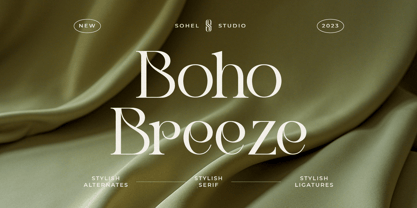 Boho Breeze is a Modern elegant serif typeface with Unique alternative , multilingual support with perfect kerning. This typeface is perfect for an elegant & luxury logo , classy editorial design, women's magazine, fashion brand , cosmetic brand, fashion promotion , modern advertising design, invitation card, art quote, home decoration , book/cover titles, special events, Tote bag, T-shirt, Advertising and much more.
