10,000 search results
(0.042 seconds)
- Examors by Kulokale,
$15.00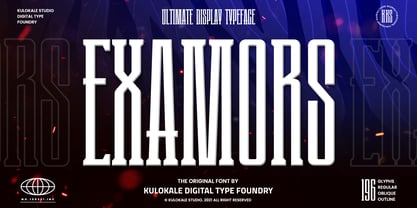 Examors is an ultimate sports display font, and with a style that is very different from the others. This font comes in four styles, Regular, Outline, Oblique and Oblique Outline Version. Examors is well-suited for posters, social media, headlines, magazine titles, clothing, large print formats - and wherever you want to be seen. Inspired by the style of design that is currently popular, and this is the answer to all the needs of every idea that you will pour in this modern era. We highly recommend using a program that supports OpenType features and Glyphs panels such as Adobe Illustrator, Adobe Photoshop CC, Adobe InDesign, or CorelDraw, so you can see and access all Glyph variations. This font is encoded with Unicode PUA, which allows full access to all additional characters without having special design software. Mac users can use Font Book, and Windows users can use Character Map to view and copy one of the extra characters to paste into your favorite text editor / application. Thank You.
 - Odisseia by Plau,
$20.00 Odisseia: Monospaced Typeface Made on Earth by Plau. Plau presents Odisseia, a monospace type family in 8 styles designed with simplicity of shapes and a humanist touch. We’ve ventured into monospace territory, where all letters must occupy the same amount of space. This style is usually associated with typewriters and computer terminal fonts. Like all monospaced fonts, every letter align vertically in a multi-line setting. The rhythm created is peculiar, since large letters such as m and w occupy the same space as narrow ones like i. Because we have 4 different weights: light, regular, bold and black the design of some characters have to be adapted to fit the same width and achieve a constant light/dark value throughout. These features make Odisseia suitable for a specific yet considerable range of uses, from computer coding to systemized communication such as brand identities. This style has been used from high-end brand identity to cutting edge digital applications. Odisseia sets a little shorter in comparison with other monospaced fonts, and bears a large x-height.
 - Magneta by Positype,
$25.00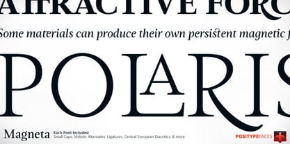 To describe what inspired Magneta would be to add a little Dwiggins, throw in some Benton with a hint of Austin, wrap it up in a crisp, contemporary package and serve. The skeleton of the family is a Garalde (like my earlier Epic) but with a desire to produce something much more transitional and contemporary, I sought to simplify, simplify, simplify. Cap and ascenders share the same height, the x-height is slightly larger than expected which should make a functional typeface for editorial, headlines or where more visually complex systems are needed. The modulation is much more intentional than historical and creates some interesting interactions between the various weights. There are both Normal and Condensed widths available with 6 different weights and matching italics, small caps, oldstyle figures, swashes, stylistic and discretionary ligatures (that includes some fun majuscule ligatures in the roman styles), there is no lack of typographic goodness for the designer. To add some spice, a set of Decorative Ornaments have been created that include geometric, floral, curvilinear patterns and much more.
 - Frambuesa by Sudtipos,
$39.00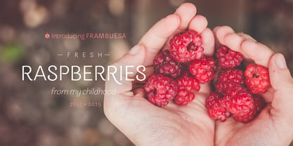 Organic versus geometric are two different universes that converges on nature systems and has its reflection on this new sans serif typeface. Frambuesa is a half humanist-half geometric sans that merges decorative curves with straight lines looking for a balance. The result: a solid but somewhat romantic, nostalgic type program that go ahead harmoniously, dancing to the rhythm of a naturally imperfect melody. Frambuesa can’t hide its family genetics. Structure and proportions come from Elisetta, her older sister they so both have a really good text performance. Regular variables and italics feel comfortable in a lot of contexts and are useful for little words or big title compositions. All seven weights are carefully adjusted to achieve soft transitions between one and the other resulting in high readability levels on program combinations and complex uses. This new font family name is a tribute to Lucia’s childhood, a very happy one. Frambuesa honors this sweet intense red fruit that her grandpa’s Coco gave to his grandchildren every Sunday in the summer.
 - Phoska Dangers by Kulokale,
$16.00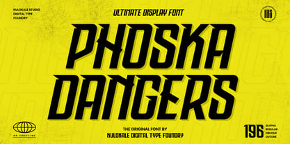 Phoska Dangers is an sports sans serif display font, and with a style that is very different from the others. This font comes in four styles, Regular, Outline, Oblique and Oblique Outline Version. Phoska Dangers is well-suited for posters, social media, headlines, magazine titles, clothing, large print formats - and wherever you want to be seen. Inspired by the style of design that is currently popular, and this is the answer to all the needs of every idea that you will pour in this modern era. We highly recommend using a program that supports OpenType features and Glyphs panels such as Adobe Illustrator, Adobe Photoshop CC, Adobe InDesign, or CorelDraw, so you can see and access all Glyph variations. This font is encoded with Unicode PUA, which allows full access to all additional characters without having special design software. Mac users can use Font Book, and Windows users can use Character Map to view and copy one of the extra characters to paste into your favorite text editor / application. Thank You.
 - Ouster Sans by Skinny Type,
$15.00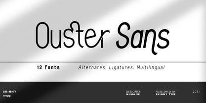 Ouster Sans offers various options for creating logos, titles and titles. Great for books, editorial, packaging, advertising, branding and more. A modern sans serif font with a vintage touch, giving users the freedom to create compositions. Ouster Sans includes a Collection of Uppercase Letters, Styles, Latin Based Language Support, Numbers and Punctuation. Style Sets are available in Lowercase to Uppercase. Ouster Sans Also Included in 12 different weight and italic font file styles Ouster Sans is coded with PUA Unicode, which allows access to all features without special design software. Mac users can use Font Book, and Windows users can use Character Map to view and copy additional characters to paste into your favorite text editor/app. How to access all alternative characters, using the Windows Character Map with Photoshop: https://www.youtube.com/watch?v=Go9vacoYmBw How to access all alternative characters using Adobe Illustrator: http://youtu.be/iptSFA7feQ0nn feel free to message me if you have any issues or questions :) If you need any help or have any questions let me know or send an email. I'm happy to help :) Thanks & Happy Designing!
 - Budinger Oldstyle by The Ampersand Forest,
$20.00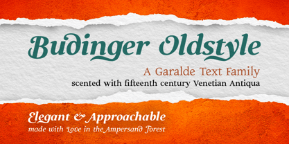 The Ampersand Forest has its first book family! Budinger Oldstyle is elegant and approachable at the same time, with five different weights, making it a perfect choice for text or display in situations that require a hint of scholarship, fine arts, craft, erudition, and clarity. Budinger Oldstyle has the legibility of a Garalde (like those of Garamond, Manutius, et al.), with a whiff of Venetian revival (after the fashion of Schneidler & Goudy). The letters are arbitrary, with conventions like cupped serifs and leftward stress. It also has a higher x-height than might be expected, to give it an upright posture and openness in the counters. The italic is more compact, with more clearly calligraphic letterforms and conventions like Swash Caps. Its many features include OpenType alternates (a one-story a and g, and a K, R, and Q with elongated descenders), full and true small caps, both standard and discretionary ligatures, oldstyle and lining numerals, and Swash letterforms in the Italic (all capitals and descenders, plus the ascender of the d). Plus, the most adorable pudge of an ampersand you've ever seen!
 - Mihbur by Twinletter,
$17.00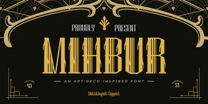 Introducing Mihbur, an Art Deco-inspired font that exudes elegance and sophistication. With its sleek lines and geometric shapes, this font captures the essence of the Art Deco movement while also offering a modern twist. Mihbur comes equipped with 51 alternate characters and 43 ligatures, giving you plenty of options to make your designs truly unique. Plus, it’s multilingual, making it a versatile choice for any project. Whether you’re designing invitations, posters, or branding materials, Mihbur is the perfect font to add a touch of vintage glamour to your work. So why settle for a plain font when you can elevate your designs with Mihbur? Try it out today and see the difference for yourself. What’s Included : - File font - All glyphs Iso Latin 1 - Alternate, Ligature - Simple installations - We highly recommend using a program that supports OpenType features and Glyphs panels like many Adobe apps and Corel Draw so that you can see and access all Glyph variations. - PUA Encoded Characters – Fully accessible without additional design software. - Fonts include Multilingual support
 - Bromawo by Alit Design,
$22.00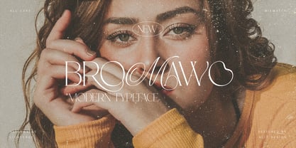 Presenting the BROMAWO typeface from alitdesign. BROMAWO font is designed by combining an elegant script font with a simple and charming serif font style. This font has a modern sans serif style combined with elegant script-style letters that make the BROMAWO font look different and unique from the fonts you have on your computer collection. BROMAWO is perfect for magazine cover designs, brochures, flyers. Instagram ads, Canva Design and so on with unique and modern concepts. besides that this font is very easy to use both in design and non-design programs because everything changes and glyphs are supported by Unicode (PUA). The "MOREDYA"contains 668 glyphs with many unique and interesting alternative options. Language Support : Latin, Basic, Western European, Central European, South European,Vietnamese. In order to use the beautiful swashes, you need a program that supports OpenType features such as Adobe Illustrator CS, Adobe Photoshop CC, Adobe Indesign and Corel Draw. but if your software doesn't have Glyphs panel, you can install additional swashes font files.
 - Conrad by Linotype,
$29.00The award-winning Conrad was created by Japanese type designer Akira Kobayashi. Its design was based on the fifteenth-century type by Conrad Sweynheym and Arnold Pannartz, two German printers active in Rome at that time. They produced a unique, slightly unbalanced yet attractive type. Kobayashi says of his typeface, “I have designed a couple of typefaces inspired from the past, but this time the original print acted merely as a reference. The distinctive lowercase ‘a’ and some other letters were inspired by Sweynheym and Pannartz’s second roman type, but I revived the type in a more informal way. Here I used the historical type as a springboard. The resulting type looks different, taking on a rather temporary and lively look. I assume that the Conrad is the first revival of the Sweynheym and Pannartz type, though it does not closely resemble the original.” Conrad won first prize for the text typeface category in Linotype’s Third International Typeface Design Contest (2000) as well as the Certificate of Excellence in Type Design from the Type Directors Club (2001). - Organica Pro by Sudtipos,
$39.00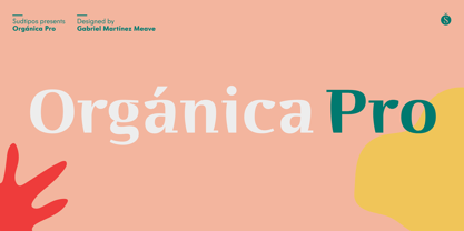 Just as most buildings are based on a structure of vertical columns, horizontal floors, square angles and the occasional arch, most Latin typefaces are designed within a largely uniform, static, alphabetic structure that provides a framework for playing with the style of the terminals —serif, sans-serif, slab-serif, flared, Tuscan— without significantly modifying the deep anatomy of the letters. Orgánica Pro, by contrast, proposes a different structure: curvilinear, subtle and sophisticated, beyond the typical «sticks and balls» model. Organic anatomy, in one word; deliberately dynamic and asymmetrical. Over this radically distinct structure, terminals play a characteristic, expressive role that challenges easy classifications: Is this a serif or a sans font? A semi-serif? A semi-sans? For text or display? Modern or ultra-modern? Joke or serious? All answers are valid. Anyway, its six stylistic variants allow for multiple, diverse uses in text setting, headings and logotypes. In spite of —or perhaps thanks to— its innovative, uncommon structure, Orgánica’s personality is sweet to the eyes, wittily elegant and surprisingly legible.
 - Slatz by CozyFonts,
$20.00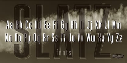 The Slatz Font Family is Vertical. It has a slender, consistent weight that is best used in limited, left to Right, space limitations as to maximize font height. Slatz font variations all have extremely clean edges and even the serif versions are crisply defined with a flat-pointed serif for an added unique character. The designed intent was for a tight kern, however evenly letterspacing these family members give a distinct personality and continues to command the negative space just as in tight kerned examples. The compatible relationship of these font family members, serif to sans serif, and regular to italic is seamless and the overall design coloring of words as sentences is well balanced and extremely legible. The Slatz Family fonts are matching members glyph to glyph yet there is a noticeable difference between the serif and sans serif members. The sans serif works in contemporary and vintage settings. The serif members work particularly well in vintage, period applications. The Bold and Drop versions of Slatz also fit the above descriptions and also work on their own.
 - Emoli by Arttype7,
$10.00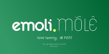 Emoli is a strong font family with a laid-back style. Inspired by the strong bending of iron, a unique character can be felt through controlled letterforms and blunt finishes. Each font in this family is standalone, and strong and cute. Emoli consists of ten fonts Emoli-Thin & Emoli-Thin Italic, with the thinnest complexion looks luxurious in high appearance. Emoli-Light and Emoli-Light Italic looks elegant combined with the weight of the Emoli Font family. Regular and italic emojis, the basis of emollient fonts, balance shapes, and letter uniqueness are found in this weight. Emoli Bold and Emoly Bold Italic will gently emphasize a strong character. Emoli Extra Bold and Emoli Extra Bold Italic, the thickest weights that will facilitate legibility and strong attitude. FEATURES 10 weights / Italics / Lines / Numbers & Signs Font family Emoli works well on applications, brands, logos, magazines, films. Different weights give you the full range to explore a variety of applications, while illustrated fonts give a modern, relaxed and powerful feel to any project.
 - Aeroxys by Kulokale,
$17.00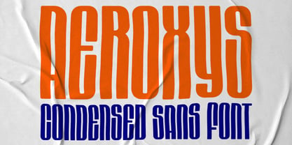 Aeroxys is an condensed sans serif display font, and with a style that is very different from the others. This font comes in four styles, Regular, Oblique, Outline, and Oblique Outline Version. Aeroxys is well-suited for posters, social media, headlines, magazine titles, clothing, large print formats - and wherever you want to be seen. Inspired by the style of design that is currently popular, and this is the answer to all the needs of every idea that you will pour in this modern era. We highly recommend using a program that supports OpenType features and Glyphs panels such as Adobe Illustrator, Adobe Photoshop CC, Adobe InDesign, or CorelDraw, so you can see and access all Glyph variations. This font is encoded with Unicode PUA, which allows full access to all additional characters without having special design software. Mac users can use Font Book, and Windows users can use Character Map to view and copy one of the extra characters to paste into your favorite text editor / application. We hope you enjoy the font. Thank you.
 - Magneta Condensed by Positype,
$25.00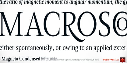 To describe what inspired Magneta would be to add a little Dwiggins, throw in some Benton with a hint of Austin, wrap it up in a crisp, contemporary package and serve. The skeleton of the family is a Garalde (like my earlier Epic) but with a desire to produce something much more transitional and contemporary, I sought to simplify, simplify, simplify. Cap and ascenders share the same height, the x-height is slightly larger than expected which should make a functional typeface for editorial, headlines or where more visually complex systems are needed. The modulation is much more intentional than historical and creates some interesting interactions between the various weights. There are both Normal and Condensed widths available with 6 different weights and matching italics, small caps, oldstyle figures, swashes, stylistic and discretionary ligatures (that includes some fun majuscule ligatures in the roman styles), there is no lack of typographic goodness for the designer. To add some spice, a set of Decorative Ornaments have been created that include geometric, floral, curvilinear patterns and much more.
 - Resgak by Kulokale,
$30.00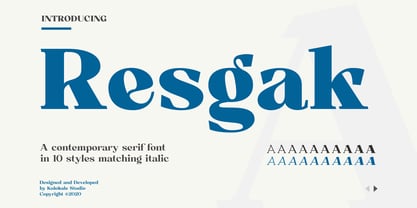 Resgak is a contemporary serif font with 20 fonts, ranging from thin to extra black with its matching italics, Resgak offers many possibilities to be applied in many graphic or editorial projects. Lighter weights are suitable for body text, and the heavier weights are perfect for striking headlines. Resgak is perfect for many different projects such as logos and branding, invitations, stationery, social media posts, advertisements, printed quotes, product packaging, product designs, labels, photography, watermark, special events and many more. This font is encoded with Unicode PUA, which allows full access to all additional characters without having special design software. Mac users can use Font Book, and Windows users can use Character Map to view and copy one of the extra characters to paste into your favorite text editor / application. I highly recommend using a program that supports OpenType features and Glyphs panels such as Adobe Illustrator, Adobe Photoshop CC, Adobe InDesign, or CorelDraw, so you can see and access all Glyph variations. We hope you enjoy the font and have fun! Thank You.
 - Bronson by Ronny Studio,
$22.00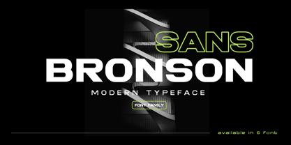 Bronson is a sans serif family that comes in 7 weights. The Bronson font has a very bold body, but still has high contrast. This font looks very modern when paired with contrasting design colors. This font is impressive and features a clean and elegant font, professionally shaped, and as a result, it will easily match a variety of creations that require a different touch. Add it with confidence to your projects, and you'll love the results. This typeface is perfect for elegant logos, branding, promotions, book covers, magazine layouts, or simply as a stylish text overlay onto any background image. Bronson Features : Uppercase Lowercase Numbers & Punctuation Multilingual Support Simple installation All of features and special characters of this font are included in one file. So it is easy to accessed by using program or software that support the opentype like Adobe Illustrator, Adobe Photosop, and Adobe Indesign). This font also very easy to use because compatible for all software even for non-opentype supported. Please comment us if you have any questions Thank you and have a nice day. thank you
 - Onimusha by Artisticandunique,
$30.00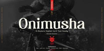 Onimusha - Serif font family - 6 Styles - Multilingual supports. Onimusha is an elegant serif font family with different alternative character designs. It has a unique emblem.The inspiration for the characters is based on ancient Japan, samurai philosophy and Far Eastern mysticism. Hard and pointed ends represent a Katana, and elegant soft turns represent the aesthetic understanding. This font provides flexibility in all your projects with the alternatives it offers you with its multiple language options, 6 styles and rich glyph options. You will have the opportunity to enrich the content of your projects with alternative characters. According to the purpose of use in typographic compositions that you will create with the aesthetic structure of alternative characters; You can enrich your titles in books or magazines, and your logos in branding. Especially for editorials, magazines, books, branding, packaging, logo design, web design, headlines, movie and game titles etc. If you're looking for a font with stylistic alternatives, Onimusha serif font might meet your needs. With this font you can create your unique designs. If you have a question, please contact me. Have a good time.
 - Snobbish by Create Big Supply,
$15.00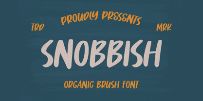 Designed with an organic brush style, this font adds a touch of uniqueness to your projects. Although Snobbish is an all-uppercase font, its distinctive character sets it apart, allowing you to explore endless possibilities. With Snobbish, you have access to both uppercase and lowercase letters, numbers, and punctuations, providing flexibility in your designs. Express yourself in various languages, as Snobbish offers multilingual support, enabling you to reach a global audience. This purchase includes TTF, OTF, and WOFF font files, ensuring compatibility across different platforms and software. The font is PUA encoded, allowing easy access to all its features and ensuring a seamless design experience. Character Sets: Snobbish encompasses a wide range of characters, including symbols, accents, and special characters. Let your imagination run wild and create visually stunning compositions that leave a lasting impression. Unleash your creativity with Snobbish and elevate your designs to new heights. Whether you're working on branding, logos, invitations, or any other artistic project, Snobbish is the perfect choice for adding a touch of organic charm.
 - Sabre by Alias,
$60.00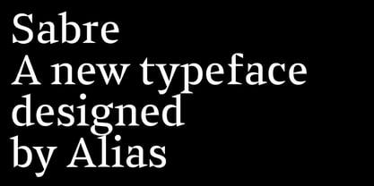 I generally refer to our typefaces as ‘graphic’ rather than typographic. By that I mean their starting points are usually ways of constructing shapes and systems of shapes. As with other Alias typefaces, Sabre has stone and wood cut letterforms as a starting point. What is interesting about lettercutting is the connection between shape and material. These beautifully crafted letterforms have a particular sharpness which reflects, of course, how they were made. The idea of constructing letters from a kit of parts we first explored in early fonts Elephant and Factory. These are different in that they were very much grid-based, with a geometric structure. For Sabre I also had Fred Smeijers’ stencil construction drawings in mind. These show how a set of components can be the basis for a crafted, elegant typeface. Sabre is quite a loose interpretation of this idea. Sabre’s graphic shape means it works well at large sizes, with a dramatic, angular impact. Its aim is to be typographic enough to function for blocks of small-size text too.
 - Thenaskle by Alit Design,
$21.00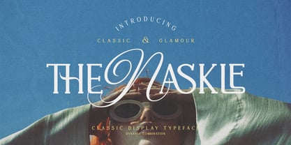 Presenting the THENASKLE typeface from alitdesign. THENASKLE font is designed by combining an elegant script font with a simple and charming serif font style. This font has a modern serif style combined with elegant script-style letters that make the THENASKLE font look different and unique from the fonts you have on your element design collection. THENASKLE is perfect for magazine cover designs, brochures, flyers. Instagram ads, Canva Design and so on with unique and modern concepts. besides that this font is very easy to use both in design and non-design programs because everything changes and glyphs are supported by Unicode (PUA). The "THENASKLE"contains 688 glyphs with many unique and interesting alternative options. Language Support : Latin, Basic, Western European, Central European, South European,Vietnamese. In order to use the beautiful swashes, you need a program that supports OpenType features such as Adobe Illustrator CS, Adobe Photoshop CC, Adobe Indesign and Corel Draw. but if your software doesn't have Glyphs panel, you can install additional swashes font files.
 - Mr Tiger by Hipopotam Studio,
$30.00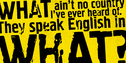 After the success of our best-selling Mr Black, we decided to once more use my grandfather’s dry transfer lettering sheets. My grandfather was a Polish military cartographer and he left us some used-up sheets. The letters didn't transfer so well but we liked the way they were damaged. Mr Tiger has upper- and lowercase characters with up to four alternate glyphs. First three variations are only slightly damaged but the fourth one is usually more distorted. All of the glyphs have a very high resolution so they can be used in a large scale and they will still look great. One of the best things in Mr Tiger is the OpenType Contextual Alternates feature. It will automatically set alternate glyphs depending on frequency of appearance of the same character. The script doesn’t throw random glyphs. For example in the word “HIPPOPOTAMUS” you will automatically get three different “P” glyphs and two “O” glyphs. It really works great but of course you can always fine tune it by hand.
 - Booer by Product Type,
$18.00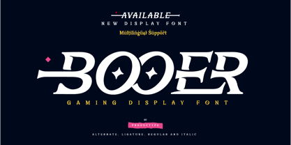 Introduce the Booer Font Express Your Creativity with a Powerful and Modern Gaming Style. Booer display is a font that reflects the power and style of the gaming world in a sharp, modern package. Booer is the perfect solution for a variety of projects that require a unique theme, whether it's a film, game, or streaming event. Her bold and exciting style provides room for creativity to flourish. What Makes Booer Special: Powerful Gaming Style, Booer Design exudes power, capturing the essence of the gaming world. Each letter is a statement of dominance and modernity. Two Style Families: The Booer font offers two different style families: Regular and Italic. This advantage allows you to adapt your designs to various contexts, whether requiring a strong presence or an elegant touch. Multilingual Support: Booer Font supports multiple languages, allowing you to connect with a global audience easily. Enhance your designs and make an impact with Booer Fonts. It's not just a font; it's a gateway to a bold, modern, and compelling visual world. Download Font Booer now and experience the thrill of creating unforgettable designs!
 - GarciaToons by Victor Garcia,
$40.00GarciaToons is a dingbats type family integrated by 3 styles: GarciaToons Bunny, GarciaToons Cat, and GarciaToons Mouse. GarciaToons can be defined as a type cartoon to read some text situations at a glance. It is a contemporary type tool for seasoning texts in a way that simple words are insufficient to express. GarciaToons is about funny and fresh real-life communication needs, the ones we facing anytime anywhere in our daily writing issues. Aim: To design an easy-to-understand and user-friendly symbol type code, able to combine with –or even to replace– words in a text. Idea: To develop a comic's faces dingbats series starting from the same pattern for the whole variants. The challenge was to represent different cartoon characters with minimal design changes. Designs are framed into a straight and geometric visual structure, just as logotypes themselves are. Face expressions are inspired on the worldwide understandable cartoons aesthetic. The result combines logo sharpness with cartoons flexibility. As it's said: A picture is worth more than a thousand words. - Samory by Alit Design,
$20.00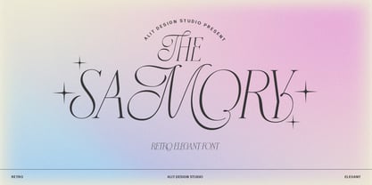 Presenting the SAMORY typeface from alitdesign. SAMORY font is designed by combining an elegant script font with a simple and charming serif font style. This font has a modern serif style combined with elegant script-style letters that make the SAMORY font look different and unique from the fonts you have on your computer collection. SAMORY is perfect for magazine cover designs, brochures, flyers. Instagram ads, Canva Design and so on with unique and modern concepts. besides that this font is very easy to use both in design and non-design programs because everything changes and glyphs are supported by Unicode (PUA). The "SAMORY"contains 634 glyphs with many unique and interesting alternative options. Language Support : Latin, Basic, Western European, Central European, South European,Vietnamese. In order to use the beautiful swashes, you need a program that supports OpenType features such as Adobe Illustrator CS, Adobe Photoshop CC, Adobe Indesign and Corel Draw. but if your software doesn't have Glyphs panel, you can install additional swashes font files.
 - Festivo Letters by Ahmet Altun,
$19.00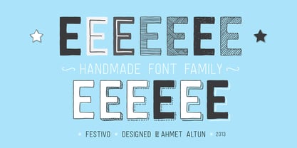 Festivo Font Family is a handmade layered font which includes several textures, shadows. Different font types can be created using various combinations of Festivo Fonts and colors. All fonts of Festivo letters are created as hand-drawn design based on F.L. NO:8 Font's Letters. The fonts No:16, No:17 and No:19 have the same metric and kerning structure than the other Festivo Fonts except No:18. So each one of these 3 fonts are a layer. But they can also be use as wide spaced fonts. No:18 is specific with its metric and kerning structure which was formed by No:17 but No:18 is its bold version. It was designed as a supplemental font. The fonts No:12 and No:15 can be used as shadows. This font family also includes a few ornaments. For your convenience, the files of the fonts were termed by their numbers. The various possibilities of the Festivo Font Family allows you to create a lot of great works such as posters, magazines, printings, t-shirts etc.
 - Journey Signature by Azetype,
$19.00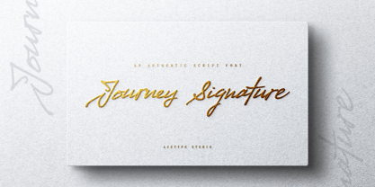 Presenting Journey Signature! An Authentic Script Font crafted carefully. Based on original signature hand scratches that look Classy and Vintage style. This font can be used at any time and in any project. You can see in the presentation picture above, how it's working! So, this font can give a different touch to all your design projects e.g. watermark, quotes, logotype, poster design, personal branding, lettering, photography needs, blog header, wedding, letter, invitation, stationery, etc. WHAT'S INCLUDED? 1. Journey Signature • This one comes with Standard Characters and 3 Stylistic Alternates (uppercase, lowercase) numeral, punctuation, symbols, and huge multilanguage support e.g. Afrikaans, Albanian, Catalan, Czech, Danish, Dutch, English, Estonian, Finnish, French, German, Hungarian, Icelandic, Indonesian, Italian, Latvian, Lithuanian, Maltese, Malay, Norwegian, Polish, Portuguese, Spanisch, Slovak, Slovenian, Swedish, Zulu, and Many More). • Multilingaul Glyphs: ÀÁÂÃÅÄĀĂǺĄÆǼǢÇĆČĈĊĎÐÈÉÊËĘĒĖĚĔĞĢĠĜÌÍÎǏÏĪĮĬĨļĶĿĽĻĹŁÑŃŇŅŊÒÓÔÕÖŌŐŎØŒÞŔŘŖŚŠŞŜ ŦŤŢÙÚÛÜŪŮŰŲŨŬŴÝŸŶŻŹŽàáâãåäāăǻąæǣçćčċĉďđðèéêëęěēėĕğģġĝĥħıìíîǐïīįĭĩķłŀĺñńňŋʼnņòóôõöőŏøœ þŕřŗśšşşŝßŧťţùúûüūůűųŭŵýÿŷżźž 2. Journey Signature Swash • This One comes with an underline swash that makes your design project looks standout and classy. For feature, you just type A-Z or a-z, choose the Swash version, and than ready to use. Thank You Azetype Std.
 - Kade by Re-Type,
$45.00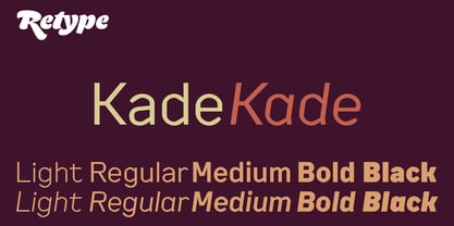 Kade is a display/semi display sans family of fonts based on vernacular lettering photographed over the last ten years in and around the harbors of Amsterdam and Rotterdam. Hence the name Kade that translates into English as ‘quay’, also the name of its designer. Kade grew slowly from many different ideas and elements. The letters reflects the industrial method in which they are cut for the side of ships from large steel plates. Frequently subtleties of curves are compromised due to the cutting tools and the fact engineers are in control. Kade’s italics have an experimental character and were produced in an unorthodox manner by rotating 8 degrees, rather than slanting the roman characters, a method sometimes employed in shipyards. Kade constructed character is ideal for contemporary editorial works, architecture magazines, museums communication and posters. The six distinct styles are published in OpenType format, featuring small caps and four sets of numbers (proportional old style, tabular old style, proportional lining and tabular lining), as well as matching currency symbols and a complete set of fractions.
 - Cebreja by Rafaeiro Typeiro,
$29.90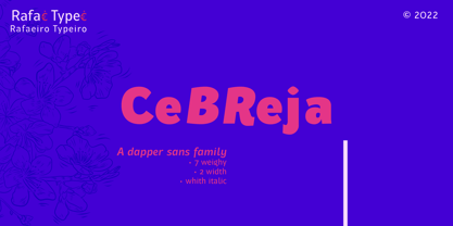 Cebreja is made of “cereja” (Cherry in English) with “br” in the middle, “br” from Brazilian. So called because the font is made with Brazilian cherry wood, which allows thin rods to be carved without breaking and maintaining its shape with use and allowing the ink to spread evenly and precisely, since the density of the wood guarantees this robustness. Its well-polished and minimalistic, works wonderfully on its own for logos, headlines, posters, packaging and smaller applications! And with seven different weights with their correlated italics and all SmallCaps to choose from, your option to create more unique and versatile designs is a lot wider. Have fun and produce more. This typography has the OpenType features that are standard in our type foundry, complete set of numerals, standard ligatures, discretionary ligatures, Stylistic Alternates, Stylistic Sets –ss01 and ss02, in addition these features have been enriched with smarter scrypts, which make fractions form automatically; prevents alternate glyphs from clash. Making composition with this typography even faster and easier.
 - Gutenberg A by Alter Littera,
$-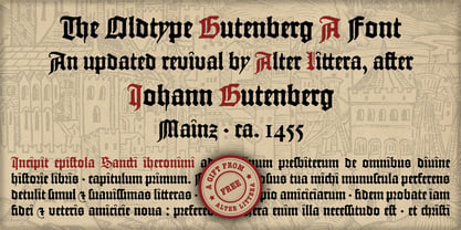 This is a free abridged edition of the full-featured Gutenberg B and Gutenberg C fonts. Although (as the name suggests) it was originally conceived as the first release in the B42-type series, it actually represents the colophon to this series. In addition to having a narrower scope, the font differs from its full-featured predecesors in both letter and word spacing, as well as in glyph design, using exclusively straight lines for every glyph and providing a significantly rough appearance at medium to large point sizes. The font includes the usual standard characters for typesetting modern texts, as well as a few special characters, alternates and ligatures that can be used for typesetting nearly as in Johann Gutenberg’s 42-line Bible and later incunabula. Please note that the use of this free font is subject to the same terms and conditions as those for Alter Littera’s pay fonts. Specimen, detailed character map, OpenType features, and font samples available at Alter Littera’s The Oldtype “Gutenberg A” Font Page.
 - Type Tile by Konst.ru,
$19.00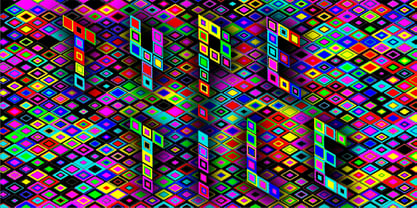 The fastest and easiest way to create original images. It is necessary to take any text and use it with Type Tile. Create pictures, patterns and backgrounds from real texts. Font can be used in various encodings and you can type texts in many languages. Type Tile supports Central European languages that use Latin script, (Polish, Czech, Slovak, Hungarian, Slovene, Serbian, Croatian, Romanian and Albanian), Cyrillic alphabets, Western languages, Greek, Turkish, Hebrew, Arabic, Baltic languages, Vietnamese, Thai and Japanese. You can make the background from the original text for the page on which can print the translated text. This symbiosis can create a feeling of presence in the original text. Decorate the packaging in which the text is written in the form of ornament. Several layers of the texts with Type Tile shows an incredible pictures. Use a pair of letters can give a regular pattern. Type Tile provides endless and fantastic opportunities for design on any surfaces and for different purposes in publish, fashion, textiles, industry, animation, Internet and so on.
 - Serene Orchid by Prestige Artsy Studio,
$19.99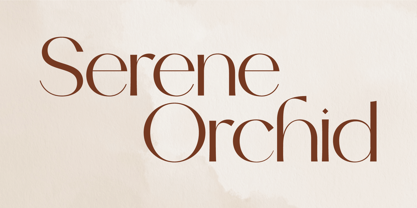 Introducing Serene Orchid a revolutionary new sans serif font! This modern and evolutionary font combines sleek, minimalistic design with the latest technological advancements to create a font that is truly one-of-a-kind. Serene Orchid font offers a wide range of stylistic sets, giving designers and creatives ample options to choose from. From elegant to edgy styles, this font can be used to bring any project to life. The design of this font is inspired by the natural evolution of design and typography. It embraces the latest trends while staying true to the fundamental principles of typography, resulting in a font that is both timeless and contemporary. The unique spacing and letter formation of Serene Orchid font ensures perfect readability and legibility for any project, and its compatibility with all major design software ensures ease of use. Whether you are using this font for brand identity, packaging, editorial design or anything else, this modern and evolutionary sans serif font is sure to make your projects stand out. Try it out today and see the difference for yourself!
 - Samaritan Tall by Comicraft,
$49.00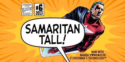 Fifteen hundred years from now, a man will be selected to go back in time to prevent a catastrophic event which turned his world into a dystopia. Sent back in time, he was enveloped in empyrean fire, the strands of energy that make up time itself. Crash-landing near Astro City in late 1985, he learned how to master and channel the empyrean forces that had suffused his body -- finally learning to control his powers in time to prevent the destruction of the Space Shuttle Challenger, the event he had been sent to avert. He described himself to journalists as nothing more than "a Good Samaritan", and has continued to help his fellow man in Astro City ever since. John JG Roshell has also been struggling with the empyrean challenge of fitting all of Kurt Busiek's Astro City dialogue into balloons with the regular Samaritan font, so he created the Samaritan Tall font to help his fellow comic book letterers! It's kinda the same thing really. See the families related to Samaritan Tall: Samaritan &
 - Just Sunday by Ahmad Jamaludin,
$15.00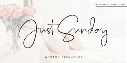 Introducing! New Elegant Script Font. Just Sunday! Just Sunday is modern feminine font, every single letters have been carefully crafted to make your text looks beautiful. With modern script style this font will perfect for many different project ex: logo, photography, watermark, quotes, blog header, poster, wedding, branding, logo, fashion, apparel, letter, invitation, stationery, etc. Just Sunday also includes Regular and Bold, full set of uppercase and lowercase letters, multilingual symbols, numerals, punctuation. The font has smooth wet ink texture, so would be perfect for all types of printing techniques+you can do embroidery, laser cut, gold foil etc. Just Sunday has beautiful ligature following : Ju Su St af ah ak al am an as at ay ch ck cl ct dd ef eh ek el em en es et ey ff if ih ik im in il is it iy ll nn oo sh sl ss st tt uf uh uk um un ul us ut uy Contact me if you have any questions: dharmasahestya@gmail.com Thanks! dharmas Std
 - Phitagate by Ronny Studio,
$19.00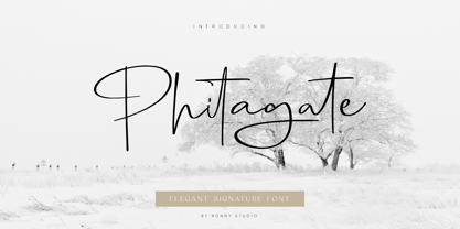 Phitagate is a signature script font with beautiful strokes. This font is impressive and features a clean and elegant font, professionally shaped, and as a result, it will easily match a variety of creations that require a different touch. Add it with confidence to your projects, and you'll love the results. This typeface is perfect for elegant logos, branding, promotions, layout magazines, beauty products, business cards, weddings, quotes, or simply as a stylish text overlay onto any background image. 2 Style Font : - Regular - Italic Phitagate Features : - Uppercase - Lowercase - Numbers & Punctuation - Alternates - Ligatures - Swashes - Multilingual Support - Simple installation All of features and special characters of this font are included in one file. So it is easy to accessed by using program or software that support the opentype like Adobe Illustrator, Adobe Photosop, and Adobe Indesign). This font also very easy to use because compatible for all software even for non-opentype supported. Please comment us if you have any questions Thank you and have a nice day. thank you
 - Acuta by Anatoletype,
$27.00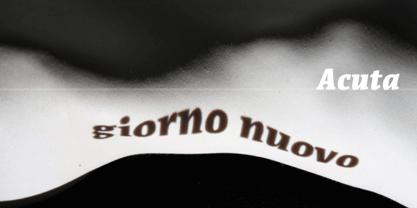 Acuta is a new all-purpose text serif with a good readability and a contemporary, robust look thanks to its low-medium contrast. The differences between thicks and thins are less strongly marked than in oldstyle text faces; yet the diagonal stress needed to facilitate reading is partly provided by the letter shape itself: sharp angles and italic construction give the right dynamism to the text. Acuta becomes very distinctive as a headline, while its big x-height makes it suitable for texts at rather small sizes too. The family consists of seven weights & correspondent italics, with a large character set. The Book and Medium weights, relatively close to each other, can both be used as “plain” weight depending on the size of the text, background color or backlighting. Small caps, oldstyle and tabular figure alternates, superiors and inferiors and ligatures are available in all styles through OpenType features. The real italics include unobtrusive swash alternates to emphasise the written feeling. Please find a specimen of Acuta (PDF) in the Gallery section.
 - Muttung by Haksen,
$12.00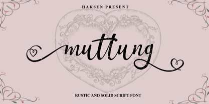 Dear Font Lovers, I really glad to inform You and of course introduce my New Collection Font with the name "Muttung" "Muttung" is beauty font script with more than 40 glyps of alternate to provide beauty types. In this chance I would like to give You 2 variations of this font, what's the variation? You will get : Muttung Solid Muttung with Rustic effect What's the different of couple these font? Muttung Solid is designed for anything brand with beauty type in many alternate to provide your requirement. Muttung with Rustic effect is designed for beauty type with vintage sensation but still looks beautiful. With these fonts I'm hope You will get satisfaction for everything of Your projects or anything for You works. These fonts are support with many software such as : Adobe Photoshop CC, Adobe illustrator CC, Coreldraw, also many more. Finally, I hope with these fonts You will get everything your requirement and get satisfaction. Thanks for Your visit and attention. Success is always for You. Best Regards, Haksen
 - Bustor Rhikan by Kulokale,
$22.00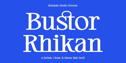 Bustor Rhikan is a stylish, clean, and linear slab serif font, with style that is very different from the others. This font comes in two styles, Regular and Oblique Version. Bustor Rhikan is well-suited for posters, social media, headlines, magazine titles, clothing, large print formats - and wherever you want to be seen. Inspired by the style of design that is currently popular, and this is the answer to all the needs of every idea that you will pour in this modern era. We highly recommend using a program that supports OpenType features and Glyphs panels such as Adobe Illustrator, Adobe Photoshop CC, Adobe InDesign, or CorelDraw, so you can see and access all Glyph variations. This font is encoded with Unicode PUA, which allows full access to all additional characters without having special design software. Mac users can use Font Book, and Windows users can use Character Map to view and copy one of the extra characters to paste into your favorite text editor / application. Thank You.
 - Street Tag Vol 2 by Tomatstudio,
$19.00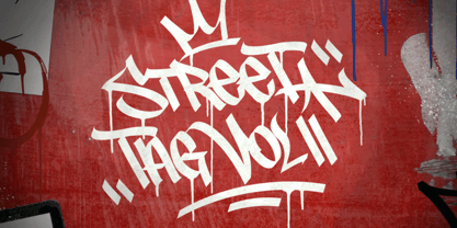 Street Tag vol 2 is the second version of Street Tag fonts. Inspired from realistic caligraphy tagging style in many big cities. This style is more bold and readable, perfect for your “street art” designs style. I combined the real graffiti experiences into computer fonts, I think it will be different with other fonts if you can feel it, cause I draw graffiti, tagging and throw ups since I was high school. The real tagging style is never be tidy, but don’t worry, I already adjust the kerning and spacing in the best possible way. You’ll find the better result when you adjust the kerning, and edit baseline manually, especially for the alternates font, if you unfamiliar with these one, you can find many tutorials in youtube, for the example https://www.youtube.com/watch?v=251cTL029M4. what will you get You’ll get some alternates in several alphabet, see that in the font preview, some sample fonts I change the dot in “I” to stars, and I add ‘ into “O”, sometimes we do that in the real walls! You can explore more with this font!
 - Trovoada Mono by SullivanStudio,
$25.00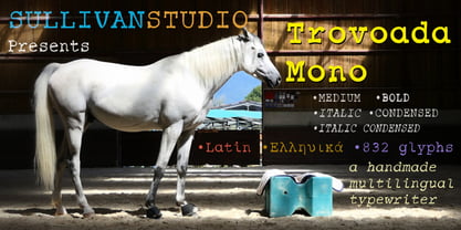 Trovoada Mono is a monospaced font for use in print (but also looks great on display). Hand-drawing glyph by glyph, my intention was to get that old manual typewriter look, with uneven inks, but with a totally up-to-date, emotional and admittedly humorous attitude. Trovoada Mono borrows from classics like Courier and Letter Gothic, reinventing serifs here and there. The result is a font that is both familiar and unusual. As I love Greek typography, I made sure to include a full polytonic alphabet, in the same vintage spirit: the text looks very legible and matches the Latin characters. The font has no kerning, obviously, and no ligatures (this is a typewriter, my friend!), but it has important OpenType features: fractions, subscripts/superscripts, slashed zero and stylistic alternatives for some characters. The italics are 11 degrees, which brings a strong personality. Some characters have true italics, giving the text an overall texture different from the upright type. All that is missing is that nervous typewriter noise. Enjoy!