10,000 search results
(0.032 seconds)
- Land of Fear by IKIIKOWRK,
$19.00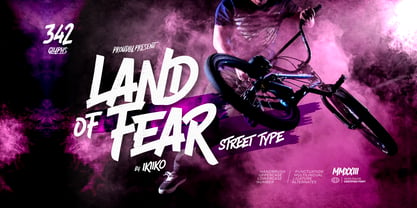 Proudly present Land Of Fear - Street Type, created by ikiiko Land of Fear is a hand-drawn street brush font in an urban style that has a gritty and edgy look, conveying the roughness of city streets. The letters have bold characters and appear to be scratched quickly with a strong brush. This font has wild strokes and comes in different widths and angles, giving the letter a sense of spontaneity and vitality. This font has an overall rough and rugged look, but also evokes a style that is young, wild and free. This typeface is perfect for an extreme sport stuff, street vibes, magazine layout, poster, fashion brand, urban style, quotes, or simply as a stylish text overlay to any background image. What's Included? Uppercase & Lowercase Numbers & Punctuation Alternates & Ligature Multilingual Support Works on PC & Mac
 - Thurof by Twinletter,
$17.00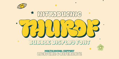 Welcome to the world of Thurof, a bubble typeface that will provide a strong, bold, and whimsical touch to your projects. Do you want to make your messages more colorful and entertaining? Thurof is the ideal candidate. Thurof is available in three different styles: Regular, Outline, and Shadow. This means you can produce an effect that is appropriate for your project, from bright to lighter with an outline or shadow effect. Thurof's plethora of variant ligatures and characters distinguishes it from other languages. This allows you to use your imagination to create unique and inspiring designs. Thurof's multilingual support will also assist you in spreading your message over the world. Thurof is an excellent choice for projects that demand a fun, playful appearance. Allow Thurof to transform your message into something vibrant and inspiring, and leave an indelible impact.
 - Winter Tales by Hart Foundry,
$12.00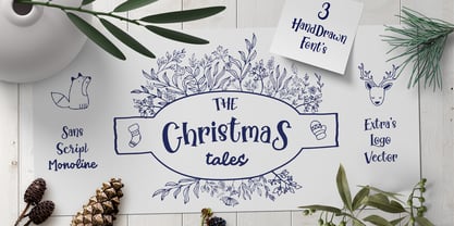 Introducing Winter Tales Font Pack Winter Tales is a new handwritten font pack from us, this font is really new and fresh. With four different font characters, you can play your imagination in designing. This font is very easy to use and really playful. New Monday perfect for logos, printed quotes, invitations, cards, product packaging and another project design. What Inside The Pack -Winter Tales Script -Winter Tales Monoline -Winter Tales Sherif Winter Tales • This fonts have uppercase, lowercase, alternate And Support Multi language characters so you can play around with all of these fonts and create something funny and awesome. To use the alternate or the ligatures, you have to use the aplication who support Open Type features I really hope you enjoy using New Monday, please don't hesitate to drop me a message if you have any question :) -Hart
 - Mrs. Santhi by Abo Daniel,
$15.00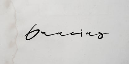 Proudly present Mrs. Santhi, a fancy Signature Font. This font is very unique. I designed it for you who want something different from the others. It is perfect for branding, photography, invitations, quotes, watermarks, advertisements, product designs, labels, and much more! I created 194 ligatures to keep this font look natural: aa ab ah ak al am an at ant all amm ann att bh bt cc ch ct dd eb ee ek em en et enn ent ett ff gh hh ii ib ik in it inn int itt ix ixx kh ll mm mt nt nn oo oh on ob ok ol oll om ot ont ott oot onn ox oxx ph pt and more as you can see on the presentation pictures. Mrs. Santhi also features punctuations and multilingual support. Hope you love it!
 - Haniberryku by Kotak Kuning Studio,
$20.00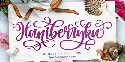 Haniberryku is a lovely modern script font with a natural & stylish flow. Perfect for making elegant stylish statements - or adding a touch of class to your designs. This script has a multitude of lovely alternates character in its OpenType features - making the font look a beautiful. Haniberryku is perfect for many different projects such as logos & branding, invitation, stationery, wedding designs, social media posts, advertisements, product packaging, product designs, label, photography, watermark, special events or anything. I highly recommend using a program that supports OpenType features and Glyphs panels such as Adobe Illustrator, Adobe Photoshop CC, Adobe InDesign, or CorelDraw, so you can see and access all Glyph variations. We hope you enjoy the font, please feel free to comment if you have any thoughts or feedback. Or simply email me at kotakkuningstudio@gmail.com. Thanks for purchasing and have fun!
 - Calicanto by Sudtipos,
$39.00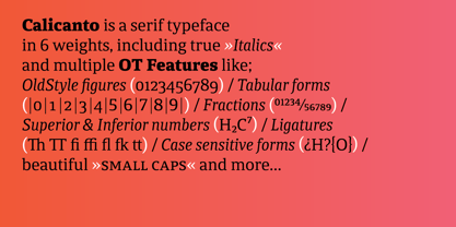 Alejandro Freitez’s first commercial typeface is inspired by contemporary serifs and newspaper typography. Calicanto is a compact typeface with strong serifs, symmetrical curves and a vertical axis. It has open counters and a generous x-height with slightly condensed characters and low contrast strokes. The design of its letters are simple (with a precise rationale), and it is ideal for combining different variables and typographic bodies, for digital and printed media. Each of the 12 variables has 750 glyphs (supporting more than 90 languages), with small caps, ligatures, lining figures by default, OldStyle and tabular, mathematical and currency symbols for each set of numerals, intelligent fractions, lower and upper numerals, glyphs sensitive to capital letters and circular numerals, among other OpenType functions that make it ideal for composing demanding texts for books, magazines, newspapers, annual reports, and much more.
 - 1543 German Deluxe by GLC,
$38.00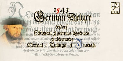 This family was inspired by the sets of fonts used in 1543 by Michael Isengrin, printer in Basel (Germany) to print the splendid New Kreüterbuch...(New herbal...), with numerous nice pictures, the masterpiece of Leonhart Fuchs, father of the modern botany. It is a Schwabacher pattern, with three different sets of fonts, small (± 4mm for the upper case) in the main text, larger for titles (± 8mm for the upper case) and large Initials or lettrines (five lines of main text). This font contains standard ligatures and German historical ligatures (German double s, long s, tz, ch,...) and diacritics (special umlaut "e superscript" and "∞" unstead of dieresis with letters a, o and u,) naturally, we have added numerous letters lacking in the original to permit a contemporary use of the font. It can be used in complement with 1538 Schwabacher or/and 1534 Fraktur.
 - Bell MT by Monotype,
$39.00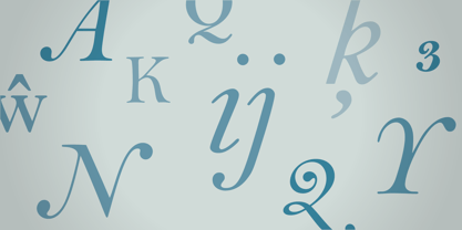 Monotype’s hot metal Bell series from 1931 was based on original types made by the punchcutter Richard Austin for the foundry of John Bell in the 1780s. The different sizes of Monotype’s series were not all based on the same model. As type historian James Mosley wrote on Typophile, “For 18 point and above (the metal type was cut in sizes up to 36 point) Monotype’s model was a larger type [than the model used for the text sizes], the ‘Great Primer’ cut by Austin. This has greater contrast in the capitals and a flat foot to letter a.” The digital Bell closely follows the design of the hot metal 18pt version, and is therefore somewhat lighter in color than the text sizes of Monotype’s original metal face. James Mosley’s Typophile article can be found here.
 - Mixed Tape by Ksenia Belobrova,
$35.00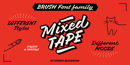 Mixed Tape is a brush typefamily inspired by music and based on calligraphy. It has 3 different styles so that you can choose which you need or combine them as you like. Mixed Tape Regular is a casual neutral brush script, Mixed Tape Small is a more elegant variation and Mixed Tape Capitals is an energetic, probably even brutal brush script. You can freely play with the three of them creating your typographic compositions. You can use Mixed Tape for posters, prints, menus, packaging, book covers and headlines, cards and as a starting point for logotypes. Mixed Tape has a lot of alternates and ligatures which are built into the ‘Liga’ feature that is turned on by default. It also has swashes, titles, fractions, ordinals and case sensitive forms. Let’s all enjoy good music and typography!
 - Coal Brush by Hanoded,
$15.00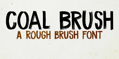 Coal Brush is a bit of a misleading name. It looks as though it was made with a brush, but it was, in fact, made with a almost dried out old marker pen. But a font named ‘dried out old marker pen’ doesn’t really fly, so I decided to pimp the name. There you have it, you can’t even trust an honest typographer! Marker pen or brush, Coal Brush is a very sweet little font. It is all caps, but upper and lower case differ and can be mixed freely. Plus there’s a hidden stash of alternates for the lower case letters and an alternate ampersand! I actually threw that in to make up for my lie. So, use it for your books, your posters, your rap albums, rock operas, grilled food restaurants and designer BBQ sauces. It’s yours for the taking!
 - Merciful by Create Big Supply,
$17.00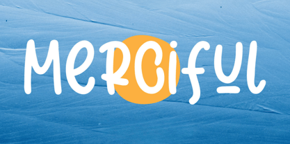 Introducing Merciful, a charming and playful sans serif font that brings a touch of fun and uniqueness to your designs. With its cute and lively style, Merciful adds a playful and vibrant element to any project. Whether you're designing greeting cards, children's books, party invitations, or any other creative work, Merciful is sure to capture attention and spread joy. This font features both uppercase and lowercase letters, making it versatile for various design purposes. It also includes numbers and punctuations, allowing you to create engaging typography and eye-catching headlines. Merciful supports multilingual characters, enabling you to express your creativity in different languages. With the added convenience of PUA encoding, accessing all the font's glyphs and swashes is effortless. You can unlock a world of creative possibilities by exploring the various ligatures and alternate characters available in Merciful.
 - Anabella by RNS Fonts,
$33.00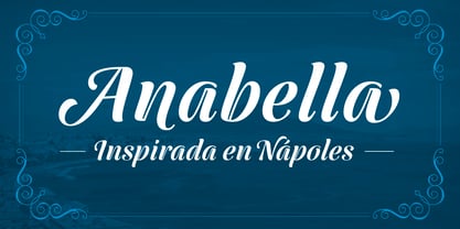 Anabella is a typeface made for the Master’s Degree in Typography at the University of Buenos Aires. It is inspired by the posters of pizzerias located in Naples, Italy; in order to be used in the pizza franchise Giuseppe in Buenos Aires, Argentina. The font preserves and rescues gestural features of these posters, adding a vertical axis and high contrast, typical of the Italian types that arrived in the city product of the immigration. The stroke with brush provides a more organic quality to the sign and provides connotative features. The family has three variables for the different applications that may be required in a pizza place: Italic for bodies greater than 16 pt, Roman for short texts up to 14 pt, and Stencil for use in brands and titles. Anabella was selected to participate in the eighth typography biennial Tipos Latinos.
 - SK Seren by Salih Kizilkaya,
$9.99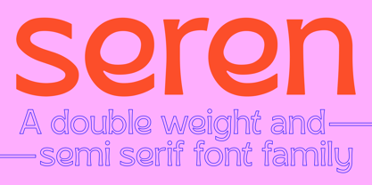 SK Seren is a clean, double weight and semi-serif font family. This font family, which you can use in long texts or headlines, logos and posters you will design without hesitation, manages to stand out even in the most crowded environments. As you can easily use in print and web design, this is the only font you need in every medium. This family consists of 10 different fonts and 5890 glyphs. In this way, it contains all the typographic materials you will need in your design and offers full support to the Latin alphabet. This font family is a new version of the first font I designed while studying college in 2018. This version includes many new glyphs that were not available in the first version, and all bugs found in the first version were fixed and kerning settings were reconfigured.
 - Mr Anteater by Hipopotam Studio,
$20.00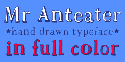 Hand drawn serif typeface designed for one of our books. You can use just the regular style or set the fill style over the stroke style to get a more colorful version. It has upper and lowercase characters with up to three alternate glyphs. Build in OpenType Contextual Alternates feature will automatically set alternate glyphs depending on frequency of appearance of the same character (even in web font but only in HTML5 browsers). The script doesn’t throw random glyphs (so it won't break the layered, two colored version). For example in the word “HIPPOPOTAMUS” you will automatically get three different “P” glyphs and two “O” glyphs. It really works great but of course you can always fine tune it by hand. Mr Anteater has younger sister. Mrs Ant was designed for side notes in the same book.
 - Expedition One by Gustav & Brun,
$6.00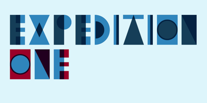 To be independent or to be dependent? The formula “one plus one is one” is here essential for this to work. The different cases, upper and lower is dependent on one another. To give us clarity they have to work together, to be like one the upper and lower cases must work together. Expedition One works best in InDesign or equivalent software. How to use it: write your text in lower case, copy the text frame and ”Paste in Place”, change your lower case text to upper case (you do that under top menu->type->change case). Change colour if you want to and maybe change the blending mode in the effects window to “multiply” makes it even more sparkling. On numbers and ampersand for example, you have to use the glyph window in InDesign to find their second half.
 - Aromo by Underground,
$19.00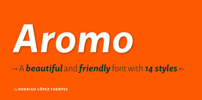 Aromo was initially conceived for editorial purposes. This typeface mixes the versatility of a simple and modern sans-serif, with the sensibility of the humanist feeling: thus making it useful in a wide range of purposes when a balanced and friendly font, with elegant proportions and high readability is required. The functional nature of its design is complemented by a family of 14 variants (7 weights, plus their matching true italics) interpolated optically for application as a hierarchical resource, where the middle weights (Light, Regular) have been optimized for use in small bodies, while the extremes (Ultra Light, Black) where designed for display environments. Aromo also offers a wide range of historical and discretionary ligatures, small caps, eleven different types of numerals and a set of more than 700 characters covering about two hundred languages of Latin script.
 - Tuna by Ligature Inc,
$49.00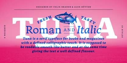 Tuna is simply a contemporary body text font. It is contemporary, meaning the merge of charming broad-nibbed calligraphic style with optimized readability on screen – showing that the roots of writing and typesetting are still in charge when reading “Anna Karenina” on your Kindle till 4 o’clock in the morning. Tuna has a natural fit for cross-media use because the design is based on forms characterized by different conditions of constancy, stability and good readability. Well-defined shapes and distinctive details only become apparent when used in larger sizes, making Tuna a true all-rounder. With more than 700 glyphs in 10 styles created with a maximum of consideration, it has all the qualities of a modern OpenType font serving the needs of today's communication. If you would like to read more about the Typeface please visit our promo site.
 - Mamute by PintassilgoPrints,
$18.00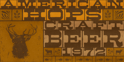 Mamute is a block rockin' family with a cool letterpress look. Its upper- and lower-case slots hold glyphs with slightly different textures for a natural look. Numbers and punctuation marks also have alternate versions. Just trigger the Contextual Alternates feature to easily cycle the alternate glyphs, preventing double letters from displaying the same texture. Mamute is a highly decorative typeface available in 2 widths, regular and condensed, each also offered as a layered font, a handy and playful way for adding shades to your composition. There’s also a generous ornaments font and a catchwords one to spice up your designs. Mamute is based on Aldine wood type spirit (as there were many incarnations of it!), from circa 1870. Please note that this family has a limited character set and doesn't bring diacritics nor accented characters. But yet it does rock, you bet!
 - Lathier by Twinletter,
$17.00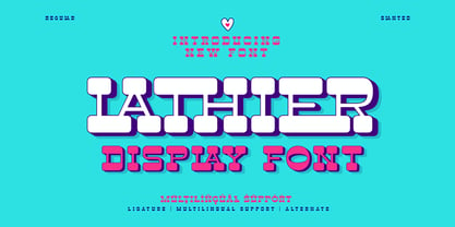 Welcome to a world of design full of character and creativity! Lathier is a unique display font, combining bold and fat elements into an unforgettable letterform. If you're looking for a truly powerful look for your various visual design projects, Lathier is the perfect choice. What sets Lathier apart? The unique shape of the letters is strong and full of character. With regular, shadow, and slant families, as well as complete ligature and alternate features, Lathier gives you the flexibility to create typographic designs that are striking and different from the rest. Lathier supports multiple languages. With Lathier fonts, your message will penetrate the world, without language barriers. It's time to create a truly extraordinary design. Get Lathier now and watch how this font will transform any of your projects into powerful and unique works of typographic art.
 - Ancyra by Hurufatfont,
$29.00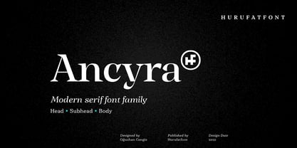 Ancyra is a transitional serif family designed with current usage areas and requirements in mind. Efforts were made to provide the most effective harmony within each character and with the characters they are associated with. For customizing the usage areas and providing an impressive and fluent reading experience; it is designed in three different optical weights as title, subtitle and body text. Sharp and soft terminals used together (such as v, w, y, s, c, k) have an extraordinary effect, especially in italic styles. Contextual alternatives are designed to be compatible with the letters after the letters "c, e, t" in the text and create a cursive effect. Ancyra is perfect for use in newspapers, magazines, e-books, packaging design and fashion industry, branding of quality products and services. Ancyra has a versatile usage area with its optical weights.
 - Blakstone by Albatross,
$19.00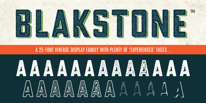 Borne of geometry, found-type and a genuine love of texture, Blakstone has a lot to offer the letterpress style type genre. With 25 styles including hatches, halftones, grunge, linen, inline, shadow, fills, and outlines, Blakstone becomes useful as a layered type system. Combine styles to control colors on different layers to achieve your desired effect or just use a single style to keep it simple. Blakstone is full of open-type features including ligatures, discretionary ligatures, superscript numbers, subscript numbers, and automatic open-type fractions. Another great feature of Blakstone is its support for 130 International languages and dialects. Blakstone has many uses in the design world including signage, branding, invites and cards, clothing design, the music industry, restaurant and grocery signage, coffee shops, the list goes on. Blakstone has a texture for any occasion.
 - Merimount by Rillatype,
$19.00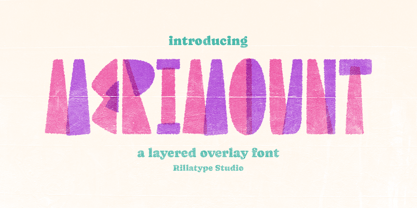 Introducing Merimount - Your Ultimate Layered Overlay Font Elevate your design game with Merimount, a versatile and innovative layered overlay font that allows you to create stunning typographic masterpieces effortlessly. With three unique styles—Merimount Regular, Merimount One, and Merimount Two—this font opens up a world of creative possibilities. What sets Merimount apart is its layered design, enabling you to stack the fonts for a dynamic and dramatic effect. Experiment with different combinations and take advantage of the blending mode feature to achieve the perfect look for your project. Whether you're going for a bold and impactful design or a subtle and sophisticated feel, Merimount has you covered. Ideal for a wide range of design projects, from posters to branding, Merimount adds a touch of creativity and flair. Unlock the full potential of your designs with this must-have layered overlay font. Uppercase
 - Thorben by Studio Buchanan,
$18.00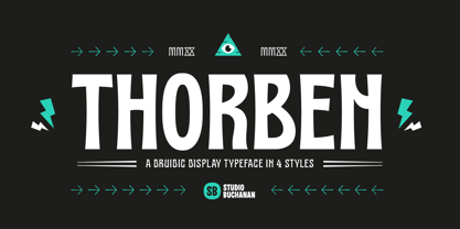 The old Norse legend of Thorben Odinson is a cautionary tale. And this typeface, like the nebulous kingdom he ruled, is something of a cloudy concoction. Thorben the typeface is something of an inspiration-hybrid, pulling aspects from multiple sources and combining them into a typeface that strangely seems to work (or not – depending on your point of view). What started as a redrawing of some old carvings (on a castle wall in deepest, darkest Suffolk), is now something entirely different. Part Nouveau curves and Celtic script, topped with a few sprinkles of modernism, darkness and some quirky ideas – Thorben absorbs it all, creating a display face that feels antiquated and current at the same time. Each style also comes pre-loaded with a handful of pictograms and icons perfect for adorning your designs with extra Thorben-ness.
 - Avallon by Set Sail Studios,
$16.00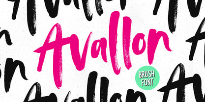 Avallon is a wild and playful paintbrush font. With each letter authentically hand painted, Avallon maintains a wonderfully messy texture and realistic strokes. It's the perfect choice for lively & loud display typography. Avallon also contains a full set of alternate lowercase characters in the 'Alt' version. If you wanted to avoid letters looking the same each time to recreate a custom-made style, or try a different word shape, simply switch to this font for an additional layout option. Not only that, Avallon contains a third variation - Avallon All Caps. This is a brand new set of capital letters, designed to pair perfectly with the regular version, and provide you with even more layout options for your text composition. Language Support; English, French, Italian, Spanish, Portuguese, German, Swedish, Norweigen, Danish, Dutch, Turkish, Polish, Finnish, Romanian, Hungarian, Estonian, Filipino, Indonesian, Icelandic, Romansh.
 - Cherubina by Hanoded,
$15.00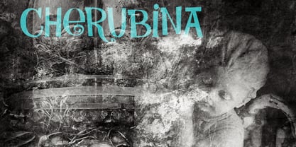 Cherubina means ‘Blessed’. It is a name derived from the Akkadian “karabu / kuribu”, meaning “blessing, blessed”. A cherub is a type of spiritual being mentioned in the Hebrew Bible, often depicted as a baby with wings. This font was based on the hand lettering I found on a 1962 Japanese poster for the movie “Mother Joanna Of The Angels”. The poster was designed by Hiroyoshi Oshima. Cherubina font is an all caps font (upper and lower case differ and can be used together) with a medieval feel to it. I tried to keep the ‘spirit’ of Hiroyoshi Oshima’s lettering, but changed the glyphs and designed most of them myself, as I had nothing but the title of the poster to work with. I have added some ligatures as well. Comes with my blessing and an eternity of diacritics.
 - Market Square by Hanoded,
$12.00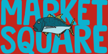 I love markets, especially the farmer’s markets with fresh produce and home made cheese. Too bad I need to travel a long way to get to one, as there is only a ‘regular’ market in my hometown - you know, with cheap duvets, ‘local’ fruit like bananas and a guy selling books about the end of times. I thought it would be great to create a font family you could actually use on a market. Hence Market Square. Market Square consists of 4 different fonts (each with its own Italic style), ranging from a fat marker font to a thin, squarish font. Each of them oozes freshness and authenticity and they were designed to complement each other. The cherry on top is the cute doodle font, loaded with fresh produce and seafood - just like you’d see on a Market Square.
 - Marioline Barnard by Asd Studio,
$14.00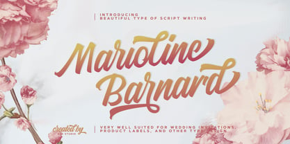 Introducing my Marioline Barnard Script, a passionatly crafted fancy script. Marioline Barnard script fully meets my expectations for a script that gives you luxurious vibes as much as casual vibes, elegant but simple, strong but light vibes. Marioline Barnard comes with beautiful uppercase and lowercase alternates (up to 11 level alternates, ligatures include), and swashes. Marioline Barnard has Multilingual support (Western European characters) and works with following languages: English, French, Italian, Portuguese, German, Swedish, Norweigan, Danish, Dutch, Finnish, Indonesian, Filipino, and Malay. Marioline Barnard is modern script font, every single letters has been carefully crafted to make your text looks beautiful. With modern script style this font will perfect for many different project, example: invitations, greeting cards, posters, name card, quotes, blog header, branding, logo, book cover, fashion, apparel, letter, logotypes, wedding invitations, product labels, and clothing product, stationery and more. Thank you.
 - Escritura Hebrew by Vanarchiv,
$21.00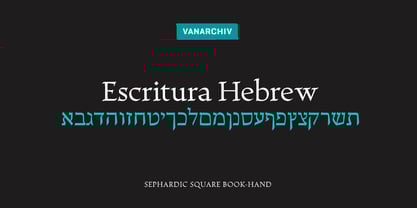 It was my first attempt to drawing a Hebrew alphabet to mach directly with other typeface (Latin) which I already designed. The Latin version is an handwriting display typeface influenced by chancery handwriting from the Italian Renaissance (broad-nib pen). One of the most typographic characteristic is there wavy forms, especially the serifs, where contains some of the main calligraphic references from this font family. The Hebrew script contain reverse contrast, the vertical proportions are more tall and the stroke weight is slightly more strong than latin lowercase to produce a correct visual balance between them, especially on small sizes (text proportions). This Hebrew square book-hand was influenced by Sephardic script style. The Latin characters contains interrupted strokes, the same was made for Hebrew letterforms to transpose correctly the same calligraphic approach between these two different alphabets.
 - Alfina Notte by Eurotypo,
$39.00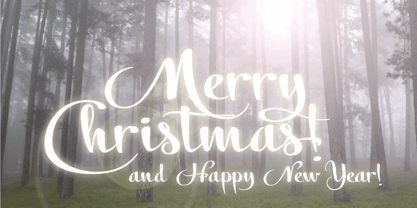 Alfina Notte is a chancery typeface that shows a modern temperament, but is inspired by the eponymous town of Torre Alfina, one of the most beautiful medieval villages of Italy, situated on the edge of the plateau Alfina, a few miles from of Orvieto. The place where is the castle is steeped in history. Its roots date back to the Lombard kingdom (seventh century); later it was under the rule of Monaldeschi (1200-1700) and more recently (1880) the property of the rich French banker Count Edoardo Cahen of Antwerp, who was responsible for the present aspect of the Castle. Alfina Notte is the bold version of Alfina, a type with soft lines, very slender upper cases and thin overlapping strokes; The stylistic alternates are particularly important, and the type is enriched by many, different OpenType features.
 - Franklin Gothic Raw by Wiescher Design,
$19.50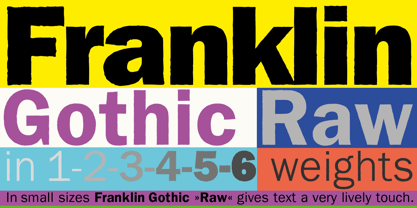 When drawing a new font, there is a time when the final form is found – almost – but the curves are not slick and clean yet, that's what I call the "raw" form. Raw – no sweeteners added! In this family I tried to redefine this moment in type development for the eternally beautiful "Franklin Gothic". I call the design "Franklin Gothic Raw", not to be confounded with "rough". The family can be used like any good normal typeface, you hardly see any difference to a conventionally cut "Franklin Gothic" in small sizes. The charm of the design becomes obvious the bigger it becomes, then it enhances your design with its imperfections in the outline. "Franklin Gothic Raw" is therefore an extremely versatile family. I created the cuts, that I considered necessary for the seasoned designer who knows what he's doing. Enjoy!
 - Rawson by Latinotype,
$45.00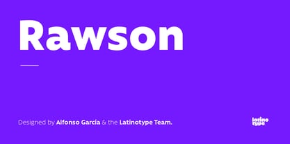 Designed by Alfonso García and Latinotype Team. Rawson is inspired by early humanist sans-serif English typefaces. We have added a bit of Johnston, a bit of Gill and a lot of Latinotype to the font. Rawson is an elegant font—but definitely not a black tie one—with the strength of a geometric sans but as friendly as a humanist typeface. This mixture, though not capricious, gives the font a ‘classic’ personality and a modern look at the same time. Rawson is a typeface with a large x-height, open counterforms and classical ductus. The font is well-suited for branding, signage, packaging and short text. Rawson has a 778-character set that supports 219 languages and includes alternative characters, discretionary ligatures, small caps, a variety of figures and fractions—a wide range of typographic tools to meet different design needs.
 - Tavern by FontMesa,
$25.00 Tavern is a super font family based on our Algerian Mesa design, with Tavern we've greatly expanded the usability by creating light and bold weights plus all new for 2020 with the introduction of extra bold and black weights Tavern is now a five weight family. The addition of the bold weight made it possible to go further with the design by adding open faced shadowed, outline and fill versions. Please note, the fill fonts are aligned to go with the open faced versions, they may work with the outline versions, however you will have to apply them one letter at a time. The Tavern Fill fonts may also be used a stand alone font, however, the spacing is much wider than the regular solid black weights of Tavern. In the old days of printing, fill fonts rarely lined up perfect with the open or outline font, this created a misprinted look that's much in style today. To create that misprinted look using two different colors, try layering the outline fonts offset over the top of the solid black versions. Next we come to the small caps and X versions, for a font that's mostly seen used in all caps we felt a small caps would come in handy. The X in Tavern X stands for higher X-height, we've taken our standard lowercase and raised it for greater visibility in small text and for signage where you want the look of a lowercase but it needs to be readable from the street. In August of 2016 I started the project of expanding this font into more weights after seeing the font in use where someone tried creating a bold version by adding a stroke fill around the letters. The result didn't look very good, the stroke fill also caused the shadow line to merge with the serifs on some letters. This lead me to experiment to see if a new bold weight was possible for this font and I'm pleased to say that it was. After the bold weight was finished I decided to type the regular and bold weights together in a first word thin second word bold combination, however the weight difference between the two wasn't enough contrast. This lead me to wonder if a lighter weight was possible for this font, as you can see yes it was, so now for the first time in the history of this old 1908 type design you can type a first word thin second word bold combination. So why the name change from Algerian to Tavern? Since the original font was designed in England by the Stephenson Blake type foundry I decided to give this font a name that reminded you of the country it came from, however, there were other more technical reasons. During the creation of the bold weight the engraved shadow line was sticking out too far horizontally on the bottom right of the serifs dramatically throwing the whole font off balance. The original font encountered this problem on the uppercase E, L and Z, their solution was a diagonal cut corner which was now needed across any glyph in the new bold weight with a serif on the bottom right side. In order to make the light and regular weights blend well with the bold weight diagonal cut offs were needed and added as well. This changed the look of the font from the original and why I decided to change the name, additional concerns were, if you're designing a period piece where the font needs to be authentic then this font would be too new. Regular vs. Alt version? The alternate version came about after seeing the regular version used as a logo and secondary text on a major product label. I felt that some of the features of the regular version didn't look good as smaller secondary text, this gave me the idea to create an alternate version that would work well for secondary text in an advertising layout. But don't stop there, the alternate version can be used as a logo too and feel free to exchange letters between both regular and alternate versions. Where are the original alternates from Algerian? Original alternates from Algerian are built into the regular versions of Tavern plus new alternates have been created. We're excited to introduce, for the first time, all new swash capitals for this classic font, you're going to love the way they look in your ad layout, sign or logo. The best way to access alternate letters in Tavern is with the glyph map in Adobe Illustrator and Adobe InDesign products, from Adobe Illustrator you can copy and paste into Photoshop as a smart object and take advantage of all the text layer style features Photoshop has to offer. There may be third party character maps available for accessing alternate glyphs but we can't advise you in that area. I know what you're thinking, will there be a Tavern Condensed? It takes a lot of hours to produce a large font family such as this, a future condensed version will depend on how popular this standard version is. If you love Tavern we're happy to introduce the first weathered edge version of this font called Bay Tavern available in February 2020.
 - Advertisers Gothic by HiH,
$12.00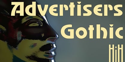 Advertisers Gothic is bold and brash, like the city it comes from, Chicago. It was designed by the accomplished German-American matrix engraver, Robert Wiebking, for the Western Type Foundry in 1917. As its name suggests, it was designed for commercial headliner work, much as Publicity Gothic by Sidney Gaunt for BB&S the year before. See our Publicity Headline. Alternate letters ‘A’ & ‘S’ are provided. The most popular ad words “Free!”, “New!” and “Sale” (with both esses) are provided at an angle for dramatic tension. Advertisers Gothic became quite popular because it was effective. It can work equally well for a flyer advertising a non-profit event as for a magazine product ad. This font refuses to be a wimp. Use it boldly. Advertisers Gothic ML represents a major extension of the original release, with the following changes: 1. A total of 335 glyphs (compare) with added glyphs for the 1250 Central Europe, the 1252 Turkish and the 1257 Baltic Code Pages. 2. Added OpenType GSUB layout features: pnum, ornm, liga, hist & salt ˜ with total 13 lookups. 3. Added 209 kerning pairs. 4. Revised vertical metrics for improved cross-platform line spacing. 5. The most popular ad words “Free!”, “New!” and “Sale” (with both esses) are provided at an angle for dramatic tension The zip package includes two versions of the font at no extra charge. There is an OTF version which is in Open PS (Post Script Type 1) format and a TTF version which is in Open TT (True Type)format. Use whichever works best for your applications.
 - Hype vol 2 by Positype,
$20.00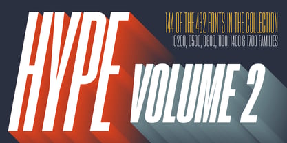 Hype lives up to its name. An energetic attempt to blow past previous sans’ descriptive words of massive, large, extensive, super and others. Hype transcends the everyday marketing terms and rests solely atop them all with a jaw-dropping current offering of 432 fonts that spans 18 widths and 12 weights. Insert a long pause and mic drop here, because nothing compares. Hype Volume 2 includes 6 of the 18 subfamilies that comprise the full Hype Collection. Each of these subfamilies represent 1 of the 18 available widths and each width contains 12 weights and matching italics. Volume 2 contains 144 fonts. Families included in Volume 2: Hype 0200, Hype 0500, Hype 0800, Hype 1100, Hype 1400, and Hype 1700. If you would like to complete your collection be sure to view and purchase Hype vol 1 and Hype vol 3. Hype’s bombastic approach meant supplying everything it could within each typeface: including small caps, yes small caps, a full numeral set that includes inferiors and superiors, super- and subscripts, full fraction support, case-sensitive forms, stylistic alternate letterforms, and more while touting a full Western, Central and South Eastern European character support. Embracing a Univers-esque bravado and a willingness to push the envelope, Hype leaves even more room to grow. No corners were cut, no shortcuts taken with a focus on sensible, efficient letter construction and functional reliability that ignores any one classification and instead looks to form an amalgam of classic sans styles influenced by wood type, movie showcards, and urban industrial letterforms.
 - Hype vol 3 by Positype,
$20.00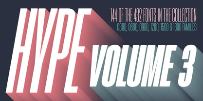 Hype lives up to its name. An energetic attempt to blow past previous sans’ descriptive words of massive, large, extensive, super and others. Hype transcends the everyday marketing terms and rests solely atop them all with a jaw-dropping current offering of 432 fonts that spans 18 widths and 12 weights. Insert a long pause and mic drop here, because nothing compares. Hype Volume 3 includes 6 of the 18 subfamilies that comprise the full Hype Collection. Each of these subfamilies represent 1 of the 18 available widths and each width contains 12 weights and matching italics. Volume 3 contains 144 fonts. Families included in Volume 3: Hype 0300, Hype 0600, Hype 0900, Hype 1200, Hype 1500, and Hype 1800. If you would like to complete your collection be sure to view and purchase Hype vol 1 and Hype vol 2. Hype’s bombastic approach meant supplying everything it could within each typeface: including small caps, yes small caps, a full numeral set that includes inferiors and superiors, super- and subscripts, full fraction support, case-sensitive forms, stylistic alternate letterforms, and more while touting a full Western, Central and South Eastern European character support. Embracing a Univers-esque bravado and a willingness to push the envelope, Hype leaves even more room to grow. No corners were cut, no shortcuts taken with a focus on sensible, efficient letter construction and functional reliability that ignores any one classification and instead looks to form an amalgam of classic sans styles influenced by wood type, movie showcards, and urban industrial letterforms.
 - Amica Pro by Eclectotype,
$40.00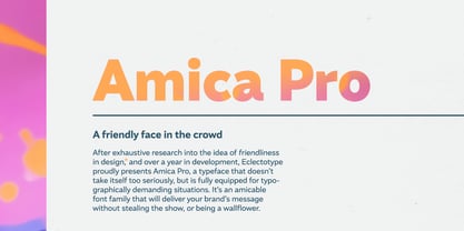 Welcome Amica Pro, a workhorse sans designed to give your branding a friendly, approachable look. What is it that makes a typeface friendly? Eclectotype undertook extensive research* in this and the results are in! To cut a long story short, friendliness in sans serif fonts can be summed up in two words – short and fat. Basically, think Danny DeVito in letter form. The shortness in Amica Pro is achieved (somewhat counterintuitively) by pushing up the x-height. This, coupled with short ascenders and descenders, gives the text a squat appearance. For the fatness, that's easy in the bolder weights, but how to carry this through to the lights? Here, the fatness equates to roundness, so the letterforms, even if the stroke weight is light, have a rotund appearance from the wideness and roundness of the circular glyphs. When thinking about friendliness, we think about inclusiveness. To this end, Amica Pro supports a super wide range of latin-based languages, as it uses Underware's Latin Plus character set, as well as extra support for Vietnamese. Amica Pro is best used for branding, logos, infographics etc. It will give your UI a friendlier feel, but that doesn't mean it's not serious. There are many useful typographic features, including alternates, numerous figure styles, automatic fractions and case-sensitive forms. The italics are carefully optically corrected "sloped romans" and as such they are the same width as their upright equivalent, so changing your copy to italics will not mess around with the spacing. *I looked at a few fonts and drew some lazy conclusions.
 - Geo Deco by Tipo Pèpel,
$28.00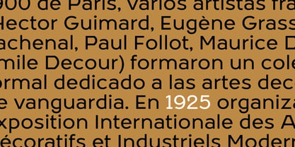 Geodeco font family brings to you the recovery of the typographic forms from the beginning of the 20th century, with a strong ArtDecó flavour but from a new point of view: modernity and geometry. Modernity in the visual contrast between lowercase and capital letters, where rounded shapes are opposed to the breaks and graphic tensions of the strokes of the capital letters. which gives it an enormous originality. Generous doses of internal whites, assure a powerful legibility even with the spite of its short ascending and descending strokes. What we get is a coherent and martial look where fluidity and homogeneity is the main note. Soft and rounded minuscule, with large internal whites for super legibility, bombproof, especially on screens, where Geodeco lives with an astonishing naturalness. The capital letters, used alone as display, or as companions of the minuscule characters, give the family a touch of originality and exotic flavor. Like the spices in the food; a brief but intense note. Breaking the rectangular shapes so that the appearance of the letter comes out benefits from enlarging the internal whites and making them consistent with the white of the lower case. GeoDeco works very well in plain text with the obvious limitation that it is not a type for small bodies, but exceptionality weldon for plain text and signage. Maximum visibility, total beauty on screens. A family of this new century with the flavour of that epoch of experimentation that were the years 20. Extensive multilanguage support and almost all Opentype functionalities. Try it and it will convince you - for sure!
 - Banished GRP by Grype,
$16.00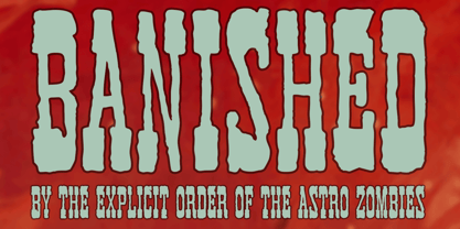 Banished was inspired by posters for the 1968 Cult Cinema Classic, “Astro Zombies”, but it exudes the rough and tumble, chewed up and spit out Old West era. Banished dives head first into all of the nostalgic clichés of the old west, as well as the cult classic that inspired it. Here's what's included with Banished: 388 glyphs - including Capitals, Lowercase (Alt. Capitals), Numerals, Alt. Numerals, Punctuation and an extensive character set that covers multilingual support of latin based languages. (see the 6th graphic for a preview of the characters included) Contextual Alternates that auto-switches between Capitals & Lowercase (Alt Capitals) glyphs, as well as Numerals and Alt Numerals for visual randomness. To access the Contextual Alternates feature, you will need to be using software with Opentype compatibility otherwise you can access the alternate glyphs via a Glyphs panel. Stylistic Alternates feature that swaps all default Numerals with their Alternates Numerals Font is provided in TTF & OTF formats. The TTF format is the standard go to for most users, although the OTF and TTF function exactly the same. Here's why Banished is for you: You're in need of a good rustic slab serif typestyle with a narrow width and gritty feel You're planning a Western themed party and need a unique western typeface You're a fan of the 1968 Cult Classic "Astro Zombies" as just have to have the font to match You've got one of those Old West photography studios and need a great Wanted poster font You just like to collect quality fonts to add to your design arsenal
 - Royalis by Julien Fincker,
$34.95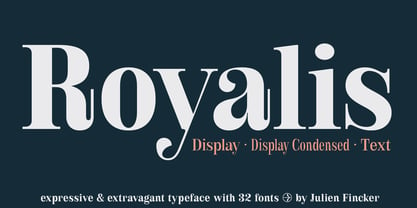 About Royalis: Royalis is an expressive and extravagant serif typeface family. It is characterized by a high contrast and dynamic features in the details, such as long terminals or deep inktraps. Royalis is available in three versions: a display version in six weights, a corresponding condensed version also for display applications, and a text version for body text in four weights. It also comes with all the corresponding italics. This makes Royalis versatile, especially for editorial, packaging, branding and advertising. The wide range of weights and possibilities allows Royalis to be used variably. The thinner weights are characterized by their elegance, while the thicker weights captivate with their powerful contrast. They complement each other like the three musketeers once did. Be it the charmingly elegant Aramis, the sober strategist Athos, the powerful ruffian Porthos or the charismatic d'Artagnan, who led the group. Features: The Royalis family has a total of 32 weights, from extralight to black with matching italics, as Display, Display Condensed and Text versions. With over 1027 characters, it covers more than 200 Latin-based languages, with a whole range of Open Type features. There are alternative characters as stylistic sets, small caps, automatic fractions - just to name a few. Arrows and numbers: In particular, the extensive selection of arrows and numbers should be mentioned here. Thanks to Open Type features and a simple system, the various designs of arrows and numbers can also be easily "written" without first having to select them in a glyph palette.
 - Typist Slab Mono by VanderKeur,
$25.00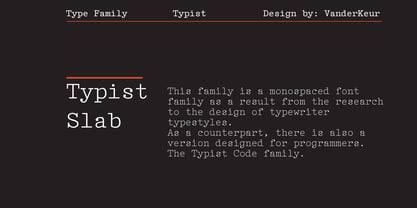 The typeface Typist originated during an extensive research on the origin and development of typewriter typestyles. The first commercially manufactured typewriter came on the market in 1878 by Remington. The typestyles on these machines were only possible in capitals, the combination of capitals and lowercase came available around the end of the nineteenth century. Apart from a few exceptions, most typestyles had a fixed letter width and a more or less unambiguous design that resembled a thread-like structure. A lot of this mechanical structure was due to the method the typestyles were produced. Looking at type-specimens for print before the first typewriters were good enough to came on the market we can see that in 1853 and in 1882 Bruce’s Type Foundry already had printing type that had a structure of the typewriter typestyles. Of course printing types were proportional designed as typewriter typestyles had a fixed width. So it is possible that except from the method of production for typewriter typestyles, the design of printing types were copied. In the design of the Typist, the purpose was – next to the monospace feature – to include some of the features of the early typewriter typestyles. Features such as the ball terminals and the remarkable design of the letter Q. This new typeface lacks the mechanical and cold look of the early typewriter typestyles. The Typist comes in six weights with matching italics in two versions. One that resembled the early typewriter typestyles (Typist Slab) and a version designed with coding programmers in mind (Typist Code).