10,000 search results
(0.029 seconds)
- Mailuna Pro AOE by Astigmatic,
$24.00 Mailuna Pro is a family of gothic typefaces of weight and oblique stature, finding themselves on a line between modern and historical gothic styles. Originating as a revival and elaboration of a limited lettering specimen from a series of old loose spanish specimen book pages, it finds itself in the visual company of vintage transportation roll signs, wood type gig posters, financial publications, etc. What began as just Capitals, Lowercase and Numerals was expanded to a rich pro glyphset including small caps, unlimited fractionals, superiors & inferiors, ordinals, tabular & proportional figures, a Caps to small caps feature and an expanded language glyph set. From modern letterpress back to historical adverts, book covers, headlines, or anything else you want to give a dash of vintage authenticity to, the Mailuna Pro Family is here to fill your needs. Be sure to download and take Mailuna Pro AOE - Book weight for a spin for free.
 - Magnesit Dark by Rekord,
$22.00 Sporty and brawly, Magnesit Dark creates impact everywhere it lands. Impressive headlines are its specialty, but it feels right at home used in packaging, branding and poster design. Very tall x-height, wide language support and minimalistic yet playful appearance, make it suitable on any serious typographic job. Three distinct styles expand the possibilites even further: the straight to the point Regular, the friendly Soft and the determined Hard styles share metrics across related Magnesit and Magnesit Stencil families, so you can mix and match to achieve exactly the effect you need. Magnesit Dark works great with illustrations, the generous shapes can be easily filled with strong imagery to great effect. Based on the best-selling Grim, Magnesit is a vast improvement of the concept with long awaited addition of lowercase, reworked proportions, spacing and kerning, expanded language support and useful icons to satisfy even the most demanding typographers’ needs.
 - Retro Morely by Typeskets,
$17.00 I want to introduce this cool font, namely (Retro Morely) which is a Bold script font with a charming touch of Retro style, this font also looks interesting because I added some alternative features that you can use, don't forget to add extrude style in it to make it look more Attractive for your designs, this font is suitable for those of you who want a design that displays an old-fashioned side but is still relevant for a charming modern look. there's nothing wrong if you feel all the experience of using this font in your designs, make this font as one of the font collections on your computer what will you get : Retro Morely Retro Morely Extrude Alternates Features PUA encoded We hope you enjoy this font! please feel free to comment if you have any thoughts or feedback. Thanks for purchasing and happy creating! :)
 - Capraia by CAST,
$45.00 Capraia is a book typeface, with a heavily quirky look when shown at big sizes, and with an irregular but attractive rhythm at text sizes. Capraia Book and Regular are designed specifically for continuous texts: Book meets a current preference of Italian publishers for lighter faces, while the slightly heavier Regular is intended for the wider international market. True to its vocation for publishing, Capraia has a big x-height, medium contrast and wide bracketed serifs. Furthermore, its slightly flattened curves, some unconventional roman letterforms (a, G, Q) and the 'slanted roman' italics, along with design details such as ball terminals, give to the whole family a very contemporary appeal. Originally the design was intended as a tribute to Caslon's Great Primer but at a certain point the designer was enthralled by Baskerville. Capraia is the unpredicted and original result of that intense experience.
 - Magnesit by Rekord,
$22.00 Sporty and brawly, Magnesit creates impact everywhere it lands. Impressive headlines are its specialty, but it feels right at home used in packaging, branding and poster design. With a very tall x-height, wide language support and minimalistic yet playful appearance, it can take on any serious typographic job. Three distinct styles expand the possibilites even further: the straight to the point Regular, the friendly Soft and the determined Hard styles share metrics across related Magnesit Stencil and Magnesit Dark families, so you can mix and match to achieve exactly the effect you need. Magnesit works great with illustrations, the generous shapes can be easily filled with strong imagery to great effect. Based on the best-selling Grim, Magnesit is a vast improvement of the concept with long awaited addition of lowercase, reworked proportions, spacing and kerning, expanded language support and useful icons to satisfy even the most demanding typographers’ needs.
 - Ragata by Arterfak Project,
$17.00 Ragata is a bold and playful display font that draws inspiration from retro sans serif and vintage logo design. With its elegant yet lively character, Ragata is perfect for creating eye-catching headlines, labels, badges, logos, stickers, motion graphics, posters, and more. The font family comes in three styles: Regular, Outline, and Extrude, which can be combined to create a unique 3D effect. In addition, Ragata is equipped with stylistic alternates and ligatures, giving you even more creative control. Ragata also has multilingual support, making it a versatile choice for designers and creatives from all around the world. Whether you're creating a bold, retro-inspired design or something more modern and playful, Ragata is a versatile and stylish font that is sure to impress. What you'll get : Ragata - Regular Ragata - Outline Ragata - Extrude Uppercase & Lowercase Numbers & Symbols Stylistic alternates & ligatures Multilingual support Thank you for visiting!
 - Short Films by Dharma Type,
$19.99 Short Films is an all-new-styled family, which kind of looks like Art Deco Style. Wide opened counters and softly rounded bowls create a new feeling – Retro but futuristic, geometric but humanistic. Exquisite contrast between thin and bold parts of glyphs make mixed feeling – Pop and feminine, formal and casual, strong and soft. The most distinctive feature is a coexistence of decorativeness and Readability. This coexistence expands the range of font usage. You can use this font for not only titling but also body-text. Short Films consists of 6 weights and their matching Italics for a wide range of usages. Further, Short Films supports international Latin languages and basic Cyrillic languages including Basic Latin, Western Europe, Central and South-Eastern Europe. Also, Short Films covers Mac Roman, Windows1252, Adobe1 to 3. This wide range of international characters expands the capability of your works.
 - Delution by Lemonthe,
$13.00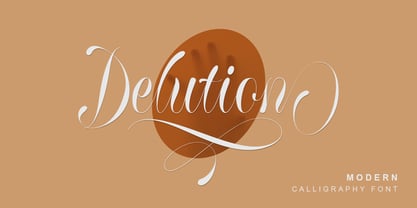 Delution is a beautiful modern calligraphy font. Delution Font is perfect for many different project such as logos & branding, invitation, stationery, wedding designs, social media posts, advertisements, product packaging, product designs, label, photography, watermark, special events or anything.
 - Melamine by Haniefart,
$14.00 Melamine is a handwritten font inspired by classic styles, deliberately made with different characteristics, so that it looks unique, beautiful, attractive and modern. Melamine can be used for company brands, logos, film titles, magazines, book covers and others.
 - Highman by Eko Bimantara,
$19.00 Highman is a modern condensed bold font. Its contain all caps letter yet its have a different height between the uppercase and lowercase. Its fit for brand, titling, stacking or grid layout and all kind of display usage.
 - Guideline by PizzaDude.dk,
$16.00 Here is a Guideline for you: Use this font if you want fun, unpredictable, legible and handmade text with influences from both comics and graffiti. Each letter has 5 different versions, and they automatically cycles as you type!
 - Longbow BB by Blambot,
$20.00 Longbow BB is an unconventional gothic/blackletter typeface with a hefty compliment of European characters. The Opentype version has autoligatures to make any two adjacent, duplicate letters or numbers look slightly different for a more hand-lettered look.
 - Jt Gilboys by Jolicia Type,
$19.00 Jt Gilboys Inspired by bold and rounded typefaces.Very characterful, fat and rounded , it is the best choice for editorial, You can use glyphs to create a different appearance for your design. world name or brand design, charismatic shape,
 - Murisa Monolinia by Murisa Studio,
$10.00 Monolinia is a font that is unique and different from the others. Monolinia will make your designs and products more attractive. Try Monolinia and have an amazing experience. Your designs and products will look more elegant and authoritative.
 - Losta Bonita by Creativemedialab,
$20.00 Introducing Losta Bonita A modern, vintage, and retro serif family. Consists of 9 weights from thin to black and variable format. The stylistic alternates allow many different unique shapes that give your lettering idea a well-looking look.
 - Pepperminta by PizzaDude.dk,
$16.00 A curly and playful sans serif font with blurry lines. Fits nice to anything that has to do with products for kids! Comes with 3 different versions of each lowercase letter, and they automatically cycle as you type
 - Kutai by Eko Bimantara,
$18.00 Kutai is an explorative typeface that created to pursue unique display typeface fuse with ethnic look. It's consist of three styles or instance; Normal, Tall and Taller which have different height between each other, especially the x-height.
 - Surrey by Intellecta Design,
$26.90 Surrey is a collection of seven different decorative fonts, all uppercase letter designs, great display face for headers and antique-like projects. It's another Intellecta's best-seller, a classic vintage design remastered with our feeling to ancient things.
 - Metalworker JNL by Jeff Levine,
$29.00Metalworker JNL is Jeff Levine's take on a perennial favorite originally known as Eagle, but available under different names over the years. This bold, clean Art Deco font was the basis for Jeff's star-studded National Spirit JNL. - Just in case by PizzaDude.dk,
$14.00 Just in case you need something crispy for your next project - this could be it! Handmade, multilingual and with contextual alternates - 4 different versions of each letter, and these cycle automatically as you write, for a random look.
 - Mixed Messages JNL by Jeff Levine,
$29.00Mixed Messages JNL brings back a favorite old theme... mixing up various letters and numbers from different fonts to create a printed message that resembles a ransom note or a collage of type with many styles of lettering. - Respektable by PizzaDude.dk,
$15.00 Respektable is random and funky ant the same time, and even though all letters are super legible, the font has this unpredictable feeling to it. Each letter has 5 different versions that vary in width and stroke weight.
 - Breakfast by PizzaDude.dk,
$15.00 This is close to insane! My Breakfast font has got 8 (yes EIGHT!) different versions using contextual alternates! They cycle nice and easy AS you type! How cool is that?! Ofcourse, the font is also loaded with diacritics!
 - Mazzard Soft by Pepper Type,
$35.00 Mazzard Soft is a rounded version of Mazzard – a superfamily of three geometric grotesques with three different x-heights (H, M, and L). It features rich language support, includes Cyrillic, and offers a wide variety of alternate forms.
 - FS Siena by Fontsmith,
$80.00 Eclectic FS Siena is a typeface with history, and not just in the sense of having its origins in classical Roman lettering. Fontsmith founder Jason Smith first committed it to tracing paper while still at college, instinctively redrawing letterforms based on Hermann Zapf’s Optima according to ‘what felt right’. When Krista Radoeva took up the challenge to edit and extend the typeface, she and Jason were determined to preserve its subtly nonconformist and eclectic spirit. Like a great dish, there are individual components throughout the character set that all add flavour, and need to be balanced in order to work together. The smooth connection of the ‘h’ ‘m’ ‘n’ and ‘r’ contrasts with the corners of the ‘b’ and ‘p’. The instantly recognisable double-storey ‘a’ – the starting point of the design – contrasts with the single-storey ‘g’ and the more cursive ‘y’. And only certain characters – ‘k’, ‘w’, ‘v’ and ‘x’ in the lowercase and ‘K’, ‘V’, ‘W’, ‘X’ and ‘Y’ in the caps – have curved strokes. Transitional FS Siena is a contrasted sans-serif typeface, blending classical elegance and modern simplicity. Its construction and proportions are descended from classical broad-nib calligraphy and humanist typefaces, with a high contrast between the thick and thin strokes. The angle of the contrast, though, is vertical, more in the character of pointed-nib calligraphy and modernist typefaces. This vertical stress helps to give FS Siena a strong, cultured presence on the page. Idiosyncratic italics The italics for FS Siena were developed by Krista to complement the roman upper and lower-case alphabets first drawn by Jason. Many of the letterforms are built differently to their roman counterparts: there’s a single-tier ‘a’, a looped ‘k’ and connections more towards the middle of stems, such as in the ‘m’, ‘n’ and ‘u’. These distinctions, along with generally much narrower forms than the roman, give the italics extra emphasis within body copy, where the two are side-by-side. In editorial, especially, the combination can be powerful. To cap it all… In his original draft of the typeface, Jason found inspiration in Roman square capitals of the kind most famously found on Trajan’s Column in Rome. In keeping with those ancient inscriptions, he intended the capitals of FS Siena to also work in all-upper-case text, in logotypes for luxury consumer brands and property developments, for example. A little added space between the upper-case letters lets the capitals maintain their poise in a caps-only setting, while still allowing them to work alongside the lower-case letterforms. The caps-only setting also triggers a feature called case punctuation, which adapts hyphens, brackets and other punctuation to complement the all-caps text.
 - ALS FinlandiaScript by Art. Lebedev Studio,
$63.00 Some 40 km north of Helsinki, surrounded by meadows and a serene Finnish lake, lies Ainola, the former home and now museum of composer Jean Sibelius (1865–1957). I know the place quite well, since it is only a stone’s throw away from the art school where I began my graphic design studies. We sometimes went there after classes—a beautiful walk, especially in spring, when the days were getting longer, the snow melting in the sun and the ice cracking on the lake. The composer often professed his love for this landscape and found constant inspiration in its moods, sounds and scents during different seasons. For many people, Sibelius and his music, most notably his famous symphonic poem Finlandia, are a symbol of Finland. I decided to name the typeface family I’m presenting here FinlandiaScript, because it owes its influence to both Sibelius’ manuscripts and the Finnish landscape around Ainola. The shape of letters, their poise and the rhythm they create resemble Sibelius’ handwriting without copying it. The letters form gently flowing lines of text which is legible without giving up individuality. The font family comes in three styles: FinlandiaScript, FinlandiaScript Bold and FinlandiaScript Frost. Together they are perfect for magazines, websites and brands aiming to create a personal and sincere image. While the fine details of FinlandiaScript Frost are best suitable for display sizes, FinlandiaScript and FinlandiaScript Bold work well in both headlines and texts of smaller sizes. Hundreds of ligatures give them an especially flexible appearance. The FinlandiaScript family contains Western, Central European and Extended Cyrillic character sets and supports almost 100 languages. It is best suited for Opentype savvy programs with the “standard ligatures” and “contextual alternates” features turned on.
 - Bunken Tech Sans by Buntype,
$49.00 The Bunken Tech Sans superfamily: A reminiscence of constructed fonts of the modern age designed with considerably cleaner forms. Bunken Tech Sans follows in the best tradition of the straight-lined and somewhat angular structures of its predecessors while offering a much more open and mild design. The shapes of the letters are therefore reduced to the most essential elements: The spurs on a, b, n and other lower case letters occur just as little as decorative or style details, the lightly rounded inside edges are more pleasing to the eye than certain historic role models and make for a harmonic, flowing style. Use In particular Bunken Tech Sans stands out as an easy, distinctive headline font with its straight-lined, technical design. Open counters and large x-height make it equally suited for use in shorter texts. It is also perfectly complemented by Bunken Sans or Bunken Slab in longer texts (available soon). Features Available in 10 styles with widths ranging from Light to ExtraBold with associated Italics. All of the styles are very extensive: Support for at least 58 languages, Small Capitals, 9 number sets (e.g. Lining, Oldstyle, Tabular and Small Cap Figures), ligatures, alternate characters, numerous Opentype functions, and lots of other small features that make it more pleasant to work with the font on a daily basis as well as fulfilling typographic desires. Each style contains more than 870 characters! Each style is available in a professional (Pro) and standard (Std) edition with a reduced range of functions. (Language support, OpenType features and number of glyphs). Details can be found on the respective pages. Bunken Tech Sans is part of the Bunken Tech superfamily and is available in Condensed, Normal and Wide. Also of interest: The slab serif variation Bunken Tech Slab Features in Detail: 12 Weights: -Light -Book -Medium -SemiBold -Bold -ExtraBold and corresponding Italics 3 Widths: -Condensed -Normal -Wide Alternate Characters: A, E, F, L, S, e, f, t, s, y, etc. Small Capitals 5 Sets of Figures: -Lining Figures -Old Style Figures -Tabfigures -Old Style Tabfigures -Small Cap Figures Automatic Ordinals Automatic Fractions Extended Language Support and more...
 - Soho Gothic by Monotype,
$29.99 “There is just something magical about type design,” says Sebastian Lester. “If you draw a successful typeface it can travel the world, taking a part of you with it.” If this is true, his Soho® Gothic family has taken him far and wide. Understated, modern and exceptionally versatile, the family has been put to good use in just about every application imaginable. A good choice for virtually any type of project, The Soho Gothic family performs equally well as the backbone of a global brand as it would in an edgy fashion magazine. Versatile, extensive, customizable, and multilingual – the Soho Gothic typeface family has it all.With the same proportions as Soho, its slab serif cousin, Soho Gothic ranges across seven weights, from a willowy hairline to a brawny ultra – each with a complementary italic.Lester took care to ensure that the Soho and Soho Gothic designs work in perfect harmony. According to him, “The typefaces were developed alongside each other so that I could consider every aspect of each design and be certain that they would be absolutely compatible.”Soho Gothic is a more understated and more subtle design than Soho. Features that give the design its distinctive tone are the flat, crisp apexes of the diagonal characters like the A and V, and the marked horizontal stress in the a, g and s. “I wanted the family as a whole to radiate effortless modernity,” recalls Lester, “to be a master communicator that works in all conditions and at all sizes.” A collection of alternate and “semi-slab” characters were also part of Lester’s plan. “I like to develop alternate characters for all my type designs,” he says. “I believe they give graphic designers greater flexibility and make a typeface more valuable.” Soho Gothic is available as OpenType® Pro fonts that have an extended character set which supports most Central European and many Eastern European languages. If you’re looking to complete your designs, consider pairing it with Bembo® Book,Joanna® Nova,Neue Frutiger®,PMN Caecilia®,or ITC Stone® Serif.
 - Gladolia by Ahmad Jamaludin,
$17.00 Get ready to rock your designs with the brand new Chunky Groovy Font, GLADOLIA! 🎉 Gladolia is a chunky typeface with a unique retro style that is sure to make your designs stand out. With 2 different style fonts, regular and oblique, plus an extra Extruded Font version for each style, you can easily create eye-catching designs without any extra effort. This font is perfect for a retro 80s theme and can be used for cover magazines, brochures, logos, headlines or quotes, stand-alone displays, and short paragraphs or content. Each font in the family is dynamic and authoritative on its own, making it perfect for any display project. So what are you waiting for? Elevate your designs with the cool and groovy vibes of Gladolia! 🤘 Similar Item: Sugar Peachy : LINK HERE Gyoza : LINK HERE Gunydrops : LINK HERE Swipe: LINK HERE Replay : LINK HERE Bright : LINK HERE Margin : LINK HERE Nighty : LINK HERE What you get? Gladolia Regular Gladolia Italic Gladolia Shadow Regular Gladolia Shadow Italic Features : Alternates and Ligatures Instructions ( Access special characters, even in circuit design ) Letters, numbers, symbols, and punctuation No special software is required to use this typeface even work in Canva Multilingual Support Give your design projects that fun, playful edge with GLADOLIA! Thank you, Dharmas Studio
 - Ribbons by Positype,
$20.00 Ribbon type. Holy grail of complex-lettering-turned typeface or an elusive Loch Ness monster that is often teased, possibly seen in the wild, but never confirmed? From the amazing lettering artist and author Martina Flor and masterful type designer Neil Summerour, comes the aptly named Ribbons. Ribbons is a sincere and well-conceived approach to providing a reliable solution to ribbon and ribbon-styled type for creative professionals when a lettering artist just isn’t available. Ribbons provides both flat and ‘folded’ options with the Regular and Fold styles, but then raises the bar with separate layer styles that will allow you to easily create the elegant back and forth movements produced with ribbon-style lettering we have all come to appreciate. These layer options are provided in both ‘smooth’ and ‘pleated’ connected styles. Flor and Summerour didn’t stop there. Each typeface was expanded with a number of stylistic alternates, additional swashed and flourished letters, ligatures, and even more in order to provide as many decorative options as possible to the creative. To round out the nine fonts available in the typeface and to ‘put a bow on it’, they’ve added a separate Shadow style and two different color fonts (available exclusively with family purchases).
 - Saral Devanagari by Linotype,
$187.99Saral, meaning simple in Hindi, is a monolinear design supporting most Devanagari based languages. Derived from the older Linotype typeface Rohini, it has been greatly expanded into three weights and a wide character set. Saral Light, Regular, and Bold are made to coordinate with the respective weights of Helvetica. This design works well in many environments, such as corporate designs, advertising, packaging, signage, and especially for bi-lingual texts. The OpenType font format accommodates hundreds of pre-composed conjuncts, accurate placement of vowel signs, and supports varying length matras. Saral's Unicode encoding guarantees your text is rendered correctly and is compatible across different software and computer platforms. Please note that due to current operating system and application limitations the OpenType features in complex scripts such as Davanagari are not universally supported. Saral is designed to be rendered correctly in Microsoft Word on Windows running the latest version of Uniscribe. If using a Mac or Adobe products such as InDesign then many features may not function as expected. This is including glyph reordering, substitutions, and mark positioning. In the case of small passages of text, alternate input methods can be employed. Apple's character palette and Adobe's glyph palettes are two readily available options that can be used to manually insert glyphs as needed." - K-Block by HiH,
$10.00 K-Block was inspired by a hand-lettered sign by a young lady by the name of Kristina Lee. It captures a light-hearted, youthful feeling and is not intended to be taken too seriously. It was drawn for fun and is fun to use. Its very inconsistency insists on being casual and relaxed. Probably better for a birthday party announcement than a bank letterhead. Can you imagine a Just-For-Fun National Bank? K-Block Solid compliments K-Block and provides a stronger presence when required. For two-color work, K-Block can be layered on top of K-Block Solid to provide a different color outline for a very effective presentation. Full Western European character set plus alternate g and y, as well as a Th ligature. If you have a drawing program like Corel Draw, you can easily convert the alternate g and y to curves and stretch out the tails to underline an entire word. The zip package of each font includes two versions. There is an OTF version which is in Open PS (Post Script Type 1) format and a TTF version which is in Open TT (True Type)format. Use whichever works best for your applications. K-Block and K-Block Solid are sold separately.
 - Ribfest by FontMesa,
$25.00 Ribfest is a new font based on lettering found on old United States currency from the 1800’s. Named after the Ribfest held in Naperville IL over 4th of July weekend each year, this font will be perfect for your next summer barbecue party. Ribfest offers three Fill fonts that can be layered behind the main open faced fonts, the regular Fill font covers the complete opening on the main fonts while the Fill T for top and Fill B for bottom gives you the option to fill with two different colors for top and bottom. The Fill fonts for Ribfest may also be used as stand alone fonts, the Fill T and Fill B fonts when layered together creates a unique look on its own. Expand your summertime fun with Ribfest and save me some of those rib’s, with extra barbecue sauce please. Special Note: When using the Opentype format of Ribfest, if you experience some letters appearing too bold at point sizes of 36 or above please install the truetype version that came with your purchase. Due to the extra detail in this font some graphics drivers may increase the boldness of the Opentype version of this font, the solution is to uninstall the Opentype and install the Truetype version.
 - Italiano Fushion New by RM&WD,
$35.00 Italiano Fushion is part of an expanding project on which we have been working for several years and which we are committed to in the future. Like the first two, this one too starts from the study of the great Futurist adventure of the early 1900s by great artists such as DEPERO and MARINETTI, who twisted the world of typography with shapes and colors. Italian Fushion is made up of almost 2,000 glyphs for each weight and in addition to hundreds of alternatives mainly, such as initials and endings of each word but also different alternatives for the letters I, J, Y. Thanks to the characteristics of Open Type, you can change them in automatic many of the alternatives, use it as a simple text font by changing only the I's and J's that have the typical capital dot, and giving the text a more fun breath to the composition. Italiano Fushion is suitable for large texts and to get the most out of it it is compulsory to transform the text into UPPERCASE text using the tabs of graphic applications such as Illustrator, or activate the Alternavive tabs and the various options of SS. Ideal for creating Logos, Head Lines, Web Titles, Posters, Epub Covers, Tatoo Projects, T-Shirts, Drink Labels ... Thanks
 - Frutiger Serif by Linotype,
$42.99 Frutiger® Serif is a re-envisioning of Meridien,a typeface first released by Deberny & Peignot during the 1950s. Working closely with Adrian Frutiger, Linotype's Type Director Akira Kobayashi expanded the original metal type version of Meridien into a new digital family of 20 variants. Renamed Frutiger Serif, this up-to-date Meridien has new weights, widths, and styles that correspond better with several other of Frutiger's designs. Just as Meridien has always been a fine choice for text settings, Frutiger Serif works brilliantly for large amounts of text & also at small point sizes. With its many weights and styles, this family is strong enough for most typographic projects. However, its added versatility is revealed when used in combination with other fonts. Frutiger Serif works well with the original Frutiger, Frutiger Next, and Univers - just to name a few. Paring these serif and sans serif families together is perfect for creating complex hierarchies and clear information design. Working with complicated typographic systems - involving elements such as headlines, captions, pull quotes, multilingual text, etc - is made easy by selecting Frutiger Serif and another of Frutiger's sans serif families. The designer needs simply to mix and match different weights and styles for the various textual elements to create smart and innovative layouts.
 - Quendel by URW Type Foundry,
$39.99 Quendel has been expanded to become Quendel Happy Family. Apart from the new Bold weight for easy distinction and emphasis, there are now four other very exciting variants, rendering different writing tools and writing materials. The basic form of Quendel was written with a Japanese bamboo tip and therefore embodies a form letter of natural flow. The new versions show other features that provide the feel of written scripts. While the styles Wood and Crayon include some alternate characters, Q Marking Pen and Q Fingertip, due to their apparently more complex enacted forms, do not need additional alternates without looking stiff or boring. The wood relief of Quendel Wood was created by a freehand wood relief drawn with oiled chalk. Quendel Marking Pen seems to be written with a felt-tip pen soon depleted. At the same time it is also reminiscent of the blooming effect, which we know from photography. The name of Quendel Fingertip suggests what can be seen - someone seems to have written with the finger in a grainy material. One would like to try it himself. The effect of broken lines which can be gained by writing with chalk as reflected in Quendel Crayon. Almost like parched sandy soil, the writing material seems to crumble.
 - Ongunkan Younger Futhark by Runic World Tamgacı,
$45.00 The Younger Futhark, also called Scandinavian runes, is a runic alphabet and a reduced form of the Elder Futhark, with only 16 characters, in use from about the 9th century, after a "transitional period" during the 7th and 8th centuries. The reduction, somewhat paradoxically, happened at the same time as phonetic changes that led to a greater number of different phonemes in the spoken language, when Proto-Norse evolved into Old Norse. Also, the writing custom avoided carving the same rune consecutively for the same sound, so the spoken distinction between long and short vowels was lost in writing. Thus, the language included distinct sounds and minimal pairs that were written the same. The Younger Futhark is divided into long-branch (Danish) and short-twig (Swedish and Norwegian) runes; in the 10th century, it was further expanded by the "Hälsinge Runes" or staveless runes. The lifetime of the Younger Futhark corresponds roughly to the Viking Age. Their use declined after the Christianization of Scandinavia; most writing in Scandinavia from the 12th century was in the Latin alphabet, but the runic scripts survived in marginal use in the form of the medieval runes (in use ca. 1100–1500) and the Latinised Dalecarlian runes (ca. 1500–1910)
 - Charpentier Sans Pro by Ingo,
$41.00 A humanistic sans serif The first version of this font was created in 1994 within the framework of the bid placed by the city of Graz to become the location for the Winter Olympics in 2006. Appropriately, its original name was ”Olympia.“ The font is intended to embody classic ideals as well as to meet modern demands. The proportions of Charpentier Sans are directly derived from Roman capitals and the humanistic book-face. The contrast between strokes and thin strokes is based on medieval uncial script. And thus, a modern serif sans was created emphasizing thick and thin strokes together. Thanks to its traditional form language, Charpentier Sans is very legible, adapts to various forms of content and expresses a kind of calmness and certainty. Details resulting from writing with the quill guarantee that the font doesn’t appear too rough and unemotional. Even the tiny, pointed mini serifs contribute to the unmistakable appearance of the font. They create an exciting contrast to the soft flowing forms of the letters and are, to a great extent, conducive to the legibility. Consequently Charpentier Sans always appears with an extremely sharp and clear outline. Charpentier Sans Italique has an even more distinct ductus derived from writing. Especially the rounded forms from a, e, f, g and y reflect the handwritten humanistic cursive. Charpentier Sans is comprised of many ligatures, including discretional ones, plus proportional medieval and capital figures for the normal type as well as disproportional tabular figures with a consistent width. Above and beyond the ”normal“ Latin typeface system, small caps are available as an especially elegant form of distinction.
 - Gala72 by Dmitriy Shchetinskiy,
$25.00 Gala72 font consist of 72 calligraphic greetings letterings for different event. These letterings are original and handwritten. This font makes it possible to use high quality calligraphy in your projects - greeting cards, certificates, invitation cards, letters of commendation etc.
 - Congratulatory 2.0 by Dmitriy Shchetinskiy,
$19.00 Congratulatory 2.0 font consist of 36 calligraphic greetings letterings for different event. Letterings are original and handwritten. This font makes it possible to use high quality calligraphy in your projects - greeting cards, certificates, invitation cards, letters of commendation etc.