10,000 search results
(0.078 seconds)
- Myhota Hatched by Ingrimayne Type,
$7.00 Myhota is a condensed sans-serif face that has a bit of rawness to it. It is condensed and has a very high x-height, so it more useful for display than text. Myhota-Bold and Myhota-Light were designed in 1990 and the other seven weights were added in 2021 as were the italic and backslanted styles. There is rarely a use for backslanted type, but when it is needed, Myhota provides an option. Myhota-Hatched was an attempt to see if a readable text font could be hatched out of Myhota by lowering the x-height and widening the letters. The result is a face with rather squarish letters. The regular and bold were original styles with the medium and italic styles added in 2021.
 - Rens Gazet by Ingrimayne Type,
$9.50 RensGazet is a decorative blackletter typeface with elaborate upper-case letters and condensed lower-case characters. It was inspired by the masthead of a short-lived weekly newspaper, The Rensselaer Gazette, which was published from 1857 until 1860. I could not find any existing digitized fonts that replicated this old typeface, so I decided to create an interpretation of it. I had samples of few letters in large point sizes and a number of others at a small point size, though these were blurry and not sharply defined. As a result, this typeface is undoubtedly considerably different from the original. Also, my spacing is much tighter than that in the source samples.
 - Milonguita by Sudtipos,
$49.00 Milonga is one of the most characteristic dances of Argentina and it is usually compared to Tango. However, couples perform shorter and more energetic movements when dancing to the beat of Milonga. In addition, while Tango evokes the idea of nostalgia and reminiscence, Milonga conjures up more light-hearted memories in people's minds. Milonguita was designed so that readers can experience the passion and spontaneity of this dancing style through words. Users can play with the upwards and downwards patterns of the letters creating different images and textures and thus, making texts flow smoothly and naturally, just as a warm piece of Milonga would. The irregularity of the strokes conveys emotions and establishes a bond between the font and the sensitivity of the writer. The result will be a typographic combination of elegance, energy and rhythm which will surely reach the heart of the reader. Milonguita comes in all font formats, including a Opentype version plenty of built-in alternates and a simulated random code. Digitized by Alejandro Paul.
 - Dream Goods by Create Big Supply,
$15.00 Introducing DreamGood, a captivating natural handwriting font that adds a touch of artistic charm to your creative projects. With its authentic style and versatile nature, this font is perfect for various craft endeavors. DreamGood's natural handwriting style brings a unique and personalized feel to your designs. Whether you're working on shirt designs, websites, SVG creations, home decor, branding materials, blogs, logos, or invitations, this font will elevate your projects with its organic appeal. With both uppercase and lowercase letters, DreamGood offers flexibility in crafting engaging compositions. It also includes numbers and punctuation, ensuring seamless integration within your text. The font's multilingual support enables you to communicate your message effectively across different languages, expanding your reach to a wider audience. DreamGood features ligatures that enhance the flow and aesthetics of your typography, allowing for captivating and cohesive designs. The font's PUA Encoding provides easy access to special characters and glyphs, opening up endless creative possibilities. Embrace the natural beauty of DreamGood in your craft projects and watch your creations come to life with an artistic flair. From handmade goods to digital designs, this font adds a touch of elegance and authenticity.
 - Broadside by Device,
$39.00 Broadside is a versatile, authoritative and functional family inspired by the sans serifs seen on ’40s and ’50s patriotic posters and period advertising. It is available in seven weights across condensed, normal and extended widths, each with reweighed italics. The type from this period was very often hand-drawn, and so differs considerably from poster to poster. Many American examples of this period use a Photo-Lettering style called Murray Hill and its derivatives, although their UK counterparts, designed by such luminaries as Abram Games or Tom Eckersley, are more stylistically diverse. Even though no single model is available to base a digitisation on, there are certain recurring stylistic quirks that give the type its unique flavour, and so the most interesting examples from several sources were be combined for the final family. Alternate short descenders, allowing for tighter line spacing, can be toggled on or off in the Opentype panel of Indesign or Illustrator. Tabular and lining numerals and a single-story ‘a’ are also available in all weights and styles.
 - Impulsa by Just Font You,
$16.00 Impulsa is a very impulsive handwritten font. It is finished with digital touch but still keep holding on to the honest of the handwriting feeling. I believe messages with personalized handwriting vibes always deliver deeper feelings to anybody. Impulsa is an all-caps font. You can play with the uppercase and lowercase mix to get the different vibes of every letters so it looks seamlessly handwritten.
 - Salda by Hurufatfont,
$19.00 Salda; It is a modern sans serif family that blends old and new generation sans serif fonts in the same body. It has a wide usage area with its light narrow structure, sharp and clean lines, humanist touches. It provides clean and smooth visuals in vertical screens, mobile applications and block texts. With two different x heights (xL-xS), the body offers richness in text and headings. It consists of a total of 40 styles. Ideal for all kinds of editorial design, packaging, corporate identity, brand, application, web and desktop.
 - Roadline by John Moore Type Foundry,
$45.00 Roadline is a professional display font collection of Streamline style for lettering, a style of lettering that was much in vogue from the 30 to the 60. Roadline aligns all your characters on a horizontal baseline and allows headlines or logos into three wide variables. Besides its connectors allow you to create variations ranging from elegant classics to radicals or creative situations, adapting to all target tones of voice message, it brings Roadline a series of pre-programmed parts in Opentype links for easy use and enable very creative and unexpected combinations. For its decorative character this typeface is very useful for headlines and logo creation. Relive the golden years of the brands with Roadline.
 - Naveid by NamelaType,
$19.00 Inspired by Germany Type, Naveid comes with Old Style with different nuances. It was carefully designed to combine the cuppped serif on top and the tinny Subtle Flaring on the terminal, which makes this font look elegant. Naveid designed with low contrast, consists of 18 styles from thin to black with each matching italics, it makes this font not only great for Headlines, but also great for paragraph, text and printing.
 - VVDS Big Tickle by Vintage Voyage Design Supply,
$15.00 To the sound of smooth jazz 50's and incendiary Rock'n'Roll dance of 60's Im glad to Introduce you the new product in my Vintage Voyage — The Big Tickle Font Family! Absolute useful collection! Firstly is playful serif. The range of weights can be used to maintain an even colour across different sizes. Use it normally or all caps and play with baseline, give more bounce to composition. Or try to use Caps alternates and get really bouncing letters. Alternates has every uppercase letter. Also, for more variety I add a few versions for decoration: Inner hatched and Offset with Shadow. Okay, folks! The second one is Script. I really love them, they look like was signed with true brush. It can be perfectly used both independently and in tandem with the serifs. And the last one is Retro Graphic! Authentic collection of typical design elements of 50's and 60's style of Poster, Books or Ads. You can create awesome retro patterns or use them individually. 124 graphic elements total. A-Z; a-z; 0-9. Multilingual. Grab this stuff and have a good time with Mid Century Modern Adventure!
 - X Ruffian by ThoroughBR&,
$9.00 X RUFFIAN Ruffian was a champion thoroughbred horse who won 10 consecutive races. A feat worth mentioning & repeating. Her tenacity & steadfast approach established the basis for this variable based font. The X represents both the Roman numeral 10, but also the X-factor for creating bespoke works of art. It is quite befitting that this font be named after a legendary champion. Which begs the question...Do you champion variety? X Ruffian's design motif uses a broad tipped chiseled marker that was set at an angle for that extra bit of vigor. Identical letter forms defeat that truly "hand rendered" look that we ultimately strive for. Each uppercase letter offers 10 (X) or more stylistic alternatives, the lowercase and number sets have 3+ options and an over under for those special characters that yield a long bottom or top (see images). Ligatures & bonus characters can add that unique offering to your already individual style & can easily be found via the glyphs panel in any open type program. With a gigantic glyph count of 688, you'll never run out of options. As a right of passage, we felt obliged to include a roman numeral set as the name beckons, which differs from the standard letter form in which you would use to create. This is a variable winner. See you at the races!
 - Bestgift by Nathatype,
$29.00 Bestgift is a striking display font available in regular and outline styles, both featuring a very thick weight and low contrast. With its commanding presence and versatile design, this typeface is the perfect choice for a wide range of creative projects. The very thick weight of Bestgift commands attention and ensures a strong visual impact. Each character is robust and substantial, making a bold statement in any composition. The thick strokes exude confidence and stability, adding a sense of reliability to your designs. With low contrast letters, it offers a balanced and uniform appearance. The consistent stroke width throughout the font creates a cohesive and harmonious visual experience. This display font comes in both regular and outline styles, providing flexibility and versatility to suit different design needs. The regular style exudes solidity and strength, while the outline style adds a touch of modernity and sophistication. This combination allows you to create captivating designs with contrasting elements, adding depth and visual interest to your compositions. For the best legibility you can use it in the bigger text. Enjoy the available features here. Features: Ligatures Multilingual Supports PUA Encoded Numerals and Punctuations Bestgift fits in headlines, logos, attention-grabbing titles, product packaging, branding materials, editorial layouts and website headers. Find out more ways to use this font by taking a look at the font preview. Thanks for purchasing our fonts. Hopefully, you have a great time using our font. Feel free to contact us anytime for further information or when you have trouble with the font. Thanks a lot and happy designing.
 - Ouster Sans by Skinny Type,
$15.00 Ouster Sans offers various options for creating logos, titles and titles. Great for books, editorial, packaging, advertising, branding and more. A modern sans serif font with a vintage touch, giving users the freedom to create compositions. Ouster Sans includes a Collection of Uppercase Letters, Styles, Latin Based Language Support, Numbers and Punctuation. Style Sets are available in Lowercase to Uppercase. Ouster Sans Also Included in 12 different weight and italic font file styles Ouster Sans is coded with PUA Unicode, which allows access to all features without special design software. Mac users can use Font Book, and Windows users can use Character Map to view and copy additional characters to paste into your favorite text editor/app. How to access all alternative characters, using the Windows Character Map with Photoshop: https://www.youtube.com/watch?v=Go9vacoYmBw How to access all alternative characters using Adobe Illustrator: http://youtu.be/iptSFA7feQ0nn feel free to message me if you have any issues or questions :) If you need any help or have any questions let me know or send an email. I'm happy to help :) Thanks & Happy Designing!
 - Dance Records JNL by Jeff Levine,
$29.00 A record album entitled “Calypso” by the Talbot Brothers had a hand lettered cover with a free form style reminiscent of the early 1960s. This inspired Dance Records JNL, which is available in both regular and oblique versions.
 - Pausefisk by Bogstav,
$18.00 I wanted to mix the handmade look with both comic and grafitti, but leaving an organic laid back feeling. The result is this: Pausefisk. A font with smooth, handdrawn curves and a total of 6 different versions of each letter. Pausefisk is actually something from my childhood: when the TV-programs where finished (yes, there were no TV after midnight!) the only thing to see was a camera pointed at a fishtank...and that went on for hours!
 - Alter Aves by Glen Jan,
$30.00 Alter Aves type is the first part of AlterType project – the serie of small display typefaces based on letterings, left-off types and altered foundry typefaces. Alter Aves is display condensed sans-serif typeface with couple of geometric-round letters, serif-styled elements and flat brush strokes. It supports Latin Extended-A (Western, Central Europe, Baltic, Turkish) and Cyrillic encoding languages and minimal opentype features – oldstyle digits, case sensitive punctuation, small-numeric forms and scripted fractions. Fully functional Demo style is distributed free for non-commercial using.
 - Scala Jewel Pro by Martin Majoor,
$29.00 Scala Jewels is a set of four highly decorative typefaces, based on the bold capitals of Scala. Whereas Crystal and Pearl are modelled on historic examples, Diamond and Saphyr are original designs. Scala Jewels offers the possibility to set decorated borders, designed in the style of each of the four variations. There are corners and different sorts of long and short elements. One of the best ways to use Scala Jewels is as a two- or three-line drop cap at the start of a chapter. The award-winning Scala family (1990-1993) is a worldwide bestseller and has established itself as a ‘classic’ among digital fonts.
 - Syracuse by Woodside Graphics,
$19.95Syracuse is a font inspired by the typefaces of the "Arts & Crafts" designers of the early 20th Century. As such, it has a distinct "hand" look. In "Syracuse" you will find hints of Dard Hunter's work at the Roycrofters in East Aurora, New York, a little of the Art Nouveau style of 1900 Vienna, even a touch of Charles Rennie Mackintosh's design ideas in Glasgow, Scotland. The font was named for the city in New York where Gustav Stickley produced his Craftsman furniture. Syracuse owes a debt to all of these sources yet is original and different from any other "Arts & Crafts" font available. - Neospace Exp - Personal use only

- Brev Script by Mans Greback,
$59.00 Old style handwriting, inspired by 1800-1900's letters. Contains hundreds of alternate glyphs; each lower case letter has four variations, accessible through contextual and standard alternates.
 - GEOspeed by deFharo,
$22.00 GEOspeed, a typeface that redefines design standards, this typeface goes beyond conventional, fusing robustness with elegance. Ideal for advertising use, posters or banners, GEOspeed is the very essence of modern visual expression. The typography includes 28 geometric icons accessible through the Open Type Functions: smcp and c2sc. Regular and Versalite: Two Styles, One Powerful Visual Identity: GEOspeed features two unique styles to meet all your creative needs. The Regular version provides solidity and clarity, while the Versalite adds a bold and distinctive touch. Together, these styles allow you to explore an unlimited range of visual expressions. 22 degree inclination: Movement and modernity in each letter: With a 22-degree incline, GEOspeed is not just about movement, it also has an avant-garde feel. Each letter is an expression of dynamism, capturing attention and carrying your message into the future. Each letter is a statement of progression and avant-garde. Sans serif geometry. GEOspeed's sans serif geometry sets a new standard for modernity. Each character is a geometric masterpiece, creating a contemporary look that highlights strength and elegance. Readability is guaranteed with meticulous metrics and kerning. Advanced OpenType features. GEOspeed's advanced Open Type features give you precise control over the appearance of your text. From sophisticated ligatures to typographic variations, your creativity is the limit. Explore an infinite range of possibilities with GEOspeed's numbers and letters set. From striking figures to expressive letter combinations, each design is unique. Includes dynamic fractions that maintain readability without sacrificing style. Every detail has been perfected to ensure a flawless typographic experience.
 - Junkwerk by PizzaDude.dk,
$20.00 Junkwerk is my heavy metal grunge font! It has got that feel like something that was stamped on, jumped on, shaken and headbanged for hours...just like how you would feel after hours of heavy metal! Comes with different upper- and lowercase letters, alternate letters and ligatures for both double letters and double numbers - and ofcourse it has got unique accented letters! You will need to use OpenType supporting applications to use the ligatures.
 - Lattolatoo by Zamjump,
$17.00 Lattolatoo is a unique modern display font with a fun and trendy kind of street style twist. From poster designs to t-shirts and packaging, Lattolatoo will give your designs an alternative to the minimal look and supercharge your creative work. Lattolatoo is hand-drawn, having an almost handwritten appearance; the characters skip the baseline giving it a charming yet modern look and feel. Alternative All characters A to Z one alternative. To make your text look less repetitive, you can substitute the letters for something else—this makes your design look more like handwriting. Ligature Lattolatoo has standard ligatures, 7 of them in total. You can activate it through the glyph panel in Adobe applications. The binder makes a huge difference in the look of Beautiful Freak. It switches the order of two popular letters making your design look more individual. opentype Please note: Alternatives and Binders use OpenType features. Therefore, you'll need a design application to access these options—an application such as Adobe Photoshop, Illustrator, or InDesign. Included : - Uppercase glyphs only (This font is unicase) - Punctuation, Symbols, and Numbers - Alternate A-Z characters (1 character) - 7 Ligatures - Support for Central, Western, and Southeast European characters
 - Rocket Please by PizzaDude.dk,
$17.00 A charming font with shaky lines and 6 different version for each letter. Use it for something that needs a handmade and/or organic look. That could be children's books, posters, greeting cards, product packaging ... anthything that needs a special appearance and charm.
 - Standard Request by Bogstav,
$18.00 Standard Request is 100% handmade, and was inspired by both grafitti and comic book lettering. When viewed at large sizes, the handmade look and feel really stands out - at the same time, Standard Request, is super legible even at really small sizes. I've added 5 slightly different versions of each letter, and they automatically cycle as you type!
 - Gendis by Surotype,
$20.00 Gendis is a complete fonts pack for build brands, comes in three different styles and extras. This complete package is perfectly for all your creative work such as branding projects, packaging design, ads and more. To enable the opentype stylistic alternates, you need a program that supports opentype features.
 - Kandidat by Fontroll,
$30.00 Imagine being printer in the early nineteenth century, your stock isn’t the finest, your lead characters are worn out: Voilá Kandidat Rough. But wait, Kandidat isn’t the usual scan-an-old-book,-put-the-glyphs-in-a-font-and-you’re-done-font. Kandidat Rough has a variety of whopping 14 alternates for most characters. Our algorithm changes the letters automatically. All you have to do is turn on Contextual Alternates in your layout app. The algorithm is the best we’ve seen so far, and it’s so good that even same words appear in different forms. And should by coincidence words have the same glyphs, just assign a different Style Set to the first letter, and all other letters in the word will change as well (well, it depends a bit on your software). The mechanism isn’t perfect and maybe we stretched OpenType capabilities a bit over the top, but we yet haven’t seen any better routine for switching letters on the fly. Is it worth to mention that Kandidat Rough not only speaks English, but also German, French, Spanish, Dutch, Danish, Norwegian, Swedish, Croatian, Turkish and most likely some other languages? Maybe. To be sure whether your language is supported, this is the typeset of all letters: ABCDEFGHIJKLMNOPQRSTUVWXYZÀÁÂÃÄÅÆÇÈÉÊËÌÍÎÏÑÒÓÔÕÖØÙÚÛÜÝĆČĐĞ݌ފŸŽ abcdefghijklmnopqrstuvwxyzàáâãäåæçèéêëìíîïñòóôõöøùúûüýÿćčđğıœşšž Apart from that we also included the following punctuation and currency symbols: !"#$%&'()*+,-./:;?@[\]_{|}¡©«®°±¶·»¿×–—‘’‚“”„†•…‹›⁄≠☞ €¢$£¥ This sums up to nearly 3000 glyphs per font, and we have three of them: Regular, Italic and Bold. All neatly kerned. All in all a great repertoire for even the most demanding book or advert jobs with a look of old times. And now imagine you are sick of the rugged print experience Kandidat Rough delivers: go for Kandidat. This is our Scotch-ish ancestor the Rough version was made from. A sturdy, friendly, round, warm friend from the beginning of the nineteenth century. A bit dark, maybe. You will like it. Kandidat has the aforementioned type set plus complete Baltics, Eastern Europe and Cyrillic. Plus a couple of gimmicks like fleurons, stars, circled numbers, arrows, and, and, and… Kandidat Regular additionally has small caps for Latin based scripts (not Cyrillic). The spick and span Kandidat font set also consists of Regular, Italic and Bold cuts. The bold cut is on the very bold side and can nicely be used for headings, whereas Italic is a great companion for Regular. It took us some time and trouble to finish this project, but after all we are very proud of our little feat and hope you will enjoy Kandidat as much as we do. Enjoy!
 - Bolívar by César Puertas,
$39.95 Bolívar is a contemporary display typeface inspired in the handwriting of one of the most prominent personalities of the Latin American 19th century: Simón Bolívar, “the liberator". The typeface intends to capture the passion of handwritten letterforms and to translate it into type. Among the characteristics that best contribute to its strong personality, are the impressive length of ascenders and descenders as well as the more than 45 degrees of slant. Bolívar mimics certain aspects of handwriting such as the slightly different baseline for each letter and ink clogs in the counters of some letters. Use Bolívar whenever you need to add passion to a piece of text, from logos or single words to sentences and captions.
 - Du by sugargliderz,
$20.00 Du is a self hommage to Uncertain Felttip. Uncertain, made in 2008, is a typeface which reproduced faithfully the style in which I am writing on copy paper, usually using the felt-tip pen. This time, I wrote the new family by the same method but using the tablet PC and the touch pen. Although, as for some characters, Uncertain differs in a form, it is the result of reflecting my hand writing. I wrote all the characters. If it is original, all the characters diverted and composed, for example, characters, such as Aacute and Agrave, are written. Different specification from Uncertain is family composition. Although Uncertain had only 3 weight, 7 weight were designed for Du. This way a user can choose his favorite weight because the variation of weights increased.
 - Vainest by Gatype,
$12.00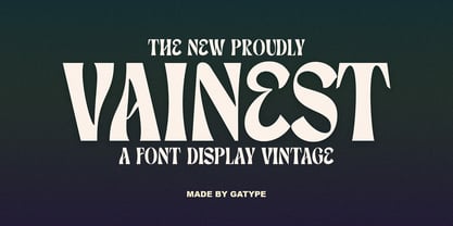 Vainest Serif vintage style font It has a modern and retro look. Comes with different styles, really helps to create amazing logos, quotes, posts, blog posts. branding projects, magazine imagery, book and billboard displays, and more. hope you will enjoy using the Vainest font and it will make a perfect addition to your font collection! Contact me with an inbox message If you have any questions. Thank you
 - Pindunk by Tama Putra,
$17.00 Pindunk is a typeface inspired from gothic style. The Pindunk typeface includes a full set of uppercase and lowercase letters as well as multi-lingual and currency support, numerals, punctuations, alternates, ligatures and some extra glyphs.
 - Morgan Font Duo by Silverdav,
$15.00 Introduce “Morgan” is a duo font, consisting of Serif and Script fonts, a very fitting combination, of course making your design more elegant and very charming Morgan was created to fulfill your need to create a charming and cool design. Equipped with many unique ligatures in serif fonts that will make your designs different from other designs, and also equipped with many Alternates in Script Fonts that will add a luxurious impression to your designs. How to use special characters in serif fonts for the letters “A, I, U, E, O” please select one of the letters above then use the dot 2 times (A..), then you get a special character, and to get a special character on letters K, R & L, use one of the letters above, then add a hyphen (-) once or twice. What's Includes: Morgan Serif Morgan Script Special Ligatures in Serif Font Special Alternates in Script Font Multilingual Support If you have any questions, please contact us
 - Vertical by Alias,
$60.00 Alias Vertical is a sans serif typeface with a vertical cut-off point for letter endings. The vertical cut-offs bend round characters (b, c, o, etc) into a squarish, high-shouldered shape, suggesting Roger Excoffon’s Antique Olive. In mid-weights, the typeface mixes Antique Olive with typefaces such as Gill or Johnston, for example the shape of the t, the l borrowing Johnston’s flick. Vertical has the same minimal difference in weight between verticals and horizontals as Gill and Johnston, and the same sharp connection point where curves meet straight lines. Like Antique Olive, Vertical has a narrow connection point here, adding contrast and definition. The overall effect feels austere at lighter weights and strident and graphic at bolder weights, and sharp and incised throughout. In the Bold and Black weights, the squarish and top heavy shape of Antique Olive is most noticeable. For example the wide uppercase, with the B having almost-even width between top and bottom curves, and the almost-overhang of the top curve of the G. But Vertical does not have as extreme an aesthetic or square shape as Antique Olive. As well as its wide design, the upper case is given extra authority by being a slightly heavier weight than the lower case. This is a device borrowed from Gill, and other ‘old’ typefaces, where the upper case is presented as a titling design. Modern sensibilities are more focussed on an even colour between upper and lower case. Vertical was originally intended as a sister typeface to Ano, like AnoAngular or AnoStencil. Vertical developed into a similar but separate design. Ano was designed for use in Another Man — in its modular, circle-base design, and the way there aren’t the amendments usually made in bolder weights to ensure letter clarity. This is for layouts where different weights are used together in different sizes so that the overall letter weight is the same, a feature of the magazine. Where Ano is simple and graphic, Vertical has nuance and texture. It is a pragmatic, utility design. In the balance between graphic and typographic, its focus is the latter.
 - Tuna by Ligature Inc,
$49.00 Tuna is simply a contemporary body text font. It is contemporary, meaning the merge of charming broad-nibbed calligraphic style with optimized readability on screen – showing that the roots of writing and typesetting are still in charge when reading “Anna Karenina” on your Kindle till 4 o’clock in the morning. Tuna has a natural fit for cross-media use because the design is based on forms characterized by different conditions of constancy, stability and good readability. Well-defined shapes and distinctive details only become apparent when used in larger sizes, making Tuna a true all-rounder. With more than 700 glyphs in 10 styles created with a maximum of consideration, it has all the qualities of a modern OpenType font serving the needs of today's communication. If you would like to read more about the Typeface please visit our promo site.
 - Green by ITC,
$29.99Green is the work of British designer Timothy Donaldson, known for his experimentation with letter forms. This typeface features a sharp stroke contrast and eccentric lower case letters, giving it a vital, clean-cut style. Green is perfect in both large display sizes and small text sizes and gives any work a fresh, new look. - Arkham Land by Artisticandunique,
$15.00 Arkham Land - Sans Serif Font Family - Multilingual - 12 Style Arkham Land Sans serif font family helps you create many alternatives in your creative projects with its 12 styles.With its elegant and strong structure, different weights, it is also assertive about being a highly readable font. It provides flexibility in the width of usage areas in your projects, from thin styles to Black styles. It is a timeless font family with is rich styles, multilingual supports and modern structure. You can use Thin styles in elegant and stylish projects, and Black styles in strong titles. This font comes with uppercase, lowercase, punctuation, symbols and numbers, ligatures and multilingual options. Great for books and magazines, editorials, headlines, websites, logos, branding, advertising and more. This font family can meet your needs in all creative projects, modern and classic. With this font you can create your unique designs. If you have a question, please contact me. Have a good time.
 - Hello Beach by Letterara,
$14.00 Hello Beach is a friendly and elegant handwritten font. Its natural and unique style makes it incredibly fitting to a large pool of designs. Its distinct and well interesting letters make this font a masterpiece. Fall in love with its incredibly versatile style and use it to create spectacular designs! This font is PUA encoded which means you can access all of the awesome glyphs with ease! It also features a wealth of special features including ligatures.
 - Alvarisky by Putracetol,
$24.00 Alvarisky is a stylish script font that inspired by combination of streetwear, bouncy and hand lettering styles. Ideal for logos, badge, label, apparel, club, event, handwritten quotes, product packaging, header, poster, merchandise, social media & greeting cards. Alvarisky come with opentype feature like ligature and a lot of alternates character. Its help you to make beautiful lettering. This font is also support multi language.
 - The Talkshow by Grewfont Studio,
$13.00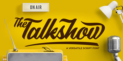 The Talkshow is a classy script font. Combined with calligraphic styled handwritings will make your design project more powerful. Made for any professional project branding. It is the best for logos, branding and of lettering quotes. Every letter and character has a unique and beautiful touch. Enriched with tons of stylistic alternates and beautiful ligatures, The Talkshow is your best choice!
 - VVDS Minorica by Vintage Voyage Design Supply,
$15.00 Hey folks! Glad to introduce you a new MINORICA handwritten collection to imitate a hand lettering style! A complete font kit with graphics give you a fantastic result. A roughen pencil written letters with the same rustic shapes and decorate doodle elements looks very authentically! Play with styles, use the stroke style with inlines, or just a regular. You'll get: Bouncing baseline spooky serif with all caps letters, stroke style and inline decoration Handwritten textured and roughen brush script Bold playful sans with inline and stroke styles. Decoration font with text shapes and doodle elements decoration. A helpful kit to create a funny stuff as greeting cards, t-shirts, advertisement content, cafe or coffee shop decoration, book covers etc. Thank you and Enjoy! VVDS
