10,000 search results
(0.221 seconds)
- The Snailson by Putracetol,
$24.00 The Snailson - Decorative Black Letter Font. The Snailson is a decorative black letter display typeface. The Snailson font inspired by black letter theme of the vintage posters. The Snailson have classic decorative, retro and trendy display. But in The Snailson font I combine several variations such as the ligature. It makes The Snailson font even more unique and different. The Snailson is also great for any kind of display purpose from album, cover,poster, label, tshirt, apparel, signage, quote, logo, greeting card,logotype and many more. The Snailson is also support multi language. The alternative characters were divided into several Open Type features such as Swash, Stylistic Sets, Stylistic Alternates, Contextual Alternates, and Ligature. The Open Type features can be accessed by using Open Type savvy programs such as Adobe Illustrator, Adobe InDesign, Adobe Photoshop Corel Draw X version, And Microsoft Word. This font is also support multi language.
 - Parangon by ParaType,
$25.00 PT Parangon™ was designed in 1986-2002 by Anatoly Kudryavtsev and licensed by ParaType. This type family belonges to Neogrotesque subclass of closed Sans Serif. Letterforms of lower case is based on the tradition of 1710 Civil type and some modern Italic types. The family has a lot of weights and styles including Extra Condensed, Condensed, Regular, Extra Light, Light, Bold, Extra Bold. For advertising and display matter. Also it can be used for texts in advertising magazines.
 - Welo Casual NF by Nick's Fonts,
$10.00Another tip of the hat to master draftsman Samuel Welo. His famous Studio Handbook was hand-lettered throughout, and provided the inspirations for many of Nick's favorite fonts. This little number is based on the unnamed style Mr. Welo used for much of his paragraph text. Use it when you want to convey homespun warmth and a handmade feel. Both versions of this font include the complete Unicode Latin 1252, Central European 1250 and Turkish 1254 character sets. - Satampra by Scriptorium,
$24.00Satampra evokes the spirit of Arabic calligraphy with a hint of something strange and magical. It is an unusual calligraphic font based on an obscure hand lettered style with unique overlapping character strokes. It fits the theme of oriental fantasy and would work well with the fonts in our Arabian Nights Fonts and Art package. Satampra is an upper-case only font, but the lower case positions have alternative versions of the upper case character set. - Shtozer by Pepper Type,
$25.00 Shtozer is a retro-themed display typeface based on designs of 1960s and 1970s and additionally inspired by Cyrillic ornate lettering Vyaz. It comes in 8 weights, with 5 width variations each, all accompanied with respective obliques - making 80 styles altogether. Shtozer is a font family with extensive language coverage including Cyrillic script. It also contains numerous OpenType features and alternate glyphs to vivify the typesetting.
 - Hendbras by Seniors Studio,
$15.00 Hendbras is handcrafted font duo created with a brush and ink, bold and irregular baseline. Contains a complete set of lowercase, uppercase, alternates, ligatures, punctuation, numbers, and multilingual support. This font ideal for use in watercolor design or lettering style bold hand, such as posters, wedding elements, t-shirt, apparel, cover books, business cards, greeting cards, branding, merchandise, invitations and handmade quotes and more.
 - Agitha by Awan Senja,
$14.00 Agitha is a lovely, round lettered handwritten font. This font is PUA encoded which means you can access all of the glyphs and swashes with ease! It features a varying baseline, smooth lines, gorgeous glyphs and stunning alternates. Fall in love with its incredibly versatile style and use it to create gorgeous wedding invitations, beautiful stationary art, eye-catching social media posts, and much more!
 - Stink Buster by Bogstav,
$16.00 There’s nothing stinky about this font, don’t worry! But what’s is up with Stink Buster is a whole lot of serifs gone bad! Each letter is loosely based upon the classic slab serif style, but influence by grafitti and comics just made them crooked and off the grid. But despite that, the font works great if you have a message that you want shouted out loud!
 - Caleb Grotesk by Brenners Template,
$19.00 It seeks a stable balance through the pairing of plain contrasts and ink trap interfaces. The ordinary yet sophisticated ink trap digging is designed to minimize the discomfort caused by the change in weight. This stability is consistent no matter what weight or style you choose. So it has a wide coverage area ranging from logo design, editorial design, web UI, and app design.
 - Histeagin Sans by Yahya Type,
$22.00 Histeagin Sans – Sans serif version of Histeagin. Histeagin Sans – this style works well for branding projects, logo, wedding designs, social media posts, advertisements, product packaging, product designs, label, photography, watermark, invitation, or whatever project you’re working on. WHAT’S INCLUDED? Uppercase & lowercase letters Numbers, punctuation Ligature & Huge Stylistic alternate Multilingual support. Still got a question? Send me a message and I’ll be happy to answer! qura.yahya@gmail.com
 - Vinegart by FHFont,
$19.00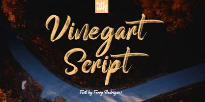 Vinegart is a script font with a hand-lettered, dry brush style, with OpenType feature include in the font. Suitable for design, element design, wedding, event, t-shirt, logo, badges, sticker, and awesome work. Features Of The Font: - All Standard Character, Symbol, Multi-lingual Support, Ligature, Stylistic Sets and Swashes. - PUA Encoding Follow Me: - https://www.instagram.com/FHFont - https://twitter.com/FH_Font - https://www.facebook.com/FHFont/ - https://id.pinterest.com/feydesign/
 - The Amgesta by TM Type,
$12.00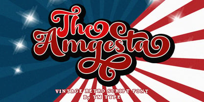 The Amgesta is a Vintage retro font inspired by retro typography and lettering in the 60s and 80s combined with a bold typography style. This font is perfect for vintage and retro designs, badges, logos, t-shirts, posters, branding, packaging, signage, book covers, and so much more! This font is PUA encoded, which means you can access all of the glyphs and swashes with ease!
 - Espadrille by Atlantic Fonts,
$21.00 Step into your next project with comfort. Espadrille is handmade, clean, and friendly, without being loud. Appealing for a casual, but style conscious crowd - whether brightening t-shirts, posters, packaging, or publications, its one-height upper and lower case make it fun for creative blocks of text and mixing cases at will. It features double-letter discretionary ligatures as well as a few extras.
 - Monthstage by ahweproject,
$10.00 Monthstage is a Vintage retro font inspired by retro typography and lettering in the 70s and 80s combined with a bold typography style. This font is perfect for vintage and retro designs, badges, logos, t-shirts, posters, branding, packaging, signage, book covers, and so much more! This font is PUA encoded, which means you can access all of the glyphs and swashes with ease!
 - Bantat by Jipatype,
$20.00 ฟอนต์ Bantat เป็นแบบอักษรแซนเซอริฟ ที่มีความเรียบง่ายโดยออกแบบให้หลังคาและฐานตัวอักษรกลุ่มหนึ่งราบเรียบไปกับเส้นบรรทัด ผสมกับหลังคาแบบปกติ เพื่อให้มีไดนามิคแทนที่จะราบเรียบไปทุกตัวอักษร มีให้เลือกใช้ 18 น้ำหนัก และ 5 ความกว้าง ทั้งตัวตรงและตัวเอียงรวมแล้วมี 90 ลักษณะ เหมาะสำหรับงานทั่วไป บนสื่อได้หลากหลายขนาดไม่ว่าจะมีความกว้างหรือแคบ -- The Bantat font is a simple Sans Serif typeface designed to flatter parallel to the baselines and x-height. Available in 18 weights and 5 widths, both upright and italic have 90 Styles in total. Suitable for general work on media in a variety of sizes, whether wide or narrow.
 - Reiseburo Display by Elyas Beria,
$5.00 Pack your bag, Reisebüro is about to take you on a romp to the most wunderbar destinations around the globe. This quirky and playful display font is inspired by hand painted lettering. Pick a city from the list in the travel agency’s window and book your flight—your glass of champagne will be waiting for you in First Class. 4 Styles included: Regular Oblique Thin Thin Italic
 - Canapé by FDI,
$25.00 Canapé is based on the idea of letters with a subtly curved and slightly modulated line. Through this, the typeface has a warm and friendly, almost haptical appearance which brings some kind of cosiness to your communication with type. Designed and crafted with great attention to detail, the type family is usable for copy texts as well as corporate design or display purposes. Canapé (Serif) with its 4 fonts and more than 4,200 characters contains a large amount of features like small capitals, swashes, 10 different figure sets, automated fractions, ordinals, standard and discretionary ligatures, language support for Central and Western Europe and a small sofa building kit. All features are conveniently accessible through OpenType features. Check out the type specimen PDF for more details and a closer look.
 - Celion by Dora Typefoundry,
$19.00 Celion is a serif display type with a nonsensical feel. modern high contrast with a bright positive character. The clean shapes and slightly conical edges of the letters create a welcoming atmosphere in any design. Including ligatures and custom alternative glyphs, the Celion font is perfect for headlines, magazines, logotypes, food packages, advertisements, and many others. Features: All Caps Font with different uppercase and lowercase Number & Symbol Supported Languages Alternates and Ligatures PUA Encoded We highly recommend using a program that supports OpenType features and Glyphs panels like Adobe apps and Corel Draw, so you can see and access all Glyph variations. This type of family has become the work of true love, making it as easy and fun as possible.I really hope you enjoy it! Thank you Enjoy the font and go get creative :)
 - Jesaya by Typodermic,
$11.95 Introducing Jesaya: the typeface that will elevate your design game. With its unique geometric design, Jesaya will bring a new level of sophistication and style to your creative projects. Its clean shapes and sharp angles give your message a distinctive voice, projecting a sense of precision and attention to detail. And with seven weights and italics, you have the flexibility to experiment with different styles and layouts, ensuring your design stands out from the crowd. But that’s not all—Jesaya is designed with your comfort in mind. Its shaved sharps prevent typographic injury, ensuring a smooth and seamless design process. So whether you’re crafting a bold logo, designing a sleek website, or creating eye-catching marketing materials, Jesaya’s contemporary style and unique geometry will help you express your vision with clarity and impact. Try it today and see the difference for yourself. Most Latin-based European writing systems are supported, including the following languages. Afaan Oromo, Afar, Afrikaans, Albanian, Alsatian, Aromanian, Aymara, Bashkir (Latin), Basque, Belarusian (Latin), Bemba, Bikol, Bosnian, Breton, Cape Verdean, Creole, Catalan, Cebuano, Chamorro, Chavacano, Chichewa, Crimean Tatar (Latin), Croatian, Czech, Danish, Dawan, Dholuo, Dutch, English, Estonian, Faroese, Fijian, Filipino, Finnish, French, Frisian, Friulian, Gagauz (Latin), Galician, Ganda, Genoese, German, Greenlandic, Guadeloupean Creole, Haitian Creole, Hawaiian, Hiligaynon, Hungarian, Icelandic, Ilocano, Indonesian, Irish, Italian, Jamaican, Kaqchikel, Karakalpak (Latin), Kashubian, Kikongo, Kinyarwanda, Kirundi, Kurdish (Latin), Latvian, Lithuanian, Lombard, Low Saxon, Luxembourgish, Maasai, Makhuwa, Malay, Maltese, Māori, Moldovan, Montenegrin, Ndebele, Neapolitan, Norwegian, Novial, Occitan, Ossetian (Latin), Papiamento, Piedmontese, Polish, Portuguese, Quechua, Rarotongan, Romanian, Romansh, Sami, Sango, Saramaccan, Sardinian, Scottish Gaelic, Serbian (Latin), Shona, Sicilian, Silesian, Slovak, Slovenian, Somali, Sorbian, Sotho, Spanish, Swahili, Swazi, Swedish, Tagalog, Tahitian, Tetum, Tongan, Tshiluba, Tsonga, Tswana, Tumbuka, Turkish, Turkmen (Latin), Tuvaluan, Uzbek (Latin), Venetian, Vepsian, Võro, Walloon, Waray-Waray, Wayuu, Welsh, Wolof, Xhosa, Yapese, Zapotec Zulu and Zuni.
 - Hutton by Fettle Foundry,
$10.00 Hutton is a sans-serif typeface with flattened overshoots, such as shoulders, arms, and bowls. There are seven weights, from light to bold, with matching oblique italics. Inspired by using a ruler to write straight lines, and offering additional horizontality to characters, Hutton’s flattened bowls are intended to evoke a sense of flatness and retro influence – as if drawn at a drafting table. Featuring closed counters and low-contrast, Hutton is closely related to grotesque sans serif designs of the 20th Century, but with something a little different. Included is comprehensive European language support with contextual kerning on common diacritic combinations – as well as localised alternatives for languages such as Polish. Also included are two stylistic sets, which feature characters with a more geometric quality or a more humanistic quality, depending on which you would like to bring to your design.
 - ITC Johnston by ITC,
$29.00ITC Johnston is the result of the combined talents of Dave Farey and Richard Dawson, based on the work of Edward Johnston. In developing ITC Johnston, says London type designer Dave Farey, he did “lots of research on not only the face but the man.” Edward Johnston was something of an eccentric, “famous for sitting in a deck chair and carrying toast in his pockets.” (The deck chair was his preferred furniture in his own living room; the toast was so that he’d always have sustenance near at hand.) Johnston was also almost single-handedly responsible, early in this century, for the revival in Britain of the Renaissance calligraphic tradition of the chancery italic. His book Writing & Illuminating, & Lettering (with its peculiar extraneous comma in the title) is a classic on its subject, and his influence on his contemporaries was tremendous. He is perhaps best remembered, however, for the alphabet that he designed in 1916 for the London Underground Railway (now London Transport), which was based on his original “block letter” model. Johnston’s letters were constructed very carefully, based on his study of historical writing techniques at the British Museum. His capital letters took their form from the best classical Roman inscriptions. “He had serious rules for his sans serif style,” says Farey, “particularly the height-to-weight ratio of 1:7 for the construction of line weight, and therefore horizontals and verticals were to be the same thickness. Johnston’s O’s and C’s and G’s and even his S’s were constructions of perfect circles. This was a bit of a problem as far as text sizes were concerned, or in reality sizes smaller than half an inch. It also precluded any other weight but medium ‘ any weight lighter or heavier than his 1:7 relationship.” Johnston was famously slow at any project he undertook, says Farey. “He did eventually, under protest, create a bolder weight, in capitals only ‘ which took twenty years to complete.” Farey and his colleague Richard Dawson have based ITC Johnston on Edward Johnston’s original block letters, expanding them into a three-weight type family. Johnston himself never called his Underground lettering a typeface, according to Farey. It was an alphabet meant for signage and other display purposes, designed to be legible at a glance rather than readable in passages of text. Farey and Dawson’s adaptation retains the sparkling starkness of Johnston’s letters while combining comfortably into text. Johnston’s block letter bears an obvious resemblance to Gill Sans, the highly successful type family developed by Monotype in the 1920s. The young Eric Gill had studied under Johnston at the London College of Printing, worked on the Underground project with him, and followed many of the same principles in developing his own sans serif typeface. The Johnston letters gave a characteristic look to London’s transport system after the First World War, but it was Gill Sans that became the emblematic letter form of British graphic design for decades. (Johnston’s sans serif continued in use in the Underground until the early ‘80s, when a revised and modernized version, with a tighter fit and a larger x-height, was designed by the London design firm Banks and Miles.) Farey and Dawson, working from their studio in London’s Clerkenwell, wanted to create a type family that was neither a museum piece nor a bastardization, and that would “provide an alternative of the same school” to the omnipresent Gill Sans. “These alphabets,” says Farey, referring to the Johnston letters, “have never been developed as contemporary styles.” He and Dawson not only devised three weights of ITC Johnston but gave it a full set of small capitals in each weight ‘ something that neither the original Johnston face nor the Gill faces have ‘ as well as old-style figures and several alternate characters. - Multipa by Hurufatfont,
$22.00 Multipa takes inspiration from old-style grotesque fonts and reinterprets them for the present. Its contrast structure distinguishes it from other sans serif fonts. Thanks to style sets, letters like t, b, d, k, l are synchronized with capitalization height. It allows you to create powerful typographic designs with body text and heading styles. It is equipped with rich opentype features, style sets and ligatures for professional typography designs. Ideal for packaging, labels, routing designs, mobile applications, brand designs, logos, all kinds of presentation and editorial designs, indoor and outdoor printing works.
 - Actium by Type Mafia,
$45.00 Actium is a contemporary multilingual sans serif typeface developed to help perfect typography automatically. Type Mafia has focussed on words with odd combinations of capital letters and numbers, such as product names and postal codes such as WD40 and H1N5, jump out of the text. They sit awkwardly together as the numerals have been designed to work with the lowercase, not the uppercase letters – affecting readability.To fix this Type Mafia invented Smart Capo™. Smart Capo™ Smart Capo is a feature that automatically activates once you type an uppercase letter together with a number. When a capital letter is sat next to a numeral, Smart Capo converts the letter to a mid-cap — a contemporary alternative to small caps — and the default old-style numeral to a lining numeral. Actium’s mid-caps and lining numerals have been designed with the same height (between cap and x-height) so they sit comfortably next to each other and fit more harmoniously into text. Smart Capo applies equal attention to capitalised words without any numbers, such as NAVO and USA, and are also automatically set into mid-capitals. Working on its own, Smart Capo saves time and money for the typographer — taking the pain out of text formatting — and makes it a more pleasurable experience for the reader. This feature is made possible by the use of ‘contextual alternates’, an OpenType feature used in modern font software, working with a set of characters specially designed at mid-cap height. By default these changes automatically take place so it doesn't need to be switched on, it will just work. Actium Actium’s design has an unusual diagonal contrast — much more common in a serifed face than in a sans serif — giving it more bite. The typeface looks elegant when set in large sizes and remains very legible when shown in small sizes. The family consists of six weights in two styles, making a dozen fonts. Weights range from light to black in roman and true italic. All fonts are fully loaded with functional elements. Actium boasts an extended Latin character set and with Greek. This means a wide range of Western languages are supported: perfect for use in bilingual publications and packaging. For numerals, each font includes old-style and lining figures in both proportional and tabular widths, with superiors and inferiors. These allow you to select the right set of numbers for the right task.
 - Morro by Great Scott,
$16.00 Morro is based on simple geometric shapes – circles, triangles and rectangles. Imagine cutting circles, triangels and rectangles from paper and arranging them into letters where the outer edges form a filled figure. Arranging figures like this to form letters is nothing unique. You can find several beautiful examples of alphabets that inspired the creation of Morro. Everywhere from a 1936 booklet by Draughtsman called ”Modern lettering for all branches of commercial arts” to obvious examples is from the paragon of the design industry - Milton Glaser - with his typeface Baby Teeth. What sets Morro apart from other digitized versions of Glasers' ”Baby teeth”, or other similar designed fonts, is that Morro is expanded into lower case and also supports Basic latin, Western European, Central European, south Eastern European and Pinyin. There are also stylistic alternatives to some of the glyphs. Morro Regular works like a stencil and is accompanied by a block shadow style and an outline. The Morro family of fonts are layered and can be superimposed on each other to create several types of text effects.
 - ZT Yaglo by Khaiuns,
$16.00 ZT Yaglo is a dynamic and expressive display font, from the first impression you may have noticed that this font is a fishing rod-like concept, with a consistent rhythmic curve that gets sharper at the ends. The ZT Yaglo typeface is framed in a sans theme and added a serif feel to produce a bold, geometric typeface in all thicknesses. ZT Yaglo mixes a simple sans style for extra bold serif energy with the feel of calligraphic shapes. The thicker your choice of style, the more striking the flow of changes in shape becomes spiky. ZT Yaglo is a cool alternative for you to create branding projects, Logo designs, Apparel Branding, product packaging, magazine headers or just as a stylish text overlay onto any background image. ZT Yaglo has 9 Styles, 1 Free for Commercial, and one Variable font. each face has 457 glyphs. Includes Standard Ligature, and the "&" character has an alternate letter in each Weight. I hope you have fun using ZT Yaglo. Thanks for using this font ~ Khaiuns X zelowtype
 - Yuanita by Putracetol,
$12.00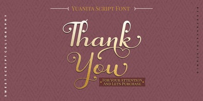 Yuanita is a beautiful modern calligraphy font. A modern script with a handmade calligraphy style. This font is feminime, elegant, messy and modern. Yuanita perfect for wedding event, anniversary, birthday, greeting cards, logotype, branding, wedding invite and card, elegant logo, poster, packaging, stationery, website, and any other projects requiring a handwritten and luxurious touch. Includes OpenType feature with a lot of alternates to help you to make great lettering. This font also supports multiple languages.
 - Yngreena by Ingrimayne Type,
$12.95 Yngreena is a serifed typeface with calligraphic origins. In updating it in 2011, I began to add alternative letters and reached the point where it made sense to create an alternative family of faces rather than include all the alternatives as part of an OpenType font. The letters K, R, V, W, Y, f, g, k, t, v, and w are tamer in Yngreena Alt. As a result, though it is still a decorative text face, Yngreena Alt is better suited for lengthier blocks of text than is the original Yngreena face.
 - Ornate Blackboards by Intellecta Design,
$16.90Ornate Blackboards is a beautiful collection of ornaments from Intellecta Design, excellent for use in works of art and editorial publications, like book covers, headpieces to sections of books, magazines, packaging works, and many other solutions. Good to use with roman versals, chiseled fonts and many other different kinds of typefaces. - Aimchestar by FHFont,
$18.00 Aimchestar is script with a hand-lettered brush style, and includes OpenType features. It is suitable for designs, weddings, events, t-shirts, logos, badges, sticker, and more to make your work awesome.
 - Magistan by Letterena Studios,
$9.00 Magistan is a distinct and vintage styled slab serif font. It will create elegant & luxurious logos, books or movie title designs, fashion brands, magazine covers, clothes, lettering, quotes, and so much more.
 - Dorige by Issam Type,
$20.00 Dorige is a modern retro serif typeface for branding, logo design and retro designs, This font comes with joining ligatures that give it a fancy and unique style. Dorige typeface comes with regular, italic, bold and bold italic font styles. Uppercase & lowercase letters, numbers, punctuation, ligatures, alternates Multilingual support. If you have any questions, please feel free to get in touch. Thank you
 - Teja by Eurotypo,
$59.00 “Teja” font was inspired in the lettering styles printed on enamel advertising signs. The enameled iron signs were, from 1880s until the 1950s, amongst the most striking features of streets and railway stations in most towns and villages around the world. “Teja” was designed specially for use in logotypes, advertising and packaging. It is interesting to note the use of free-flowing lettering to perform its own eye-catching.
 - Futura ND by Neufville Digital,
$45.25 Futura is one of the best known and most widely used of modern typefaces. Designed by Paul Renner between 1924-1927 for the Bauersche Giesserei, it remains today one of the most successful typefaces due to its simplicity of features, perfect legibility, and meticulous finish of each of its letters. Its great variety of styles and weights makes Futura particularly fit for distinguished user interfaces, information displays, smart watches, e-readers, television apps, technical appliances, and internet-related uses. Futura is a Trademark of BauerTypes SL
 - Babyhome by Haksen,
$14.00 Babyhome Elegant Script If you are needing a touch of casual chic calligraphy for your designs, this font was created for you! Babyhome was built with OpenType features and includes beginning and ending swashes alternate characters for both lowercase letters, loads of different swash alternates for lowercase letters, numbers, punctuation, alternates, ligatures and it also supports other languages :) Accessing the swashes / opentype features / glyphs: This font works best in a program that supports OpenType features such as Adobe Indesign, Adobe Illustrator CS, or Adobe Photoshop CC. You can access the swashes and alternates from the 'Glyphs Panel' in these programs. More Questions? Here are some (potential) answers! You are not permitted to resell this font in any way. Multilingual Support is included for Western European Languages Also, the sans-serif font used in the preview images is Gotham :)
 - Chico by Type-Ø-Tones,
$49.00 Chico was by designed by Javier Mariscal and Josema Urós specifically for the final roll of credits in the animated film Chico y Rita. The goal was to design a typeface with a good readability but that conveyed a strong script character and, in some way, tuned to the style of line used throughout the film. Using a modular sans-serif as a template, Javier Mariscal reinterpreted the forms freely, while maintaining gridlike proportions. Chico can be useful for comic-book lettering, editorial work and display applications.
 - Strangelove Next by FaceType,
$16.00 Strangelove Next is inspired by Stanley Kubrick’s movie “Dr. Strangelove”. The original titles were designed by Pablo Ferro, who is one of the most acclaimed film title designers, especially famous for his hand-drawn lettering. The Strangelove Next family contains the highly successfull narrow version, a new expanded version and finally a mix of the first two, which gives it a surprising and unpredictable look. All three styles have more glyphs than the original family. Looking for a serif version? Have a look at Strangelove NextSlab!
 - Agustus Signature by IbraCreative,
$14.00 Agustus Signature is a sophisticated and stylish font that embodies elegance and refinement. Drawing inspiration from the grace and poise of a personalized signature, Agustus Signature delivers a timeless and luxurious feel to any design. Each letter is meticulously crafted with intricate curves and fine details, mirroring the fluid strokes of a genuine signature. This font is perfect for high-end branding, luxury products, and exclusive invitations, adding a touch of prestige and class to any project. With its versatile nature, Agustus Signature seamlessly adapts to a wide range of creative applications, showcasing its impeccable style and leaving a lasting impression of sophistication and distinction
 - Film Reel JNL by Jeff Levine,
$29.00 In a World War II training film from the U.S. Signal Corps, the opening title card saying “First Aid” was hand lettered in an extra bold, Art Deco inline style. Those two words (with seven available letters) used as a work model has inspired Film Reel JNL, which is available in both regular and oblique versions.
 - Celluloid JNL by Jeff Levine,
$29.00Celluloid JNL was modeled from a few samples shown in a 1947 sales catalog for changeable letter directory boards and the various styles available for these signs. Prior to modern plastics, celluloid was the material used for these molded letters. Aside from the Regular and Oblique versions, there is also Celluloid Highlight JNL and Celluloid Highlight Oblique JNL. - Retirement JNL by Jeff Levine,
$29.00 The hand lettered film credits for 1937’s “Make Way for Tomorrow” were done in a sans serif design with an ever-so-slight flare and a slightly semi-calligraphic look. Unusual in both style and varying character thicknesses, the lettering has been digitally redrawn as Retirement JNL, which is available in both regular and oblique versions.