10,000 search results
(0.088 seconds)
- Western Trail JNL by Jeff Levine,
$29.00 For decades, Samuel Welo’s “Studio Handbook for Artists and Advertisers” was a source of inspiration for sign painters, graphic artists and designers. In later years, many digital revivals of Welo’s hand lettered typography have been made available. Western Trail JNL is the latest member of such digital fonts, and is available in both regular and oblique versions.
 - Battle Cry by Comicraft,
$19.00 As Titans Clash in The Final Battle of Good versus Evil, Man versus Machine, God versus Mortal and Coke versus Pepsi, ace lettering artist, Ferran Delgado from Spain teams up with our very own John ‘JG’ Roshell for one last attack on the assembled Cover Lettering Styles of Yore. Fill your lungs and prepare for... BATTTTTTLECRRRRRYYYYYYYYYYY! See the families related to Battle Cry: Battle Scarred & Battle Damaged .
 - Spur Wide JNL by Jeff Levine,
$29.00 Spur Wide JNL was modeled from an example of hand lettering from the antique French alphabet book L'Art du Tracé Rationnel de la Lettre. Heavy Roman style letters with spurs (often referred to as Latin) were most popular with sign painters and show card writers in the early part of the 20th century. Spur Wide JNL is available in both regular and oblique versions.
 - SomaSkript by ArtyType,
$29.00 SomaSkript is a natural extension to the basic Somatype font design, adding more variety to the family, all of which have similar features. Basically, by widening the uprights and maintaining the thin cross-bars it takes on more of a script-like quality, hence the name. Slanting the letters reinforces the script illusion and consequently brings a broader application to the font’s original format. When designing the Somatype alphabet originally, I always envisaged maximizing on its potential by creating an incised version. This variation not only emphasizes the implied script qualities within the name but brings out the softer, feminine side of the typeface. This evolutionary process creates a different looking font altogether and in turn the slanted version emphasizes the elegant quality even more so.
 - Pulp Magazine JNL by Jeff Levine,
$29.00 For a pulp magazine called Spicy Western Stories, it was unusual that the January 01, 1939 issue had its cover title hand lettered in an extra bold Art Deco style rather than Western influenced lettering. This did not stop the lettering from being used as the design model for a digital type revival. Pulp Magazine JNL, is available in both regular and oblique versions.
 - Selfie by Lián Types,
$37.00 ATTENTION CUSTOMERS :) There's a new Selfie available, have a look here; Selfie Neue is better done and more complete in every aspect. However, you can stay here if you still prefer the classic version. -But first, let me take a Selfie!- said that girl of the song and almost all of you at least once this year. While some terms and actions get trendy, some font styles do it too. It wouldn't be crazy to combine these worlds, in fact it happens often. Selfie is a connected sans serif based in vintage signage scripts seen in Galerías of Buenos Aires. These places are, in general, very small shopping centres which pedestrians sometimes use as shortcuts to get to other parts of the city. Their dark corridors take you back in time, and all of a sudden you are surrounded by cassettes, piercings, and old fashioned cloth. For some reason, all these shops use monolined geometric scripts. Surely, neon strings are easier to manipulate when letterforms have simple shapes. My very first aim with Selfie was to make a font that would serve as a company to those self-shot pictures that have become so popular nowadays. However, the font turned into something more interesting: I realised it had enough potential to stand-alone. Selfie proves that geometry itself can be really attractive. In this font, elegance is not achieved with the already-known contrast between thicks and thins of calligraphy, but with the purity of form. Its curves were based in perfectly shaped circles which made the font easy to be used at different angles (some posters show it at a 24.7º angle) without having problems/deformities. In addition to its nice performance when used over photographs, the font can be a good option for packaging and wedding invitations. TIPS Adding some lights/shadows between letters will for sure catch the eye of the viewer: Words will look as if they were made with tape/strings; so trendy nowadays. Try using Selfie at a 24.7º angle so that the slanted strokes become perfectly vertical. Having the decorative ligatures feature (dlig) activated is a good option to see letters dance. TECHNICAL It is absolutely recommended to use this font with the standard ligatures feature (liga) activated. It makes letters ligate perfectly and also improves the space between words.
 - Lontare by RGB Studio,
$17.00 Lontare script typeface works really well for Logos and Apparel Design. It's also great for creating Prints or Merchandise, as you can use the illustrative qualities of the shapes to create an art piece. Lontare script typeface includes many different alternates for each lowercase letter. It's extremely fun to use as each word can be transformed to your liking. Files Include : Basic Latin A-Z and a-z Numbers Symbols PUA Encode Multilanguage Support Thanks and have a wonderful day, If you have any questions, please get in touch with us Don't forget to check out our other products.
 - Buket by Ahmet Altun,
$19.00 Bouquet or in Turkish, Buket Font Collection includes 18 styles and textures which are different but compatible with each other. Decorative and script sans fonts include several useful ornaments. It can be created elegant and decorative typographic designs and additionally, eye-pleasing designs can be made even in miniscule texts.
 - Wayfinding Sans Symbols by FDI,
$29.00 Placing pictograms as single vector images makes designing signage a time-consuming task. But with Wayfinding Sans Symbols and its built-in OpenType intelligence using pictograms becomes as easy as typing words. With Wayfinding Sans Symbols you don’t need to scroll through endless glyph palettes to look for one symbol among hundreds of symbols. Just active ligatures and type in the mnemonic codes like #wheelchair, #parking, #toilet and so on. An overview of these codes can be found in the type specimen PDF. Each pictogram is available in 4 different versions and you can easily assign an additional background color or turn the symbol into a prohibition sign. Wayfinding Sans Symbols has a full coverage of the Unicode range “Transport & Map symbols” and a lot of additional signs that are missing in the typical wayfinding symbol sets. Beside the pictograms, Wayfinding Sans Symbols also has a huge set of arrows for every possible situation and you can easily switch between the different sets using OpenType feature controls. The enclosed letters and figures make it easy to set transport line numbers, room & storey numbers and much more. Wayfinding Sans Symbols is the perfect addition to Ralf Herrmann’s signage typeface Wayfinding Sans Pro, but it can also be used with any other typeface.
 - Bargitta by Letterhend,
$13.00 Introducing a SVG font called Bargitta Script. This typeface has 3 different styles that you can use according your needs : Textured SVG, textured vector /rough, and solid. It has very nice look, very suitable for corporate branding, logos, documents, social media design, presentations, print design, web, and more. This typeface comes in uppercase and lowercase, with punctuation, symbols, numerals, stylistic set alternate, ligatures, and also has multilingual support.
 - Oh November by Supfonts,
$15.00 This new font was inspired by the game with different signature styles. I also added 102 ligatures to it. The result is a light and nice font that looks completely hand-drawn. Oh November will look beautiful on Christmas and holiday invitations, wedding invites and stationery, logos, and more. I love using it for emphasis words and pairing it with serifs Check out my blog: https://www.instagram.com/zloillev pinterest.com/dmitriychirkov7
 - Newt Juice by Cool Fonts,
$24.00 Newt Juice is a funky hand drawn font comes in both Outline and Fill styles. Put them both together in your favorite application and you can get some really organic looks. Newt Juice is perfect for kid stuff or grungy graffiti. While it is an all caps font, the upper and lower case characters are position differently to create more randomness. Be the first on your block to juice the newt!
 - Bouncy by Mans Greback,
$59.00 Bouncy is a funny cartoon font. Drawn and created by Mans Greback in 2021, this comic-style lettering has a happy, quirky personality and optimistically bold appearance. Activate "Contextual Alternates" in your design program, and the letters will overlap. https://www.fontshop.com/content/enable-contextual-alternates The typeface is provided in three styles: Thin, Black and Regular (Outlined) Bouncy is built with advanced OpenType functionality and has a guaranteed top-notch quality. It has extensive lingual support, covering all European Latin scripts. It contains all characters you'll ever need, including all punctuation and numbers.
 - Musty Scoot by Bogstav,
$15.00 Got a pair of jeans that goes well with both party and casual living? A shirt that would fit well to a Hollywood movie premiere and would be suitable to pick up the kids from the kindergarten? If so, you know exactly what I mean, when I say that the Musty Scoot font is suitable for anything! Well, almost anything...maybe not that highway sign, or that security sign at the airport!!! But suitable for anything for children, toys, adventures, handcraft, invitation, restaurants, playgrounds, libraries...etc etc Each letter has 7 slightly different versions, which automatically cycles as you type. There is even a version of right/left sided arrow to choose from!
 - Gothiks by Blackletra,
$50.00 Gothiks is a powerfull 6-weight display sanserif influenced by Texturas. The rithm and verticality of Texturas can be easily identified on the letters with diagonal strokes like A N M K k V v W w X x Y y Z z: here they are all vertical. This kind of morphology was chosen because it accepts condensation in a very natural way, giving to this compact sanserif a very unique personality. The intermediate weights can be used for short texts while extreme weights are excellent for big sizes. It has an extensive character set — with extensive language support — and many OpenType features like fractions, small capitals and different figure sets. Default figures align with lowercase.
 - Exotico by Atom,
$13.00 Hi There, Exotico is special in that one word can be written in a million different ways. With a picturesque and exotic touch, it will give a new feel for all your design needs. Whats incuded: Exotico.otf containing upper & lowercase characters, full set of punctuation and numerals, with opentype features with stylistic alternates and ligatures. Exoticottf - For folks without opentype capapble software, the standard Serendipity font with the first set of letters. Features : Ligature,Contextual Alternates, Stylistic Alternates, PUA Encoded Can't wait to hear your comments and we are very grateful for your visit to our store. if there any questions, please feel free to ask me, i'm happy to help. Have a great day! Thank you :)
 - Mauritz Caps by Mans Greback,
$59.00 Mauritz Caps is a brush script typeface. A lively uppercase graffiti-style lettering fonts, Mauritz Caps was drawn and created by Mans Greback in 2021 to be the ultimate set of wild-style handwritings for logotypes and branding. This calligraphy family consists of five high-quality fonts in a variety of weights: Mauritz Caps Thin, Light, Regular and Bold. The font is built with advanced OpenType functionality and has a guaranteed top-notch quality, containing stylistic and contextual alternates, ligatures and more features; all to give you full control and customizability. It has extensive lingual support, covering all Latin-based languages, from North Europe to South Africa, from America to South-East Asia. It contains all characters and symbols you'll ever need, including all punctuation and numbers.
 - Black Sapphire by Silverdav,
$14.00 Black Sapphire font is a modern font with a luxurious retro style, carefully crafted to produce the best product, there are 4 styles that you can use and mix to produce a unique, luxurious, and elegant design. Black Sapphire consists of, Regular, Italic, Outline & Outline italic, combine and create your own design, plus a lot of uppercase and lowercase alternate letters will add to the uniqueness and luxury of the design you create. Black Sapphire is perfect for Branding, Logo, Magazine, T-Shirt, Mockup, Quotes, Poster, and more, try it yourself and create amazing designs with Black Sapphire font. What’s Included: Black Sapphire Black Sapphire Italic Black Sapphire Outline Multilingual Support 185 Uppercase & Lowercase Alternates Ligatures If you have any Question Please Contact Us
 - Blackoak by Adobe,
$29.00Joy Redick designed Blackoak, a big and heavy Egyptienne-sytle titling slab serif face, in 1990. The extremely robust style of the characters in this typeface was consciously distorted; creating letterforms that appear flattened and stretched, like a rubber band. Blackoak is drawn in the style of old wood tpes, just like those that one envisions when one thinks of the large, decorative posters that once filled Wild West America. The wood type collection of the Smithsonian Institute in Washington, DC acted as a primary source of inspiration for this design. True to its rooks, Blackoak is meant for use exclusively in headlines in very large point sizes, or for logos and other corporate advertising purposes. - Panamericana by Andinistas,
$19.95 @andinistas presents an update of Panamericana in 2019, a typographic family worn out and expressive with 10 fonts perfect for short writings with cursive and stained calligraphic look. Panamericana works perfectly in headlines or logos of a film because its different thicknesses of corrosion and textures guarantee striking messages on t-shirts, stickers, skateboards, magazines, printed quotes, packaging, headings and all the designs you can imagine. Panamericana works best by exchanging and mixing letter by letter among its 10 fonts. In this way, you will take advantage of its corrosion levels by mixing the 3 uppercase, lowercase and ideal calipers for the beginning, middle or end of words, phrases or short paragraphs. Each empty and full Panamerican area was designed with care, care and attention and that is why its more than 2000 glyphs were carefully planned in 10 fonts designed for maximum performance in compositions that need scruffy and creative visual properties.
 - Navigated by Ditatype,
$29.00 Introducing Navigated, a captivating script font that seamlessly combines boldness with balance. Navigated showcases a unique connected letterform design, where each letter is expertly linked, resulting in a fluid and harmonious appearance. With consistent proportions and a low-contrast style, Navigated offers both stability. Adding a touch of flair to Navigated, you'll find striking swinging endings on select letters. These graceful flourishes bring an element of charm and sophistication to your words, making them stand out with a captivating visual appeal. Navigated fits in headlines, logos, posters, flyers, branding materials, print media, editorial layouts, and many more designs. Find out more ways to use this font by taking a look at the font preview.
 - Schnipsl by Dominik Krotscheck,
$6.50 Schnipsl is a playful font based on handicraft letterforms. It comes with a bunch of features to give it that extra organic look. Those features include alternates for the letters A-Z and a-z, ligatures, and filled letterforms. All the features are easily activated via Opentype. The four styles of the Schnipsl family can be layered to create colorful designs that always maintain a handmade and personal look. The Schnipsl works well for logos, headlines, illustrations, or short texts.
 - MC High Nobiety by Maulana Creative,
$24.00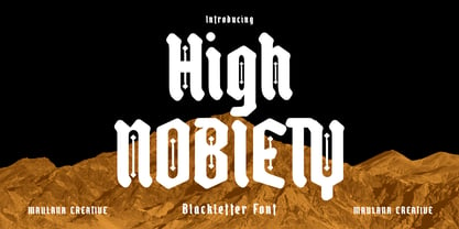 High Nobiety is a modern style of blackletter font. With medium low contrast stroke, fun character with a bit of ligatures and alternates. To give you an extra creative work. High Nobiety font support multilingual more than 100+ language. This font is good for logo design, Social media, Movie Titles, Books Titles, a short text even a long text letter and good for your secondary text font with sans or serif. Make a stunning work with High Nobiety font. Cheers, Maulana Creative
 - Blufcrowds by Maulana Creative,
$16.00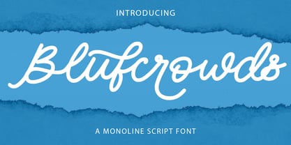 Blufcrowds is a classic style of script font. With regular mono-line stroke, slanted and fun character with a bit of ligatures and lowercase alternatives. To give you an extra creative work. Blufcrowds font support multilingual more than 100+ language. This font is good for logo design, Social media, Movie Titles, Books Titles, a short text even a long text letter and good for your secondary text font with sans or serif. Make a stunning work with Blufcrowds font. Cheers, MaulanaCreative
 - Stagehand JNL by Jeff Levine,
$29.00 Too often, familiarity in type design can fool us into mislabeling similar styles of lettering. The Art Deco years provided many variations of the thick-and-thin alphabet, and we tend to lump all of them together as being "a version of Broadway", as this is the most popular of the genre. However, if one looks closely at each design, they will see variations of line thickness, angles and even individual character design. One such variation is Stagehand JNL, based on a set of wood type and now presented in digital form.
 - Spark Sans by Primitive Spark,
$5.00 Spark a revolution for a better future with Spark Sans. Super clean and geometric, this display typeface is ideal for tech, transportation, electronic music, revolutionary products or other disruptive ideas that move us beyond the present. Spark Sans has a relatively high x-height and squared off curves that give it a distinctive look while still maintaining a minimalist aesthetic. The design originated with custom lettering for the Primitive Spark identity, which became the foundation for the bold style. With 260 glyphs, Spark Sans is a great choice for many languages with Latin characters.
 - Roc Grotesk by Kostic,
$40.00 Roc is a sans serif grotesk inspired by American wood types from the end of the 19th century. With nine weights in five widths, this family contains 45 fonts in total. The character set supports Western and Central European languages, as well as Turkish. Roc Grotesk comes in a range of five widths: Compressed, Condensed, Normal, Wide and ExtraWide, in order to cover a wide scope of applications. Although the styles at both ends of each range are made in their most pronounced form in terms of width and weight, they are not taken to such extremes as to become absurd, and are quite usable in display settings. The Normal width keeps all its nine styles in proportionally similar widths. The Compressed width, however, is deliberately made to be disproportionate, so that every style takes the least possible horizontal space. That is why the contrast between Compressed Thin and Compressed Heavy style is substantial. As the weights progress from Thin to Heavy, the stroke contrast becomes more prominent. It is intentionally exaggerated in heavier weights, which is particularly apparent in the uppercase E and R of the Black and Heavy style. Roc has a large x-height and relatively short descenders and ascenders. No uppercase letter descends below the baseline, so the lines of an all-caps text can be packed tightly on a poster or a headline. The Regular style is somewhat generously spaced, as it is most likely to be used for setting longer passages of text. Its Bold counterpart is spaced in such a way that the width of the text column will be similar to the text set in Regular. Tabular figures in these two styles have exact matching widths, so for example, you could emphasize one row of numbers in a data column without visually disrupting the vertical order of the table. The lowercase g and r have alternatives to accommodate what most designers expect from a typical Grotesk typeface. The single-story g and the cut-off r are accessible via the OpenType feature.
 - Plakato Pro by Underware,
$50.00 Plakato, a stencil love affair Plakato is a family of display fonts, consisting of various eye-catching styles, each of them very bold. Plakato is an identity toolkit, a heavyweight building block in case you need a strong personality, a small stencil font family to cut out your best ideas and grab all the attention. But just as with many other creations, its outcome is as divers as its multiple origins. Plakato comes in 16 eye-catching styles. The default stencil style comes in Regular & Italic. They both have 2 variations: one version, named Plakato Stencil, automatically creates borders around the text, putting any text into a graphic stencil in this way. Another version, the extruded three-dimensional version, guarantees even more attention for your message. Next to this there is also the Inline version, which is an optical play with a lot of lines. Plakato Inline has a supportive background layer, a separate font in case you want to add a background in a different colour. Then there is Plakato Paper, a manually teared version of Plakato offering a more physical look. This small family of eye-catching display fonts also contains a Neon font, an independent design in Plakato style, which can actually be used for making neon signs due to its construction. Plakato Neon comes with its own Dingbat font for that extra flush-flush. Plakato has also been redrawn on a C64, and with all its accompanying limitations been ported back and turned into a font: Plakato Game. Also this font comes with its own Dingbat font, full of emoji’s and icons for oldskool pleasure. Last but not least there is Plakato Build, constructed out of blocks. As if that wasn’t enough, there are various dynamic versions in the Plakato Play package, which offer a whole new range of possibilities for typographic expression, with new animation and interaction opportunities.
 - Artnoova by Popskraft,
$18.00 The Artnoova typeface combines the inimitable mastery of the great styles of the early twentieth century and at the same time looks organic among modern ones. Like the famous Art Deco typeface, Artnoova is designed for a strong yet elegant typography. In addition, a balanced set of capital letters allows you to type large sections of text. All this allows the Artnoova font to be used in almost any area of design, such as corporate identity, typography, posters, web design and other design areas.
 - Linotype Zootype by Linotype,
$29.99Zootype –the first original single font– was designed in 1997 by Victor Garcia of Argentina and as a winner of Linotype's Second International Type Design Contest is included in the TakeType Library. The three additional family styles –Zootype Air, Zootype Land, Zootype Water– were added in 1999. In the words of the designer, the design concept is meant to display the funny, happy joy of animal nature.’ Animal heads peek into the block forms of the letters, giving the font a unique whimsical character. - LFT Iro Sans by TypeTogether,
$49.00 Milan-based Leftloft studio developed LFT Iro Sans, an expansive family that solves the significant, wide-ranging challenges of branding, wayfinding, pictographic language, and complex editorial use. LFT Iro Sans began as the clear and welcoming wayfinding project of San Siro stadium in Milan. Over time many other styles and weights have been added. LFT Iro Sans never finds itself outmatched by the task at hand. The primary aim was to design a technical typeface that was readable in any low visibility condition, for instance in a poorly lit area with awkward wall shapes and overhangs. This worked well for stadium and large lettering use, but other problems also needed to be addressed, such as complementary iconography. A location developer was left mixing — clashing, really — one type family with a different family of icons, resulting in a cobbled-together look which diluted the brand and the experience. They set out to radically simplify and clarify each shape and its meaning, accepting uniqueness as part of the final visual language. LFT Iro Sans pictograms answers the need for having a consistent and large group of icons, perfectly suited to the text typeface. As it concerns public spaces, this didn’t exist before. LFT Iro Sans incorporated a branding project too, so they decided to let LFT Iro Sans go out on a limb and created a unicase style that demands attention. Each unicase letter is a combination of the lowercase and capital form, quite noticeable in the ‘i’, ‘m’, ‘t’, and unique ‘d’ and ‘b’, balanced by more restrained forms of ‘a’, ‘s’, ‘c’, and ‘e’. LFT Iro Sans is not only a technical typeface, but, thanks to letters’ proportions, can also be used for editorial purposes. Assertive and economical in stature, the text weights are clear and assured. And a display version for headlines in Ultralight and Heavy (with italics) was developed for stunning headlines. For enthusiasts of every stripe, LFT Iro Sans can be a brand’s rallying cry with its arresting unicase, be a developer’s go-to pictogram choice, or set the most demanding editorial text in digital or print. With its many OpenType features, simplified pictogram commands (even available in Apple’s Pages and Microsoft Word), and a total of 30 targeted family members, LFT Iro Sans is a brilliant, easy choice. As with the rest of the TypeTogether catalogue, the complete LFT Iro Sans family, designed by Lefloft and developed by Octavio Pardo, has been optimised for today’s varied screen uses.
 - Anago by Positype,
$16.00 Anago shares the same DNA as its sibling Macha, but is a completely different species than the former or any of my other sans serifs (Aaux Next, Air, Akagi Pro or Wasabi). Soft, ample letterforms are casually constructed and the end result produces a typeface that changes color as it varies in size — allowing the type family to work well in both text and display settings as long as attention is given to size. Anago takes a little but gives a lot. The 10-style typeface features a fully-loaded character set that includes: Small Caps, Proportional Lining and Oldstyle Numerals, Tabular Lining and Oldstyle Numerals, Fractions, Ordinals, Inferiors, Superiors, Stylistic Alternates, Ligatures, Case-sensitive, and more.
 - Bailey Rogles by RCKY Studio,
$15.00 Bailey Rogles is a retro signage font, bold and clean. There are so many variations on each character. You can create so many different typographic layouts easily and quickly. Bailey Rogles is very versatile and very interesting. You have lots of options to customize it and that makes it perfect for logos, packages, t-shirts, signage, logos, headlines, branding, packaging, and titles. Bailey Rogles features an alternate character. Includes initial and terminal letters, alternates, ornaments, swashes, ligatures and multiple language support. Thank you for your purchase!
 - Indbydelse by PizzaDude.dk,
$20.00 I would like to invite you to a party, wedding, birthday, event, gameshow, baby shower, housewarming ... ehh, what I mean is: this is an invitation to (almost) anything! As you may have read, “Indbydelse” is danish and means “invitation” - why? Well, because these four fonts have enough power to create an exciting invitation! Use them as single fonts, combine one, two, three or all four - that’s totally up to you! They all got multilingual support as well as contextual alternates with several different versions of each letter!
 - Margo by Jen Wagner Co.,
$17.00 Margo is a playful font duo that includes a signature script and a hand-drawn serif – already matched up and ready to be used together for your next design! You can see how Better Homes and Gardens used Margo throughout their October 2019 issue. FEATURES: Margo Script includes: • 108 ligatures, which will help make your text look even more hand-written • Alternate letters to help avoid duplicating letters in your words • Foreign language accents & characters for the international designer Margo Serif includes: • Alternate letters (the lowercase letters function as alternates of each uppercase letter!) • Foreign language accents & characters
 - Life by Bitstream,
$29.99Designed by Francesco Simoncini and W. Bilz, this design follows Times New Roman in structure, but differs in some details. Unlike Times New Roman, the boldface is a weighted version of the roman. - Arunika Lavanaa by Inumocca,
$15.00 Arunika Lavanaa Feminine Script, inspired from Women ornament with beautiful curly. Bold and Otline style from monoline hand lettering, really Easy to make it your own style typography. Good for your Lettering, Signature, Typography, Magazine, Branding, Poster, wedding invitations, Quotes Lettering, and more your project design. - Unique glyphs - Multilingual Characters - UPPERCASE - Lowercase - Numeric - Symbol - Punctuation Character - Ligature - SS01, SS02, SS03, SS04 inumocca type
 - Afrah by Creativetacos,
$18.00 Afrah Serif Font Family Pack is a beautiful serif font that comes with 5 different weights. It includes all basic glyphs with Non-English characters. It can be used for headlines, posters, branding, packaging, presentations, logo, quotes, titles, magazine headings, web layouts, advertising, invitations, packaging design, books, and nearly any creative design. Included Features: Font Weight: Regular, Thin, Light, Round and Bold Afrah Font Features: Uppercase Letters Lowercase Letters Numbers & Punctuation Non English Characters ( Latin Supplement + Latin Extended A) Supported Characters: ABCDEFGHIJKLMNOPQRSTUVWXYZ abcdefghijklmnopqrstuvwxyz 0123456789 !"#$%&'()*+,-./:;=?[]^_`{|}~¡¢´¿ˆˇˉ˘˙˚‘’“”‰⁄€ ÀȦÁÂÃÄÅÈÉÊËÌÍÎÏÑÒÓÔÕÖØÙÚÛÜĂàáâäåèé êëìíîïñòóôõöøùúûüÿĀāĂ㥹ĆćĈĊċČčĎďĒēĔĕĖė ĘęĚěĜĞğĠġĤĨĩĪīĬĭİıĴĹĽľŁłŃńŇňŌōŎŏŔŘřŚśŜŠš ŤťŨũŪūŬŭŮůŴẀẂẄẼỲŶŸŹźŻżŽž ǫɢɪɴʀʏʙʜʟᴀᴄᴅᴇᴊᴋᴍᴏᴘᴛᴜᴠᴡᴢꜰꜱ
 - Zest by Scholtz Fonts,
$22.00 Zest is an informal brush script drawn with quick, thick brush strokes. While it is based on everyday handwriting, the expansive and easy flow of the script hides the care that has been given to the crafting of each character. In style it harks back to the hey-day of American lettering and calligraphy, yet it has a looseness that is thoroughly modern. Zest comes in three styles: -- Zest-Medium, which is medium-weighted and appropriate to a wide range of applications; -- Zest-Drama, in which the contrast between the the thicker and thinner parts of a brushstroke has been dramatically enhanced; and -- Zest Bezel, in which the brush strokes have been given a contemporary, square-cut appearance. Zest is ideal for invitations to stylish but relaxed events, for advertisements that are intended to create a special ambiance, for posters and for announcements.
 - Ritafurey by Device,
$39.00 Ritafurey is an extended sans in seven weights, with characteristic low bowls on the P and R. Modern, sleek and corporate, but with a dash of character. It has been used on tech logos, summer blockbuster movies and Playstation skateboarding games. This new version reinstates the original Unicase versions of the M and N (available through the Glyph palette or Opentype options), adds extensive international character support, redrawn and respaced glyphs, a new Regular weight for better weight flow distribution, and many other additional glyphs. (Note the the new weights differ slightly from the old of the same name, so may change the appearance of existing files.)