10,000 search results
(0.05 seconds)
- Power Grotesk by Power Type,
$15.00 Power Grotesk is a sans serif typeface with details that give typography that has its own characteristics from the thinnest to the thickest that is slightly widened. The goal is to create a typeface with legibility and good contrast between black and white so that it is suitable for different sizes. The typeface has a special feature that aids in reading and reproducing, trapping the right-sized ink for the text to work. The geometric shapes and structures reflect the inspiration and influence of medieval typography. Power Grotesk moves between the vast historical material that makes up modern typography, combining contemporary details with classic styles.
 - SF Pastel by Sultan Fonts,
$10.00 About Pastel font family: Pastel font is a simplified Arabic digital Ruqah font, which adopts horizontal formatting characters, The font is available in two styles: Pastel Regular and Pastel Bold. The difference between the two fonts: The Pastel regular font has short ends, The Pastel bold has extended and extended characters. Pastel font for desktop applications Pastel is suitable for large display sizes, especially in the area of advertising, while still functioning well as a text face. The font includes a matching Latin design and support for Arabic, Persian, Kurdish and Urdu. Language families: Arabic, Persian, Urdu, Latin, Kurdish Designer: Sultan Maqtari Design date: 2020
 - Proach by Grontype,
$10.00 Poarch is a clean and modern condensed font, the font well designed as a sans serif font with all caps. It has round tip angle and different style as a sans font in common. The font is perfect for any project such as Brochure/Magazine Header, Logo Tagline, Flyer Titles and it also can be a paragraph text font. Features: Uppercase and Lowercase Regular, Light and Italic Version Numeral and Punctuation Ligatures Multilingual Support Modern Look Thankyou for Choosing This font Regards, Grontype
 - Good Night JNL by Jeff Levine,
$29.00 The beautiful hand lettering on the sheet music cover for Will R. Anderson's "Good Night Dear" (circa 1908) features quaint, semi-calligraphic lettering in the Art Nouveau Style. The song itself was popularized by Billie Burke [best remembered as the Good Witch in “The Wizard of Oz”] in the musical comedy "Love Watches".
 - Betina Script by ParaType,
$30.00 The type family was designed at ParaType (ParaGraph) in 1992 by Alexander Tarbeev. Based on the handwriting of the German graphic artist Betina Kuntzsch. For use in advertising and display typography. Additional Latin letters (for the whole family) and Greek letters (for the normal style) were added by Gennady Fridman in 2006-2009.
 - HWT Brylski by Hamilton Wood Type Collection,
$24.95 HWT Brylski is a typeface by Nick Sherman, named for retired wood type cutter Norb Brylski and designed to be cut as wood type at the Hamilton Wood Type & Printing Museum. This font is the digital counterpart to the wood type made as part of the Hamilton Legacy Project . It incorporates several themes that were common in 19th-century type design, including split tuscan serifs with angled mansard-style sides, heavy weight placement at the top and bottom of letters (traditionally referred to as French or Italian/Italienne, regardless of any actual relation to those countries), and an extended overall width. This digital version contains over 400 glyphs for full European language coverage.
 - Lionheart by Canada Type,
$24.95Lionheart is the digitization and expansion of Saladin, a neo-gothic typeface designed by Friedrich Poppl, long after he established himself as one of the greatest German designers of all time with some of the most “ausgezeichnet” scripts and text faces to ever come out of Europe. This typeface, though lesser-known among Poppl’s other masterpieces, was one of the first in its genre to abandon blackletter influence and attempt letter variations based strictly on Roman alphabet shapes. Poppl’s idea spawned a whole generation of neo-gothics that can now be found on many a movie poster or book cover where the design must hint at secrets and dark sides. Lionheart succeeds with the idea of gradual curves leading to sharp concave or plano-concave terminals, to effectively build serious letter forms that speak of historical mystique and mystery. This font was was named after Richard I, King of England for a decade in the late 11th century. He reportedly exchanged many gifts of respect with Saladin, even though the two kings were on different sides of the Crusades. Lionheart comes in all popular font formats, with some alternates placed in accessible cells of the character set. - LHF Centennial Panels 1 by Letterhead Fonts,
$46.00 One of four fonts consisting of the best old fashioned panels from Golden Era Studios. Each font contains 36 expertly drawn panels. Each letter generates a different design. Special Note: Due to the large file size of these fonts, they will not convert for use in Gerber Omega. Instead, Omega users may wish to use an alternate program to type the characters and import them into Omega as .eps files. CorelDraw users should use the "Weld" command rather than "Convert to Curves" command to convert these fonts to vector outlines. Otherwise, the program may crash due to the sheer number of points in each panel.
 - Boberia by Linotype,
$29.99Linotype Boberia is part of the Take Type Library, which features winners of Linotype’s International Digital Type Design Contest. Designed by Bo Berndal, its historical roots lie in the neoclassicism of the turn of the 20th century. The slender letters with a large x-height and marked stroke contrast give the font an elegant character. The nostalgic, flowing forms are typical of Art Deco fonts and allow designers a number of possibilities for the font’s use. Boberia includes regular, italic and bold type styles. - Boule Plus by Ingo,
$33.00 CAPITALIZED, geometric, bold and round. If the typographer sees a font like that, it's enough to make his toes curl. But sometimes it just has to be that way. Geometrically constructed fonts do not necessarily have to be pointed and angular; It also works consistently around. And if I say it consistently, then in this case, that's done consistently. The basis for the BOULE is the circle. The letters are drawn with constant line width, the “corners“ and endings all have the same radius, the lines are all the same thickness. The BOULE consists only of capitals. There is only one difference in the use of uppercase and lowercase letters: in the uppercase letters, the round letters are circular, while the lowercase letters are narrow. The character set of the Boule contains all letters and accents to support the Western, Northern, Central and Eastern European languages with Latin alphabet. The BOULE is not only very fat, it also runs very tight; that is, the glyphs are very close to each other. To avoid "holes" due to unfortunate letter combinations, the BOULE contains ligatures for FT, ST, TT and TZ. There are also other versions of the font: BOULE Brillant on the one hand. In this version, simple highlights simulate a light incidence from the top right. These light edges give the font a decorative effect that makes it easy to think of wet sausages or balloons in some shapes. And finally the BOULE Contour. As the name implies, it is the outer contour of the letters, combined with a shadow at the bottom left. The name BOULE (French for ball) says it already: this font is globated. Therefore, it is also very suitable for all three-dimensional alienation effects. With simple light and shadow you can achieve a very convincing 3D effect with little effort.
 - Brithany by Josstype,
$12.00 Brithany Script is Hand Lettered Calligraphy Font with beautiful waves and natural flow. has a unique letter style, with natural handdrawn, and has a softer and smoother character subtly connect all the characters. They have a simple elegant swashes in separate letters, you can use graphic design software to access the alternate letter. Brithany Script 427+ glyphs . including initial and terminal letters, alternates, swashes, ligatures and multiple language support. o enable the OpenType Stylistic alternates, you need a program that supports OpenType features such as Adobe Illustrator CS, Adobe Indesign & CorelDraw X6-X7, Microsoft Word 2010 or later versions. There are additional ways to access alternates/swashes, using Character Map (Windows), Nexus Font (Windows), Font Book (Mac) or a software program such as PopChar (for Windows and Mac). How to access all alternative characters: http://youtu.be/iptSFA7feQ0nn http://cuttingforbusiness.com/2016/01/28/how-to-use-opentype-fonts-in-silhouette-studio-or-cricut- design-space/ https://www.youtube.com/watch?v=Go9vacoYmBw Thank you for your purchase! and please let me know if you have any questions. via email: joelpopon@gmail.com
 - Poem Script Pro by Sudtipos,
$79.00 Poem Script is a mixed collection of interpretations conjuring a late nineteenth century American pen script style. Though not an actual Italian letterform, this style was called “Italian Alphabet” stemming from an old penman’s term for an alphabet where the stress or shades are opposite their normal placement. The American variant followed from the late eighteenth century British hand also confusingly called “Italian Hand,” which itself evolved from some seventeenth century French batarde scripts. It showcases the phenomenal control and mastery of hand skills required to create such ornamental and lively letters centuries ago. Producing the shaded strokes in reversed positions such as this required holding the pen in a position horizontal to the baseline, or the letterforms would have to be written backwards or by rotating the paper at peculiar and extreme angles to achieve the effect. Exotic, elaborate and very attractive, Poem Script contains plenty of variations on each letter and comes with hundreds of calligraphic ornaments. Poem Script received a Certificate of Excellence at the Type Directors Club NY and was selected at the Bienal Tipos Latinos 2012.
 - Algarabia Display by Macizo.com.mx,
$55.00 Algarabía Display was created for titles or to highlight a particular text. It includes a set of accented capitals and accented lowercases, almost one hundred ligatures, entry and exit capitals, symbols, punctuation and numerals, and almost 50 different kinds of dingbats. It is a typeface to have fun.
 - Fezola by IbraCreative,
$17.00 Fezola, a handwritten signature typeface, epitomizes the essence of personalized elegance. With its fluid strokes and graceful curves, Fezola captures the artistry of a handcrafted signature, infusing a sense of individuality into every letter. The seamless connectivity between characters emulates the natural flow of a pen, creating a signature style that feels authentic and unique. Whether used for branding, invitations, or personal correspondence, Fezola adds a touch of sophistication and warmth, transforming words into a visual representation of personal expression. This typeface transcends conventional fonts, embodying the charm and character of a handwritten signature to impart a distinctive and memorable quality to any project it graces.
 - Sacremende by Lauren Ashpole,
$15.00 Welcome to Sacremende, a chunky, slightly messy display font. As the name implies, this font was inspired by the retro California aesthetic and, in particular, old surf rock posters. To highlight the vintage feel, the font package comes with a distressed option for a well-worn effect. This font is all caps but includes unique styles for upper and lowercase letters. Both versions are available as webfonts but for better performance, I would recommend using the regular option for the web.
 - Sympathetic by Bülent Yüksel,
$19.00 “Sympathetic Font” multi-purpose use is an open designed font. It is possible to produce unlimited designs using this font. “Sympathetic Font” is made up of 24 different forms. Hearts, square, triangle, circles, moon and stars, horizontal and vertical lines, sloping inner lines and wavy lines. Shading and decorations are also available. Ideally suited for advertising and packaging, logo, branding, slogans and creative industries, poster and billboards as well as web and screen design. You can create unique designs using fonts in layers. TECHNICAL: Sympathetic provides advanced typographical support for Latin-based languages. An extended character set, supporting Central, Western and Eastern European languages, rounds up the family. “Sympathetic” has 24 different forms and italics total 48 types. The family contains a set of 321 characters. Stylistic Alternates, Localized Forms and Old Style Figures just one touch easy In all graphic programs. Sympathetic is the perfect font for web use. You can enjoy using it.
 - Antique Six by Wooden Type Fonts,
$15.00 A revival of one of the popular English Antique styles of the 19th century. The slab serif style was also used by American wood type manufacturers.
 - Desert Sands JNL by Jeff Levine,
$29.00 The February 19, 1923 issue of The Film Daily contained an ad for Mack Sennett's new Ben Turpin comedy entitled "The Shriek of Araby". No doubt this was a spoof of the popular Rudolph Valentino film "The Sheik". The ad tries to emulate Mideastern or Arabic typography via a standard Western alphabet. It somewhat captures the flavor, but its free-form hand lettering comes off as more of a novelty-type style. This is now available digitally as Desert Sands JNL in both regular and oblique versions.
 - Kwersity by Ingrimayne Type,
$12.95 Kwersity is a boxy, geometric, slab-serifed typeface with strokes of uniform weight. Its circular elements are almost rectangular. The narrower style has a high x-height. Both the narrower and wider variants come in three weights, regular, semi-bold, and bold. (In its original, pre-2020 form, what is now semi-bold was bold. What is now bold is new as of 2020.) There is also a shadow version; Kwersity-semibold can be layered on top of it to color the interior of the letters.
 - Devinyl by Nootype,
$35.00 Devinyl is a monolinear typeface family which mixes different styles. The typeface is entirely composed in capital. The uppercase is inspired by old grotesk from late 19th and the lowercase is a humanist-sans. This is a monoline typeface and the variety of style make it perfect for magazine and poster design. Download the PDF here. Devinyl comprises a family of 8 styles, from the art-deco inspired ‘line’ to the ‘stencil’, often used in street art. All the fonts share the same base. Devinyl family supports Latin and Cyrillic, all these languages are covered: Latin language support: Afrikaans, Albanian, Asturian, Azeri, Basque, Bosnian, Breton, Bulgarian, Catalan, Cornish, Corsican, Croatian, Czech, Danish, Dutch, English, Esperanto, Estonian, Faroese, Filipino, Finnish, Flemish, French, Frisian, Friulian, Gaelic, Galician, German, Greenlandic, Hungarian, Icelandic, Indonesian, Irish, Italian, Kurdish, Latin, Latvian, Lithuanian, Luxembourgish, Malagasy, Malay, Maltese, Maori, Moldavian, Norwegian, Occitan, Polish, Portuguese, Provençal, Romanian, Romansch, Saami, Samoan, Scots, Scottish, Serbian, Slovak, Slovenian, Spanish, Swahili, Swedish, Tagalog, Turkish, Walloon, Welsh, Wolof Cyrillic language support: Adyghe, Avar, Belarusian, Bulgarian, Buryat, Chechen, Erzya, Ingush, Kabardian, Kalmyk, Karachay-Balkar, Karakalpak, Kazakh, Komi, Kyrgyz, Lak, Macedonian, Moldovan, Mongol, Permyak, Russian, Rusyn, Serbian, Tatar, Tofa, Tuvan, Ukrainian, Uzbek
 - Santoro Script by Jukebox Collection,
$36.99 Santoro Script is a fun, happy script font created in the style of handpainted sign lettering. The first brand-new font added to the Jukebox library since 2011, it displays a jubilant attitude which will add a spontaneous, warm and friendly look to any design. The typeface contains three versions of every letter found under the Swash and Stylistic Alternates OpenType features as well as a few additional letter versions and ligatures under the Titling and Discretionary Ligatures OpenType features. These extra alternates help give the font a hand painted feeling. Jukebox fonts are available in OpenType format and download packages contain both .otf and .ttf versions of the font. They are compatible on both Mac and Windows. All fonts contain basic OpenType features as well as support for Latin-based and most Eastern European languages.
 - Shandy BF by Bomparte's Fonts,
$40.00 Shandy is a cheerful, free-spirited font that dances jauntily along an undulating baseline. Like Gene Kelly merrily cavorting through that rain-soaked street, in the famous dance scene from Singin’ in the Rain. Curiously, it’s got the liveliness of a bouncy brush script, with some elements of a robust Copperplate-style script, that appear to have been defined by a funhouse carnival mirror. In order to promote variety, no two letters are identical within most occurrences of typical lowercase double-letter pairings (bb, dd, ee, ll, nn, oo, tt, etc.) To enhance your typography, Shandy features many automatic OpenType ligatures, beginning and terminal lowercase forms and Stylistic Alternates for letters E, M and N which are accessible in OpenType-capable applications. Suitable for Branding, Logos, Product Packaging, T-shirts, Magazine headlines, Fashion Glossies, and Food Advertising to name a few arenas.
 - Picture Show JNL by Jeff Levine,
$29.00 An ad promoting the 1919 silent film comedy “Back Stage” starring Roscoe “Fatty” Arbuckle was hand lettered in a thick-and-thin sans style with Art Nouveau influences. This lettering is now available digitally as Picture Show JNL, in both regular and oblique versions.
 - Ottocento by Eurotypo,
$39.00 Ottocento is an elegant chancery cursive, derived from XIXth century Italian calligraphy. Slightly inclined and with a fast and marked ductus, this font is well balanced between thick and thin strokes and shows marked ascendings and descendings. Ottocento is rich in stylistic variations with its elaborated upper cases, and stylistically different in traits and different ligatures are considered to make the most of the many OpenType features.
 - Kareny by Craft Supply Co,
$20.00 Introducing Kareny – Brush Script Font A Vibrant Beginning Firstly, let’s dive into the world of Kareny – a delightful brush script font. Bursting with charm, Kareny initiates a journey where each letter dances with playful creativity. Right from the start, its enchanting style captivates the eye, setting a tone of warmth and friendliness. Effortlessly Versatile Moving forward, Kareny’s versatility becomes unmistakably evident. Seamlessly transitioning from one application to another, it proves to be the ideal companion for a multitude of display needs. Consequently, it crafts a space where readability coexists with a distinctive visual appeal.
 - Jantar Sharp by CAST,
$45.00 Jantar Sharp is a text family with flared terminals that eludes the categories of serif or sans. Its most recognisable features are taken from both styles to achieve proper design and high legibility standards. Jantar Sharp performs especially well when used for continuous reading including texts on web platforms. Its personality lies in the flared stroke endings and certain details which make its shapes neither sans nor serifs. Rather than following any particular historical model, it picks up elements from various periods to achieve an organically dynamic look which is entirely compatible with the reading process. Jantar Sharp Italic makes a nice contrast, though the pace and proportions are not drastically different from the upright. This allows for effortless reading of longer passages of italicised text. Jantar Sharp – as well as its teammate Jantar Flow – has been designed in seven weights from ExtraLight to Heavy, all with accompanying italics; it has a tabular and proportional set of figures in both old style and lining options are included together with a special set of hybrid figures sitting between x-height and capitals. Superscripts and subscripts are provided together with a vast collection of diacritics covering all European language and a set of case-sensitive characters.
 - Thrillington by Rochart,
$15.00 Thrillington is font duo with modern vintage look design styles, available on script and Display Sans serif typeface. These two lovely fonts would be perfect to combine in your design. Brand new stylish textured fonts and Make it easy for made logotype hand lettering Style. It will be great for Logotypes, Posters, Digital Lettering Arts, Clean Design, Branding Design, Sign, Merchandise and Social Media Posts. This font contain of Uppercase, Lowercase, Number, Symbol, Punctuation, also support multilingual and already PUA encoded.
 - Port Vintage by Onrepeat,
$25.00 Guided tour available here. Port Vintage is a new typeface expanded upon the original Port typeface, released in 2013, and being an experimental Didone typeface with a modern twist, inspired by the well known forms of typography masters such as Bodoni and Didot and the exuberance and elegance of calligraphy typefaces. A lot of changes were made, the whole typeface is now softer and has less rough edges, the time it took to mature made it possible to achieve an entirelly new and distinct flavour from the original Port, giving away the rough edges from Port and giving place to the soft transitions and curved connections between the stems and serifs of Port Vintage. Port Vintage melts the straight lines and strong contrasts of the Didone typefaces with the elegant lines of calligraphy in a geometric way, resulting in exuberant characters with geometric swashes that can be combined in countless ways. The result of this experiment is Port Vintage, an unique and rich display typeface meant to be used on big sizes and it’s main perk is the amount of alternative characters it features. Port Vintage is Open-Type programmed and includes hundreds of alternates, from swashes to titling alternates, ligatures and stylistic sets with each character having a thin version of itself, giving complete freedom to all your creative needs. Port Vintage is available in 10 different styles: Port Vintage Regular, being the base version and featuring the whole base character set; Port Vintage Regular Decorated, featuring richer forms and containing more ornamentated and more extravagant characters; Port Vintage Medium and Port Vintage Medium Decorated, designed for the occasions you need a bit more thickness and the decoration variants: Port Vintage Ornaments, containing a wide set of elements meant for the creation of fillets, vignettes and fleurons, resulting in an almost infinite number of possible combinations to embellish your designs and Port Vintage Words, a set of some of the most common words used in English, Spanish, French, German, Italian and Portuguese. All styles, except Port Vintage Ornaments and Port Vintage Words, include italic styles. For a better understanding of all the uses of Port Vintage and the full character list the reading of the manual is recommended.
 - Winslow Title by Kimmy Design,
$25.00 Winslow Title is a high contrast modern type family comes in two styles and a monolinear script family. The traditional proportions of Winslow Title are historical in nature and follow the design and style of Winslow Book as a high contrast variant. The Winslow Title Mod family is a contemporary take on the style, with tapering terminals and less pronounced finials. Each family includes both styles, to be accessed through the opentype panel as a stylistic alternate. If preferable, you can purchase the entire family collection to have easier access to both styles, but it's not necessary. The typeface family comprises of roman and italic styles in six weights from Thin to Black and two widths in the roman style: Regular and Narrow. The accompanying script family has a single weight but offers five tracking widths, from Narrow to Wide. The bundle is an elegant combination of styles perfect for titling and display design. The serif typeface is packed with features that make ideal titling styles. Not only do they include the Stylistic Alternates, but also Titling Alternates, Discretionary Ligatures, Small Capitals, Swashes and Contextual Ligatures. As noted previously, the typeface comes in two styles, Traditional and Modern. Each can be accessed either by the Stylistic Alternates or Stylistic Sets. Titling Alternates are alternates that expand the ball terminals to K, R, V, W, and Y (see Titling Alternates slide). Contextual Ligatures are for capital combinations with A that tighten the gap created by the extended serifs. It connects characters with a pairing serif (the lower right serif of the M with the lower right serif of the A) and bridges them together. This combination works for single and multiple A combinations. It is turned on automatically in the Opentype panel and shouldn’t need to be accessed individually. Alternatively, the Discretionary Ligatures feature combines diagonal or baseline stems with lifted small capitals, creating a unique combination of characters. Swashes is an extensive feature that offers up to five swash options per many of each character. These can be selected via the Glyphs panel or as character alternates in Adobe programs. The Script family has a feature set of it’s own, with initial and final swashes on lowercase letters, middle swashes for select characters, and a titling feature that joins words together by replacing the space with a line. Stylistic alternates create a bouncing baseline on connecting strokes. *Note: there is no great need to purchase both families as all styles can be accessed via Opentype features, but if customers prefer to purchase both styles, it can be done by selecting the Complete Typeface Family collection.
 - Cyceon Pro by DBSV,
$90.00 Fluted pillars… As for the name of "Cyceon", it is a "juice-drink" that they made in ancient Greece...! In this font the straight lines are not vertical but inclined like something from the Doric columns!!! There are two versions of letters. In the first version, it is of a normal character, while in the second version I have mixed some capitals with lower case letters. I have given them the acronym Msc "miscellaneous". I tried in this way to give another version of the small capitals and I think they show a different view from the purely small capitals… And in this family, the “Strap”/“Strap Msc”/“StrapIt”/ and “Strap MscIt” with “Solid”/“Solid Msc”/“SolidIt”/ and “Solid MscIt” engage in the same way like… “Layered font families” as the previous series. This series is composed and includes twenty-four fonts with 642-658 glyphs each, with true italics and supports Latin, Greek and Cyrillic.
 - Simply Harmony by Pen Culture,
$14.00 Proudly present "Simply Harmony -Vintage Monoline Font" Simply Harmony comes with 2 styles that have their own characteristics. Simply Harmony Regular : has a clean and elegant style. This font has a more modern feel, so you can apply it to modern-themed projects. Simply Harmony stamp: this font has a rough style both in the middle and the edges of each letter, this font has a vintage feel and can be applied to various needs. This font has 114 awesome alternates and has 311 total glyphs, there are various kinds of alternates that you can use as you wish. I really hope you enjoy it – please do let me know what you think, comments & likes are always hugely welcomed and appreciated. More importantly, please don’t hesitate to drop me a message if you have any issues or queries. Thank you
 - Talonica by Nantia.co,
$24.00 Greek Signature Font Talonica The Greek Signature Font Talonica is a signature decorative font with which you can achieve a hand-lettering style. Talonica is a multilingual lettering font with Greek (of course), Latin characters, and diacritics. Supports all European languages. This signature style is perfect if you want to achieve a modern-looking graphic design project. In addition, this font has a really nice flow so you can also use it in a larger body of text. It can also be used on social media content, for branding or packaging applications. Also, this is the ideal typeface for organic product wine branding and packaging. You can use it to create logotypes with character and natural flow. Additionally, you can use its romantic vibes for wedding invitation designs. Especially if you are looking for a handwritten font for Instagram quote posts or any other social media content, this signature typeface is for you!
 - Hiany Lau by Attype Studio,
$14.00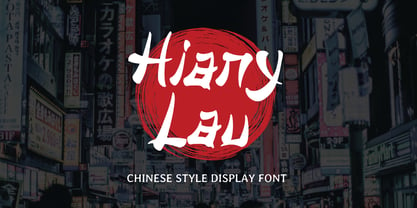 Hiany Lau is Font that inspired by chinese letter style, perfect for any Asian theme of design & promotion to create spectacular designs! Hiany Lau is perfect for branding, logo, invitation, stationery, social media post, product packaging, merchandise, blog design, game titles, cute style design, Book/Cover Title and more. Hope you enjoy with our font! Attype Studio
 - Ankormati by Taznix Creative,
$17.00 Ankormati Is a font with a touch of classic Victorian era style with bold letters wrapped in small ornaments that add to the feel of the Victorian era, but here it makes the look of this font with a colorful retro feel, not really like the old Victorian era design. But this can be tailored to the desires of your design needs, This font fits perfectly with the retro vintage style which will add classic value to your designs. What's Included : Standard glyphs Ligature Works on PC & Mac Simple installations Accessible in the Adobe Illustrator, Adobe Photoshop, Adobe InDesign, even work on Microsoft Word. PUA Encoded Characters - Fully accessible without additional design software. Fonts include multilingual support for; ä ö ü Ä Ö Ü ß ¿ ¡ Hope you enjoy with our font! Taznix
 - Richard Starkings by Comicraft,
$39.00 A NEW HOPE! You begged with us..! You pleaded with us..! But we decided to release the official Richard Starkings font anyway! Huh? WHAT? You heard that line before? Where? Hmm... on this very site...? Well, yes, the Hedge Backwards font is all fine and dandy and does resemble the lettering legerdemain of comic book lettering robot, Richard Starkings... but has it been tweaked over the years to better suit the writing stylings of ELEPHANTMEN creator and writer, Richard Starkings? Has it been refurbished and digitally remastered by ELEPHANTMEN designer and Comicraft Secret Weapon, John JG Roshell? Hmm? No? Well then... here it is, retooled, reimagined and reStarkingsed...ah, what the hell, we started from scratch! This ain't no Greedo Shoots First -- you won't have to keep your pasty '70s VHS recordings of previous Richard Starkings Fonts inside a concrete bunker. Because any other font that claimed to be the official Richard Starkings font would have been called The Official Richard Starkings Font, would it not?
 - Diamond Lady by Redy Studio,
$19.00 Diamond Lady is so gorgeous, she’ll steal your heart with her hand-lettering and handwritten font shapes, The idea of this font was to create as realistic as the possible texture of hand lettering and keep the style of Signature. Diamond Lady is a handwriting font with delicate curves and a unique blend of thick and thin lines. This font offers all the sophistication and beauty you could ask for in one package. It will help you to create an authentic modern signature or a stylish handwritten effect for your logotype and headlines. The font contains 94 ligatures, so it would be perfect for logos and branding with handwriting/sig logos look. She’s got all the real hand-lettered shine, loveliness, and romance attached to the art of hand lettering. Don’t hesitate, just get it! Diamond Lady features: A full set of upper & lowercase characters Numbers & punctuation 94 Gorgeous ligatures Multilingual symbols PUA Encoded Characters – Fully accessible without additional design software. Feel free to give me a message if you have a problem or question. Thank you so much for taking the time to look at one of our products.
 - Kaleko 105 by Talbot Type,
$19.50 Kaleko 105 is inspired by the classic, geometric sans-serifs such as Gill Sans, but has shallower ascenders and descenders for a more compact look. It’s a well-balanced, versatile, modern sans, highly legible as a text font and with a clean, elegant look as a display font at larger sizes. It includes old style non-aligning (lower case) numbers, both proportional and tabular as well as accented characters for Central European languages. The Kaleko 105 family comprises of six weights, and is closely related to Kaleko 205. The most notable differences between the two variations, are the single-storey lower case a and g in Kaleko 105, where they are two-storey in Kaleko 205.
 - Kaleko 205 by Talbot Type,
$19.50 Kaleko 205 is inspired by the classic, geometric sans-serifs such as Gill Sans, but has shallower ascenders and descenders for a more compact look. It’s a well-balanced, versatile, modern sans, highly legible as a text font and with a clean, elegant look as a display font at larger sizes. It includes old style non-aligning (lower case) numbers, both proportional and tabular as well as accented characters for Central European languages. The Kaleko 205 family comprises of six weights, and is closely related to Kaleko 105. The most notable differences between the two variations, are the two-storey lower case a and g in Kaleko 205, where they are single-storey in Kaleko 105.
 - Kamerik 105 by Talbot Type,
$19.50 Kamerik 105 is inspired by the classic, geometric sans-serifs such as Futura and Avant Garde, but has shallower ascenders and descenders for a more compact look. It's a versatile, modern sans, highly legible as a text font and with a clean, elegant look as a display font at larger sizes. It includes old style non-aligning (lower case) numbers, both proportional and tabular and accented characters for Central European languages. The Kamerik 105 family comprises of six weights, and is closely related to Kamerik 205. The most notable differences between the two variations, are the single-storey lower case a and g in Kamerik 105, where they are two-storey in Kamerik 205.
 - Links by HouseOfBurvo,
$36.00 Links was built adhering to a strict grid of 'linked' squares; and comes with special "Grid Glyphs" that line up perfectly with all characters. These Grid Glyphs can be used to create an invisible grid for your layout or as a background to enhance your design. Perfect for posters, logos and headlines, this font is available in four styles; Round and Square with accompanying obliques. This font was inspired by much of the lettering from the Dutch movement, or Functionalism which in turn was a descendant of the International Style pioneered by the Swiss. In keeping with these traditions, Links was build adhering to a strict grid of linked squares, taking a clear scientific approach to construct each character. One of the main features of International Style is the implementation of a Grid. This font has built in special characters that I call 'Grid Glyphs'; these Grid Glyphs line up perfectly with every character, enabling you to construct your own grid that echoes the form of the characters. These glyphs can also be used to create a background for your layout, as can be seen in the gallery pictures.