10,000 search results
(0.074 seconds)
- Ottanio Pack by Fontscafe,
$39.00 As the most classic and traditional style pack of the Fonts Café, the Ottanio family take a place of honor in the list of the Fonts Café handmade Vintage style fonts. Clearly born for being noticed, the boldness and the almost imperceptible, but present to the eyes of subconscious mind, irregularities of the Ottanio Family has been well balanced to create a set of handmade Serif fonts that can be used as “jack of all trades” where traditions, origins and a touch of Vintage style are required. From the integrity of the Ottanio Regular, the stronger style of the Shaded version and the scraped look of the Stamp option, the whole Ottanio Pack will be the perpetual solution always useful to have on hand!
 - Educator JNL by Jeff Levine,
$29.00Educator JNL joins the large library of Jeff Levine's stencil fonts and was re-drawn from a set of individual letter stencils with the distinctive look of Franklin Gothic. All of the irregularities of the original die-cut letter forms were left intact, giving a "real world" look to the font. - Quarter Braille by Echopraxium,
$20.00 Presentation QuarterBraille (Abbreviated as "QB" thereafter) is a decorative, steganographic and lattice font. Its core design concept is that Braille dots are represented as "quarters of a square"[1]. This is illustrated by posters 1 and 2 (NB: these glyph parts will be called "QB dots" thereafter). The other glyph parts (see poster 3) are purely decorative and meaningless in terms of Braille dots encoding[2]. All glyph parts are meant to generate a wide variety of patterns from horizontal and vertical combinations of glyphs. There is also a graphic convention to differentiate uppercase from lowercase letters with the presence or absence of shape subparts (in the "endings", "quarter of a circle with a ring" and "quarter of a diamond with a small square in the middle") like shown by poster 4. This font is suitable for very short texts (e.g. logos, acronyms, quotes, ambigrams, pangrams, palindromes, etc...) but on the other hand it may be used for steganographic purpose like geocaching as well as fictive alphabets (e.g. Alien/SciFi/Fantasy/Antique civilizations). Posters 1. Font Logo: the displayed text is " Quarter " followed by " Braille". There's a rainbow layer above the text to highlight the "QB dots", this is achieved by A..Z glyphs with "only QB dots" (codes 230..255) 2. Anatomy of a Glyph (L) and "QB Dots" (quarters of a square) 3. Glyphs Parts: Square and Cross (Inverted square), Circle and Inverted Circle (with or without the small circle in the middle), Diamond (with or without the small square in the middle), Inverted Square and Circle, Shape combos, Ending 4. Uppercase vs Lowercase (tiny shape subparts are shown in red) 5. Sample 1: Bathroom sink with QB tiles on the credence 6. Sample 2: Hands knuckle tatoos: "LOVE/HATE"[4] 7. Sample 3: Poker Hand: pocket Aces. It's an Ace of Hearts (Ah) on the left and an Ace of Spades (As) on the right. Like in regular cards, the card value (e.g. Ah) is displayed twice: at the top and rotated by 180 degrees at the bottom. This poster also illustrates that QB could be used to print embossed playing cards with tactile and visual display of card values. 8. Sample 4: Pangram: "Adept quick jog over frozen blue whisky mix" 9. Sample 5: Latin Magic Square: "SATOR AREPO TENET OPERA ROTAS" (NB: for compensation of the 2/3 glyph ratio, letters on each line are separated by a space: "S A T O R", ...). 10. Sample 6: Quote of Mahatma Gandhi: "Learn as if you will live forever, live like you will die tomorrow.". This is also a demonstration of border glyphs combinations. 11. Sample 7: Steganography use case: the text is a sequence of 64 aminoacids (1 Letter notation), this protein was described in a research paper "The complete Aminoacid sequence of an amyloid fibril protein AA of unusual size (64 residues) 1975". 12. Sample 8: Border Glyphs with the provided styles and mixed styles. The words are the same than in poster 9 ("SATOR AREPO TENET OPERA ROTAS"). Despite the 2/3 glyph ratio, the "TENET cross" was achieved by both inserting spaces in horizontally ("T ENE T") and by using the "thin borders glyphs". Notes a. Border glyphs[3] are meant to enhance the esthetics of text samples displayed with QB b. Special characters (e.g. *$()[].,;:&@# ...) are provided and follow the NABCC (North American Braille Computer Code) convention. c. A..Z Glyphs with only the "QB dots" are provided as demonstrated by posters 1 and 2 (A/N: this was very useful to create them). d. Glyph Map: 32..64: Special characters - 161..187: "Thin variant" of Border glyphs, 192..229: Border glyphs, 230..255: A..Z with only the "QB dots" - Codes 176 an 181 are "regular SPACE" (empty glyph). Footnotes 1. There is indeed two shapes which represent the braille dot: the "quarter of a square" and the "quarter of a cross". It's because a cross may be considered as an "inverted square" because the square corners are merged in the center. 2. That's why the SPACE glyph is only made of decorative/meaningless glyph parts (i.e. no "QB dots"). 3. For other fonts with border glyphs, please take a look at my other "decorative Braille fonts" (GoBraille, HexBraille, KernigBraille, StackBraille, MaBraille, DiamondBraille, LorraineBraille). 4. LOVE/HATE knuckle tatoos are inspired by the anthology scene from "The Night of the Hunter" movie (Charles Laughton 1955), it also appearead in "Do The Right Thing" movie (Spike Lee 1989). Disclaimer This font is not appropriate and not meant to print text documents in Braille for the blind readers audience.
 - Arabetics Symphony by Arabetics,
$59.00 Arabetics Symphony is a Sans Serif Latin typeface with a comprehensive support for the Arabetic scripts, including Quranic texts. It is designed with a uniform glyph thickness and weight throughout, using a combination of simplified and clear open lines and curves and plenty of spikes and visual hints to compensate for the missing Latin serifs or traditional cursive Arabic calligraphic influence. This type family is suitable for both text and display applications. Additional Latin spacing is added to match an overall open-looking Arabic and is further maintained by a careful implementation of a typical Latin font kerning process. The design of this font family, including metrics and dimensions, was intended to make its Latin harmonize with other Arabetics foundry fonts. Arabetics Symphony fully supports MS 1252 Western and 1256 Arabic code pages, in addition to all the transliteration characters required by the ALA-LC Romanization tables. Users can either select an accented character directly or form it by keying the desired combining diacritic mark following an unaccented character. For Arabic, it fully supports Unicode 6.1, and the latest Arabic Supplement and Extended-A Unicode blocks. The Arabic design of this font family follows the Mutamathil Taqlidi design style with connected glyphs, emphasizing vertical strokes to bring added harmony, and utilizing slightly varying x-heights to match that found in Latin. The Mutamathil Taqlidi type style uses one glyph for every basic Arabic Unicode character or letter, as defined by the Unicode Standards, and one additional final form glyph, for each freely-connecting letter of the Arabic cursive text. Arabetics Symphony includes the required Lam-Alif ligatures in addition to all vowel diacritic ligatures. Soft-vowel diacritic marks (harakat) are selectively positioned with most of them appearing on similar high and low levels—top left corner—, to clearly distinguish them from the letters. Tatweel is a zero-width glyph. Keying the “tatweel” key (shft-j) before Alif-Lam-Lam-Ha will display the Allah ligature. Arabetics Symphony includes both Arabic and Arabic-Indic numerals, in addition to generous number of punctuation and mathematical symbols. Available in both OpenType and TrueType formats, it includes two weights, regular and bold, each has normal, Italic, and left-slanted styles.
 - Compiler by Identity Letters,
$39.00 Legible, technical, clear—with a hint of retro: Compiler is a no-frills font family straight from the heart of a microprocessor. Inspired by console typefaces, the humanist sans serif typeface combines a large x-height with striking serifs on certain letters such as i and l. Those serifs evoke the aesthetics of monospace typefaces for programming. Even though Compiler is a proportional typeface, this detail improves glyph recognition and helps differentiate between individual letters. Combined with vertical stroke ends, which allow for particularly even spacing, the serifs make for an extremely legible typeface. (Even in small sizes.) Brand recognition guaranteed: Compiler is ideal for applications that require a mechanical flavor without appearing offish. You can use it for websites, apps, branding, corporate design, annual reports, signage, and many other areas with perfect results. Compiler consists of two font families; the second one is Compiler Plain. In Compiler Plain, the signature letters lose their serifs and the forms of "a" and "g" are simplified. This way, the shapes are neutralized. The technical impression recedes into the background. Both families can be combined smoothly: you might use the standard Compiler fonts for display sizes and Compiler Plain styles for body copy. For total design control, you can toggle each of the defining design elements individually from Compiler to Compiler Plain and vice versa. Just use Stylistic Sets to fine-tune your Compiler fonts. Compiler provides you with 8 weights in 4 variations: Upright, Italics, Plain Upright and Plain Italics. That's a total of 32 fonts. Each style contains more than 860 glyphs, including advanced typographic tools such as proportional and tabular figures (both lining and old-style) or small caps—something you'll rarely find in this genre. Other glyphs are optimized for display sizes, such as circled figures and various arrows. There's also a set of glyphs designed for web use: with symbols for shopping carts, hamburger menus or checkboxes, you can implement your web projects elegantly and consistently without relying on third-party tools (like an external icon font). Powered by highly productive OpenType functions, Compiler is an intermedia workhorse straight from cyberspace.
 - 1863 Gettysburg by GLC,
$38.00 This script font was inspired by a lot of autographs, notes and drafts, written by President Abraham Lincoln, mainly the Gettysburg address, first draft and copies, but also the emancipation proclamation. It is an attempt to offer a typical manual script from this American period, not to propose the exact writing from A. Lincoln himself. This font is a little fat and monotone, maybe Abraham Lincoln used a smooth or rounded pen, but some letters I have consulted were written obviously with a sharp one, so, in the future, I will certainly produce a slim version of this font. It is used as variously as web-site titles, posters and fliers design or greeting cards, all various sorts of presentations, menus, certificates, letters. This font supports enlargement as well as small size, though the original size was about 18 to 24 pts. When printed, it remain perfectly legible from 10 to 12 pts.
 - Heinemann by Heinemann Collection,
$39.00 The Heinemann fonts were initially developed by the in-house design team at Heinemann educational publishing out of the necessity to find the perfect font for use in early primary reading books and literacy products. Basic Heinemann is defined by longer ascenders and descenders which help children to distinguish between letters; rounded edges on all letterforms help focus the reader on the individual letter shape; and modified characters (eg. a, g,) ensure instant recognition of letterforms. Heinemann Special offers further modified characters and kerning pairs ideal for dyslexic or special needs use (eg a, d, b). The Heinemann fonts were developed in partnership with children, literacy advisors, teachers of special needs/dyslexia and primary school teachers, and are now released in response to hundreds of requests from publishers, designers and teachers to purchase them. They have been trialled in schools and learning institutions over an 8 year period, and are a favorite for use in both print and electronic product. The modern, clean aesthetic of the fonts ensures that their use can span beyond educational application.
 - Heinemann Special by Heinemann Collection,
$39.00 The Heinemann fonts were initially developed by the in-house design team at Heinemann educational publishing out of the necessity to find the perfect font for use in early primary reading books and literacy products. Basic Heinemann is defined by longer ascenders and descenders, which help children to distinguish between letters; rounded edges on all letterforms, which help the reader focus on the individual letter shape; and modified characters (eg., a and g), which ensure instant recognition of letterforms. Heinemann Special offers further modified characters and kerning pairs ideal for dyslexic or special-needs use (eg., a, d, and b). The Heinemann fonts were developed in partnership with children, literacy advisors, teachers of special needs/dyslexia, and primary-school teachers and are now available in response to hundreds of requests from publishers, designers, and teachers to purchase them. They have been tested in schools and learning institutions over an 8-year period, and they are a favorite for use in both print and electronic products. The modern, clean aesthetic of the fonts ensures that their use can spread beyond educational applications.
 - Oz Handicraft BT WGL by Bitstream,
$50.99Oswald Cooper is best known for his emblematic Cooper Black™ typeface. Although he was responsible for several other fonts of roman design, Cooper never drew a sans serif typeface. But that didn’t stop George Ryan from creating one. Ryan saw a sans serif example of Cooper’s lettering in an old book and decided that it deserved to be made into a typeface. Ryan’s initial plan was to make a single-weight typeface that closely matched the slender and condensed proportions of the original lettering. While the resulting Oz Handicraft™ typeface proved to be very popular, Ryan was not satisfied with the limited offering. So, between other projects – and over many years – Ryan worked on expanding the design’s range. The completed family includes light, semi bold and bold weights to complement the original design, plus a matching suite of four “wide” designs, which are closer to normal proportions. Fonts of Oz Handicraft include a Pan-European character set that supports most Central European and many Eastern European languages. - Pocomoke JNL by Jeff Levine,
$29.00 Two pieces of vintage sheet music (“Honeymoon Hotel” and “By a Waterfall”) from Warner Brothers' 1933 musical “Footlight Parade” featured a hand-lettered bold alphabet with a touch of the 1930s Art Deco influence. These song sheets served as the basis for Pocomoke JNL. As informal and casual as the design is, its strength is in the boldness of the letter forms (which showcases the era of pen-and-ink display lettering).
 - Blitzen by Anastasia Kuznetsova,
$16.00 Introducing the Blitzen font! Blitzen is a fabulous and playful but striking font. These are massive, hand-drawn letters that are guaranteed to stand out, whether on lighthearted product designs or more spectacular quote designs. Ideal for quotes, lattering projects, packaging of goods... so many things! Font Features A-Z; a-z character set; 1 language (English); numbers and punctuation marks, symbols A font containing uppercase and lowercase letters, numbers, and a wide range of punctuation marks. Fonts can be opened and used in any software that can read standard fonts, even in MS Word. No special software is required, and to get started. It is recommended to use it in Adobe Illustrator or Adobe Photoshop Made with love ♡
 - Bohemian Initials by Kaer,
$24.00 I’m happy to present you the Bohemian initials font family. Regular and Colored styles (Uppercase & Numbers) based on Codex Gigas originated in medieval Bohemia. The manuscript has been dated 1230. The elaborate initials are at the beginning of the main texts and their principal divisions. The painter was aiming to achieve a plastic depiction of the trailing vines of the initials, and he painted with solid colours. He used only four of the primary colours cinnabar red, blue, green and yellow, brightly toned, as well as white accents and contours. The trailing vines of the initial letters are painted in a decorative, advanced Romanesque style, already bordering on naturalism. The plant taken as the starting point is the acanthus, a thistle-like plant which grows wild in the Mediterranean countries. The decoration of the Devil’s Bible is not the work of an amateur. Scholars have concurred: it is book illuminations created in Northeast France and Southern England in the so-called Channel style which provided the starting point for the coiled trailing-vine shapes in the initials of the Devil’s Bible. --- You can use color fonts in PS CC 2017+, AI CC 2018+, ID CC 2019+, macOS 10.14 Mojave+ Please note that the Canva & Corel & Affinity doesn't support color fonts! --- Please feel free to request any help you need: kaer.pro@gmail.com Thank you!
 - Teksi by AdultHumanMale,
$10.00 Teksi Teksi I saw you everywhere, I just had to have you. Teksi is a marker felt style font, I’ve seen various hand drawn styles of this typeface or something similar on taxis and vans all over the island of Penang.This hand drawn style is slowly being replaced with boring Arials and other Serif printed fonts, so I wanted to capture the charm of the original. A heavily weighted font which could work for comic styles and headlines. I hope you like it.
 - Foro Sans by Hoftype,
$49.00 Foro Sans is the matching friend of the popular Foro family (Foro and Foro Rounded). It comes with the same number of styles and the form displays the same characteristic features. Foro Sans consists of 16 styles and is well suited for ambitious typography. It comes in OpenType format with extended language support. All weights contain ligatures, superior characters, proportional lining figures, tabular lining figures, proportional old style figures, lining old style figures, matching currency symbols, fraction- and scientific numerals and matching arrows.
 - Dona by Harbor Type,
$30.00 🏆 Selected for Tipos Latinos 9. Dona is a non-boring sans serif. While very legible in text sizes, its friendly details really come to life on headlines, packaging and visual identities. To make it even more interesting, Dona Alt brings a different feeling with just a few different glyphs. The Dona type family comes in 5 weights, from Regular to Black, matching italics and an Alt version, totalling 20 fonts. If you need even more control, variable fonts are also available. Each font contains 528 glyphs and supports over 200 languages.
 - ArTarumianAfrickian by Tarumian,
$40.00 The influence for this font came from the Fred Africian's uppercase letter composition shapes, published in "The Art of Letter-type" album, Yerevan, 1984.
 - Monarqy by Alit Design,
$20.00 Discover Monarqy - The Funky Retro Font with Dynamic Flair Get ready to transport your projects back to the rad era of the 1980s with Monarqy, a font that encapsulates the funky, retro style of the era while adding a contemporary twist. This font will infuse your designs with a vibrant, nostalgic energy that captures the essence of the 80s like no other. Why Monarqy Stands Out: Cool Dynamic Characteristics: Monarqy oozes character with its funky, dynamic design. Each letter exudes a sense of movement and excitement, making it the perfect choice for projects that demand a playful and energetic vibe. Ligatures for That Perfect Flow: Monarqy offers an extensive range of ligatures, ensuring that your text flows seamlessly, delivering a polished and professional appearance. This feature is a game-changer for designers who demand precision in their typography. Rich Character Set: With an impressive repertoire of 610 characters, Monarqy accommodates a wide array of design applications. Whether you're crafting headlines, branding, or body text, you'll find all the characters you need to bring your vision to life. Alternatives for Creative Freedom: Monarqy doesn't hold back when it comes to creative freedom. The font provides alternative characters that let you experiment and find the perfect fit for your design. Customize your text to match your unique style and vision effortlessly. Multilingual Support: Monarqy is your passport to the global design landscape. With comprehensive multilingual support, it effortlessly adapts to various languages and ensures your message resonates across borders. PUA Unicode: Monarqy is PUA (Private Use Area) encoded, allowing you to unlock even more creative potential. Access special characters and ornaments that will set your designs apart from the rest. Monarqy is Perfect for: Retro-themed designs 80s-inspired branding Party invitations and posters Apparel design Album covers Packaging and labels Editorial layouts And so much more! Reignite the spirit of the 80s with Monarqy and let your creativity shine. Whether you're working on a fun project or a professional design, this font will add that extra touch of style and nostalgia. Get your copy of Monarqy today and embark on a typographic journey back to the funky, retro world of the 80s!
 - Madurai Slab by insigne,
$24.00 Chennai’s market-tested type styles have taken new form once again. The geometric forms of Chennai and its derivant Madurai, both successful in web-based applications and logotypes, have now been adapted for the superfamily Madurai Slab, a potent, square slab serif ideal for headlines and posters. Under the surface of Madurai Slab’s straightforward geometric structure, the font’s exaggerated vertical serifs provide the face with an extra chunk that commands the reader’s attention and gives the font more impact in its heavier styles. The extra-fortified forms are anything but monotonous, though. The bolder structure of the slab is instead rational, diligently thought-out, with minimally contrasting strokes, making the sturdier look particularly legible in shorter textual content blocks. This child of Madurai contains a comprehensive range of nine weights--slender to black--and features condensed and extender selections for a complete set of fifty-four fonts. All users of the Madurai Slab collection can access numerous OpenType alternates. Madurai Slab is furnished for experienced typographers, together with alternates, compact caps and many alts like “normalized” capitals and lowercase letters that come with stems. The typeface also contains a range of numeral sets, together with fractions, old-style and lining figures with superiors and inferiors. OpenType-capable programs including Quark or the Adobe suite allow quick changes to ligatures and alternates. Previews of these options can be found in the .pdf brochure. Madurai Slab also features the glyphs to enable all Central, Eastern and Western European languages. In all, Madurai Slab supports around forty languages that utilize the prolonged Latin script, making it an excellent option for multi-lingual publications and packaging. This richness of options makes this the best slab serif family for websites as well as for print, motion graphics, logos, t-shirts and the like. Madurai Slab is a great choice when looking for a Neo-Grotesque slab serif font. In the hands of a learned designer, this new slab offers the potential for beautiful and well-blended layouts. With its widths adjusting to compact and extended content blocks, this typeface is perfect for the headings, captions and other brief, immediate messages that you need to drive your message home.
 - Silent Brush by Ditatype,
$29.00 Silent Brush is a very lovely, elegant script font in capital letters bigger than ordinary ones to express such dramatic, attractive visual effects. To be consistently legible and harmonious in the whole context, every letter has its own proportions. One of the font’s main features is the brush scratch on every letter to show that the writing is made up of a paint brush producing a lot of rough textures. You can see the brush scratches along the letters’ edges and the letters’ sides to express dynamic moving flows. Despite being inspired by handwritings, this script font has gone through various adjustments making it more consistent and legible. Furthermore, it is much better to use this font for big text sizes to be more legible. In addition, you may enjoy the available features here as well. Features: Multilingual Supports PUA Encoded Numerals and Punctuations Silent Brush fits best for any design projects requiring artistic touches such as brands’ logos, posters, merchandise designs, and other promoting media. Find out more ways to use this font by taking a look at the font preview. Thanks for purchasing our fonts. Hopefully, you have a great time using our font. Feel free to contact us anytime for further information or when you have trouble with the font. Thanks a lot and happy designing.
 - Kake by Eclectotype,
$30.00 Kake’s upper case letters are inspired by a hand-painted sign outside a temple in Ubud, Bali. The rest of the font is made to fit the style. The hand-made aesthetic is increased by the implementation of contextual alternates, which automatically swap glyphs to alternate forms to avoid the monotony of repeating letters. The amount of variations for each glyph is dependent on letter frequency in English; there are more a’s and e’s than q’s and j’s. Even with only two variations of some glyphs, the programming makes sure that no two matching glyphs are ever next to eachother, and for the most part they will rarely be even two letters apart. This all makes for type that looks like it isn't type. The glyphs bounce and subtly change weight with willful abandon. Some of the letters on that original sign are somewhat quirky. If you're not a fan you can engage stylistic alternates or stylistic sets to change the C, G, S, Y, c, s and y glyphs to a less idiosyncratic form. These variations still have variations themselves, so with contextual alternates on, they will look as random as all the rest. Case sensitive forms and automatic fractions are included, as are 98 ornaments, ranging from the useful to the (let’s just say) esoteric. These can be accessed from the glyph palette. I know you've probably never realized you need an anchor, a fuel pump, skull and crossbones and chess symbols in the same font before, but that doesn't mean you don't! Kake is full on display typography. It’s legible for small blocks of copy but don't go setting essays in it. Unless you really want to... in which case, go for it.
 - Corinthiago by 38-lineart,
$19.00 “Corinthiago” feels equally charming and elegant. This stunning handwritten font is a stylish homage to classic calligraphy. It features a varying baseline, smooth lines, gorgeous glyphs and stunning alternates Alternates to help enrich your designs: 1. Titling (titl) alternates, are accents for initial letters. is the first stroke that is long and and slightly curved according to the letters, both lowercase and uppercase. 2. Swash (swsh) alternates, is an accent at the end of a letter, is an additional stroke to end writing. 3. Stylistic alternate (Salt), is an alternative glyph to add style emphasis. 4. Stylistic set (SS), some additional glyphs for design alternatives. If you use a combination of two lowercase with a combination of tilt and swsh it will produce a harmonic letter that you can use for a logo, no problem also for a logo consisting of more than two letters, all you have to make sure is starts with a titl and ends with swsh. All glyph alternates (titl, swsh, Salt and SS) are also supported by multiple languages. Another OpenType that is also very important is Ligature (league), this font consists of 51 Ligatures including: Abe, Ade, Ale, Ab, Ad, Af, Aj, Ak, Al, Am, An, Ao, Ap, As, Ax, Ay, Az, aa, ar, be, cc, da, de, di, do, du, dy, ee, er, ii, ir, is, le, ll, lt, om, on, oo, op, or, ov, ow, ox, oy, oz, ss, st, th, tl, tt, ur and uu. We continue to see the possibility to update ligatures in the future. This font is the right choice for a modern design, can be applied to invitations, writing messages in the form of quotes, book and magazine covers, and of course for your brand logo text.
 - Espander by Great Studio,
$16.00 Espander is a rough brush script font with a clear style and dramatic movement this font is great for your next creative project such as logos, printed quotes, invitations, cards, product packaging, headers, Logotype, Letterhead, Poster, Apparel Design, Label, and etc. Espander has two Espander Regular and Espander Italic letters, complete with uppercase and lowercase letters, as well as multi-language support, numbers, punctuation. also provide some ligatures and extra swash. Mail Support: If you have any question, please contact : greatstudio92@gmail.com
 - Arlista by CBRTEXT Studio,
$15.00 Arlista is a stylish, classy and modern handwritten font with many alternative styles for your beautiful project. We make this font carefully so that each letter can be accessed well. Alternatives to the letters a-z, beautiful decoration, and the ligatures make your project more elegant and classy. Arlista also has multilingual support and is PUA encoded. Features : 350+ Glyphs Ligatures Alternates Simple installations Standard Uppercase and Lowercase Alphabet Numbers and Punctuation Swash Stylistic Set Open Type Features PUA Encoded Multi-lingual Support
 - Batelik by Sulthan Studio,
$10.00 Batelik -This is handwriting on paper using a pen and then we turn it into 3 styles such as regular Batelik which is original or natural handwriting without being cleaned or tidied up in the slightest while Batelik1, or Batelik2 I tidy it up and clean it, it's very modern and minimalist, it's really cool and it's amazing that you can try it for the job you're doing. letters are equipped with uppercase and lowercase letters, punctuation numbers and also language support
 - Hampala by TSA Creative,
$14.00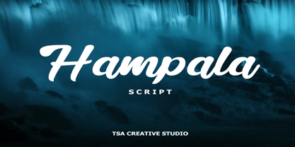 Hampala is a handwritten script font with a simple and classy style, such as branding, watermark on photography, signature, logo design, quotes, album cover, business card, and many other design project. From business cards to photo watermarks, Hampala is here to elevate your work. Hampala comes with uppercase letters, lowercase letters, lowercase, numbers, punctuation, ligature and multi lingual support If you have any queries, questions or issues please don't hesitate to contact us direct. Thank you very much Tiko Creative
 - NorB Note by NorFonts,
$28.00 NorB Note is a handwritten text font with an angled fat marker lettering style. You can use this font with any word processing program for text and display use, print and web projects, apps and ePub, comic books, graphic identities, branding, editorial, advertising, scrapbooking, cards and invitations and any casual lettering purpose… or even just for fun! NorB Note comes with 3 weights, each with their matching Italics, Oblique and in a Light, Normal and Condensed version. (a Chalk version is also featured!)
 - Basaro by Viaction Type.Co,
$20.00 Basaro Typeface is all caps display sans serif with many letter combinations according to creation. This font is inspired by an elegant & classic style with various swash. Equipped with Stylistic Set: ss01 - ss12, 12 alternatives per letter. Very easy to use and perfect for headlines, logos, posters, packaging, T-shirts, postcards and much more. Font Features : - Character Set Uppercase. - Character Set Lowercase. - 312 Stylistic Alternates ( ss01 - ss12). - Numerals & Punctuation. - Multilingual Support. Recommended to use in Adobe Illustrator or Adobe Photoshop.
 - Foliart by Struvictory.art,
$14.00 Foliart is thin line uppercase font with floral motives. The typeface includes Decorative and Symbol styles. To get an elegant and unique design, combine letters with symbols. Foliart is suitable for feminine business branding, eco-friendly and minimalistic art, social media design. The font works great for craft products branding and packaging (organic cosmetics and food, jewelry, floristics, handmade soap ect.) Also use individual letters and symbols to create logos and monograms. Foliart combines well with modern graphics: abstract shapes and line art.
 - Heroliga by Yahya Type,
$18.00 Heroliga is an elegant & modern sans serif font with special alternative letters and with multilingual support. Heroliga is perfect for logo design, magazine headers, product packaging, branding projects, clothing or simply as a stylish text overlay to any images or websites. WHAT’S INCLUDED? • Comes with regular, italic, bold and bold italic font styles. • Uppercase & lowercase letters. • Numbers, punctuation. • Ligature & Huge Stylistic alternate. • Multilingual support. Still got a question? Send me a message and I’ll be happy to answer! qura.yahya@gmail.com
 - Logopedia Next by Bülent Yüksel,
$19.00 What makes "Logopedia Next" unique is that it has a strong body, upper and lower case letters are the same size and work in perfect harmony. All letters in the character have "alternatives" in various numbers. This feature provides you variety in your designs. It is possible to take your designs to the next level by using "Logopedia Next". "Logopedia Next" is ideal for especially logo design, advertising and packaging, branding and creative industries, banners and billboards and signage as well as web and screen design. "Logopedia Next" provides advanced typographical support for Latin-based languages. An extended character set, supporting Central, Western and Eastern European languages, rounds up the family. The designation “Logopedia Next 500 Regular” forms the central point. Logopedia Next comes 3 weights and italics total 6 types. The family contains a set of 543 glyphs. Classes and Features, Stilistic Style, Fractions and Old Style Numerator just one touch easy In all graphic programs. Logopedia Next"" is the perfect font for web use. Be sure to check out the other siblings of "Logopedia". - Logopedia Now - Logopedia Now Soft - Logopedia Next - Logopedia Next Soft You can enjoy using it.
 - Logopedia Now by Bülent Yüksel,
$19.00 What makes "Logopedia Now" unique is that it has a strong body, upper and lower case letters are the same size and work in perfect harmony. All letters in the character have "alternatives" in various numbers. This feature provides you variety in your designs. It is possible to take your designs to the next level by using "Logopedia Now". "Logopedia Now" is ideal for especially logo design, advertising and packaging, branding and creative industries, banners and billboards and signage as well as web and screen design. "Logopedia Now" provides advanced typographical support for Latin-based languages. An extended character set, supporting Central, Western and Eastern European languages, rounds up the family. The designation “Logopedia Now 500 Regular” forms the central point. "Logopedia Now" comes 3 weights and italics total 6 types. The family contains a set of 543 glyphs. Classes and Features, Stilistic Style, Fractions and Old Style Numerator just one touch easy In all graphic programs. "Logopedia Now" is the perfect font for web use. Be sure to check out the other siblings of "Logopedia". - Logopedia Now - Logopedia Now Soft - Logopedia Next - Logopedia Next Soft You can enjoy using it.
 - Logopedia Next Rounded by Bülent Yüksel,
$19.00 What makes "Logopedia Next Rounded" unique is that it has a strong body, upper and lower case letters are the same size and work in perfect harmony. All letters in the character have "alternatives" in various numbers. This feature provides you variety in your designs. It is possible to take your designs to the next level by using "Logopedia Next Rounded". "Logopedia Next Rounded" is ideal for especially logo design, advertising and packaging, branding and creative industries, banners and billboards and signage as well as web and screen design. "Logopedia Next Rounded" provides advanced typographical support for Latin-based languages. An extended character set, supporting Central, Western and Eastern European languages, rounds up the family. The designation “Logopedia Next Rounded 500 Regular” forms the central point. "Logopedia Next Rounded" comes 3 weights and italics total 6 types. The family contains a set of 543 glyphs. Classes and Features, Stilistic Style, Fractions and Old Style Numerator just one touch easy In all graphic programs. "Logopedia Next Rounded" is the perfect font for web use. Be sure to check out the other siblings of "Logopedia". - Logopedia Now - Logopedia Now Rounded - Logopedia Next - Logopedia Next Rounded You can enjoy using it.
 - Logopedia Now Rounded by Bülent Yüksel,
$19.00 What makes "Logopedia Now Rounded" unique is that it has a strong body, upper and lower case letters are the same size and work in perfect harmony. All letters in the character have "alternatives" in various numbers. This feature provides you variety in your designs. It is possible to take your designs to the next level by using "Logopedia Now Rounded". "Logopedia Now Rounded" is ideal for especially logo design, advertising and packaging, branding and creative industries, banners and billboards and signage as well as web and screen design. "Logopedia Now Rounded" provides advanced typographical support for Latin-based languages. An extended character set, supporting Central, Western and Eastern European languages, rounds up the family. The designation “Logopedia Now Rounded 500 Regular” forms the central point. "Logopedia Now Rounded" comes 3 weights and italics total 6 types. The family contains a set of 543 glyphs. Classes and Features, Stilistic Style, Fractions and Old Style Numerator just one touch easy In all graphic programs. "Logopedia Now Rounded" is the perfect font for web use. Be sure to check out the other siblings of "Logopedia". Logopedia Now Logopedia Now Rounded Logopedia Next Logopedia Next Rounded You can enjoy using it.
 - Vitage by Fractal Font Factory,
$10.00 This sans-serif type family of two weights plus matching italics. Influenced by the geometric-style sans serif faces that were popular during the 1920s and 30s, the fonts are based on geometric forms that have been optically corrected for better legibility. Vitage has a functional look with a warm touch. It is manually hinted and optimized for screens, so it will be a good choice for Websites, eBooks or Apps.
 - Layla by Putracetol,
$24.00 Introducing "Layla," a stunning new display serif font that combines the luxury serif of the display cover with an elegant typeface style. With a lot of alternates character, you have a plethora of options to create unique and striking display lettering. Layla comes with open type features, including a vast selection of alternates and end swashes, allowing you to create stunning lettering designs. Additionally, Layla supports multi-language use, making it ideal for global designs. Layla is best used for various purposes, including Logotype, heading, cover, poster, logos, quotes, product packaging, header, merchandise, social media & greeting cards, and many more. Its versatility makes it a valuable addition to any designer's toolkit. In the zip package, you will receive Layla in otf, ttf, and woff formats, with features that include uppercase and lowercase letters, opentype alternates and ligatures, numbers, punctuation, symbols, and multilanguage support. To access Layla's alternate glyphs, you will need a program that supports OpenType features such as Adobe Illustrator CS, Adobe Photoshop CC, Adobe InDesign, and Corel Draw. Overall, Layla is an excellent font choice for anyone looking to add a touch of luxury and elegance to their designs. Its stunning design and high-quality features make it an ideal font for all your design needs, including print and digital media.
 - Nextir by Ditatype,
$25.00 Nextir is an extraordinary brush sans serif font that commands attention and redefines modern typography. Designed with large letters and a thick weight, its distinctive square letter shapes are the epitome of strength and contemporary style. What sets Nextir apart from the ordinary is its brush detailing. This unique blend of brush strokes and sans serif elements adds a layer of organic texture to the font. The combination of large letters, thick weight, square shapes, and brush detailing creates a font that makes a striking statement with a contemporary edge. When you need a typeface that combines strength with artistic expression, Nextir is the perfect choice to infuse your designs with boldness, modernity, and a touch of handcrafted elegance. You can also enjoy the features here. Features: Multilingual Supports PUA Encoded Numerals and Punctuations Nextir fits in headlines, logos, posters, flyers, branding materials, print media, editorial layouts, and many more designs. Find out more ways to use this font by taking a look at the font preview. Thanks for purchasing our fonts. Hopefully, you have a great time using our font. Feel free to contact us anytime for further information or when you have trouble with the font. Thanks a lot and happy designing.
 - Balter Serif by Art Grootfontein,
$19.00 Balter Serif is a hand-drawn layered typeface family inspired by sign painting, 1960’s movie posters and jazz album lettering. It can look fresh and modern or exquisitely vintage. Combine upper, lowercase and alternates to create a handmade custom lettered look, then layer the styles using colors to add value and depth to your designs ! Balter Serif works perfectly in short headlines. It is suitable to create a wide range of projects from posters to branding, logos, packaging, magazines and more. Features Uppercase & Small caps Numbers & Symbols International Glyphs 60 Alternates & swashes 70 Ligatures 30 Letter combinations Quick tip for layered fonts in Adobe Illustrator : Click and drag out a text frame to start (don’t just click with the cursor on the page). Then select the stacked text frames, go to Type in the menu bar > Area Type Options > Offset: First Baseline and select “Fixed”.
 - Salinas by TipoType,
$38.90 Salinas imitates a friendly and warm handwritten typeface. Its particular feeling is achieved thanks to several character variations, which can automatically alternate between three different (and complete) sets of characters, giving the font the proper character of hand writing, mixing: height, weight and inclination. Through its opentype programming, Salinas generates multiple character changes in the text, without losing its surprising legibility in various sizes. The added gestural strokes for titles enriches the spectrum of variants and versatility. Itís ideal for countless pieces of design that require warmth and spontaneity.
 - Autobats by Canada Type,
$24.95 Autobats is a set of over 100 different car and truck icons, minimal silhouettes that can be adapted to whatever context your design flings at them. The mystery of why this font has been so popular was solved when one of our customers said, “I always use this thing, because the name starts with A, so it’s one of the first fonts I see in my slap-a-logo collection”. To see all the icons available, a glyph palette would be come in handy while using the font. Honk if you like convenience. Beep beep!
 - Azalleia by Intellecta Design,
$26.90 Azalleia is a new exaggerated flourished caps typeface. Well elaborated and unusual design, inspired by old cross-stitch and craft books. Works great when used for display artworks. Entirely designed by hand, without use of auto-tracing and available in two different designs. Buying the two fonts pack you get free the exclusive collection of Azalleia native colored eps vectors, zipped with the font and ready to use. Take a look at the banners in the gallery section to see samples of this nice collection of eps free vectors.