10,000 search results
(0.055 seconds)
- Desert Sands JNL by Jeff Levine,
$29.00 The February 19, 1923 issue of The Film Daily contained an ad for Mack Sennett's new Ben Turpin comedy entitled "The Shriek of Araby". No doubt this was a spoof of the popular Rudolph Valentino film "The Sheik". The ad tries to emulate Mideastern or Arabic typography via a standard Western alphabet. It somewhat captures the flavor, but its free-form hand lettering comes off as more of a novelty-type style. This is now available digitally as Desert Sands JNL in both regular and oblique versions.
 - South Route by Nicky Laatz,
$15.00 Introducing South Route Font Duo and Extras - a handsome new font duo with tons of versatility.South Route consists of two fonts , A textured casual script and a bold & hearty sans-script titling font.To make your designs more authentic, South Route Script font has a set of lowercase alternate letters and ligatures included.South Route also has a handy set of 26 extra dry marker swashes and grit dingbats . Fantastically versatile, South Route lends itself to both retro hipster style designs and fresh bold modern designs.
 - Glaser Stencil by Linotype,
$40.99 The renowned American illustrator and graphic designer Milton Glaser designed Glaser Stencil in 1970. Glaser Stencil is a perfect summation of both Modernist proportion and New York-style solidity and self-assurance. An all capitals font, the shapes of the letters are reminiscent of popular sans serif faces of the time, such as Futura and ITC Avant Garde Gothic. Like everything New York-related, Glaser Stencil should be used big, in headlines and display applications, where it can play a bold, proud, and confident role.
 - Kwersity by Ingrimayne Type,
$12.95 Kwersity is a boxy, geometric, slab-serifed typeface with strokes of uniform weight. Its circular elements are almost rectangular. The narrower style has a high x-height. Both the narrower and wider variants come in three weights, regular, semi-bold, and bold. (In its original, pre-2020 form, what is now semi-bold was bold. What is now bold is new as of 2020.) There is also a shadow version; Kwersity-semibold can be layered on top of it to color the interior of the letters.
 - Amira by Rhd Studio,
$19.00 Amira Script with a modern calligraphy type font, I hope you are interested in this font, if you want to use it for your work, this font can be used easily and simply because there are many features in it containing a complete set of uppercase and lowercase letters, various kinds of punctuation. , numbers, and multilingual support. This font also contains several ligatures and alternative Style Stylistic Sets for those of you who have software capable of running OpenType (Photoshop / Illustrator / InDesign). what is included:
 - ITC Johnston by ITC,
$29.00ITC Johnston is the result of the combined talents of Dave Farey and Richard Dawson, based on the work of Edward Johnston. In developing ITC Johnston, says London type designer Dave Farey, he did “lots of research on not only the face but the man.” Edward Johnston was something of an eccentric, “famous for sitting in a deck chair and carrying toast in his pockets.” (The deck chair was his preferred furniture in his own living room; the toast was so that he’d always have sustenance near at hand.) Johnston was also almost single-handedly responsible, early in this century, for the revival in Britain of the Renaissance calligraphic tradition of the chancery italic. His book Writing & Illuminating, & Lettering (with its peculiar extraneous comma in the title) is a classic on its subject, and his influence on his contemporaries was tremendous. He is perhaps best remembered, however, for the alphabet that he designed in 1916 for the London Underground Railway (now London Transport), which was based on his original “block letter” model. Johnston’s letters were constructed very carefully, based on his study of historical writing techniques at the British Museum. His capital letters took their form from the best classical Roman inscriptions. “He had serious rules for his sans serif style,” says Farey, “particularly the height-to-weight ratio of 1:7 for the construction of line weight, and therefore horizontals and verticals were to be the same thickness. Johnston’s O’s and C’s and G’s and even his S’s were constructions of perfect circles. This was a bit of a problem as far as text sizes were concerned, or in reality sizes smaller than half an inch. It also precluded any other weight but medium ‘ any weight lighter or heavier than his 1:7 relationship.” Johnston was famously slow at any project he undertook, says Farey. “He did eventually, under protest, create a bolder weight, in capitals only ‘ which took twenty years to complete.” Farey and his colleague Richard Dawson have based ITC Johnston on Edward Johnston’s original block letters, expanding them into a three-weight type family. Johnston himself never called his Underground lettering a typeface, according to Farey. It was an alphabet meant for signage and other display purposes, designed to be legible at a glance rather than readable in passages of text. Farey and Dawson’s adaptation retains the sparkling starkness of Johnston’s letters while combining comfortably into text. Johnston’s block letter bears an obvious resemblance to Gill Sans, the highly successful type family developed by Monotype in the 1920s. The young Eric Gill had studied under Johnston at the London College of Printing, worked on the Underground project with him, and followed many of the same principles in developing his own sans serif typeface. The Johnston letters gave a characteristic look to London’s transport system after the First World War, but it was Gill Sans that became the emblematic letter form of British graphic design for decades. (Johnston’s sans serif continued in use in the Underground until the early ‘80s, when a revised and modernized version, with a tighter fit and a larger x-height, was designed by the London design firm Banks and Miles.) Farey and Dawson, working from their studio in London’s Clerkenwell, wanted to create a type family that was neither a museum piece nor a bastardization, and that would “provide an alternative of the same school” to the omnipresent Gill Sans. “These alphabets,” says Farey, referring to the Johnston letters, “have never been developed as contemporary styles.” He and Dawson not only devised three weights of ITC Johnston but gave it a full set of small capitals in each weight ‘ something that neither the original Johnston face nor the Gill faces have ‘ as well as old-style figures and several alternate characters. - Alfazine Script by Mysterylab,
$24.00 Alfazine Script is a bold and spirited script with extensive ornate detailing. This versatile font is evocative of antique signpainters' letters, circus wagon & carnival booth graphics, groovy 1960s psychedelic scripts, and even sportswear team insignias, all combined with a modern approach towards lively curlicues and ball finial stroke ends. As with all other font offerings from Mysterylab Designs, we take great care with artful kerning and weight-matching of glyphs to allow this font to be used not only at attention-grabbing headline and logo sizes, but also at small body copy sizes in extended passages. Alfazine also features an extruded shadow version that's very useful for designing logos and customized layered lettering.
 - Billstone Signature by Din Studio,
$29.00 Billstone Signature is a modern signature font in relatively thick weight. Its main character relates to the name given which is similar to a signature in the interconnected letters. Besides, there is no prominent thick line differences on the letter. To improve legibility, use this font for bigger-sized texts. Features: Ligatures Stylistic Set Swashes Multilingual Supports PUA Encoded Numerals and Punctuations Billstone signature fits for any design projects, such as posters, banners, logos, book covers, invitations, quotes, headings, printed products, merchandise, social media, etc. Find out more ways to use this font by taking a look at the font preview. Feel free to contact us for further product information or trouble complaints. Thank you and happy designing. Thank you for downloading premium fonts from Din Studio
 - Humblest Pro by Gleb Guralnyk,
$15.00 Hi. Introducing a new version of my one of the most popular fonts. Now Humblest Pro includes much more characters and has west european multilingual support. This font has a smooth and clean shape without any grain unlike the original one. Almost all of the capital leters has two version, for the begining and for the ending of the word. The final alternative letter will be automatically replaced if you type a big last letter in the word (check out if the "contextual alternates" opentype feature is activated). Decorative swashes are now a part of the font. To use this decorative lines just type an underscore character and the corresponding number from _00 to _39 (make sure that “standard ligatures” opentype feature is activated). Also a lot of ligatures for small letters are available, please check out the previews with all available glyphs. Thank you and have fun!
 - P22 Elizabethan by IHOF,
$24.95 Elizabethan is part of the fonts designed by Ted Staunton for his historic novel centered around a family bible and the handwritten annotation through seven generations. The Elizabethan font is based on a style known as “secretary hand” circa 1610.
 - Kelpo by Ahmad Jamaludin,
$15.00 Please welcome our new Groovy Retro Typeface, Kelpo! Kelpo - Created from our explorations which were inspired by 70's retro style and pop culture visual design like old comics, cartoons, and posters. The strong bold character with groovy style makes us feel retro vibes and takes us to the 70's era Kelpo - Comes with 59 beautiful alternates which consist of 4 stylistic sets. Contains 2 styles regular and italic, this font is best used for headings, logotype, quotes, apparel design, posters, flyers, packaging, book cover, and many more. What you get : Letters, numbers, punctuation, multilingual support Has 59 beautiful alternates Come and say hello over on Instagram! https://www.instagram.com/dharmas.studio/ Dharmas Studio
 - SkyClad Gothic BB by Blambot,
$20.00A traditional calligraphy-style gothic font with a twist. The uppercase letters were designed for easier readability than typical gothic text. This gothic font can be used in all caps and still be extremely legible. - Artiste by ITC,
$29.00A casual, open brush script style designed with a shadow effect for a three-dimensional impression by British designer Martin Wait. This typeface looks best with tight letter and word spacing in large display settings. - Black Queen by Gleb Guralnyk,
$14.00 Presenting the vintage style typeface "Black Queen". It includes font files for each decorative element which can be useful for manipulating colors and effects. Black Queen font has multilingual support and several alternative letter glyphs.
 - Amestina by Aqeela Studio,
$20.00 Amestina’s most recent letter styles are ideal for projects that call for a handwritten aesthetic, including wall displays, wedding invitations, social media post logos, commercials, product packaging, product designs, labels, photographs, watermarks, invitations, and stationery.
 - Filler Variable by CarnokyType,
$80.00 Filler is a display variable font that allows you to flexibly change the width ratio of font characters from extra narrow to extremely wide shapes. The typeface includes complete Latin language support with contrasting drawing of accents and punctuation. The character set includes special symbols, such as a set of emoticons or arrows that support OpenType features. In addition to the variable font, Filler also offers five width styles – Compressed, Condensed, Medium, Extended, Expanded. The font is intended primarily for strong display use in large proportions.
 - Lo-Res by Emigre,
$39.00 The Lo-Res family of fonts is a synthesis of pixelated designs, including Emigre's earlier coarse resolution fonts, as well as bitmap representations of Base 9. It replaces the preexisting Emigre, Emperor, Oakland and Universal families and groups these related bitmap designs under one family name in the font menu, thereby simplifying their naming. The Lo-Res fonts also offer technical improvements, including a more complete character set, more consistent character shapes among styles and weights, as well as improved alignment among the various resolutions.
 - Notre Dame by Linotype,
$29.99 Notre Dame is a part of the 1990 program Type before Gutenberg, which included the work of twelve contemporary font designers and represented styles from across the ages. Linotype offers a package including all these fonts on its web page, www.fonts.de. Notre Dame was designed by Karlgeorg Hoefer, who was inspired by the structure of forms once used mainly for liturgical purposes. Digital techniques made it possible to add Gothic ornaments and borders to the font, perfect for designing anything which should have a late Gothic feel.
 - Hiatus by Stephen Rapp,
$59.00 Hiatus bridges the gap between formal scripts used for invitations and more classic settings and casual scripts that exude a warmer tone. Like many formal scripts, Hiatus is fully connecting. Its low body height combined with generous letterspacing adds an elegant profile to lines of text. Like casual scripts, Hiatus has a warm, hand-lettered appearance with great rhythm. Solid in structure; Hiatus also sets well at smaller sizes. Type enthusiasts will enjoy the variety of options. For optimal text flow, both letters and ligatures have alternate versions programmed to come in at the appropriate place for both beginnings and endings as well as in various contextual settings. In addition, there are variations and flourished versions of almost every letter and ligature. Some ligatures have as many as 12 variations. Also included are fractions, a set of old-style numbers, and a set of ornamental flourishes. Hiatus is a unique contemporary script with the strength of a time-tested classic. Please note that this version supports a wider range of languages compared with the lower-priced version available through other channels.
 - Grabnika Unix by DePlictis Types,
$46.00 Grabnika Unix is a unicase style typeface with a straight and a bit tall look and it has a residual influence of monospaced fonts. One of the major characteristics of this typeface are those sharp cuted ears and joints that appears repeating at some of the letters and gives him a distinctive personality and a minimalist design approach on other group of letters that creates an alternative interesting fill of the spaces. It is suitable for signage purpose and headlines or relatively short body texts and also for logo design and branding. It is a loud and fresh display that could give a certain distinctive and young personality to your designs. As a fun fact, the name of this font comes from the romanian word “grabnic” that means “fast” and I developed this font by chance as a custom lettering for a logo design project, so I saw it proper as an alternative in the actual wide font markets and I decide to finishing it as a multilingual support typeface. Enjoy!
 - Recycled by Kerry Colpus Designs,
$25.00 Recycled was created by creating letters from bits of recycled materials such as cardboard, newspapers etc. and then taking parts of those letters to create new letters.
 - Adios Script Pro by Sudtipos,
$99.00 Romantic, decorative Adios Script is one of Alejandro Paul’s most elaborate and technically refined faces to date. Inspired by designs in “how-to” commercial lettering guides of the 1940s, it has been refined and brought into the 21st century through a huge variety of ornate swash letterforms. The lowercase “h” alone offers 43 variants. Hundreds of ornamental ascenders and descenders allow a beautiful interplay of strokes and combinations, while avoiding overlaps or conflicts. Adios Script features a mind-boggling 1,470 characters in total, in OpenType format. Adios Script received a Certificate of Excellence from the Type Directors Club.
 - Krellon by Nathatype,
$29.00 Krellon invites you to step back in time and embrace the elegance of the past with its vintage style. Rounded shapes define each character, creating a sense of approachability and friendliness. What makes Krellon so special is its subtle, textured appearance. The font carries a delightful roughness that adds authenticity to your text, as if each letter has endured the test of time. Beautiful ornaments are included as a bonus. Krellon fits in headlines, logos, branding materials, and many more.
 - Wood Fancy Reverse JNL by Jeff Levine,
$29.00 Amongst some pages scanned and posted online of old wood type alphabets comes this lovely, ornamental design in a reversed style of white lettering on black rectangular boxes. This classic set of wood type is now available digitally as Wood Fancy Reverse JNL. There is a narrow blank box on the “less than” key for use as an end cap, and a wider blank box on the “greater than” key to use between words as a blank space if so desired.
 - Million Smiles by Subectype,
$17.00 Introducing our newest font, "Million Smiles", a casual bold script font with hand-letterred style. Million Smiles is an upgraded version of our previous font, "Billion Dreams". In this new version, we've rounded the edges a bit for a softer look, compared to the sharp edges of the old one. This enchanting font is the perfect choice for design projects that aim for a fun, urban, and classy vibe. It adds a touch of cool to your creativity without losing its elegant charm.
 - theLUXX by Resistenza,
$39.00 The Luxx font was born in 2010 and in the 2013 has been redesigned. Luxx is based on a style of lettering often seen on Italian art deco posters and advertising of the 1930s. This font is very modern, and is inspired by the “velocitá-speed” of this artistic period. TheLuxx is perfect for when you want to use eye-catching big texts for anything from posters and retro-advertisements, and art, but it´s especially striking for printed projects.
 - Stilla by Linotype,
$29.99 François Boltana was a French prolific lettering artist during the late 20th Century. He created the Stilla typeface in 1973. Stilla is a cursive “Fat Face”-style design, reminiscent of the first large advertising and display types produced in the wake of the successful Bodoni, Didot, and Walbaum text faces. Because of this pedigree, Stilla is the perfect headline choice for applications that look back to the 19th century. Stilla could also be used for very short headlines or big logos.
 - Spanish Main by FontMesa,
$19.95 Spanish Main is a revival of an old MacKeller Smiths & Jordan font named Sloping Black. Like most foundries MacKeller Smiths & Jordan doesn't display all the letters of the fonts in their specimen books so it took a little more time to find the complete character set for this old beautiful classic font. New in this version is the addition of a Greek character set which is experimental as you normally don't see Old English style fonts include a Greek alphabet.
 - Two Step Nouveau JNL by Jeff Levine,
$29.00 Popular music of the early 1900s included a genre called two step; round dances utilizing a sliding step with a tempo in either march or polka time. 1911's "Daughters of the American Revolution" was one such march/two step. The cover of the sheet music had the title hand lettered in a slightly rounded sans serif type design in the Art Nouveau style popular during that era. It is now available as Two Step Nouveau JNL, in both regular and oblique versions.
 - Norsy by Adam Fathony,
$15.00 Norsy, A Display Typefaces with Variable Weight and Width. Norsy is a modern elegant variable font. Basically this is a Sans with a small touch of serif on every letters. A Simplicity yet very legible with various width and weight that you can explore, combine, create and help you designing something. In a Total of 21 Style Font files or even more if you are using the Single Files Variable, you can slide the weight and width on the sweetest spot of Norsy.
 - Zathira by Gian Studio,
$12.00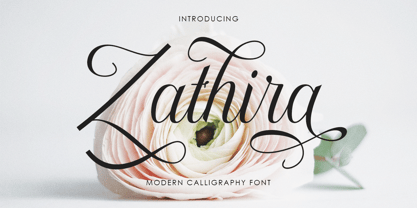 Zathira is a modern calligraphy font. This font is made for those of you who need a touch of elegance and a reflection of modern style in their designs. You can use Zathira for various purposes such as logos, brochures, business cards, wedding invitations, packaging, letterhead, labels, news, posters, and more. Zathira is built with OpenType features and includes initial and final swash, alternative swash characters for most lowercase letters, numbers, punctuation, alternatives, ligatures and also supports some western languages.
 - Quench by Linotype,
$29.99 Quench is a fun and unique typeface from designer Hannes von Döhren. It is unmistakably characterized by its strong contrast of inside and outside forms. The counters are nearly straight and have many right angles. Conversely, the outside curves are smooth and rounded making them soft and almost bubbly. The italics have juicy curves reminiscent of brush lettering. Used together or individually, the four weights and styles can be used for a wide variety of projects including magazines, advertising, logos, and branding.
 - Greenwood by Protimient,
$22.50Greenwood is a monospaced, cursive typewriter script, based on a typewritten letter from a Mr J. G. Greenwood Esq. to a branch of the National Westminster bank in Oxfordshire, Great Britain, dated 6th June 1904. This uncommon style of typeface is suitable for many tasks as it not only has the functionality of a monospaced font but it has a quirky distinctiveness that lends itself especially well to any setting that requires a decorative font that reads surprisingly well in extended text. - Futurism by Artyway,
$19.00 I am pleased to present you an excellent futuristic font "Futurism" in modern graphic style! The font supports the Latin alphabet and Cyrillic alphabet. It is recommended to use it at long intervals between letters, but you can customize it perfectly for your own design, use it to create logos, emblems, posters and posters. Futurism is very stylish, it ideally suited for a space mood, future tech and innovative products! Uppercase and lowercase english letters Uppercase cyr letters Numbers
 - Scala Pro by Martin Majoor,
$49.00 The award-winning Scala family (1990-1993) is a worldwide bestseller and has established itself as a ‘classic’ among digital fonts. It was one of the first serious digital text fonts to support small caps, ligatures and different set of numbers. In fact Scala and Scala Sans (1990-1993) are two different typefaces sharing a common form principle: the skeletons of both Scala and Scala Sans are identical. Scala’s dark colour and low contrast works to prevent the thin parts from breaking up. The generous length of Scala italic’s serifs gives it a strong rhythm. The bold weight has the same character widths as the normal weight, so changing a text from normal into bold does not affect the set width. Another part of Scala is very popular among its users: Scala Hands, containing more than one hundred decorative hands and pointers, is a free bonus. Scala Jewels is a set of four highly decorative typefaces, based on the bold capitals of Scala.
 - Be Creative by Corradine Fonts,
$34.95 When you are trying to solve any problem, surely you round the solution like a swirl. This typeface represents that continuous search of creative solutions. So, our recommendation is “Be Creative” always. Based on the skeleton of the classic typeface from Corradine Fonts “Mussica”, this softened semi-serif type family comes in eight useful weights and has many full functional Open Type features that allow you to play with the extension and type of the ornaments including three levels of swash caps and many ascender, descender, starting and ending forms for the lower case set. Use the Swashes and Titling features separately or mixed to extend the length of the swashes and apply the Contextual alternates feature to obtain wonderful smart swashes. If you prefer to use the common lowercase “r”, instead the original one of the typeface, you could replace it just by applying the Stylistic Alternates feature. And finally you can enjoy the numerous discretionary ligatures that Be Creative has available to obtain a completely improved appearance of your design.
 - Samo Sans by CarnokyType,
$- Samo Sans is a modern sans-serif typeface with low contrast strokes and is balanced between technical shapes and dynamic feeling. The primary type family is consisted of complete set of Latin glyphs for lower and upper case. It also supports diacritics of all European languages including lining numerals, standard ligatures and other characters sufficient for regular typesetting. Characteristic features are lower spurs (a, b, d, u), and upper spurs (m, n, p, q, r) with distinctive wedge-shaped cuts. These parts are complemented by homogeneously designed diacritics, which is not disturbing and harmonizing with the whole unit. Another very strong feature of the type drawing are lower terminals of the round glyphs, which are finished by moderate narrowing. The type has got decreased caps height, also decreased numerals and optimal x-height, which makes it suitable for more extensive text typesetting. It can be effectively applied in corporate identities or in display typesetting. The narrowness of the basic set of Samo Sans typeface is supplemented by extended type family Samo Sans Pro .
 - Wink by Sudtipos,
$49.00 Wink has been created as the result of exhaustive research, trial and development. It is an OpenType set of fonts which appears in a friendly and fun way, with a new twist on what Joluvian has previously created. Full of personality, with a brave and strong creative line, it is intended to reflect authenticity when being used in all types of media and styles. The ornaments offered in this font work as a graphic resource that expand all the possibilities for Wink users. Although Wink is inspired by traditional calligraphic flourishes, its modern twist makes it elegant and simple at the same time. It’s not completely a brush type but it has been created with the same calligraphy base Joluvian usually works with. Wink also has a caps version with the same style of the script. Both versions could work perfectly, individually or together. As usual, the type has been developed with Ale Paul for Sudtipos, and the collaboration of Macus Romero has been essential to illustrate the style that Wink represents.
 - Pocketknife by Blank Is The New Black,
$13.00 Pocketknife is a simple grid-based titling font on it’s surface, but it has a surprisingly prolific set of features under the surface. The most notable of these features is an abundant set of ligatures that give Pocketknife it’s unique look. There are very few kerning pairs contained within Pocketwatch, and these ligatures fill in most gaps that could be created by letters with more empty space, such as L and T, and also give a more playful look to an otherwise sharp-edged typeface. Pocketknife also contains with 2 full sets of alternate characters, one pairing with the uppercase set and one pairing with the lowercase—available as OpenType stylistic alternates or individually in the Glyphs panel. Pocketknife Regular is designed to be used on it’s own, while the Inline and Base fonts are designed to be used as a simple layered combination. The Base font is nearly identical to Regular, but contains a few specially adjusted characters that better accommodate the Inline style. Pocketknife Outline is a combination of the Inline/Base styles, to be used individually. Pocketknife is sharp, but playful. Simple, but sophisticated. Sporty, technical, and aggressive, yet elegant and fun. Pocketknife, while simple at first glance, is a deceivingly versatile typeface.
 - Capellina by Outras Fontes,
$35.00 Capellina is a responsive type family comprised of four styles – two script fonts and two small caps romans – built to work together in typographic compositions intended to catch the eye. The fonts will work in your app as you can see in the presentation above. They can be seen as some kind of lettering machines programed to take advantage of swashes (specially at the beginning and and at the end of text lines) and to avoid stroke collisions. Because of the Contextual Alternates feature, the letters will change while you’re writing. Just use any OpenType-compatible software, keep this feature activated and the font’s algorithm will do the rest. In Capellina Script and Capellina Rough you can also use the stylistic alternates / stylistic sets feature if you want to explore some extra letterforms.