10,000 search results
(0.05 seconds)
- ZAP by Wannatype,
$9.90 ZAP is an all-caps monospaced and (almost) monolined typeface family. ZAP comes along in square and round shape, 2 widths (ZAP 360 and ZAP 500), and 8 weights. ZAP also offers Slant and BAckslant styles. ZAP covers multiple languages with Extended Latin. Even complete Greek alphabets are part of the ZAP keymap.
 - Pamela Bestie by Ardian Nuvianto,
$18.00 Pamela Bestie is a fun and playful layered font that's perfect for adding some personality to your designs. This font comes in two styles: regular and extrude. The regular style features a smooth, clean design that's easy to read and works well for headlines and body text. The extrude style has a dimensional, layered look that adds depth and texture to your designs. Both styles of Pamela Bestie feature a hand-drawn feel with slightly irregular letterforms, giving the font a charming and quirky personality. The font includes a full set of uppercase and lowercase letters, as well as numerals and punctuation. Overall, Pamela Bestie is a versatile font that's great for a variety of design projects, from branding and packaging to social media graphics and more. Whether you use it alone or layered with the extrude style, this font is sure to add some fun and whimsy to your designs.
 - Northunder Rough by Alphabet Agency,
$23.00 Northunder (Nor/Thunder) Rough is a vintage style font with a powerful presence. It can be used as an excellent display font as it possesses a unique serif style combination of slab serif and serif that create sharp points that really give the font its character. The slab serif elements help give the characters a strong look and balance across the font. The font includes uppercase, lowercase, number, international Latin letters and punctuation.
 - Sharpe by Mans Greback,
$29.00 Sharpe is a stylish serif typeface family. The type has been drawn by Måns Grebäck during 2018 and 2019. It is clear, sharp and has brave, lively letter forms but with a conservative backbone. The five font weights balance beautifully in contrast to each other, and each weight has an italic equivalent, totaling in ten styles from Thin to Black. Each style contains ligatures and support for a wide range of languages.
 - Volare by Gatype,
$15.00 Volare latest style letters are perfect for wall displays, social media post logos, advertisements, product packaging, product designs, labels, photography, watermarks, invitations, stationery, and any project that turn creative idea into a true piece of art. These fonts include: OTF files. Displayed fonts: Uppercase, Lowercase, Numbers, Symbols, Accents, Styles, Swashes and Ligatures also Multilingual Support Enjoy the font, feel free to comment or feedback, send me a PM or email. Thank You!
 - Sadina by NumidiaType,
$29.00 Sadina™ is the first font family in Sadina's series, based on geometric modernism with a classic touch. Designed with triple thicknesses to build a beautiful mix between modern humanist style, contrast, and classic sense, it provides support for double linguistic zone scripting in the world, depending on "Western European and Cyrillic" languages. It supports Professional Opentype features and supports a wide variety of alternative letters and styles for scripting and an attractive titling.
 - Cuthick by GuseType,
$12.00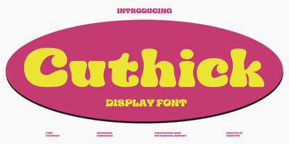 Cuthick is a display font that made based on thick lines, this font has a chubby and cute shape. You can use this font in playful, retro, and vintage style designs. This font can be use for a variety of projects or artwork such as sticker, headline, branding, product label, poster, logotype, magazine, and many more. Feature: - Kerning - Alternative Style and Ligature - Uppercase and Lowercase Letters - Numeral - Punctuation and Symbols - Multilingual Supports
 - Rumble Brave Vintage Fonts by Alit Design,
$14.00 Introducing Rumble Brave Vintage Fonts Packages. Lately I've been happy to see the design style with its vintage Victorian classic. Hence from that I launched fonts packages with vintage style. In this package, there are three types of letters: serif, script, and dingbat. The three font combinations are compatible with the Victorian classic design concept. You can also use each font by itself, without combining it with the others in the package.
 - Northunder by Alphabet Agency,
$23.00 Northunder (Nor/Thunder) is a vintage style font with a powerful presence. It can be used as an excellent display font as it possesses a unique serif style combination of slab serif and serif that create sharp points that really give the font its character. The slab serif elements help give the characters a strong look and balance across the font. The font includes uppercase, lowercase, number, international (basic Latin) letters and punctuation.
 - Phraxtured by Ingrimayne Type,
$13.95 Phraxtured is a fairly accurate rendition of the letter forms used in an old German-language publication that I found in a trash heap. However, several characters in fraktur, such as the k, y, x, and S, look bizarre to English-language readers, and I have created more comfortable alternatives. The Phraxtured-Deutsch version has the more traditional characters. The ShadowedInside style is designed to be used in layers with the Shadowed style.
 - Lucky Beauty SS by Sensatype Studio,
$15.00 Lucky Beauty is a Styled Classy Beauty Font pairing between regular and italic style. Crafted specially for Branding needs to make any elements standout and Perfect beauty look. With a simple and classy shape will make your design more classy, elegant, and certainly unique with this font. Lucky Beauty is also included full set of: regular and italic version uppercase and lowercase letters multilingual characters numerals *punctuations Wish you enjoy my font! :)
 - Olimpos by Gatype,
$8.00 Olimpos is a Display sans font that is absolutely perfect for editorial headlines. Her large, bold and slender figure is perfect for posters, t-shirts, and magazine covers. Reserved for capital letters only, this calm and bold typeface is a content creator's best friend. font files Uppercase, Numbers, Punctuation & Symbols. Diacritic for Multilingual Support This Olimpos is a modern sans-serif font that includes 4 weights of the normal style and the Italic style.
 - Vivala bl by Johannes Hoffmann,
$38.00 Vivala bl has a high black ratio that supports a compact typographic style. It is particularly suitable for decorative typesetting, for example, for posters, logos, and book illustrations. Complementing the ornamental style, Black Letter has a narrow style that works well for smaller type sizes. And it is equipped with various contextual alternates and ligatures.
 - Vivala Marbod by Johannes Hoffmann,
$29.00 Vivala-Marbod is a versatile serif font that boasts a wide range of features and styles. With ten styles and 545 glyphs, the Marbod enables a wide range of applications. Whether subtle headings or easy-to-read body text, Marbod offers the necessary versatility. A set of symbols with fractional numerals, scientific numerals, and matching arrows makes them particularly suitable for informative design. Advanced language support makes it ideal for international projects. In addition to the upright font, Marbod contains a well-developed italic. This is great for making posters, brochures, and corporate designs that need to be precise and stylish.
 - HWT Etta by Hamilton Wood Type Collection,
$24.95 HWT Etta is a fun display typeface that has two styles: East and West! Its two variations ensure you have maximum wood type swagger in every display size that you might want. This fresh design takes a cue from the wild design experimentation that was happening in the heyday of mid 19th Century wood type—but filtered through 1960s photo-type sensibilities and served up for today’s design needs. Etta West is a decorative inline style and the Etta East is a whimsical reverse contrast style. They live together harmoniously, with their own specific flavors. Practically speaking, both styles are intended for display use, so use them big and use them proudly! Set your XXL size titles in West and your L to XL size types in East. As different as they might look at first, both fonts share a common DNA—Don’t be shy about using them together. The HWT Etta font is part of the Hamilton Wood Type and Printing Museum’s Type Legacy Project. In keeping with the project, Etta is named after Etta Shove Hamilton, who was J.E. Hamilton’s wife and the company’s first bookkeeper.
 - Dilemma by Sudtipos,
$39.00 Dilemma is a sans/sans serif type system with 42 styles; it is inspired by the anonymous Polyphème, Cyclopéen and Extra Condensé designs from the early 1900s at the Peignot Fonderie. From these initial points of reference, Sudtipos went further and reimagined these projects for an actual use by blending them into a unique and complex type system. Dilemma is defined as ‘a situation in which a difficult choice has to be made between two or more alternatives, especially ones that are equally undesirable’ and that is exactly how we designed this font. We created a workhorse system where each style functioned well alone but would be more powerful when working as a team, pairing the sans styles with the serifs. Dilemma comes in 3 different widths and 7 weights in both the sans and the serif, ranging from the more economical yet legible condensed styles, to the opulent bold and expanded weights. Dilemma also contains 2 Variable Fonts. We imagine Dilemma being used in a limitless array of graphic projects including identity systems, digital platforms, public spaces, editorial design and beyond. Now the Dilemma is yours.
 - SK Barbicane by Salih Kizilkaya,
$9.99 SK Barbicane is a family of typefaces named after Jules Verne's famous book, From the Earth to the Moon. Inspired by Jules Verne's foresight, it was designed with a synthesis of the future and the past. While it carries sharper and futuristic lines than the future, it also incorporates the organic structure of the past. All characters have equal dimensions in this font with mono weight and mono space. In this way, you can create regular typographic layouts in your designs. Consisting of two different families, Normal and Unicase, this font has a total of 12 different fonts and 5088 glyphs. In this way, it contains many typographic elements that you will need in your designs.
 - Simple Serenity by Set Sail Studios,
$26.00 Discover an exquisitely elegant modern typography pairing with the Simple Serenity Font Duo. This beautiful set combines a contemporary take on a classic serif with a clean & modern fine calligraphy script—creating the perfect pair for stunning logos, wedding designs, quotes, display text and more. This font family includes; Simple Serenity Script • A clean, elegant hand-drawn script font containing upper & lowercase characters, all punctuation and numerals. Contains 50 ligatures to help the text flow naturally and add a custom-made feel. Includes 9 alternate characters for d,k,f,g,h,i,j,t,y which have extra flourishes. Also includes beginning and end swashes for every lowercase letter. Simple Serenity Serif • A modern take on a classic serif font. Contains uppercase-only characters, all punctuation & numerals. Includes 14 ligatures for extra flair and uniqueness, as well as 10 alternate characters for Q,A,M,E,R,K,U,F,H,W. Using Ligatures and Alternates; Both fonts contain a number of 'Standard Ligatures' (unique double-letter pairings) and 'Stylistic Alternates' (alternative letter designs) to provide you with more customisation options. Make sure these functions are switched on in your software in order to access these characters. You can also access these characters via a Glyphs panel. This is available on most Adobe software & Affinity Designer. Language Support; Both fonts support English, French, Italian, Spanish, Portuguese, German, Swedish, Norwegian, Danish, Dutch, Finnish, Indonesian, Malay, Hungarian, Polish, Turkish, Icelandic, Slovenian
 - Neo Sans Cyrillic by Monotype,
$103.99The branding agency's client wanted an ultra modern"" typeface that was ""futuristic without being gimmicky or ephemeral,"" according to the design brief. Designer Sebastian Lester took on this intriguing custom font assignment, but soon, a bureaucratic decision cancelled the project. ""I was left with a sketchbook full of ideas and thought it would be a shame not to see what came of them,"" says Lester. He decided to finish the design on his own. Lester's research confirmed that the principal ingredient of an ""ultra modern"" typeface was simplicity of character structure: a carefully drawn, monoline form, open letter shapes and smooth, strong curves. To conceive a typeface that crossed the line from modern to futuristic, Lester decided to amplify these qualities. About a year after Lester's initial conceptual work, two highly functional and versatile typefaces emerged. These are Neo Sans and Neo Tech, designs Lester describes as ""legible without being neutral, nuanced without being fussy, and expressive without being distracting."" Both the Neo Sans and the more-minimalist Neo Tech families are available in six weights, ranging from Light to Ultra. Each has a companion italic, and Neo Tech offers a suite of alternate characters. While engineered to look modern as tomorrow, Neo Sans and Neo Tech display the functional and aesthetic excellence that earns them a place in the list of classic designs from the Monotype typeface library. - Neo Sans Paneuropean by Monotype,
$114.99The branding agency's client wanted an ultra modern"" typeface that was ""futuristic without being gimmicky or ephemeral,"" according to the design brief. Designer Sebastian Lester took on this intriguing custom font assignment, but soon, a bureaucratic decision cancelled the project. ""I was left with a sketchbook full of ideas and thought it would be a shame not to see what came of them,"" says Lester. He decided to finish the design on his own. Lester's research confirmed that the principal ingredient of an ""ultra modern"" typeface was simplicity of character structure: a carefully drawn, monoline form, open letter shapes and smooth, strong curves. To conceive a typeface that crossed the line from modern to futuristic, Lester decided to amplify these qualities. About a year after Lester's initial conceptual work, two highly functional and versatile typefaces emerged. These are Neo Sans and Neo Tech, designs Lester describes as ""legible without being neutral, nuanced without being fussy, and expressive without being distracting."" Both the Neo Sans and the more-minimalist Neo Tech families are available in six weights, ranging from Light to Ultra. Each has a companion italic, and Neo Tech offers a suite of alternate characters. While engineered to look modern as tomorrow, Neo Sans and Neo Tech display the functional and aesthetic excellence that earns them a place in the list of classic designs from the Monotype typeface library. - Hand Scribble Sketch Times by TypoGraphicDesign,
$19.00 CHARACTERISTICS A state-of-the-art OpenType-Feature (like Contextual Alternates (calt) and Stylistic Alternates (salt)) of “Hand Scribble Sketch Times” is, that each uppercase and each lowercase letter has automatically alternated two variations to bring humanly-random characteristics of handwriting to life. The character of the rough, ruggend and raw handwritten classic serif typeface is a very unique warmly atmosphere. An pro-version of the font “Hand TIMES”. APPLICATION AREA warmth, love, handmade. For support of human warmth. Of cooking recipes, menus in the restaurant across party flyer, music cover Art to logo (word marks), headings in magazines and websites. TECHNICAL SPECIFICATIONS ? Font Name: Hand Scribble Sketch Times ? Font Weights: Regular, Rough, Invert ? Font Category: Grunge Serif Display for Headline Size ? Font Format: OTF (OpenType Font for Mac + Win) ? Glyph coverage: 601 ? Language Support: Basic Latin/English letters, Central Europe, West European diacritics, Baltic, Romanian, Turkish ? Specials: Alternative letters, Standard & Discretionary Ligatures, extras like symbols, dingbats, Old-style Digits, Lining Figures, accents & €, incl. OpenType-Features like Contextual Alternates (calt), Glyph Composition/Decomposition (ccmp), Discretionary Ligatures (dlig), Kerning (kern), Standard Ligatures (liga), Numerators (onum), Ordinals (ordn), Stylistic Alternates (salt), Stylistic Set 01 (ss01), Stylistic Set 02 (ss02), Stylistic Set 03 (ss03), Slashed Zero (zero), Lining Figures (lnum), Tabular Figures (tnum), Old Style Figures (onum), Proportional Figures (pnum) ? Design Date: 2013 ? Type Designer: Manuel Viergutz
 - Raldo RE by URW Type Foundry,
$49.99 Quite unusual, Musenberg started his Raldo design with the italic. However, he managed to preserve the temperament and vividness of the italic in the roman without questioning the stability of the individual characters. Raldo is a modern Sans Serif family already quite popular in Germany. The German IGEPA group chose Raldo as corporate typeface family. Now, Marc Musenberg redesigned and extended his Raldo typeface family. The new Raldo RE Pro comprises 10 styles, 5 roman and 5 corresponding italics. All fonts now include the complete Latin character set plus fractions, different sets of figures and fractions as well as small caps and small caps figures for Raldo RE Pro Text, Regular, Semibold and Bold. Raldo RE Pro has been chosen to be part of the URW++ SelecType.
 - Le Monde Livre Std by Typofonderie,
$59.00 A text face in 4 styles Before the arrival of Phototypesetting, each font size had a specific design. Le Monde Livre, designed by Jean François Porchez, along with Le Monde Journal re-establishes this practice. When Le Monde Journal was developed specifically for use at small point sizes (below 10 points.) Le Monde Livre works beautifully for book typography, magazine settings. In comparison to the italics in Le Monde Journal, Le Monde Livre’s italics are of a totally different design, closer to the models of the Renaissance. The families match well together on the same page, Le Monde Journal for small sizes settings, Le Monde Livre for large settings. The verticals metrics and proportions of Le Monde Livre are calibrated to match perfectly others Typofonderie families.
 - Seconda Soft by Durotype,
$49.00 Seconda Soft is the soft companion of Seconda. A little friendlier, a little easier on the eye, a little more informal, a little more fashionable — but still the refined and reliable Seconda. Seconda Soft’s softness comes from the moderate rounding of the edges of its characters. Seconda Soft has sixteen styles, extensive language support, eight different kinds of figures, sophisticated OpenType features — so it’s ready for advanced typographic projects. For text and display use. When using Seconda Soft in small text sizes, it will be a reliable and legible text face. When using it in big display sizes, it will show its refined details. Seconda Soft in use: 1 2. For more information about Seconda Soft, download the PDF Specimen Manual.
 - ZT Mota by Khaiuns,
$14.00 ZT Mota is a bold and elegant typeface. It has a temperamental character but is more flexible towards various stylistic designs, reflecting more in its graphics the transitional stage between classical serifs of varying proportions, leaning towards the stylized types of Roman culture. All the ZT Mota styles are based on the same core but with a completely different expression which is to have an extra large x-height and bold so that the font looks bold as if the writing on the font was actually carved out of stone, perfect for an efficient choice for use of distinguishable displays such as headlines, packaging, magazines, posters, and advertisements, among others. I hope you have fun using ZT Mota Thanks for using this font ~ Khaiuns X zelowtype
 - Without Sans by W Type Foundry,
$30.00 Without Sans is a new geometric sans serif of 10 weights plus matching italics and alt family. It was designed by Felipe Sanzana and Diego Aravena, the founders of “Without Foundry”, in 2014/15. It is inspired by the geometric-style sans serif typefaces that were famous during the 50s. The fonts are based on the geometric forms with a mix of grotesque typefaces. The opentype fonts have an extended character set to support Central and Eastern European as well as Western European languages. It is perfectly suited for highlighting lettering, magazines, web, interaction design, advertising, logotypes, etc. Learn about upcoming releases, work in progress and get to know us better! On Instagram W Foundry On facebook W Foundry wtypefoundry.com
 - Open Book ING by Ingrimayne Type,
$9.00 OpenBookING is a gimmick or novelty font that has letters on pages of a book. It is caps only and monospaced. The letters on the upper-case keys are on the left-handed pages of an open book and the letters on the lower-case keys are the same letters but on the right-handed pages of an open book. One could alternate upper and lower case keys to get letters on complete books, but the Opentype feature of contextual alternatives (calt) does this automatically. Several previous typefaces from IngrimayneType used the calt feature to alternate shapes that fit together in an interlocking pattern, such as alternating concave and convex shapes. OpenBookING uses the calt feature in a different way, to alternate two halves of a symmetrical shape. To provide two copies of numbers and common symbols, some non-alphabetical characters are unavailable because their slots were taken by the second form of the number or common symbol. If stylistic set one (ss01) is turned on, spaces are replaced with empty pages. This may leave you with unwanted spaces at the end of lines, and to eliminate them, turn off the feature (or change the font) for these spaces. The empty pages can be used in a layer to add color to the text. There is also a second set of empty pages with a filled page that can also be used in layers. (See poster for examples.) These pages are on the (logicalnot multiply) and (register divide) characters for the first set and on the (ordmasculine ellipsis) and (macron trademark) keys for the second set. Finally, OpenBookING has a large set of accented characters if anyone should need them. The letters used on the books were derived from the font Myhota-Bold. For a related typeface of letters on book covers, see NewLibrary. OpenBookING has limited uses and is priced accordingly.
 - Ramelik by Letterena Studios,
$17.00 Proudly present Ramelik, a modern and classy black letter font that has a unique style and modern look. This typeface is perfect for an elegant & luxury logo, book or movie title design, fashion brand, magazine, clothes, lettering, quotes, and so much more. ** Uppercase
 - Da Mane by Tugrul Mustafa Gunaydin,
$15.00 DaMane Display combines the decorative design style used in the past and the minimal design used today. Simple lines, sharp and radius corners come together harmoniously in the letters. High contrast letters create an elegant visual perception. It has nearly 400 glyph sets.
 - Old English by URW Type Foundry,
$35.00 Old English Old English is related to Black Letter styles from early printed books and have a distinguished, historic look. The Old English font is used in advertising, invitations, greeting cards, and wherever a formal hand-lettered or engraved look is desired.
 - Golden Signer by Letrasupply Typefoundry,
$20.00 Golden Signer was inspired by vintage and tattoo letters. The font family comes with Regular and Serif type, completed with alternates characters, deboss style, shapes and also free ornaments. Golden Signer is a perfect package for any project that needs display lettering.
 - Agakê by Sea Types,
$19.00 Agakê is a typography for comics with 03 weights, variations in italics and shadow. It has 432 glyphs with support for multiple languages and was designed to adapt to a variety of styles and narrative genres, whether adventure, fiction, graphic novel or even superhero. Traditionally, the typeface in the comics are applied in capital letters, seeking the optimization of the space without losing the readability. But Agakê was designed to work also in lowercase, allowing a greater number of combinations and an incredible reading experience. Valuing the foundations of the graphic narrative, Agakê obtains total harmony next to the most diverse styles of illustration of the comic books.
 - Plinc Kerpow by House Industries,
$33.00 Inspired by the hand-lettered sound effects found in comic books, Dave West takes a three-dimensional deep dive into the genre with his extensive onomatopoeic alphabet originally designed for Photo-Lettering, Inc. The sonorous voice of Kerpow’s caps captures “cartoon” brilliantly, while the accompanying lowercase provides options for broader applications. Turn to Kerpow for eye-catching children’s book covers, fast casual restaurant marketing, or family fun centers, and…BAM!…all eyes will be on your design. Originally drawn in the late 1960s, Kerpow was digitized by Allen Mercer in 2011. Please note that the shaded version of the typeface is composed by layering the Regular font and a separate Drop Shadow font. Some assembly required. Like all good subversives, House Industries hides in plain sight while amplifying the look, feel and style of the world’s most interesting brands, products and people. Based in Delaware, visually influencing the world.
 - Fightever by Ditatype,
$29.00 Fightever is an expressive script font that embodies the boldness and energy of a brushstroke. With its interconnected letters and dynamic design, this typeface brings a sense of movement and liveliness to your projects. The defining feature of Fightever lies in its connected brush style, where each letter flows seamlessly into the next. This interconnectedness creates a sense of continuity and fluidity, resembling the strokes of a brush gliding effortlessly across the canvas. The result is a script font that feels organic and natural, with each letter forming a harmonious composition. Fightever captures the essence of artistic expression. The font exudes a sense of raw energy and passion, as if every letter is infused with the brushstroke's vibrant movement. This dynamic style adds a touch of personality and uniqueness to your designs. Enjoy the various features available in this font. Features: Alternates Multilingual Supports PUA Encoded Numerals and Punctuations Fightever perfect for logos, branding materials, invitations, or any design project that calls for a touch of handcrafted charm. This font will also work on designs related to art, fashion, hand-lettering, or any project that requires a personal touch, this font will bring an authentic and expressive feel. Find out more ways to use this font by taking a look at the font preview. Thanks for purchasing our fonts. Hopefully, you have a great time using our font. Feel free to contact us anytime for further information or when you have trouble with the font. Thanks a lot and happy designing.
 - Dakota Magic by Scratch Design,
$14.00 Dakota Magic Glowing is a new font duo with handwritten style. Dakota magic font using a hand brush style, this font will look artistic & modern as a brushed font, and Glowing Signature font is a monoline handwritten style, and this font looks like a very natural signature. This font pair that already matched up and ready to be used together for many of your projects. Here’s a run through everything included in this product: Dakota Magic! features 19 ligatures giving you the options to look totally custom and natural. Font also includes a full set of uppercase and lowercase letters, multilingual symbols, numerals, punctuation & swash. Glowing Signature features 37 ligatures giving you the options to look natural fast hand signature. Font also includes a full set of uppercase and lowercase letters, multilingual symbols, numerals, punctuation & swash. All fonts are available for Multi Languages Support. You can check your language by typing characters in the text box above. Dakota Magic Glowing Font Duo has a natural shape and texture, so would be perfect for all types of printing techniques. Enjoy it!
 - Epilepsja Round by Mikołaj Grabowski,
$29.00 Here I present Round - a type family that is derived form Epilepsja, which was my first alphabet commercially out. After its release I came to think that there should be other fonts of this design that would enrich the variety of choice. Here comes ‘Epilepsja Round’ which is soft and friendly while the Regular family remains firm and sharp. It supports all Latin-based European and African languages and acts as a multicolour layered font. best for headlines, titles and other display uses.. It is an all-caps alphabet of stencil-sprayed and painted letters found in the city space. The glyphs are simple but unordinary. Every letter has something from Escher-like 3D illusion, but is flat simultaneously. Epilepsja Round consists of three styles: Outline, Solid and Fill. Outline is the base from which the other two styles are created. When you mix Solid with Fill, you can create two-color Outline style. You can even mix it with not-Round Epilepsja! Solid is neat and legible in small sizes. Use it for posters, headlines, magazines, websites or anything you like.
 - Laca Pro by Nova Type Foundry,
$52.99 Laca Pro now supports Greek and Cyrillic scripts. The letter shapes capture the playful spirit of Laca. The added language support brings even more usefulness for the use of Laca for branding, editorial and other projects. Communication is one of our passions, by supporting other scripts we want to create better communication.
 - Titul by ParaType,
$30.00 Titul is a display typeface with strong historical connotations. It is based on a series of stylish lettering for book covers, designed by Russian graphic artist Alexander Leo in the 1920s. The historical reference for him was book design of the 1st half of the 19th century. Type family consists of four ornamented and three basic styles: one solid, one inline and one striped. All seven faces have corresponding oblique styles. Also, there is a beautiful vignette font and a style for constructing ornamental borders. Titul suits best for vintage spirited typography, from the 19th to early 20th century. It is perfect for book covers, theater posters, packaging and greeting cards. Typeface was created by Isabella Chaeva and released by Paratype in 2020.
 - 1584 Rinceau by GLC,
$20.00 This set of initial letters is an entirely original creation, inspired by French renaissance patterns used by Bordeaux printers circa 1580-1590. It contains two roman alphabets : the first of decorated letters, the second of single large capitals, all with Garamond style, and a few fleurons using the same background pattern style. Both containing Thorn, Eth, L slash and O slash. It can be used as variously as website titles, posters and flyers design, publishing texts looking like ancient ones, or greeting cards, all various sorts of presentations, as a very decorative, elegant and luxurious additional font... This font is conceived for enlargements, possibly strong ones, remaining very smart and very fine (especially decorated initials). This font may be used with all GLC Foundry blackletter fonts, but preferably with 1543 Humane Jenson, 1557 Italique, 1589 Humane Bordeaux, 1742 Civilite, 1776 Independence without any fear of anachronism.
 - Sticker by DonyaDesign,
$14.00 Special creative products for you, our products will give you an extraordinary experience that will not be forgotten. A popular and professional script font. Modern and elegant, this typeface is made of beautiful creative strokes. This font is perfect for your creative ideas, both formal and informal. It has a modern style with a touch of creative ideas that is very suitable to be applied anywhere that requires creative ideas such as invitation cards, letterheads, website logos, social media, banners, advertisements, brochures, packaging products, leather products, and any product that requires writing. By using this font, all of your products will look luxurious, elegant, and attractive, please try and see the results. This font includes a complete set of beautiful upper and lowercase letters, numbers, a wide variety of punctuation marks, and ligatures. All lowercase letters include a start and end, providing a realistic style. everything you get.