10,000 search results
(0.067 seconds)
- Black Blocker by Sign Studio,
$10.00 This is Black Blocker, a font that can make contrast to the text. Having a corner of the box on the inside that becomes unique. It is suitable for posters, titles,banding, tags, quotes and more. Developed from the sans-syerif family makes it easy to apply to designs. Reach many languages with Adobe CE standards (over 331 characters). Take it to make your design be different.
 - Nanumunga by insigne,
$11.95Insigne is pleased to release Nanumunga, inspired by the carefree antics of tropical fish. Designers will find this typeface is useful whenever a relaxed and lighthearted typeface is required. Nanumunga is a versatile face. The font includes small caps and a shadow alternate for titling. Some potential uses are advertising for children's products, tropical destinations, or just whenever you need a slightly different "cartoon" look. - Tact Slab by Pesic,
$35.00 Tact Slab is geometrically slab serif font, black and condensed looks glyphs, with an alternative glyph set to improve its use in different graphic contexts. Tact Slab is compatible with the sans serif font Tact. It is suitable for use in the fields of science, art, architecture, urban planning, techniques, electronics, advertising, futuristic themes, sport, film, computers, phones, video games, magazines... Contains all Latin and Cyrillic glyphs.
 - Gryffensee by Catharsis Fonts,
$30.00 Gryffensee is designed to be the Futura of blackletter, combining the time-honored gravity and relentlessness of the Gothic script with the clean, contemporary freshness of the geometric sans. Built from a tightly controlled inventory of lines, arcs, sharp cuts, and OpenType features, Gryffensee was born and raised in the digital age, yet retains the powerful charisma and human warmth of its mediaeval blackletter ancestors. As a result, it excels in a wide range of display settings, logotypes, and short text. Unlike most conventional blackletters, it even handles all-caps usage with grace, and includes an extensive Cyrillic character set (in the Pro version). Apart from a generous range of automatic ligatures and contextual alternates, Gryffensee offers stylistic alternates that allow users to customize its appearance to their tastes. The capital letters |AGHIKZ| come in alternate cuts that trade traditional shapes for increased legibility, while the letter |s| appears in three cuts, each with a unique, distinct flavor. All these options are accessible through OpenType stylistic sets in the main Latin font, Gryffensee Eins. For easy use in applications without OpenType support, we provide two additional Latin fonts (Gryffensee Zwei and Drei) in which these options replace the default cuts. Finally, Gryffensee Pro offers all the functionality of Gryffensee Eins, plus Cyrillic support. My intention to devise a contemporary geometric blackletter was inspired by four hand-painted letters, |ABCD|, in Sasha Prood�s online portfolio. I later found out that he had, in turn, taken those letters from an existing font, Bastard, by Jonathan Barnbrook. Luckily, by that time my project had taken on a life of its own. Gryffensee is an original design that bears only the most superficial resemblance to Bastard. Gryffensee is a mediaeval spelling of the lake Greifensee near which I grew up. It is pronounced [?gri?f?n?se?], or "GRIEF-un-say" in English approximation. This font is dedicated to Simone.
 - Farmhause Script by Struggle Studio,
$15.00 Farmhouse Together - DUO is a lovely, pretty handwritten font with lots of alternative, binding styles. Has two Styles (Sans & Script) in one Font.
 - Ocean Beach by LLW Studio,
$22.00 Ocean Beach is a fun, retro, all-caps Nautical Art Deco headline font. It sports geometric letterforms, perfect circles and highly stylized crossbars with waves on several letters—think the beach, flags rippling in the breeze and Fred and Ginger tap-dancing merrily on the deck of a ship! The inspiration for this font are the many whimsical nautical-themed buildings still to be found dotting the landscapes of America, from South Beach in Miami to hidden gems tucked away in industrial areas of southern California. I was fascinated by some of them when I was growing up, and in doing research on Art Deco styles I found many images of these wonderful buildings sporting portholes, streamlined moderne details and even faux rivets. Ocean Beach is created with a 3-stroke detail, and the complexity of the design will be appreciated better in larger sizes of type (36 pts or larger). Use this font for any application that needs a bold, decorative or Art Deco look; great for signage, magazine layout, illustration, posters and packaging.
 - Melusine by Scriptorium,
$18.00Melusine is based on an ornate style of gothic calligraphy used primarily in decorative signs and advertising in Germany around the turn of the century. It has many of the characteristics of a true medieval gothic hand, but is a more elaborate, extreme variaton on the style. - Bodoni Highlight by Image Club,
$29.99Giambattista Bodoni (1740-1813) was called the King of Printers; he was a prolific type designer, a masterful engraver of punches and the most widely admired printer of his time. His books and typefaces were created during the 45 years he was the director of the fine press and publishing house of the Duke of Parma in Italy. He produced the best of what are known as modern" style types, basing them on the finest writing of his time. Modern types represented the ultimate typographic development of the late eighteenth and early nineteenth centuries. They have characteristics quite different from the types that preceded them; such as extreme vertical stress, fine hairlines contrasted by bold main strokes, and very subtle, almost non-existent bracketing of sharply defined hairline serifs. Bodoni saw this style as beautiful and harmonious-the natural result of writing done with a well-cut pen, and the look was fashionable and admired. Other punchcutters, such as the Didot family (1689-1853) in France, and J. E. Walbaum (1768-1839) in Germany made their own versions of the modern faces. Even though some nineteenth century critics turned up their noses and called such types shattering and chilly, today the Bodoni moderns are seen in much the same light as they were in his own time. When used with care, the Bodoni types are both romantic and elegant, with a presence that adds tasteful sparkle to headlines and advertising. This version of Bodoni was done by Morris Fuller Benton for American Typefounders between 1907 and 1911. Although some of the finer details of the original Bodoni types are missing, this family has the high contrast and vertical stress typical of modern types. It works well for headlines, logos, advertising, and text." - ATF Franklin Gothic by ATF Collection,
$59.00 ATF Franklin Gothic® A new take on an old favorite Franklin Gothic has been the quintessential American sans for more than a century. Designed by Morris Fuller Benton and released in 1905 by American Type Founders, Franklin Gothic quickly stood out in the crowded field of sans-serif types, gaining an enduring popularity. Benton’s original design was a display face in a single weight. It had a bold, direct solidity, yet conveyed plenty of character. A modern typeface in the tradition of 19th-century grotesques, Franklin Gothic was drawn with a distinctive contrast in stroke weight, giving it a unique personality among the more mono-linear appearance of later geometric and neo-grotesque sans-serif types. Franklin Gothic has been interpreted into a series of weights before, most notably with ITC Franklin Gothic. But as the original type was just a bold display face (later accompanied by a few similarly bold widths and italics), how Benton’s design is expanded to multiple weights and styles as a digital type family can vary significantly. Benton designed several gothic faces that harmonize with one another, including Franklin Gothic, News Gothic, and Monotone Gothic, that can serve as models for new interpretations of his work. With ATF Franklin Gothic, Mark van Bronkhorst looked to Benton’s Monotone Gothic—originally a single typeface in a regular weight, and similar to Franklin Gothic in its forms—as the basis for lighter styles. ATF Franklin Gothic may appear familiar given its heritage, but is a new design offering a fresh take on Benton’s work. The text weights are wider and more open than some previous Franklin Gothic interpretations, and as a result are quite legible as text, at very small sizes, and on screen. ATF Franklin Gothic maintains the warmth and the spirit of a Benton classic while offering a suite of fonts tuned precisely for contemporary appeal and utility. The 18-font family offers nine weights with true italics, a Latin-extended character set, and a suite of OpenType features. Download the PDF specimen for ATF Franklin Gothic.
 - Ador by Fontador,
$24.99 Ador is a humanist sans serif especially designed for contemporary typography and comes up with 8 weights from ultralight to black plus true italics and 343 ligatures. A large x-height not only creates space in the letters for extra-bold styles, but also lends Ador an open and generous character in the more narrow and semi-bold versions. The nice balance between sharp ink trapped and soft, dynamic shapes helps to work in small sizes. Diagonal stress, angled finials and the 4 degree true italic styles give Ador a dynamic look. The font contains 981 glyphs including small caps, tabular, old style, fractions … and a wide range of flexibility for Latin language support for every typographical needs. Ador is a contemporary sans serif typeface, special for logotypes, brands, magazines and editorial.
 - Augsburg Initials by Kaer,
$18.00 Hey! I'm happy to introduce to you my new initial's set. These drop caps I found in the "Introductorium in astronomiam" manuscript. It was printed in Augsburg in 1489 by Erhard Ratdolt. I've added some lost letters and assembled a full alphabet. Augsburg is a medieval gothic style font. Set of dim colored and monochrome grunge style emblems. Engraved initial drop caps. Perfect for vintage premium identity, Middle Ages posters, luxury packaging. If you want dark and strong medieval style concepts, please try it. --- *You can use color fonts in PS since CC 2017, AI since CC 2018, ID since CC 2019, macOS 10.14 Mojave* *Please note that the Canva & Corel doesn't support color fonts!* --- Please feel free to request any help you need: kaer.pro@gmail.com Best, Roman. Thank you!
 - Outright Horror by Wing's Art Studio,
$10.00 This new addition to my Video Store font series takes a scratched lettering style and pairs it with a wildly spontaneous brush font with horrific effect! Given life by an unknowable hand, this font clawed into the misty midnight inspired by retro horror movies, ghost stories and unsettling fireside tales. A boiling pot of misspent youth reading Edgar Allen Poe, M.R. James and H.P. Lovecraft. Outright Horror comes with an all-caps scratched style font with a subtly controlled Art Deco feel and a contrasting brush font that ramps up the fear! Consider it’s Regular style the skeleton that holds the Bold creeping flesh, ready for some horrific Halloween designs! It also comes with numerals, punctuation, language support, custom underlines and automatic ligatures. Contents: Outright Horror Regular Outright Horror Bold Underlines
 - Silqa by Tour De Force,
$25.00 Silqa is distinctive display family inspired with art deco style. Unique family that combines cutoff letter shapes, swashes, geometry and jumpy ascender value is ideal for titles, headlines and product names – in every usage where originality is desirable.
 - Mogula by Letterena Studios,
$17.00 A serif modern and classic typeface that has its own unique style & modern look. This typeface is perfect for an elegant & luxury logo, book or movie title design, fashion brand, magazine, clothes, lettering, quotes, and so much more.
 - True Rose by Creativemedialab,
$22.00 True Rose is a decorative serif family. It contains seven weights from thin to black. Vintage retro style combined with simple Victorian ornaments makes the lettering look neat and clean, perfect for your heading, title, or branding projects.
 - Moklan by Jadatype,
$12.00 Moklan is an all caps bold display font that has a funky and playful style. suitable for logotype, branding, social media, posters, advertisements, and so on. contains standard English letters, numbers, punctuation, and several accents that support multilingualism.
 - Gajkley by Letterena Studios,
$17.00 A serif modern and classic typeface that has its own unique style & modern look. This typeface is perfect for an elegant & luxury logo, book or movie title design, fashion brand, magazine, clothes, lettering, quotes, and so much more.
 - Malkana by JprintStudio,
$10.00 Introducing Malkana, Malkana is inspired by classic typography and brings its own unique style to any design project. It will take your designs to the next level! Ready to use for projects, texts, letters, or whatever you want!
 - BAGISKO by Letterena Studios,
$9.00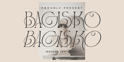 Bagisko is a serif modern and classic typeface with a unique style & modern look. This typeface is perfect for an elegant & luxury logo, book or movie title design, fashion brand, magazine, clothes, lettering, quotes, and so much more.
 - Asian Railway JNL by Jeff Levine,
$29.00 A poster for the 1932 film “Shanghai Express” starring Marlene Dietrich has the films name is a semi-Asian lettering style. This bold poster font is now available as Asian Railway JNL in both regular and oblique versions.
 - No Help by Jadatype,
$15.00 No Help is an all caps display font that comes with a scary-dark-black-halloween style. suitable for tshirt, branding, social media, and so on. contains standard English letters, numbers, punctuation, and several accents that support multilingualism.
 - Mystery Story JNL by Jeff Levine,
$29.00 The opening title card for “Grand Central Murder” (1942) is hand lettered in a stylized, condensed serif type style with strong but elegant appeal. This is now available as Mystery Story JNL in both regular and oblique versions.
 - The Wobliy by Letterena Studios,
$9.00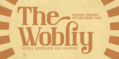 Wobliy is a classy serif font that has its own unique style & modern look. This typeface is perfect for an elegant & luxury logo, book or movie title design, fashion brand, magazine, clothes, lettering, quotes, and so much more.
 - True Sage by Creativemedialab,
$20.00 True Sage is a pretty decorative serif family. Contains Eight weights from thin to black. Vintage retro style dressed with pretty swirly alternates makes the lettering look pretty and unique, perfect for your heading, title, or branding projects.
 - Heralen Antelik by Letterena Studios,
$17.00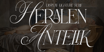 A serif modern and classic typeface that has its own unique style & modern look. This typeface is perfect for an elegant & luxury logo, book or movie title design, fashion brand, magazine, clothes, lettering, quotes, and so much more.
 - Hauntress by Jadatype,
$15.00 Hauntess is a Serif Font that comes with a scary sharp-display's style. suitable for posters, logotype, branding, social media, book, movie and so on. contains standard English letters, numbers, punctuation, alternates, and several accents that support multilingualism.
 - Gerlick by Letterena Studios,
$17.00 Gerlick s a modern and classic serif typeface with a unique style & modern look. This typeface is perfect for an elegant & luxury logo, book or movie title design, fashion brand, magazine, clothes, lettering, quotes, and so much more.
 - Qalisso by Letterena Studios,
$9.00 Qualisso is a modern and classic serif font with a unique style & modern look. This typeface is perfect for an elegant & luxury logo, book or movie title design, fashion brand, magazine, clothes, lettering, quotes, and so much more.
 - Trelink by Letterena Studios,
$17.00 A serif modern and classic typeface that has its own unique style & modern look. This typeface is perfect for an elegant & luxury logo, book or movie title design, fashion brand, magazine, clothes, lettering, quotes, and so much more.
 - Blue Pastel by Putracetol,
$28.00 Blue Pastel - Display Font is a bold and retro-inspired font that exudes uniqueness and groovy charm. Its display style makes it a perfect choice for various design applications. Whether you need a font for logos, branding, headlines, titles, posters, or a modern twist on retro designs, Blue Pastel is the ideal font to add a touch of nostalgia and contemporary flair to your projects. The bold display style of Blue Pastel immediately captures attention and adds a strong visual impact to your designs. Its retro-inspired elements evoke a sense of nostalgia, taking your audience on a trip down memory lane. The font's unique and groovy appearance sets it apart from traditional serif fonts, making it a great choice for those seeking a distinctive typographic solution. Whether you're creating a vintage-inspired logo, designing a groovy poster, or adding a retro twist to modern branding, Blue Pastel - Display Serif Font offers the versatility and character needed to elevate your designs to new heights.
 - Baldwin by Pen Culture,
$15.00 Introducing Baldwin, a modern retro serif font that seamlessly blends contemporary design with vintage flair. With its clean lines and classic letterforms, Baldwin exudes a timeless elegance that is perfect for a wide range of design projects. Whether you're creating branding materials, editorial layouts, or web designs, this versatile font will add a touch of sophistication to your work. Featuring a distinctive, slightly geometric serif style, Baldwin offers a fresh take on traditional serifs. Its balanced proportions and subtle detailing create a harmonious look that is both refined and approachable. Available in a variety of weights and styles, this font is designed to adapt to any design setting, from headlines to body copy. I really hope you enjoy it – please do let me know what you think, comments & likes are always hugely welcomed and appreciated. More importantly, please don’t hesitate to drop me a message if you have any issues or queries. Thank you
 - Futurism by Artyway,
$19.00 I am pleased to present you an excellent futuristic font "Futurism" in modern graphic style! The font supports the Latin alphabet and Cyrillic alphabet. It is recommended to use it at long intervals between letters, but you can customize it perfectly for your own design, use it to create logos, emblems, posters and posters. Futurism is very stylish, it ideally suited for a space mood, future tech and innovative products! Uppercase and lowercase english letters Uppercase cyr letters Numbers
 - Humpty Dumpling NF by Nick's Fonts,
$10.00This rollicking romp through the alphabet is based on an offering from the irrepressible M. Draim, seen in La Lettre dans le Décor & la Publicité Modernes, published by Monrocq Frères of Paris in 1932. Its animated and friendly demeanor will add personality to any headline it graces. Both versions of this font contain the Unicode 1252 (Latin) and Unicode 1250 (Central European) character sets, with localization for Romanian and Moldovan. - Golden Decades by Dharma Type,
$19.99 Back to the basics. In the last ten years, type design has been confronting chaotic scene. The font market is flooded with a mixture of wheat and chaff and typography becomes increasingly complex. But one golden straight path exists. The path began from the industrial revolution, passing through swiss style, now we walk along the path as a matter of course. It is sans-serif. The decades from the Swiss style, namely "less is more age" to the contemporary basic style "Less, but better age", we call it golden decades. In those decades, type design met modernism. Go back to a theory in the golden decades, we redesigned new geometric, minimal sans-serif. Less is more and better. We added cool and calm spices to the modernism in the golden decades. As a result, letterform has a contemporary, sharp, and neutral atmosphere, and geometric rounded bowls and counters create a nice rhythm. Golden Decades consists of 8 weights and their matching Italics for a wide range of usages. Farther, Golden Decades is supporting international Latin languages and basic Cyrillic languages including Basic Latin, Western Europe, Central and South-Eastern Europe. Also, Golden Decades covers Mac Roman, Windows1252, Adobe1 to 3. This wide range of international characters expands the capability of your works. Lowercase "a" has OpenType stylistic alternate for advanced typography.
 - Collette by Scholtz Fonts,
$21.00Collette was named in honor of an art deco font called "Independent" designed in the 1930s by Collette and Dufour. Collette is influenced by the design of the original font, however, there are substantial differences: instead of small caps, a true lower case was created, the upper case character proportions and shapes have been greatly modified, and all missing characters have been created to make a truly modern font which nevertheless has all of the panache of the original. It is best used to create a retro feel and in headings, subheads and in short passages of text. - Cervino by Typoforge Studio,
$29.00 Did you know that Cervino is the Italian name for one of the highest and most beautiful mountain in Europe - Matterhorn? Just like this majestic peak, our new family is HUGE. Cervino family consist of three width masters, with nine weights in each of them, giving the total amount of 54 instances. It is full of different features - from the wide set of numerals and math signs, by small caps to subscript and superscript. It covers full latin and Cyrillic script. Cervino would be a perfect choice for headlines, newspapers and for the longer texts as well.
 - Filo Pro by URW Type Foundry,
$49.99 Filo Pro is a very beautiful and highly legible typeface family as regular, medium and bold. It is a quite characteristic, modern interpretation of the humanistic serif. The serifs of Filo Pro are not too dominant, and its forms are soft and organic. The font family renders extremely well in text sizes but can equally well be used for headlines. The OpenType Pro family of Filo Pro comes with an extended Latin character set including a large number of beautiful ligatures as well as small caps and different sets of figures. Filo Pro has been chosen to be part of the URW++ SelecType.
 - Orbita by Resistenza,
$39.00 Orbita is a new playful display font. Based on our popular ‘Stencil Creek’ skeleton and keeping its freshness and grace. The aim was to create a new version, dynamic and full of movement, so we came along with this idea of adding a pop up effect which creates a visual illusion of strokes moving in different directions. The family includes 4 versions of this font. It’s perfect to create headlines, posters, book covers, cards, wrapping paper, invitations, T-shirts, labels, packaging and an endless array of options for your projects. In these flags is also featured one of our popular font, ‘Nautica’
 - Rosart and Fleisch Hi Res by California Type Foundry,
$129.00 This font is not just historic, but classy, timeless, and in its current form, a modern classic. The original Titling Caps and icons Jacque François Rosart painstakingly carved, now meticulously digitized to be a true, accurate, and complete representation of the original designs. You can get the fully matching family with "ALL", or choose the set that meets your immediate needs: Zodiac and Constellations - The Stars Have Aligned into a Great Font So what's your sign? Whatever it is, R&F has it, and in so many ways! Pictograph, symbol, constellation and picto-constellation are all included. Constellations are useable even in scientific and education settings: based on current star charts and matched to Bayer designations, these stars shine both in design and accuracy! Includes Rosart's original moon and sun faces. Faces for the planets to match those for the sun and moon. Rosart's symbols for the planets. Astrology symbols including, Rosart’s pictographs for the twelve signs. Constellations of the Zodiac from precise star charts. Precise small star shapes, so you can design other constellations. Pinwheel, saltires, asterisks, solid stars, and even the Christmas star. Dave Lawrence, "Each symbol was carefully designed to match the main font." Alchemy Symbols - Turns A Design into Gold From labeling your cupboard of magical ingredients to getting one step closer to the golden goose, these rare alchemical symbols are a treasure trove of possibilities. Including: classic symbols for elements combinations medicinals chemistry mathematical symbols Includes music symbols for titling, as well as Verse and Response symbols. Seasons - Symbols to Keep Things Organized Throughout the Year Classic weather stylings, including old fashioned lightning and an eclipsing moon with the four-o'clock shadow. Map Markers Religious Symbols Phases of the moon. Pointing symbols: fingers, arrows, triangles, with circles Matching Italics CAL's Dimension Slant™ Instead of sloping all the pictures and drawings to an even slant, a multidimensional approach was used. And each symbol was evaluated and crafted individually. Pro World1 Font The pro world font contains all of these: Latin Standard set Rosart's original backwards X alternate. Alternate U shape. In the italic: swash variants for the J, Q, and Y. Proportional Lining (default), proportional old style, small caps figures. CAL Dimension Slant, for dynamic italics Includes Rosart's original moon and sun faces, along with additional faces for each planet. Rosart’s symbols for the planets and pictographs for the twelve signs of the zodiac. Constellations of the Zodiac along with small star shapes. Large stars, pinwheel, saltires, asterisks Symbols for chemistry Medicine Music symbols Mathematical symbols Pointing symbols like the finger, acorn, arrow and triangle. Geometrical shapes. Plus these more: Latin Pro character set for central European languages and Turkish. Rare kerns for Polish, Czech, Slovakian and others. Ligatures needed for some central European orthographies. Lowered German Umlauts for better line spacing. Cyrillic uppercase and small caps for eastern Europe, southern Europe, and Russia, with kerning. Rosart’s original Greek uppercase and small caps, but also tonos for monotonic Greek. Vietnamese, which has been kerned. Pinyin, including a special form of the Ü so that titles can be set closer. Numbers: A set of stacking (nut) fractions, along with very elegant automatic fractions A large set of currency symbols in lining, old style, small caps, denominator and numerator sizes. Our first Retail Pricing Feature: (ss03 + ss04) Just turn on the feature and type $1.99 and Rosart will do the rest. Ampersand alternates. Numerator sized musical sharp and flat symbols. Dave Lawrence, “From the moment I saw these letters I knew I had to make this typeface. What I didn’t know was that I would end up drawing most of Rosart’s special symbols... But it was too hard to resist."
 - Lievin by Mofr24,
$11.00 Lievin is an exceptional slab serif font that stands out for its simplicity, clean lines, and captivating elegance. What sets it apart is its unique ability to effortlessly adapt to diverse design needs, making it a versatile choice for any project. With an impressive range of 50 variable styles, ranging from delicate thin to bold and massive black, Lievin caters to a wide array of typographic demands. Its versatility makes it perfect for various applications such as posters, marketing materials, logotypes, headlines, books, magazines, and more. One of the defining features of Lievin is its impeccable balance of classic charm and contemporary appeal. Its sleek and refined aesthetic adds a touch of sophistication to any design. The font's exceptional legibility ensures that the message is conveyed with clarity and impact. Lievin pairs harmoniously with a range of typefaces, making it an ideal choice for combination and layering. It complements sans-serif fonts, such as Helvetica or Futura, creating a visually dynamic and engaging typographic composition. Beyond its visual appeal, Lievin boasts an extensive character set, providing support for multiple languages and typographic features. This allows designers to express their creativity and accommodate different linguistic requirements. The design concept of Lievin is rooted in the desire to create a timeless and versatile slab serif font that would seamlessly integrate into modern design practices. Its clean lines and balanced proportions ensure legibility across various media and sizes, while its elegant charm adds a touch of sophistication. Lievin is the result of a meticulous creative process aimed at delivering a font that captures attention and makes a lasting impression. It combines the best of traditional and contemporary design elements, offering a fresh take on slab serif typography. As a modern typeface, Lievin is an original creation, not based on any historical design or revival. It embodies a contemporary interpretation of slab serif fonts while incorporating functional aspects that cater to the needs of today's designers.