10,000 search results
(0.078 seconds)
- Praitor by Scriptorium,
$18.00Praitor is based on a devotional inscription to the goddess Diana found a short distance from Rome in 1887. It is an early style from before 100 BC and has some characteristics of Etruscan lettering. It's a rough, strong font which works very well for distinctive titles. - Brown Sugar by Muntab Art,
$18.00 Brown Sugar fonts includes uppercase letters, numerals, a large range of punctuation. Serif font with modern stylish style. Created for poster, web design, branding, illustrations, badges and some other works. Please contact us if you have any question, we are happy to help you! Thank you!
 - Aiglon Drame by ErlosDesign,
$19.00 Aiglon Drame is a ligature serif font with modern style. It includes uppercase letters, numeral, a large range of punctuation, ligatures, alternates and also multilingual support. Perfects for poster, web design, magazine cover, album cover, branding and much more. Features: • Works on PC & Mac • Simple installation Enjoy!
 - Carpellon by Creativemedialab,
$16.00 Carpellon is inspired by tattoo scripts, and features nice curves to represent the combination of art and beauty. It is unique and easy to read, and includes both regular and ornament styles. It is best for use with gothic art themes, tattoo lettering, posters, logos and more.
 - Ageoline by Blankids,
$17.00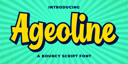 Introducing of our new product the name is Ageoline a Bouncy Script Font. Ageoline inspired by bouncy lettering style this font is a fun theme very good for display, tshirt design, craft, quote sign, logotype and etc FEATURES : Uppercase Lowercase Number Punctuation Multilingual PUA Encode Opentype
 - Alsace by 38-lineart,
$17.00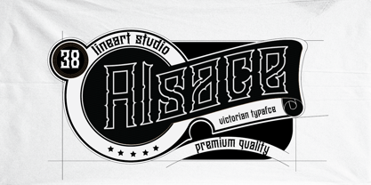 Alsace is a powerful blackletter font. It features a great look and feel and it is perfect for logos, tattoo designs, branding, stationery and much more! vintage styled and assertive display font. Thick lettered and distinct, this font will make each of your designs stand out
 - NS Mudolf by Novi Souldado,
$35.00 NS Mudolf is inspired by the lettering of vintage prints, signs and labels. It comes with five font styles and extra swashes, ligatures and stylistic alternates. It's ideal and perfect for creating a design piece such as letterheads, posters, signage, charters, labels, packaging, logotypes, and more.
 - Best Life by Sulthan Studio,
$12.00 Best life - This cool one line handwritten font is very stylish and elegant that has a great style for your work with hearts in the middle and also lowercase swashes in front and back and lowercase swashes on back and hearts in front of letters to connect.
 - Show Card Brush JNL by Jeff Levine,
$29.00 A movie poster for the 1952 Dean Martin & Jerry Lewis comedy “Sailor Beware” had the text rendered in a casual style of brush lettering similar to that found on store show cards. This inspired Show Card Brush JNL, which is available in both regular and oblique versions.
 - Matwin by Eyad Al-Samman,
$10.00 The idea behind designing ‘Matwin’ font was related to the youngest children of the designer namely the M-A fraternal twin. The name of the typeface (i.e., Matwin or M-A-Twin) was composed by merging three linguistic small syllables. The ‘-Twin’ syllable refers to the non-identical twin of the designer. The ‘M-’ and ‘A-’ syllables refer to the initial letters of the twin’s first names (i.e., Muhammad and Abdul-Wli) respectively. The typeface ‘Matwin’ has a personal trait which makes it as one of the most favorite fonts for the designer among his humble collection of fonts. Modestly, it is the designer’s handwriting and it has been designed to be added to the script font family known as brush un-joined. The brief process for having this typeface alive was done by firstly scanning the real script for each Latin letter, digit, symbol which were handwritten earlier by the designer himself. Then, the combination of these many scanned characters was manipulated using digital programs to produce at the end the complete typeface. The typeface has the essential glyphs comprising the character set required for most of the Latin, Western, and Eastern European languages including the Irish language. It combines +605 characters and this makes it as a pro font. It also entitles it to be applicable for usage in many languages of different communities and nations worldwide. ‘Matwin’ is dedicated for those who search for a genuine handwriting typeface with a natural touch and informal style to be added on their different published and produced products and services. It is more preferable when it is used in artistic, typographic, and other works using the lowercase letters or by mixing both upper- and lower-case letters. Moreover, the typeface is appropriate for any type of typographic and graphic designs in web, print, and other media such as boards and walls. It is also preferable to be used in the wide fields related to publications especially children-related ones, comics, printed or handwritten menus of cafeterias and restaurants at universities and public places, as well as other prints related to services and production industries. It also can create a very personal and friendly impact when used in headlines, books and novels’ covers, posters, titles, messages, envelopes addresses, grocery lists, postcards, ads, fliers, journals, paper arts, public notices, invitations, scrapbooks, notations, products’ surfaces for organic foods and juices, logos, medical packages related to children, Android applications, as well as products and corporates branding and the like. In a nutshell, ‘Matwin’ typeface fits without a glitch those (i.e., designers, typographers, publishers, artists, packagers, service providers, and so on) who have drastic and strong tendency towards imprinting their works with spontaneous and outlandish touches made by this typeface. Please, enjoy it extremely.
 - Rennie Mackintosh Allan Glens by CRMFontCo,
$35.00Since the 2006 launch of Rennie Mackintosh Glasgow, the world’s first lowercase Mackintosh-style typeface, designer George R. Grant has been pleased with its acceptance by Mackintosh lovers around the world. In fact, “Glasgow” has proved to be as popular as the original “founding” font, the classic Charles Rennie Mackintosh Font. By modifying many of these letterforms, and giving a more “freehand” shaping, George has developed this latest offering. The font has irregular “serifs” at the extremities of each stem - a suggestion of being handwritten. The name “Allan Glens” comes from the high school Mackintosh attended which, coincidentally, George did too. Says George, “As the school no longer exists, I wanted a way to perpetuate the Allan Glen’s name in type. I can think of no better way than associating it with the name of one of the school’s most famous sons. One of the glyphs even features the school logo”. - Modster Script by Moovied Co.,
$15.00 Modster Script is a collective inspired by urban style created from the style of hand-lettering with love. Modster comes with a set of styles, alternatives, present and extra shadow. This font is ideal for branding, logos, handwritten quotes, product packaging, headers, posters, merchandise, social media books / cover titles, special events, etc. To enable the OpenType Stylistic alternates, you need a program that supports OpenType features such as Adobe Illustrator CS, Adobe Indesign & CorelDraw X6-X7. There are additional ways to access alternates, using Character Map (Windows), Nexus Font (Windows), Font Book (Mac) or a software program such as PopChar (for Windows and Mac).
 - Rimbomba by Muykyta,
$13.00 Rimbomba is a freehand style font with long ascenders and descenders and a steep slant making it elegant yet casual. It is inspired by writing letters by hand, as it was done before, with strokes that in the normal style imitate the tip of a pen and in the medium and bold styles they imitate a round pen stroke. It is a font with strength in its movements and finesse in its curves, which creates a homogeneous set that is easy to read and which produces a certain reading speed. It is complemented with stylistic alternatives for the beginning and the end of the words.
 - Artwork Stencil JNL by Jeff Levine,
$29.00 Many great lettering examples were found in the 1939 French publication by Georges Léculier, "Modèles de Lettres Moderns" ("Models of Modern Letters"). One design in particular is a stencil alphabet so typical of the Art Deco movement of the 1930s. Artwork Stencil JNL is now available digitally in both regular and oblique versions.
 - ITC Founder's Caslon by ITC,
$40.99The Englishman William Caslon punchcut many roman, italic, and non-Latin typefaces from 1720 until his death in 1766. At that time most types were being imported to England from Dutch sources, so Caslon was influenced by the characteristics of Dutch types. He did, however, achieve a level of craft that enabled his recognition as the first great English punchcutter. Caslon's roman became so popular that it was known as the script of kings, although on the other side of the political spectrum (and the ocean), the Americans used it for their Declaration of Independence in 1776. The original Caslon specimen sheets and punches have long provided a fertile source for the range of types bearing his name. Identifying characteristics of most Caslons include a cap A with a scooped-out apex; a cap C with two full serifs; and in the italic, a swashed lowercase v and w. Caslon's types have achieved legendary status among printers and typographers, and are considered safe, solid, and dependable. ITC Founder's Caslon® was created in 1998 by Justin Howes, an English designer who used the resources of the St. Bride Printing Library in London to thoroughly research William Caslon and his types. As was common in the eighteenth century, Caslon had punchcut several different sizes of his types, and each size had a slightly different design. Howes digitized every size of type that Caslon cast, keeping their peculiarities and irregularities and reproducing them as they appeared on the printed page. This family has the 12 point, 30 point, 42 point, and Poster styles, as well as a full set of bona fide ornaments. In keeping with the original Caslon types, none of the sizes have bold weights, the numerals are all old style figures, and a full set of ligatures (some with quaint forms) are included. ITC Founder's Caslon® is a remarkable revival in the true sense of the word, and works beautifully in graphic designs or texts that require an authentic English or historical flavor. - 1815 Waterloo by GLC,
$38.00 This script font was inspired by a few manuscripts and letters written by French representatives or ministers after the defeat of Napoleon at Waterloo. It is an attempt to offer a typical handwritten script from this period. This font can be used variously as website titles, in the design of posters, fliers and greeting cards, as well as for menus, certificates and letters as a very decorative, elegant and unusual font. This font supports large sizes as well as small ones, remaining clear and easy to read.
 - Testament by Canada Type,
$24.95 From the standpoint of calligraphy, a font family of capitals and uncials makes perfect sense. The Roman square capitals, the quadrata, are matched by round capitals of older Greek origin; the word "uncus" means hook-shaped like a beak or talon. Interrelated and often interchangeable, these capital letters served as book hands for both the Latin West and the Greek-speaking East before they evolved into minuscule alphabets. The Testament family is based on the few formal capital manuscripts of the Bible, Virgil and Homer that have survived from the ancient world. Throughout the Middle Ages both uncials and square capitals were used, often together, for headings and initial characters. By their nature the Roman capitals are the voice of Caesar and hold the place of authority, while the uncials speak for the Church in a balanced relationship. In ancient times church and state were not as separate as they are now, and the alphabets were not as different as typographic tradition has made them. In this calligraphic rendering it is clear that they are of the same substance and can be written in the same style, conveying even to the modern eye the eternal and classical quality of epic and scripture. Testament comes in all popular font formats, and includes support for a vaster-than-usual range of Latin-based languages.
 - Merchandising JNL by Jeff Levine,
$29.00 With some slight variation, Merchandising JNL was modeled from the lettering on a display box for Meyercord Decal letters and numbers. The phrase "make your own signs with decals" was lettered in a casual brush-like style, and is reproduced for the first time digitally.
 - Gersio by Rosario Nocera,
$16.00 Gersio is a revisiting of a lapidary typeface from the 19th century designed for the horror and thriller genre but thanks to its strong distinctiveness it’s also suitable for branding. Gersio is available in light, regular and bold weights in two versions: solid and Scratched, it also offers a large selection of alternative letters. Gersio is suitable for display works, posters and billboards.
 - Kirschwasser NF by Nick's Fonts,
$10.00An unannotated photocopy tucked inside the leaves of an old lettering book yielded this unusual and exuberant Art Deco face. The caps feature a simple “bubbly” pattern that makes this offering pack a punch, not unlike the German cherry brandy for which it is named. Both versions of the font include 1252 Latin, 1250 CE (with localization for Romanian and Moldovan). - Martinaz by Typogama,
$19.00 Martinaz is a retro inspired, bold script typeface created for use in logos, posters or packaging. Through the use of extensive Opentype features, this font offers variable letter combinations that can easily be integrated or mixed. An added feature is the inclusion of a few typographic fleurons that can either be used with the text or as icons in your design.
 - Society Column JNL by Jeff Levine,
$29.00 The title card for the 1938 screwball comedy "Four's a Crowd" (starring Errol Flynn, Olivia de Havilland and Rosalind Russell) offered a classic, thin Art Deco type design with stylized letter forms. This is the basis for Society Column JNL; which derives its name from the newspaper columns popularized in that era detailing the whereabouts of the "upper crust" of society.
 - Brookside JNL by Jeff Levine,
$29.00 The 1920s were part of an era in songwriting where snappy wordplay and clever (if not long) titles prevailed. The lettering on one such piece of sheet music with the song title "In A Shady Nook by A Babbling Brook" offered up a bold, condensed sans serif design which is now available digitally as Brookside JNL. Available in both regular and oblique versions.
 - Avenir Next Cyrillic by Linotype,
$49.00 The original Avenir typeface was designed by Adrian Frutiger in 1988, after years of having an interest in sans serif typefaces. The word Avenir means “future” in French and hints that the typeface owes some of its interpretation to Futura. But unlike Futura, Avenir is not purely geometric; it has vertical strokes that are thicker than the horizontals, an “o” that is not a perfect circle, and shortened ascenders. These nuances aid in legibility and give Avenir a harmonious and sensible appearance for both texts and headlines. In 2012, Akira Kobayashi worked alongside Avenir’s esteemed creator Adrian Frutiger to bring Avenir Next to life, as a new take on the classic Avenir. The goal of the project was to take a beautifully designed sans and update it so that its technical standards surpass the status quo, leaving us with a truly superior sans family. Since then, Monotype expanded the typeface to accommodate more languages. Akira’s deep familiarity with existing iterations of the Frutiger designs, along with his understanding of the design philosophy of the man himself, made him uniquely suited to lead the creation of different language fonts. Avenir Next World family, the most recent release from Monotype, is an expansive family of fonts that offers support for more than 150 languages and scripts that include Latin, Cyrillic, Greek, Hebrew, Arabic, Georgian, Armenian and Thai. Avenir Next World contains 10 weights, from UltraLight to Heavy. The respective 10 Italic styles do not support Arabic, Georgian and Thai, since Italic styles are unfamiliar in these scripts/languages. Separate Non-Latin products to support just the Arabic, Cyrillic, Georgian, Hebrew and Thai script are also available for those who do not need the full language support.
 - Avenir Next World by Linotype,
$149.00 The original Avenir typeface was designed by Adrian Frutiger in 1988, after years of having an interest in sans serif typefaces. The word Avenir means “future” in French and hints that the typeface owes some of its interpretation to Futura. But unlike Futura, Avenir is not purely geometric; it has vertical strokes that are thicker than the horizontals, an “o” that is not a perfect circle, and shortened ascenders. These nuances aid in legibility and give Avenir a harmonious and sensible appearance for both texts and headlines. In 2012, Akira Kobayashi worked alongside Avenir’s esteemed creator Adrian Frutiger to bring Avenir Next to life, as a new take on the classic Avenir. The goal of the project was to take a beautifully designed sans and update it so that its technical standards surpass the status quo, leaving us with a truly superior sans family. Since then, Monotype expanded the typeface to accommodate more languages. Akira’s deep familiarity with existing iterations of the Frutiger designs, along with his understanding of the design philosophy of the man himself, made him uniquely suited to lead the creation of different language fonts. Avenir Next World family, the most recent release from Monotype, is an expansive family of fonts that offers support for more than 150 languages and scripts that include Latin, Cyrillic, Greek, Hebrew, Arabic, Georgian, Armenian and Thai. Avenir Next World contains 10 weights, from UltraLight to Heavy. The respective 10 Italic styles do not support Arabic, Georgian and Thai, since Italic styles are unfamiliar in these scripts/languages. Separate Non-Latin products to support just the Arabic, Cyrillic, Georgian, Hebrew and Thai script are also available for those who do not need the full language support.
 - Avenir Next Hebrew by Linotype,
$79.00 The original Avenir typeface was designed by Adrian Frutiger in 1988, after years of having an interest in sans serif typefaces. The word Avenir means “future” in French and hints that the typeface owes some of its interpretation to Futura. But unlike Futura, Avenir is not purely geometric; it has vertical strokes that are thicker than the horizontals, an “o” that is not a perfect circle, and shortened ascenders. These nuances aid in legibility and give Avenir a harmonious and sensible appearance for both texts and headlines. In 2012, Akira Kobayashi worked alongside Avenir’s esteemed creator Adrian Frutiger to bring Avenir Next to life, as a new take on the classic Avenir. The goal of the project was to take a beautifully designed sans and update it so that its technical standards surpass the status quo, leaving us with a truly superior sans family. Since then, Monotype expanded the typeface to accommodate more languages. Akira’s deep familiarity with existing iterations of the Frutiger designs, along with his understanding of the design philosophy of the man himself, made him uniquely suited to lead the creation of different language fonts. Avenir Next World family, the most recent release from Monotype, is an expansive family of fonts that offers support for more than 150 languages and scripts that include Latin, Cyrillic, Greek, Hebrew, Arabic, Georgian, Armenian and Thai. Avenir Next World contains 10 weights, from UltraLight to Heavy. The respective 10 Italic styles do not support Arabic, Georgian and Thai, since Italic styles are unfamiliar in these scripts/languages. Separate Non-Latin products to support just the Arabic, Cyrillic, Georgian, Hebrew and Thai script are also available for those who do not need the full language support.
 - Sign and Display JNL by Jeff Levine,
$29.00 Sign and Display JNL is a long-overdue companion font to 2009’s Sign and Poster JNL. The original design models were Art Deco influenced die-cut cardboard letters and numbers manufactured by the Duro Decal Company of Chicago. Square in shape with rounded corners, the thick cardboard letters were used for making show-cards and other display signage. Subsequently, Duro used the same style of lettering to manufacture water-applied decals for boat identification and other uses. It was a set of these decals (with a black outline and yellow interior) that inspired the outline typeface Sign and Display JNL, which is available in both regular and oblique versions.
 - Blue Venom by Linecreative,
$16.00 Blue Venom is a unique typography with a modern style, Each letter is cut into two parts, the first consists of three labyrinthine combined lines and the other is a diagonal cut line, so that the combination of these two parts into one letter that looks stunning , and each letter consists of four character choices, two character choices for numbers, and equipped with Ligatures (Opentype feature) All character options are included in one font. You can use alternatives in most major image editors, just find the Glyps (Alternate) menu item there. For example, in Adobe Illustrator you need to select the Window / Type / Glyphs menu item.
 - Floresta by Great Studio,
$21.00 Floresta is a modern vintage serif font packaged in a modern and classy style, complete with access to your OpenType features to access a large selection of alternates letters and ligatures, the choice of letters you like from variations of uppercase and lowercase letters to get a display luxurious and elegant. Floresta Display has 433 glyphs with 11 ligatures and 197 alternates to beautify the design you like. This font is perfect for branding projects, Logo design, Clothing Branding, packaging, magazine headings, advertising, T-shirts, postcards and much more. Features · All Uppercase and Lowercase · Number & Symbol · Supported Languages · Alternates and Ligatures · PUA Encoded Thank you, Great Studio
 - Museum Initials by Wundes,
$12.00Museum is the Wundes foundry's first font revival. These letter forms are scanned from the engravings of Freeman Delamotte who in 1879 published a spectacular set of ancient and mediaeval ornamental alphabets. The original forms for this font were created in 1490, a few years before Columbus discovered America. There was not much information on the origin of this font, save that it came from a British museum, hence the name. The original character set was missing the letters J,P,V and W so I've constructed these letters in the same style to complete the alphabet. Other than those 4 additions, the engravings are true to their original forms. - Bigola Display by Great Studio,
$20.00 Bigola Display is a modern vintage serif font packaged in a modern and classy style, complete with access to your OpenType features to access a large selection of alternates letters and ligatures, the choice of letters you like from variations of uppercase and lowercase letters to get a display luxurious and elegant. Unique, playful and versatile serif family with 14 ligatures and 170 alternates to beautify the design you like. This font is perfect for branding projects, Logo design, Clothing Branding, packaging, magazine headings, advertising, T-shirts, postcards and much more. What is included: Bigola Display Regular Features · All Uppercase and Lowercase · Number & Symbol · Supported Languages · Alternates and Ligatures · PUA Encoded
 - MFC Hills Medieval by Monogram Fonts Co.,
$24.95 MFC Hills Medieval was developed from a unique historical Blackletter type specimen in the 1882 Hills Manual of Social and Business Forms. While you could use its ornate capitals to construct a monogram, this is not a monogram font, but a fully functional typeface for invitations and period lettering. From stylish and ornate capitals to a soft lowercase resembling bled ink, this period lettering style is a true eye-catcher. Because of some of the unique medieval letterforms, standardized letterforms were created as the default typeable letters while the true historical forms were setup as Stylistic Alternates. A sophisticated Blackletter for manuscripts and invitations alike.
 - Axiforma by Kastelov,
$55.00 Axiforma was designed with the single idea of creating a font that starts with the letter A, because let's face it, this is the best letter. For those of you who didn't see it coming, Axiforma is a /drum roll/ geometric sans in 20 weights. If you are thinking "Oh boy, another geometric sans", you clearly know your stuff. Yet, Axiforma is different in at least three crucial ways: 1) It's made by me 2) It's not free 3) It's polite and humble Additionally, Axiforma is packed with Opentype such as oldstyle numbers, fractions, case sensitive alternates, localized forms, stylistic sets, cyrillic alphabets (Bulgarian & Russian) and many more. Basically it's quite extensive and kinda great. Upon using Axiforma, clients will start to behave differently around you and may even start paying you. Your spouse will start working out again just to gain your attention and your kid will become instantly popular at school. After all you are using Axiforma and rumors do spread quickly. That's what we are talking about - raw font power. With Axiforma regular typed text is suddently transformed into first class design. That includes branding, posters, headlines, display, presentation materials, websites, logotypes, etc. The world will now be your playground. To sum it up, Axiforma is badass, thus you should have it and use it everywhere.
 - PhrackSle by Ingrimayne Type,
$11.95 PhrackSle is a a Fraktur face with a difference: it has a uniform stroke rather than a calligraphic-pen stroke. It comes in four weights: thin, plain, bold, and extrabold. (For a version of the design done with a calligraphic stroke, see PhederFrack.)
 - Sadina S by NumidiaType,
$29.00 Sadina™ S is the small lowercase font family of the default version Sadina™, It comes with the same OpenType features provided in the default family, and all lowercase glyphs are designed smaller. It will give you a different scripting taste.
 - No Liming by chicken,
$17.00 A chunky, laid-back typeface inspired by a hand-painted notice on the doors of a mechanic's workshop in Plymouth, Tobago. Two different mostly-uppercase alphabets in one font help to keep things loose. 'Liming'? hanging out, drinking rum, shooting the breeze...
 - Pimpaw Cat by Yoga Letter,
$15.00 "Pimpaw Cat" is a unique and cute display font. This font is decorated with different types of cat shapes. Equipped with uppercase, lowercase, ligatures, punctuations, numerals, and multilingual support Suitable for posters, banners, prints, branding, stickers, magazine titles, film titles, and more.
 - Born Strong by Rook Supply,
$16.00 Born Strong is built with athletics in mind. The goal was to make the perfect typeface for sports teams, college football, athletic wear and everything in between. The font family supports a wide range of languages and is available in many different weights.
 - ITC Tactile by ITC,
$29.99ITC Tactile is a puzzle of subtle typographic contradictions. Capitals have traditional epigraphic proportions, but the lowercase has a uniform optical width. Light weights are stately and elegant, but bold designs are almost jolly. This paradoxical alphabet even combines two distinctively different serif designs. Designer Joe Stitzlein says, “I wanted to create a modern and dynamic serif face that draws its forms from antiquity. I also wanted to have as much fun as possible with the drawing and architecture of each letter. Hopefully I've created a very legible typeface that grabs the reader's eye in a nice, 'tactile' way.” The apparent inconsistencies of the design are the result of careful consideration. Of the seemingly odd serif design, Stitzlein explains, “The transitional serif is an entry point for the eye into the letterform, and the long slab is an exit, leading to the next letter.” The result is a typeface that's easy to read at text sizes but offers surprising details when enlarged to display sizes, setting ITC Tactile apart from more traditional designs. While this is his first commercial typeface design, Stitzlein has ample experience creating custom typefaces for corporate branding, including companies such as Silicon Graphics and Sempra Energy. His graphic design business has served a wide range of clients, including Apple Computer and the 2002 Salt Lake City Olympics. The ITC Tactile family is available in three weights, with complementary italic designs and a suite of small caps for each of the roman designs. Stitzlein drew the small caps to match the height of the lowercase x-height, which enables “bi-form” or “unicase” setting in display copy. - Varia Display by Tomtype,
$6.00 Introducing Varia Display, a font that emerged from the renowned challenge of 36 Days of Type. In the 2023's edition, I embarked on a journey to explore a wide variety of styles, leading to infinite possibilities for crafting unique letterforms. The result is a meticulously crafted variable font with a single weight axis, designed to push the boundaries of typographic aesthetics across all characters. With each letter and number embodying a distinct and innovative approach, this font offers a captivating typographic experience. With its distinctive and varied letterforms, this font is ideally suited for eye-catching main headlines and complementary typography. Whether you seek diversity or a touch of uniqueness, this font is sure to meet your creative needs. Embrace the world of possibilities it presents and elevate your designs to new heights. Key features: Meticulously designed Variable Font Single Weight Axis Multilingual support 374 glyphs Contact: If you have any doubts or questions please ask me via mail or Instagram hello@tomascastiglioni.com @tomtype