10,000 search results
(0.127 seconds)
- Howlett by Greater Albion Typefounders,
$22.95 Howlett combines great character with extreme legibility. It's a simple display face that offers a sense of coziness and order, that speaks of all being well with the world. It is a modern design which pays due Acknowledgment to the past. An extensive range of Opentype features, including old-style numerals, terminal forms, ligatures and stylistic alternatives are included. Use it for headings and titles as well as eye catching poster work.
 - Michael Sheikh by Silverdav,
$18.00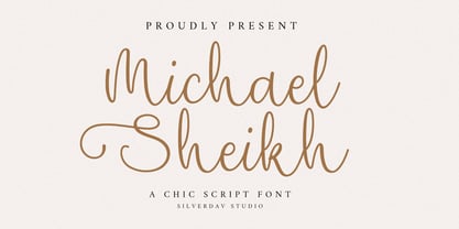 Introducing the “Michael Sheikh” font, a playful and unique handwriting typeface designed to infuse your projects with a touch of whimsy and character. This font offers a delightful collection of alternate characters, providing you with endless creative possibilities. With “Michael Sheikh,” you can effortlessly add and charming touch to your designs. Its handcrafted style lends authenticity and warmth, making it perfect for a wide range of applications, from invitations to branding and beyond.
 - Brattons by Lone Army,
$17.00 Brattons, a newly crafted font, embodies an essence of elegance and sophistication. Its graceful curves and delicate strokes exude a distinctly feminine allure, capturing the essence of luxury and style. This serif font boasts stylistic alternates and ligatures that elevate its visual appeal, offering a unique and refined touch to any design project. Brattons is a testament to its meticulous craftsmanship, designed to resonate with those seeking a blend of timeless charm and contemporary finesse.
 - Molard Two by Putracetol,
$20.00 Molard - Modern Various Font. This sans-serif typeface offers a diverse range of styles, featuring two distinct weights and versions – clean and textured. With a selection of three texture levels, Molard presents a total of eight fonts in its collection. Its contemporary and robust aesthetic adds an assertive touch to your projects. Perfectly suited for logo creation, branding, labels, quotes, printing, magazines, posters, film titles, and more, Molard empowers your creativity to flourish.
 - Brother Garage by Edignwn Type,
$18.00 Introducing Brother Garage, the ultimate vintage motorcycle-inspired font collection designed to bring the spirit of the garage to your designs. This combines the best of stencil serif and sans serif fonts. With three unique styles - regular, rough, and stamp - Brother Garage offers authenticity, allowing you to effortlessly bring your designs with the rustic and classic looks. But that's not all! Alongside the Brother Garage fonts, you'll receive a fantastic bonus of 13 crafted illustrations.
 - Gandy Dancer NF by Nick's Fonts,
$10.00The 1912 American Specimen Book of Type Styles from ATF featured a quaint little offering called "Tabard", whose antique charm was enhanced by several rather quirky alternate characters. This version tosses out the standard characters and keeps the quirks in the works: the result is warm, engaging, slightly mischievous and a whole lot of fun. The Opentype version of this font supports Unicode 1250 (Central European) languages, as well as Unicode 1252 (Latin) languages. - Planet Express by Estudio Calderon,
$29.99 Family type designed by Felipe Calderón. This type is a display with a modern style and a different and innovative concept. The development of this type was a challenge because it was set out from the begining as a script font with ornaments and complements, where the round shapes do not have prominence in the result. Planet Express is an interesting job from the aesthetic point of view, it works for big scale texts and contains little shadow-cuts in each character to give it more personality and stand out among other fonts from this gender. I hope this new project works to solve issues in design. Planet Express is composed of Regular & Italics, it has 250 intelligent ligatures to produce the best signs in big scale, it is perfect for branding and works very well with the geometric complements. It is designed with programming in opentype: Ligatures, Discretionary ligatures, Stylistic Alternates, Stylistic set 01, Stylistic set 02, Stylistic set 03, Stylistic set 04, Stylistic set 05, Stylistic set 06, Stylistic set 07, Stylistic set 08 & Stylistic set 09, multiple language support and a complete set of extras like arrows, catchwords, flags, emblems, hands, fleurons & crossed elements. Planet Express can be used in different ways, each character pretends to cover the needs in any circumstance where it is used. It is funny to write words and play with the complements. It also works with current concepts in graphic design like sports, cars, hip hop, music, social network, skateboarding and more. Everybody can use this font, it works with different languages like italian, french, portuguese, danish, german and so forth. See specimen and samples here. Enjoy it!
 - Oktah Neue by Groteskly Yours,
$25.00 Oktah Neue is an extended version of a more limited Oktah family. Since its release in 2019, Oktah Neue received two major updates, the most recent in June 2022. The latest version of Oktah Neue is comes in 22 styles as well as one variable font. Oktah Neue inherits the best traits of Oktah—great legibility, simple geometric letters shapes, low contrast across all styles—but also introduces what Oktah fell short of: extensive language support and enhanced OpenType features. While working on Oktah Neue, we strove to create a neutral typeface that would be a workhorse for designers, typographers and other font users alike. Building onto the familiar shapes of Oktah, we tried to make them more neutral, at the same time preserving the unique character of the typeface. Certain characters remained the same, others have undergone a complete transformation, which left them better tailored for the wide implementation range of Oktah Neue. Over the past years the size of the character set in Oktah Neue was significantly expanded (currently standing at 2500+ characters). In addition to Extended Latin, new language systems (Extended Cyrillic, Greek — both Basic and Polytonic — and Hebrew) were introduced. The already vast Cyrillic set also includes localised forms for such languages as Bulgarian, Serbian and many others. Oktah Neue is OpenType friendly: it knows how to do alternatives, contextual alternatives, switch various between stylistic sets and adjust the height of punctuation and symbols as you type. Small Caps include all listed languages as well as numerals and symbols. Oktah Neue comes equipped with various styles of numerals — from standard Proportional Lining figures to Oldstyle, Tabular Oldstyle. Sub- and Superscript, Fractions and two sets of circled numbers. Oktah Neue is well-kerned with more than 3000 kerning pairs and automatically hinted. Oktah Neue comes in 22 styles (11 uprights and 11 italics), two of which — Ultra Light and Black Italic — can be downloaded free of charge to get a firsthand experience of what Oktah Neue is ready to offer. The latest update of Oktah Neue introduced a fully variable option: now, both axes (Slant and Weight) can be accessed in the same file for utmost convenience.
 - Sabinard by Greater Albion Typefounders,
$12.95 Sabinard offers a distinctive form of 'Swash' lettering. It is excellent for poster work, or for headings and titles. Its distinguishing feature is the combination of long ascenders and descenders with a small cap height. It has been designed to compliment Greater Albion's Sabio, but also works splendidly as a 'feature' type alongside any Roman Face.
 - Avendica by Mokatype Studio,
$24.00 Avendica is an experimental typeface inspired by Celtic Roman font. It’s developed with a modern serif style design so it looks elegant and luxurious. This font is only used in Uppercase form with some different styles between the uppercase and the lowercase. This font is suitable for short-text designs like headlines, logos, brands, and more. Works on PC & Mac, simple installations, accessible in Adobe Illustrator, Adobe Photoshop, Adobe InDesign, and even works on Microsoft Word. PUA Encoded Characters - Fully accessible without additional design software. Fonts include multilingual support Image used: All photographs/pictures/vectors used in the preview are not included, they are intended for illustration only. Thank You
 - Fernolester by Maculinc,
$10.00 Fernolester is a classic themed font with a unique edge and above all; packed with different styles and ligatures - making it easy to create unique characteristics for your project. This typeface has a classic taste, very suitable as a design choice for books, magazines, packaging, branding, signage and many other creative projects. To activate the OpenType Stylistic alternative, you need a program that supports OpenType features such as Adobe Illustrator CS, Adobe Photoshop, Adobe Indesign & CorelDraw X6-X7. and much more This package includes 4 files; Fernolester Regular, Fernolester Italic, Fernolester Regular In Style & Fernolester Italic Instyle as OTF & TTF. Mail support : maculinc@gmail.com Thank you! Maculinc
 - Boyscotte by Trim Studio,
$13.99 Boyscotte Handwritting font, a elegant mix beauty and masculine font, its crafted to deliver the simple style it self, and brings mature on design style, Boyscotte also have 3 different weight, so you can easily combine and adjust the design theme with it Its perfectly suited for crafter and graphic artist to complete their design such as invitation, advertisement, poster, logo, birthday, product sign, magazine, book, and many more! even so contains All Standard glyphs and punctuations --- File Include: - Boyscotte Regular - Boyscotte Medium - Boyscotte Bold Thank you for let us be your design partner, If you have any questions please don't hesitate to drop me a message
 - Night Light Neon by Wing's Art Studio,
$24.00 Night Light is a specially created collection of seven neon inspired fonts giving designers the power to replicate traditionally hand-made lettering from the comfort of their own computer. Choose from the selection of script, sans serif and outline fonts to set your text. Then apply our custom graphic styles for a life giving jolt of electricity! The appeal of neon lettering lives in its power to display a message in a functional, eye-catching and timelessly cool way. How many times have you stopped in the street to admire a bar sign or shop front blazing with neon colors? It's aesthetic works equally well for a Hot Dog stand or high-end fashion brand, providing a tried and tested technique for grabbing customer attention. I've designed these fonts to make the power of neon accessible to all, investing time to research real neon signs and how they are made, paying attention to their human imperfections and inherent limitations (all of which makes them). This research has been distilled into these essential styles; Script, Outline, Inline, Square and Compressed. These seven core fonts give designers a new opportunity to take advantage of realistic neon lettering in their print and online projects, perfect for music promotion, film titles, YouTube tutorials and gig posters. Ready to be moulded to any requirement, the power of neon is in your hands. Neon Graphic Style Presets Available Here The link above provides access to the graphic styles seen in the visuals with support for Adobe Photoshop, Adobe Illustrator, Adobe After Effects. Simply download and follow the instructions provided.
 - Eleanore Typeface by IKIIKOWRK,
$17.00 Proudly present Eleanore Typeface, created by ikiiko. A decorative typeface that has own unique style & modern look. This typeface is perfect for an elegant & luxury logo, book or movie title design, fashion brand, magazine, clothes, lettering, quotes, and so much more. What's Included? Uppercase & Lowercase Number & Punctuation Multilingual Support Format File : TTF & OTF Works on PC & Mac Get also a good offer & FREEBIE at our site : www.ikiiko.com Enjoy our font and if you have any questions, you can contact us by email : ikiikowrk@gmail.com
 - Hand Stamp Slab Serif Rough by TypoGraphicDesign,
$25.00 The typeface “Hand Stamp Slab Serif Rough” was designed for the Typo Graphic Design font foundry in 2017 by Manuel Viergutz. It is a display font with a classic slab serifs based on real rubber stamp letters for a authentic, rough & dirty, stamped-by-hand appearance. It provides a vintage look through state-of-the-art Open Type features such as contextual alternates that cycle automatically through 5 different letter variants for each character to create a varied look, just as if the letters were stamped by hand. The font is intended for use in logos, magazines, posters, advertisements, and as a webfont for decorative headlines. The font works best for display sizes. There are 1031 glyphs with 5× A–Z, 0–9 & a–z and 70+ decorative extras like arrows, dingbats, symbols, geometric shapes, catchwords, and many alternative letters. A range of figure set options including oldstyle figures and additional decorative ligatures (type the word “love” for ❤ … ), Versal Eszett (German Capital Sharp S), symbols, and emojis. Have fun with this font & use the DEMO-FONT (with a reduced glyph-set) FREE!
 - MFC Billow Monogram by Monogram Fonts Co.,
$299.00 The inspiration source for MFC Billow Monogram is a beautiful letterset from the "Manuel de Broderies No. 179" by N. Alexandre & Cie. from the late 1800's. We've drawn out some flourishes and ornamental glyphs based on the original design in order to offer more versatility with this monogram. Experiment with the flourishes in different combinations. You may be surprised at what you can create! Download and view the MFC Billow Monogram Guidebook if you would like to learn a little more.
 - AT Move Decoupe by André Toet Design,
$39.95 Découpé Based on a French children’s play from 1906. In a car boot sale André Toet found a funny looking box containing a lot of cut out cardboard figures, in fact it looked a bit like a geometric puzzle! He played around a bit and succeeded to create a workable typeface with it ! The interesting thing about this particular font is, that in fact it’s organized chaos. The 26 letters of the alphabet are a mix between caps and lowercases, so within one word caps and lowercases will be used next to each other. It’s a very useful font for different projects. Concept/Art Direction/Design: André Toet © 2017
 - CA Moskow has a plan by Cape Arcona Type Foundry,
$20.00 Inspired by an old Russian book about Moscow’s plan to take over the world, this font was designed to give digital prints the taste of hand lettering. It’s vivid outlines and slight differences in boldness between characters give it an accurate and realistic imperfect letterpress look. It works amazingly well as a text font in small sizes and shows it’s crippled outlines only at larger sizes. »CA Moskow has a plan« has got an extensive character-set including Russian Cyrillic, the Russian Rubel and the Turkish Lira sign. Although it includes kerning, for a full simulation of letterpress print and cold-war feeling we recommend to turn it off.
 - Befoil by eyetype,
$6.00 Befoil is a bold sans versatile font family full of the characters you want. Befoil includes stylistic alternates, ligatures, uppercase letters, numbers and punctuation. Befoil supports various languages including: French, German, Spanish, Portuguese, Italian, Dutch, Finnish, Swedish, and more. Befoil works great in any branding, logos, magazines, films. The different weights give you full range to explore a whole host of applications, while the outlined fonts give a real modern feel to any project. OpenType features can be accessed by using OpenType smart programs such as Adobe Photoshop, Adobe Illustrator, Adobe Indesign, Corel Draw and Microsoft Office and can also be accessed through the character map.
 - Brushland by Type-Ø-Tones,
$50.00 Brushland was initially born as custom type project, where the goal was to achieve a natural feeling as if it was really written. The project raised some questions, how natural should be this script typeface? How to simulate this writing feeling? For this, four different glyphs were drawn for the same character. This “Feature” or “Behavior”, programmed in the font, combines the variants in the sequence of 1, 2, 3 & 4 and replaces the letters at the time the words are composed, in order to avoid the repetition of glyphs. Through the “Contextual Alternates” OT Feature, the user can decide if they appear or not.
 - French Geometric JNL by Jeff Levine,
$29.00 An Art Deco geometric alphabet found within the pages of the 1939 French lettering book "Modèles de lettres modernes par Georges Léculier" ("Models of Modern Letters by Georges Léculier") is the basis for French Geometric JNL; available in both regular and oblique versions.
 - Carnegie Classic by Wilton Foundry,
$59.00 Carnegie Classic differs from Carnegie 1 & 2 in that the capital letters are larger in height; several connecting strokes and letter shapes have also been refined. Classic also has many more ligatures and is only available in Open Type. Like Carnegie 1 & 2, Classic is a based on my own functional hand lettered calligraphy. Characters are disciplined yet fluid and spontaneous, creating a unique overall texture that is visually very pleasing. Carnegie Classic is ideally suited for wedding and event invitations, certificates, maps, menus, place cards, announcements, memorial documents, titles, testimonials, birth and death certificates, etc. In the gallery is a an image with all the ligatures available in Open Type.
 - Eezyl by Partu Haodis,
$25.00 A title font that looks better as larger the font size. First of all, it is designed for use in the upper-case format. Feature style: futurism, space, modernism, glyph variety (uniqueness (minimum automatic generation)). A kind of „s‟ in the lower-case format sets the tone and emphasizes the character, formed in the Prime Numbers Nebula — they determined its appearance, and influenced the style as a whole. Particular attention is paid to the kern: the kern table is formed manually, taking into account absolutely all the glyphs included in the font-family. Two types of stress (grave, acute) for all letter glyphs. The font contains basic Latin and several additional tables, as well as three types of quotation marks, a non-breaking space and a hyphen, a short, medium, and long dash. For a set of mathematical expressions there are centrifugal signs: equal, minus (not a hyphen or minus-hyphen), plus, multiplication (X-shaped and dot), plus-minus, division. The font was made for 3 years.
 - La Pejina ffp - Personal use only

- Sabandija ffp - Personal use only

- Tabaiba wild ffp - Personal use only

- Victorian Supremacy by Burntilldead,
$14.00 With over a year of design and development, Victorian Supremacy is ready to help you and your clients make a statement by adding elegance and unique flair to your next design project. Victorian Supremacy inspired by letterheads from the late 1800's and early 1900's. Set includes four major styles and layered version (gradient, outline & extrude). Victorian Supremacy offers an expansive set of options, making it the perfect choice for books, magazines, packaging, branding and signage. From period style and Victorian to modern and elegant, Victorian Supremacy is strong and stately, yet elegant and decorous.
 - Sregs Serif Display by Propertype,
$18.00 Sregs Serif Display Family A Serif family inspired by popular 1960s-80s typography. Combined with modern nuances that are much in vogue in now days. Reflexive serifs with soft transitions make the letters easy to read and recognize. Its 7 weight with 2 style (Standard and Italic) variations provide several options that will help you find the ideal typographic feel for your project. Made for use in branding projects, large-scale printing such as billboards, signboards, titles, headlines, writing on short paragraphs, books title, page titles, taglines, websites, apps, logos, etc. Several Alternatives letters can be used to create a variety of design style or to make changed some letter in text.
 - Jalopy JNL by Jeff Levine,
$29.00 History, as it's said, tends to repeat itself. The round-point pen lettering used in the 1920s logo and ads for Dodge Brothers cars (pre-General Motors) is an early predecessor to the techno type styles of the 1980s. Square in shape, with unique stylization to some letters, Jalopy JNL can cross the decades and be used for a 1920s period piece and still look fresh in an ad for computer parts. Rather than round out the inside lines of the characters to fully emulate the strokes of a lettering pen, the inside lines have straight intersections for the contemporary side of this font's design.
 - Kaleko 105 Text by Talbot Type,
$19.50 Kaleko 105 Text is the text specific variation of stablemate, Kaleko 105 . With a shallower x-height and longer ascenders and descenders, its more traditional proportions make it more economical with space and better suited to continuous text. It's a well-balanced, versatile, modern sans, highly legible as a text font and with a clean, elegant look as a display font at larger sizes. The Kaleko 105 Text family comprises of four weights and includes old style non-aligning (lower case) numbers, both proportional and tabular as well as accented characters for Central European languages. It is closely related to Kaleko 205 Text , which offers variations in some characters, most notably a two-storey lower case a and g.
 - Kaleko 205 Text by Talbot Type,
$19.50 Kaleko 205 Text is the text specific variation of stablemate, Kaleko 205 . With a shallower x-height and longer ascenders and descenders, its more traditional proportions make it more economical with space and better suited to continuous text. It's a well-balanced, versatile, modern sans, highly legible as a text font and with a clean, elegant look as a display font at larger sizes. The Kaleko 205 Text family comprises of four weights and includes old style non-aligning (lower case) numbers, both proportional and tabular as well as accented characters for Central European languages. It is closely related to Kaleko 105 Text , which offers variations in some characters, most notably a single storey lower case a and g.
 - Kamerik 205 Text by Talbot Type,
$19.50 Kamerik 205 Text is the text specific variation of stablemate, Kamerik 205. With a shallower x-height and longer ascenders and descenders, its more traditional proportions make it more economical with space and better suited to continuous text. It's a well-balanced, versatile, modern sans, highly legible as a text font and with a clean, elegant look as a display font at larger sizes. The Kamerik 205 Text family comprises of four weights and includes old style non-aligning (lower case) numbers, both proportional and tabular as well as accented characters for Central European languages. It is closely related to Kamerik 105 Text, which offers variations in some characters, most notably a single storey lower case a and g.
 - Kamerik 105 Text by Talbot Type,
$19.50 Kamerik 105 Text is the text specific variation of stablemate, Kamerik 105. With a shallower x-height and longer ascenders and descenders, its more traditional proportions make it more economical with space and better suited to continuous text. It's a well-balanced, versatile, modern sans, highly legible as a text font and with a clean, elegant look as a display font at larger sizes. The Kamerik 105 Text family comprises of four weights and includes old style non-aligning (lower case) numbers, both proportional and tabular as well as accented characters for Central European languages. It is closely related to Kamerik 205 Text, which offers variations in some characters, most notably a two-storey lower case a and g.
 - Mantika Book by Linotype,
$50.99 Mantika Book was originally conceived and drawn parallel to the first Agilita drawings. *[images: pencil drawings] It took several years before having a chance looking at these designs again. But then, my first impulse was to turn this alphabet into a new sanserif, which was to become Mantika Sans. This was the starting point to conceive a super family consisting of different design styles and corresponding weights. The initial drawings of Mantika Book were refined and an Italic was developed to go with it. The aim was to create a modern serif typeface which is reminiscent of humanistic Renaissance typefaces, yet without following a particular historic model. Its large x-height for one is far away from original Renaissance models. Mantika Book was designed as a companion serif typeface to Mantika Sans that can be set for lengthy texts as in books, hence its name. It shares the same x-height with Mantika Sans but has longer ascenders and descenders, making for better word shapes in long, continuous reading. The approach of an ›old-style‹ looking typeface with large minuscules makes Mantika Book also a choice for magazine text settings where one often needs smaller point sizes to fit in a multiple columns layout. The unique details of Mantika Book are the asymetric bracketed serifs in the upright font and its higher stroke contrast than usual in a Renaissance style. The stems are slightly curved inwards. Also, the Italics have a low degree of inclination, which makes longer passages of text set in Italic rather pleasing to read. Another feature Mantika Book shares with Mantika Sans is that all four weights take up the same line length. It covers all European languages plus Cyrillic and Greek, is equipped with lots of useful scientific symbols [double square brackets, angle brackets, empty set, arrows] and the regular weight has small caps. There is a kind of an old-style feeling to Mantika Book, yet these citations were turned into a contemporary serif typeface with a soft but sturdy character.
 - Tradesman by Grype,
$16.00 Rough-hewn industrial geometric typefaces have been used and admired from early wood types through the digital age of Machine and beyond, but they have lacked an expansive enough family to become a true workhorse. The Tradesman family finds its origin of inspiration in the Craftsman tool company logo, and from there expands to type megafamily. Tradesman celebrates the angular octagonal forms of industrial lettering, transcending its brand inspired origin to give birth to a font family that pulls on modern and historical styles. It inherited its reliably tough tone from the all capitals lettering that inspired it, and goes on to include a lowercase, small caps style, and a comprehensive range of widths and weights, creating a straightforward, uncompromising collection of typefaces that lend a solid foundation and a broad range of expression for designers.
 - Bardi by URW Type Foundry,
$39.99 Tilp Barde is a striking, moderately dynamic design suitable for many different typographic tasks. Its individual ductus is inspired by handwriting, however without calligraphic embellishment. There are no serifs but tiny endings which lead to think of wood-carving.
 - Innuendo by Hanoded,
$15.00 Innuendo, despite its name, is a straightforward font. It is an all caps, hand-drawn typeface with an elegant look and some cheeky curls. Upper and lower case differ and like to mingle. Comes with a bagful of diacritics.
 - Circus Didot by ParaType,
$25.00 Circus Didot typeface presents a rework of a typical neoclassical serif type in a constructivist style. Analyzing the shapes of characters author placed basic geometric figures — triangles, rectangles, circles… above the contours of letters. Resulting constructions staying recognizable letters at the same time bore a resemblance to pictures of Russian avant-garde artists from 20th century. This discovery has brought an idea to design a typeface where the tendency of a modern serif type to rationalism and geometry is realized in maximum possible extent. The prototypes for the project were taken from the works of Didot, lettering experiments of Russian constructivists and art deco artworks. The technique of juggling with shapes and overall grotesque approach to the design explains the selection of the name for the font.
 - Swily Bright by Jolicia Type,
$19.00 Say Hello to Swily Bright. Trendy, classy & modern style serif font for your fancy projects. Elegant, fashion and classic style on Swily Bright font will be great for any branding project. With 2 style Regular and Italic, alternates and ligatures will help you to create unique letters
 - Gabriela by Latinotype Mexico,
$29.00 The Gabriela project is of great importance to us since it is the first font published by Latinotype México which is our brand-new sister foundry in Mexico. Gabriela, yet more versatile, shares all of its DNA with Gabriela Stencil. The font is an excellent choice for short and medium-length text. Gabriela is a Didone typeface well-suited to classy branding and editorial designs. Its alternate version includes swashes and more than 300 glyphs and 75 ligatures, allowing for more stylized designs. It may look different from its "regular" counterpart, but the essence of both is the same. Gabriela comes in 9 styles, ranging from Thin to Black, and includes matching true italics. Each font weight has an average of 750 characters which support more than 200 Latin-based languages.


