10,000 search results
(0.039 seconds)
- Old Beck by Putracetol,
$24.00 Old Beck - Display Vintage Retro Serif Font. This bold typeface effortlessly combines the charm of vintage and retro aesthetics, creating a groovy yet classic vibe. With two distinct versions - clean and rough - Old Beck offers versatile options for your designs. The font's unique feature lies in its captivating groovy-shaped letter ends, adding an extra layer of character and style.
 - Art Nouveau SCF by Scholtz Fonts,
$21.00 The Art Nouveau styles of the the turn of the 20th century (1890 - 1905) exhibited a bold approach to organic lines and lavish decoration. This new style was spread throughout the world and helped usher in a new era that led to modern art and design. Art Nouveau SCF is strongly influenced by the style of decoration and typography created by Rennie Mackintosh as well as the Art Nouveau movement in general (with particular reference to Gustave Klimt and Alphonse Mucha). However, it differs from much of the art nouveau typography in that it largely avoids the use of straight lines in its letter forms. It is a decorative, romantic font and its subtly curved bolder lines contrast with delicate tracery to create an intricate pattern of organic flowing shapes. Use Art Nouveau SCF for: -- posters -- wedding invitations -- advertising material for clothing and beauty products -- Music CD covers and advertising media -- Film advertising media
 - Resist Sans by Groteskly Yours,
$25.00 Resist Sans is a free-spirited neo-grotesque that embodies both the innate desire for revolt and a tendency towards uniformity. While Resist Sans preserves the neat, minimalist look which is associated with neo-grotesques, it also accentuates the tentativeness of each letter form. The name, too, hints at the rebellious character of the typeface. Resist Sans comes in 28 styles (14 uprights and matching obliques). Text vs Display Resist Sans comes in two versions: Display and Text, which serve different purposes but remain interchangeable and even complementary in some cases. Resist Text is equipped with deep ink traps and optical compensators, which really come into play at smaller sizes. The Display version is smoother and more consistent, so better for use in larger sizes and headlines. Styles/Weights Each of the two versions of Resist Sans comes in 7 weights (Thin to Black) and is equipped with matching Obliques, which brings the total number of styles to 28. Two trial styles (Text Light and Display Medium Oblique) can be downloaded free of charge. Each style contains 900+ glyphs, awesome OpenType features, and around 1500 kerning pairs. Language Support Resist Sans is truly multilingual. It supports most European and Latin-languages and features Extended Cyrillic, which gives access to such languages as Ukrainian, Bulgarian, Serbian, Russian, Macedonian and many more. Free Styles Two styles of Resist Sans can be downloaded for free on MyFonts. Type Specimen Resist Sans PDF Type Specimen can be downloaded here: Resist Sans PDF Type Specimen
 - Adriane Text by Typefolio,
$49.00 Adriane Text was designed between 2006 and 2007 with additional production completed by Silas Dilworth for this 2008 release [v1.002]. Focusing on text composition and unique typographic characteristics, details within the characters provide both personality and excellent legibility at small sizes. With a medium contrast, a predominantly vertical axis, and a generous x-height, it can be classified as a transitional typeface. This package of advanced OpenType fonts consists of the style-linked quartet of Regular and Bold weights accompanied by corresponding Italics, each of which include small caps and full support for Extended Latin character sets - now including Central European diacritics. Old style and lining figures are provided in both proportional and tabular spacing, and an extensive set of ligatures, ornaments, dingbats, and alternate ampersands are available across the family. The Italics possess a fluidity that contrasts with the staid posture of the Roman styles. The degree of inclination for the uppercase and lowercase characters are slightly different, offering an enhanced visual rhythm in the text settings.
 - Disposition by PizzaDude.dk,
$15.00 You may not know it, but you've been looking for a font like DISPOSITION! Yeah, it's a font...but it doesn't act or look like one! Why?! Because there are 6 different versions of each letter! Yes, SIX different versions! Enough to make your design look soooo cool and handmade! The font uses "contextual alternates" which makes the font cycle the different versions as you type! What can you use DISPOSITION for? There are almost no limits, but I would suggest designs such as invitations, headlines, posters, signs and other cases where a dry brush look is required.
 - Mayflower Antique - Personal use only

- Kremlin Chairman - 100% free

- Hardcore - Unknown license

- WALLRIDER - Personal use only

- PopStar Autograph - Personal use only

- Caligari Pro by Elsner+Flake,
$99.00 The silent film »The Cabinet of Dr. Caligari« (1920) is undoubtedly one of the breathtaking milestones within the German Expressionist Movement, a time of extraordinarily creative works of art as a reaction to a world in rapid change. The original intertitles of Caligari were worked out by the set designers (and painters) Walter Reimann, Walter Röhrig, and Hermann Warm, using a unique expressionistic language of form for dramatic and iconic lettering. When in 2010 KOMA AMOK’s Joerg Ewald Meißner and Gerd Sebastian Jakob were commissioned by the Institut Mathildenhöhe Darmstadt and publisher Hatje Cantz to design the catalog for the exhibition »The Total Artwork in Expressionism«—showing works of art, architecture, film, literature, theater, and dance—it was soon perfectly clear that a new typeface, inspired by the Caligari intertitles, should speak for all the expressionistic arts. An intense process of research and analysis began. The original letters of the Caligari intertitles were individuals on their own. Furthermore, each of the three title designers had added his specific approach to the basic Caligari type style. From hundreds of different As to Zs a choice had to be made, which should be THE characteristic Caligari letter for a digital typesetting font. Finally the chosen letters were cut and drawn again, missing letters were added according to the formal priniciples, all-in-all 1000 glyphs were digitised to complete a usefull OpenType font ready for use. When in the autumn of 2010 the exhibition started successfully with great media interest, the posters all over Darmstadt announced »You must become Caligari!« – set in the brandnew typeface. The font Caligari Pro offers alternative forms for every letter and a whole bunch of ligatures, thus creating an expressive, individual image of headlines and text. By using included Stylistic Alternates the image will get even more vivid. Caligari comes with a complete set of expressionist ornaments and true old style figures—thus the heyday of the Expressionist Movement and the era of the silent films can be revived typographically by the means of today: »Express Yourself!«.
 - Bodebeck by Linotype,
$29.99 The Swedish designer/typographer Anders Bodebeck designed the Bodebeck type family in 2002. The family, which includes five different styles, is primarily intended for use as a titling, or display face, and belongs to the neo-transitional style of typefaces. Transitional style type first appeared in England during the late 1750s, when John Baskerville released his first sets of type. Bodeck bears similarities to another, later transitional style typeface as well - Eric Gill's Perpetua (originally released by the British Monotype Corporation in 1928). Like these two previous English stonecutters turned masters of typography, Anders Bodebeck has given us a modern re-interpretation of classic letterforms. Bodebeck, which is fitted with old style figures, is available in the following styles: Regular, Italic, Bold, Bold Italic, and Extra Bold."
 - Alpha by CTR,
$30.00 The initial designs for this font first came from the idea of creating a dynamic and visually appealing typeface just by using squares so throughout the development stages I had restricted myself to just the use of squared paper. The hardest thing that I found was overcoming the problems regarding letter forms that have diagonal lines and therefore defer from the ongoing style of the typeface.
 - Titla Brus by ParaType,
$25.00 Font family Titla Brus was developed as an extension of Titla, released earlier in 2009. New slab serif family consists of 20 members the normal and condensed proportions that present 6 weights from Light to Ultra. The fonts can be used in combination with Titla or by itself in different display matters. Typefaces demonstrate original and catchy way of using serifs -- in some places there are traditional slab serifs, in other places -- one-sided and often there are no serifs in the places where they normally should be. This approach brings to the letter shapes an unusual appearance and peculiarity. Design was developed by Oleg Karpinsky. Released by ParaType in 2011--2013 at first as a set of ten condensed styles and later in extended version enhanced by ten normal styles.
 - Three Day Pass JNL by Jeff Levine,
$29.00Three Day Pass JNL is another addition to the large collection of stencil fonts from Jeff Levine. This design was based on a 1980s clone of a popular lettering guide first sold in the 1950s. To the untrained eye, many of the stencil designs look the same - but there are subtle nuances in the shapes of the letters and numbers that makes each font unique and slightly different. - Allamare by FontaZY,
$30.00 Allamare is non connected handlettered brush script with number of alternatives, such as: Titling alternates, stylistic Variants, Initial and Final forms, some Ligatures and Underscored Titling letters with swashes of 3 different lenght. Allamare script is good for any type of advertising, package design, poster lettering and any kind of invitations and greeting cards. Allamare Script is multilingual, it covers almost all Latin-based languages and also contains Cyrillic.
 - Modesto Open by Parkinson,
$20.00 Modesto Open is now a Chromatic Font Family. The old font Modesto Open has been improved, renamed Modesto Open Primary and joined by four new fonts that ornament and augment the Primary font in many different ways. All Caps. Modesto is a loose-knit group of Font Families based on a signpainting lettering style popular in the late-19th and early-20th centuries. It evolved from the lettering I used for the Ringling Bros. and Barnum & Bailey Circus Logo. The Modesto family was not planned. It just happened, a few fonts at a time over about fifteen years. In 2014 seven new Italic fonts and two Chromatic families were added.
 - Monotalic by Kostic,
$30.00 Monotalic was created as a fun experiment, exploring better solutions for the monospaced type design. Most monospaced (fixed-width) typefaces have the same main design problem regarding the lowercase – filling the empty space around l, f, i, j and r. That usually brings the addition of slab serifs to those narrow characters, causing many monospaced fonts to look and feel alike. Monotalic solves that problem by adopting the handwritten (or cursive) form for those problematic characters, which allows them to be defined in more strokes, thus getting a better distribution of form in that fixed-width space. On the other hand, cursive writing usually lacks the legibility of a Roman (Regular upright) style, so Monotalic was created to be a hybrid, taking the best of both worlds. Monospaced fonts today are mostly used for coding. Modern code editors use colored text in order to differentiate between different kinds of code. So, in that environment there’s actually no need for traditional text styling by adding Italics, Bold or other styles, because the code lines are overstated as it is. That is why Monotalic focuses on one style only, in three widths and four weights. The weights allow users to choose the perfect contrast of text on screen, depending on their monitor resolution and background color in the editor. Movie scripts are almost exclusively set in 12pt Courier. It became the industry standard because when set in the specific “screenplay format" it helps with the breakdown of the schedule and budgeting process of the film production. Although it looks completely different, text set in Monotalic (Normal width) will take the same amount of space as Courier.
 - TT Nooks by TypeType,
$39.00 TT Nooks useful links: Specimen | Graphic presentation | Customization options TT Nooks is an experimental font family that includes a high contrast serif, TT Nooks, and an upright italic, TT Nooks Script. Despite the difference in style, both subfamilies get along well, which is partially thanks to their similar proportions. Each of the subfamilies includes 4 weights: Light, Regular, Bold and Black. The main subfamily is TT Nooks—a stylish high-contrast serif with a light touch of self-centeredness. If TT Nooks were a person, it would be an elegant lady with an independent and firm personality. In the original sketches of TT Nooks there were traces of a broad pen, but in the course of further evolution the typeface moved away from this style, retaining only the high contrast of strokes. In addition, in the process of design searches TT Nooks has obtained a touch of geometricity. The serifs in TT Nooks stand out especially visibly thanks to their geometric shape that resembles slippers. In addition to their peculiarity, such serifs add stability to the font and allow better compensation of the black and white ratio within the letters. TT Nooks has small capitals for Latin and Cyrillic alphabets, as well as a set of stylistic alternates (including some figures) that makes the typeface a bit more geometric. In addition, we have drawn more than 25 ligatures, including ligatures for capital letters, slashed zero and many other useful OpenType features. TT Nooks Script is a complementary family designed to harmoniously extend the main family and expand its scope. The forms of the characters in bold and light fonts of TT Nooks Script are quite different. For example, Black & Bold have high contrast strokes and an open aperture, and in Regular & Light the aperture of the characters is closed. TT Nooks also has small capitals for Latin and Cyrillic alphabets, ligatures, oldstyle figures and other OpenType features. In light faces, TT Nooks Script is more humanist and has artifacts inherent to the continuous movement of a flat pen. In bold faces, TT Nooks Script has a very dense and dynamic typing rhythm, and the shape of the letters begins to geometrize. We had had the difficult task of preserving the continuity of forms between bold and light faces, and we have managed to solve it thanks to the found rhythm, which united different fonts, and proximate stylistic solutions.
 - Ametis by Larin Type Co,
$20.00 Ametis is a modern elegant serif display font. In this font you will find many ligatures and alternates that give great potential for creating logos, branding, arranging wedding invitations, business cards, packaging and much more. This font will help to realize all your ideas and will not leave indifferent even the most sophisticated. Try it, change alternates and ligatures and you will see how many options you can get by creating in a classic style or a more elegant style. Lowercase completely duplicate uppercase, they have the same alternates and ligatures, but differ in size from uppercase. This font is easy to use has OpenType features.
 - Baker Street by Kimmy Design,
$20.00 Baker Street was inspired by a recent trip to London, England where I happened upon a bustling pub with beautiful typographic signage. Early sketches created an array of specialized ligatures from which the font really took shape. The family is comprised of regular, italic, inline and a rustic textured style. Baker Street delivers a multitude of Opentype features, primarily including hundreds of discretionary ligatures that connect letter pairs through varying flourishes. These distinct ligatures are used in combinations between two capital letters, two lowercase letters, uppercase to lowercase pairs and specific number combinations. For a number of capital and lowercase letters, large swashes expand above and below the characters. Contextual swashes are also applied to some characters when placed at the beginning or end of a word. Stylistic Alternatives and Titling Alternatives offer distinct style variations to capital letters. Tabular Lining and Oldstyle Figures provide several numerical alternatives. Lastly, the family also includes two sets of ornaments created specially to work with Baker Street’s style. With all that, Baker Street provides each and every user the tools to solve their own case. The game is on!
 - FM Clog by The Fontmaker,
$21.00 The Clog font family is represented by four different outlines - Normal, Open Face, Shadowed and Engraved. Each of them could be your best choice when designing a wine label, package or magazine headline. By using Open Face and Shadowed outlines you will discover how easy it is to produce unique design of its own style.
 - Citizen Kern by Pierre Tur,
$9.00 Citizen Kern is a modern, geometrical grotesk typeface. It comes in 5 different styles and opentype features for a better use of typography: it’s good for both headlines and body copy. It was made from the simplest geometrical shapes for a universal appearance, with enhanced overlaps to ensure an offbeat look. Citizen Kern is meant to work for any graphic project. You can use it for branding, editorial design, signage or even motion design : its simple shapes make it super easy to animate. Do you love the classic sans serif fonts? We all do. But what if you could add some singularity to your projects? Then Citizen Kern is the ideal pick for you. It will never be as perfect as the classics but will definitely offer an alternative, and freshness to your work.
 - Clarified JNL by Jeff Levine,
$29.00 Based on William H. Page’s Clarendon Extended wood type from the 1800s, Clarified JNL is digitally available in both regular and oblique versions. In the days of wood and metal type, foundries often made changes to an existing design to make their font more unique and different from their competitors. Clarified JNL is different from Clarenwood JNL (which is partially based on another wood type Clarendon and features many alternate letter forms).
 - Cowboy Junk by PizzaDude.dk,
$15.00 Cowboy Junk is my loose handmade impression of what would happen if the wild west crashed into grafitti! The letters are loose and jumpy and the terminals are kind of exaggerated to give that firce impression of handcraft! So, better get up early and leave this town, 'cos there’s only room for one sheriff in this here town, and that is Cowboy Junk! Comes with contextual alternates, which means that the font will automatically cycle through the 5 different versions AS YOU TYPE! Yieeehaaar!
 - Satron by Aah Yes,
$3.95A reminder of the days of flower power, Satron is quite a bit different, slightly hippy and slightly grungy. Although it is not in any way an attempt to emulate the fonts used in that era, it evokes the mood of the time. There's two different shapes making up each character, with a grungy black one in front of a hippy white one. The combined effect however is quite novel and modern. There's also a jumbled version with the letters rotated and whacked around, in case you want it funky-flavored. There's all the main characters plus lots of extra accented letters as well. The package contains both OTF and TTF versions - install either OTF or TTF, not both versions on the same machine. - Cupcake Mystery by Bogstav,
$17.00 Who took the last cupcake? It's a mystery! This lovely cookie Is made out of crunchy handmade lines, and comes with 7 different versions of each letter - these automatically cycles as you type. Pretty lovely, if you ask me! On top of all this, Cupcake Mystery has multilingual support! Enjoy!
 - Apprentice Signwriter JNL by Jeff Levine,
$29.00 Inside the book “New Zanerian Alphabets” (1900) by C.P. Zaner is a set of thin monoline letters and numbers along with many chamfered characters offered as alternates to the main design. This simple, but effective type style has been redrawn digitally and is now available as Apprentice Signwriter JNL in both regular and oblique versions.
 - Signaline by Typehand Studio,
$17.00 We created this with vibe of real hand lettering. This is Perfect for your BRANDING not just branding you can do design, wedding, funny logos with this font. These typeface work well for many different aesthetics. this typeface work well with Liquor Labels, Signage, & any type of signature-styled logo. Signaline is handwritten signature script with a natural & stylish flow. This collection of scripts is perfect for personal branding. In order to use the beautiful swashes, you need a program that supports OpenType features such as Adobe Illustrator CS, Adobe Photoshop CC, Adobe Indesign and Corel Draw. Signaline also includes full set of uppercase and lowercase letters, multilingual symbols, numeral, punctuation. This font would be perfect for all types of printing techniques *you can embroidery, laser cut, gold foil etc.
 - Khatt by Arabetics,
$39.00 Khatt tries to mimic the concept behind the meaning of the Arabic word Khatt: a straight horizontal line. The word Khatt is also the word for calligraphy in the Arabic language. Even though Khatt is a cursive style font it offers clearly distinguished and visually unified letter shapes in every position of a word. Khatt supports all Arabetic scripts covered by Unicode 6.1, and the latest Arabic Supplement and Extended-A Unicode blocks, including support for Quranic texts. It comes with five weights, regular, medium, bold, light, and ultra-light. Each weight has normal and left-slanted “italic” styles. The script design of this font family follows the Arabetics Mutamathil Taqlidi style and utilizes varying x-heights. The Mutamathil Taqlidi type style uses one glyph per every basic Arabic Unicode character or letter, as defined by the Unicode Standards, and one additional final form glyph, for each freely-connecting letter in an Arabic text. Khatt includes the required Lam-Alif ligatures in addition to all vowel diacritic ligatures. Katts’s soft-vowel diacritic marks (harakat) are positioned with most of them appearing on similar lower or upper positions to emphasize they are not part of letters.
 - P22 Gothic Gothic by IHOF,
$24.95 The name says it all. Gothic from the old literary style and/or current subculture genre. And Gothic meaning a block or sans serif style of lettering. The concept was to take the classic German style lettering and create a contemporary extended block letter typeface. The result is a fusion of old and new.
 - Geliat by Wahyu and Sani Co.,
$99.99 Geliat would be the youngest brother of Creo, retaining the letterform and proportion but has more geometric looks. This font family comes in two versions which has some different default glyphs. Geliat family has similar letterform with Creo, while the Alt version has common geometric letterform. Italic styles of Geliat were designed using semi-rotalic method. The round parts have 5 degrees italic angle, while the vertical strokes were made in 10 italic degrees. The result gives the styles look more circular than most geometric typefaces with the same 10 degrees italic angle. Each version of Geliat has 2 variable fonts along with 10 different predefined weights from Thin to Heavy with matching italics. Each family member of Geliat also equipped with useful OpenType features such as Ordinals, Superscripts, Scientific Inferiors, Stylistic Sets, Tabular Lining, Standard Ligatures, Fractions, Numerators & Denominators. Each font has 500+ glyphs which covers Western & Eastern Europe, and other Latin based languages. Geliat will be suitable for many creative projects, from logos, posters, presentations, headlines, lettering, branding, quotes, titles, magazines, headings, web banners, mobile applications, art quotes, advertising, packaging design, book title, and more! Sky is the limit!
 - Romantis Scene by Lemonthe,
$15.00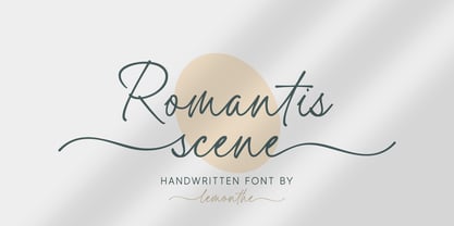 Romantis Scene is a beautiful and flowing script font with a modern style. This gentle font will look gorgeous on a variety of design ideas. It is perfect for many different projects such as logos & branding, invitation, stationery, wedding designs, signature, product designs, labels, photography, and much more!
 - THD Praxim by Tim Hutchinson Design,
$25.00 THD Praxim is a modern, condensed style, sans serif font that comes in four weights – thin/regular/bold/heavy. The font is perfect for header & subheadings, editorial, display, brand & identity, campaigns, apps & web. It has a clarity & confidence which can communicate a range of messages through different media channels.
 - Goblin Monster by Yoga Letter,
$16.00 "Goblin Monster" is a font with a monster theme that is perfect for your Halloween celebration. This font is very easy to use and each letter is decorated with bats and spider webs which will add to the beauty of this font. The shape of the letters and the character of the letters is very unique and different. This font can also be used for book covers, movie or book titles, logos, posters, stickers and more.
 - Public Beat by PizzaDude.dk,
$15.00 Public Beat is full of fun and party! Look how the letters jumps and bounces while you type your text - well, that's the Contextual Alternates that are having a party! Each lower-case letter has 4 different versions, that automatically cycles when you type. A great trick to make your text look scrambled and realistic
 - La Gathe by Slide Shoot,
$12.00 La Gathe is an elegant serif font. Different letters make this font has its charm. Fall in love with its incredibly versatile style and use it to create spectacular designs. It is suitable for various products such as invitations, product packaging, quotes, product design, crafter, labels, photography, watermarks, logos & branding. FEATURES Ligatures Uppercase and Lowercase letters Numbering and Punctuations Multilingual Support Works on PC or Mac Simple Installation Support Adobe Illustrator, Adobe Photoshop, Adobe InDesign, also works on Microsoft Word Hope you Like it. Thanks.
 - Melvin and Emily by Ivan Rosenberg,
$13.00 Melvin and Emily is a modern calligraphy font with perfect serif pair. Both fonts includes multilingual support for Western and Central Europe. These are ideal for blog website, instagram, branding, invitations, business cards, weddings and many more. Script version also includes alternate characters for both UPPERCASE AND LOWERCASE letters, beginning ending swashes for all lowercase letters and ligatures for different styles. For access to Stylistic Alternates is required software with glyphs panel like Photoshop and llustrator. No special software is required to use Ligatures.
 - Turbo Modul by PizzaDude.dk,
$15.00 The future is square! Well, at least according to Turbo Modul! Maybe the future is square, but it is also funky - just like Turbo Modul ... and its pretty unpredictable! Turbo Modul is loaded with alternative letters with arrows pointing in all directions, all made to pimp your designs! I've also added ligatures to substitute double letters, and there's a slight difference from caps and lowercase. Wow! That's a lot of different combinations! I tell you what ... I take a look at the posters I've made, and hopefully it will make you want to try out the font. I had a lot of fun doing the font, and maybe you will have a lot of fun using it! ;)
 - 1499 Alde Manuce Pro by GLC,
$42.00 This family was inspired by the beautiful roman font used by Aldus Manutius in Venice (1499) to print for the first time Hypnerotomachia Poliphili..., the well known book attributed to Francesco Colonna. Francesco Griffo was the punchcutter. The present font contains all of the specific latin abbreviations and other ligatures used in the original. The Italic style, carved by Francesco Colonna, the so called "Aldine" style, was inspired from various documents, all printed with this first Italic font. We offer the complete set of ligatures (about 60) we have been able to find, contained in the original font. In the two styles, we have made differences between I and J, V and U, to make easier a modern use. Added are the accented characters and a few others not in use in this early period of printing. The Italic style may be used as a complement to our 1470 Jenson Latin. The font contains all characters for West European (including Celtic), Baltic, East and Central European and Turkish language.


