10,000 search results
(0.055 seconds)
- PG Gothique by Paulo Goode,
$30.00 This is my addition to a long line of traditional gothic typefaces. As you can probably tell, PG Gothique is inspired by classics such as Trade Gothic, News Gothic, Franklin Gothic, Alternate Gothic, and Gothic Gothic. Well, maybe not the last one... But Paulo, we have all those already, why would we want to add PG Gothique to our collection? This typeface has many subtle design nuances that differentiates itself from its historical influences. Also, this is possibly the most comprehensive Latin gothic font family released to date. It has 99 fonts that cover pretty much every style you could ever need, and if you do require more, this family is available as a single variable font that covers all the weights and widths in between. PG Gothique is designed to handle a multitude of applications, from branding projects, to titles, body text, user interfaces, and film poster credits. This type family has a style that will suit the purpose. There are 99 fonts in this family, ranging from Thin to Ultra weights across six widths in both roman and italic*. Activate Stylistic Set 1 and you will get the alternate slab serif-style capital “I” that offers improved legibility when placed adjacent to a lowercase “l”. PG Gothique has an extensive character set that covers every Latin European language. If you would prefer PG Gothique as a single variable font, please choose PG Gothique Variable. Test drive PG Gothique today – both the Regular and Italic fonts are offered as a free download. See full details and hi-res examples at https://paulogoode.com/pg-gothique Key features: 9 Weights 6 Widths 99 Fonts Small Caps Old Style Figures European Language Support (Latin) 600+ Glyphs per font *Compressed weights do not include italics.
 - Celtic Knots by Clanbadge,
$20.00 While it is obvious that this is an ornamental style font, it is more than that: it is a Celtic Knotwork design tool! Irish, Scottish, Welsh, even Norse and Viking cultures have used knotwork designs for millenia. These ancient traditional interwoven designs are experiencing a revival as Celtic culture gains exposure in the modern world. Intricate Celtic knots are featured everywhere from jewelry to tattoos. While many enjoy them simply for their beauty and fascinating twists, they can also be used to add an air of myth, magic and mystery to any project. The interlaced lines make them perfect for wedding invitations, borders, dividers and rules, web graphics, and logos. I began using Celtic knotwork designs in my own work as part of my knifemaking and jewelry making hobbies. I read all of the books I could find about Celtic knots and at first I drew them by hand with pencil and paper. Then as I realized how nice it would be to have "undos" I switched over to using Corel Draw. Draw proved to be a natural for this type of artwork with tools like contour and the trim function. But even with these great tools, it was still tedious to create these designs. I noticed that I was able to reuse a lot of parts in repetitive sections. I developed a small library of reusable bits and chunks of Celtic designs. I found them so useful and fun to work with that I began thinking about ways to market my Celtic design kit. I thought about CDR and EPS formats, but then I thought of creating this toolset as a True Type Font. That way anyone with ANY program that uses fonts could easily create Celtic knotwork designs. Word processors, embroidery programs, engraving programs, jewelry design programs, CAD/CAM programs...almost every program can use fonts. I was also interested in CNC work and thought that this font would work well for applications such as laser etching, vinyl signs, and machining. With that in mind, I designed each character of the font with extremes of accuracy. If one character from the font is used at one inch tall, every control point will be placed to an accuracy of better than 0.0001 inch. I wanted every piece to meet exactly with the next, with no possibility for misalignment. The different styles are all very carefully created to fit accurately with each other. So the Filled Style fits exactly into the Outline Style, and the Inverse Style fits precisely around the Outline Style so as to make up the background behind the knotwork. Combining the styles allows you to have complete creative control. By assembling the nearly 200 pieces it is quite easy to produce very complex designs. It is actually a bit like playing with a puzzle and many people really enjoy putting the pieces together to make designs. In fact, I have had many customers tell me of how they love playing with this font and making knots into the wee hours of morning. If you like puzzles then you will absolutely love this font! And creating the patterns is just the beginning of the fun! If you apply your favorite Photoshop tricks on them you can make anything from dazzling chrome knotwork to carved stone. Photoshop plug-ins like SuperBladePro are great for converting knotwork text into corroded bronze or rusted iron. Use your knotwork to add texture to a virtual landscape, or add them as surface embelishments on architecture and furniture. You can also make round knotwork by using this font with "WordArt" (WordArt is included with every copy of Microsoft Word. See http://clanbadge.com/round_knots.htm for a tutorial on how to make round knotwork). For Crafters there are limitless uses for this font. It has been used for embroidery, jewelry, leatherwork, stencils, stained glass, quilting, painting, pyrography, woodcarving and lots more. We have even sold copies to monks for use in decorating handmade books!
 - Mula by Typesketchbook,
$55.00 Mula is an extra large super family of 80 styles. Mula has such a big abundance of contrast, styles, weights, width. The complete Mula family consists of regular, slim and rounded versions for use in a multifunctional settings, especially for cooperative work, websites, magazines, editorials, publishing, packaging and more.
 - Sandena by Polyglyphic,
$40.00 Sandena began as an attempt at a harmonic convergence between the classic lines of Palatino and the curved flair of Optima - both favorites of mine from the great Hermann Zapf. As I’ve always loved the Swash characters of the 50’s and 60’s letterforms, I incorporated these alternatives to offer the more complete package that you see here - a humanist font in the truest calligraphic sense. This OpenType font family comes in four weights and includes condensed and Swash Cap alternates. Sandena offers multiple-character foreign language support and is being offered in a number of packages best-tailored for your unique application.
 - Retail Packaging JNL by Jeff Levine,
$29.00 The retail storage box for a vintage metal numbering stamp manufactured by the American Numbering Machine Company had its brand name hand lettered in an Art Nouveau style that most likely went back to the 1920s, as the company was in existence from 1908 to around 1971. Numbering machines were used in offices, schools, libraries, and anywhere a series of numbers needed to be marked onto printed items. Similar to what was called a ‘crash numberer’ used in letterpress shops, the machines could be set to do a run of digits [for example: 4000, 4001, 4002] or repeat numbers for forms used as carbon copies. As computers took over most forms of printing, the use of numbering machines dwindled, but they are still available. The American Numbering Machine Company was one of several Brooklyn, New York companies that specialized in the manufacture of these machines. Retail Packaging JNL replicates the lettering from their packaging, and is available in both regular and oblique versions.
 - Wave by Jennifer Delaney Designs,
$23.00 WAVE is characterized by curved lines and intricate details. Each character was individually made in Illustrator and Type Tool using my original illustrations. Wave is a decorative font best used for titles or short bursts of texts in large point settings. The typeface is based on the uppercase letterforms, but I have also created lowercase letters, numbers, and glyphs. The motion lines used in the making of Wave mirror an art deco-style. Inspired by an illustration of a large wave, I was fascinated that by using only lines and solid colors we as artists can depict the translucency and ever-changing movement of waves. I began by delicately sketching out all of the letters using graph paper and micron pens. My work always begins with traditional media. I'm an illustrator, freelance artist, and graphic designer from Chicago, IL. I studied at Texas Christian University, and received my Bachelors of Arts in Graphic Design from Columbia College Chicago. Visit www.jennyddesigns.com for more! :)
 - P22 Posada by P22 Type Foundry,
$24.95 Mexican printmaker Jose Guadalupe Posada (1851-1913) created a massive variety of material—broadsheets, cards, advertisements, posters, etc.—which largely represented a defense of the common man and a manifestation of the horrible and gruesome events of the day. Posada often cut his own lettering that looked like more decorative versions of Gothic wood types. His most notable imagery comes from his Calaveras celebrating the Day of the Dead. Calaveras often represent effigies of living people depicted as skeletons going about their daily activities. These are often humorous and playful in a way that helps bridge this world with the beyond. This font family contains two small caps style fonts and one Extras font containing 60 images.
 - Lewis Hamilton by IbraCreative,
$27.00 Lewis Hamilton is a stylish signature font that embodies elegance and sophistication. Inspired by the signature of the renowned Formula One driver, Lewis Hamilton, this typeface exudes a sense of confidence and refinement. Each letter carries a graceful flow, reminiscent of a personalized signature, adding a touch of exclusivity to any design. With its sleek lines and carefully crafted curves, Lewis Hamilton captures the essence of a stylish and modern aesthetic. Whether used for branding, luxury products, or high-end invitations, this font brings a sense of prestige and class. Lewis Hamilton is the perfect choice for those seeking a signature font that exudes timeless style and a touch of celebrity allure.
 - Letterhythm by Letterhythm Studio,
$30.00 Letterhythm is a modern, contemporary handcrafted blackletter typeface made with experienced by the hand of Dhiya Roslan. The style was influenced by Old School Blackletter Calligraphy Script culture, Fraktur style, and with an extra touch of urban street attitude of Calligraffiti (Calligraphy+Graffiti). The letterform took years of practices to finally made it into digital format. Letterhythm is a very flexible font for almost anything from merchandise, logo, branding, artwork, title, sub-title, body text, tattoo arts, apparels to infinity and beyond. Letterhyhm is a timeless typeface that suits and fit perfectly in any timeframe or style you want. It comes with Multilingual Support for most Latin alphabet's languages derived with 3 unique font styles that made a total of 220 glyphs each style to complete the typeface including ligatures, alternates and all necessary symbols & punctuations.
 - Maiola by TypeTogether,
$49.00 Being inspired by early Czech type design, Maiola is clearly a contemporary typeface, that is mindful of its historical heritage, implementing old-style features and calligraphic reminiscence, more frankly so in the Italic. Nevertheless, through its personality, it attempts to create a welcoming tension on the page, without shouting too loudly at the reader. It handles its expressive tendencies with care and in doing so increases its usability, with legibility being of great importance. Subtle irregularities of the letterforms enhance furthermore the dynamic spirit and liveliness of the typeface. With the advent of Opentype, allowing for bigger character-sets and better language support, as a natural consequence, Maiola Multiscript covers Latin A, Cyrillic and Greek. Although basically independent from each other, they are, however, designed in the same spirit as the Latin, and harmonize well in multilingual text settings. The update to this beautiful font family includes the addition of over 240 glyphs featuring new ornaments, stylistic alternates, ligatures, superior letters, fractions and more. Furthermore, several glyphs were significantly improved and the kerning was fine tuned for better performance. Originally released in 2005, Maiola was an immediate success. It won the renowned TDC competition in 2004 where it was also recognized as a “judge’s choice”, was part of the touring exhibition e-a-t, and was selected in the Creative Review design competition in 2005.
 - Pirulen by Typodermic,
$11.95 In a future world where technology reigns supreme, communication must adapt to convey the cold and calculated efficiency of machines. Pirulen is the answer to this need. This hi-tech headliner is a futuristic marvel that transcends the limitations of traditional typography. Pirulen takes inspiration from the bold and daring style of 1930s Bank Gothic, but with a unique and revolutionary twist. It strips away any hint of warmth or humanity and replaces it with a cold and calculated design that perfectly captures the feeling of machines and technology. The result is a typeface that is both imposing and captivating. One of the most striking features of Pirulen is the lambda-style “Λ”, which adds to its already bold and robust appearance. This iconic symbol is a clear indicator of Pirulen’s futuristic design and sets it apart from other typefaces. And if you’re looking for even more variation, Pirulen offers barred “A” and accented variants that can be easily accessed through your application’s stylistic alternates function. With six different weights and italics, Pirulen is a versatile typeface that can adapt to any situation. Whether you’re creating sleek and modern designs or gritty and industrial ones, Pirulen can help you convey the cold and calculated efficiency of the future. So don’t be left behind—embrace the future with Pirulen. Most Latin-based European writing systems are supported, including the following languages. Afaan Oromo, Afar, Afrikaans, Albanian, Alsatian, Aromanian, Aymara, Bashkir (Latin), Basque, Belarusian (Latin), Bemba, Bikol, Bosnian, Breton, Cape Verdean, Creole, Catalan, Cebuano, Chamorro, Chavacano, Chichewa, Crimean Tatar (Latin), Croatian, Czech, Danish, Dawan, Dholuo, Dutch, English, Estonian, Faroese, Fijian, Filipino, Finnish, French, Frisian, Friulian, Gagauz (Latin), Galician, Ganda, Genoese, German, Greenlandic, Guadeloupean Creole, Haitian Creole, Hawaiian, Hiligaynon, Hungarian, Icelandic, Ilocano, Indonesian, Irish, Italian, Jamaican, Kaqchikel, Karakalpak (Latin), Kashubian, Kikongo, Kinyarwanda, Kirundi, Kurdish (Latin), Latvian, Lithuanian, Lombard, Low Saxon, Luxembourgish, Maasai, Makhuwa, Malay, Maltese, Māori, Moldovan, Montenegrin, Ndebele, Neapolitan, Norwegian, Novial, Occitan, Ossetian (Latin), Papiamento, Piedmontese, Polish, Portuguese, Quechua, Rarotongan, Romanian, Romansh, Sami, Sango, Saramaccan, Sardinian, Scottish Gaelic, Serbian (Latin), Shona, Sicilian, Silesian, Slovak, Slovenian, Somali, Sorbian, Sotho, Spanish, Swahili, Swazi, Swedish, Tagalog, Tahitian, Tetum, Tongan, Tshiluba, Tsonga, Tswana, Tumbuka, Turkish, Turkmen (Latin), Tuvaluan, Uzbek (Latin), Venetian, Vepsian, Võro, Walloon, Waray-Waray, Wayuu, Welsh, Wolof, Xhosa, Yapese, Zapotec Zulu and Zuni.
 - Cut Sans Serif by Aksharasarovara,
$25.00The thought behind this font was not to join vertical, horizontal and diagonal stems. Each stem is designed separately and arranged in a good manner to create glyphs. Something different from tradition; liberal, but in the limit. - Bostroom by Lemonthe,
$14.00 Bostroom is a beautiful brush font. Bostroom Font is perfect for many different project such as logos & branding, invitation, stationery, wedding designs, social media posts, advertisements, product packaging, product designs, label, photography, watermark, special events or anything.
 - Baginda by Arendxstudio,
$12.00 Baginda is a minimalist with hand-written characters that have their own distinct characteristics that differ from previous font designs and which carries confidence. This font is very appropriate for you to put into your project designs.
 - False Widow by OhType!,
$18.00 False Widow is a display typeface, designed for graphic pieces looking for a great visual impact. Aggressive but measured in its proportions is easily adaptable to different uses and formats such as posters, headers; print and digital.
 - Ozana Pro Text by Mostardesign,
$25.00 Ozana Pro is a bracketed serif font family adapted to the professional requirements of graphic designers, web designers and mobile app developers. Comprised of 24 styles including 12 styles designed especially for headlines and 12 styles for text and long paragraph design. Ozana Pro is a very versatile family of fonts that can be used in many projects such as editorial design, branding or corporate identity creation, design of posters or logos, the creation of websites or the development of mobile applications. With this design of glyphs differentiated by the optical size according to the styles, the titles have a very graphic aspect while the long texts have a more classic design in order to keep an optimal readability in all cases. Ozana Pro is also equipped with powerful OpenType features such as case sensitivity, true small caps, ligatures, tabular figures, old styles figures, numbers circled. Ozana Pro is also available as a variable font family.
 - Ozana Pro Display by Mostardesign,
$25.00 Ozana Pro is a bracketed serif font family adapted to the professional requirements of graphic designers, web designers and mobile app developers. Comprised of 24 styles including 12 styles designed especially for headlines and 12 styles for text and long paragraph design. Ozana Pro is a very versatile family of fonts that can be used in many projects such as editorial design, branding or corporate identity creation, design of posters or logos, the creation of websites or the development of mobile applications. With this design of glyphs differentiated by the optical size according to the styles, the titles have a very graphic aspect while the long texts have a more classic design in order to keep an optimal readability in all cases. Ozana Pro is also equipped with powerful OpenType features such as case sensitivity, true small caps, ligatures, tabular figures, old styles figures, numbers circled. Ozana Pro is also available as a variable font family.
 - Lustra by Grype,
$16.00 Since the early 1980's, the automotive industry has been developing geometric/technical style logotypes for car chrome labels. The styles are ripe with inspiration for great font families, but surprisingly, many of these sleek logotypes are lacking an expansive family to enhance and express their brand in a richer sense, becoming true brand workhorses. The Lustra family finds its origin of inspiration in the HYUNDAI automotive company logo, and from there expands to an 8 font family of weights. Lustra celebrates the techno display styling of the inspiration logotype, transcending its brand inspired origin to give birth to a font family that pulls on modern and historical styles. It inherits a sturdy yet approachable style with its uniform stroke forms and curves, and goes on to include a lowercase, numerals, and a comprehensive range of weights, creating a straightforward, uncompromising collection of typefaces that lend a solid foundation and a broad range of expression for designers.
 - Bohemia by Linotype,
$29.99Argentinean designer Eduardo Manso created the Bohemia type family in 2003. Bohemia's cunning and elegant essence shows off refined letters that evoke the Transitional style typefaces like Baskerville, though most Baskerville-like designs tend not to be as curvaceous as Manso's! True to form, Bohemia shines in smaller text sizes, like 9 point and above, while still maintaining a unique character and spirit. Bohemia is a great alternative to better-known text faces. The critics have been raving. Bohemia came to Linotype via its fourth International Type Design Contest (ITDC) [Link] in 2003, where it received one of the three top awards. Under the name Argot, this typeface received a Certificate of Excellence in Type Design from the Type Directors Club of New York in 2004. Bohemia was also selected for inclusion in the 21st International Biennale of Graphic Design 2004 in Brno, Czech Republic, and was later named one of the most relevant works in the Bienal Letras Latinas 2004 exhibition, which traveled through Buenos Aires, San Paolo, Santiago, and Vera Cruz." - Celebrate The Day Pro by CheapProFonts,
$10.00 The freeflowing and quite feminine style of this script appealed to me, but it needed a bit of taming. Quite a few of the letterforms have been normalized - to better accommodate the diacritics. :) All fonts from CheapProFonts have very extensive language support: They contain some unusual diacritic letters (some of which are contained in the Latin Extended-B Unicode block) supporting: Cornish, Filipino (Tagalog), Guarani, Luxembourgian, Malagasy, Romanian, Ulithian and Welsh. They also contain all glyphs in the Latin Extended-A Unicode block (which among others cover the Central European and Baltic areas) supporting: Afrikaans, Belarusian (Lacinka), Bosnian, Catalan, Chichewa, Croatian, Czech, Dutch, Esperanto, Greenlandic, Hungarian, Kashubian, Kurdish (Kurmanji), Latvian, Lithuanian, Maltese, Maori, Polish, Saami (Inari), Saami (North), Serbian (latin), Slovak(ian), Slovene, Sorbian (Lower), Sorbian (Upper), Turkish and Turkmen. And they of course contain all the usual "western" glyphs supporting: Albanian, Basque, Breton, Chamorro, Danish, Estonian, Faroese, Finnish, French, Frisian, Galican, German, Icelandic, Indonesian, Irish (Gaelic), Italian, Northern Sotho, Norwegian, Occitan, Portuguese, Rhaeto-Romance, Sami (Lule), Sami (South), Scots (Gaelic), Spanish, Swedish, Tswana, Walloon and Yapese.
 - Helsa Display by ParaType,
$39.00 Helsa is a slim and eccentric serif for headings and short texts. It’s a modern interpretation of the narrow Elseviers of the early 20th century. The letterforms are based on Dutch samples, and in the details there are references to both American type catalogs and letters from the foundries of Wolf and Herbeck. Due to the compact proportions of characters and the high contrast of strokes, Helsa doesn’t take up much space in the line and allows you to increase the type size freely, drawing the viewer's attention to the text. The typeface is suitable for branding museums and exhibitions, alternative music bands, independent clothing and perfume brands, and for any topic related to design or history. Helsa’s character set has more than 1600 characters. It supports hundreds of languages, including extended Cyrillic, Greek, and Vietnamese, as well as many OpenType features: fractions, ligatures, old style and tabular numerals, titular letter alternates, and more. There are variants of dashes and other punctuation marks specifically for uppercase typing. In addition to letters, the typeface contains arrows, numbers in circles (in fact, in ovals), symbols of various types of plastic, card suits and much more. Helsa typeface was made at Paratype in 2020-2022.
 - Caverson by Letterena Studios,
$10.00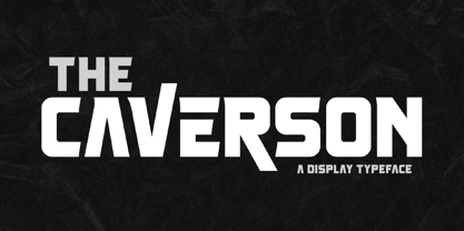 Proudly present Caverson Typeface, a modern and classy slab serif font with a unique style and fancy look. This typeface is perfect for an elegant & luxury logo, book or movie title design, fashion brand, magazine, clothes, lettering, quotes, and so much more. **Uppercase
 - Ovetta by Awanstudio,
$15.00 Say Hi to Ovetta, a beauty and natural handwritten script. It has a classy style and allows you to create stunning and easy hand-lettering in an instant. Highly recommended for logos, quotes, product label/packaging, fashion, advertising, posters, merchandise, apparel, and more.
 - National Parks JNL by Jeff Levine,
$29.00 National Parks JNL was based on a 1930s WPA (Works Progress Administration) poster where the word "National Parks" was hand lettered in an unusual and eclectic Art Deco style. Bold and non-conformist, the typeface is available in both regular and oblique versions.
 - Dancing Girl JNL by Jeff Levine,
$29.00 The poster for the 1930 film “Show Girl in Hollywood” had the title hand lettered in a squared Art Deco style with some angled cross strokes. This became the basis for Dancing Girl JNL, which is available in both regular and oblique versions.
 - Suifak by Letterena Studios,
$10.00 Suifak is a modern and classic serif typeface that has its own unique style and fashionable look. This typeface is perfect for an elegant and luxurious logo, book or movie title design, fashion brand, magazine, clothes, lettering, quotes, and so much more.
 - Movie Nouveau JNL by Jeff Levine,
$29.00 A 1920s magazine featuring behind-the-scenes stories about the motion picture industry had its name [“Shadowland”] lettered in an Art Nouveau sans serif style. This has been recreated digitally as Movie Nouveau JNL, and is available in both regular and oblique versions.
 - Brock Restar by Letterena Studios,
$10.00 Brock Restar is a modern and classic display typeface that has its own unique style and fashionable look. This typeface is perfect for an elegant and luxurious logo, book or movie title design, fashion brand, magazine, clothes, lettering, quotes, and so much more.
 - Birthmont by Typeskets,
$18.00 Birthmont is a vintage display style font, capital letters with interesting combinations, very suitable for use on label designs, titles, or other vintage themed designs. a font inspired by the 80's label designs that used it for the title and headline sections
 - Fleischer Display by Lewis McGuffie Type,
$30.00 Fleischer is a rough and playful display typeface good for headlines and posters. The face is based on historical letterforms combined with energetic 20th century pulp-style lettering. Fleischer comes with caps and small caps plus West, Central and East European language support.
 - Enjoyable by Invasi Studio,
$16.00 Enjoyable born from hand-lettered style combines fun and playful glyph with all-caps font; delivering a fancy hand draw that is guaranteed to add an eye-catching suitable for your quotes, logo designs, brand imagery, product packaging, merchandise & social media posts.
 - Typewriter Spool by Typodermic,
$11.95 Introducing Typewriter Spool, a typeface collection inspired by the timeless beauty of the Underwood No. 5, and carefully crafted for the modern designer who appreciates the artistry of typewritten text. With 122 fonts to choose from, Typewriter Spool offers a stunning variety of styles that are sure to add an air of erudite elegance to any project. One of the standout features of Typewriter Spool is its incredible attention to detail. Each letterform has been meticulously modeled after the classic manual typewriters of the twentieth century, resulting in a collection of fonts that exude a sense of refined authenticity. And with seven weights, three widths, and underline available in the clean and precise Typewriter Spool CLN, you’ll have all the options you need to create polished and professional-looking text. For those seeking a more realistic typewriter effect, the smooth and slightly misaligned Typewriter Spool SFT is an excellent choice. With six weights, three widths, and an automatic variation shuffle for the alphanumeric characters, this font offers a convincing manual typewriter appearance that will make your work truly stand out. Looking for something a little more unique? Typewriter Spool XRX offers a fascinating blend of typewritten text with the aesthetic of multiple generations of faxing and photocopying. And with six weights, three widths, underline, and a variation shuffle effect, you’ll have endless possibilities for creating eye-catching designs. For those seeking a touch of vintage charm, Typewriter Spool RUF offers a worn ink ribbon texture and clunky misalignment that harks back to the days of classic typewriters. And with four weights, underline, and a variation shuffle effect, you’ll have everything you need to create stunningly authentic-looking text. All Typewriter Spool fonts include fractions, punctuation, and mathematical symbols, as well as smart quotes for added convenience. With its wide range of weights, widths, special effects, and language support, Typewriter Spool is truly the last typewriter typeface you’ll ever need to buy. So why settle for ordinary typography when you can elevate your work to the level of artistry with Typewriter Spool? Try it today and experience the difference for yourself. Most Latin-based European, Vietnamese, Greek, and most Cyrillic-based writing systems are supported, including the following languages. Afaan Oromo, Afar, Afrikaans, Albanian, Alsatian, Aromanian, Aymara, Azerbaijani, Bashkir, Bashkir (Latin), Basque, Belarusian, Belarusian (Latin), Bemba, Bikol, Bosnian, Breton, Bulgarian, Buryat, Cape Verdean, Creole, Catalan, Cebuano, Chamorro, Chavacano, Chichewa, Crimean Tatar (Latin), Croatian, Czech, Danish, Dawan, Dholuo, Dungan, Dutch, English, Estonian, Faroese, Fijian, Filipino, Finnish, French, Frisian, Friulian, Gagauz (Latin), Galician, Ganda, Genoese, German, Gikuyu, Greenlandic, Guadeloupean Creole, Haitian Creole, Hawaiian, Hiligaynon, Hungarian, Icelandic, Igbo, Ilocano, Indonesian, Irish, Italian, Jamaican, Kaingang, Khalkha, Kalmyk, Kanuri, Kaqchikel, Karakalpak (Latin), Kashubian, Kazakh, Kikongo, Kinyarwanda, Kirundi, Komi-Permyak, Kurdish, Kurdish (Latin), Kyrgyz, Latvian, Lithuanian, Lombard, Low Saxon, Luxembourgish, Maasai, Macedonian, Makhuwa, Malay, Maltese, Māori, Moldovan, Montenegrin, Nahuatl, Ndebele, Neapolitan, Norwegian, Novial, Occitan, Ossetian, Ossetian (Latin), Papiamento, Piedmontese, Polish, Portuguese, Quechua, Rarotongan, Romanian, Romansh, Russian, Rusyn, Sami, Sango, Saramaccan, Sardinian, Scottish Gaelic, Serbian, Serbian (Latin), Shona, Sicilian, Silesian, Slovak, Slovenian, Somali, Sorbian, Sotho, Spanish, Swahili, Swazi, Swedish, Tagalog, Tahitian, Tajik, Tatar, Tetum, Tongan, Tshiluba, Tsonga, Tswana, Tumbuka, Turkish, Turkmen (Latin), Tuvaluan, Ukrainian, Uzbek, Uzbek (Latin), Venda, Venetian, Vepsian, Vietnamese, Võro, Walloon, Waray-Waray, Wayuu, Welsh, Wolof, Xavante, Xhosa, Yapese, Zapotec, Zarma, Zazaki, Zulu and Zuni.
 - FF Good by FontFont,
$72.99 FF Good is a straight-sided sans serif in the American Gothic tradition, designed by Warsaw-based Łukasz Dziedzic. Despite having something of an “old-fashioned” heritage, FF Good feels new. Many customers agree: the sturdy, legible forms of FF Good have been put to good use in the Polish-language magazine ‘Komputer Swiat,’ the German and Russian edition of the celebrity tabloid OK!, and the new corporate design for the Associated Press. Although initially released as a family of modest size, the typeface was fully overhauled in 2010, increasing it from nine styles to 30 styles, with an additional 30-style sibling for larger sizes, FF Good Headline. In 2014, the type system underwent additional expansion to become FontFont’s largest family ever with an incredible 196 total styles. This includes seven weights ranging from Light to Ultra, and an astonishing seven widths from Compressed to Extended for both FF Good and FF Good Headline, all with companion italics and small caps in both roman and italic. With its subtle weight and width graduation, it is the perfect companion for interface, editorial, and web designers. This allows the typographer to pick the style best suited to their layout. As a contemporary competitor to classic American Gothic style typefaces—like Franklin Gothic, News Gothic, or Trade Gothic—it was necessary that an expanded FF Good also offers customers both Text and Display versions. The base FF Good fonts are mastered for text use, while FF Good Headline aims for maximum compactness. Its low cap height together with trimmed ascenders and descenders give punch to headlines and larger-sized copy in publications such as newspapers, magazines, and blogs. There is even more good news about FF Good: it has something of a serif companion. Łukasz Dziedzic built FF Good to work together with FF More, creating in a powerhouse superfamily that is versatile in both its function and aesthetic.
 - Gnuolane Stencil by Typodermic,
$11.95 Introducing Gnuolane Stencil, a captivating typeface that exudes sophistication and style. Inspired by the timeless elegance of grotesque models from the early twentieth century, Gnuolane Stencil is the perfect combination of classic and modern design. With its superelliptical 1960s feel, Gnuolane Stencil will transport you back to an era of cool, sleek lines and understated elegance. The slim stencil design lends a serious and authoritative air to any message, making it the ideal choice for logos, headlines, and other high-impact designs. But Gnuolane Stencil is more than just a pretty face. This versatile typeface comes in five different weights, allowing you to find the perfect balance of boldness and subtlety for your project. And if you’re looking for even more creative options, be sure to check out the plain version called Gnuolane and the playful, bouncy variation known as Gnuolane Jump. So whether you’re looking to add a touch of vintage flair to your designs or simply want a typeface with character and charm, Gnuolane Stencil is the perfect choice. Try it out today and experience the unique personality and style that only Gnuolane Stencil can offer. Most Latin-based European writing systems are supported, including the following languages. Afaan Oromo, Afar, Afrikaans, Albanian, Alsatian, Aromanian, Aymara, Bashkir (Latin), Basque, Belarusian (Latin), Bemba, Bikol, Bosnian, Breton, Cape Verdean, Creole, Catalan, Cebuano, Chamorro, Chavacano, Chichewa, Crimean Tatar (Latin), Croatian, Czech, Danish, Dawan, Dholuo, Dutch, English, Estonian, Faroese, Fijian, Filipino, Finnish, French, Frisian, Friulian, Gagauz (Latin), Galician, Ganda, Genoese, German, Greenlandic, Guadeloupean Creole, Haitian Creole, Hawaiian, Hiligaynon, Hungarian, Icelandic, Ilocano, Indonesian, Irish, Italian, Jamaican, Kaqchikel, Karakalpak (Latin), Kashubian, Kikongo, Kinyarwanda, Kirundi, Kurdish (Latin), Latvian, Lithuanian, Lombard, Low Saxon, Luxembourgish, Maasai, Makhuwa, Malay, Maltese, Māori, Moldovan, Montenegrin, Ndebele, Neapolitan, Norwegian, Novial, Occitan, Ossetian (Latin), Papiamento, Piedmontese, Polish, Portuguese, Quechua, Rarotongan, Romanian, Romansh, Sami, Sango, Saramaccan, Sardinian, Scottish Gaelic, Serbian (Latin), Shona, Sicilian, Silesian, Slovak, Slovenian, Somali, Sorbian, Sotho, Spanish, Swahili, Swazi, Swedish, Tagalog, Tahitian, Tetum, Tongan, Tshiluba, Tsonga, Tswana, Tumbuka, Turkish, Turkmen (Latin), Tuvaluan, Uzbek (Latin), Venetian, Vepsian, Võro, Walloon, Waray-Waray, Wayuu, Welsh, Wolof, Xhosa, Yapese, Zapotec Zulu and Zuni.
 - Lucyna by K94 Studio,
$9.00 The Lucyna serif font is a stylish and sophisticated typeface that exudes elegance and refinement. The font's unique design, inspired by the natural beauty and fluidity of the sea, features clean and well-defined serifs that give it a distinctive and timeless character. One of the most popular styles in the Lucyna family is the regular weight, which has a balanced and harmonious look that is easy on the eyes. This makes it perfect for use in long-form text such as books, magazines, and newspapers. The regular style's clean lines and legibility also make it an excellent choice for branding and advertising, where it can add a touch of sophistication and class. With its versatility and expressive nature, the Lucyna regular style is a font that can adapt to a wide range of design needs, while still maintaining its distinctive character and personality.
 - Altemus Pinwheels by Altemus Creative,
$11.00 Each style is a collection of 174 pinwheel designs.
 - FF Real Text by FontFont,
$50.99 FF Real is a convincing re-interpretation of the German grotesque style from between 1998 and 1908, but with much more warmth and improved legibility as well as a hint towards the warmer American grotesques. Later on, not just slanted styles, but a “proper” italic version was added inspired by the way Roman and Italic are distinguished in traditional serif faces. NEW: a specially created set of obliques were added in 2018 to give designers more design flexibility, for those looking for a less calligraphic look. In 2020 the family was extended with matching condensed weights. FF Real was originally conceived by Erik Spiekermann as one text weight and one headline weight to be used as the only faces in his biography ‘Hello I am Erik’, edited by Johannes Erler, published in 2014. While Spiekermann drew the alphabets, he passed on the font data to Ralph du Carrois and Anja Meiners who cleaned it up and completed it. In the meantime, FF Real has been extended to a family of two styles and 65 weights each. The design of FF Real is rooted in early static grotesques from the turn of the century. Several German type foundries – among them the Berlin-based foundries Theinhardt and H. Berthold AG – released such designs between 1898 and 1908. The semi-bold weight of a poster-size typeface that was lighter than most of the according semi-bolds in metal type at the time, gave the impetus to FF Real’s regular weight. In the words of Spiekermann, the historical example is “the real, non-fake version, as it were, the royal sans serif face“, thus giving his new typeface the name “Real” (which is also in keeping with his four-letter names, i.e. FF Meta, FF Unit). FF Real is a convincing re-interpretation of the German grotesque style, but with much more warmth and improved legibility. With a hint towards the warmer American grotesques, Spiekermann added those typical Anglo-American features such as a three-story ‘g’ and an ‘8’ with a more defined loop. To better distinguish characters in small text sizes, FF Real Text comes in old style figures, ‘f’ and ‘t’ are wider, the capital ‘I’ is equipped with serifs, as is the lowercase ‘l’. What’s more, i-dots and all punctuation are round.
 - FF Real Head by FontFont,
$50.99 FF Real is a convincing re-interpretation of the German grotesque style from between 1998 and 1908, but with much more warmth and improved legibility as well as a hint towards the warmer American grotesques. Later on, not just slanted styles, but a “proper” italic version was added inspired by the way Roman and Italic are distinguished in traditional serif faces. NEW: a specially created set of obliques were added in 2018 to give designers more design flexibility, for those looking for a less calligraphic look. In 2020 the family was extended with matching condensed weights. FF Real was originally conceived by Erik Spiekermann as one text weight and one headline weight to be used as the only faces in his biography ‘Hello I am Erik’, edited by Johannes Erler, published in 2014. While Spiekermann drew the alphabets, he passed on the font data to Ralph du Carrois and Anja Meiners who cleaned it up and completed it. In the meantime, FF Real has been extended to a family of two styles and 65 weights each. The design of FF Real is rooted in early static grotesques from the turn of the century. Several German type foundries – among them the Berlin-based foundries Theinhardt and H. Berthold AG – released such designs between 1898 and 1908. The semi-bold weight of a poster-size typeface that was lighter than most of the according semi-bolds in metal type at the time, gave the impetus to FF Real’s regular weight. In the words of Spiekermann, the historical example is “the real, non-fake version, as it were, the royal sans serif face“, thus giving his new typeface the name “Real” (which is also in keeping with his four-letter names, i.e. FF Meta, FF Unit). FF Real is a convincing re-interpretation of the German grotesque style, but with much more warmth and improved legibility. With a hint towards the warmer American grotesques, Spiekermann added those typical Anglo-American features such as a three-story ‘g’ and an ‘8’ with a more defined loop. To better distinguish characters in small text sizes, FF Real Text comes in old style figures, ‘f’ and ‘t’ are wider, the capital ‘I’ is equipped with serifs, as is the lowercase ‘l’. What’s more, i-dots and all punctuation are round.
 - From the Internet by Typodermic,
$11.95 Introducing From the Internet, a sleek and pragmatic sans-serif typeface that exudes technical sophistication. The narrow and square shapes of this typeface create a compact and organized appearance, perfect for modern industrial design. With softened edges, the boxy letterforms have a sense of approachability that is sure to draw in any reader. From the Internet’s austere and uncomplicated style ensures that your message is delivered with clarity and precision. Its lack of intricate detail prevents any distractions, keeping the focus on the essential message. This typeface avoids clichés, ensuring that your designs are always fresh and unique, without any conspicuous sci-fi influences. This font’s versatility is enhanced by the “stylistic alternatives” feature available in OpenType-savvy applications, allowing for access to alternate versions of the “f” and “t” letters. From the Internet offers a range of styles, including Regular, Italic, Bold, and Bold Italic, each with its unique personality. Whether you’re looking to create sleek tech manuals or modern business presentations, From the Internet is the perfect typeface to convey your message with sophistication and style. Its pragmatic and precise style ensures that your designs will always be on-trend and highly readable, making it an excellent choice for any designer looking to create an impact. Most Latin-based European writing systems are supported, including the following languages. Afaan Oromo, Afar, Afrikaans, Albanian, Alsatian, Aromanian, Aymara, Bashkir (Latin), Basque, Belarusian (Latin), Bemba, Bikol, Bosnian, Breton, Cape Verdean, Creole, Catalan, Cebuano, Chamorro, Chavacano, Chichewa, Crimean Tatar (Latin), Croatian, Czech, Danish, Dawan, Dholuo, Dutch, English, Estonian, Faroese, Fijian, Filipino, Finnish, French, Frisian, Friulian, Gagauz (Latin), Galician, Ganda, Genoese, German, Greenlandic, Guadeloupean Creole, Haitian Creole, Hawaiian, Hiligaynon, Hungarian, Icelandic, Ilocano, Indonesian, Irish, Italian, Jamaican, Kaqchikel, Karakalpak (Latin), Kashubian, Kikongo, Kinyarwanda, Kirundi, Kurdish (Latin), Latvian, Lithuanian, Lombard, Low Saxon, Luxembourgish, Maasai, Makhuwa, Malay, Maltese, Māori, Moldovan, Montenegrin, Ndebele, Neapolitan, Norwegian, Novial, Occitan, Ossetian (Latin), Papiamento, Piedmontese, Polish, Portuguese, Quechua, Rarotongan, Romanian, Romansh, Sami, Sango, Saramaccan, Sardinian, Scottish Gaelic, Serbian (Latin), Shona, Sicilian, Silesian, Slovak, Slovenian, Somali, Sorbian, Sotho, Spanish, Swahili, Swazi, Swedish, Tagalog, Tahitian, Tetum, Tongan, Tshiluba, Tsonga, Tswana, Tumbuka, Turkish, Turkmen (Latin), Tuvaluan, Uzbek (Latin), Venetian, Vepsian, Võro, Walloon, Waray-Waray, Wayuu, Welsh, Wolof, Xhosa, Yapese, Zapotec Zulu and Zuni.
 - Teenage Rockstar by Teenage Foundry,
$19.00 TF Teenage Rockstar Display Script Font - a stylized design that is sure to bring a touch of elegance and sophistication to your projects. Our font features swooping tails on select lowercase letters, adding an extra level of flourish and personality that is sure to capture attention. There are 2 styles available (Regular & Extrude). Both font versions are meticulously crafted with attention to detail, ensuring that each letterform maintains its structural integrity while still conveying its unique style. With our display script font, you can create designs that are both elegant and impactful, giving you the freedom to express your creativity with confidence. Features: Uppercase, Lowercase, Numeral, Opentype Features, Punctuation & Multilingual. Note: To access tails, just type underscore + underscore + numeral. The alternates feature must be active. Example __3 For any questions please contact me 🙂 Thanks!