10,000 search results
(0.04 seconds)
- Flicka by PizzaDude.dk,
$20.00 Flicka is a super funky font that oozes of fun and games. Every single letter has got it's personality of its own! And, what's even better: the Flicka font comes with ligatures for both lowercase-lowercase, uppercase-lowercase and uppercase-uppercase! 154 different ligatures in total! You will need to use OpenType supporting applications to use the autoligatures.
 - Megren by Azzam Ridhamalik,
$18.00 Introducing Megren, an experimental display typeface combining a simple and clean sans serif typeface with an elegant copperplate script typeface. Consists of 1 font file with copperplate script typeface on the uppercase and sans serif on the lowercase. The combination of different typefaces looks modern and fashionable but also gives a nostalgic retro vibes at the same time.
 - Sign Work Deco JNL by Jeff Levine,
$29.00 The prolific hand lettering of Samuel Welo is showcased in his “Studio Handbook for Artists and Advertisers” (published in both 1927 and 1960). A thick and thin Art Deco design in the 1960 edition – somewhat reminiscent of Futura Black (but with significant differences) is now available as Sign Work Deco JNL in both regular and oblique versions.
 - Paper Sting Stencil by PizzaDude.dk,
$17.00 I made Paper Sting using an inky pen. There is a great variation in the stroke width, which gives a very lively handmade feeling. Paper Sting comes in two versions: Regular and Stencil - mix them for cool realistic results. Of course there is multi-lingual support as well as contextual alternates, which means 5 different versions of each letter.
 - Spirrevip by Bogstav,
$18.00 Spirrevip is for that moment when you need something legible, organic and obviously handmade at the same time. The letters are straightforward, yet variable in thickness of strokes, height and width. Spirrevip is definitely playful and serious at the same time. I have added 5 slightly different versions of each letter, and they automatically changes as you type!
 - PR Mysticon 01 by PR Fonts,
$5.00 There has long been interest in the talismanic value of different numbers and their varied many - pointed stars or patterns. This font presents star designs with points numbering between five and twelve, in solid form, outlined, interlaced, and placed within a circle. Whether your interest is mathematical or mystical, We hope you will enjoy this collection of forms.
 - Happy Reader by JBFoundry,
$1.00 Happy Reader is a font family conceived to make reading easier for dyslexic children. Recent studies show that a wide spacing of the letters favors speed and understanding of the children with difficulties. Happy Reader proposes a handwritten writing with connected characters in three different spacings. NB: if letters are not connected, it is necessary to activate Contextual Alternates.
 - ArchiType Rounded by Archiness,
$15.00 ArchiType Rounded is not just the rounded version of the ArchiType font. The aim was to get a slightly different balance between the squareness and the roundness of the original font. Now with rounded endings, resulting in a smoother appearance. Every glyph is redesigned, around 70 glyphs have been added and kerning has been vastly improved.
 - Arinttika Signature by Namara Creative Studio,
$20.00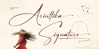 Arinttika is a natural and stylish signature font with a sense of elegant souls. perfect for many different project such as logos & branding, invitation, stationery, wedding designs, social media posts, advertisements, product packaging, product designs, label, photography, watermark, special events or anything. Including uppercase, lowercase, swashes, numerals, punctuations, multilingual support and the alternates of lowercase with ending swashes.
 - CA Fourty Open by Cape Arcona Type Foundry,
$29.00 CA Fourty Open is another take on the idea of a double-line font. It reminds us of neon-sings, but lifts the 50s aesthetics to a contemporary level. Although it’s an all-caps font, upper and lower cases differ a little bit. The upper cases are more open. CA Forty Open has a full Central European letterset.
 - Saturator Serif FA by Fontarte,
$39.00 Saturator Serif FA is a younger brother of Saturator FA. It comes with upper and lower case letters and with diacritic characters for many Latin languages. Its informal and cheerful character allows for different creative ways of usage. This slab serif typeface is designed to accompany sans serif version. It has three variants: Regular, Italic and Shadow.
 - Just Boys by j.dsky,
$19.00 Silhouette font designed to be used as a decorative element within layouts and illustrations. Featuring boys and toys in everyday life situations. Inspired by my kids and their friends playing, running, fighting and expressing different emotions. To create this set of 81 glyphs I used photographs that I hand-traced. Picture font recommended for a variety of illustrative purposes.
 - Guzzles by PizzaDude.dk,
$15.00 Guzzles is a very legible font and has that great ‘unevenish’ look - making it a great typeface for packaging and books, and practically everything that has to with organic and creative projects. I have added 4 slightly different versions of each letter, and they automatically changes as you type - and of course there is a strong multilingual support
 - Kidsnote by Luxfont,
$20.00 Meet Kidsnote, where each letter is like a letter in the margins of the page, written with a ballpoint pen. This dissimilar family of different fonts is framed by the atmosphere of handwritten notes. From block and cursive letters to underlining and mini-doodles, every typeface captures the feeling of writing with a real pen. Like the pages of a notebook, written in small handwriting. Features: - Extras - Kerning
 - Sidewalker by FSD,
$50.00In Sidewalker we can see pieces of OCR-A, letters and of other fonts; letters pressed over metallic supports with too much ink and then redesigned on a computer. Reminiscent of how different materials in Burri or Rauchenberg's paintings are used. Some numbers have the same shape of some letters (J=2, 6=G=9, I=1=l ...) and many pieces of letters are copied into others. Very experimental... - Reyhan by Plantype,
$30.00 Reyhan is a low contrast typeface that looks legible and clean in small sizes. On large sizes, it wraps the space around. Finely drawn negative spaces, neat and minimal shapes define Reyhan. Simple and clean lines give the typeface a solid and finished look. Reyhan is pure and powerful with well designed proportions. Different alternatives such as square dots, alternate /a /l /y /R /1 /6 /9, coverage of 94 Latin languages, various Opentype features, and 18 styles expand the usage area of Reyhan, making it a versatile workhorse. With high-quality spacing, Reyhan looks good on all sizes, making it not only a valuable tool for graphic designers but also a total typeface solution for every person who communicates with type. Reyhan is a typeface designed to adapt requirements of modern and traditional communication. For more information please visit www.plantype.co
 - Flying Dutchman by FontMesa,
$25.00 In nautical folklore, the Flying Dutchman is a ship that can never go home and is doomed to sail the seas forever as a ghost ship. The story of the Dutchman appeared in print in the 1820s. With different versions written over the years, some date the legend to the 1640s or the early 1700s. The Flying Dutchman font is a revival of an 1876 font from MacKellar, Smiths & Jordan Co. The Truetype and OpenType formats include a larger extended character set with Central and Eastern European accented letters. Extra characters in this font are left and right pointing hands in place of the less than and greater than keys and a pirate flag is on the bracket keys. New to this style is the distressed version where the letters look like they've been hacked by a cutlass.
 - Geogrotesque Slab by Emtype Foundry,
$69.00 Geogrotesque Slab is the ideal companion of the popular Geogrotesque. The challenge was to achieve a fully recognizable font that works as part of the existing family, for that reason the Slab version conveys the same message in a different way. The new font remains clean and tech with a human touch yet provides a new security, confidence and firmness thanks to the serifs. This new addition, combined with Geogrotesque, Geogrotesque Stencil and Geogrotesque Condensed Series provides even more design options and now there’s a Geogrotesque for every need. The type family consist of 14 styles 7 weights (Thin, UltraLight, Light, Regular, Medium, SemiBold and Bold) plus italics. It is available for desktop and WebFont and includes ligatures, tabular figures, fractions, numerators, denominators, superiors and inferiors with support for Central and Eastern European languages. For more details see the PDF.
 - Mostyn by Artisan Studio,
$20.00 Description Mostyn Variantions is the font family, Mostyn Variantions is a font family that has 8 variations plus extrude in every variety, it is a model of modern calligraphy typefaces, in combination with a calligraphy writing style. Can be used for various purposes.such as headings, logos, wedding invitation, t-shirt, letterhead, lable, news, posters, badges etc. Multilingual support for various languages including: French, German, Spanish, Portuguese, Italian, Dutch, Finnish, Swedish, and more. Mostyn Variantions works great in any branding, logos, magazines, films. The different weights give you a full range of whole hosts of applications, while the outlined fonts give a real modern feel to any project. OpenType features can be accessed by using OpenType smart programs such as Adobe Photo Shop, Adobe Illustrator, Adobe Indesign, Corel Draw and Microsoft Office. can also be accessed through the character map.
 - Crystania by RGB Studio,
$17.00 Crystania is a must-have signature script that has a diverse. This collection fills a void and separates itself from other scripts available. Crystania is a handwritten signature script with a natural & stylish flow. This collection of scripts is perfect for personal branding. But, this works well for many applications. Everything from personal branding & wedding invitations to advertising could benefit from this collection of signature fonts. These typefaces work well for many different aesthetics. They work well with something like 'cosmetics' for example but would also work well with Liquor Labels, Signage, & any type of signature-styled logo. Files Include : Basic Latin A-Z and a-z Numbers Symbols PUA Encode Multilanguage Support Thanks and have a wonderful day, If you have any questions, please get in touch with us Don't forget to check out our other products.
 - Merciful by Create Big Supply,
$17.00 Introducing Merciful, a charming and playful sans serif font that brings a touch of fun and uniqueness to your designs. With its cute and lively style, Merciful adds a playful and vibrant element to any project. Whether you're designing greeting cards, children's books, party invitations, or any other creative work, Merciful is sure to capture attention and spread joy. This font features both uppercase and lowercase letters, making it versatile for various design purposes. It also includes numbers and punctuations, allowing you to create engaging typography and eye-catching headlines. Merciful supports multilingual characters, enabling you to express your creativity in different languages. With the added convenience of PUA encoding, accessing all the font's glyphs and swashes is effortless. You can unlock a world of creative possibilities by exploring the various ligatures and alternate characters available in Merciful.
 - Market Square by Hanoded,
$12.00 I love markets, especially the farmer’s markets with fresh produce and home made cheese. Too bad I need to travel a long way to get to one, as there is only a ‘regular’ market in my hometown - you know, with cheap duvets, ‘local’ fruit like bananas and a guy selling books about the end of times. I thought it would be great to create a font family you could actually use on a market. Hence Market Square. Market Square consists of 4 different fonts (each with its own Italic style), ranging from a fat marker font to a thin, squarish font. Each of them oozes freshness and authenticity and they were designed to complement each other. The cherry on top is the cute doodle font, loaded with fresh produce and seafood - just like you’d see on a Market Square.
 - Narrow Minded JNL by Jeff Levine,
$29.00 In the days of hand lettering, a common philosophy was "the problem creates the solution". Often times the layout artist would have to adapt the lettering style to fit the amount of copy on a line. A perfect example is during the early 1900s, when popular sheet music of the time almost seemed to be competing for how many words could be used within a song's a title. One such piece of sheet music offered up the tall, condensed and variable-width lettering found within Narrow Minded JNL.
 - Wedding by HiH,
$10.00 Wedding Regular was originally designed by Morris Fuller Benton for ATF and released as Wedding Text in 1901. It is a lighter version of his ENGRAVER'S OLD ENGLISH of the same period. Wedding Regular is based on the Textura style of blackletter that continued in popularity in England into the 16th century, long after the Dutch, French and Italians had moved to a Roman model that expressed the Renaissance humanism of the period. Wedding Headline is a still lighter version of the regular text face, suitable for setting larger sizes while still preserving the delicacy of the decorative hairlines. Textura continues in use in England and the United States for newspaper mastheads, gift shop signs, wedding invitations and programs and other applications where a feeling of tradition is desired. I recently saw an 1980ish photo of a “Tubby Isaac” sign in London using textura. I believe Benton’s design captures that feeling without being heavy-handed and still remaining quite readable for eyes accustomed to Roman lettering. Both Wedding Regular and Wedding Headline convey a comfortable familiarity. These two fonts may be purchased together at an attractive discount or they may be purchased separately. The full character set may be found in the pdf file that you can download from the gallery section. The two monks (alt-0172 and alt-0177) are from a set of sixteenth century decorative initial letters by Gering and Renbolt. Please note that there are two different eszetts, the blackletter style at alt-0126 and the antiqua style at the alt-0223.
 - Faya by Clevus,
$16.00 Proudly present Faya stencil modern ligature. Faya is a font designed with a modern stencil style that blends classic elements with elegant contemporary touches. Featuring ligatures that offer design flexibility, Faya is suitable for various graphic design needs, including posters, banners, logos, and more. Don't forget to use all caps too in your mixing and matching - it adds contrast and impact to your type design. Design tips! : Tighten your letterspacing for larger titles to create a range of looks. Crafted with meticulous attention to detail, Faya's letterforms are bold, sharp, and geometrically-shaped, catching the eye with their visually appealing design. The font boasts high clarity and legibility, offering a range of different letter variations such as elegant uppercase and lowercase letters. With its clean yet stylish appearance, Faya is perfect for modern and minimalist design applications. Font Features : Lettres, numbers, symbols, and punctuation, alternates and ligatures No special software required they may be used even in canva, any basic program /website apps that allows standard fonts That's it folks! Multilingual Support Language Support: Danish, English, Estonian, Filipino, Finnish, French, Friulian, Galician, German, Gusii, Indonesian, Irish, Italian, Luxembourgish, Norwegian Bokmål, Norwegian Nynorsk, Nyankole, Oromo, Portuguese, Romansh, Rombo, Spanish, Swedish, Swiss-German, Uzbek (Latin) Follow My Shop For Upcoming Updates Including Additional Glyphs And Language Support. And Please Message Me If You Want Your Language Included or If There Are Any Features or Glyph Requests, Feel Free to Send me A Message. Kindly check over on Instagram! https://www.instagram.com/clevustudio/ Have a Good Day !
 - Orto by LetterPalette,
$20.00 Orto is a type family of sans serif fonts in eight weights. It's a humanist typeface with real cursive, containing both Roman and Italic styles. The letters are designed to look good on screen, they have a bit narrower proportions and simple shapes. Their structure is based on flat horizontal and vertical strokes, which are emphasized wherever possible. That’s where the name comes from: Orto is an abbreviation of the word orthogonal. Thanks to its narrow width, the typeface is less space-consuming and adapts well to the screens of smaller devices. It is legible in small sizes, thanks to the larger x-height. The characteristic details, like bent ends of diagonal strokes, stand out when used in larger sizes. Orto can be used equally good in print and its overall neutral look fits different contexts. However, its character is pretty recognizable. Orto contains Latin and Cyrillic script and covers six codepages: Latin 1, Latin 2, Cyrillic, Turkish, Windows Baltic and MacOS Roman. It has basic OpenType features like ligatures, oldstyle numerals, proportional and tabular lining figures, fractions, superiors, etc. Capital German sharp S shows up when the lowercase is typed between two uppercase letters, and the Contextual Alternates feature is turned on. The Stylistic Set 01 changes the shape of the Cyrillic b. The Stylistic Set 02 is a shortcut for using Serban Cyrillic alternatives that differ from Russian in cursive.
 - Thicker by Zetafonts,
$39.00 Thicker is a type-family designed for Zetafonts by Francesco Canovaro with Andrea Tartarelli. A geometric sans typeface on steroids, it was first designed in the muscular Extrablack weight with the aesthetics of high-power dynamic typefaces used in sports communication, and then developed in the lighter weights where the shapes show some vintage-inspired proportions and the slightly squared look that nods to Novarese famous Eurostile, eponymous with retro-futurism. With these diverse influences the typeface allows for both impressive display use and effective logo design as well as more fine-tuned editorial use in body text - with a natural inclination for effective and powerful advertising. Sports typography usually uses italics to add dynamism and impact, and Thicker complies with this by offering a choice of three alternate italic forms with different slant, made even more customizable by the inclusion of variable font technology that allows fine tuning of the weight range as well as precise choice of typeface slant. In each of the 44 weights of the typeface family (as well as in the all-in-one variable type solution) Thicker offers a extended charset of over 900 latin, Cyrillic and Greek glyphs, covering over two hundred languages and including useful Open Type features (Alternate forms, Positional Numerals, Small Caps and Case Sensitive Forms) for flawless typesetting.
 - Aston Script Pro by TRF,
$25.00 Aston Script is a calligraphy script font that comes with very beautiful changing characters, a kind of classic decorative copper script with a modern touch, designed with high detail to bring stylish elegance. Aston Script is attractive as a typeface that is smooth, clean, feminine, sensual, glamorous, simple and very easy to read, because there are many fancy letter connections. I also offer a number of viable style alternatives for many letters. The classic style is perfect to be applied in various formal forms such as invitations, labels, restaurant menus, logos, fashion, make up, stationery, novels, magazines, books, greeting / wedding cards, packaging, labels or any type of advertising purpose. Aston Script has 1330+ glyphs and 1039 alternative characters, including various language support. With OpenType features with alternative styles and elegant ligatures. The OpenType feature does not work automatically, but you can access it manually and for the best results needed for your creativity in combining this Glyph variation. ? New Update, Now the Aston Script font has been updated or has two styles with the Aston Script Bold version.
 - Elise by Context,
$12.00 Elise is a sweet natured, layered display typeface, with a few layers but a wealth of options. From the feminine to the fun to the nostalgic, Elise is a capable and personable set. Best used BIG and with color, you’ll always find an occasion for Elise’s charm. To use this typeface, once you have your copy in place in the design program of your choice, copy your text block and paste it directly on top of your existing text block. Set this new text block to a different Elise layer and voila! You’ll already start to see some interesting effects take place. In some cases, different effects are achieved by bringing The Elise Ribbed layer to the front or to the back. Also available is a free ornament set to get you started.
 - Decoral Soft by Totem,
$30.00 Decoral Soft depicts the character of Art Deco period typography and reinterprets it into modern approaches. This typeface is a friendly and flexible family that is fun to use. It comes with a set of 670 characters per weight, supporting over 50 different languages using the Latin alphabet. Decoral Soft also comes with special stylistic sets and swash characters that allow the user to be creative and playful with the type, helps enhance many different possibilities that certainly will spice up your design. Decoral Soft will satisfy all your typographic needs, from book jackets to monograms to packaging, logos, and even wedding invitations—timelessly elegant, with a distinctive flair that exudes Art Deco typography in a fresh, modern way. The wide selection of titling alternates and ligatures make copyfitting a delight.
 - Roves by Andrew Footit,
$12.00 Roves is a font family dedicated to exploration, adventure and the early merchants of history. The word rove means “a journey, especially one with no specific destination; an act of wandering”. the family consists of three Stencil versions each with a Regular and Bold weight as well as two Sans versions each also with a regular and bold weight, this is a total of 10 different options to work with. When combined these two fonts create great looking typography that compliment each other but each also strong enough to be used on their own. The Roves family is a display font with a great rust vintage feel to it which gives the user an authenticity when working with typographic projects. Roves has been created with the designer in mind, to create with and explore the different options with in the family.
 - Assemblage by Latinotype,
$36.00 Assemblage Designed by Daniel Hernández, Alfonso García, Bruno Jara Ahumada and Luciano Vergara. Thanks to Pedro González for his contribution in the initial stage of the design process. Assemblage is a typeface-inspired by Roman square capitals-that comes in 6 different weights and ranging from Thin to Black. The background of the typeface makes it well-suited for branding, short text, titles and complex compositions, thanks to its italic version. Contrary to some conservative fonts, Assemblage includes an italic version with a look based on Elzeverian and Dutch Barroque typefaces, what gives the font an extra dash of elegance, resulting in a very enjoyable design. The family was specially created for labelling wine bottles and general packaging. Assemblage is a font collection consisting of a Sans Serif plus an Italic version of classic features. The family comes in 6 weights and includes ligatures, caps and small caps plus 3 sets of smaller small caps for different kinds of composition. The Italic version-with strong decorative features-comes with swashes. Assemblage also includes a set of dingbats, especially designed for packaging as well as for publishing or branding. The Sans contains 979 characters and the Italic version 620 characters. Assemblage supports 212 different languages and its OpenType features include ligatures, semi oldstyle figures, 3 sets of ornamental small caps (in the Sans version), swashes, ending forms and alternates in the Italic version.
 - Fabrizio by ARTypes,
$60.00 The new Fabrizio™ types, designed by Ari Rafaeli, have made their first appearance in Saggi di Letteratura Italiana: Da Dante per Pirandello a Orazio Costa, by Lucilla Bonavita, printed at Pisa in March 2016 by Fabrizio Serra Editore for whom the type was specially designed. The types are now offered for general sale. Each style (roman, small capitals, italic, semi-bold, bold) contains Cyrillic and ‘polytonic’ Greek letters and letters for many European languages (Czech, Hungarian, Icelandic, Lettish, Polish, Romanian, Serbian, Ukrainian, Welsh etc.), non-kerning fs, long ſ, ligatures and fractions. Alternative forms are supplied in ‘B’ versions of each style. A set of swash letters and sets of superiors, inferiors, fractions and phonetic letters are also offered. Two ‘Special’ fonts (roman and italic) containing special accents, letters for transliteration, Vietnamese letters, mathematics signs and symbols, arrows, commercial signs, pictograms, figures in circles, scansion marks, braces & benzene rings and the Rafaeli-Meruba Hebrew letters, as well as Latin, Cyrillic and Greek letters, are included in the Fabrizio family.
 - Mr De Haviland Pro by Sudtipos,
$45.00 The Charles Bluemlein Script Collection is an intriguing reminder of the heady days of hand lettering and calligraphy in the United States. From the early 1930s through World War II, there were about 200 professional hand letterers working in New York City alone. This occupation saw its demise with the advent of photo lettering, and after digital typography, became virtually extinct. The odd way in which the Bluemlein scripts were assembled and created - by collecting different signatures and then building complete alphabets from them - is a fascinating calligraphic adventure. Because the set of constructed designs looked nothing like the original signatures, fictitious names were assigned to the new script typefaces. The typeface styles were then showcased in Higgins Ink catalogs. Alejandro Paul and Sudtipos bring the Bluemlein scripts back to life in a set of expanded digital versions, reflecting the demands of today’s designer. Extreme care has been taken to render the original scripts authentically, keeping the fictitious names originally assigned to them by Bluemlein.
 - Mr Sandsfort Pro by Sudtipos,
$45.00 The Charles Bluemlein Script Collection is an intriguing reminder of the heady days of hand lettering and calligraphy in the United States. From the early 1930s through World War II, there were about 200 professional hand letterers working in New York City alone. This occupation saw its demise with the advent of photo lettering, and after digital typography, became virtually extinct. The odd way in which the Bluemlein scripts were assembled and created - by collecting different signatures and then building complete alphabets from them - is a fascinating calligraphic adventure. Because the set of constructed designs looked nothing like the original signatures, fictitious names were assigned to the new script typefaces. The typeface styles were then showcased in Higgins Ink catalogs. Alejandro Paul and Sudtipos bring the Bluemlein scripts back to life in a set of expanded digital versions, reflecting the demands of today’s designer. Extreme care has been taken to render the original scripts authentically, keeping the fictitious names originally assigned to them by Bluemlein.
 - Mr Stalwart Pro by Sudtipos,
$45.00 The Charles Bluemlein Script Collection is an intriguing reminder of the heady days of hand lettering and calligraphy in the United States. From the early 1930s through World War II, there were about 200 professional hand letterers working in New York City alone. This occupation saw its demise with the advent of photo lettering, and after digital typography, became virtually extinct. The odd way in which the Bluemlein scripts were assembled and created - by collecting different signatures and then building complete alphabets from them - is a fascinating calligraphic adventure. Because the set of constructed designs looked nothing like the original signatures, fictitious names were assigned to the new script typefaces. The typeface styles were then showcased in Higgins Ink catalogs. Alejandro Paul and Sudtipos bring the Bluemlein scripts back to life in a set of expanded digital versions, reflecting the demands of today’s designer. Extreme care has been taken to render the original scripts authentically, keeping the fictitious names originally assigned to them by Bluemlein.
 - Mrs Von Eckley Pro by Sudtipos,
$45.00 The Charles Bluemlein Script Collection is an intriguing reminder of the heady days of hand lettering and calligraphy in the United States. From the early 1930s through World War II, there were about 200 professional hand letterers working in New York City alone. This occupation saw its demise with the advent of photo lettering, and after digital typography, became virtually extinct. The odd way in which the Bluemlein scripts were assembled and created - by collecting different signatures and then building complete alphabets from them - is a fascinating calligraphic adventure. Because the set of constructed designs looked nothing like the original signatures, fictitious names were assigned to the new script typefaces. The typeface styles were then showcased in Higgins Ink catalogs. Alejandro Paul and Sudtipos bring the Bluemlein scripts back to life in a set of expanded digital versions, reflecting the demands of today’s designer. Extreme care has been taken to render the original scripts authentically, keeping the fictitious names originally assigned to them by Bluemlein.
 - Mr Lackboughs Pro by Sudtipos,
$45.00 The Charles Bluemlein Script Collection is an intriguing reminder of the heady days of hand lettering and calligraphy in the United States. From the early 1930s through World War II, there were about 200 professional hand letterers working in New York City alone. This occupation saw its demise with the advent of photo lettering, and after digital typography, became virtually extinct. The odd way in which the Bluemlein scripts were assembled and created - by collecting different signatures and then building complete alphabets from them - is a fascinating calligraphic adventure. Because the set of constructed designs looked nothing like the original signatures, fictitious names were assigned to the new script typefaces. The typeface styles were then showcased in Higgins Ink catalogs. Alejandro Paul and Sudtipos bring the Bluemlein scripts back to life in a set of expanded digital versions, reflecting the demands of today’s designer. Extreme care has been taken to render the original scripts authentically, keeping the fictitious names originally assigned to them by Bluemlein.
 - Mr Sopkin Pro by Sudtipos,
$45.00 The Charles Bluemlein Script Collection is an intriguing reminder of the heady days of hand lettering and calligraphy in the United States. From the early 1930s through World War II, there were about 200 professional hand letterers working in New York City alone. This occupation saw its demise with the advent of photo lettering, and after digital typography, became virtually extinct. The odd way in which the Bluemlein scripts were assembled and created - by collecting different signatures and then building complete alphabets from them - is a fascinating calligraphic adventure. Because the set of constructed designs looked nothing like the original signatures, fictitious names were assigned to the new script typefaces. The typeface styles were then showcased in Higgins Ink catalogs. Alejandro Paul and Sudtipos bring the Bluemlein scripts back to life in a set of expanded digital versions, reflecting the demands of today’s designer. Extreme care has been taken to render the original scripts authentically, keeping the fictitious names originally assigned to them by Bluemlein.
 - Miss Fajardose Pro by Sudtipos,
$45.00 The Charles Bluemlein Script Collection is an intriguing reminder of the heady days of hand lettering and calligraphy in the United States. From the early 1930s through World War II, there were about 200 professional hand letterers working in New York City alone. This occupation saw its demise with the advent of photo lettering, and after digital typography, became virtually extinct. The odd way in which the Bluemlein scripts were assembled and created - by collecting different signatures and then building complete alphabets from them - is a fascinating calligraphic adventure. Because the set of constructed designs looked nothing like the original signatures, fictitious names were assigned to the new script typefaces. The typeface styles were then showcased in Higgins Ink catalogs. Alejandro Paul and Sudtipos bring the Bluemlein scripts back to life in a set of expanded digital versions, reflecting the demands of today’s designer. Extreme care has been taken to render the original scripts authentically, keeping the fictitious names originally assigned to them by Bluemlein.