10,000 search results
(0.067 seconds)
- GungsuhChe by Microsoft Corporation,
$129.00GungsuhChe™ features a mincho (serif) stroke style with half-width Latin characters. This GungsuhChe font file is 6.9 MB in size. GungsuhChe is a trademark of the Microsoft Corporation. GungsuhChe Character Set: Latin 1, Korean code page 949 - Fd Hallway by Fortunes Co,
$15.00 Hallway inspired from vintage script combined with modern style, suite for adventure or classic feeling sport, sign painting, labeling, suitable for logo, product names packages, labels, old fashioned coffee shops, bars and everything with specific characteristics of past times.
 - The Rambutan by Alifinart Studio,
$10.00 The Rambutan is a unique font with a subtle and bold style. This font is very well used in a variety of designs such as menus, catalogs, invitation cards, wedding, blog, travel photographers and others. Alifinart Studio alifinart@gmail.com
 - Vanigar Display by Tony Type Studio,
$15.00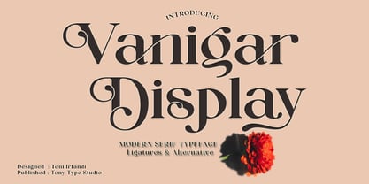 Vanigar Display is a serif font that comes with a very beautiful change character that will bring a touch of luxury and style to your projects. Vanigar Display is perfect for editorial design, branding, headings, logos, magazines and more.
 - Promo by Borutta Group,
$35.00 Promo is charming rounded sans family. This typeface is defined by multiple features, which give it a friendly feeling. Promo is perfect for branding and display purposes. Entire family consist of 9 styles with italics from Thin to Bold.
 - Niemi by Blank Is The New Black,
$10.00 Niemi is a continuation of the work started with Versteeg. Where Versteeg was separated into individual circles, Huet connects these circles and adds a sharp geometric style. This creates a nice juxtaposition between the rounded ends, and sharp corners.
 - Lemonstyle by ffeeaarr,
$13.00 lemonstyle, we named as a lemon because near of girly name character. girly font name are much similar, so we added and combine including style in one name without space. it's really good for women including cosmetic products & anothers
 - Navue by Gholib Tammami,
$15.00 The Navue font is a typeface designed with an elegant and feminine style, making it suitable for enhancing the quality of your product branding. This font is well-suited for various purposes, including displays, printing, branding, and many others.
 - Salminah by Letterafandi Studio,
$14.00 Salminah is a fashionable and thin lettered script font. Suitable to a wide variety of designs due to its neat and simple style, this font has the potential to become your favorite go-to font, no matter the occasion!
 - Sophistica by RagamKata,
$14.00 Sophistica is a stylish and classic typeface and twist harmoniously together. The Eleanor font style will make you love designing and taking advantage of the cool designs for this font. Keep following us for updates on making further fonts
 - Qareluna by Typebae,
$12.00 Qareluna is a beautiful and elegant sans serif font. Suitable to a wide variety of designs due to its neat and simple style, this font has the potential to become your favorite go-to font, no matter the occasion!
 - Claudia Alves by DYSA Studio,
$19.00 Claudia Alves is a New Modern Serif Typeface. This another collection of Serif is perfect for your next branding project, excellent for your business. Claudia Alves have a smooth edges, so this font gives an authentic handcrafted feel style.
 - Chisel Tip by m u r,
$15.00The evolution of letters is something obsessed over by graffiti writers and font fanatics alike. This font is authentic and can be used both by other graffiti writers as well as by people looking to create that particular style. - JT Marnie by JAM Type Design,
$14.00 The design is influenced by the geometric style sans serif faces which were popular during the 1920s and 30s. The JT Marnie font family is well suited for headlines and small blocks of text, particularly in advertising and packaging.
 - Pianka Brush by DYSA Studio,
$19.00 Pianka Brush is a new Handwritten Script Font. This another collection of handwritten is perfect for your next branding project, excellent for your business. Pianka Brush have a natural edges, so this font gives an authentic handcrafted feel style.
 - Realstin by Ajibatype,
$19.00 Realstin is a luxurious serif with an elegant style. It seduces your eyes with its curves yet still manages to maintain its classy serenity, it’s perfect for branding, logos, invitations, long texts, and many more of your other needs.
 - Just Great JNL by Jeff Levine,
$29.00 A 1940s British music collection of classical music piano pieces entitled "The Great Masters Series" had its title hand-lettered in a free form, casual sans serif with a cartoon style. This is now available as Just Great JNL.
 - Danity by Sesa Grafika,
$35.00 Danity is a gorgeous and retro styled display font. Add it confidently to your projects, and you will love the results. This font is PUA encoded which means you can access all of the glyphs and swashes with ease!
 - Kiddie Blokz JNL by Jeff Levine,
$29.00Kiddie Blokz JNL is a limited character set font in three styles: Regular, Lined and Block, emulating the look of toy blocks for themes with a juvenile motif. For a companion font to set regular copy, use Roughshod JNL. - Hello Almeida by Blankids,
$24.00 Introducing of our new product the name is Hello Almeida a Bold Handwritten Font. Hello Almeida inspired by modern calligraphy style this font is a fun theme very good for display, tshirt design, craft, quote sign, logotype and etc
 - Vingiloth by Mr. Typeman,
$12.00 Vingiloth is a delicate script which simulates natural handwriting. Vingiloth includes Vingiloth Regular and Vingiloth Caps, designed to contrast and compliment each other with elegant beauty and contemporary style, making it an excellent fit for projects of all types.
 - Nouveau Stencil Ornate JNL by Jeff Levine,
$29.00 A 1902 publication entitled "Lettering for Schools & Colleges" had an example of an ornate, hand drawn stencil alphabet in the Art Nouveau style. This is now available digitally as Nouveau Stencil Ornate JNL, in both regular and oblique versions.
 - Fiendstar by AVP,
$29.00Initially created as a less quirky alternative to GillSans Schoolbook, Fiendstar has been developed into a family of widths, weights and styles. High legibility makes it suitable for signs and school books, especially for readers with poor reading ability. - Old Fat Boy by Gleb Guralnyk,
$14.00 Hello! Introducing a creative all caps font named Old Fat Boy. It's a vintage shape smooth typeface with authentique 90's style look. This font includes lots of multilingual characters (check out a screenshot with available letters and signs).
 - HU BlueoceanKR by Heummdesign,
$25.00 This is a headline typeface created by imagining the appearance of waves in a square glass tube. It is a typeface that adds a wave shape to the gothic style in a full square module. HU BlueoceanKR includes Korean.
 - Cool Sensation by Arendxstudio,
$13.00 Cool Sensation - Graffiti Font is a free style font that has the characteristics of street art that shows freedom and is filled with unique characters Features : • Character Set A-Z • Numerals & Punctuations (OpenType Standard) • Accents (Multilingual characters) • Ligature • Alternate
 - Funky Star by Arendxstudio,
$13.00 Funky Star - Graffiti Font is a free style font that has the characteristics of street art that shows freedom and is filled with unique characters Features : • Character Set A-Z • Numerals & Punctuations (OpenType Standard) • Accents (Multilingual characters) • Ligature • Alternate
 - Star Blast by Blankids,
$19.00 Introducing of our new product the name is Star Blast a Playful Cartoon Font, Star Blast inspired by playful style with a fun theme very good for kids theme design. FEATURES : Uppercase Lowercase Number Punctuation Multilingual PUA Encode Opentype
 - Sometype Mono by Dharma Type,
$- Sometype Mono is a free monospaced font family for coding and tabular layout which can be used for commercial purpose for free. So far, Sometype Mono consists of 6 style. Regular, Italic, Medium, Medium Italic, Bold and Bold Italic.
 - Aphrodite Slim by Typesenses,
$57.00 Aphrodite Slim Pro is not just a lighter version of its sister Aphrodite Pro. Aphrodite Slim Pro has duplicated the quantity of characters of its partner, and that means more than 500 new glyphs, reaching a total of more than 1000. More delicate and meticulous, Aphrodite Slim Pro is once more a new typography with deep calligraphic ideals: We immersed ourselves into the world of each calligraphy ductus and each calligraphy masters by studying from decoration to lettering books. This was the key for the logic of Aphrodite Slim’s behavior. The new concept of Aphrodite Slim Pro was to join diverse styles of calligraphy in one in order to achieve an autonomous expressiveness, in fact, this is what calligraphy aims to, and we agreed to bring those ideals to the world of typography: It is justifiable to be inspired in hundred-year-old calligraphies, but it is even better if the results you obtain have a plus. A personal plus. During the creation process we were wondering whether it was possible to mix certain strokes of such rigid styles as uncial, (Li·n’s favourite style), with strokes of the copperplate, (Sav’s favourite style), and also to take and mix cualities of cancelleresca cursiva, formata and moderna; finally giving our creation a roman-transition italic look. So Aphrodite Slim takes ideals and aspects from those formal styles, following its own logic though, and emphasizing the fact of being a decorative typography. Calligraphy masters of our past are who we are in debt with. They are the cause we have lovely letters now. They have been spontaneous at the moment of creation, what differs from the type-designers of nowadays, whose spontaneity is more limited. Digital faces that we are used to see these days are a result of long hours of optical adjustments, grids, macros and inspirations of other existing typography, but without personal contributions. Aphrodite Slim wants to refute this. Its mission is to rescue de spontaneity of the artesanal lettering in order to obtain unique words; those which only calligraphy masters of our past or lettering artists of our present could give us. We have worked hard to achieve this, making Aphrodite the most universal font we could: It was necessary to study the most common words, focalizing more in the ones referring to “sensitivity”, of four of the most spoken languages in the world. Aphrodite Slim has an enormous quantity of decorative characters and special ligatures for phrases and words in English, French, Spanish and German. (See English, Français, Español, Deutsch PDF in the gallery section). We promise there is no existing type that decorates/ligates glyphs and words like Aphrodite Slim does: It is the first time a font like this really considers its purpose. -The way glyphs are ligated is insane- : Aphrodite Slim rescues some ideals of persons like Jan van den Velde (Italian cancilleresca writing of XVI Century) who understands ascenders and descenders as possibilities to beautify the lines of writing with curved strokes that seem to be dancing above and below of the words. This master also creates ascenders and descenders even where they are not necessary, on letters that do not actually need them: Aphrodite Slim takes this ideal. The font counts with a wide range of glyphs that seem not to be satisfied with its more primitive form and prefer to extreme their parts to be decorative. It also existed masters of calligraphy like José de Casanova of XVII Century, who, with a magnificant skill and a really personal mark, had the particularity of ligating words that were actually separated with spaces. This is another innovative feature in Aphrodite Slim. An investigation of the most common beginnings and endings words of the English language was done. Having that feature activated (discretionary ligatures), common words will start to ligate or to be decorated even when they are separated by spaces. Impossible to forget Francesco Periccioli of XVII Century and our experience us designers to face with works of him: His letters, that today are included in the group of cancellerescas modernas, have been a direct inspiration to the oldstyle figures and historical forms variables in Aphrodite Slim. Giovanni Antonio Tagliente (XVI Century) and his particular way of making tails and diagonals longer than usual, qualities that our creation reflects too. Finally, our adventures in Biblioteca Nacional and Barrio San Telmo, Buenos Aires, were essential for us to make Aphrodite Slim more complete and interesting: Sav did an excellent work when studying how the decorative miscellanea and swirls of early XX century were. She also investigated what particularities made those roman titling characters look antique so she could rescue some ideals for the oldstyle figures and historical forms variables. This also leaded her to create the ornaments variable in Aphrodite Slim. We are really proud of presenting Aphrodite Slim Pro, a typography that was the result of days and nights of working hard, because we do love what we do; and we are glad we are living in a present that gives us the possibility to spread this kind of art, because that is the way we consider our job: Aphrodite Slim Pro is Art. Hope you can appreciate the enormous work this type has. Features. Aphrodite Slim Pro is the most complete variable. It includes more than 1000 glyphs. Thanks to the Open-Type programming, it counts with a easy way to change/alternate glyphs if the application in which the font is used supports this. The variables contained in Aphrodite Slim Pro are also offered separately. Aphrodite Slim Text: It is the variable for lines and paragraphs. Thus it is the least ornamental and the most accurate to achieve a satisfying legibility. It has the Standard Ligatures feature in order to improve the possible conflicts some glyphs could have by others. Aphrodite Slim Contextual: It is the one that makes emphasis in decorating. It has the particularity of ligating/decorating words of common use in English, French, Spanish and German. It also has the quality of ligating common beginnings and endings of the common words in English. Aphrodite Slim Stylistic: With similar features of Slim Contextual. It includes a set of decorative numbers for a display use. Aphrodite Slim Swash: This one has special beginnings and endings to decorate words. Aphrodite Slim Endings: It makes words look as a signature. Aphrodite Slim Historical: It adds an antique look to the written word. It also has the special historical ligature function. Aphrodite Slim Titling: This one is the most decorative. Its copperplate inspired ornaments give words a special color, in order to handle the quantity of decoration, it comes with the standard ligature feature, which has the most common ligatures plus others that make decorative swirls not to be conflictive. Aphrodite Slim Ornaments: A set of 52 ornaments. Aphrodite Slim Pro includes all this features plus the Stylistic Set 1; Stylistic Set 2 and the possibility of Slashed Zero. We recommend you to check out the gallery in order to see all these features in action.
 - Pegasus by chicken,
$23.00 Pegasus scrapes the DNA of a great twentieth century painter who scattered text across his work like no other… not any kind of facsimile, but tough, playful, adaptable display type forged from the bones of a unique writing hand. Three weights - Skinny, Domestic and Peso - each offer five alternates for each letter, three for each numeral and multiple versions of many punctuation and other symbols. Letters are uppercase only with the lowercase providing one of the alternate forms of each letter… with OpenType Contextual Alternates switched on, you get automatic variation between the two… and you can manually throw in wilder variations from the remaining alternates. Some repeated punctuation - periods, question marks, etc. - are automatically varied too. OpenType Stylistic Set 1 switches to a rowdier selection from the alternates… Set 2 flips all the E’s to distinctive ‘skeleton’ alternates… Set 3 introduces automatic variation into numerals. Save some $$$ by purchasing the Whole Livery Line - all three weights at a nice discount... or, if you're really hurting, Cheapskate offers just two alternates for each letter and a single set of numerals.
 - Eckhardt Display Serif JNL by Jeff Levine,
$29.00The pages of a vintage sign painter's manual yields many interesting typefaces that reflect on the design styles of years gone by. Eckhardt Display Serif JNL is a distinctive, hand-lettered serif face that has a hint of Art Noveau. Part of a series of sign painter's fonts named in honor of the late Albert Eckhardt, Jr. who owned Allied Signs in Miami, Florida, Jeff Levine continues this series of fonts in tribute to his friend and the art of sign lettering. - Sharung by Twinletter,
$14.00 Sharung, our newest font family, is now available! This font family is opulent and one-of-a-kind. This collection includes 18 various styles, making it ideal for a wide range of projects. Each style was built from the ground up to optimize beauty and personality. This font was created specifically for a wide range of display design and branding requirements. Sharung has everything you’ll need to create stunning graphics, including titles, texts, banners, posters, and more. Get a unique design look with this font right now! of course, your various design projects will be perfect and extraordinary if you use this font because this font is equipped with a font family, both for titles and subtitles and sentence text, start using our fonts for your extraordinary projects.
 - Mrs Onion by Hipopotam Studio,
$26.00 Mrs Onion is an all uppercase, multilayer typeface with lots of possibilities. It consists of 38 fonts that can be divided into two groups – Regulars for a day-to-day use and Monsters if you want to walk on the wild side. You can combine up to 6 styles to achieve complex and colorful effects. We created a dedicated, simple website at mrs-onion.love, where you can learn how the layering of styles works and test your own words and phrases on some predefined samples. You can also download a manual from here and enjoy it offline. Feel free to use Mrs Onion not only for posters, invitations, book covers, apps, games, and any kind of headlines but also for mugs, t-shirts, logotypes, walls, cars, and hot balloons.
 - Lucida Handwriting by Monotype,
$40.99 Lucida Handwriting is a casual, connected script designed for smooth and fun reading on screens and in print. Its relaxed personality and vigorous energy sends a distinctive message. Lucida Handwriting was originally released in one weight. It is now available in five weights, from Thin to Black. Lucida Handwriting was designed by Kris Holmes and Charles Bigelow based on historic blackletter style cursives. As with other joining script typefaces, all capital letters usage is not recommended: it is best to use upper and lowercase for optimal legibility. Lucida Handwriting is part of the Lucida superfamily of fonts from Bigelow & Holmes. Lucida is highly regarded for legibility and its extensive range of type styles. The Lucida Handwriting typeface family has a Standard character set with 255 glyphs supporting the basic range of Latin languages.
 - Chord Brights by Letterhend,
$16.00 Introducing, Chord Brights, a one of a kind layered typeface with 4 styles (Regular, Extrude, Outline, Inline). This typeface has a nostalgic feel because of its style, so the font is really a match for your project with a retro/vintage theme. Chord Brights is perfectly made to be applied especially in logos, invitations, labels, logos, magazines, books, greeting/wedding cards, packaging, fashion, make up, stationery, novels, labels or any type of advertising purpose. Features : uppercase & lowercase numbers and punctuation multilingual ligatures alternates swashes PUA encoded contextual alternate We highly recommend using a program that supports OpenType features and Glyphs panels like many of Adobe apps and Corel Draw, so you can see and access all Glyph variations. Email us to letterhend@gmail.com if you need something! Happy Designing!
 - LC Gianluca by Compañía Tipográfica de Chile,
$29.00 Gianluca is a typeface of glyphic serif, or “flare” inspired by Aldo Novarese’s fonts from the 70s, with a fresh and modern touch. It is a type family that can be elegant in its normal version, or very playful, to compose from extensive texts to flashy headlines in books, magazines, labels, posters, branding and more. It has many discretionary ligatures in capital letters (with its diacritics) to play with the text, 5 stylistic sets: among them medieval style or references to Herb Lubalin, and some special letters. Gianluca consists of 5-weight fonts, from Thin to Extra Bold. All of them with matching italics. It has a nice set of small capitals, modern and old style numbers, and capital-sensitive punctuation, among other striking glyphs. Play with Gianluca!
 - Matcha by Los Andes,
$59.00 We decided to explore the concept of fitness, but from a more natural perspective. With so many people drinking detox drinks and eating raw food, we were inspired to create a font that mixes the ‘strength’ of sports and the organic nature of natural products. The result is ‘Matcha’: a strong and energetic typeface that also flows at the same time. Matcha consists of a stable, very friendly Slab face and a calligraphy Script with a handmade style: spontaneous and fickle with some reverse-contrast alternative characters. Can you guess who is the designer behind each style? The duo contains OpenType features and is perfect for labeling natural products, cookbooks, magazine photography, fashion & beauty magazines covers, health & fitness publications, and more. For both print and digital communication. Matcha: the new black coffee!
 - Frieze by Fine Fonts,
$29.00 The origin of this font was a frieze in the RAF Chapel in Westminster Abbey which Michael Harvey was commissioned to design and create. It was comprised of the names of the top brass in wartime Bomber Command, namely Dowding, Harris, Newall, Tedder, Portal and Douglas. The Brief was to cut the letters in bronze and gild them. Instead, they were cut in perspex and gilded. To sit comfortably within the long and narrow vertical space available beneath the chapel’s stained glass window, extended letterforms were used with many vertical serifs omitted and with lengthened horizontal serifs. Some twenty years later, the missing upper-case letters were drawn together with the lowercase letters and Frieze, the font, was born. Subsequently, additional weights and styles were added to create a font family of six styles.
 - TT Squares by TypeType,
$29.00 You are on the page of the old display version of the TT Squares typeface. In 2020, we released an entirely new, completely redesigned, and significantly expanded version of the typeface called TT Octosquares. In addition to 73 styles, TT Octosquares has 3-axis variable version, stylistic alternates, ligatures, old-style figures and many other useful OpenType features. Before you buy the old display version of the font, we suggest that you pay attention to the new superfamily TT Octosquares and study it in more detail. - Squares created for infographics and statistics. This font has both futuristic and techno attributes. Most popular typefaces formula: Thin, Light, Regular, Bold, Black and Italics. Squares are ideal for short inscriptions and long text blocks. Optimized for the websites, mobile applications, and printing materials.