10,000 search results
(0.07 seconds)
- Stinger by Zetafonts,
$39.00 Since their first appearance as Italians on the pages of the 1821 William Caslon type specimens, reverse contrast typefaces have been typography's best loved quirky outcasts. Subverting the traditional relationship between thick verticals and thin horizontals made them perfect for eye-catching advertisements. The unexpected contrasts and the thick slabs produced by reverse-contrast serifs became ubiquitous in period posters, and synonymous with wild west and circus iconography. In designing Stinger, the Zetafonts design team composed by Maria Chiara Fantini, Andrea Tartarelli and Francesco Canovaro and orchestrated by Cosimo Lorenzo Pancini decided to marry this subversive tradition with the workhorse approach of modernist sans serif typefaces like Univers, developing a super-family with four widths, each in five different weights, from thin to heavy. This gives the designer a full range of options for type setting, with the Normal and Fit widths providing two different text-sized alternatives, the wide width adding display and titling options and the Slim ready to deal with the space-saving necessities of extremely long texts. True italics have been added developed for all weights and variants, bringing the Stinger family to a total of 40 fonts, with a latin extended + Russian Cyrillic character set covering over 200 languages, and open type features including positional numbers, stylistic sets and alternate forms. In the crowded panorama of contemporary grotesque typefaces, all aiming to stark geometric perfection, Stinger stands out with its bold choices and strong personality. From the calligraphy-inspired terminals in the thin weights to the logo-ready sculptural approach in the heavy weights, each variant manages to look striking without forgetting the readability and flexibility lessons of modern reverse-contrast classics like those designed by Excoffon or Novarese. A variable version is included with the full family, allowing maximum flexibility and control for the designer over the wide range of expression capabilities of the Stinger super family.
 - Roadline by John Moore Type Foundry,
$45.00 Roadline is a professional display font collection of Streamline style for lettering, a style of lettering that was much in vogue from the 30 to the 60. Roadline aligns all your characters on a horizontal baseline and allows headlines or logos into three wide variables. Besides its connectors allow you to create variations ranging from elegant classics to radicals or creative situations, adapting to all target tones of voice message, it brings Roadline a series of pre-programmed parts in Opentype links for easy use and enable very creative and unexpected combinations. For its decorative character this typeface is very useful for headlines and logo creation. Relive the golden years of the brands with Roadline.
 - Blackoak by Adobe,
$29.00Joy Redick designed Blackoak, a big and heavy Egyptienne-sytle titling slab serif face, in 1990. The extremely robust style of the characters in this typeface was consciously distorted; creating letterforms that appear flattened and stretched, like a rubber band. Blackoak is drawn in the style of old wood tpes, just like those that one envisions when one thinks of the large, decorative posters that once filled Wild West America. The wood type collection of the Smithsonian Institute in Washington, DC acted as a primary source of inspiration for this design. True to its rooks, Blackoak is meant for use exclusively in headlines in very large point sizes, or for logos and other corporate advertising purposes. - JP Alva Expanded by jpFonts,
$19.95 jpAlva is a technical and functional sans-serif that consists of 40 typefaces, divided in 2 font families jpAlva and jpAlva Extended. A universal family of typefaces that fits pretty much any purpose. It illustrates a precise balance of modern geometrics, with a functional yet sparing style that effectively communicates without distraction. A straightforward, unadorned appearance with efficient construction. Simple, clean with a technical note and a wide range of styles it is perfectly suitable for a wide range of applications, from identity systems to editorial design, from signage systems to software applications. Designed with powerful OpenType features (e.g. figure sets, fractions, ligatures, case sensitive forms) and extended language support, it is easy and enjoyable to use.
 - Pasarela by Los Andes,
$26.00 The street is the new runway. Pasarela is a display typeface inspired by the new culture of fashion in the streets. A global phenomenon across continents, traveling through social networks, fashion bloggers and street style. Everything is possible, everything is combined. The new culture of fashion is eclectic with hints of each culture at miles away. The complexity generated by the start page of this mix styles is solved perfectly with his neutral and clean tone, streamlined structure and thin strokes. It has been designed in two weights plus a set of borders that can generate graphic compositions for application in blogs, magazines, posters and tv. No one needs to be a fashion victim to cross the pasarela.
 - JP Alva by jpFonts,
$19.99 jpAlva is a technical and functional sans-serif that consists of 40 typefaces, divided in 2 font families jpAlva and jpAlva Extended. A universal family of typefaces that fits pretty much any purpose. It illustrates a precise balance of modern geometrics, with a functional yet sparing style that effectively communicates without distraction. A straightforward, unadorned appearance with efficient construction. Simple, clean with a technical note and a wide range of styles it is perfectly suitable for a wide range of applications, from identity systems to editorial design, from signage systems to software applications. Designed with powerful OpenType features (e.g. figure sets, fractions, ligatures, case sensitive forms) and extended language support, it is easy and enjoyable to use.
 - Dvarlin Staves by Sins,
$37.48 Dvarlin Staves is a collection of 512 rune glyph's divided into six font family's. The three main font's are Root, Caber and Bole, while Remnant, Branch and Blossom are taller versions of the main set. They all come in four weights: Light, Regular, Semibold and Bold. As well as a Italic and a Slant style for the purpose of adjusting letters on a curved line. It also features codex:437 glyph set and an extended array of letters and corner alternatives, including the default runic glyph's. The collection stands at 72 styles that contains a total of 36 864 glyph's. For extra supporters consider gifting some Staves away to a crafty friend.
 - RTCO Flinton by Roams Type Co,
$9.00Flinton is a basic Vintage Serif Display Font. Flinton Font Family consists of 3 types of letters that have several variants into 14 font style, Include Regular Serif, Bold Serif & Script Demo and Catchwords & Illustrations for extras. This font is suitable for types of designs that have elements of Vintage Concepts, such as logotypes, posters, merchandise designs, etc. And this font has an opentype feature, also supported for several languages, Which consists of several styles: Clean Outline Roughen Texture Slant Texture Slant Script Demo Catchwords what is included in this font are as follows: Opentype Feature Multilanguage Support Numeral Sepparators Math Symbol More 1000 Count Glyphs I hope you enjoy using this Flinton Font Thanks For Support - Slippery Fishes by Ingrimayne Type,
$9.00 SlipperyFishes alternates two letter sets to create an undulating line of text that reminds me of a slippery fish. It resembles Undulate, another typeface that uses the OpenType feature of contextual alternatives (calt) to alternate letters, but while the tops and bottoms of letters in Undulate trace parallel paths, the tops and bottoms of letters in SlipperyFishes trace reflecting paths. SlipperyFishes is monospaced with tight letter spacing to accentuate the ripple pattern. The family has four members: regular, outlined, condensed, and condensed outlined. The outline styles that can be used in a layer with their base styles to add color.Slippery fishes is bizarre and weird and can be used in places where those attributes will create attention-grabbing lettering.
 - China Dragon JNL by Jeff Levine,
$29.00 China Dragon JNL was inspired by a vintage letterpress logo cut on sale in an online auction. The logo for The China Dragon restaurant (presumably from the 1950s or 1960s) had a wonderfully eclectic hand-lettered look. Some of the original characters were modified slightly to conform with the ones created for the remainder of the typeface, but the original styling remains intact. The unique design of this font allows it to adapt well to Art Nouveau or Mideastern project styles. In January of 2006, Jeff Levine Fonts started with just ten designs. A little more than seven years later, in April, 2013 the release of China Dragon is the 700th font added to this ever-growing library.
 - Armavir by FontaZY,
$19.00 Armavir by Fontazy is an uppercase type-family consisting of three gradually distressed sub-families Armavir 01, Armavir 02 and Armavir 03 (each in Regular and Bold weights) and Shadow (also in Regular and Bold). Armavir is a sans serif font with a slight touch of handmade. Each typeface contains stylistic alternate version of vowels -A, -a, -E and -e, that converting uppercase font in unicase(-ish). The Shadow style is suitable for each of three text styles. Being a duplicate of the text layer, it gives an additional decorative appearance to the text. All fonts in the family has Latin (West, Central and Baltic) and Cyrillic encoding. Armavir is perfect for logo making, print design, advertising, branding etc.
 - Bizarre - Unknown license

- Gawain - Unknown license

- OpenMind - Unknown license

- Mono Spec Stencil by Halbfett,
$30.00 Mono-Spec Stencil is a monospaced family of sans-serif type. At least in default settings, all characters across the typeface share a common width, which is immediately noticeable for its condensed nature. Mono-Spec Stencil is a sibling of a non-stencil family, simply named Mono-Spec. Characters in each are just as wide, allowing Mono-Spec Stencil to be used together with Mono-Spec, as a secondary typeface. As a typeface whose characters are stencil-shaped, this design channels the spirit of resistance and street culture. When you look at the family, remember that it ships in two different formats. Depending on your preference, you can install the typeface as a single Variable Font or use the family’s five static OpenType font files instead. Those weights run from Light through Bold. While the static-format fonts offer a good intermediary-step selection, users who install the Variable Font have vastly greater control over their text’s stroke width. The Mono-Spec Stencil Variable Font’s weight axis allows users to differentiate between almost 1,000 possible font weights. That enables you to fine-tune your text’s exact appearance on-screen or in print. Whatever format you choose, the Mono-Spec Stencil fonts are equipped with several OpenType features. The most striking of these can be activated via a Stylistic Set. That will replace several letters – like “B”, “E”, “F”, “H”, and “I” with double-width alternates. Those alternates take up as much space as two characters placed next to each other otherwise word. The effect of Mono-Spec Stencil’s double-width alternates is striking, and their use strikes a strong chord in any display typography applying them.
 - Poligon by Halbfett,
$30.00 Poligon is a large family of geometric sans serif fonts. It is inspired by classic typefaces from the geometric-sans genre, like Futura and Avant Garde Gothic, whose shapes were constructed from circles and straight lines. Every character has been crafted to give it a distinct and individual feel. The family is an excellent choice for both corporate design and editorial design projects because of its range of weights, as well as its legibility in text. The typeface family ships in two different formats. Depending on your preference, you can install the typeface as two Variable Fonts or use the family’s eight static OpenType font files instead. Those weights run from Thin to Black. While the static-format fonts offer a good intermediary-step selection, users who install the Variable Fonts have vastly greater control over the stroke width in their upright and italic texts. The weight axes in Poligon’s Variable Fonts allow users to differentiate between almost 1,000 possible font weights. That enables you to fine-tune your text’s exact appearance on-screen or in print. But even the static fonts satisfy the need for flexibility, creating harmonious variations of texture and emphasis. Despite their rigid geometry, the fonts have a playful air to them. That playfulness and uniqueness can be dialed up by applying stylistic alternates via the fonts’ four Stylistic Sets. The first of these replaces “G”, “M”, and “&” with alternate, more outgoing shapes. Stylistic Set 2 has an alternate “ß”; Stylistic Set 3 has a “Q” with a longer tail and another “G”. Stylistic Set 3 has alternates for “A”, “K“, “Q”, “R”, “S”, “Y”, and “Z”.
 - Ashemore by insigne,
$34.99 Ashemore developed as a result of my visits to Barcelona, Spain and to Germany, followed soon after by a visit to Asheville, North Carolina. Blending the styles of art and architecture from these three areas may seem initially to result in an unusual formula, but the distinct and flamboyant style of Art Nouveau and the Arts and Crafts style combined with the more strict rules of a sans serif transfer well into a beautiful and very usable blend of these individually eccentric forms. The resulting font retains the Art Nouveau and Craftsman style flavors, which shine through the typeface despite its geometric base. One of the font’s defining characteristics is the unique terminators of its C, G and S. This face’s texture and rhythm also moves well in longer texts. These and other features give Ashemore a restrained bohemian vibe that seems particularly appropriate for a coffee house or an art gallery. The Ashemore family has a full range of six weights from thin to black and includes condensed and extended options for a total of 36 fonts. The typeface also includes some unique OpenType alternates that make the superfamily even more versatile. Ashemore is equipped for complex professional typography, including alternates, small caps and many alternate characters. The face also has a number of numeral sets, including tabular figures, fractions, old-style, lining figures and superiors and inferiors. OpenType-capable applications such as Quark or the Adobe Suite can take full advantage of automatic ligatures and alternates. You can find these features demonstrated in the .pdf brochure. Ashemore also includes the glyphs to support a wide range of languages, including Central, Eastern and Western European languages. In all, Ashemore supports over 40 languages that use the extended Latin script, making the new addition a great choice for multi-lingual publications and packaging. Ashemore was designed by Jeremy Dooley with production assistance from Lucas Azevedo and Marcelo Magalhaes. Kerning assistance from iKern.
 - Offroad by Grype,
$16.00 Geometric typefaces can harken back and visually tie themselves to so many genres, from constructivist posters, to techno club flyers, to raw industrial era power. The Offroad family finds its origin of inspiration in the O’Neal MX logo for their motocross division, represented in its truest form in the MX styles of this family, and expanded to a type megafamily. Offroad grabs hold of that unique pseudo-unicase style and runs with it to create a range of widths and weights that are perfect for historical through modern use. It embodies the hardcore motocross rigidity from the limited inspiration of the original logotype and expands to include a full and expansive glyphset, and a comprehensive range of widths and weights, creating a straightforward, uncompromising collection of typefaces that lend a solid foundation and a broad range of expression for designers. Here's what's included with the Offroad Collection bundle: 382 glyphs per style - including Capitals, Lowercase (Unicase Style), Numerals, Punctuation and an extensive character set that covers multilingual support of latin based languages. (see the 6th graphic for a preview of the characters included) 45 fonts in 6 width subfamilies: Extra Condensed, Condensed, Standard, Expanded, & Wide. 5 weights per subfamily with obliques: Light, Book, Regular, Bold, & Black. Fonts are provided in TTF & OTF formats. The TTF format is the standard go to for most users, although the OTF and TTF function exactly the same. Here's why the Offroad Collection is for you: You're in need of a geometric pseudo-unicase family with a big range of weights and widths You're a die-hard motocross fan, and want to design anything within that genre You're a club flyer designer, and need a kick-ass techno style font family You're totally into constructivist design, and want to create designs within that genre You just like to collect quality fonts to add to your design arsenal
 - Ghibli by Eyad Al-Samman,
$- The word ‘Ghibli’ per se refers to a Saharan hot and dry wind commonly known as the Sirocco. In Arabic language, ‘Ghibli’ is known as ‘Qibli or Kibli’, meaning ‘Southern’ for those Arabic nations who live in the North of Africa. The ‘Ghibli’ wind is most common during spring and autumn, and can blow at almost 60mph; it is this wind which is responsible for the dry, dusty conditions on the Mediterranean coast of North Africa. ‘Ghibli’ can last for days making life miserable and is therefore feared by the desert dwellers in that region. It can also have profound effect on the landscape by moving vast quantities of sand and dunes. Inspired by the Studio Ghibli’s unique and magical characters, the ‘Ghibli’ typeface is designed as a Latin free and literary serif typeface. It strongly expresses transition, imagination, sharpness, characterization, and modernization. It is a literary type that can capture the eyesight of readers and other observers with its acute and stylistic letterforms, dots, and numerals. It has transitional serifs and it is generally based upon the Latin printing style of the 18th and 19th centuries, with a pronounced vertical contrast in stroke emphasis (i.e., vertical strokes being heavier than the horizontal strokes). It has more regular forms in which serifs are bracketed and more symmetrical. The main characteristic of ‘Ghibli’ typeface is in its new designed serif letters. Special letters that can be described as having modern designs include small ‘g’, ‘p’ (with their open ends), ‘x’, and capital ‘B’, ‘P’, ‘Q’, and ‘R’ (with their open ends). ‘Ghibli’ typeface has also both of lining and old-style numerals which makes it more suitable for any literary and printing purposes. This gratuitous font comes in only two weights (i.e., Ghibli Regular and Ghibli Bold). It is absolutely preferable to be used in the wide fields related to literature and publication industry. This includes typing titles of diverse literary and academic books, readable texts of novels, novellas, short stories, prose, poetry, textbooks, newspapers, and magazines. It is also notable if chosen for designs that include movies’ titles, logos of academic institutions such as colleges and universities, organizations and associations’ names, medical packages such as those dedicated for tablets and syrups, and also other different educational and social materials. ‘Ghibli’ is simply a free literary typeface dedicated for all who want to write and read using a modern and stylish serif font. Enjoy it.
 - RAYOH by Product Type,
$13.00 Rayoh is a stylish and freedom-loving graffiti display font. With two variations available, regular and shadow, this font gives a unique touch to projects that require rich and beautiful handwriting. With Rayoh, you can bring freedom and creativity to your designs. This font combines bold graffiti and beautiful handwriting elements to create an amazing combination. Expressive designs and bold characters make Rayoh the perfect solution for projects that want to stand out. With this font, you can create a striking poster, a cool merchandise design, or unforgettable promotional material. Their different variations provide flexibility in customizing the desired style and effect. Use regularly for a plain look and bring out the beauty of handwriting, or choose shadow for a dramatic shadow effect that adds depth and dimension to your design. Rayoh is the right choice for those who want to add a touch of freedom and uniqueness to their creative projects. Immediately choose Rayoh as your flagship font and see how your design steals attention and attracts potential customers in no time. What’s Included : - File font - All glyphs Iso Latin 1 - Ligature, Alternate - We highly recommend using a program that supports OpenType features and Glyphs panels like many Adobe apps and Corel Draw, so you can see and access all Glyph variations. - PUA Encoded Characters – Fully accessible without additional design software. - Fonts include Multilingual support
 - Young Morin by Alit Design,
$23.00 Presenting the Young Morin typeface from alitdesign. Young Morin font is designed by combining elegant script font with a classic serif font style. The Young Morin font is inspired by a classic roman design that we apply modern elements according to current trends. This bold classic concept will create a design that is frightening but still looks modern and elegant. The Young Morin font is perfect for the design of young people who dare to be different and unique from the current trending design concept. Young Morin font is highly recommended to be a collection of fonts for current or future design creation. Young Morin is perfect for magazine cover designs, brochures, flyers. Instagram ads, Canva Design and so on with unique and modern and brave concepts. besides that this font is very easy to use both in design and non-design programs because everything changes and glyphs are supported by Unicode (PUA). The "Young Morin"contains 660 glyphs with many unique and interesting alternative options. Language Support : Latin, Basic, Western European, Central European, South European,Vietnamese. In order to use the beautiful swashes, you need a program that supports OpenType features such as Adobe Illustrator CS, Adobe Photoshop CC, Adobe Indesign and Corel Draw. but if your software doesn't have Glyphs panel, you can install additional swashes font files.
 - Gulitov by ParaType,
$25.00 Original type work designed in unconventional technique by type and graphic designer Yuri Gulitov. The shapes of signs were built up in a very specific routine. At the first stage signs were drawn on the black sheets of paper by the PVA adhesive, then a white sheets was placed above, and finally after some time the white sheets were torn off. The scraps of white paper presented the signs. Inverse style shows hypothetic result of tearing off the black sheets. The style together or separately can be used in display and advertizing works for demonstration of fight between the forces of good and evil or vice versa. Analog version of the font was awarded by diploma on Third International Biennale of Graphic Design “Golden Bee”. Digital version was released by ParaType in 2008.
 - Songbook JNL by Jeff Levine,
$29.00 Songbook JNL is based on a promotional blurb from the back of a piece of vintage sheet music. Its interesting style of slab serif lettering with strong Art Deco influence was worthy of re-drawing into a digital typeface. This design is the 900th release from Jeff Levine Fonts since its inception in January of 2006.
 - Dancin' by ITC,
$29.00Dancin' is yet another unusual typeface from American designer David Sagorski. Based on his own style of handwriting, Dancin' is an inventive, carefree typeface ornamented with dots and unusual strokes. - Nouveau Work JNL by Jeff Levine,
$29.00 Based on the sheet music title lettering for Al Jolson's 1920 song "Grieving for You", the casual style of Nouveau Work JNL is available in both regular and oblique versions.
 - Armadura by Graviton,
$12.00 Armadura font family has been designed for Graviton Font Foundry by Pablo Balcells in 2012. It is a display typeface with a geometric angular look. Armadura consists of 6 styles.
 - Better Land by Nurf Designs,
$16.00 Better Land is a handwritten font with a classic and retro style. This font is the perfect fit for all of your logos, branding, social media, and crafty DIY projects.
 - Summer Ink by Seemly Fonts,
$12.00 Summer Ink is a sweet and friendly handwritten font. Its natural and unique style makes it incredibly fitting to a large pool of designs. The only limit is your imagination!
 - Noonvlix by ArashiGames,
$30.00 A font designed in the style of vintage stencil show-cards. Uses bold chunky geometric shapes to form characters. This font is great for creating titles for books and products.
 - Symcaps Vario X1 by Deniart Systems,
$20.00 The Symcaps Vario X1 typeface is a monospaced design created to give optically symmetrical message forms. This all-caps alphabet provides two styles of capital letters plus numbers 1-0.
 - Almond Cake by Epiclinez,
$14.00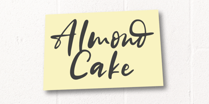 Almond Cake is a sweet and stylish handwritten font. Its natural and unique style makes it incredibly fitting for a large pool of designs. The only limit is your imagination!
 - Houseguest PB by Pink Broccoli,
$14.00 Houseguest is fun, childish, heavyweight offbeat sans serif font with an alternate caps set, and a stylistic alternates to swap in a handful of lowercase styles for a unicase mix.
 - Jumping Unicorn by Subectype,
$15.00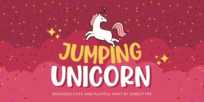 Jumping Unicorn is a sweet and friendly display font. Its natural and cute style makes it incredibly fitting to a large pool of designs. The only limit is your imagination!
 - Countless Blessings by Epiclinez,
$14.00 Countless Blessings is a fun and casual handwritten font. Defined by all-round characters and a flexible style, this font will make each of your designs look readable and trend
 - TDF Arena by TypeDrift,
$15.00 TDF Arena is a solid block font built for a sellout crowd. One of our best-selling typefaces is now available here, exclusively in a grunge style with Monotype Fonts.
 - Time Christmas by Sealoung,
$12.00 Christmas Time is a flowing and festive handwritten font. With a retro style and a warm feel, this font will make each of your holiday cards and designs look outstanding!
 - Eslava by Graviton,
$12.00 Eslava font family has been designed for Graviton Font Foundry by Pablo Balcells in 2012. It is a display typeface with a geometric angular look. Eslava consists of 6 styles.
 - Blue Dino by Sakha Design,
$10.00 Dino Blue is a sweet and friendly handwritten font. Its natural and unique style makes it incredibly fitting to a large pool of designs. The only limit is your imagination!
 - Comic Hand by Tom Chalky,
$16.00 Need to grab attention? Look no further than these three lovingly legible handwritten typefaces oozing with personality and style. Full of charismatic imperfections, this powerful trio is ready for battle!
 - Delighted Panda by Seemly Fonts,
$12.00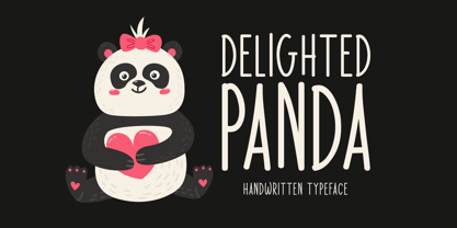 Delighted Panda is a sweet and simple handwritten font. Its natural and unique style makes it incredibly fitting to a large pool of designs. The only limit is your imagination!


