10,000 search results
(0.046 seconds)
- Cadho Toys by Alit Design,
$20.00 Introducing CADHO TOYS, an exciting and playful bubble display font that will add a touch of whimsy to your designs. This font features a unique alternate ligature style that combines bubbles and letters, creating a fun and engaging visual experience. With its lively appearance, CADHO TOYS is perfect for various design projects, especially those aimed at children, toys, games, or anything that requires a cheerful and vibrant aesthetic. This font is carefully crafted with 707 characters, ensuring versatility and multilingual support. Whether you’re designing in English, French, Spanish, German, or any other language, CADHO TOYS has got you covered. The font includes special characters, punctuation marks, numerals, and a wide range of glyphs, allowing you to express your creativity without limitations. One of the standout features of CADHO TOYS is its support for PUA Unicode. This means that you can access the font’s extensive character set through private use area codes, giving you even more freedom to customize and personalize your designs. Let your imagination run wild as you combine different characters and ligatures to create captivating typographic compositions. CADHO TOYS will bring joy and excitement to any project it graces. Whether you’re designing posters, logos, packaging, websites, or any other creative endeavor, this bubble display font is bound to make a lasting impression. Its alternate ligature style adds a touch of uniqueness and flair, setting your designs apart from the crowd. So why wait? Get your hands on CADHO TOYS today and unlock a world of creativity, fun, and boundless possibilities. Let this font take your designs to new heights and bring smiles to the faces of your audience. Language Support : Latin, Basic, Western European, Central European, South European,Vietnamese. In order to use the beautiful swashes, you need a program that supports OpenType features such as Adobe Illustrator CS, Adobe Photoshop CC, Adobe Indesign and Corel Draw. but if your software doesn’t have Glyphs panel, you can install additional swashes font files.
 - Madison Street by Studioways,
$40.00 Madison Street is a font family with 8 fabulously fun typefaces! Eliza Gwendalyn & Jim Lyles of Studioways have teamed up with Spencerian calligrapher Elaina DeBoard to create a classic pointed pen calligraphy font. From its ornamental monograms, to its variety of complimentary text styles, and to its Madison Street Pro, with its elegant stylistic swashes and OpenType goodies, there is a font for every designer. Enjoy the sleek Madison Street Sans, Serif or Script, paired with the Ornaments font, complete with ornate monograms, or use each typeface on its own! Madison Street Pro has all the OpenType bells and whistles. The Ligature feature automatically substitutes beginning and ending letterforms, as well as 100 ligatures. Turn on the Swash feature for elegantly sweeping swash lowercase forms. Enable Stylistic Alternates for even more variations. There are also 10 Style Sets to chose from. And many more OT features! Madison Street is a basic version of the Pro font, intended for users who do not have OpenType savvy applications. Madison Street Stylistic is also a basic version of the Pro font, intended for users who do not have OpenType savvy applications. It has stylistically different ascenders and descenders. Madison Street Swash is intended to be used with the basic fonts, Madison Street and Madison Street Stylistic. It has lowercase beginning and ending swash glyphs and cannot be used to set text by itself. Madison Street Sans, Serif, and Script are text fonts modeled after the handwriting of Elaina. They are intended to be complimentary to any of the script fonts. However, you'll need to set them at a smaller point size (about 1/3 the size) in order to get the preferred scale and weight. Finally, the hairline weight of the Madison Street script fonts is very thin, and at small sizes up to 40 pt, you may notice some breaking up when printing to desktop printers. To remedy this, we recommend outline stroking the text a small amount (.1 -.3 value). this should improve the output without adding to much weight overall.
 - Charleston Caps by Type Associates,
$21.95 Based on hand-lettered poster styles of the twenties and thirties, Charleston evokes a mood of flapper-era nostalgia. Ideal font to suggest the period of fashionable bobbed hairstyles, short(ish) hemlines and baggy pants.
 - Leco 1988 by CarnokyType,
$18.00 The typeface LECO 1988 is another font family which belongs to LECO set. It is a display typeface, which is inspired by the title written on the bottle of lečo from 1988. Its typical features are embedded diacritics and significant black look with low contrast. Lower case is united with upper case and has several identical glyphs in both forms. Font contains alternative set of glyphs for letter „E“. Tabular numerals, superiors and inferiors and the full set of (glyphs - symbols) for languages using the Latin alphabet are also included in this font. LECO 1988 font family includes six specific styles: Regular, Blind, Gradient, Outline, Shadow and Stencil style. Those styles extend typographic options by mutual combination or overlapping, whilst every style share the identical metrics and kerning. Font format is Open Type with the support of several open type features. This typeface is suitable for creating logotypes, powerful posters or can be used as a headline display typeface.
 - Kulturista by Suitcase Type Foundry,
$39.00 Kulturista is an unmistakeable linear slab serif typeface with pronounced rectangular serifs. The drawings are based on the sans-serif Nudista typeface, and Kulturista also inherits Nudista’s distinctive narrowed character proportions, range of weights and glyph sets. The italics are inclined sufficiently, and have the same width and colouring as the plain styles. They aren’t just a mechanically-slanted version of the basic styles, as is often the case for typefaces derived from geometrical images — a whole range of characters have their own drawn variants, which greatly strengthens their highlight function. The italics are therefore an equal partner for the roman styles. Kulturista is definitely a good choice for a headline typeface for magazines and book covers. The range of boldness can come in handy when editing sections, headlines and supplements. The typeface understandably proves itself as a healthy foundation for a unified visual style, and holds up at display sizes as well as on shorter texts.
 - Aleesya Rose by Brenners Template,
$19.00 Aleesya Rose is a Stylish Font Family to bring a touch of elegance to any design. The clear contrast blends into all styles - even thin styles - and the strong individuality by weight delights the designer's imagination. 14 styles including 7 weights and italics are essential for designers to complete more detailed and sophisticated typography. This style has 426 glyphs each, check the glyph window in your app. The upright standing of the vertical stems stably supports the center of gravity of the entire font. And the thin strokes used as finishing touches will convey an elegant personality to the layout. The ligatures are designed to appeal to the reader with their beautiful tenderness, and they are: Ba, Be, Ha, He, LO, Le, Lo, Re, Ro, ck, de, do, ee, ff, fi, oo, rr, th. In particular, we recommend that you choose this font family to achieve the following purposes: Editorial design, Personal branding, Branding business, logo design, portfolio, and any special design.
 - Deus by Renegade Fonts,
$22.00 Deus is when type design is brought to extreme. It tries to answer the question whether you can design all glyphs in one axis of stress. It does not try to be all purpose, useful at all sizes, legible or readable and most of all it does not try to be neutral. It has its own style you either accept or not. But if you do so, it has many great stuff inside. Every glyph has the same width across four masters, so you can change the style in one title or even make an animation out of that. It also has some cool animated emojis, so make sure you take all four styles! Deus has two sets of styles. "Deus" that has an expanded glyph set, and "Deus Basic" that comes with a limited glyph set. You can play around with "Deus Basic" since you get it for free, then fall in love with this font family and go for the full version.
 - Veranda Poster SG by Spiece Graphics,
$39.00 Veranda Poster was derived from a European art supply manufacturer’s logotype done in the Vienna (Wien) Austria style. This distinctive classic style was used by artists such as Julius Klinger and Willy Willrab in the 1920s. Two new faces have been added to the original version - Veranda Poster Small Caps and Veranda Poster Alternates. Here is an extensive collection of capital and small cap alternates plus a wide selection of figures for almost any use. The contemporary alternate additions have a slightly Russian flavor. The combination of all three styles makes for striking logo and display settings. All three styles are now available in the OpenType Std format. Some additional characters have been added to this OpenType version as stylistic alternates. This advanced feature works in current versions of Adobe Creative Suite InDesign, Creative Suite Illustrator, and Quark XPress. Check for OpenType advanced feature support in other applications as it gradually becomes available with upgrades.
 - Bikini Season by Los Andes,
$37.00 Summer has come! Boho girl is going on her beach vacation. Relaxed, spontaneous, feminine, irreverent, though. Like a girl with a Gipsy soul, she just grabs her Bikini and turns away! This is the new font duo by the couple Coto and Luciano. Bikini includes a sans version, based on the proportion and structure of Roman capitals, but with a contemporary flavor and a clean style that give the typeface a chic touch. The other version of this font duo is a modern calligraphy script of handmade style. The mix is just perfect: opposites attract creating a very interesting counterpoint. Can you guess who is the designer behind each style? This font duo is intended to be used for posters, labelling or branding. The sans and script styles add visual hierarchy when composing text. Feel the fresh free spirit of its OpenType features and ornaments! Please see User Guide Every season is Bikini season!
 - Howli by Adam Fathony,
$15.00 Introducing : Howli Playful fontpack with 7 Font Styles Howli are a combinations of fonts that fits with the playful concept. Purely created in a hand drawn to create a unique rough. An exploration of a playful theme with nice & cute look and you can combine within 7 style fonts from this FontPack! What's in this Pack : The **Boldest** on this pack are Howli layers, **3 Layered** fonts with *base, shadow and inline or hatch*. you can choose between inline or hatch for the Howli Layers. Howli Sans Serif Style comes with 3 Styles. Two of them are available for a Ligatures like I've shown on the display. Serif, A Dancing baseline serif gives you a freedom. Script, a Classic look of Script fonts Fun Script, a Cute and Fun Script. What's you'll get (10 Font Files) : Howli Layers Base.otf Howli Layers Hatch.otf Howli Layers Inline.otf Howli Layers Shadow.otf Howli Sans One.otf Howli Sans Two.otf Howli Sans Three.otf Howli Sans FunScript.otf Howli Sans Script.otf Howli Sans Serif.otf
 - Normerif by Invasi Studio,
$19.00 Introducing the Normerif Font, the perfect typeface for those seeking a touch of elegance and vintage style in their designs. With its display serif style and elegant alternates, Normerif provides a fashionable and sophisticated look to any project. This font is specially designed for classic-themed projects and is perfect for creating simple, clean, and stylish designs. Whether you're looking to create logos, titles, magazines, or any other design project, Normerif is a perfect choice. Its elegant and refined serif style makes it suitable for a wide range of design applications, including print materials, websites, and more. The font features stylish alternates, which add a touch of sophistication and elegance to your designs. So if you're looking to add a touch of class and sophistication to your next project, look no further than Normerif Font. With its elegant and fashionable style, this font is perfect for creating simple, clean, and stylish designs that will make your projects stand out.
 - Pyragy by Belli Creative,
$9.00 Pyragy is a display font with a classical vibe. It has beautifully crafted nine swashes. It’s genuine, interesting, and perfectly fits different design works, such as posters, book or album covers, digital spaces, or any other media. It supports various Latin-based languages and comes with powerful open-type and true-type features.
 - Hatmi White by Beary,
$14.00 Hatmi White is an elegant handwritten font. Every single letter has been carefully crafted to make your text looks beautiful. This modern script will be perfect for many different project such as photography, watermark, quotes, blog header, poster, wedding, branding, logo, fashion, apparel, letter, invitation, stationery, etc. Hatmi White has Multi-lingual support.
 - Seraphon by Lemonthe,
$15.00 Seraphon is a stylish and delicate handwritten font. It has a gentle and beautiful flow and it will be a hit for any design that you want to add it to. is perfect for many different project such as logos & branding, invitation, stationery, wedding designs, signature, product designs, label, photography, and more!
 - Benedicta by Krafted,
$10.00 Whether you wish to add some elegance to your brand or create beautiful wedding invitations, the font you choose makes all the difference. Introducing Benedicta - A Modern Calligraphy Font. It’s stylish, eye-catching, and combines perfectly with other fonts. Thanks to this, it leaves a very strong impression and makes your brand memorable.
 - Balzano by Adobe,
$29.00In 1994, John Benson designed Balzano, Alexa and Caliban, three typefaces with a similar calligraphic character. Balzano differs from the other in its vertical figures, adding a static element to the otherwise lively, flowing components. Balzano is good for short texts and headlines, anywhere in which a personal, elegant look is desired. - Undeka by WildOnes,
$24.95 Undeka™ is a modern contemporary sans serif typeface that embodies simple geometric shapes combined with strong typographical foundations. Inspired be the grotesk typefaces made in the early 20th century. It was made by Krisjanis Mezulis at the WildType Foundry. Undeka is available in 6 different versions - Regular/Italic, Light/Italic, Bold/Italic.
 - Brillany by Solidtype,
$14.00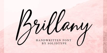 Brillany is a simple handwritten script font, modern and fashionable. This elegant font is legible and looks great as a headline or in body text. This font will perfect for many different project for blogging, social media, branding, wedding invites, cards etc. Including ligatures, uppercase and lowercase, punctuation and multiple languages support.
 - Immensity by Innire,
$17.00 Immensity is a stylish font family with graceful ligature features and stylistic alternatives (for example, the letters i and j). Smooth and elegant lines combined with high contrast in bold lettering. All this, together with support for diacritical symbols and five different weight, makes it possible to use it widely in various projects
 - Fat Nib by A New Machine,
$12.00 This hand drawn calligraphy font was made with a wide nib pen. It is all cap with different glyphs for the upper and lower case letters for mixing and matching. The Splatter family comes with extra splatter glyphs. Great for use when you need some added punch in a headline or callout.
 - Glimpse by MJType,
$19.00 The Glimpse Font Family, with its reverse contrast approach, provides a fresh take on display fonts. It allows designers to play with visual hierarchy in an innovative way, using the variable weights to enhance different textual elements. Despite their distinctive weights, each font in the family maintains a cohesive look and feel.
 - Londrina by Tipos Pereira,
$- Londrina is formerly known as Folk. The Londrina family originally had four typefaces: Solid, Shadow, Outline and Sketches. The idea is to combine the main typeface Solid with the others, experiencing different outlines. Now Londrina has three new weights: Thin, Book and Black, growing the family to work with the Solid version.
 - Cristhyna Signature by Namara Creative Studio,
$12.00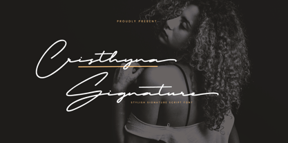 Cristhyna Signature is a modern handwritten script font with natural and stylish flow, this Typeface is an incredible addition to your font library. Perfect for business branding, wedding invitation, cosmetics, fashion, signature logo, magazine cover, advertising and these typefaces work well for many different aesthetics. Features : Stylish & Modern Font Alternates, Ligatures & Multilingual Support
 - Kartoon Kutz NF by Nick's Fonts,
$10.00These charming little cartoon figures, known in the trade as "midgets", added a little extra oomph to everything from business cards to matchbook covers from the 1920s to the 1950s. Each font contains 52 different cuts, ready and waiting to spice up your layouts, and each carefully hand drawn from authentic historical sources. - Mental Duck by PizzaDude.dk,
$17.00 Drawn with a thick marker, I present to you: Mental Duck! A loose and laid back comic book font, suitable for both comics, posters, products for children, toys ... in fact anything that needs a legible and handdrawn look. Comes in three different versions: Regular, Fill and Shadow. Mix them for great results!
 - Conundrum by Atom,
$14.00 Conundrum is a cool, rough brush font, quickly painted on paper, so it looks natural and organic. If you want a font character that is unique and different than others, Conundrum is worth a try. With this bold concept it would be suitable if used for movie titles, magazine titles, covers, posters, etc.
 - Dellena by DM Studio,
$20.00 The Dellena Handwritten Font is a captivating and versatile typeface that combines the charm of natural handwriting with a contemporary aesthetic. With its flowing letterforms and clean, legible design, this font offers a wide range of creative possibilities for your projects, from branding and invitations to social media graphics and more. Features: Handwritten Elegance: Dellena Handwritten Font exudes the elegance and authenticity of a handwritten script. Its graceful letterforms offer a personal and human touch to your designs, making it ideal for projects that require a blend of elegance and approachability. Clean and Legible Design: Despite its handwritten style, this font maintains excellent legibility. Each character is carefully crafted to ensure readability at various sizes. Whether it's in print or on a digital screen, your text will remain clear and accessible. Versatile Application: This font is incredibly versatile and well-suited for a variety of design projects. Use it for branding, invitations, social media posts, blog headlines, and more. Its adaptability makes it suitable for both personal and professional use. Uppercase and Lowercase Letters: The font includes both uppercase and lowercase letters, providing creative flexibility for your designs. You can mix and match cases to create visually appealing typography that suits your project's needs. Punctuation and Symbols: In addition to the alphabet, Dellena Handwritten Font includes a comprehensive set of punctuation marks, numerals, and common symbols. This ensures consistency and ease of use when incorporating the font into your design projects. Easy to Install and Use: Installing and utilizing the Dellena Handwritten Font is straightforward. It is compatible with both Windows and Mac operating systems and can be easily integrated into popular design software, including Adobe Photoshop, Illustrator, and InDesign. Elevate your designs with the elegance and versatility of the Dellena Handwritten Font. Let its flowing letterforms and clean design add a touch of personal and human connection to your projects. Whether you're crafting branding materials, invitations, or digital content, this font offers a stylish and readable solution for your typographic needs.
 - Aspire Narrow by Grype,
$18.00 While the Aspire family finds its roots of inspiration in the ACURA automotive company logo, with its wider base, the Aspire Narrow family condenses those styles into something more suitable for larger bodies of text in a more standardized width. Aspire pays homage the techno display styling of the inspiration logotype, further evolving beyond its brand inspired origin to give birth to a font family that pulls on modern and historical styles. It adopts a sturdy yet approachable style with its uniform stroke forms and curves, and goes on to include a lowercase, numerals, and a comprehensive range of weights, creating a straightforward, uncompromising collection of typefaces that lend a solid foundation and a broad range of expression for designers. Here’s what’s included with the Aspire Narrow Family bundle: 477 glyphs per style - including Capitals, Lowercase, Numerals, Punctuation and an extensive character set that covers multilingual support of latin based languages. (see the 6th graphic for a preview of the characters included) Stylistic Alternates - alternate characters that remove the angled stencil cuts for a more standardized text look. 3 weights in the family: Light, Regular, & Black. 3 obliques in the family, one for each weight: Light, Regular, & Black. Fonts are available in TTF & OTF formats. The TTF format is the standard go to for most users, although the OTF and TTF function exactly the same. Here’s why the Aspire Narrow Family is for you: - You’re in need of a narrow automotive sans font family with a range of weights and obliques. - You’re love that ACURA letter styling, and want to design with a narrow font within that genre. - You’re looking for an alternative to Eurostile with more stylized letterforms. - You’re looking for a clean techno typeface for your starship console labelling. - You just like to collect quality fonts to add to your design arsenal.
 - Adantine by Greater Albion Typefounders,
$9.95 Adantine offers the opportunity to bring Victorian Elegance and Character to modern design work. It is inspired by the hand-lettered captions often seen on old sepia-toned postcards, but also has some of the spirit of 19th century advertising cuts. Adantine is offered in regular and text faces, as well as all and small Capitals forms with purpose made swashed capitals, and in a decorative embossed form. It can be used to set small amounts of text, as well as for headings and display purposes. Bring some steam-age elegance to your next project!
 - TA Bankslab by Tural Alisoy,
$33.00 The building of the Northern Bank of St. Petersburg's Baku branch was built in 1903-1905. It was the first Art Nouveau-style building in Baku, Azerbaijan. Later the bank was transformed into the Russian-Asian Bank. After the oil boom in Baku in the 19th century, branches of many banks and new banks were opened in the city. The branch of the Northern Bank of St. Petersburg was among the first banks that was opened in Baku. N.Bayev was the architect of the building for the branch of the Northern Bank of St. Petersburg located at Gorchakovskaya 3 in 1903-1905. The building currently houses the Central Branch of the International Bank of Azerbaijan. My purpose in writing this is not to copy and paste the information from Wikipedia. What attracted me to the building was the word "Банкъ" (Bank) written in Cyrillic letters, which was also used in Azerbaijan during the Soviet era. The exact date of the writing is not known. Every time I pass by this building, I always thought of creating a font of this writing someday. I had taken a photo of the building and saved it on my phone. I did a lot of research on the font and asked a lot of people. However, some did not provide information at all and some said they did not have any information. I was interested in the history of this font but I do not know if this font really existed or it was created by the architect out of nowhere. If there was such a history of this font, I wanted to recreate this font and make it available. If not, I had to create it from scratch in the same way, using only existing letters on the building. Finally, I made up my mind and decided to develop the font with all letters I have got. It was difficult to create a font based on the word, Банкъ. Because in the appearance of the letters, the midline of the letters on A, H, K was very distinct, both in the form of inclination and in more precise degrees. The serif part of the letters, the height of the upper and lower sides, differed from each other. I don't know whether it was done this way when the building was constructed or it happened over time. I prepared and kept the initial version of the font. I took a break for a while. I started digging on the story of the font again. Meanwhile, I was researching and got inspired by similar fonts. Unfortunately, my research on the font's history did not yield any results. I decided to continue finishing up the font. After developing the demo, I created the font by keeping certain parts of these differences in the letters. In addition, I had to consider the development of letters in the Cyrillic, as well as the Latin alphabet, over the past period. Thus, I began to look at the appearance of slab-serif or serif fonts of that time. In general, as I gain more experience in developing fonts, I try to focus on the precision of the design for each font. In recent years, I specifically paid attention to this matter. YouTube channel and articles by Alexandra K.'s of ParaType, as well as, information and samples from TypeType and Fontfabric studios on the Cyrillic alphabet were quite useful. I gathered data regarding the Latin alphabet from various credible sources. I do not know if I could accomplish what I aimed at but I know one thing that I could develop the font. Maybe someday I'll have to revise this font. For now, I share it with you. I created the font in 10 styles. 7 weight from Thin to Extra Black, an Outline, Shadow, and Art Nouveau. The Art Nouveau style was inspired by the texture in the background used for the text on the building. The texture I applied to capital letters adds beauty to the font. If you like the font feel free to use it or simply let me know if your current alphabet doesn't support this font.
 - TA Bankslab Art Nouveau by Tural Alisoy,
$40.00 TA Bankslab graphic presentation at Behance The building of the Northern Bank of St. Petersburg's Baku branch was built in 1903-1905. It was the first Art Nouveau-style building in Baku, Azerbaijan. Later the bank was transformed into the Russian-Asian Bank. After the oil boom in Baku in the 19th century, branches of many banks and new banks were opened in the city. The branch of the Northern Bank of St. Petersburg was among the first banks that was opened in Baku. N.Bayev was the architect of the building for the branch of the Northern Bank of St. Petersburg located at Gorchakovskaya 3 in 1903-1905. The building currently houses the Central Branch of the International Bank of Azerbaijan. My purpose in writing this is not to copy and paste the information from Wikipedia. What attracted me to the building was the word "Банкъ" (Bank) written in Cyrillic letters, which was also used in Azerbaijan during the Soviet era. The exact date of the writing is not known. Every time I pass by this building, I always thought of creating a font of this writing someday. I had taken a photo of the building and saved it on my phone. I did a lot of research on the font and asked a lot of people. However, some did not provide information at all and some said they did not have any information. I was interested in the history of this font but I do not know if this font really existed or it was created by the architect out of nowhere. If there was such a history of this font, I wanted to recreate this font and make it available. If not, I had to create it from scratch in the same way, using only existing letters on the building. Finally, I made up my mind and decided to develop the font with all letters I have got. It was difficult to create a font based on the word, Банкъ. Because in the appearance of the letters, the midline of the letters on A, H, K was very distinct, both in the form of inclination and in more precise degrees. The serif part of the letters, the height of the upper and lower sides, differed from each other. I don't know whether it was done this way when the building was constructed or it happened over time. I prepared and kept the initial version of the font. I took a break for a while. I started digging on the story of the font again. Meanwhile, I was researching and got inspired by similar fonts. Unfortunately, my research on the font's history did not yield any results. I decided to continue finishing up the font. After developing the demo, I created the font by keeping certain parts of these differences in the letters. In addition, I had to consider the development of letters in the Cyrillic, as well as the Latin alphabet, over the past period. Thus, I began to look at the appearance of slab-serif or serif fonts of that time. In general, as I gain more experience in developing fonts, I try to focus on the precision of the design for each font. In recent years, I specifically paid attention to this matter. YouTube channel and articles by Alexandra K.'s of ParaType, as well as, information and samples from TypeType and Fontfabric studios on the Cyrillic alphabet were quite useful. I gathered data regarding the Latin alphabet from various credible sources. I do not know if I could accomplish what I aimed at but I know one thing that I could develop the font. Maybe someday I'll have to revise this font. For now, I share it with you. I created the font in 10 styles. 7 weight from Thin to Extra Black, an Outline, Shadow, and Art Nouveau. The Art Nouveau style was inspired by the texture in the background used for the text on the building. The texture I applied to capital letters adds beauty to the font. If you like the font feel free to use it or simply let me know if your current alphabet doesn't support this font.
 - Kewl Script by Sudtipos,
$59.00 Kewl is the result of being caught in the afterimage of one design project while conceptualizing another one. Just before finishing the final tests on Mrs Blackfort, the first of what became a long series of Charles Bluemlein fonts, some of the letters began morphing differently in my mind. The idea was to go on the heavier and more playful side, but with a South American sign letterer’s twist, rather than just good handwriting. I did some sketching, took some notes, then got busy with other projects. Some of that stuff eventually seeped into Candy Script and, to a lesser extent, the Whomp font. But it was only a matter of time before I got back to the original concept and finished it. Kewl is ideal for food packaging, book and music covers, magazines, and window splashes. Illustrations by Catriel Martinez.
 - Messenger by Canada Type,
$29.95 Messenger is a redux of two mid-1970s Markus Low designs: Markus Roman, an upright calligraphic face, and Ingrid, a popular typositor-era script. Through the original film faces were a couple of years apart and carried different names, they essentially had the same kind of Roman/Italic relationship two members of the same typeface family would have. The forms of both faces were reworked and updated to fit in the Ingrid mold, which is the truer-to-calligraphy one. The Messenger package is comprised of two interchangeable fonts that support Western, Eastern and Central European languages, as well as Baltic, Celtic/Welsh and Esperanto. Messenger Pro is a single OpenType font that contains the characters of both Messenger and Messenger Alt, linked by programmed features for stylistic alternates, automatic f-ligatures and class-based kerning.
 - Quietism by Michael Rafailyk,
$20.00 A smooth contemplative Antiqua with aspiring to the sky ascenders, inspired by the Quietism philosophy. Clarity of the mind is achieved by bringing the body into a state of calm and contemplation, and this is reflected in the design – the quiet horizontal serifs (body) are opposed to the peaky soaring ascenders (mind). The design also features four optical size subfamilies with different x-height and contrast, oldstyle diagonal stress, oldstyle figures by default, smooth details and slightly dark texture. Video about the Quietism typeface concept: https://www.youtube.com/watch?v=gBqkROHMEAc Scripts: Latin, Greek, Cyrillic. Languages: 480+. The complete list of supported languages: michaelrafailyk.com/quietism The promo images used illustration of Ola Rafailyk, paintings of Pieter Bruegel the Elder and Tom Roberts, photos of Boys in Bristol Photography and Ken Cheung from Pexels, and photo of Rodin's The Thinker at the Musée Rodin.
 - 1543 German Deluxe by GLC,
$38.00 This family was inspired by the sets of fonts used in 1543 by Michael Isengrin, printer in Basel (Germany) to print the splendid New Kreüterbuch...(New herbal...), with numerous nice pictures, the masterpiece of Leonhart Fuchs, father of the modern botany. It is a Schwabacher pattern, with three different sets of fonts, small (± 4mm for the upper case) in the main text, larger for titles (± 8mm for the upper case) and large Initials or lettrines (five lines of main text). This font contains standard ligatures and German historical ligatures (German double s, long s, tz, ch,...) and diacritics (special umlaut "e superscript" and "∞" unstead of dieresis with letters a, o and u,) naturally, we have added numerous letters lacking in the original to permit a contemporary use of the font. It can be used in complement with 1538 Schwabacher or/and 1534 Fraktur.
 - Bartender by Tour De Force,
$15.00 Small family called Bartender, for the lovers of retro style typefaces. Ideal for product names, packages, labels, old fashioned coffee shops, bars and everything with specific characteristics of past times.
 - Rosette Ornaments by Gerald Gallo,
$20.00 Rosette Ornaments was inspired by the wide spectrum of ornamental styles produced during the Victorian era. There is an assortment of 47 ornaments all located under the character set keys.
 - Line44 by URW Type Foundry,
$39.99 Remembering us of the early graffiti on the New York subways. And similar to creating and producing a graffiti, a "Piece", also the styles of Line44 are superposed in layers.
 - First Contact by SilverStag,
$19.00 I am First Contact, a super ultra condensed all caps font with support for over 90 languages and over 540 ligatures. I am a cutting-edge font that is both cool and chic, yet still personal. I am perfect for a wide range of design projects, from logos and branding to headlines and posters. I am the future of your typography. I am the font that will take your designs to the next level. I am bold, I am confident, and I am here to make a statement. I am not like other fonts. I am not afraid to be different. I am unapologetically myself. I am First Contact, and I am here to shake things up. I am the perfect font for anyone who wants to stand out from the crowd. I am the font for the bold, the brave, and the innovative. I am First Contact, and I am the font for the cool kids. I am the font for the trendsetters. I am the font for the people who want to be ahead of the curve. I am First Contact, and I am here to help you create something truly unique. I am more than just a font. I am a movement. I am a call to action. I am a challenge to be different. So what are you waiting for? Use me today!
 - Fodecumbers Display by Zamjump,
$9.00 Fodecumbers is a strong FontFamily and Sans sophisticated look. Inspired by dynamic squares can be felt through controlled letterforms and a modern twist. Balance of hard lines and smooth curves. Each font in the family can be standalone, dynamic, and authoritative on its own, or mix it with italics for the tagline in a logo. it's really worth it. Fodecumbers includes all thirteen uppercase fonts: Four weights, two outlines, seven italics. FEATURES Four weights / Italics / Lines / Numbers & Punctuation / Extensive Language Support USE Fodecumbers works well in every branding, logo, magazine, film. The different weights give you the full Fodecumbers is a strong FontFamily and Sans sophisticated look. Inspired by dynamic squares can be felt through controlled letterforms and a modern twist. Balance of hard lines and smooth curves. Each font in the family can be standalone, dynamic, and authoritative on its own, or mix it with italics for the tagline in a logo. it's really worth it Fodecumbers includes all thirteen uppercase fonts: Four weights, two outlines, seven italics. FEATURES Four weights / Italics / Lines / Numbers & Punctuation / Extensive Language Support USE Fodecumbers works well in every branding, logo, magazine, film. The different weights give you the full range to explore a whole host of applications, while the fonts outlined give a real modern feel to any project. Any specific license questions or questions, feel free to contact zamjump@gmail.com zamjump