10,000 search results
(0.943 seconds)
- San Marco by Linotype,
$29.99San Marco is a part of the 1990 program Type before Gutenberg, which included the work of twelve contemporary font designers and represented styles from across the ages. Linotype offers a package including all these fonts on its web page, www.fonts.de. San Marco was designed by Karlgeorg Hoefer and brings to mind the style of the Italian Gothic found on the cathedrals of Milan and Florence as well as on the facade of St. Mark’s Cathedral in Venice. Its highly stylized characters make San Marco a good choice for extravagant typography. - Kosumi by Thinkdust,
$10.00 Kosumi is an experimental display typeface. Its juxtaposition of thick and thin catches that gleam in your eye, and leads you by the hand out of your comfort zone with such ease that you'll never look back. Kosumi is comfortable in any of a thousand different places, looking brilliant on posters, and reigning supreme within magazine spreads. All you need to do is let is whisk you away. The eye-catching differences between thick and thin lines serve to capitalise your attention, ensuring your nicely laid out headline is truly the star of the show!
 - State Wide by Arkitype,
$10.00 Say hello to State, this family is inspired by sport and a further development on Comply Slab. This family of fonts has some bold letters as well as stylistic alternates to give your layouts some interesting variation. State comes in 3 styles, Regular, Soft and Rough each with 7 weights and italics. It was specifically designed with a wider structure for better appearance in small sizes and the extra attention to the detail was needed for the big sizes. Use State to get the delivery you need, whether its for print, online or Television.
 - Shallot by Eko Bimantara,
$24.00 Shallot is a serif font family with sharp and exquisite characteristic. The initial letterforms are made not completely based on calligraphic strokes, which make it more likely close to transitional serif style. The letterforms have high contrast strokes and sharp serif with curved brackets. The upright styles have a fairly wide proportion. The italic styles have 12 degree angle and redrawn lowercase letters. Shallot consist of 4 styles from regular to extrabold with each matching italics. It contains 462 glyphs that support broad latin languages.
 - Gift Wrap JNL by Jeff Levine,
$29.00 Gift Wrap JNL takes a classic wood type display font and cuts it into diagonal striped lines to emulate package wrapping paper. An interesting side effect of the lettering is that at first glance you might perceive the style as being an oblique, but the letters are actually vertical. This typeface is perfect for holidays, birthdays and special events featuring a festive theme.
 - Stitch Warrior by Roland Hüse Design,
$19.00 Stitch Warrior is a a gothic style stitch font. It's made of cross stitches ("x") even the kerning - the distance between the letter pairs varies between 1, 2 or 3 stitches distance. I was trying to be as accurate and close to reality as possible. It can be pefectly used for stitch lettering or text pattern to create visual effects.
 - Roast Serif by Konstantine Studio,
$18.00 You can be wild and bold in an elegant way. And serif typeface can be very wide and versatile without losing the characteristic. That’s where the ROAST came from. An elegant serif Display typeface with a lot of special alternate letters in every single letters. Elevate your elegant vibes with pushing the style in edgy way instantly with this font.
 - Crane Titling NF by Nick's Fonts,
$10.00This multipurpose display alphabet combines medieval-inspired uppercase letters drawn by famed book illustrator Walter Crane with charming, if somewhat quirky, lowercase letters by J. W. Weekes. The net effect is a typeface which can add style and warmth to any project. Both versions of this font include the complete Unicode 1252 Latin and Unicode 1250 Central European character sets. - Hyperbole by Dmitry Bogolyubov,
$10.00 Hyperbole is a condensed futuristic display typeface, suitable for writing headlines and drawing posters. This font is strict, cosmic, bewitching. It contains alternative styles for latin letters and extended latin letters.
 - Audace Std by Typofonderie,
$59.00 Between geometry & shapes inspired by nature, in 4 fonts Audace was born as a response to a simple brief: how to visually express human interaction and technology with abstract forms? The starting point is a humanistic sanserif, to which are added external references: design pieces, furniture, buildings. Architects shape our world with the intention to reconnect nature, human and address a perfect functionality. Not so far to typeface design which combines a personal vision and ensures good legibility in a certain context. Audace — like the works of those artists, designers, architects — is clearly influenced by the tension of the line, the play with negative space, the dynamics, the surprise, the nature that will influence the shapes of the letters. So if a v is asymmetrical, and the y based on similar asymmetry but in reverse, these two shapes help to distinguish from one to the other. This is a consequence of the influence of forms from design and art in the design of the Audace. And this small example illustrates the confrontations of the designer’s influences: the search for the most unique shapes, but without compromising on function: to be read, to be legible, even at very small size in the worst conditions. Audace, between geometry and shapes inspired by nature
 - GretaDS by FontAle,
$9.00 One day, when I was walking with my daughter Greta, I stopped in front of the windowshop of a bookshop, that caught my attention, but Greta was pretty irritated, as always when it comes to books: she is dyslexic. All things written are basically a nightmare for her!So one thing came to my mind: if the great Louis Braille, with visual impairment, invented an instrument that allowed blind people to read, write and play,there had to be a tool that made it easier for dyslexics to do the same things. So, I proposed to Greta to create together a font to help her and other dyslexics. We worked on it, becoming a bit of graphic designers, inventors and guinea pigs at the same time.We brought some initial changes to the mirror letters "pq bd", based on some examples already available on the market, that improved reading times, strenghtening our willing to go ahead. That's how "GretaDS" is born, a completely new font, from the "handwritten" family, which marks a difference on the mirror letters, making them easily recognizable, as well as the lowercase couple rn (RN) which can be confused with the letter "m", not to mention the capital "I" (vowel i) indistinguishable from the lowercase "l" (L)We hope, that other graphic designers will follow its flow, modify and improve the path, and make the most of its energy, to offer dyslexics a tool that make reading as easy as drinking a glass of water.
 - Nautica Line by Resistenza,
$39.00 Nautica Line is a new version of Nautica font. This fonts family contains 10 fonts, made by different weight of lines. The Features of this fonts are: Contextual Alternates, Standart ligatures, Stylistic Alternates and Stylistic sets.
 - Town by J Foundry,
$20.00 Town is a display collection inspired by art deco and contemporary lettering. The fonts have a classic feel, with contemporary proportions, styling and details. There are eight base weights and nine decorative styles in multiple weights. The variety of styles are designed to create bespoke brand marks, stylish liquor labels, unique restaurant menus, engaging websites and fresh magazine layouts. The fonts are built on the same foundations, so the display and decorative styles can be mixed and matched while maintaining a harmonious look. Several of the styles can also be layered together; add a subtle shadow to your headline or create a full dimensional look with an inline face. The collection is rounded out with two sets of accent fonts, and a set of text weights, with matching italics.
 - Songbook JNL by Jeff Levine,
$29.00 Songbook JNL is based on a promotional blurb from the back of a piece of vintage sheet music. Its interesting style of slab serif lettering with strong Art Deco influence was worthy of re-drawing into a digital typeface. This design is the 900th release from Jeff Levine Fonts since its inception in January of 2006.
 - Textworthy Serif by Caron twice,
$78.00 Textworthy Serif is a simple serif typeface with a human character. It is based on writing with a classic pen. Serif form we know as the trustworthy type style. Similar shapes we’ve been reading about since the 15th century when letterpress began. And antique can be developed after blackletter type. Textworthy Serif was created because we still believe in serif type for over 500 years. And we still need to use serif types in today’s world for comfortable and rational acceptance of text information. Italic styles are in production. We wanted to offer these 5 styles for those purposes where the number of styles is enough.
 - Smart Chameleon by Cititype,
$17.00 We are pleased to offer a unique typewriter font. Consists of two versions, namely regular and italic, Smart Chameleon has more than 650 glyphs and can be used in more than 150 languages. We present it in a handwritten version with untidy curve that makes you even more exasperated. Smart Chameleon has a vintage style that is packaged in the current version. Suitable for all styles, you only need to replace the color and background of the design and the appearance will totally change, from children's style to fancy, retro or modern youth style. Just like a chameleon that changes according to the conditions. Enjoy.
 - Neo Tech by Monotype,
$29.00 Neo Sans began as an intriguing assignment from a branding agency. The agency’s client wanted an “ultra modern” type family that was "futuristic without being gimmicky or ephemeral.” When a bureaucratic decision cancelled the project, Monotype staff designer Sebastian Lester decided to finish the design on his own. “I was left with a sketchbook full of ideas,” he said, “and thought it would be a shame not to see what came of them.” Lester decided that the principal ingredient of an "ultra modern" typeface was simplicity of character structure: a carefully drawn, monoline form, open letter shapes and smooth, strong curves. By further amplifying these qualities, he crossed the line from modern to futuristic. Two highly functional and versatile typefaces emerged. These are Neo Sans and Neo Tech, designs Lester describes as "legible without being neutral, nuanced without being fussy, and expressive without being distracting." Both the Neo Sans and the more minimalist Neo Tech families are available in six weights, ranging from Light to Ultra, with companion italics. Neo Tech offers a suite of alternate characters.
 - Hando Soft by Eko Bimantara,
$24.00 Hando Soft is a variant of Hando neo grotesk sans family. Each letter on Hando Soft has curve strokes end, which gives a soft and more ease-looking letterforms. Hando offers a wide range of usage possibilities. It's low x-height and variety of light size options make it a good choice for reading, it's tenuous white spaces in the counter letterforms make it legible enough to be recognized remotely. It's curved tensions on the circular letterforms gave a futuristic impression. It's sleek and simple strokes make it perfect for a broad range design purposes. Hando consists of 10 styles from Hairline to Black with each matching oblique. Contains more than 440 glyphs that support a broad latin language. Also some Opentype features e.g. stylistic alternates, variation of figures, e.t.c
 - Desperado by FontMesa,
$20.00 Desperado is a modern bold type style that will work well in sign and truck lettering.
 - Montecatini Pro by Louise Fili Ltd,
$35.00 Montecatini takes its cues from the elegant Stile Liberty travel posters of Italy in the early 1900s. In its successful first release by Louise Fili Ltd in 2017, the typeface introduced distinctive ligatures typical of the time when Art Nouveau emerged as a worldwide phenomenon. Now Montecatini has been expanded into 24 alluring styles, spanning 6 weights and 4 widths. With the addition of these new styles, Montecatini has a dynamic capacity for comprehensive use and pairing. Everything looks better in Montecatini, from book jackets to monograms to packaging and logos—and the wide selection of ligatures, weights, and widths makes copyfitting a delight. Montecatini Pro’s ligatures are setup as contextual alternates. If you would like to try out Montecatini Pro’s ligatures or learn more about the font, please visit: https://www.louisefili.com/montecatini-pro
 - Wishes Script by Typesenses,
$32.00 Plenty of swashes, ligatures, beginning and ending shapes, Wishes is a wit option for invitations, cards, stationery, fashion and apparel, among a wide range of uses. The curves of the cursive style are neither too solemn or pompous, its grace and playfulness are more 1950s than 1750s. This family offers the designer an additional decorative toolkit full of frames, ribbons, hearts, flowers and ornaments, plus a collection of caps and small caps. Wishes Script Pro includes the complete set of Script characters plus Ornaments and Caps. The family offers optically optimized Display and Text styles for each of the weights: Light, Regular and Bold. Use professional software that widely support Open Type features. Otherwise, you may not have access to some glyphs. For further information about features and alternates, see the User Guide Use Wishes to express your greetings!
 - Albion's Marker No.1 by Greater Albion Typefounders,
$16.50 Albion’s Marker No.1, as the name suggests is the first in a series of ‘Marker Pen’ typefaces- merging good type design practice with deliberately casual and hand-drawn letter forms. Inspired by the great classic typefaces such as Bembo and Caslon, the design of Marker No.1 offers a unique blend of legibility and relaxed randomness.
 - Vanrott by Ergibi Studio,
$15.00 Vanrott is an old font with two styles: Regular and Destroyed. Both styles have a bold, prominent, old-fashioned but modern look! Vanrott is perfect for those of you who need fonts for titles, logos, clothing, invitations, branding, packaging, advertisements, and more. Vanrott includes uppercase and lowercase letters, punctuation, symbols, numbers, stylistic sets, alternate, ligatures as well as multi-lingual support.
 - Blackmoor by ITC,
$29.99Noted British type designer David Quay designed Blackmoor in 1983. Based on an old English letter style, this textura-style Blackletter evokes a mediaeval character, expertly mixing a gothic lowercase together with Lombardic capitals. Blackmoor's rough, distressed features make it ideal for a variety of applications, from serious historical publications to horror movies, and comics. Featured in: Best Fonts for Tattoos - Eisley by Rocket Type,
$20.00 Eisley started as an experiment with creating brushes in illustrator. I began by drawing each letter and tweaking until each one balanced next to one another. I painted over 50 paint brush strokes to give a variety of different looks to the final characters. Strategically crafted to look as real and as spontaneous as a sign painter might paint up (although possibly running a bit dry on paint giving the end result a vintage and grungy effect). Eisley is perfect for use in any design branding that requires vintage or distressed display lettering. Eisley is perfect for use in any design branding that requires vintage or distressed display text. Great fun to use AND personalize with your own flair.
 - Balpoine by Krntype Studio,
$18.00 Introducing Balpoine! a wonderful Handwritten, monoline font display. made with a unique and high curve style that makes it look different Balpoine is an eye-catching, and clean handwritten font. balpoine comes with an accent language and ligatures. This font is suitable for handwriting logos, Wedding invitation cards, T-shirts, merchandise, quotes, social media posts, advertising, and a lot more!
 - General by Juraj Chrastina,
$29.00 It's all about these subtle nuances that make a neutral sans typeface different. Pure geometry with a human touch is a recipe that works in every generation. Inspired by classical fonts from the early 20th century, General rides the line between traditional and modern styles. With its 5 light weights, the General family is a strong tool for a clean design.
 - Bloxhall by Ana's Fonts,
$16.00 Bloxhall is a sans serif display font with an art deco inspired style. This font family includes outline, faded and layered versions, with an extra offset variation to make layering super easy. Bloxhall's different variations and solid retro look, make it a perfect set for poster design, logotypes & branding, editorial design, titles, short phrases & slogans. Your creativity is the limit!
 - Moony by Brave Lion Fonts,
$9.99 Moony combines edgyness with softness and was made to look elegantly strong. The typeface is great for big headlines and impressive titles. Yet a reduced sans serif font, Moony brings it own character with it. With eight styles in different weights you can easily combine it with other typefaces, like scripts. Use Moony to bring a statement in neutral designs.
 - Tropican by Letteralle,
$23.00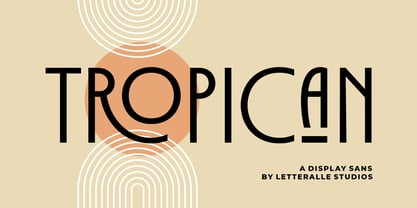 Tropican is an uppercase sans serif font with a vintage and minimal style. Tropican brings many ligatures that will make this font even more interesting and different. Tropican is a versatile font, perfect for display, editorial projects, Logo design, Wedding, Clothing Branding, product packaging, magazine headers, or simply as a stylish text overlay to any background image. I hope you enjoy! Letteralle Studios
 - Suomi Sans by Suomi,
$25.00 There are many sans serif typefaces with calligraphic tendencies, but Suomi Sans is different: the outside forms are fairly basic, fairly narrow sans serif style, but the counter forms have a strong calligraphic flair with accented upper left and lower right hand corners. With six weights in Roman and italic, Suomi Sans works well for both headline and text use.
 - Sunset Waves by Epiclinez,
$18.00 Welcome to Sunset Waves, a fun display font that adds a playful touch to your project. This font is the right choice for creating graphics with an eye-catching and unique style. Whether you want a creative edge for your party invitations or looking to jazz up a logo design, this funky font is here to make a difference. Thank You
 - Momento by IbraCreative,
$17.00 Momento – A Stylish Script Monoline Font Momento, a stylish script monoline font, effortlessly marries elegance with modernity in a seamless dance of curves and lines. The graceful strokes of each letter exude a sense of sophistication, making it an ideal choice for projects that demand a touch of refined aesthetics. The monoline design maintains a consistent thickness throughout, adding a contemporary flair to the timeless script style. With its fluid connections and balanced spacing, Momento captures a harmonious rhythm, allowing the script to flow effortlessly like a well-choreographed dance. Whether employed in invitations, branding, or other design ventures, Momento stands as a testament to the perfect fusion of style and versatility, offering a script font that is not only visually pleasing but also a timeless representation of modern elegance. Momento is perfect for branding projects, logo, wedding designs, social media posts, advertisements, product packaging, product designs, label, photography, watermark, invitation, stationery, game, fashion and any projects. Fonts include multilingual support for; Afrikaans, Albanian, Czech, Danish, Dutch, English, Estonian, Finnish, French, German, Hungarian, Italian, Latvian, Lithuanian, Norwegian, Polish, Portuguese, Slovak, Slovenian, Spanish, Swedish.
 - Gattermoon Handwritten Signature Font by Fontysia,
$12.00 Gattermoon Script takes you away for romantic rendezvous with your love of signature handwritten scripts. Slightly slick, slightly classy, Gattermoon is a must-have for any signature handwritten font collection. Gattermoon adds a different nuance because of its different slope. It's a little more cheerful and relaxed and tends to be more elegant. Perfect for: elegant branding, wedding stationery, romantic book cover designs, classy packaging, album covers, handwritten quotes, greeting cards, quirky social media posts and more.
 - Zahariel by Scriptorium,
$18.00Zahariel is a stylish script font based on samples of turn of the century calligraphy. It has a different, cleaner look in comparison with many of our other script fonts, and features alternate versions of many of the lower case characters. - Medieval Leaves by Kaer,
$19.00 Once I found a pretty H letter initial on an ancient book. The letter was illuminated by beautiful engraved leaves. Based on it, I designed A-Z and 0-9 sets and assembled Medieval Leaves font. Medieval Leaves font family has Regular and Colored styles. It's all you need to precisely imitate medieval style text. Use this font as a decorative element at the beginning of a paragraph or section, other part of the paragraph should be in regular black letter font. You’ll get Drop Caps & Numbers set. --- *You can use color fonts in PS CC 2017+, AI CC 2018+, ID CC 2019+, macOS 10.14 Mojave+ * *Please note that the Canva & Corel doesn't support color fonts!* *Please download this test file with only A letter ( https://www.dropbox.com/s/03e7i78j4bz4mnm/MedievalLeaves-Test.otf?dl=0 ) to check your app & system.* --- Please feel free to request any help you need: kaer.pro@gmail.com Best, Roman.
 - Neo Neo by ITC,
$29.99Neo Neo is the work of British designer Timothy Donaldson, a type style straight out of a 1950s time capsule. It can be set in all caps or a mixture of capitals and lowercase. The casual, slightly condensed forms with their smooth, soft lines are reminiscent of highway diners and motel ads of the time and convey a bright, inviting mood. - Bailamore by 38-lineart,
$19.00 Bailamore is a retro boldscript font. We're pouring the lettering styles into fonts. As much as possible we make this font well integrated with spacing and balance of space. We made 159 ligatures. Activate the ligature mode and you are like being a lettering artist, plus 85 alternates to enrich the feel of lettering. This font consists of 3 fonts, namely regular, outline and shadow. Regular stands alone, while outline and shadow are complementary if you want a 3D extrude impression. Please see the video torial here: https://youtu.be/H71JEgEOows Please try and enjoy the retro bold Bailamore script
 - Castor by Albatross,
$20.00 Castor is a woodtype and letterpress hybrid based on grotesque letterforms. It’s a vintage decorative bold distressed display with 3 options for each letter; Uppercase, lowercase, and alternates. Castor comes complete with 4 styles plus catchwords, unique ‘catchword dividers’ (horizontal rules), ornaments, as well as a free set of extras! (grunge, dividers and bullets) The catchwords, ornaments, and dividers are designed to compliment the font family giving it a ton of diversity, and the designer unlimited creative options. Opentype features include alternate letters and numbers, double letter ligatures for realism, subscript numbers,and superscript numbers.
 - Rogelio Script by Joelmaker,
$15.00 Rogelio Script is a stylish modern calligraphy font with casual chic flair. It is perfect for branding, wedding invites and cards, signature and maybe for red wine label. Rogelio Script includes full set of gorgeous uppercase and lowercase letters, numerals, a large range of punctuation and variation ligatures. All lowercase letters include beginning and ending swashes, giving realistic hand-lettered style. What you get, darling? In order to use the beautiful swashes, you need a program that supports OpenType features such as Adobe Illustrator CS, Adobe Photoshop CC, Adobe Indesign and Corel Draw.