10,000 search results
(0.043 seconds)
- Neospace Expanded by deFharo,
$21.00 Neospace Expanded is an avant-garde typeface designed for technology and science fiction lovers. With its elegant geometric minimalism, Neospace redefines typographic aesthetics with a perfect fusion between modern and futuristic. Geometric Inspiration Designed with an expanded proportion and thin thickness, it exudes its own high-tech, futuristic and space style. Each Neospace character has been sculpted from the letter “O”, using the mathematical proportions of the Fibonacci sequence in curves, metrics and kerning, adding a golden ratio to each character. This meticulous approach ensures exceptional readability and a unique aesthetic that evokes a sense of order and precision. Three styles: Regular, which provides a modern and clean look; the Dot Layer, which adds a touch of color and creativity to typographic titles; and the Bold version, which evokes the feeling of futuristic and sophisticated electronic circuits, bringing a sense of avant-garde and advanced technology to your projects. Neospace allows you to create typographic titles in various colors, imitating the sophistication of futuristic electronic circuits. Limitless Versatility Neospace goes further by offering alternative letters and signs, multiple sets of numbers and capital letters, as well as monetary and cryptocurrency symbols. In addition, it incorporates complex OpenType functions that further enrich the design possibilities, allowing even greater customization in your typographic designs.
 - Sugar Pie by Sudtipos,
$79.00 When Candy Script was officially released and in the hands of a few designers, I was in the middle of a three-week trip in North America. After returning to Buenos Aires, I found a few reactions to the font in my inbox. Alongside the congratulatory notes, flattering samples of the face in use, and the inevitable three or four “How do I use it?” emails, one interesting note asked me to consider an italic counterpart. I had experimented with a few different angles during the initial brainstorming of the concept but never really thought of Candy Script as an upright italic character set. A few trials confirmed to me that an italic Candy Script would be a bad idea. However, some of these trials showed conceptual promise of their own, so I decided to pursue them and see where they would go. Initially, it seemed a few changes to the Candy Script forms would work well at angles ranging from 18 to 24 degrees, but as the typeface evolved, I realized all the forms had to be modified considerably for a typeface of this style to work as both a digital font and a true emulation of real hand-lettering. Those were the pre-birth contractions of the idea for this font. I called it Sugar Pie because it has a sweet taste similar to Candy Script, mostly due to its round-to-sharp terminal concept. This in turn echoes the concept of the clean brush scripts found in the different film type processes of late 1960s and early 1970s. While Candy Script’s main visual appeal counts on the loops, swashes, and stroke extensions working within a concept of casual form variation, Sugar Pie is artistically a straightforward packaging typeface. Its many ligatures and alternates are just as visually effective as Candy Script’s but in a subtler and less pronounced fashion. The alternates and ligatures in Sugar Pie offer many nice variations on the main character set. Use them to achieve the right degree of softness you desire for your design. Take a look of the How to use PDF file in our gallery section for inspiration.
 - Leifa by Identity Letters,
$39.00 A flare-serif socialite. Elegant and affable at once. Leifa is a flare-serif typeface that strikes a balance between elegant and affable. It’s pleasant to read in text sizes yet takes center stage in headlines and display applications. With its higher-than-usual contrast, Leifa might evoke Didone typefaces at first. However, it differs from strictly Didone designs in the details: flattened serifs and deeply incised, tapered spurs provide an organic effect. These humanist elements are restrained and almost inconspicuous in body copy. It’s in display sizes that they realize their full potential. Set your message in Leifa, set it large, and it will get noticed. A true socialite, Leifa is a most welcome guest on any party. With its dual character and a range of weights that allow for fine-tuning the desired visual voice, it’s a brilliant choice for branding and editorial design. Its good-natured yet sophisticated character makes Leifa the perfect typeface for fashion, sports, lifestyle, social media, food and cooking, health, beauty, architecture, interior design, art, literature, theater, and travel. (And any other topic that you’d love to talk about at a dinner in good company.) The entire font family consists of eight weights. Each comes with an italic counterpart, totaling 16 styles. Leifa’s italics are oblique, optically corrected versions of the upright styles. Each style comprises a character set of 883 glyphs that includes small caps, a set of ligatures, tabular and old-style figures, case-sensitive forms, fractions, symbols, and many other features. Four stylistic sets allow you to adjust the appearance of the Leifa fonts: a single-story a (SS01), a simple f (SS02), a triple-story g (SS03), and thin punctuation marks (SS04) are at your disposal. If you’re looking for a typeface with some debonair spirit, look no further than Leifa.
 - GothBlocks by Dingbatcave,
$10.00Great for making all sorts of tiling backgrounds, borders and edging, the numbers of different possibilities are limitless. - Hanstoc Script by Mans Greback,
$69.00 Hanstoc Script is a formal calligraphy typeface. A sporty cursive, this retro lettering works as a cool team logotype or a vintage headline. Drawn and created by Mans Greback in 2022, it has a fresh style and a bold personality. Use underscore _ to make a swash. Example: Baseball_ Use multiple underscores to make different lengths. Example: Beauty____ The Hanstoc Script family consists of four professional styles: Regular, Bold, Italic, Italic Bold; complimenting each other for greater design opportunities. The font is built with advanced OpenType functionality and has a guaranteed top-notch quality, containing stylistic and contextual alternates, ligatures and more features; all to give you full control and customizability. It has extensive lingual support, covering all Latin-based languages, from Northern Europe to South Africa, from America to South-East Asia. It contains all characters and symbols you'll ever need, including all punctuation and numbers.
 - Typer Pro by (v) design,
$25.00 Typer Pro (formerly Consul Typewriter Pro) is a modern OpenType font family reviving the look of old typewriters. Its carefully converted forms are detailed enough even for high pointsizes while keeping a reasonable number of outline points. Typer Pro comes in two variants: Typer Pro Mono is strictly monospaced (all characters occupy the same amount of horizontal space – this way old typewriters usually operated). However, sometimes a more even appearance may be desirable. Therefore, Typer Pro Text has been proportionally altered for a more pleasant and balanced look. Moreover, it is possible to achieve both proportional and monospaced look in both families via Stylistic Sets. You can choose from four different weights in each family and pick characters from its extensive glyph set. Typer also contains a number of Stylistic alternates, randomly replaced alternative letters to avoid the repetition of letters in a word. Typer Pro is a versatile typeface and is perfectly legible even at small sizes and on-screen. When printed, it looks best at its original size around 11–12 pt. Typer supports many OpenType features and offers great multilingual support for most of Latin-based languages. Feel free to download the detailed PDF Specimen.
 - Oceanwide Pro by California Type Foundry,
$47.00 A font perfect for not just one, but many projects! Introducing Oceanwide Pro, a sans that loves to be used in just about any situation! Designed with ultra clean lines and versatility in mind, Oceanwide wants to be your new favorite sans! Oceanwide’s ultra clean letters work anywhere you want to communicate orderliness and competence, and designed to build trust and rapport with your audience. Its wide proportions make it ideal for display and logo use. Oceanwide especially shines for white/bright letters on black/dark backgrounds! That’s because the inside shapes are nearly perfect circles in many weights. Here's a quick video tour of Oceanwide Pro by Dave Lawrence, including all the great things Oceanwide can be used for! We've tested Oceanwide for these industries, with stunning results!: Tech Arts Fashion & Style Business & Branding Corporations Logistics Architecture Food and many more... Oceanwide can be used for: Headers Subheadlines Logos Even body text, if tracked. Print & Screen The styles it can take are also many. It's great for: Modern/minimalist design Flat design Cut out design User Interface (UI) Technical designs In combination with text effects, even for grunge and other situations. And many others... DESIGN FEATURES Simplicity Tall x-height Hand-sloped obliques (italics) Narrow spacing Semi-wide proportions Expert kerning Well proportioned, usable lights & extra lights Large caps Great ALL CAPS MODE Uppercase punctuation Uppercase spacing with California Type Foundry’s Smart Tracking™ Advanced fraction support Proportional lining figures Thick joins Smooth curves Sturdy—great for textures and effects Variable font available Latin Pro character set for Central European languages. That's the writing for over 782 languages and transliterations worldwide! DESIGN STORY—THE FORGOTTEN SANS by Dave Lawrence, Lead Designer, California Type Foundry Adrian Frutiger was the 20th century master of sans, but I didn't realize he had made—not one—but TWO geometric sans! It wasn't until I had purchased the book “Adrian Frutiger: Typefaces”. I had hoped to someday meet Adrian Frutiger, but he passed away that very same year. Here is the story of Frutiger's forgotten sans. Back in 1968, Frutiger was approached by Pentagram to make a design for British Petroleum. They wanted a "new version of Futura". However, they wanted him to make a couple adjustments. First, they felt that Futura was "too fiddly." By this, they meant that it narrowed too much at the joins. (Joins are for example where the round and straight parts of the 'd' meet.) This is something that is necessary for small print text (to prevent ink clogging), but is not necessary at large sizes. Second, they wanted it to be entirely geometric, using the circular shape with minimal optical corrections. Unfortunately this font was not even used very consistently in the BP brand. A haphazard mix of Futura and Frutiger's BP font ensued. It was then replaced by another font design very soon after. My design is different in several ways. First, the commas and quotes are a more modern style. I tried his original commas, but these just didn’t work to 21st century eyes. Second, in his drawings, Frutiger went for a more standard u with a downstroke on the right. However, Oceanwide has a simpler u. Third, I made more optical adjustments. At the direction of his employer, Frutiger reluctantly put no font optical corrections into the letters. So I think my optical adjustments are similar to what Frutiger would have wanted. Fourth, I extended the weight into the light and extra light ranges. Fifth, the rest of the font I created according to the principles of Adrian Frutiger, but with no sources for inspiration. Here is Frutiger’s design philosophy, in his own words: “If you remember the shape of your spoon at lunch, it has to be the wrong shape. The spoon and the letter are tools; one to take food from the bowl, the other to take information off the page... When it is a good design, the reader has to feel comfortable because the letter is both banal and beautiful.” The words about the spoon were the ones I kept in my mind as I tried to make the curves ultra smooth, and the shapes ultra simple. Hopefully this font is a worthy successor to the font that inspired it. Released on the 93rd birthday of Adrian Frutiger, to celebrate the life and achievements of this amazing designer. ——————— Simplicity. Versatility. Oceanwide.
 - Nvma Titling by Stone Type Foundry,
$49.00 Nvma is based on Roman letterforms which appeared during the period from the earliest extant examples in the sixth or seventh century BC until the end of the third century BC. For Nvma the J, U and W had to be fantasies as they did not exist until much later, similar to the G, numerals and other non-alphabetic signs in the font. Thus not all of the archaic forms are represented in Nvma. Nvma was designed to work with Magma, as it matches the weights and heights for Magma Thin and Magma Titling Thin.
 - Town And Country JNL by Jeff Levine,
$29.00 Town and Country JNL features a mix of block-style characters along with rounded ones found so often in the Art Deco fonts of the 1940s. Modeled from the hand-lettered title on a piece of sheet music from that era, this unusual coupling of two distinct design styles works despite it breaking all of the obvious rules of typography.
 - Onimusha by Artisticandunique,
$30.00 Onimusha - Serif font family - 6 Styles - Multilingual supports. Onimusha is an elegant serif font family with different alternative character designs. It has a unique emblem.The inspiration for the characters is based on ancient Japan, samurai philosophy and Far Eastern mysticism. Hard and pointed ends represent a Katana, and elegant soft turns represent the aesthetic understanding. This font provides flexibility in all your projects with the alternatives it offers you with its multiple language options, 6 styles and rich glyph options. You will have the opportunity to enrich the content of your projects with alternative characters. According to the purpose of use in typographic compositions that you will create with the aesthetic structure of alternative characters; You can enrich your titles in books or magazines, and your logos in branding. Especially for editorials, magazines, books, branding, packaging, logo design, web design, headlines, movie and game titles etc. If you're looking for a font with stylistic alternatives, Onimusha serif font might meet your needs. With this font you can create your unique designs. If you have a question, please contact me. Have a good time.
 - Horse Pro by Studio Fat Cat,
$14.00 Horse Pro is another popular sans-serif typeface. Horse Pro was designed by Atok Khoirudin and released through the Studio Fat Cat Type foundry. It is characterized by its bold and uppercase letters, giving it a strong and impactful appearance. Horse Pro is perfectly used in various design contexts, such as headlines, posters, logos, and banners, where a bold and modern look is desired. The font family includes different weights and styles, allowing for flexibility in design projects and have become go-to choices for many designers looking for a bold and stylish sans-serif font for their projects.
 - Bonami by Ivan Rosenberg,
$19.00 Bonami Font is a modern calligraphy font with many alternative characters and ligatures. Bonami font includes multilingual support for Western and Central Europe. These are ideal for blog website, logos. instagram, branding, invitations, business cards, weddings and many more. This hand-lettered font comes with 4 up to 20 alternates for both uppercase and lowercase characters, beginning and ending swashes and ligatures for different styles. For access to Stylistic Alternates is required software with glyphs panel like Photoshop and lllustrator. No special software is required to use Ligatures. If you have any questions or suggestions don't hesitate to contact me. Ivan
 - ZT Frimpong by Khaiuns,
$12.00 ZT Frimpong is a sans serif look made by hand, all the letters are drawn one by one, so that no one line is exactly the same. This is a closed, low contrast typeface with an emphasis on connecting strokes. Sensational style, potentially unique atmosphere, ZT Frimpong comes in three thicknesses, and each type has a different feel, namely each weight of the font texture is getting denser, so there are fewer cavities. It can be used to create almost any type of design project such as Poster materials, logos and web designs. Just use your imagination and your project will come alive and alive than ever with the ZT Frimpong Font. I hope you have fun using ZT Frimpong Thanks for using this font ~ Khaiuns X zelowtype
 - Di Mare by Ksenia Belobrova,
$49.00 Di Mare is a layered script inspired by Italian restaurant and cafe signs. It’s about delicious food and the joyful atmosphere of traveling: freedom, sea, fresh wind and warm sun. This font family has three styles: Regular, Line, Shadow. You can combine and overlay them to get different effects. Di Mare works well for menu, packaging, clothes, signs, magazines, and as a starting point for lettering and logos. Di Mare is designed with hundreds of contextual alternates and ligatures. It makes all connections look natural and harmonious. Di Mare supports most European languages, has small capitals, numbers, fractions, currency and mathematical signs. All contextual alternates are built into the “Liga” feature that is turned on by default. However, when your work with typeface, please make sure that “Liga” is turned on.
 - Largelake by Mans Greback,
$59.00 Largelake is a bold logotype script typeface. Drawn and created by Mans Greback in 2021, this lettering has a colourful character and confidence. It has the appearance of a classic restaurant or hotel sign, or logo for a casino or sports event. Use multiple underscores to make swashes of different styles and lengths. Example: Fisher____ (Download required.) The font is built with advanced OpenType functionality and has a guaranteed top-notch quality, containing stylistic and contextual alternates, ligatures and more features; all to give you full control and customizability. It has extensive lingual support, covering all Latin-based languages, from North Europa to South Africa, from America to South-East Asia. It contains all characters and symbols you'll ever need, including all punctuation and numbers, ensuring it works great for big cats and small businesses.
 - Street Tag Vol 2 by Tomatstudio,
$19.00 Street Tag vol 2 is the second version of Street Tag fonts. Inspired from realistic caligraphy tagging style in many big cities. This style is more bold and readable, perfect for your “street art” designs style. I combined the real graffiti experiences into computer fonts, I think it will be different with other fonts if you can feel it, cause I draw graffiti, tagging and throw ups since I was high school. The real tagging style is never be tidy, but don’t worry, I already adjust the kerning and spacing in the best possible way. You’ll find the better result when you adjust the kerning, and edit baseline manually, especially for the alternates font, if you unfamiliar with these one, you can find many tutorials in youtube, for the example https://www.youtube.com/watch?v=251cTL029M4. what will you get You’ll get some alternates in several alphabet, see that in the font preview, some sample fonts I change the dot in “I” to stars, and I add ‘ into “O”, sometimes we do that in the real walls! You can explore more with this font!
 - Rooster Squad by Alexander Sharkov,
$9.00 Let me introduce our new handwritten font - the Rooster Squad! Our dangerous font is designed for completely different missions. Suitable for logo and package design, user interface design, online and print use, comics and more! The font contains letters from a huge number of languages. Contains Latin and Cyrillic alphabets. We also designed various ligatures and alternate letters to add variety to our cool and dangerous typeface. The font will be constantly updated and developed! Don't know what to do with your cool new project? Call the Rooster Squad!
 - Neo Osaka by Bejeletter,
$12.00 Neo Osaka is a lovely neo script with stylistic features. Neo Osaka is perfect for product packaging, branding project, megazine, social media, wedding, sport jersey design number or just used to express words above the background (interior). Built with OpenType features and includes beginning and ending swashes, alternate characters for both lowercase and uppercase letters, loads of different swash alternates for lowercase letters, numbers, punctuation, alternates, ligatures and it also supports other languages. Enjoy the font, feel free to comment or feedback, send me PM or email. Thank you!
 - Plandscape by Akrtype Studio,
$19.00 Plandscape smooth monoline font is a beautiful and simple handwriting script font, contemporary and fashionable, Plandscape smooth monoline font looks elegant for a wide variety of designs. This elegant font can be read and looks good as a title or body text. This font will be perfect for many different designs for magazine headlines, social media, branding, wedding invitations, cards, etc. Plandscape smooth monoline font include ligatures, capital letters and alternate letters. They are easy to use and perfect for expressing your thoughts, posting quotes and simple daily updates on social media.
 - Bellanca by Ably Creative,
$10.00 Bellanca font is a new organic calligraphic font. thats the perfect blend, with the total number of 404 glyphs, is equipped with OpenType features. Uppercase letters can alternate between at different forms and lowercase letters. These effects include start and end forms words. To activate the optional glyphs you may click on Swash, Contextual, Standard Ligatures, Stylistic or Discretionary Ligatures buttons in any OpenType savvy program or manually choose the characters from Glyph Palette. Bellanca font might be the choice to use on creating headlines, logos & posters for branding and packaging purposes. Hope you enjoy.
 - Ruthless Drippin TWO - Personal use only

- MAWNS' Graffiti Filled - Personal use only

- Kinryu_No14 - Unknown license

- VTCSundayKomixTall - Unknown license

- Walk Da Walk One - Personal use only

- Pinatas Marks by Piñata,
$12.00 Original Foundry: TypeType Original name: TT Marks The typeface Pinatas Marks is made in the style of the traditional American sign painting, which is the traditional art of painting on buildings, billboards and signage for the purpose of announcing or advertising of products, services, and activities. Font family Pinatas Marks consists of 32 fonts and has 8 different weights: Thin, ExtraLight, Light, Regular, Medium, Bold, ExtraBold, Black. Pinatas Marks is looking great on all the modern information media, ranging from small labels to entire text blocks.
 - 58 Rodeo by Baseline Fonts,
$24.00Introducing 58 Rodeo: A Classic Redefined 58 Rodeo is based on several different woodtypes used primarily as display faces in the late 1800s/early 1900s. The difference with this version of a classic woodtype is the balance and legibility. 58 Rodeo has been redrawn to emphasize line and character uniformity. The goal is to create a eurostyle, square look in a western font designed for modern applications with wild west sensibility. Additional characters provide whimsy and flair to round out any layout on the fly. Stars and other sorts are included in this reinterpreted design. Egyptienne-style fonts possess a universal appeal and are spectacular for adding interest and legibility in a variety of applications. The extended character set includes the Euro, placed on the currency key. - Gyftype Bones by giftype,
$20.00 This font is based on the different bones of an skeleton , it is ideal To make a clear an original text , designed to make a very special gift !. On the other hand it has a multitude of use both in posters and in documents of differents Kind , parties , invitations ...finally , it includes Greek and Cyrilic characters.
 - Yagi by Ably Creative,
$25.00 Yagi is a serif typeface that contrasts with old-fashioned proportions creating a more defined texture than your usual sans-serif, and Yagi is elegant enough for fashion, art, and luxury; yet sincere enough for serious business. And at 2 styles, ready for complex typographic demands. When we started this project, we wanted to try drawing modern serifs with accurately verified shapes and detailed elaboration of each character, making your text look great both on paper and on screen. Yagi creates unique and organic characters, with different sets of styles, you can change the feel of your designs from more organic to more standard. Let your designs fly!
 - Arp by W Type Foundry,
$35.00 Arp is a neo-grotesk type system exploring the relations between contrast, functionality, and graphic character in one family. This typography comes in 5 different weights including fine strokes with inverted contrast (20), a sharp sans serif (80), and a high contrast heavyweight (240). Moreover, its design is formed by short ascenders and descenders aiming higher legibility, ink traps for display-functional purposes, and includes a wide range of icons, arrows, and symbols which allow creating consistent compositions in digital and print designs. All styles of 640 characters include a display weight with geometric and glyphic style alternates, which expand the proprieties and versatility of the system.
 - IMPuzzled by Ingrimayne Type,
$9.00 IMPuzzled uses the OpenType feature of Contextual Alternatives to alternate two sets of characters. The sets are on two puzzle pieces that tessellate, that is, fit together to fill the plane with no gaps or overlaps. Empty pieces are on the brace keys and can be used to fill spaces. The black or solid style is designed to be used in a layer under the regular style, though it can be used alone if adjacent pieces are given different colors. This unusual font has limited uses but may be appropriate when the topic is related to the broad areas of puzzles, puzzled, and fitting pieces together.
 - Dofend by Twinletter,
$15.00 Dofend San Serif is a luxurious font family with 18 different styles to choose from. This font is the best choice for your various design projects because of its unique personality and beauty. The entire set includes a display and sans-serif styles that are suitable for a wide range of applications, including logos and posters. Allow this font to create stunning graphic designs, banners, posters, and texts for you! of course, your various design projects will be perfect and extraordinary if you use this font because this font is equipped with a font family, both for titles and subtitles and sentence text, start using our fonts for your extraordinary projects.
 - Geller Sans by Ludka Biniek,
$29.00 Geller Sans typeface have been developed based on his serif predecessor’s proportions. He’s quite handsome, quite organised. Looking at thin–extraheavy styles he has enough of charm to stand out in advertisement. In text styles you can relay on him. He’s able to meet demand of complex design tasks. Geller Sans has been fitted with wide range of OpenType features. As Geller Serif, he has bullets & dingbats, for easier entry-point making. Entire font family comes in 4 width (Regular, Narrow, Condensed, Compressed). Each width finds its best application in different typographic fractions what makes Geller Sans easy to apply in editorial graphic design. Who’d like to challenge him?
 - Hex Braille by Echopraxium,
$5.62 The purpose of this monospace font is to display braille in an original although rather steganographic way. Its glyphs are built from a flat hexagon which can be read as 3 rows of 2 vertices (i.e. regular braille glyph grid). The initial design is illustrated by glyphs 'ç' (no dot) and 'û' (6 dots) as shown by poster 5. Glyphs are connected to each other, thus 6 connections for each hexagon (2 on left/right and 4 on top/bottom). In the final design many diagonal segments of the hexagon were removed for esthetical reason. Text is displayed not as a honeycomb but as a lattice instead which mixes hexagons, squares and "irregular convex octagons" (mostly unclosed), the design favored squares over octagons. The whole slightly resembling a PCB. Text can be framed with 3 sets of Frame glyphs (as shown in Poster 4): Octagonal: { €, °, £, µ, §, ¥, ~, ¢ } which can be mixed with Rectangular High Rectangular Low: { è, é, ê, ï, î, à, â, ä } Rectangular High: { Â, ù, Ä, Ê, Ë, ô, õ, ë } which can be mixed with Octagonal NB: When using Frame glyphs, it is advised to show Pilcrow (¶) and Non Breaking Space, which are replaced by empty shapes (e.g. in Microsoft Word, use CTRL+8 or use [¶] button in the ribbon).
 - Magis Authentic by Lemonthe,
$14.00 Magis Authentic is a signature style font, with a natural & stylish flow. Magis Authentic Font is perfect for many different project such as logos & branding, invitation, stationery, wedding designs, social media posts, advertisements, product packaging, product designs, label, photography, watermark, special events or anything.
 - Schattig by Aisiv,
$39.00 Schattig was designed by Alexis Carrillo, published by Aisiv. Schattig is ideal for titles, booklets, and old photograph-style designs, the font contains Basic Latin and Latin-1 (ISO 8859-1) characters, along with 53 different ligatures for more realism to your titles and designs.
 - Dikta Neue by Atasi Studio,
$16.00 Dikta Neue is a neo-grotesque sans serif typeface inspired by Swiss Design in The 1960s. With a solid and minimalist letterform make this typeface suitable for text and display. Dikta Neue is available in 18 different styles from thin to black including italics.
 - Local Goods by HRDR,
$10.00 Local Goods is a font combinations with a three different style, these font can include a modern vintage look and elegant look. Local Goods It is perfect for product logo, signage, branding projects, headlines, posters, packaging, clothing brand logos, Vintage design and much more.
 - Push Ups by Gustav & Brun,
$10.00 Is it ironic? Maybe. Is it a propaganda font? Nope. Is it witty? Yes. Is it suitable for selling ice cream? Very much so. Push Ups is a handwritten 3D-font. It’s available in three different styles, combined they will give you almost endless possibilities.
 - The Billion by Lemonthe,
$13.00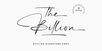 The Billion is a perfect signature font, with 2 style (regular and monoline). The Billion Font is perfect for many different project such as logos & branding, invitation, stationery, wedding designs, social media posts, advertisements, product packaging, product designs, label, photography, watermark, special events or anything.


