10,000 search results
(0.157 seconds)
- Battafia by PojolType,
$13.00 My font name is Battafia. This font is usually used for brands, greeting for someone, T-shirt design, nameplate, pins, accessories, film titles, magazine titles, web, posters, book titles, logos, country names, billboards, advertisements, book writing, products, display, and many others. Battafia, offers you: 1. Alternative uppercase (all uppercase, 1 model) 2. Lowercase character 12 letters, usually used in end letters 3. Ligature (1 two-letter character) and Alternative Styles 4. Multilingual Support (Europe Latin West), Numbers and Punctuation
 - Mrs Lollipop by Hipopotam Studio,
$20.00 Mrs Lollipop is a hand drawn narrow typeface designed for one of our books. You can layer different styles over the background style to achieve lots of colorful effects. Check out the manual for details. Mrs Lollipop has upper and lowercase characters with up to three alternate glyphs. Build in OpenType Contextual Alternates feature will automatically set alternate glyphs depending on frequency of appearance of the same character (even in web font but only in HTML5 browsers). The script doesn’t throw random glyphs. It has lines, frames, hearts, stars, ladybird and two rabbits.
 - Street Smart by Fontysia,
$9.00 Introducing: Street Smart is a fun and bold graffiti font, which includes six versions of each letter which can be used separately or on top of one another for a different look. This font is PUA coded which means you can access all the glyphs and replace them easily! (please type preview to see if I have what you need!)
 - Response by PizzaDude.dk,
$20.00 Response is 100% handmade with a worn look to it. Comes with 5 different versions of each letter, and by using the contextual alternates they automatically cycles as you type! Response is good if you need a response regarding your next project - that being an invitation, packaging or something that needs a worn handmade look! Besides that, Response is full of international characters!
 - Kong Gulerod by PizzaDude.dk,
$16.00 Kong Gulerod is handmade, yet digitally remastered. I did my best to keep the whimsical and childlike looks, and keep the legibility. Use Kong Gulerod for massive amounts of text or for product labelling, maybe even educational materials for kids or creative minds. I have added 4 different versions of each lowercase letter, and they automatically change as you type!
 - Wyoming Pastad by Ingrimayne Type,
$14.95 Wyoming Pastad is the simplest of the Wyoming series. The round letter shapes of Wyoming Spaghetti have moved toward squareness. The overall effect is that Wyoming Pastad no longer looks much like an “Old West” face. There are two shadowed versions of WyomingPastad. Using the ShadowedInside style in layers with the shadowed styles is an easy way to get two-colored letters.
 - Schuss Sans CG Poster Extrabold by typic schuss,
$33.00 Schuss Sans CG Poster Extrabold 1 upright OTF Font Latin extended, Cyrillic and Greek. Specially developed for headline poster display sizes. A Sans Serif Extrabold Headline-Font in addition to the Schuss superfamily. The heights are optimized for big sizes, different to the text fonts of the Superfamily Schuss. The character set is slightly different to the non poster styles too, but comparable to Schuss Sans CG Poster Black. No italic, no additional figures, no tabular figures, no small Caps. But with maximum manual kerning. Ligatures: fi, fl, ff, ffi, ffl. No special OpenType features.
 - Portsmouth Second Fleet by Open Window,
$19.95 Portsmouth Second Fleet is the rag tag, wild bunch companion to Portsmouth. It is a strong, sturdy typeface with historical character. Its inspiration comes from the height and strength of the wooden tall ships that sailed into port in their day. With caps and small caps, this typeface is great for headlines or subheads for design projects that need a historical or retro feel, such as from the 1940s and earlier. Two different styles that can be layered allow for different colored drop shadows, outlines and fill for even more customization.
 - 2 Quadro by Apostrof,
$50.00 This big family summarizes and develops the tradition of boldface squared-off 45° shear sanserifs. Known from the middle of 19th century and actively used in different times (1920s, 1970s) is still usable now, thanks to its brutal expression, monumentality and possibility to fully maximize the flatness without loss of readability. This font is especially good for filling letters with photos or to create geometrical “constructivist” compositions.
 - Fortezza by Eurotypo,
$22.00 Fortezza is a family of fonts inspired by the great masters who have created the Modern Roman style: Firmin Didot (1764 -1836) and Giambattista Bodoni (1740 -1813) Both typefaces can be similar, but a trained and close vision, show clear differences in the final result, like its weight and the degree of transition of the strokes. The type of Didot suggests greater warmth and elegance, they are characterized by extreme contrast in thick strokes and thin strokes, by the use of serifs very thin and by the vertical stress of the letters. while the Bodoni type conveys a greater robustness and hardness. Fortezza brings together the elegance and spirit of both types, but proposes a contemporary vision, establishing a distance with certain features typical of the baroque that was manifested at that time.
 - Senja Mentari by Ahmad Jamaludin,
$15.00 Senja Mentari is elegant modern calligraphy font inspired by delicate inky hand lettering, gorgeous wedding calligraphy and trending minimal branding designs. This beautiful font is for those who are needing of elegance and stylish for their designs and particularly well suited for wedding invitations, cards and feminine branding. I have wanted to create such combination a long time and can’t believe that it is here. I’m super excited and hope you’ll estimate it too. Now all you need for perfect wedding invitation design is in one product. I think this decision will help you to save your time! What's included? More than 100 beautiful swashes in this font Accessible in the Adobe Illustrator, Adobe Photoshop, Adobe InDesign, even work on Microsoft Word. PUA Encoded Characters - Fully accessible without additional design software. Multilingual Support : à á â ã ä å æ ç è é ê ë ì í î ï ñ ò ó ô õ ö ø ù ú û ü ý ÿ š fl fi ž œ ı ç ø š ž æ œ À Á Â Ã Ä Å Æ È É Ê Ë Ì Í Î Ï Ñ Ò Ó Ô Õ Ö Ø Œ Ù Ú Û Ü Ý Ÿ Š Š ŽŁ Ð Ç
 - KG Be Still & Know by Kimberly Geswein,
$5.00 Inspired by typewriter-style lettering, this font is legible and still has a bit of flair.
 - IMars by Artyway,
$14.00 Introducing the IMars Font - the future of typography is here! This sleek and modern font is the perfect addition to your design arsenal. Its clean lines and minimalist elegance make it ideal for contemporary, sci-fi, and space-themed designs. But that's not all - the versatility of the IMars Font also makes it the perfect choice for branding, adventure, and music projects. With its cutting-edge design, this font will bring your projects to the next level. Whether you're creating a stunning sci-fi movie poster or a sleek and stylish brand identity, the IMars font has you covered. So why wait? Get creative and try different styles and kerning combinations to find the perfect look for your project. Embrace the future of typography with the IMars font today! Try different styles and experiment with kerning for best results.
 - Asteric Vintage by BlackLotus,
$12.00 Asteric Vintage is a retro-vintage font family with an amazing set of ornaments. It comes in 3 different styles: Regular, Rough, Display, and also presents 26 beautiful and luxurious ornaments . The Rough Style has a characteristic that resembles rust on each character, thus creating results that seem strong and hard. The Display Style is very suitable for display, every work created with it becomes luxurious, wrapped in a classic atmosphere. The Regular Style is a style that has a clean character but still carries a classic scent that is thick and unique. This style is very suitable for use in magazines, books, newspapers, etc.
 - Graffiti Youth by Nirmana Visual,
$22.00 Inspired by Graffiti style Design, with 2 Style : Regular & Shadow Graffiti Youth offers beautiful typographic harmony for a diversity of design projects, including logos & branding, social media posts, advertisements & product designs.
 - Graffiti Boldy by Nirmana Visual,
$19.00 Inspired by Graffiti style Design, with 2 Style : Regular & Shadow Graffiti Boldy offers beautiful typographic harmony for a diversity of design projects, including logos & branding, social media posts, advertisements & product designs.
 - Graffiti Urban by Nirmana Visual,
$17.00 Inspired by Graffiti style Design, with 2 Style : Regular & Shadow Graffiti Urban offers beautiful typographic harmony for a diversity of design projects, including logos & branding, social media posts, advertisements & product designs.
 - Cardholder Dispute SRF by Stella Roberts Fonts,
$25.00 From the remnants of an old freeware font by Ray Larabie comes Cardholder Dispute SRF. Thoroughly rebuilt from the ground up by Jeff Levine, this post-80s techno lettering can also double as a pop culture font evoking 60s or 70s rock concerts and hippie colonies or (as the name implies) credit cards. The net profits from my font sales help defer medical expenses for mysiblings, who both suffer with Cystic Fibrosis and diabetes. Thank you.
 - Gemsea by Product Type,
$17.00 With Gemsea Fonts, you open the door to a world of limitless creativity. A display theme that celebrates the power of the ocean, bringing a strong, bold, and fun touch to any of your projects. Gemsea is the perfect solution for projects that require a unique theme. From epic films to stunning games and unforgettable streaming events, this font offers durability and appeal in various languages. Stunning Features: Five different family styles: Regular, Blur, Engrave, Outline, and 3D. This gives you the flexibility to create a variety of nuances in your designs. It supports multilingual so that you can connect with a global audience without restrictions. Gemsea creates not just projects, but unforgettable works of art. Get the Gemsea Font now and bring the magic of the ocean into your designs!
 - Limit Corner by Storictype,
$15.00 Introducing new serif display typeface its called Limit Corner. Inspired by victorian style with classic style .OpenType features some characters that allows you to mix and match pairs of letters to fit in your designs. It’s an all caps typeface, with strong and sleek letters. It features over 50 stylised alternatives, offering an infinite opportunity to customise and create logos, headlines, titling, product packaging, labeling, logo, classic shop, badges, movie title, t-shirt, posters, label, greetingcard, letterhead, book cover, etc. To access the alternat glyphs, you need a program that supports OpenType features such as Adobe Illustrator CS and Adobe Indesign Features : Character Set A-Z Numerals & Punctuations (OpenType Standard) Accents (Multilingual characters) Thanks and enjoy designing.
 - Popfun by Surotype,
$20.00 Popfun is a display typeface with playful taste. It comes in two different styles, normal and extrude paired with a mono style, this font fits perfectly. Really playful font to make it easier for you creative work such as — branding, film titles, packaging, advertising, posters, and web or app.
 - Fada by Gaslight,
$25.00 Fada is a unicase geometric grotesque that was made on the basis of a logo for a bar, which we have designed. We were inspired by the license plate, in which the letters have specific heats in places conjoined. The only difference between upper or lower case characters is reduced and increased waist. This is characteristic not only for letters and digits. Fada - good for fashion, editorial, posters, logos and so on.
 - Nonsense Note by Bogstav,
$19.00 There really is no nonsense in this font - but the name comes from my original sketches, where I drew a lot of nonsense! Actually, I couldn't figure out what letters to use from the sketches, so I picked them all!!! That's why each letter has 10 different versions! And what is cool is that they automatically cycles as you type. All you have to do is turn on Contextual Alternates, and the rest is magic!
 - Bottle Fork by PizzaDude.dk,
$15.00 Here is my font with carved out letters, like a really bad stamp. Each lowercase letter has 3 different versions, and that makes your text more natural, organic and handmade. Normally I kern my fonts throughout, but this time there is no kerning at all...and that's odd, when we're not talking about monospaced fonts. Anyway, Bottle Fork has its flaws and jumpy x-height...but that's exactly the charm of it all! :)
 - Mithella by Lafontype,
$19.00 Mithella is a sans serif family with a pleasant touch. Some letters, especially linear ones, look normative like other rounded sans serifs, but the difference can be seen clearly in curved letters so that it gives a pleasant impression for each series of words. Mithella comes with eight weights ranging from thin to black to complement your design needs be it branding, blogging, logos, advertising, games, cooking, packaging, editorial and publishing, web and screen design.
 - Music Note by Putracetol,
$22.00 Music Note is a quirky display music font that captures the fun and whimsy of musical themes. This font is a perfect blend of musical notes, instruments, scales, rhythm, and tempo, designed with a childlike spirit and a crafter’s touch. With 9 unique variations to suit different musical styles, Music Note is as versatile as it is charming. Whether you are creating a logo, branding, a children’s theme, a crafting project, an invitation card, a packaging design, a poster, a title, a business identity, a greeting card, a sticker, a children’s book, or a magazine layout, Music Note will add a touch of musical magic to your design. Each letter dances with rhythm and melody; every stroke resonates with the harmonious tunes of joy.
 - Abril Titling by TypeTogether,
$35.00 Abril is an extension of the Abril typographic system that was engineered as a response to a very specific requirement from the editorial design community: a low contrast typeface for head- lines. Given its broad range of styles though, Abril deserves to be considered a separate font family on its own. Based on the original text styles of Abril, the letter shapes are sturdy, very legible, and deliver a newsy and trustworthy feel. The accented editorial style of the Scotch Roman finds continuity in this new type family, but some of the details have been ironed out for improved performance in headline, both in print and on screen. The family is conceived as four series of different widths, with four weights in each series plus matching italics, a total of 32 fonts. This wide range of styles allows for setting titles at almost any size. The wider series are aimed for smaller point sizes while the con- densed weights can deliver a striking and cohesive appearance as front cover headlines. Abril was designed as a versatile tool for those graphic and web designers looking for a workhorse with high impact. It is also an excellent companion for the rest of the Abril type family: Abril Titling and Abril Narrow.
 - Bloque by Corradine Fonts,
$19.95 Bloque is a heavy slab font family which contains six fonts. It has three layers for both roman and italic styles, including an inline and a shadow versions to make different color combinations
 - Location JNL by Jeff Levine,
$29.00 The lettering style of Location JNL is based on sets of "vintage" metal house identification letters and numbers seen for sale online. As these sets are available from overseas sources, it's not clear whether those metal characters are cast from original vintage dies that have been used for years or just designed to look like a vintage style of lettering. Nonetheless, they make for a great digital interpretation and the design is available in both regular and oblique versions.
 - Camonflet by TanveerType,
$12.00 This unique set of letters designed in the style of serif. It's cutting edge and expanded looks carefully designed to feel like classic lettering. It's easy to read and cover a small area to utilize.
 - Roller Poster by HiH,
$12.00 Roller Poster is named after Alfred Roller. In 1902, Roller created a poster to advertise the 16th exhibit of Austrian Artists and Sculptures Association, representing the Vienna Secession movement. The exhibit was to take place in Vienna during January & February 1903. The location is not mentioned because everyone in Vienna knew it would be held at the exhibit hall in the Secession Building at Friedrichstraþe 12, a few blocks south of the Opernring, near the Naschmarkt. Designed by Joseph Maria Olbrich in 1897, the buiilding has been restored and stands today as one finest of the many fine examples of Art Nouveau architecture in Vienna (see vienna_secession_bldg.jpg). Because of its dome, it is called “the golden cabbage.” The poster itself is unique. The word “secession” is in one type style and takes up two-thirds of the elongated poster. At the bottom of the poster are the details in a different lettering style. It is this second style at the bottom that is the basis for the font Roller Poster. In keeping with our regular naming conventions, we were going to call it Roller Gezeichnete (hand-drawn), but the wonderful play on both words and the shape of the three S’s in secession was too compelling. In November 1965 there was an exhibit of Jugendstil and Expressionist art at the University of California. Alfred Roller’s Secession Poster was part of that exhibit. Wes Wilson was designing promotional material at Contact Printing in San Francisco. Among their clients was a rock promoter named Bill Graham, staging dance-concerts at Fillmore Auditorium. Wilson saw the catalog from the UC exhibit and Roller’s lettering. Wilson adapted Roller’s letter forms to his own fluid style. The result was the poster for the August 12-13, 1966 Jefferson Airplane/Grateful Dead concert at Fillmore put on by Graham (BG23-1). Wilson continued to use Roller’s letter forms on most of the posters he did for Graham through May 1967, when he stopped working for Graham. The posters were extremely successful and the lettering style along with Roller’s letter forms were picked up by other artists, including Bonnie MacLean, Clifford Charles Seeley, James Gardner, and others. The Secession poster and the Fillmore posters have inspired a number of fonts in addition to ours. Among them are JONAH BLACK (& WHITE) by Rececca Alaccari, LOVE SOLID by Leslie Carbarga and MOJO by Jim Parkinson. Each is different and yet each clearly shows its bloodlines. Our font differs in two ways: 1) the general differences in the interpretation of the letter forms and 2) the modification of the basic letter form to incorporate the diacriticals within the implied frame of the letter, after the manner of the original design by Roller. We borrowed Carbarga’s solution to the slashed O and used it, in a modified form, for other characters as well to accomplish the same purpose. We recommend that you buy ours and at least one of the other three. According to Alaccari, a version called URBAN was released by Franklin Lettering in the 70’s (and is shown on page 51 of The Solotype Catalog). For comparison of our font to original design, see image files roller_poster_2s.jpg of original poster and roller_poster_2sx.jpg showing reconstruction using our font for the lower portion (recontructed area indicated by blue bar). Please note the consistency of character width. In the lower case, 23 of the basic 26 letters are 1/2 EM Square wide. The ‘i’ is an eighth narrower, while the ‘m’& ‘w’ are one quarter wider. All the Upper Case letters are 1/8 EM wider than the lower case. This is to make it easier to fill a geometrical shape like a rectangle, allowing you to capture a little of the flavor of Wes Wilson’s Fillmore West poster using only a word processor. We have also included a number of shapes for use as spacers and endcaps. If you have a drawing program that allows you to edit an ‘envelope’ around the letters to distort their shape, you can really get creative. I used Corel Draw for the gallary images, but there are other programs that can accomplish the same thing. The image file “roller_poster_keys.jpg” shows the complete character set with the keystrokes required for each character (see “HiH_Font_readme.txt” for instruction on inserting the non-keyboard characters). The file “roller_poster_widths.jpg” shows the exact width of each character in EM units (based on 1000 units per EM square). You will notice that the font is set wide for readability. However, most programs will allow you to tighten up on the character spacing after the manner of Roller & Wilson. In MS Word, for example, go to the FORMAT menu > FONT > CHARACTER SPACING. Go to the second Drop-Down Menu, labeled ‘Spacing’ and select "condensed' and then set the amount that you want to condense ‘by’ (key on the little arrows); two points (2.0) is a godd place to start. Let your motto be EXPLORE & EXPERIMENT. Art Nouveau has always been one of my favorite movements in art -- I grew up in a home with a couple of Mucha prints hanging on the living room wall. Perhaps because of that and because I lived through the sixties, I have enjoyed researching and designing this font more than any other I have worked on. Let’s face it (pardon the pun), Roller Poster is a FUN font. You owe it to yourself to have fun using it.
 - Ceramika by Santi Rey,
$25.99 Ceramika is a modern tribute to Old Style typefaces. This design is inspired by the letterforms of the serif faces found in history books from the beginning of the 20th-century. Its sturdiness and generous X-Height makes it bold and compact; while the high-contrast strokes and recognisable shapes makes it extremely readable. All this makes Ceramika a really versatile font, perfect for logos, headlines and even body copy. It comes in 6 different weights and 2 styles — Standard and Italic.
 - Announcement Board JNL by Jeff Levine,
$29.00 Many decades back, churches, schools and other buildings with a need to display an outdoor message often chose a sign making system utilizing characters silk screened onto metal pieces in a block chamfer style. Each piece had a crimp in the top of the metal which formed a hook to fit over the existing rails of a message panel. This allowed for a finished sign to be displayed within minutes, and a quick change of information was not very time-consuming. A popular version of these signs provided white letters and numbers on black backgrounds. This was the model for Announcement Board JNL, which is available in both regular and oblique versions. There are two different width blank panels on the broken and solid bars for those who wish to kern the letters tight to form a ribbon, however they were designed to have slight spacing in order to emulate the hand assembly of those vintage sign panels.
 - Ministry Script by Sudtipos,
$99.00 Ministry Script was designed to be “A time capsule that marks both the American ad art of the 1920s, and the current new-millennium acrobatics of digital type.” First letters of Ministry comes from a how-to lettering book but immediately turned on a complex and modern new digital typeface design with thousand glyphs. Ministry’s OpenType features include contextual and stylistic alternates, swash characters, and a galaxy of ligatures. A single face with over 1,000 characters to explore. The OpenType palette provides access to four different variants of each letter. For more info about the use of Ministry, its background, ligatures, alternates, please read The Ministry Script Guide in the Gallery section.
 - Checkmark by Set Sail Studios,
$14.00 Make your mark with Checkmark; a slick, high energy signature-style script font guaranteed to make a big impression. Digitally hand-drawn, it's super-clean smooth flow and high-intensity pen strokes make an unmistakeable impact in logo/branding projects, large header text and product packaging. Checkmark is packed full of extra features to give you plenty of customization options. This includes; a full set of upper and lowercase alternate letters, 20 ligatures (double letters) to help the script lettering flow more naturally, 26 swashes and a full set of lowercase end forms to give your text that extra flair and finesse. Here's a run through everything in more detail; Checkmark • A smooth-edged signature style font containing upper & lowercase characters, numerals, and a large range of punctuation. Checkmark Alt • This is a second version of Checkmark, with a completely new set of both upper and lowercase characters. If you wanted to avoid letters looking the same each time to recreate a custom-made style, or try a different word shape, simply switch to this font for an additional layout option. Checkmark Swash • A third font containing 26 hand drawn swashes. Simply type any a-z or A-Z character in this font to generate a swash. Perfect for underlining your Checkmark text and adding a bit of extra flair! Ligatures • 20 ligatures (double-letters) are included to help your lettering flow more naturally. Many programs will automatically have this feature switched on for you, but if you need any help accessing them, please feel free to drop me a message. End forms • Are available for all lowercase characters when using the Checkmark font. Use these characters at the end of your word to add a stylistic 'end-swash'. These are accessible via software with opentype capability, by turning on 'Stylistic Alternates', or via a Glyphs panel. Language Support • Checkmark fonts support the following languages; English, French, Italian, Spanish, Portuguese, German, Swedish, Norwegian, Danish, Dutch, Finnish, Indonesian, Malay, Hungarian, Polish, Croatian, Turkish, Romanian, Czech, Latvian, Lithuanian, Slovak, Slovenian.
 - Mogena by Kulokale,
$20.00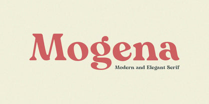 Mogena is a modern and elegant serif. It has a unique and different style and will give your design a friendly and expressive look. Mogena is perfect for many different projects such as logos and branding, invitation, stationery, wedding designs, social media posts, advertisements, product packaging, product designs, label, photography, watermark, special events or anything. We hope you enjoy the font and have fun! Thank You.
 - Goodfood by MaGo Fonts,
$9.00 Introducing our stunning Goodfood Font Family, a versatile and delicious sans serif display typeface that is perfect for your most tasteful design projects. With a total of five different weights, this font family offers you ultimate flexibility in creating captivating and impactful designs. Whether you're working on a logo, branding materials, product packaging, or editorial projects, this font family will enhance the overall aesthetic and make your designs stand out. To further enhance creativity, Goodfood Font Family includes alternates and ligatures. These additional characters provide you with ample possibilities to customize and stylize your typography, creating unique and eye-catching designs. By utilizing alternates and ligatures, you can bring a distinctive touch to your headers, titles, headlines, and other important elements of your design. Here's what you can expect from this font family: Five Weights: The font family offers five weights, ranging from Light to Bold. This wide range allows you to experiment with different typographic hierarchies and create visually appealing compositions. Alternates: The inclusion of alternates expands the versatility of this font family. By simply swapping characters, you can create different stylistic variations, giving your designs a fresh and creative look. Ligatures: The font family also includes ligatures, which are special characters that combine two or more letters into a single unique glyph. Ligatures ensure smooth and visually pleasing connections between characters, resulting in a harmonious and cohesive typography. Superior Legibility: While the Goodfood Font Family features elegant and decorative serifs, it doesn't compromise on legibility. The carefully crafted characters and balanced letterforms ensure readability across various sizes and mediums. Extensive Language Support: This font family supports a wide range of languages, allowing you to create designs for global audiences with ease. Whether you're a professional designer looking to elevate your creative projects or an individual seeking a unique font for personal use, the Display Serif Font Family offers an impressive array of options. Add sophistication, versatility, and a touch of uniqueness to your designs with this remarkable font family.
 - Wayfinding Sans Pro by FDI,
$49.00 Ralf Herrmann, the designer of Wayfinding Sans, started this project with extensive field studies, driving tens of thousands of miles to explore the legibility of road signage typefaces in dozens of countries around the world. After building his own theoretical framework of relevant legibility parameters, the design process used a unique custom real-time simulation software, which could simulate difficult reading conditions (distance, fog, halation, positive/negative contrast) while the letters were actually being designed. This process made it possible to optimize even the tiniest details of each letter for maximum legibility. Being made specifically for wayfinding purposes, this type family does not compromise on any aspect of legibility — and yet, the typeface is a beautiful, clean and modern sans serif. With its broad language support and the large number of available styles it is perfectly suitable for any possible signage project anywhere in the world. In an independent empirical study at the University of Applied Sciences “htw” in Berlin different typefaces were recently tested when used on signs and Wayfinding Sans Pro was the winner in all conducted tests, being significantly more legible and therefore superior to all other styles of the tested typefaces. Check out the PDF specimen for more information: wayfinding-sans-pro.pdf
 - CF Santiago by Contrafonts,
$28.00 This alphabet has only capital and small caps. With several alternative characters (A, R, Y) in different style groups. The capitals are even more flexible, with alternatives for Uncial inspiration. In addition to ligatures symbols and various groups of numbers. Of course we use Opentype for a expanded use in modern software for layout and graphic design. Compatible with mac and PC.
 - ITC Spirit by ITC,
$29.99While designing ITC Spirit, Patty King was influenced by classic typeface styles. The letter forms are clearly based on those of the Unziale, which, like ITC Spirit, is also composed of only capital letters. Hints of the Asian brush script style also show in this font. The irregular outer contours are best highlighted in larger point sizes and give the font the look of handwriting. ITC Spirit with its calligraphic style is best used for headlines and short texts in point sizes of 12 and larger.