10,000 search results
(0.058 seconds)
- Hippie Mojo by Mysterylab,
$18.00 Set the wayback machine for about 1967. Smell the patchouli? Now you can inject just the right dose of swirly-licious mojo into your retro design with this original vintage-styled sixties font. But as with many psychedelic hippie lettering designs, the history reaches back even further; it owes a designer's debt of gratitude to the designs of the Art Nouveau era as well. This is predominantly a uni-case alphabet, but also features a few alternative characters in the lower case – at the full height of the capitals. With an extensive character set and multilingual glyphs, you can use Hippie Mojo to say "Groovy baby" in many languages. Evoke the carefree and tripped-out vibe of the psychedelic era with Hippie Mojo; it's pure retro fun!
 - Mateo Unique by IbraCreative,
$14.37 Mateo is an extraordinary and unique handwritten typeface that stands out with its captivating originality. With letters that seem like hand-drawn works of art, each character in Mateo carries a distinct personality, exuding a sense of authenticity and creativity. The charmingly irregular lines and artistic flourishes lend this typeface an artistic and handcrafted feel, making it a perfect choice for projects that require a touch of individuality and unconventional style. Mateo’s versatility is showcased in its ability to seamlessly adapt to diverse design contexts, whether used for eye-catching logos, expressive quotes, or artistic illustrations. With its one-of-a-kind appearance, Mateo transcends traditional typefaces, inviting viewers to explore the world of handwritten artistry in every stroke and curve
 - Chadlershire by Uncurve,
$20.00 Chadlershire is font duo a perfectly blended type for any art work. Comes with emboss, inline and shadow layering styles, including alternates and some extra ornaments. Chadlershire is inspired by typografic design, sign painters, lettering, vintage art, tattoo art, and ephemera label. Perfect for labels, posters, branding, logotypes, headers, titles, packaging, display, and more.
 - Sewing Patterns by Lauren Ashpole,
$15.00 When I created my first website, I loved using vintage sewing pattern illustrations in my designs. Thinking back on it, I wanted to create a dingbat inspired by those images and Sewing Patterns is the result. The font features ladies-fashions in silhouette form for uppercase and lowercase letters and childrens- styles for the numbers.
 - Dourcha by Attract Studio,
$12.00 Dourcha Script is a new modern script font with an irregular base line. Handwriting style, trendy and feminine. Dourcha Script looks good on wedding invitations, thank you cards, quotes, greeting cards, logos, business cards and more. Perfect for use in ink or watercolors. Includes beginning and end letters, alternates, ligatures and multiple language support.
 - Fong Shay Noon JNL by Jeff Levine,
$29.00 Fong Shay Noon JNL is a non-traditional approach to an Oriental-styled font as there are some letter forms with curves and others with straight lines. The name derives from a Chinese restaurant in North Miami Beach, Florida during the 1960s, which in turn took its name from a play on a Yiddish phrase.
 - Weather In October by Wildan Type,
$10.00 Weather in October is a handwritten font. The letters are classy and unique. Use Weather in October to get a more elegant look This font is perfect for quotes, headings, blogs, invitations and more! This purchase includes Regular,Italic, Movement, and Hollow Style You will be able to use this font in ANY program!
 - Meritage by Aerotype,
$29.00 OpenType users benefit from alternate lowercase characters, crossbar ligatures for common letter pairings, case sensitive quotes and smart apostrophes. Other goodies include optional old style numerals and a few clip-on swash elements, accessible by keyboard or supporting application’s OpenType glyph menu. Meritage Pro extends the character set to support Eastern European and Baltic languages.
 - Nurhayati by Shape Studio,
$12.00 Nurhayati Font is a new modern script calligraphy font with an irregular baseline. Trendy and feminine style. Nurhayati Font Script looks lovely on wedding invitations, thank you cards, quotes, greeting cards, logos, business cards and more. Perfect for using in ink or watercolour. Including initial and terminal letters, alternates, ligatures and multiple language support
 - Free Form Retro JNL by Jeff Levine,
$29.00 The titles and credits from the 1960 French film “Le Passage Du Rhin” (English release title: “Tomorrow is My Turn”)” are hand made in a free form bold alphabet resembling both cut paper and quickly sketched lettering. This avant garde style inspired the digital type revival, which is available in both regular and oblique versions.
 - Shoqwave by Alphabet Agency,
$12.00 Alphabet Agency proudly presents Shoqwave, a distressed stencil font. The font has been designed in a unique military stencil style with an awesome distressed effect. Shoqwave is great for use in war, crime, urban, and combat sports related themes. The font contains capital and alternative capital letters, numbers, punctuation and basic Latin international characters.
 - Paddingtoons by Inumocca,
$15.00 PADDINGTOONS inspiration from children book style, its realy simple and eyecathing. Paddingtoons Powerful Display font, All Caps With Variant for the Capital Letters. is perfect for Poster quotes, flyer, headings, Magazine, Children Books cover, blogs, logos, invitations and more. - Unique glyphs - Multilingual Characters - UPPERCASE - Lowercase - Numeric - Symbol - Punctuation Character inumoccatype illustration and typo Studio
 - Nazgul by Hikhcreative,
$20.00 Nazgul is a modern dynamic sans serif font with subtle vintage characteristics. It works perfectly for film posters, headlines, block letters, subheadings, logo designs, big banners, classic and decorative typography, web designs, packaging and more. The two styles, Regular and Outline, include more than 100 ligatures and alternate characters allowing for versatility in design.
 - Miqdad by Viaction Type.Co,
$15.00 Miqdad font is inspired by Arabic letters which have bold characters. It is perfect for use as logos, quotes, and various other designs with Islamic or Arabic themes. Equipped with multilingual. Font files include: This font includes 2 styles, regular & oblique. It is very profitable to buy the Miqdad font. Get it Now ! Thanks.
 - Jump by Linotype,
$40.99Jump is a lighthearted, handwritten script. Its quick and informal style is perfect for short notes and messages to convey charisma. The letters 'jump' up and down on the baseline giving words and sentences a lively impression. Try out Jump for invitations, cards, and announcements when you are aiming for the hand-made effect. - The overthinkers by Joanne Marie,
$26.00 The overthinkers is a semi script hand lettering font for all of your hand lettering designs! With two sets of uppercase glyphs, three sets of lowercase and over 230 ligatures no two words will be same! So your designs will truly look hand lettered. With so much choice be careful not to overthink your designs ;). This font is perfect on it’s own or you may like to use it with your existing hand lettering fonts. Go ahead and try it out - it’ll compliment any design! It’s perfect for merchandise and food packaging, book designs, logos and much more.
 - FunFont by John Moore Type Foundry,
$18.00 Funfont is a sans serif fantasy font with funny spirit designed to recreate an style of good humor. FunFont comes in three styles: Normal, Outline and Shade.
 - Times New Roman PS Cyrillic by Monotype,
$67.99In 1931, The Times of London commissioned a new text type design from Stanley Morison and the Monotype Corporation, after Morison had written an article criticizing The Times for being badly printed and typographically behind the times. The new design was supervised by Stanley Morison and drawn by Victor Lardent, an artist from the advertising department of The Times. Morison used an older typeface, Plantin, as the basis for his design, but made revisions for legibility and economy of space (always important concerns for newspapers). As the old type used by the newspaper had been called Times Old Roman," Morison's revision became "Times New Roman." The Times of London debuted the new typeface in October 1932, and after one year the design was released for commercial sale. The Linotype version, called simply "Times," was optimized for line-casting technology, though the differences in the basic design are subtle. The typeface was very successful for the Times of London, which used a higher grade of newsprint than most newspapers. The better, whiter paper enhanced the new typeface's high degree of contrast and sharp serifs, and created a sparkling, modern look. In 1972, Walter Tracy designed Times Europa for The Times of London. This was a sturdier version, and it was needed to hold up to the newest demands of newspaper printing: faster presses and cheaper paper. In the United States, the Times font family has enjoyed popularity as a magazine and book type since the 1940s. Times continues to be very popular around the world because of its versatility and readability. And because it is a standard font on most computers and digital printers, it has become universally familiar as the office workhorse. Times?, Times? Europa, and Times New Roman? are sure bets for proposals, annual reports, office correspondence, magazines, and newspapers. Linotype offers many versions of this font: Times? is the universal version of Times, used formerly as the matrices for the Linotype hot metal line-casting machines. The basic four weights of roman, italic, bold and bold italic are standard fonts on most printers. There are also small caps, Old style Figures, phonetic characters, and Central European characters. Times? Ten is the version specially designed for smaller text (12 point and below); its characters are wider and the hairlines are a little stronger. Times Ten has many weights for Latin typography, as well as several weights for Central European, Cyrillic, and Greek typesetting. Times? Eighteen is the headline version, ideal for point sizes of 18 and larger. The characters are subtly condensed and the hairlines are finer." - Times New Roman Seven by Monotype,
$67.99In 1931, The Times of London commissioned a new text type design from Stanley Morison and the Monotype Corporation, after Morison had written an article criticizing The Times for being badly printed and typographically behind the times. The new design was supervised by Stanley Morison and drawn by Victor Lardent, an artist from the advertising department of The Times. Morison used an older typeface, Plantin, as the basis for his design, but made revisions for legibility and economy of space (always important concerns for newspapers). As the old type used by the newspaper had been called Times Old Roman," Morison's revision became "Times New Roman." The Times of London debuted the new typeface in October 1932, and after one year the design was released for commercial sale. The Linotype version, called simply "Times," was optimized for line-casting technology, though the differences in the basic design are subtle. The typeface was very successful for the Times of London, which used a higher grade of newsprint than most newspapers. The better, whiter paper enhanced the new typeface's high degree of contrast and sharp serifs, and created a sparkling, modern look. In 1972, Walter Tracy designed Times Europa for The Times of London. This was a sturdier version, and it was needed to hold up to the newest demands of newspaper printing: faster presses and cheaper paper. In the United States, the Times font family has enjoyed popularity as a magazine and book type since the 1940s. Times continues to be very popular around the world because of its versatility and readability. And because it is a standard font on most computers and digital printers, it has become universally familiar as the office workhorse. Times?, Times? Europa, and Times New Roman? are sure bets for proposals, annual reports, office correspondence, magazines, and newspapers. Linotype offers many versions of this font: Times? is the universal version of Times, used formerly as the matrices for the Linotype hot metal line-casting machines. The basic four weights of roman, italic, bold and bold italic are standard fonts on most printers. There are also small caps, Old style Figures, phonetic characters, and Central European characters. Times? Ten is the version specially designed for smaller text (12 point and below); its characters are wider and the hairlines are a little stronger. Times Ten has many weights for Latin typography, as well as several weights for Central European, Cyrillic, and Greek typesetting. Times? Eighteen is the headline version, ideal for point sizes of 18 and larger. The characters are subtly condensed and the hairlines are finer." - Times New Roman WGL by Monotype,
$67.99 In 1931, The Times of London commissioned a new text type design from Stanley Morison and the Monotype Corporation, after Morison had written an article criticizing The Times for being badly printed and typographically behind the times. The new design was supervised by Stanley Morison and drawn by Victor Lardent, an artist from the advertising department of The Times. Morison used an older typeface, Plantin, as the basis for his design, but made revisions for legibility and economy of space (always important concerns for newspapers). As the old type used by the newspaper had been called Times Old Roman," Morison's revision became "Times New Roman." The Times of London debuted the new typeface in October 1932, and after one year the design was released for commercial sale. The Linotype version, called simply "Times," was optimized for line-casting technology, though the differences in the basic design are subtle. The typeface was very successful for the Times of London, which used a higher grade of newsprint than most newspapers. The better, whiter paper enhanced the new typeface's high degree of contrast and sharp serifs, and created a sparkling, modern look. In 1972, Walter Tracy designed Times Europa for The Times of London. This was a sturdier version, and it was needed to hold up to the newest demands of newspaper printing: faster presses and cheaper paper. In the United States, the Times font family has enjoyed popularity as a magazine and book type since the 1940s. Times continues to be very popular around the world because of its versatility and readability. And because it is a standard font on most computers and digital printers, it has become universally familiar as the office workhorse. Times?, Times? Europa, and Times New Roman? are sure bets for proposals, annual reports, office correspondence, magazines, and newspapers. Linotype offers many versions of this font: Times? is the universal version of Times, used formerly as the matrices for the Linotype hot metal line-casting machines. The basic four weights of roman, italic, bold and bold italic are standard fonts on most printers. There are also small caps, Old style Figures, phonetic characters, and Central European characters. Times? Ten is the version specially designed for smaller text (12 point and below); its characters are wider and the hairlines are a little stronger. Times Ten has many weights for Latin typography, as well as several weights for Central European, Cyrillic, and Greek typesetting. Times? Eighteen is the headline version, ideal for point sizes of 18 and larger. The characters are subtly condensed and the hairlines are finer."
 - Times New Roman by Monotype,
$67.99 In 1931, The Times of London commissioned a new text type design from Stanley Morison and the Monotype Corporation, after Morison had written an article criticizing The Times for being badly printed and typographically behind the times. The new design was supervised by Stanley Morison and drawn by Victor Lardent, an artist from the advertising department of The Times. Morison used an older typeface, Plantin, as the basis for his design, but made revisions for legibility and economy of space (always important concerns for newspapers). As the old type used by the newspaper had been called Times Old Roman," Morison's revision became "Times New Roman." The Times of London debuted the new typeface in October 1932, and after one year the design was released for commercial sale. The Linotype version, called simply "Times," was optimized for line-casting technology, though the differences in the basic design are subtle. The typeface was very successful for the Times of London, which used a higher grade of newsprint than most newspapers. The better, whiter paper enhanced the new typeface's high degree of contrast and sharp serifs, and created a sparkling, modern look. In 1972, Walter Tracy designed Times Europa for The Times of London. This was a sturdier version, and it was needed to hold up to the newest demands of newspaper printing: faster presses and cheaper paper. In the United States, the Times font family has enjoyed popularity as a magazine and book type since the 1940s. Times continues to be very popular around the world because of its versatility and readability. And because it is a standard font on most computers and digital printers, it has become universally familiar as the office workhorse. Times?, Times? Europa, and Times New Roman? are sure bets for proposals, annual reports, office correspondence, magazines, and newspapers. Linotype offers many versions of this font: Times? is the universal version of Times, used formerly as the matrices for the Linotype hot metal line-casting machines. The basic four weights of roman, italic, bold and bold italic are standard fonts on most printers. There are also small caps, Old style Figures, phonetic characters, and Central European characters. Times? Ten is the version specially designed for smaller text (12 point and below); its characters are wider and the hairlines are a little stronger. Times Ten has many weights for Latin typography, as well as several weights for Central European, Cyrillic, and Greek typesetting. Times? Eighteen is the headline version, ideal for point sizes of 18 and larger. The characters are subtly condensed and the hairlines are finer."
 - Times New Roman Small Text by Monotype,
$67.99In 1931, The Times of London commissioned a new text type design from Stanley Morison and the Monotype Corporation, after Morison had written an article criticizing The Times for being badly printed and typographically behind the times. The new design was supervised by Stanley Morison and drawn by Victor Lardent, an artist from the advertising department of The Times. Morison used an older typeface, Plantin, as the basis for his design, but made revisions for legibility and economy of space (always important concerns for newspapers). As the old type used by the newspaper had been called Times Old Roman," Morison's revision became "Times New Roman." The Times of London debuted the new typeface in October 1932, and after one year the design was released for commercial sale. The Linotype version, called simply "Times," was optimized for line-casting technology, though the differences in the basic design are subtle. The typeface was very successful for the Times of London, which used a higher grade of newsprint than most newspapers. The better, whiter paper enhanced the new typeface's high degree of contrast and sharp serifs, and created a sparkling, modern look. In 1972, Walter Tracy designed Times Europa for The Times of London. This was a sturdier version, and it was needed to hold up to the newest demands of newspaper printing: faster presses and cheaper paper. In the United States, the Times font family has enjoyed popularity as a magazine and book type since the 1940s. Times continues to be very popular around the world because of its versatility and readability. And because it is a standard font on most computers and digital printers, it has become universally familiar as the office workhorse. Times?, Times? Europa, and Times New Roman? are sure bets for proposals, annual reports, office correspondence, magazines, and newspapers. Linotype offers many versions of this font: Times? is the universal version of Times, used formerly as the matrices for the Linotype hot metal line-casting machines. The basic four weights of roman, italic, bold and bold italic are standard fonts on most printers. There are also small caps, Old style Figures, phonetic characters, and Central European characters. Times? Ten is the version specially designed for smaller text (12 point and below); its characters are wider and the hairlines are a little stronger. Times Ten has many weights for Latin typography, as well as several weights for Central European, Cyrillic, and Greek typesetting. Times? Eighteen is the headline version, ideal for point sizes of 18 and larger. The characters are subtly condensed and the hairlines are finer." - Times New Roman PS Greek by Monotype,
$67.99In 1931, The Times of London commissioned a new text type design from Stanley Morison and the Monotype Corporation, after Morison had written an article criticizing The Times for being badly printed and typographically behind the times. The new design was supervised by Stanley Morison and drawn by Victor Lardent, an artist from the advertising department of The Times. Morison used an older typeface, Plantin, as the basis for his design, but made revisions for legibility and economy of space (always important concerns for newspapers). As the old type used by the newspaper had been called Times Old Roman," Morison's revision became "Times New Roman." The Times of London debuted the new typeface in October 1932, and after one year the design was released for commercial sale. The Linotype version, called simply "Times," was optimized for line-casting technology, though the differences in the basic design are subtle. The typeface was very successful for the Times of London, which used a higher grade of newsprint than most newspapers. The better, whiter paper enhanced the new typeface's high degree of contrast and sharp serifs, and created a sparkling, modern look. In 1972, Walter Tracy designed Times Europa for The Times of London. This was a sturdier version, and it was needed to hold up to the newest demands of newspaper printing: faster presses and cheaper paper. In the United States, the Times font family has enjoyed popularity as a magazine and book type since the 1940s. Times continues to be very popular around the world because of its versatility and readability. And because it is a standard font on most computers and digital printers, it has become universally familiar as the office workhorse. Times?, Times? Europa, and Times New Roman? are sure bets for proposals, annual reports, office correspondence, magazines, and newspapers. Linotype offers many versions of this font: Times? is the universal version of Times, used formerly as the matrices for the Linotype hot metal line-casting machines. The basic four weights of roman, italic, bold and bold italic are standard fonts on most printers. There are also small caps, Old style Figures, phonetic characters, and Central European characters. Times? Ten is the version specially designed for smaller text (12 point and below); its characters are wider and the hairlines are a little stronger. Times Ten has many weights for Latin typography, as well as several weights for Central European, Cyrillic, and Greek typesetting. Times? Eighteen is the headline version, ideal for point sizes of 18 and larger. The characters are subtly condensed and the hairlines are finer." - Times New Roman PS by Monotype,
$67.99In 1931, The Times of London commissioned a new text type design from Stanley Morison and the Monotype Corporation, after Morison had written an article criticizing The Times for being badly printed and typographically behind the times. The new design was supervised by Stanley Morison and drawn by Victor Lardent, an artist from the advertising department of The Times. Morison used an older typeface, Plantin, as the basis for his design, but made revisions for legibility and economy of space (always important concerns for newspapers). As the old type used by the newspaper had been called Times Old Roman," Morison's revision became "Times New Roman." The Times of London debuted the new typeface in October 1932, and after one year the design was released for commercial sale. The Linotype version, called simply "Times," was optimized for line-casting technology, though the differences in the basic design are subtle. The typeface was very successful for the Times of London, which used a higher grade of newsprint than most newspapers. The better, whiter paper enhanced the new typeface's high degree of contrast and sharp serifs, and created a sparkling, modern look. In 1972, Walter Tracy designed Times Europa for The Times of London. This was a sturdier version, and it was needed to hold up to the newest demands of newspaper printing: faster presses and cheaper paper. In the United States, the Times font family has enjoyed popularity as a magazine and book type since the 1940s. Times continues to be very popular around the world because of its versatility and readability. And because it is a standard font on most computers and digital printers, it has become universally familiar as the office workhorse. Times?, Times? Europa, and Times New Roman? are sure bets for proposals, annual reports, office correspondence, magazines, and newspapers. Linotype offers many versions of this font: Times? is the universal version of Times, used formerly as the matrices for the Linotype hot metal line-casting machines. The basic four weights of roman, italic, bold and bold italic are standard fonts on most printers. There are also small caps, Old style Figures, phonetic characters, and Central European characters. Times? Ten is the version specially designed for smaller text (12 point and below); its characters are wider and the hairlines are a little stronger. Times Ten has many weights for Latin typography, as well as several weights for Central European, Cyrillic, and Greek typesetting. Times? Eighteen is the headline version, ideal for point sizes of 18 and larger. The characters are subtly condensed and the hairlines are finer." - Huxley Alt by HiH,
$8.00 Huxley Alt is just that — an alternative to Huxley Vertical by ATF. It represents one of my earliest efforts. I liked the crispness of Huxley Vertical, but wanted a lowercase and with some modulation of the strokes as in Empire, also by ATF. Huxley Alt is the result. Highly condensed. Set it large or lose it. Huxley Alt is a bargain-priced font with 226 glyphs, covering the usual Western European accents (ref MS Code Page 1252). If you like the style, but would like more glyphs and/or a range of weights, may we suggest our Huxley Amore. Huxley Amore has 379 glyphs and covers the Eastern European, Baltic and Turkish code pages (1250, 1254 and 1257). We also offer Huxley Cyrillic in a single weight.
 - Atlan by Latinotype,
$29.00 Atlan—a Latin ‘spin-off’ of classic geometric sans typefaces. Remembering typefaces like ‘Kabel’ by Rudolf Koch, while paying attention to current design needs, was the starting point for ‘Atlan’—a simple, elegant and appealing font. This typeface is based on highly expressive sans-serif geometric fonts of the 1920s. We challenged ourselves to reinterpret these characteristics, without losing expressiveness, in order to create a functional and versatile design. This process resulted in a font with display features, well-suited for light, uniform-coloured texts. The family offers a variety of styles from the elegant Thin weight—ideal for publishing and corporate websites—to the Heavy variant (perfect for logotypes and packaging), which reveals the stylistic elements of the typeface.
 - Clarinette by Océane Moutot,
$32.90 Clarinette is a sophisticated 32-style typeface designed to strike a harmonious balance between softness and sharpness. Carefully crafted with triangular serifs, it exudes visual strength and carries a distinctive personality. Meanwhile, its gentle and dynamic lines add a touch of elegance. With a wide range of weights, Clarinette offers exceptional versatility. Its display and book versions enable seamless multitasking, making it suitable for various applications. From magazine titles to newspapers and logotypes, its high contrast version demands attention. Similarly, the low contrast variant provides a practical choice for text and editing purposes. Embrace the artistry of Clarinette, where the fusion of softness and precision creates an enchanting visual presence. Let your designs transcend boundaries and captivate with refined elegance.
 - Apothicaire by Sudtipos,
$49.00 Apothicaire is a new font designed by Ale Paul and the Sudtipos team that is inspired in, but not limited to, an antique style casted by a German type foundry during the late XIX century. With the addition of a contemporary design approach, Apothicaire comes in three widths —from condensed to expanded— and five weights —from light to extra bold—, offering a wide range of combinations to explore. As a bonus the font family is also available in a single variable format. An elegant small caps set, a variety of ball terminals and delicate swashes, as well as the possibility to choose from many alternates are also included in the OpenType features. Apothicaire supports a wide range of Latin alphabet-based languages.
 - Art Department JNL by Jeff Levine,
$29.00 Art Department JNL is a fun, casual serif typeface which fits perfectly with any number of visual projects. This is one of the many hand-lettered alphabets found in various Speedball® lettering textbooks that has been re-drawn digitally by Jeff Levine.
 - LAMPOH by Afkari Studio,
$13.00 LAMPOH - The Handmade Scratch Display Font LAMPOH is an artistic and captivating handmade display font, meticulously crafted by a talented type designer to bring uniqueness and authenticity to your creative projects. With its scratch-inspired design, LAMPOH stands out as a one-of-a-kind font that exudes a raw and artisanal charm, making it perfect for various artistic endeavors. Every character in LAMPOH has been meticulously hand-drawn with love and passion, ensuring that each glyph carries a distinct and organic feel. The imperfections and irregularities of the scratch strokes add an element of human touch, providing a genuine and authentic character to the font. LAMPOH comes in both regular and bold styles, giving you the flexibility to choose the perfect weight for your design needs. The regular style boasts elegance and subtlety, while the bold style makes a powerful statement, ideal for headlines and emphasis. LAMPOH's versatile design makes it an ideal choice for a wide range of projects. Whether you're creating eye-catching headlines, attention-grabbing posters, logo designs, merchandise branding, or anything that requires a touch of artistic flair, LAMPOH will effortlessly enhance the visual appeal of your work. The uppercase characters of LAMPOH are bold and expressive, demanding attention with their captivating presence. On the other hand, the lowercase letters bring a touch of playfulness, offering quirky alternatives to add delightful variations to your text. LAMPOH comes complete with a set of thoughtfully crafted standard characters and ligatures, allowing you to elevate your designs even further. These unique elements enhance the font's versatility, making it easy to create visually engaging and harmonious compositions. LAMPOH is designed to seamlessly integrate into various design software, making it effortless to use in your preferred creative tools. From Adobe Illustrator to Photoshop, InDesign, and beyond, the font's compatibility ensures a smooth and hassle-free design process. LAMPOH's high-quality design ensures that it looks equally stunning in both print and digital formats. Whether you're producing posters, brochures, social media graphics, websites, or any other project, this font will consistently deliver outstanding results. LAMPOH is not just a font; it's a work of art that adds a touch of human craftsmanship to your creative projects. With its handmade scratch-inspired design, versatile usage, and expressive characters, LAMPOH brings a unique and authentic flair to any design. Unlock your creativity and let LAMPOH illuminate your artistic vision with its captivating charm. Choose between regular and bold styles to create striking and memorable designs that leave a lasting impression on your audience.
 - Aviano Wedge by insigne,
$24.99 Firm and resolute, the sharp, triangular wedge serifs of the new Aviano Wedge stamps your copy with the confidence of late 19th century luxury, wealth, and power. Indicative of banknotes and financial strength, the large, elegant Aviano Wedge is composed in the Latin style. Aviano Wedge takes its original footing from period signage found on a building in Asheville, NC. While shaped largely by engraved faces, the elegant Aviano Wedge maintains the extra-wide comfort and ease found with the rest of the Aviano series. Aviano Wedge comes in six different weights and is packed with OpenType features. As a complement to these characters, Aviano Wedge includes 40 discretionary ligatures for artistic typographic compositions. To see these features in action, please see the informative .pdf brochure. OpenType capable applications such as Quark or the Adobe Creative suite can take full advantage of the automatically replacing ligatures and alternates. Aviano Wedge also includes support for all Western European languages. This new face has also been designed to pair well with the rest of the Aviano series, including our best-selling Aviano, Aviano Serif, Aviano Sans, Aviano Didone, Aviano Flare, Aviano Contrast, and Aviano Slab. Use it alone, or combine Aviano Wedge with any of these other fonts to build the strong presence you’re looking for.
 - Invitation Script by Intellecta Design,
$69.00 Iza W and Intellecta Design are proud to announce Invitation Script, a modern and clean revival of the classic work of the Portuguese master penman Manuel de Andrade de Figueiredo, whose work can be seen in “Nova Escola para aprender a ler, escrever, e contar (...)'' (1722). Invitation Script is the third script superfamily published by Intellecta Design, after Penabico and Van den Velde Script. Invitation Script has original letters designed by Iza W. Creative direction and core programming were provided by Paulo W. Chyrllene K assisted with some work on unusual and archaic styles, resulting in a special font - Invitation Script Archaic (soon available). Invitation started out from Andrade’s script style and evolved into a voluptuous script font family. The result is a typeface ideal for beautiful headings, signatures, art work typography, titles and short pieces of hand-lettered text. Invitation family includes two multi-table Opentype fonts, three supplementary fonts for ornaments and fleurons, and the Archaic font with some of the Andrade’s original characters. Embedded in the regular fonts are additional sets of letters. Over 40 variations are available for certain letters via the Special Sets Opentype table. The two regular versions of Invitation Script contains the following: (i) An extensive set of ligatures providing letterform variations that make eye-popping designs or simulate real handwriting. These are accessible via contextual alternates and other open-type features. (ii) Many stylistic alternates for each letter (upper and lowercase, accessed via the glyph palette, encoded in the ranges of the Special Set Opentype feature). Since there are over 1100 glyphs in each font, we suggest using the glyph palette. (iii) A set of ornaments and fleurons accessed with the glyph palette or using the Ornaments feature. Additional ornaments can be found in the two Invitation Script Ornaments fonts. (iv) Initial and final letters with artistic variations accessible using the initial and final form open-type features. (v) Major kerning work: over 6000 kerning pairs, hand-set to avoid collisions and to create intricate combinations of letters, using swashes and other resources. These powerful features are all accessible in InDesign, Illustrator, QuarkXpress and similar software. We recommend exploring the magic of this font using the glyph palette. Our sample illustrations and PDF brochures showcase the power and pizzazz of this calligraphic script. Let your imagination go wild and use Invitation Script in ways that Andrade could not have foreseen. In non-OpenType-savvy applications, Invitation Script is still an exceptionally beautiful calligraphic typeface that stands up to the competition. The regular fonts contains the complete Latin alphabet, including Central European, Vietnamese, Baltic and Turkish, with a full set of diacritics and punctuation marks. --- 1 FIGUEIREDO, Manuel de Andrade de, 1670-1735 Nova Escola para aprender a ler, escrever, e contar. Offerecida á Augusta Magestade do Senhor Dom Joaõ V. Rey de Portugal. Primeira parte / por Manoel de Andrade de Figueiredo, Mestre desta Arte nas cidades de Lisboa Occidental, e Oriental. - Lisboa Occidental: na Officina de Bernardo da Costa de Carvalho, Impressor do Serenissimo Senhor Infante, 1722. - [18], 156 p., 44 f. grav. a buril : il., ; 2º (31 cm)Engraved royal coat of arms supported by angels over the city of Lisbon, engraved portrait of the author (both of the foregoing by Bernard Picart), (12)ff., 156pp., engraved calligraphic section title, 44 engraved plates. Wood-engraved culs-de-lampe and lettrines. Sm. folio. “Andrade de Figueiredo was born in Espirito Santo, where his father was Governor of the ‘Capitania.’ The fine portrait is dated 1721 and is showing Figueiredo at the age of 48. He was an eminent calligrapher and a creator of the Portuguese handwriting until the reign of Don José I (ca. 1755). His work follows the style of the great Italian masters in its use of clubbed ascenders and descenders, and of Diaz Morante, the famous Spanish writing master, in its very elaborate show of command of hand. By his contemporaries, he was known as the ‘Morante portugues’” (Ekström). “Ce livre est un manuel, composé de quatre parties, destiné à apprendre à lire, à écrire, à conter ainsi que l’orthographe. Les planches comportent des examples d’écritures, d’alphabets et de textes ornés de remarquables traits de plume exécutés d’une main sûre et enjouée” (Jammes).
 - William Dhatos by Kotak Kuning Studio,
$18.00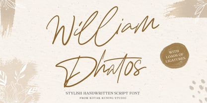 William Dhatos is a handwritten signature script with a natural and stylish flow. This font has a multitude of natural looking ligatures in its OpenType features - making the font look as close to natural handwriting as possible. William Dhatos is perfect for many different projects such as logos and branding, invitation, stationery, wedding designs, social media posts, advertisements, product packaging, product designs, label, photography, watermark, special events and more.
 - Phenotype by URW Type Foundry,
$39.99 The idea about Phenotype was to achieve a unique visual effect by touching serifs. Characters form ligatures, but every combination looks different. Touching serifs form connecting character images, e.g. like logotypes on old refrigerators or oldtimer cars, something like the fonts of Leslie Carbarga. The design idea is based on monospaced and heavy serif fonts like Courier, Isonorm Memphis or Rockwell. However, obviously, Phenotype is not a monospaced typeface.
 - Black Bamboo by Hanoded,
$15.00 Black Bamboo is a beautiful plant. My father in law, who recently passed away, loved it and had a prized specimen growing in his garden. This font was named in his honour. Black Bamboo font is a bold typeface, created using a good brush and quality paint. It is all caps, but upper and lower case differ and can be freely interchanged. Of course, Black Bamboo comes with all diacritics.
 - The Sectarian by UICreative,
$23.00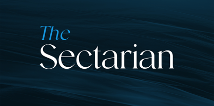 Introducing our new product the name The Sectarian Serif Font comes with 2 different weights. Modern Serif font that beautiful classy, elegant, and modern. This font is perfectly suited for a wide variety of projects, such as signature, stationery, logo, wedding, typography quotes, magazine or book covers, website headers, clothing, branding, packaging design, and more. Also for fashion-related branding or editorial design and displays both masculine and feminine qualities.
 - Ralsteda Script by Ajibatype,
$14.00 Ralsteda is a vintage script font family. Classic and elegant touch. Ralsteda script family consist of 14 fonts with 7 weigths. There are so many variations on each character. Include Opentype stylistic alternates, standard ligatures, discretionary ligatures and multilingual support. You are able to create so many different typographical layouts easily and quickly. This font is suitable for badges, lable, posters, wedding invitation, t-shirts, signage, logos, branding, packaging, etc.
 - Dropkicker by UICreative,
$23.00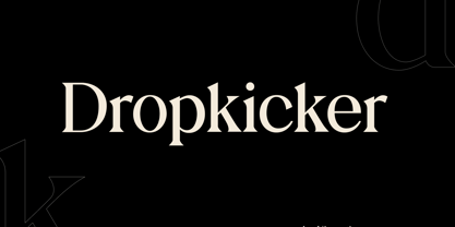 Introducing our new product the name Dropkicker Serif Font Family comes with 9 different weights. Modern Serif font that beautiful classy, elegant, and modern. This font is perfectly suited for a wide variety of projects, such as signature, stationery, logo, wedding, typography quotes, magazine or book covers, website headers, clothing, branding, packaging design, and more. Also for fashion-related branding or editorial design and displays both masculine and feminine qualities.
 - Grandiosity by UICreative,
$23.00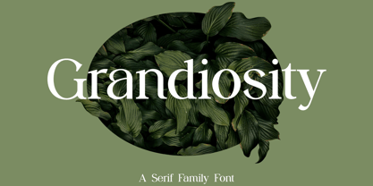 Introducing our new product the name Grandiosity Elegant Serif Font Family comes with 9 different weights. Modern Serif font that beautiful classy, elegant, and modern. This font is perfectly suited for a wide variety of projects, such as signature, stationery, logo, wedding, typography quotes, magazine or book covers, website headers, clothing, branding, packaging design, and more. Also for fashion-related branding or editorial design and displays both masculine and feminine qualities.
 - Nancy Walner by Yukita Creative,
$14.00 Nancy Walner fonts are perfect for high-end design branding, cinematic videos, social media titles and other cutting-edge creations! What sets this typeface apart from the others? This typeface is easy to read yet sophisticated. And even if you already have a few talents, you don't need to go overboard and add others. Just use fonts of different sizes and layouts—and you'll end up with a truly stunning