10,000 search results
(0.065 seconds)
- Black Queen by Gleb Guralnyk,
$14.00 Presenting the vintage style typeface "Black Queen". It includes font files for each decorative element which can be useful for manipulating colors and effects. Black Queen font has multilingual support and several alternative letter glyphs.
 - Amestina by Aqeela Studio,
$20.00 Amestina’s most recent letter styles are ideal for projects that call for a handwritten aesthetic, including wall displays, wedding invitations, social media post logos, commercials, product packaging, product designs, labels, photographs, watermarks, invitations, and stationery.
 - Billstone Signature by Din Studio,
$29.00 Billstone Signature is a modern signature font in relatively thick weight. Its main character relates to the name given which is similar to a signature in the interconnected letters. Besides, there is no prominent thick line differences on the letter. To improve legibility, use this font for bigger-sized texts. Features: Ligatures Stylistic Set Swashes Multilingual Supports PUA Encoded Numerals and Punctuations Billstone signature fits for any design projects, such as posters, banners, logos, book covers, invitations, quotes, headings, printed products, merchandise, social media, etc. Find out more ways to use this font by taking a look at the font preview. Feel free to contact us for further product information or trouble complaints. Thank you and happy designing. Thank you for downloading premium fonts from Din Studio
 - Hiatus by Stephen Rapp,
$59.00 Hiatus bridges the gap between formal scripts used for invitations and more classic settings and casual scripts that exude a warmer tone. Like many formal scripts, Hiatus is fully connecting. Its low body height combined with generous letterspacing adds an elegant profile to lines of text. Like casual scripts, Hiatus has a warm, hand-lettered appearance with great rhythm. Solid in structure; Hiatus also sets well at smaller sizes. Type enthusiasts will enjoy the variety of options. For optimal text flow, both letters and ligatures have alternate versions programmed to come in at the appropriate place for both beginnings and endings as well as in various contextual settings. In addition, there are variations and flourished versions of almost every letter and ligature. Some ligatures have as many as 12 variations. Also included are fractions, a set of old-style numbers, and a set of ornamental flourishes. Hiatus is a unique contemporary script with the strength of a time-tested classic. Please note that this version supports a wider range of languages compared with the lower-priced version available through other channels.
 - Grabnika Unix by DePlictis Types,
$46.00 Grabnika Unix is a unicase style typeface with a straight and a bit tall look and it has a residual influence of monospaced fonts. One of the major characteristics of this typeface are those sharp cuted ears and joints that appears repeating at some of the letters and gives him a distinctive personality and a minimalist design approach on other group of letters that creates an alternative interesting fill of the spaces. It is suitable for signage purpose and headlines or relatively short body texts and also for logo design and branding. It is a loud and fresh display that could give a certain distinctive and young personality to your designs. As a fun fact, the name of this font comes from the romanian word “grabnic” that means “fast” and I developed this font by chance as a custom lettering for a logo design project, so I saw it proper as an alternative in the actual wide font markets and I decide to finishing it as a multilingual support typeface. Enjoy!
 - Filler Variable by CarnokyType,
$80.00 Filler is a display variable font that allows you to flexibly change the width ratio of font characters from extra narrow to extremely wide shapes. The typeface includes complete Latin language support with contrasting drawing of accents and punctuation. The character set includes special symbols, such as a set of emoticons or arrows that support OpenType features. In addition to the variable font, Filler also offers five width styles – Compressed, Condensed, Medium, Extended, Expanded. The font is intended primarily for strong display use in large proportions.
 - Lo-Res by Emigre,
$39.00 The Lo-Res family of fonts is a synthesis of pixelated designs, including Emigre's earlier coarse resolution fonts, as well as bitmap representations of Base 9. It replaces the preexisting Emigre, Emperor, Oakland and Universal families and groups these related bitmap designs under one family name in the font menu, thereby simplifying their naming. The Lo-Res fonts also offer technical improvements, including a more complete character set, more consistent character shapes among styles and weights, as well as improved alignment among the various resolutions.
 - Notre Dame by Linotype,
$29.99 Notre Dame is a part of the 1990 program Type before Gutenberg, which included the work of twelve contemporary font designers and represented styles from across the ages. Linotype offers a package including all these fonts on its web page, www.fonts.de. Notre Dame was designed by Karlgeorg Hoefer, who was inspired by the structure of forms once used mainly for liturgical purposes. Digital techniques made it possible to add Gothic ornaments and borders to the font, perfect for designing anything which should have a late Gothic feel.
 - Adios Script Pro by Sudtipos,
$99.00 Romantic, decorative Adios Script is one of Alejandro Paul’s most elaborate and technically refined faces to date. Inspired by designs in “how-to” commercial lettering guides of the 1940s, it has been refined and brought into the 21st century through a huge variety of ornate swash letterforms. The lowercase “h” alone offers 43 variants. Hundreds of ornamental ascenders and descenders allow a beautiful interplay of strokes and combinations, while avoiding overlaps or conflicts. Adios Script features a mind-boggling 1,470 characters in total, in OpenType format. Adios Script received a Certificate of Excellence from the Type Directors Club.
 - Krellon by Nathatype,
$29.00 Krellon invites you to step back in time and embrace the elegance of the past with its vintage style. Rounded shapes define each character, creating a sense of approachability and friendliness. What makes Krellon so special is its subtle, textured appearance. The font carries a delightful roughness that adds authenticity to your text, as if each letter has endured the test of time. Beautiful ornaments are included as a bonus. Krellon fits in headlines, logos, branding materials, and many more.
 - Wood Fancy Reverse JNL by Jeff Levine,
$29.00 Amongst some pages scanned and posted online of old wood type alphabets comes this lovely, ornamental design in a reversed style of white lettering on black rectangular boxes. This classic set of wood type is now available digitally as Wood Fancy Reverse JNL. There is a narrow blank box on the “less than” key for use as an end cap, and a wider blank box on the “greater than” key to use between words as a blank space if so desired.
 - Million Smiles by Subectype,
$17.00 Introducing our newest font, "Million Smiles", a casual bold script font with hand-letterred style. Million Smiles is an upgraded version of our previous font, "Billion Dreams". In this new version, we've rounded the edges a bit for a softer look, compared to the sharp edges of the old one. This enchanting font is the perfect choice for design projects that aim for a fun, urban, and classy vibe. It adds a touch of cool to your creativity without losing its elegant charm.
 - theLUXX by Resistenza,
$39.00 The Luxx font was born in 2010 and in the 2013 has been redesigned. Luxx is based on a style of lettering often seen on Italian art deco posters and advertising of the 1930s. This font is very modern, and is inspired by the “velocitá-speed” of this artistic period. TheLuxx is perfect for when you want to use eye-catching big texts for anything from posters and retro-advertisements, and art, but it´s especially striking for printed projects.
 - Stilla by Linotype,
$29.99 François Boltana was a French prolific lettering artist during the late 20th Century. He created the Stilla typeface in 1973. Stilla is a cursive “Fat Face”-style design, reminiscent of the first large advertising and display types produced in the wake of the successful Bodoni, Didot, and Walbaum text faces. Because of this pedigree, Stilla is the perfect headline choice for applications that look back to the 19th century. Stilla could also be used for very short headlines or big logos.
 - Spanish Main by FontMesa,
$19.95 Spanish Main is a revival of an old MacKeller Smiths & Jordan font named Sloping Black. Like most foundries MacKeller Smiths & Jordan doesn't display all the letters of the fonts in their specimen books so it took a little more time to find the complete character set for this old beautiful classic font. New in this version is the addition of a Greek character set which is experimental as you normally don't see Old English style fonts include a Greek alphabet.
 - Two Step Nouveau JNL by Jeff Levine,
$29.00 Popular music of the early 1900s included a genre called two step; round dances utilizing a sliding step with a tempo in either march or polka time. 1911's "Daughters of the American Revolution" was one such march/two step. The cover of the sheet music had the title hand lettered in a slightly rounded sans serif type design in the Art Nouveau style popular during that era. It is now available as Two Step Nouveau JNL, in both regular and oblique versions.
 - Norsy by Adam Fathony,
$15.00 Norsy, A Display Typefaces with Variable Weight and Width. Norsy is a modern elegant variable font. Basically this is a Sans with a small touch of serif on every letters. A Simplicity yet very legible with various width and weight that you can explore, combine, create and help you designing something. In a Total of 21 Style Font files or even more if you are using the Single Files Variable, you can slide the weight and width on the sweetest spot of Norsy.
 - Zathira by Gian Studio,
$12.00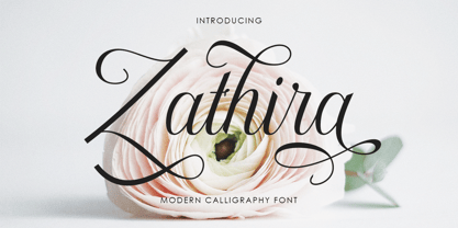 Zathira is a modern calligraphy font. This font is made for those of you who need a touch of elegance and a reflection of modern style in their designs. You can use Zathira for various purposes such as logos, brochures, business cards, wedding invitations, packaging, letterhead, labels, news, posters, and more. Zathira is built with OpenType features and includes initial and final swash, alternative swash characters for most lowercase letters, numbers, punctuation, alternatives, ligatures and also supports some western languages.
 - Quench by Linotype,
$29.99 Quench is a fun and unique typeface from designer Hannes von Döhren. It is unmistakably characterized by its strong contrast of inside and outside forms. The counters are nearly straight and have many right angles. Conversely, the outside curves are smooth and rounded making them soft and almost bubbly. The italics have juicy curves reminiscent of brush lettering. Used together or individually, the four weights and styles can be used for a wide variety of projects including magazines, advertising, logos, and branding.
 - Greenwood by Protimient,
$22.50Greenwood is a monospaced, cursive typewriter script, based on a typewritten letter from a Mr J. G. Greenwood Esq. to a branch of the National Westminster bank in Oxfordshire, Great Britain, dated 6th June 1904. This uncommon style of typeface is suitable for many tasks as it not only has the functionality of a monospaced font but it has a quirky distinctiveness that lends itself especially well to any setting that requires a decorative font that reads surprisingly well in extended text. - Futurism by Artyway,
$19.00 I am pleased to present you an excellent futuristic font "Futurism" in modern graphic style! The font supports the Latin alphabet and Cyrillic alphabet. It is recommended to use it at long intervals between letters, but you can customize it perfectly for your own design, use it to create logos, emblems, posters and posters. Futurism is very stylish, it ideally suited for a space mood, future tech and innovative products! Uppercase and lowercase english letters Uppercase cyr letters Numbers
 - Capellina by Outras Fontes,
$35.00 Capellina is a responsive type family comprised of four styles – two script fonts and two small caps romans – built to work together in typographic compositions intended to catch the eye. The fonts will work in your app as you can see in the presentation above. They can be seen as some kind of lettering machines programed to take advantage of swashes (specially at the beginning and and at the end of text lines) and to avoid stroke collisions. Because of the Contextual Alternates feature, the letters will change while you’re writing. Just use any OpenType-compatible software, keep this feature activated and the font’s algorithm will do the rest. In Capellina Script and Capellina Rough you can also use the stylistic alternates / stylistic sets feature if you want to explore some extra letterforms.
 - Pocketknife by Blank Is The New Black,
$13.00 Pocketknife is a simple grid-based titling font on it’s surface, but it has a surprisingly prolific set of features under the surface. The most notable of these features is an abundant set of ligatures that give Pocketknife it’s unique look. There are very few kerning pairs contained within Pocketwatch, and these ligatures fill in most gaps that could be created by letters with more empty space, such as L and T, and also give a more playful look to an otherwise sharp-edged typeface. Pocketknife also contains with 2 full sets of alternate characters, one pairing with the uppercase set and one pairing with the lowercase—available as OpenType stylistic alternates or individually in the Glyphs panel. Pocketknife Regular is designed to be used on it’s own, while the Inline and Base fonts are designed to be used as a simple layered combination. The Base font is nearly identical to Regular, but contains a few specially adjusted characters that better accommodate the Inline style. Pocketknife Outline is a combination of the Inline/Base styles, to be used individually. Pocketknife is sharp, but playful. Simple, but sophisticated. Sporty, technical, and aggressive, yet elegant and fun. Pocketknife, while simple at first glance, is a deceivingly versatile typeface.
 - Wink by Sudtipos,
$49.00 Wink has been created as the result of exhaustive research, trial and development. It is an OpenType set of fonts which appears in a friendly and fun way, with a new twist on what Joluvian has previously created. Full of personality, with a brave and strong creative line, it is intended to reflect authenticity when being used in all types of media and styles. The ornaments offered in this font work as a graphic resource that expand all the possibilities for Wink users. Although Wink is inspired by traditional calligraphic flourishes, its modern twist makes it elegant and simple at the same time. It’s not completely a brush type but it has been created with the same calligraphy base Joluvian usually works with. Wink also has a caps version with the same style of the script. Both versions could work perfectly, individually or together. As usual, the type has been developed with Ale Paul for Sudtipos, and the collaboration of Macus Romero has been essential to illustrate the style that Wink represents.
 - Basel Neue by Isaco Type,
$30.00 Basel Neue is the complete redesign of BaselSans ITD font, the first typeface of Isaco Type foundry, launched in 2009. As with the predecessor version, Basel Neue is a legible and discrete typeface, a sans serif with thickness variation and humanistic touch. The family consists of 8 styles, 4 weights plus their respective italic versions. Download the “OT Features” pdf to know and take advantage of all font features as best as possible (in OpenType-savvy applications)! You can also view all symbols in the glyph panel of your program, or in Character Map tool (Win) or Character Viewer/Palette (Mac). 1) Basel Neue has ligatures strategically chosen. Herbert S. Zim, in the book “Codes and secret writing”, elected the most common letter pairs of English, that in the Basel Neue became discretionary ligatures. And, of course, it also has standard ligatures. 2) It’s a fun typeface. Basel Neue has a set of emoticons and fun symbols that can be activated by discretionary ligatures. Type “:-)” and a smileface appears. Type “8-)” and a smiley with glasses appears. Type “ ”, “ ” and “ ” and a telephone, star and heart appears. Or “ ”... and a graceful corresponding symbol will appear. 3) Basel Neue contains lots of useful glyphs and features. All versions have 12 recycling symbols, 7 to different types of plastic, and over 30 currency symbols. It also has fractions, old style-, lining-, tabular numbers and other OpenType features. 4) It has an organized and large character set. The fonts have extended character set to support CE, Baltic, Turkish as well as Western European languages. If you work with languages like Catalan, German, Croatian, Romanian, Dutch, Turkish, for example, the font will use the correct ligatures or characters used in these languages. 5) It’s rigorously tested. Basel Neue is available in OpenType PS e TT flavors and each version undergoes a battery of tests, with a systematic review of nodes, curves, spacing and internal data. This eliminates the possibility of errors in the font.
 - Scala Pro by Martin Majoor,
$49.00 The award-winning Scala family (1990-1993) is a worldwide bestseller and has established itself as a ‘classic’ among digital fonts. It was one of the first serious digital text fonts to support small caps, ligatures and different set of numbers. In fact Scala and Scala Sans (1990-1993) are two different typefaces sharing a common form principle: the skeletons of both Scala and Scala Sans are identical. Scala’s dark colour and low contrast works to prevent the thin parts from breaking up. The generous length of Scala italic’s serifs gives it a strong rhythm. The bold weight has the same character widths as the normal weight, so changing a text from normal into bold does not affect the set width. Another part of Scala is very popular among its users: Scala Hands, containing more than one hundred decorative hands and pointers, is a free bonus. Scala Jewels is a set of four highly decorative typefaces, based on the bold capitals of Scala.
 - Auro Rumpthut by Khaiuns,
$10.00 Auro Rumpthut is a modern calligraphy font with contemporary, sophisticated accents. It is perfect for logo, badge, packaging, headline, poster, t-shirt/apparel, greeting card, and wedding invitation. The flowing characters are ideal to make attractive messages Auro Rumpthut includes full set of gorgeous uppercase and lowercase letters, numerals, a large range of punctuation and ligatures. All lowercase letters include beginning and ending swashes, giving realistic hand-lettered style. All uppercase letters include beginning swashes, that makes the font look fabulous! In order to use the beautiful swashes, you need a program that supports OpenType features such as Adobe Illustrator CS, Adobe Photoshop CC, Adobe Indesign and Corel Draw. Photoshop CC and higher have a glyph panel where you can access the swashes & alternates. Select the font and go to Window Glyphs and double-click on the glyph you want to use. For Illustrator choose Type Glyphs or Window Type & Tables Glyphs. Follow my instagram for update khaiuns Thanks and have a wonderful day.
 - Round Squeeze Monogram by MonogramBros,
$12.00 Round Squeeze Monogram Font is a perfect round shaped monogram font consisting of 78 letters and 3 frames. With just a single font file you will be able to create beautiful monograms in just a matter of minutes after the purchase! Round Squeeze Monogram Font comes with font file in .otf format. It features all the modern advanced font features such as contextual alternates, effectively eliminating the need to use multiple separate font files for left, center and right letters.
 - Six Sided Monogram by MonogramBros,
$12.00 Six Sided Monogram Font is a perfect shaped monogram font consisting of 78 letters and 1 basic frame. With just a single font file you will be able to create beautiful monograms in just a matter of minutes after the purchase! Six Sided Monogram Font comes with font file in OTF format. It features all the modern advanced font features such as Contextual Alternates, effectively eliminating the need to use multiple separate font files for left, center and right letters.
 - HT Pizzeria by Dharma Type,
$19.99 Ht Pizzeria is strong looking script for eye-catching part. Holiday Type Project offers retro hand drawing scripts. Inspired by retro script on shopfront lettering, wall paint advertisements in Italy around 1950s. Check out the script fonts from Holiday Type!
 - Muthiara by Abo Daniel,
$17.00 Muthiara is a beautiful script font and perfect for lettering project like cutting vinyl, silhouettes, t-shirt design, mugs, advertisements, book covers, posters, business cards, social media and more. It includes 51 ligatures, support for multiple languages and offers PUA encoding.
 - TT Runs by TypeType,
$39.00 TT Runs useful links: Specimen PDF | Graphic presentation | Customization options TT Runs Version 2.0—an Unusual Wide-Proportioned Sans Serif! An update that expands the font's capabilities. TT Runs is a font designed for the sports industry. Before starting the development, we researched the identities of various Olympic venues and analyzed current sports brands. We put in maximum effort to design a unique yet elegant modern font well-suited for the sports sector. TT Runs has wide and unusual proportions that are different from traditional ones. It is because of the reversed contrast, which refers to the distinction between the upper and lower parts of letters. The uppercase letters have distinctive inverted proportions, particularly noticeable in characters like K, C, S, and R. This design choice gives the font an original personality and makes the letters look stylish and suitable for both athletic and casual sportswear. While updating the font, we kept its distinctive characteristics and preserved the graphical look of the majority of the characters. However, we thoroughly redesigned the outlines and italic font styles and updated the font's technical aspects entirely. As a result, TT Runs has become more convenient to use, and its range of applications has significantly broadened. - More projects and countries! The set of each font style has expanded from 791 to 917 characters. We added new languages and characters of the expanded Latin and Cyrillic writing systems. - Perfect italics! The new italic font styles are flawless from both graphical and technical points of view. The updated variable font. We have united the roman and italic font styles. You can now change the font on the axes of slope and weight, choosing the suitable values. - The new set of OpenType features! We added the updated numerators with currency symbols, numbers in filled circles, and localization features for the Dutch, Catalan, Turkish, Serbian, Bashkir, Chuvash, Bulgarian, and Romanian languages. TT Runs is an expressive font. It looks aesthetically pleasing on both athletic and casual clothing and is well-suited for printing on any material. Due to its proportions, the font is an ideal choice for headings, offering excellent readability and an elegant appearance in bigger blocks of text. Created with the sports industry in mind, this font brings a touch of style to any modern project. FOLLOW US: Instagram | Facebook | Website TT Runs OpenType features: aalt, ccmp, locl, subs, sinf, sups, numr, dnom, frac, ordn, tnum, onum, lnum, pnum, case, dlig, liga, salt, ss01, ss02, ss03, ss04, ss05, ss06, ss07, ss08, ss09, ss10, ss11, ss12, calt. TT Runs language support: English, Albanian, Basque, Catalan, Croatian, Czech, Danish, Dutch, Estonian, Finnish, French, German, Hungarian, Icelandic, Irish, Italian, Latvian, Lithuanian, Luxembourgish, Maltese, Moldavian (lat), Montenegrin (lat), Norwegian, Polish, Portuguese, Romanian, Serbian (lat), Slovak, Slovenian, Spanish, Swedish, Swiss German, Valencian, Azerbaijani, Kazakh (lat), Turkish, Uzbek (lat), Acehnese, Banjar, Betawi, Bislama, Boholano, Cebuano, Chamorro, Fijian, Filipino, Hiri Motu, Ilocano, Indonesian, Javanese, Khasi, Malay, Marshallese, Minangkabau, Nauruan, Nias, Palauan, Rohingya, Salar, Samoan, Sasak, Sundanese, Tagalog, Tahitian, Tetum, Tok Pisin, Tongan, Uyghur, Afar, Asu, Aymara, Bemba, Bena, Chichewa, Chiga, Embu, Gikuyu, Gusii, Jola-Fonyi, Kabuverdianu, Kalenjin, Kamba, Kikuyu, Kinyarwanda, Kirundi, Kongo, Luba-Kasai, Luganda, Luo, Luyia, Machame, Makhuwa-Meetto, Makonde, Malagasy, Mauritian Creole, Meru, Morisyen, Ndebele, Nyankole, Oromo, Rombo, Rundi, Rwa, Samburu, Sango, Sangu, Sena, Seychellois Creole, Shambala, Shona, Soga, Somali, Sotho, Swahili, Swazi, Taita, Teso, Tsonga, Tswana, Vunjo, Wolof, Xhosa, Zulu, Ganda, Maori, Alsatian, Aragonese, Arumanian, Asturian, Belarusian (lat), Bosnian (lat), Breton, Bulgarian (lat), Colognian, Cornish, Corsican, Esperanto, Faroese, Frisian, Friulian, Gaelic, Gagauz (lat), Galician, Interlingua, Judaeo-Spanish, Karaim (lat), Kashubian, Ladin, Leonese, Manx, Occitan, Rheto-Romance, Romansh, Scots, Silesian, Sorbian, Vastese, Volapük, Võro, Walloon, Walser, Welsh, Karakalpak (lat), Kurdish (lat), Talysh (lat), Tsakhur (Azerbaijan), Turkmen (lat), Zaza, Aleut (lat), Cree, Haitian Creole, Hawaiian, Innu-aimun, Lakota, Karachay-Balkar (lat), Karelian, Livvi-Karelian, Ludic, Tatar, Vepsian, Guarani, Nahuatl, Quechua, Russian, Belarusian (cyr), Bosnian (cyr), Bulgarian (cyr), Macedonian, Serbian (cyr), Ukrainian, Gagauz (cyr), Moldavian (cyr), Kazakh (cyr), Kirghiz, Tadzhik, Turkmen (cyr), Uzbek (cyr), Azerbaijan, Lezgian, Abazin, Agul, Archi, Avar, Dargwa, Ingush, Kabardian, Kabardino-Cherkess, Karachay-Balkar (cyr), Khvarshi, Kumyk, Lak, Nogai, Rutul, Tabasaran, Tsakhur, Buryat, Komi-Permyak, Komi-Yazva, Komi-Zyrian, Shor, Siberian Tatar, Tofalar, Touva, Bashkir, Chechen (cyr), Chuvash, Erzya, Kryashen Tatar, Mordvin-moksha, Tatar Volgaic, Uighur, Rusyn, Karaim (cyr), Montenegrin (cyr), Romani (cyr), Dungan, Karakalpak (cyr), Shughni, Mongolian, Adyghe, Kalmyk, Talysh (cyr) .
 - Fendysa by Stringlabs Creative Studio,
$25.00 Fendysa is a script font with beautiful romantic calligraphy style. Whether you’re looking for fonts for calligraphy scripts for DIY projects, Styll Love will turn any creative idea into a true piece of art! This font is PUA encoded which means you can access all of the cute glyphs with ease! It also features a wealth of special features including stylistic alternate glyphs and ligatures.
 - Regalhisa by Stringlabs Creative Studio,
$25.00 Regalhisa is a script Font with modern beautiful calligraphy Style. Whether you’re looking for fonts for calligraphy scripts for DIY projects, Styll Love will turn any creative idea into a true piece of art! This font is PUA encoded which means you can access all of the cute glyphs with ease! It also features a wealth of special features including stylistic alternate glyphs and ligatures.
 - Daenerys Signature by Ferry Ardana Putra,
$14.00 Daenerys is a thin, elegant signature font that is perfect for a wide range of design projects. It has a delicate, calligraphic style with smooth, flowing lines that give it a sense of grace and beauty. The letters have a slight slant, which gives them a hand-written feel, making it suitable for invitations, wedding stationery, and other special occasions. One of the most striking features of this font is the abundance of swashes. These are decorative flourishes that extend from the letters, adding a unique and ornate touch to your designs. The swashes come in a variety of shapes and sizes, and they can be used to add emphasis to specific letters or words. This makes the font perfect for creating elegant, eye-catching titles and headlines. The lowercase letters have a unique and modern touch, The uppercase letters are more formal and elegant, making them great for headlines and titles. Daenerys is a versatile font, it's perfect for branding, packaging, and web design. The thin lines make it easy to read in small sizes and it's also great for overlaying on top of other design elements. Overall, Daenerys is a beautiful and sophisticated font that can add a touch of elegance to any design project. Daenerys features: A full set of uppercase and lowercase Numbers and punctuation Multilingual language support PUA Encoded Characters OpenType Features +274 Total Glyphs +40 Signature Swashes
 - Masonic Lodge by Eclectotype,
$20.00 As part of the day job I had to trace an old hand drawn logo of a Masonic Lodge from a very poor scan. When I finally got to the end of it I had almost a whole alphabet and I really liked the hand drawn uneven quality, so I made up the rest of the letters and set about making it into a font. I roughened up all the edges for an even older look, added a host of OpenType features and hey presto, Masonic Lodge was born. There are two versions of each letter and number which automatically alternate when contextual alternates are set, more alternates for O and o characters, a good amount of interlock style L and T ligatures (uppercase) and a square & compass ornament. Use it for pub signs, secret society meetings, monster movie titles and pub menus.
 - Aphrodite Slim by Typesenses,
$57.00 Aphrodite Slim Pro is not just a lighter version of its sister Aphrodite Pro. Aphrodite Slim Pro has duplicated the quantity of characters of its partner, and that means more than 500 new glyphs, reaching a total of more than 1000. More delicate and meticulous, Aphrodite Slim Pro is once more a new typography with deep calligraphic ideals: We immersed ourselves into the world of each calligraphy ductus and each calligraphy masters by studying from decoration to lettering books. This was the key for the logic of Aphrodite Slim’s behavior. The new concept of Aphrodite Slim Pro was to join diverse styles of calligraphy in one in order to achieve an autonomous expressiveness, in fact, this is what calligraphy aims to, and we agreed to bring those ideals to the world of typography: It is justifiable to be inspired in hundred-year-old calligraphies, but it is even better if the results you obtain have a plus. A personal plus. During the creation process we were wondering whether it was possible to mix certain strokes of such rigid styles as uncial, (Li·n’s favourite style), with strokes of the copperplate, (Sav’s favourite style), and also to take and mix cualities of cancelleresca cursiva, formata and moderna; finally giving our creation a roman-transition italic look. So Aphrodite Slim takes ideals and aspects from those formal styles, following its own logic though, and emphasizing the fact of being a decorative typography. Calligraphy masters of our past are who we are in debt with. They are the cause we have lovely letters now. They have been spontaneous at the moment of creation, what differs from the type-designers of nowadays, whose spontaneity is more limited. Digital faces that we are used to see these days are a result of long hours of optical adjustments, grids, macros and inspirations of other existing typography, but without personal contributions. Aphrodite Slim wants to refute this. Its mission is to rescue de spontaneity of the artesanal lettering in order to obtain unique words; those which only calligraphy masters of our past or lettering artists of our present could give us. We have worked hard to achieve this, making Aphrodite the most universal font we could: It was necessary to study the most common words, focalizing more in the ones referring to “sensitivity”, of four of the most spoken languages in the world. Aphrodite Slim has an enormous quantity of decorative characters and special ligatures for phrases and words in English, French, Spanish and German. (See English, Français, Español, Deutsch PDF in the gallery section). We promise there is no existing type that decorates/ligates glyphs and words like Aphrodite Slim does: It is the first time a font like this really considers its purpose. -The way glyphs are ligated is insane- : Aphrodite Slim rescues some ideals of persons like Jan van den Velde (Italian cancilleresca writing of XVI Century) who understands ascenders and descenders as possibilities to beautify the lines of writing with curved strokes that seem to be dancing above and below of the words. This master also creates ascenders and descenders even where they are not necessary, on letters that do not actually need them: Aphrodite Slim takes this ideal. The font counts with a wide range of glyphs that seem not to be satisfied with its more primitive form and prefer to extreme their parts to be decorative. It also existed masters of calligraphy like José de Casanova of XVII Century, who, with a magnificant skill and a really personal mark, had the particularity of ligating words that were actually separated with spaces. This is another innovative feature in Aphrodite Slim. An investigation of the most common beginnings and endings words of the English language was done. Having that feature activated (discretionary ligatures), common words will start to ligate or to be decorated even when they are separated by spaces. Impossible to forget Francesco Periccioli of XVII Century and our experience us designers to face with works of him: His letters, that today are included in the group of cancellerescas modernas, have been a direct inspiration to the oldstyle figures and historical forms variables in Aphrodite Slim. Giovanni Antonio Tagliente (XVI Century) and his particular way of making tails and diagonals longer than usual, qualities that our creation reflects too. Finally, our adventures in Biblioteca Nacional and Barrio San Telmo, Buenos Aires, were essential for us to make Aphrodite Slim more complete and interesting: Sav did an excellent work when studying how the decorative miscellanea and swirls of early XX century were. She also investigated what particularities made those roman titling characters look antique so she could rescue some ideals for the oldstyle figures and historical forms variables. This also leaded her to create the ornaments variable in Aphrodite Slim. We are really proud of presenting Aphrodite Slim Pro, a typography that was the result of days and nights of working hard, because we do love what we do; and we are glad we are living in a present that gives us the possibility to spread this kind of art, because that is the way we consider our job: Aphrodite Slim Pro is Art. Hope you can appreciate the enormous work this type has. Features. Aphrodite Slim Pro is the most complete variable. It includes more than 1000 glyphs. Thanks to the Open-Type programming, it counts with a easy way to change/alternate glyphs if the application in which the font is used supports this. The variables contained in Aphrodite Slim Pro are also offered separately. Aphrodite Slim Text: It is the variable for lines and paragraphs. Thus it is the least ornamental and the most accurate to achieve a satisfying legibility. It has the Standard Ligatures feature in order to improve the possible conflicts some glyphs could have by others. Aphrodite Slim Contextual: It is the one that makes emphasis in decorating. It has the particularity of ligating/decorating words of common use in English, French, Spanish and German. It also has the quality of ligating common beginnings and endings of the common words in English. Aphrodite Slim Stylistic: With similar features of Slim Contextual. It includes a set of decorative numbers for a display use. Aphrodite Slim Swash: This one has special beginnings and endings to decorate words. Aphrodite Slim Endings: It makes words look as a signature. Aphrodite Slim Historical: It adds an antique look to the written word. It also has the special historical ligature function. Aphrodite Slim Titling: This one is the most decorative. Its copperplate inspired ornaments give words a special color, in order to handle the quantity of decoration, it comes with the standard ligature feature, which has the most common ligatures plus others that make decorative swirls not to be conflictive. Aphrodite Slim Ornaments: A set of 52 ornaments. Aphrodite Slim Pro includes all this features plus the Stylistic Set 1; Stylistic Set 2 and the possibility of Slashed Zero. We recommend you to check out the gallery in order to see all these features in action.
 - Vito by Dots&Stripes Type,
$70.00 Vito is a strong and elegant sans serif family in 60 styles. A wide range of weights and widths offering tremendous typographic flexibility. Perfect to mix in magazines or packaging, corporate designs or movie titles. Masculine and sporty for adrenaline junkies, reliable and elegant for serious typographers, but with a touch of bling for high snobiety. Vito was selected as one of Typographica’s favorite typefaces of 2015. The Vito Family sets its goal to stay very functional but with a strong and unique look. Neutrality is good, but sometimes you need a bit more edge. The extreme weights and widths work great in title sizes, while the normal weights make longer texts deliciously readable. The classic and elegant outlook in all sizes make the family suitable for everything high quality. While the family looks great on the outside, it is even greater on the inside. Loads of OpenType-Features, a big amount of language support, and the flexibility of alternative letters, make working with Vito easy and exciting. And the big range of widths invite you to mix all together, and find new ways to express your designs. We would love to see, what you come up with!
 - Vaquero by Scriptorium,
$24.00Vaquero is a Wild West style font. It is characteristic of a lot of western era signage, with super-narrow characters and unusual decorative spurs and serifs. There are some similarities in Vaquero to some of our other western fonts. It sort of ties together the historic tradition of western era type and the more fanciful tradition of romantic type derived from the era of the wild west. It has the width, height and general letter shapes of Academy, but the decorative elements are similar to more fanciful fonts like Riudoso. The result is very evocative of the old west. - Gineso by insigne,
$- Michaelangelo. da Vinci. Bellini. Rafael. Masters of Italian art whose names have dwarfed those of many other great Italian artists. Yet relics from these other artists remain, though often unnoticed because of their practical nature. These unknowns are the Italian Masters of vernacular sign painting, and insigne now gives a nod to their work with its new sans serif, Gineso. Based on its inspiration, Gineso was created for posters, headlines and logotypes. (It does well in apps, too, though the sign painters probably weren’t thinking about that at the time.) Aesthetically remedied, yet still with an uncut charm, Gineso’s condensed qualities make it especially nice for signs and titling where horizontal space is at a premium. The tight, narrow forms of its geometric design leave you with a robust flavor that will remind you of mamma’s spaghetti. But don’t worry; the font’s ample counters ensure your audience won’t be reading through a bowl of pasta. These condensed forms look great on their own or when their seven different weights and matching italics are utilized together. With the included OpenType features, fractions and superior/inferior positions are also available to broaden your palette. Even more, this font is ready for complex, professional typography with OpenType features like alternate letters and a large character set including Central and Eastern European Languages. So when you find yourself (or your project) in a tight space, stir in Gineso to get the right taste for your copy. It may just make all the difference.