10,000 search results
(0.081 seconds)
- DM Unarmed by DM Founts,
$12.50 Unarmed began life as a series of rectangles in Fireworks. The task was designing my own business card for the first time in years, and the perfect lettering couldn't be found in either free or commercial fonts. While there were some good choices, none of them really communicated who I was. Initially only the lowercase letters in my name were created, with each being designed around a 7 x 4 grid of squares. I liked the result so much that I wanted to use the same typeface in different projects - and to save time in future, I decided to create this font. In creating DM Unarmed, the intention was to avoid diagonal lines, and to keep all the lines horizontal, vertical and grid-like. This made creating some of the characters - particularly the rounded ones and the letters X and Z - challenging. Coming from both worlds, I wanted to achieve a blend of technicality and creativeness, without trying to pretend one was the other. For best results this font should be used for large and prominent text, although it works at smaller sizes up to 12pt. I've spent a lot of time trying to hint a few characters that wouldn't play ball, such as 2, 7 and 8. In case you're wondering: DM Unarmed got its name from my philosophy of facing challenges without reliance on tools and weapons.
 - Planet Express by Estudio Calderon,
$29.99 Family type designed by Felipe Calderón. This type is a display with a modern style and a different and innovative concept. The development of this type was a challenge because it was set out from the begining as a script font with ornaments and complements, where the round shapes do not have prominence in the result. Planet Express is an interesting job from the aesthetic point of view, it works for big scale texts and contains little shadow-cuts in each character to give it more personality and stand out among other fonts from this gender. I hope this new project works to solve issues in design. Planet Express is composed of Regular & Italics, it has 250 intelligent ligatures to produce the best signs in big scale, it is perfect for branding and works very well with the geometric complements. It is designed with programming in opentype: Ligatures, Discretionary ligatures, Stylistic Alternates, Stylistic set 01, Stylistic set 02, Stylistic set 03, Stylistic set 04, Stylistic set 05, Stylistic set 06, Stylistic set 07, Stylistic set 08 & Stylistic set 09, multiple language support and a complete set of extras like arrows, catchwords, flags, emblems, hands, fleurons & crossed elements. Planet Express can be used in different ways, each character pretends to cover the needs in any circumstance where it is used. It is funny to write words and play with the complements. It also works with current concepts in graphic design like sports, cars, hip hop, music, social network, skateboarding and more. Everybody can use this font, it works with different languages like italian, french, portuguese, danish, german and so forth. See specimen and samples here. Enjoy it!
 - Howlett by Greater Albion Typefounders,
$22.95 Howlett combines great character with extreme legibility. It's a simple display face that offers a sense of coziness and order, that speaks of all being well with the world. It is a modern design which pays due Acknowledgment to the past. An extensive range of Opentype features, including old-style numerals, terminal forms, ligatures and stylistic alternatives are included. Use it for headings and titles as well as eye catching poster work.
 - Michael Sheikh by Silverdav,
$18.00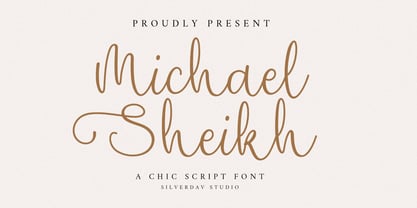 Introducing the “Michael Sheikh” font, a playful and unique handwriting typeface designed to infuse your projects with a touch of whimsy and character. This font offers a delightful collection of alternate characters, providing you with endless creative possibilities. With “Michael Sheikh,” you can effortlessly add and charming touch to your designs. Its handcrafted style lends authenticity and warmth, making it perfect for a wide range of applications, from invitations to branding and beyond.
 - Brattons by Lone Army,
$17.00 Brattons, a newly crafted font, embodies an essence of elegance and sophistication. Its graceful curves and delicate strokes exude a distinctly feminine allure, capturing the essence of luxury and style. This serif font boasts stylistic alternates and ligatures that elevate its visual appeal, offering a unique and refined touch to any design project. Brattons is a testament to its meticulous craftsmanship, designed to resonate with those seeking a blend of timeless charm and contemporary finesse.
 - Molard Two by Putracetol,
$20.00 Molard - Modern Various Font. This sans-serif typeface offers a diverse range of styles, featuring two distinct weights and versions – clean and textured. With a selection of three texture levels, Molard presents a total of eight fonts in its collection. Its contemporary and robust aesthetic adds an assertive touch to your projects. Perfectly suited for logo creation, branding, labels, quotes, printing, magazines, posters, film titles, and more, Molard empowers your creativity to flourish.
 - Brother Garage by Edignwn Type,
$18.00 Introducing Brother Garage, the ultimate vintage motorcycle-inspired font collection designed to bring the spirit of the garage to your designs. This combines the best of stencil serif and sans serif fonts. With three unique styles - regular, rough, and stamp - Brother Garage offers authenticity, allowing you to effortlessly bring your designs with the rustic and classic looks. But that's not all! Alongside the Brother Garage fonts, you'll receive a fantastic bonus of 13 crafted illustrations.
 - Gandy Dancer NF by Nick's Fonts,
$10.00The 1912 American Specimen Book of Type Styles from ATF featured a quaint little offering called "Tabard", whose antique charm was enhanced by several rather quirky alternate characters. This version tosses out the standard characters and keeps the quirks in the works: the result is warm, engaging, slightly mischievous and a whole lot of fun. The Opentype version of this font supports Unicode 1250 (Central European) languages, as well as Unicode 1252 (Latin) languages. - Elly Sandeo Cyrillic by Ira Dvilyuk,
$21.00 The Elly Sandeo Cyrillic font is a handwritten calligraphic wedding script font with. It is the font pair with will be the best option for branding, logos, wedding invitations, social media, packaging, business cards, DIY projects, social media, and many others. Elly Sandeo Latin part contains a full set of uppercase and lowercase letters. Also, lowercase letters have 6 sets of variable flourishes with teils. To make a needed form type a letter with a number such as a1, a2, a3, a4... b1, b2, b3... c1, c2, c3...after that select the word and apply the Open Type Features in programs such as Adobe Illustrator, Photoshop, and others And 17 ligatures can be used to create a handwritten calligraphy look. The Cyrillic part of the font contains uppercase letters and 2 complete sets of lowercase letters, (standard, and final form. To make a needed form type a letter with a number such as a1, a2, a3, a4... б1, б2, б3... в1, в2, в3... After that select the word and apply the Open Type Features in programmes such as Adobe Illustrator, Photoshop, and others) The Elly Sandeo Symbols is a font with 26 hand-drawn elements and swashes that can help you to make your design unique and matchless. just use A-Z and a-z keys in the included Symbols font. A different symbol is assigned to each uppercase or lowercase standard character, so you do not need graphics software, just type the letter you need. Multilingual Support for 33 languages: Latin glyphs for Afrikaans, Albanian, Basque, Bosnian, Catalan, Danish, Dutch, English, Estonian, Faroese, Filipino, Finnish, French, Galician, Indonesian, Irish, Italian, Malay, Norwegian Bokmål, Portuguese, Slovenian, Spanish, Swahili, Swedish, Turkish, Welsh, Zulu. And Cyrillic glyphs support Russian, Belorussian, Bulgarian, Ukrainian, and Kazakh languages.
 - Avendica by Mokatype Studio,
$24.00 Avendica is an experimental typeface inspired by Celtic Roman font. It’s developed with a modern serif style design so it looks elegant and luxurious. This font is only used in Uppercase form with some different styles between the uppercase and the lowercase. This font is suitable for short-text designs like headlines, logos, brands, and more. Works on PC & Mac, simple installations, accessible in Adobe Illustrator, Adobe Photoshop, Adobe InDesign, and even works on Microsoft Word. PUA Encoded Characters - Fully accessible without additional design software. Fonts include multilingual support Image used: All photographs/pictures/vectors used in the preview are not included, they are intended for illustration only. Thank You
 - Fernolester by Maculinc,
$10.00 Fernolester is a classic themed font with a unique edge and above all; packed with different styles and ligatures - making it easy to create unique characteristics for your project. This typeface has a classic taste, very suitable as a design choice for books, magazines, packaging, branding, signage and many other creative projects. To activate the OpenType Stylistic alternative, you need a program that supports OpenType features such as Adobe Illustrator CS, Adobe Photoshop, Adobe Indesign & CorelDraw X6-X7. and much more This package includes 4 files; Fernolester Regular, Fernolester Italic, Fernolester Regular In Style & Fernolester Italic Instyle as OTF & TTF. Mail support : maculinc@gmail.com Thank you! Maculinc
 - Boyscotte by Trim Studio,
$13.99 Boyscotte Handwritting font, a elegant mix beauty and masculine font, its crafted to deliver the simple style it self, and brings mature on design style, Boyscotte also have 3 different weight, so you can easily combine and adjust the design theme with it Its perfectly suited for crafter and graphic artist to complete their design such as invitation, advertisement, poster, logo, birthday, product sign, magazine, book, and many more! even so contains All Standard glyphs and punctuations --- File Include: - Boyscotte Regular - Boyscotte Medium - Boyscotte Bold Thank you for let us be your design partner, If you have any questions please don't hesitate to drop me a message
 - Hasta La Pasta NF by Nick's Fonts,
$10.00This loopy offering is patterned after a typeface from the 1888 specimen book from the Central Type Foundry of St. Louis, called simply "Spiral". The ragged contours on the original face have been smoothed out, but it still is an attention-getter. Both versions of this font include the complete Unicode Latin 1252 and Central European 1250 character sets. - Stalker by Canada Type,
$24.95 Stalker is one of those necessary fonts in a designer's toolbox: Grungy sans serif caps that are most useful for entertainment project chores. Originally made in the summer of 2003 for set and prop design of an Alliance film, Stalker is now available in retail form for those who are particular about their entertainment design or those who use broken letters in their design as means of social commentary or statement on style.
 - Fashionable JNL by Jeff Levine,
$29.00 For years, the print ads for the Hickok Jewelry Company [renowned for their line of men's belts, suspenders, wallets, cufflinks, etc.] featured its name and related main line ad copy hand-lettered in a condensed monoline with Art Deco styling. This has been reproduced in Fashionable JNL, available in both regular and oblique versions. For those of you who are wondering: yes, the founder of the company was a distant relative of "Wild Bill" Hickok.
 - Metropole by Greater Albion Typefounders,
$12.00 Metropole is an exercise in combing the curvaceous lines of the Art Nouveau with the solid character and simplicity of Art Deco. The resulting three display faces combine the spirit of the 20s and of the thirties, creating lively fun display faces for headings, signage and banners. These characterful faces with clear simple outlines are also ideal to lend a distinctive air to your web pages, or to create a distinctive 'house-style' for lettering.
 - Hamburger Font BF by Bomparte's Fonts,
$40.00 Hamburger Font BF is an endearing tribute to the lettering style of a logo, long retired, from a certain chain of fast food restaurants. It joins that fraternity of heavy, fat, round, and pleasingly-plump faces such as Cooper Black and Frankfurter; and it serves as a delightful alternative to such. It's suitable for a wide variety of uses from children’s media projects, to headlines where a cool, informal appearance is desired.
 - Autumn Song JNL by Jeff Levine,
$29.00 The cover of the sheet music for the 1931 song "When the Autumn Leaves of Life Begin to Fall" has the song's title hand lettered in a thin monoline Art Deco Style. The song itself was co-written by Buddy G. De Sylva, who would go on to be one of the founders of Capitol Records. Now digitally re-drawn as Autumn Song JNL, the font is available in both regular and oblique versions.
 - Buffet Script by Sudtipos,
$99.00 Buffet Script is based on fantastic calligraphy by Alf Becker, arguably the greatest American sign lettering artist of all time. The Alf Becker series of nameless alphabets published by Sign of the Times magazine in 1941 has attracted letter digitizers for a few years now, so it’s really a wonder that a few of those alphabets are still in the non-digital realm. It is understandable, though, that the basis for Buffet Script was not digitally attempted until now. The page presenting this alphabet shows a jungle of letters running into each others and swashes intertwining. The massive amount of work involved in digitizing such lettering, where scanning is nowhere near being an option, is quite obvious at a mere glance. If anyone was going to commit this particular alphabet to a digital form, it would have to be redrawn stroke by stroke and curve by curve on the computer. And don't we love a challenge! But seriously, the challenge was not the main attraction. In a way, the Becker approach to lettering is so far from digital that the imagination is almost forced to work out possibilities and letter combinations to solve problems presented by the scant showings in that magazine. After a few imaginative visualizations, the digital potential becomes clear in the mind, and the eye and hand follow. The result with Whomp (another Alf Becker-inspired work) was an enormous font with a lot of alternates and ligatures. With Buffet Script the imaginative process was no different, but the result particularly shines here, because this is some of the most fascinating flowing calligraphy ever seen. Calligraphy is where the accountability of all the little extra touches, such as alternates and swashes and ligatures, is raised to a higher level than in most other type categories. Buffet Script’s OpenType programming contains discretionary ligatures, stylistic and contextual alternates, interacting with each other to allow the composition of just the right word or sentence. This font is best used where lush elegance is one of the design’s requirements.
 - Temeraire by TypeTogether,
$49.00 Quentin Schmerber’s Temeraire serif font family was not designed to be invisible. It is a typographic exploration meant to be seen — with its beauty, one could even say beheld. While some fonts aim to be as easily ignored as possible, Temeraire is offered as a gift to wide-eyed readers with its anything-but-boring character and its conspicuous inconsistency in styles. Most type families increase the weight of each character to expand the family. Instead, research into 17th century sources produced Temeraire’s wide range of letterforms, from the predictable to the odd and loosely related through time. Each style is designed to work alongside the others but are also standalone homages to specific parts of English lettering tradition: gravestone cutting, writing masters’ copperplates, Italiennes, and others. Temeraire’s Regular style is a contrast-loving Transitional Serif with vertical stress, making it great for period and classic works, ironic pieces, and modern throwbacks. The weight of the Bold squares off the ends of each glyph to give it stability, and the italic style rings true: flowing, contrasting, and purposefully inconsistent. Temeraire’s Display Black style is one salvaged from expressive gravestone artistry. The details most easily noticed are the ‘g’ with its descending bowl that has been pressed back up in the centre, and the additional serif on the ‘t’ crossbar that holds its neighbouring character at bay. (The ‘g’ and ‘Q’ have loopless alternates.) The final style is the Italienne, the horizontally stressed counterpoint to the family. By design its characters flow and bend in ways not in step with the rest of the family. All the weight has been pushed to either hemisphere within each glyph, resulting in a display style that demands space and peacefulness around it so its presence can impress. As with all TypeTogether families, Temeraire meets the current designer’s needs. Not only does its five styles shine in print work, it includes alternates for when the defaults are too boisterous and has been expertly crafted for screens. The Temeraire serif font family is resurrected from echoes in time and finds its family relation through impeccable taste.
 - Evita by ITC,
$29.99Gérard Mariscalchi is a self-made designer. Born in Southern France of a Spanish mother and an Italian father, he has worked as a mechanic, salesman, pilot, college teacher – even a poet (with poetry being the worst-paying of these professions, he reports.) “Throughout all this, the backbone of my career has always been design,” Mariscalchi says. “I’ve been drawing since I was five, but it wasn’t until I was twenty-four that I learned that my hobby could also help me earn a living.” It was about this same time that Mariscalchi fell in love with type. He studied the designs of masters like Excoffon, Usherwood and Frutiger, as well as the work of calligraphers and type designers such as Plantin, Cochin and Dürer. With such an eclectic background, it’s no surprise that Mariscalchi’s typeface designs are inspired by many sources. Baylac and Evita reflect the style of the art nouveau and art deco periods, while Marnie was created as an homage to the great Lithuanian calligrapher Villu Toots. However, the touch of French elegance and distinction Mariscalchi brings to his work is all his own. Baylac Who says thirteen is an unlucky number? Three capitals and ten lowercase letters from a poster by L. Baylac, a relatively obscure Art Nouveau designer, served as the foundation for this typeface. The finished design has lush curves that give the face drama without diminishing its versatility. On the practical side, Baylac’s condensed proportions make it perfect for those situations where there’s a lot to say and not much room in which to say it Evita Mariscalchi based the design of Evita on hand lettering he found in a restaurant menu, and considers this typeface one of his most difficult design challenges. “The main problem was to render the big weight difference between the thin and the thick strokes without creating printing problems at small point sizes,” he says. Unlike most scripts, Evita is upright, with the design characteristics of a serif typeface. Mariscalchi named the face for a close friend. The end result is a charming design that is light, airy, and slightly sassy. Marnie Based on Art Nouveau calligraphic lettering, Marnie is elegant, inviting, and absolutely charming. Mariscalchi paid special attention to letter shapes and proportions to guarantee high levels of character legibility. He also kept weight transition in character strokes to modest levels, enabling the face to be used at relatively small sizes – an unusual asset for a formal script. Marnie’s capital letters are expansive designs with flowing swash strokes that wrap affectionately around adjoining lowercase letters. The design easily captures the spontaneous qualities of hand-rendered brush lettering. - Baylac by ITC,
$29.99Gérard Mariscalchi is a self-made designer. Born in Southern France of a Spanish mother and an Italian father, he has worked as a mechanic, salesman, pilot, college teacher – even a poet (with poetry being the worst-paying of these professions, he reports.) “Throughout all this, the backbone of my career has always been design,” Mariscalchi says. “I’ve been drawing since I was five, but it wasn’t until I was twenty-four that I learned that my hobby could also help me earn a living.” It was about this same time that Mariscalchi fell in love with type. He studied the designs of masters like Excoffon, Usherwood and Frutiger, as well as the work of calligraphers and type designers such as Plantin, Cochin and Dürer. With such an eclectic background, it’s no surprise that Mariscalchi’s typeface designs are inspired by many sources. Baylac and Evita reflect the style of the art nouveau and art deco periods, while Marnie was created as an homage to the great Lithuanian calligrapher Villu Toots. However, the touch of French elegance and distinction Mariscalchi brings to his work is all his own. Baylac Who says thirteen is an unlucky number? Three capitals and ten lowercase letters from a poster by L. Baylac, a relatively obscure Art Nouveau designer, served as the foundation for this typeface. The finished design has lush curves that give the face drama without diminishing its versatility. On the practical side, Baylac’s condensed proportions make it perfect for those situations where there’s a lot to say and not much room in which to say it Evita Mariscalchi based the design of Evita on hand lettering he found in a restaurant menu, and considers this typeface one of his most difficult design challenges. “The main problem was to render the big weight difference between the thin and the thick strokes without creating printing problems at small point sizes,” he says. Unlike most scripts, Evita is upright, with the design characteristics of a serif typeface. Mariscalchi named the face for a close friend. The end result is a charming design that is light, airy, and slightly sassy. Marnie Based on Art Nouveau calligraphic lettering, Marnie is elegant, inviting, and absolutely charming. Mariscalchi paid special attention to letter shapes and proportions to guarantee high levels of character legibility. He also kept weight transition in character strokes to modest levels, enabling the face to be used at relatively small sizes – an unusual asset for a formal script. Marnie’s capital letters are expansive designs with flowing swash strokes that wrap affectionately around adjoining lowercase letters. The design easily captures the spontaneous qualities of hand-rendered brush lettering. - Marnie by ITC,
$29.99Gérard Mariscalchi is a self-made designer. Born in Southern France of a Spanish mother and an Italian father, he has worked as a mechanic, salesman, pilot, college teacher – even a poet (with poetry being the worst-paying of these professions, he reports.) “Throughout all this, the backbone of my career has always been design,” Mariscalchi says. “I’ve been drawing since I was five, but it wasn’t until I was twenty-four that I learned that my hobby could also help me earn a living.” It was about this same time that Mariscalchi fell in love with type. He studied the designs of masters like Excoffon, Usherwood and Frutiger, as well as the work of calligraphers and type designers such as Plantin, Cochin and Dürer. With such an eclectic background, it’s no surprise that Mariscalchi’s typeface designs are inspired by many sources. Baylac and Evita reflect the style of the art nouveau and art deco periods, while Marnie was created as an homage to the great Lithuanian calligrapher Villu Toots. However, the touch of French elegance and distinction Mariscalchi brings to his work is all his own. Baylac Who says thirteen is an unlucky number? Three capitals and ten lowercase letters from a poster by L. Baylac, a relatively obscure Art Nouveau designer, served as the foundation for this typeface. The finished design has lush curves that give the face drama without diminishing its versatility. On the practical side, Baylac’s condensed proportions make it perfect for those situations where there’s a lot to say and not much room in which to say it Evita Mariscalchi based the design of Evita on hand lettering he found in a restaurant menu, and considers this typeface one of his most difficult design challenges. “The main problem was to render the big weight difference between the thin and the thick strokes without creating printing problems at small point sizes,” he says. Unlike most scripts, Evita is upright, with the design characteristics of a serif typeface. Mariscalchi named the face for a close friend. The end result is a charming design that is light, airy, and slightly sassy. Marnie Based on Art Nouveau calligraphic lettering, Marnie is elegant, inviting, and absolutely charming. Mariscalchi paid special attention to letter shapes and proportions to guarantee high levels of character legibility. He also kept weight transition in character strokes to modest levels, enabling the face to be used at relatively small sizes – an unusual asset for a formal script. Marnie’s capital letters are expansive designs with flowing swash strokes that wrap affectionately around adjoining lowercase letters. The design easily captures the spontaneous qualities of hand-rendered brush lettering. - Merrivale by Greater Albion Typefounders,
$16.50 Merrivale is an ideal example of the benefits of keeping ones eyes open- it was inspired by the gilt-finished raised lettering on a late Victorian shopsign in Melbourne, Australia. The family of seven faces include upper and lower case forms, small capitals, all capital forms, and flamboyant display forms. Extensive Opentype features are incorporated. All faces are offered in incised forms inspired by the original lettering as well as in solid black filled forms. Thsee typefaces are wonderful for signage where either a period air or a dignified but legible feel are required. They also lend themselves to other display uses such as posters, book covers and so forth and are ideal for the title lines of certificates.
 - Victorian Supremacy by Burntilldead,
$14.00 With over a year of design and development, Victorian Supremacy is ready to help you and your clients make a statement by adding elegance and unique flair to your next design project. Victorian Supremacy inspired by letterheads from the late 1800's and early 1900's. Set includes four major styles and layered version (gradient, outline & extrude). Victorian Supremacy offers an expansive set of options, making it the perfect choice for books, magazines, packaging, branding and signage. From period style and Victorian to modern and elegant, Victorian Supremacy is strong and stately, yet elegant and decorous.
 - RSVP Brush by Outside the Line,
$19.00 RSVP Brush is a fresh, bold, confident brush font. The bigger the better... great for posters, signs, a headline or a small block of copy. Versatile and quirky. Turn on Contextual Alternates in supporting programs so multiple letters do not repeat. Big. Bold. Brush.
 - Bardi by URW Type Foundry,
$39.99 Tilp Barde is a striking, moderately dynamic design suitable for many different typographic tasks. Its individual ductus is inspired by handwriting, however without calligraphic embellishment. There are no serifs but tiny endings which lead to think of wood-carving.
 - Innuendo by Hanoded,
$15.00 Innuendo, despite its name, is a straightforward font. It is an all caps, hand-drawn typeface with an elegant look and some cheeky curls. Upper and lower case differ and like to mingle. Comes with a bagful of diacritics.
 - MartiniThai Neue Slab V2 by Deltatype,
$39.00 Award winning 2017 font from Demark (Thailand) and G-Mark (Japan) in Graphic Design, MartiniThai Neue Slab is now available with better taste. Deltatype created a better version of MartiniThai Neue Slab V2: refined for better outline, we fine-tuned all outlines for better letterforms. Proportion were adjusted for better consistent. Metrics got new values for increased readability. Kerning, fine-tuned kerning pair for better spacing between the letters. MartiniThai Neue Slab V2 comes in six weights: Thin, Light, Regular, Bold, Extra Bold, Black. Thai Language is included in this package. MartiniThai Neue Slab is a unique slab serif in Thai Script that creates a sense of timeless and contemporary feel and is used by a media provider and nationwide in Thailand.
 - Yngreena by Ingrimayne Type,
$12.95 Yngreena is a serifed typeface with calligraphic origins. In updating it in 2011, I began to add alternative letters and reached the point where it made sense to create an alternative family of faces rather than include all the alternatives as part of an OpenType font. The letters K, R, V, W, Y, f, g, k, t, v, and w are tamer in Yngreena Alt. As a result, though it is still a decorative text face, Yngreena Alt is better suited for lengthier blocks of text than is the original Yngreena face.
 - Belinsky Text by Tabular Type Foundry,
$32.99 Belinsky is a monospace sans serif typeface inspired by early 20th century geometric sans serifs, architectural letterings, and retro video games to some extent. Its exaggerated proportions and sharp details appear less harsh thanks to the corner rounding. It is comprised of a standard and text families, and the latter is especially suited for small text and programming, with wider spacing and more centralised gravity of certain letters like E. It still gives your codes a lot of personality. The typeface name is a reference to the designer�s favourite animated film, American Pop.
 - Belinsky by Tabular Type Foundry,
$32.99 Belinsky is a monospace sans serif typeface inspired by early 20th century geometric sans serifs, architectural letterings, and retro video games to some extent. Its exaggerated proportions and sharp details appear less harsh thanks to the corner rounding. It is comprised of a standard and text families, and the latter is especially suited for small text and programming, with wider spacing and more centralised gravity of certain letters like E. It still gives your codes a lot of personality. The typeface name is a reference to the designer�s favourite animated film, American Pop.
 - Gabriela by Latinotype Mexico,
$29.00 The Gabriela project is of great importance to us since it is the first font published by Latinotype México which is our brand-new sister foundry in Mexico. Gabriela, yet more versatile, shares all of its DNA with Gabriela Stencil. The font is an excellent choice for short and medium-length text. Gabriela is a Didone typeface well-suited to classy branding and editorial designs. Its alternate version includes swashes and more than 300 glyphs and 75 ligatures, allowing for more stylized designs. It may look different from its "regular" counterpart, but the essence of both is the same. Gabriela comes in 9 styles, ranging from Thin to Black, and includes matching true italics. Each font weight has an average of 750 characters which support more than 200 Latin-based languages.
 - Stay Retro by Din Studio,
$25.00 Have you been looking for a script font with touch of retro style? Do you dream of creating headings that stand out and inspire creativity, imagination, and endless fun? Then we’ve got just the font for you! Introducing Stay Retro-A Script Font This bubble script font can be used for a host of different content needs and projects. An excellent choice to add the right amount of street vibe and playfulness. Create gorgeous printed quotes, standout packaging, or beautiful t-shirts! You can even use it to create amazing headings, logos, menus, and social media graphics. Stay Retro includes multilingual options to make your branding reach a global audience. Features: Standard Ligatures Stylistic Sets Swashes Multilingual Support PUA Encoded Numerals and Punctuation Thank you for downloading premium fonts from Din Studio
 - Jinkay Faux by Twinletter,
$15.00 We’ve created Jinkay, a display typeface with a Japanese style that’s similar to original. Don’t be afraid to use this font in all of your special projects right now; imagine how beautiful and appealing your design will be; your project will instantly captivate all of your audience at first glance; they will easily remember the appearance of your project if you use this font, because it will be unique, different, and stand out from the crowd. Logotypes, food banners, branding, brochure, posters, movie titles, book titles, quotes, and more may all benefit from this font. Of course, using this font in your various design projects will make them excellent and outstanding; many viewers are drawn to the striking and unusual graphic display. Start utilizing this typeface in your projects to make them stand out.
 - Monotype Sabon by Monotype,
$34.99Sabon was designed by Jan Tschichold and released in 1967. Sabon was created in response to the specific needs of a group of German printers who wanted a typeface that would be identical in form when produced by three different metal-casting technologies. Named after Jacques Sabon, a sixteenth century typefounder whose widow married another typefounder, Konrad Berner, who is credited with issuing the first typefounder's specimen sheet. Several types on the sheet were attributed to Claude Garamond, and one of these served Tschichold as the source for Sabon roman. The italic was based on another face on Berner's sheet, cut by Robert Granjon. Tschichold's skillful adaptation of these old style faces has produced an elegant and workmanlike book face. The Sabon font family is a popular choice for setting text. - Magari by Sudtipos,
$49.00 Partially inspired by the mid XIX century german condensed serif typefaces –and a clear connection to Italian classics– Magari extrapolates that idea of fusion to a new level, getting a unique variable font file, or 9 specific weights. With that in hand the user is able to find the perfect match for any design. From an ultra compressed thin to an extended black style, Magari is a perfect font for display use. It’s jazzy vibes and wide range of weights make it incredibly perform in advertising, packaging or editorial design, assuring great impact whether it’s thin and tall, or big and bold. The addition of three kinds of endings for the lowercase –from a serif to two tailed strokes– and two different swash sets for the capitals, Magari lets the user play with infinite results.
 - FastFingers by ParaType,
$25.00A set of signs designed by Andrey Belonogov. It includes representation of gestures used by left- and right-handed people in different countries to enhance the power of speaking. The typeface (under the name Handmade) was awarded a diploma at the ATypI International Type Design Contest “Bukva:raz!”, 2001. Released by ParaType in 2008. - Guadalupe by Latinotype,
$45.00 Guadalupe –from the family of classic Didots– is a high performance font with a great set of alternates & swashes and carefully refined details. Especially suited for fashion magazines, logotypes and luxury contexts with a range of two different terminal versions; “Regular” –a classic roman typeface– and “Gota”, much more expressive for word setting.
 - Ashtanga by Hanoded,
$15.00 Ashtanga was named after a type of yoga. In Sanskrit it means "eight-limbed", which I find quite appropriate, give the amount of swirls and curls. The font is 'all-caps', but the upper and lower case glyphs differ completely. They are, of course, fully interchangeable. Ashtanga comes with multi language support.