10,000 search results
(0.051 seconds)
- Typnic by Corradine Fonts,
$19.95 Everybody likes to have a picnic: some fresh fruits, cheese, ham, wine and so on. Like a “typographic picnic,” Typnic font system gathers many fonts with different flavors too, and you can enjoy them mixed or on their own. Typnic was drawn and calligraphed by hand and is made with eighteen typefaces, including three totally compatible yet different styles. It also has enhancement sets containing labels, dingbats, patterns and ornaments. The Headline style has six layered fonts that can be mixed in a wide variety of combinations to obtain powerful mastheads and headlines. It can be used to construct very nice advertising pieces. If you need to write informal texts, then use Typnic Script, which also comes in six variants and additionally has a complementary font with tails, double letters and ornamented ascenders. Finally, use Typnic Roman to add some secondary texts without losing the general appearance of your work. Typnic has a cool and natural feeling and could be used in all sorts of projects. Typnic is a very ambitious project and we will be working on it to further expand the whole system. Please check out our Typnic Headline Slab.
 - Zambeza by Putracetol,
$28.00 Introducing Zambeza, a modern display font that draws inspiration from vintage posters and combines it with elegant typography styles. With Zambeza, you can create unique letter combinations for lettering with a wide range of options. The font comes with open type features, including alternate glyphs and end swashes, providing you with creative freedom for your lettering designs. Zambeza is perfect for various design applications, such as logotypes, headings, covers, posters, logos, quotes, product packaging, headers, merchandise, social media graphics, greeting cards, and more. Its versatile design makes it suitable for different creative projects, adding a touch of modernity and vintage charm. To access the alternate glyphs, you will need a software program that supports OpenType features, such as Adobe Illustrator CS, Adobe Photoshop CC, Adobe InDesign, or Corel Draw. This allows you to fully utilize the font's design possibilities and create unique compositions. Your zip package will include the Zambeza font files in otf, ttf, and woff formats, providing compatibility for different design projects. The font includes uppercase and lowercase letters, numerals, punctuation, and symbols, giving you all the essential elements for your designs. Zambeza also supports multilanguage characters, making it suitable for designing in various languages. Whether you're creating designs in English, Spanish, French, or any other language, Zambeza has you covered. In summary, Zambeza is a modern display font that combines vintage inspiration with elegant typography styles. With its open type features, multilanguage support, and versatile design applications, Zambeza is a great choice for your creative projects. Thank you for choosing Zambeza from our collection. Happy designing!
 - Portsmouth by Rocket Type,
$19.95 Portsmouth is a strong, sturdy typeface with historical character. Its inspiration comes from the height and strength of the wooden tall ships that sailed into port in their day. With caps and small caps, this typeface is great for headlines or subheads for design projects that need a historical or retro feel, such as from the 1940s and earlier. Seven different styles that can be layered allow for different colored drop shadows, outlines and fill for even more customization.
 - Vidal by Blackmoon Foundry,
$24.00 The Vidal is a display typeface designed in 2016 by Elena Albertoni. It comes in three styles: Regular, Bold and Black. This wide sans-serif with low contrast is inspired by French and British Art Deco lettering and it is suitable for use in medium to large sizes, where it offers good legibility and all its friskiness. The attitude of Vidal when set in all caps derives from the models that inspired the design: mainly capital-only lettering pieces; the essential addition of lowercase letters distinguishes Vidal from similar revivals and makes it a great modern choice.
 - Too Sweet To Eat by Cuda Wianki,
$20.00 Too Sweet To Eat is a hand-drawn font that has many variations because you can choose from simple outline version, only shadow version, normal version and filling version. If You put one on another then you have a great possibility to apply different colors on different layers! That makes your letters multicolor! Great stuff for decorative writings, posters, informal stationery! SPECIFICATION: alternate characters for all numbers and letters, nearly 400 kerning pairs, multi-language coverage, ornaments.
 - Sorvettero by Just in Type,
$30.00 Sorvettero is a sans, layered and unicase typeface inspired by some wood signs at Descansópolis, a neighborhood on Campos do Jordão, a city of Brazil. A fun and cute display project with different use purposes, like packaging, logos, signs, and whatever your creativity brings on. Designed by Diego Maldonado, with contribution of Tony de Marco on the Diamond style.
 - Elah Pro by RodrigoTypo,
$29.00 Elah Pro is a Title Typography, which contains different styles such as Ornaments and Dingbats, special to play and combine and make a much more pleasant and entertaining title.
 - Muggy Feet by PizzaDude.dk,
$17.00 Muggy Feet is my handpainted and layered font. Mix the five different layers for realistic looking results. What makes it even more realistic is that the font uses "contextual alternates", which means that every letter of Muggy Feet has 5 different versions. Also, try to play around with the transparency of each layer of Muggy Feet. Muggy Feet is ready for your invitation, poster, book cover, packaging or signs.
 - Fungia by Ivan Petrov,
$30.00 Fungia is the result of an experiment to remelt loose natural forms to a coherent structure of a typeface. The idea appeared as a kind of joke: what letters look like if based on the shape of mushrooms. In a sense the structure of�mushroom has some affinity to the structure of�a letter: a cap and a stalk remind�a serif and a stem respectively. So it was pretty easy to design such straight letters like I, E, L, F. The captivating challenge was to apply the idea on round letters (O, C, D, G), letters with diagonal (N, M, Z) and signs without serifs (digits, @, &). The result exceeded expectations. The typeface turned sophisticated and vibrant but absolutely consistent. It became capital-only font in one weight. Because of its opulent forms Fungia performs best in large size and short inscriptions. However it provides readability in small size as well. Fungia is more likely thing-in-itself. Initially it wasn't intended to solve specific design challenges. But the alleged scope could include book covers, posters and billboards, street signs, magazin spreads and all situations that demand�expressive typography. Fungia supports extended latin and russian cyrillic script systems.
 - Boriel by Olivetype,
$18.00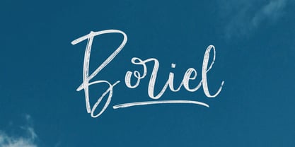 Boriel is a chic, refined script font that emanates sophistication and elegance. Its stylish alternates and ligatures make this font the perfect match for any project Features : Basic Latin A-Z & a-z. Numbers, symbols, and punctuations Swashes & Ligatures Boriel is supporting 66 Languages: from Afrikaans Albanian Catalan Danish to Dutch English Spanish Swedish Zulu. Accented Characters : ÀÁÂÃÄÅÆÇÈÉÊËÌÍÎÏÑÒÓÔÕÖØŒŠÙÚÛÜŸÝŽàáâãäåæçèéêëìíîïñòóôõöøœšùúûüýÿžß Thank you
 - Xbats by Holland Fonts,
$30.00Make your instant X-mas and Winter Holiday Greeting cards with the HF Xbats dingbats. 26 regular (capitals, A-Z) and 26 inverted (lowercase, a-z) images with the upcoming Winter Holiday Season as a theme. 7 instant Holiday Messages (numerals, 1-5 and inverted on 6-0 for English; ¡, !, ¿ and ? for Spanish) will make your Greeting complete in any combination. - Hoofer by Scholtz Fonts,
$15.00 Light and flexible, slightly retro, casual and readable, Hoofer combines 28 brush script, mono line script and sans-serif styles with ornaments into one Mega-Family. The different styles of the Hoofer Mega-family have been chosen to work together and to harmonize in a pleasing way. The Hoofer Mega-Family of fonts can be divided into three sub-families: Hoofer BRUSH subfamily: An eclectic group of five fonts. These are mainly joined scripts. Hoofer LINE subfamily: Seven mono-line scripts with joined letters in a number of weights, widths and styles. Hoofer SANS subfamily: Sixteen casual, Sans-Serif fonts. They are very readable and in a variety of weights & styles The mood of the Hoofer mega-family is light and flexible, slightly retro, casual and readable. It combines script and many sans-serif styles with ornaments into one Mega-Family. The different styles of the Hoofer Mega-family have been chosen to work together and to harmonize in a pleasing way. The Brush Sub-Family is designed for titling, packaging and display purposes, The Line Sub-Family can also be used for titling, packaging and display, however, it is less “showy”, and conveys an air of informality. The Sans Sub-Family is designed to shine as sub-heads and as body text. The wide range of Hoofline styles gives you, the designer, great flexibility in creating just the mood or impression that you want. Most of the fonts can use one or more OpenType Features. These can be accessed in a number of ways. The reason for this is that the major software producers provide different (and often conflicting) ways of accessing OpenType Features. In some cases such software manufacturers provide NO way of accessing certain OpenType Features. We have tried to remedy this by providing a highly flexible family of fonts. OPENTYPE (these OpenType features are only available in the “otf” fonts and not in the “ttf” fonts.) OpenType features that Hoofer makes use of are: Swashes (Word-Begin and Word-End Features); Alternate Numerals; and True Small Caps. ORNAMENTS In addition the Hoofer family has a font containing 94 ornaments. ALTERNATE NUMERALS You can access two sets of figures (numbers) in Hoofer Sans fonts. Both sets are tabular and lining but they differ in the height (but not the width) of the figures. The height of the alternate figures has been chosen so that they are compatible with the small caps. However, these alternate figures are available in ALL Hoofer Sans fonts, whether they feature small cap fonts or not. Hoofer has all the features usually included in a fully professional font. Language support includes all European character sets, Greek symbols and all punctuation. Opentype features include automatic replacement of some characters and discretionary replacement of stylistic alternatives.
 - Carl Beck by Monotype,
$29.99Cartographer Carl Beckman was appalled by the low standard of lettering in Sweden during the 18th century. He published an instruction and pattern book with four different letter forms in Stockholm 1794. The Carl Beck font is based on his Cursiv Skriften no. 1. - Handy Gesture by Bogstav,
$16.00 Say hello to my handy font! Use it whenever you need something handmade, vibrant and lively. I've added 6 different versions of each letter - just fo ahead and type and watch the letters automatically cycle - or choose the ones you prefer from the glyphs menu
 - Caleuche Alt by RodrigoTypo,
$25.00 Caleuche Alt is a typeface which contains different weights and styles, especially for action, Comics, horror or suspense titles, in addition to containing alternatives and ligatures
 - Body Art by Celebrity Fontz,
$24.99Body Art is a unique font whose upper-case and lower-case characters are formed by combining the silhouettes of two to four men and women of different figures and sizes to form the letters of the alphabet. Each of these carefully orchestrated combinations of human silhouettes is its own unique example of inspired typographic body art. - RB Naftalin by RockBee,
$- This typeface came out as a side idea while I was working on one logotype. Suddenly I came up with an idea of creating “tuned” version of the typeface, based on that logo. The “tuning” turned me in a completely different direction and in a few hours of haste I was looking at a completely different typeface. A few days later I made this font available for free, since it wasn't meant to be at all :-). A few months later, I saw my typeface used in the menu in one pizzeria. I was amazed and glad and happy and proud, all at the same time. Oh, by the way: the logo I was working on was of different style and even of another stem’s widths. So, this is truly a font of it’s own design. Naftalin has both Latin and Cyrillic sets, since it was used with both.
 - Sapeca by Just in Type,
$35.00 This project started from an idea to create a fun & informal typeface that would be cool for designers and for the general public. So, Just in Type designed a font with several OpenType features to create different letterings for different occasions, always in a cute way, sometimes even fancy. Have a look at the Sapeca Manual in the Gallery Menu.
 - FS Industrie Variable by Fontsmith,
$279.99Changing nature of work FS Industrie is an extraordinarily versatile new type system, with 70 variants built around five different widths and seven different weights. Type in the future will be increasingly variable, and FS Industrie is specifically designed to address the changing needs of brands. As more of the things we make exist primarily in a digital space, so our need to create type that can adapt within that space grows. It is the spirit of variable design, adaptation and flexibility that drove us to create FS Industrie. A typeface for future work in a future world. FS Industrie is a response to the changing nature of type, for brands that are responding to the changing nature of work. Industrial style Stylistically, FS Industrie feels direct and simple without sacrificing its humanity. It takes inspiration from German fonts of the 1930s, with their roots in manufacturing and signage. A classic sense of functional utility combined with a progressive view of where type is heading. Expressions in width A fundamental challenge with variable type is to ensure that craft and precision is preserved at every interval. Each width and weight is drawn by hand, with subtle variations in terminals and angles as you progress through the system. This ensures each variant can play to its unique strengths, while also pairing perfectly with its siblings. From the closed terminals of the Condensed and the open terminals of the Extended. FS Industrie is a design system that maintains a practical, grounded and robust tone throughout every variable style. Variable nature The 70 styles offer a range of expression. Each width contrasts with the next to clearly define typographic roles in graphic layouts. Every glyph is crafted with adaptability and scalability in mind, creating a pliable design space for the user. The proportions of each letterform flex as weight scales up, stem weights increase as letter width broadens. These subtle design changes create an optically consistent visual impression. - FS Industrie by Fontsmith,
$50.00 Changing nature of work FS Industrie is an extraordinarily versatile new type system, with 70 variants built around five different widths and seven different weights. Type in the future will be increasingly variable, and FS Industrie is specifically designed to address the changing needs of brands. As more of the things we make exist primarily in a digital space, so our need to create type that can adapt within that space grows. It is the spirit of variable design, adaptation and flexibility that drove us to create FS Industrie. A typeface for future work in a future world. FS Industrie is a response to the changing nature of type, for brands that are responding to the changing nature of work. Industrial style Stylistically, FS Industrie feels direct and simple without sacrificing its humanity. It takes inspiration from German fonts of the 1930s, with their roots in manufacturing and signage. A classic sense of functional utility combined with a progressive view of where type is heading. Expressions in width A fundamental challenge with variable type is to ensure that craft and precision is preserved at every interval. Each width and weight is drawn by hand, with subtle variations in terminals and angles as you progress through the system. This ensures each variant can play to its unique strengths, while also pairing perfectly with its siblings. From the closed terminals of the Condensed and the open terminals of the Extended. FS Industrie is a design system that maintains a practical, grounded and robust tone throughout every variable style. Variable nature The 70 styles offer a range of expression. Each width contrasts with the next to clearly define typographic roles in graphic layouts. Every glyph is crafted with adaptability and scalability in mind, creating a pliable design space for the user. The proportions of each letterform flex as weight scales up, stem weights increase as letter width broadens. These subtle design changes create an optically consistent visual impression.
 - Monotalic by Kostic,
$30.00 Monotalic was created as a fun experiment, exploring better solutions for the monospaced type design. Most monospaced (fixed-width) typefaces have the same main design problem regarding the lowercase – filling the empty space around l, f, i, j and r. That usually brings the addition of slab serifs to those narrow characters, causing many monospaced fonts to look and feel alike. Monotalic solves that problem by adopting the handwritten (or cursive) form for those problematic characters, which allows them to be defined in more strokes, thus getting a better distribution of form in that fixed-width space. On the other hand, cursive writing usually lacks the legibility of a Roman (Regular upright) style, so Monotalic was created to be a hybrid, taking the best of both worlds. Monospaced fonts today are mostly used for coding. Modern code editors use colored text in order to differentiate between different kinds of code. So, in that environment there’s actually no need for traditional text styling by adding Italics, Bold or other styles, because the code lines are overstated as it is. That is why Monotalic focuses on one style only, in three widths and four weights. The weights allow users to choose the perfect contrast of text on screen, depending on their monitor resolution and background color in the editor. Movie scripts are almost exclusively set in 12pt Courier. It became the industry standard because when set in the specific “screenplay format" it helps with the breakdown of the schedule and budgeting process of the film production. Although it looks completely different, text set in Monotalic (Normal width) will take the same amount of space as Courier.
 - Edigna by Johannes Hoffmann,
$25.00 Edigna is a clean, rounded sans-serif with a tall x-height. It contains five different weights and a matching inline style. The font family supports a variety of languages, including Western, Southern, Northern and Central European as well as Eastern European. It's good for headlines, posters, brands, and magazines.
 - Zero Output by PizzaDude.dk,
$15.00 You may recognize the shapes of this font - it's because it's my Universitet font, but this time it took some beating, and turned into a grunge font! The output was Zero Output! It has 5 different versions of each letter and of course multilingual support! Go ahead and grunge up your next project!
 - Buxom by ITC,
$29.00Robert Trogman originally designed Buxom for Fotostar in 1975 with lettering from Herman Spinadel. Trogman’s design is an old-fashioned headline face, whose style feels at home in a number a different periods: the Wild West, the 1960s–70s, and once again today! Buxom is an all caps typeface with a three-dimensional effect: each character looks like it sits atop a trapezoidal shape, whose right side is always shaded. An inline around each letterform enhances this shadowy image. Buxom is best used in large display sizes as a single word, or single line of text. - Happy Fingers by PizzaDude.dk,
$14.00 Happy Fingers are a truly mad font! The font contains 10 different versions of each letter - and no two letters are the same - it's a lovely mix of upper- and lowercase, serfifs and sans, grunge, comic, sci-fi, fantasy, computer ... everything you can imagine. And they are all handmade! Of course there is multilingual support and I have even added a black version, for you to use as massive fill, or perhaps a cool shadow! Go crazy, go Happy Fingers!
 - Supercard by Alphabet Agency,
$15.00 Supercard's creation is inspired by traditional athletic block lettering often only seem in uppercase form Supercard font family has captured the blue collar feel and expanded the range of this traditional look in six different weights all with uppercase, lowercase, numbers, punctuation and simple Latin international characters. The versatility of the different font weights allows for broader and fresh design possibilities in your work.
 - Mensrea by Typogama,
$19.00Mensrea is a versatile display and text superfamily combining 32 different styles into a urban, street, themed design bundle. Based on a functional and condensed sans serif, Mensrea equally includes a large range of complimentary weights that can either be used as stand alone styles or then combined with other weights to create layered design. Two Graffiti styles add a further style contrast with a handwritten and fluid dynamic to contrast the main weights, the Bubble style equally features three extra layers for styling. And lastly, a small set of pictograms have equally been included and feature symbols from office icons to themed police iconography in relation to the overall Mensrea theme. - Writeback by Trim Studio,
$15.00 Writeback Bring a touch of unique character to your designs with this simple style script brush font. The font features a mix of clean and simple brush strokes, with a touch of texture added to enhance its natural look. The casual script style and mixed textures make this font versatile, allowing it to be used for a wide range of projects. Give your designs a touch of creativity and personality with this simple style script brush font. Writeback also have 2 different style, so you can easily combine and adjust the design theme with it Its perfect for casual and fun designs, this font is great for adding a personal touch to t-shirt designs, logos, posters, and more.
 - Big Stripes Mono by Ingrimayne Type,
$9.00 BigStripesMono is another typeface family from IngrimayneType that explores the possibilities of alternating letters sets. The family is monospaced with four fonts: a base or solid style, an outlined style, and two styles in which each character is cut diagonally and the halves are separated to form two characters. These split styles are not designed to be used alone but layered with the base style, outlined style, or both to form colorful lettering with an unusual striped appearance. The stripe is not apparent in single letters but only in words or lines of text. For best results use an application that supports the OpenType feature Contextual Alternatives (calt) to alternate the letters of the split styles. The four styles can be combined in several ways to create unusual lettering appropriate for titles, headlines, and similar uses. And if one wants a bold, monospaced, sans-serif face, BigStripesMono has that too.
 - Wild Autumn by Epiclinez,
$18.00 Wild Autumn is a fun and fancy handwritten font, designed to become a true favorite. It maintains its classy calligraphic influences while feeling contemporary and fresh. Fall in love with it and bring your projects to a new height. So what’s included: Basic Latin A-Z & a-z. Numbers, symbols, and punctuations Multilingual Support. Accented Characters : ÀÁÂÃÄÅÆÇÈÉÊËÌÍÎÏÑÒÓÔÕÖØŒŠÙÚÛÜŸÝŽàáâãäåæçèéêëìíîïñòóôõöøœšùúûüýÿžß Thank you. We hope you enjoy the font.
 - Like Butterflies by Bogstav,
$10.00 Now here's a font that is named Like Butterflies, but has got nothing to do with butterflies! What? Why? Well, I recently heard the song "Even flow" by Pearl Jam and took a trip down memory lane - back to my early twenties. I remember how the lyrics affected me, and had an impact on how my life changed the years to follow. Maybe the style of the font does not reflect the inner meaning of the song, but it does reflect a look back in time for me - and the change that took place. Nevertheless, I hope you enjoy the somewhat simple, handmade style of Like Butterflies and the 4 versions that works very well together! Please notice that each letter has got 5 slightly different versions to choose from!
 - Primaria by PeGGO Fonts,
$18.00 Primaria is a display font, inspired on the very first basic handwrite style teaching at primary school, designed in cursive and print styles in three weights each one: light, Regular and Bold, considering stylistic and typographic needs, it also contain OpenType initial lowercase alternative forms in order to get better links in those case where pairs of letters could be look better. Recommended playful and friendly design, teaching and learning stuff, children toys projects, food & drink and soft stuff.
 - Waldorfschrift by Joachim Frank,
$23.00 The Waldorfschrift family was created in digital form in the years 1993-1994 by Joachim Frank, inspired by the naturally organic letters from the anthroposophical movement of the 20th century of Rudolf Steiner . In nature there are no right angles, straight lines or complete uniformity, but instead round corners, varying thicknesses and all kinds of variability. This is what the anthroposophical movement created in their buildings, their art, in their music – and also in their lettering. And this Font is like the plants in nature: it grows upwards, branches out, letters hugs to some letters, with others they keeps more distance, some letters proudly stretch their belly, others crouch in the corner - a completely natural font. Take a look at the brand of Weleda (the natural cosmetics company), Demeter (one of the biggest organic foods companies), Filderklinik (a great anthroposophical hospital in Germany) and you will see these great companies work with different but organic letter styles. More recently, Joachim revisited the Waldorf fonts with modern type design software and added extra characters such as the euro sign, and extra weights to make the fonts useable for a wide variety of design tasks. Dez 21: A big update: All fonts have been digitized again and given a complete character set, new kerning, minor bugs removed.
 - Kalyubi by Sabrcreative,
$25.00 Introducing Kalyubi Script, a captivating and versatile script font that combines elegance with a touch of playfulness. With its fluid and graceful letterforms, Kalyubi Script adds a unique charm to your designs, making it perfect for various creative projects. Whether you're designing invitations, logos, branding materials, or quotes, Kalyubi Script will effortlessly elevate your work and leave a lasting impression. The Uppercase and lowercase letters of Kalyubi Script offer a seamless blend of sophistication and versatility, allowing you to create captivating typographic compositions. The inclusion of numbers and punctuations ensures that this font is well-equipped to meet all your design needs. With multilingual support, Kalyubi Script enables you to effectively communicate your message across different languages, expanding your reach to a global audience. Featuring PUA encoding, Kalyubi Script provides easy access to a wide range of alternate characters and ligatures. These special letter combinations and decorative elements add a unique and handcrafted touch to your designs, giving them an extra level of creativity and visual appeal.
 - Music Note by Putracetol,
$22.00 Music Note is a quirky display music font that captures the fun and whimsy of musical themes. This font is a perfect blend of musical notes, instruments, scales, rhythm, and tempo, designed with a childlike spirit and a crafter’s touch. With 9 unique variations to suit different musical styles, Music Note is as versatile as it is charming. Whether you are creating a logo, branding, a children’s theme, a crafting project, an invitation card, a packaging design, a poster, a title, a business identity, a greeting card, a sticker, a children’s book, or a magazine layout, Music Note will add a touch of musical magic to your design. Each letter dances with rhythm and melody; every stroke resonates with the harmonious tunes of joy.
 - Billowy by Create Big Supply,
$15.00 Introducing Billowy, a captivating handwriting script font that brings an elegant and artistic touch to your creative endeavors. With its natural flow and versatility, this font is the perfect choice for various craft projects. Billowy's unique handwriting script style adds a sense of authenticity and charm to your designs. Whether you're working on shirt designs, websites, SVG creations, home decor, branding materials, blogs, logos, or invitations, this font will elevate your projects with its graceful appeal. With both uppercase and lowercase letters, Billowy offers flexibility in crafting captivating compositions. The font also includes numbers and punctuations, ensuring seamless integration within your text. Its multilingual support enables effective communication in different languages, broadening your reach to diverse audiences. Billowy features ligatures that enhance the smoothness and aesthetics of your typography, allowing for seamless and visually appealing designs. The font's PUA Encoding provides easy access to special characters and glyphs, enabling you to unleash your creativity without limitations. Embrace the elegance of Billowy in your craft projects and witness the beauty it brings to your creations. From handmade crafts to digital designs, this font adds a touch of sophistication and style.
 - Valiety by Din Studio,
$25.00 Valiety is a serif font family to better charm your designing experiences. It consists of eight different levels to add elegant, modern touches to your designs. Valiety has a continuity aspect produced from each small stroke in order to help the eyes smoothly move from one letter to another. Besides, the thickness differences are unnoticeable so that it leaves stable, legible impressions. With such flexibility, you can use it in either bigger- or smaller-sized texts. Include 8 different weight fonts : Valiety Hairline Valiety Thin Valiety Extra Light Valiety Light Valiety Regular Valiety Medium Valiety Semi Bold Valiety Bold Features: Multilingual Supports PUA Encoded Numerals and Punctuation Valiety is best for any design projects, such as posters, banners, logos, book covers, invitations, quotes, headings, printed products, merchandise, social media, etc. Find out more ways to use this font by taking a look at the font preview. Thank you for purchasing our font and happy designing.
 - Dom by ParaType,
$30.00 Dom was designed by Peter Dombrezian for American Type Founders in 1951–52. It is an informal unjoined script typeface that looks brushwritten. Its letters are almost monotone, freely or casually drawn. Vertical strokes of them have irregular ending at different heights, and oval axis have slightly different slopes. This typeface is to create a friendly, informal look in signs, advertising, and invitations. The Cyrillic version of the Bitstream digital font was developed by Dmitry Kirsanov for ParaType in 2008.
 - Jack History by Ditatype,
$29.00 Jack History is a unique, amazing font inspired by creative, experimental handwritings of which letters are always connected to each other to create surprising, dynamic flows, and adopt unconventional proportions and variations. Some of the letters may actually seem bigger or smaller than the others in free moving and curvy lines to express bravery and freedom nuances of the font. Differences in proportions and letter style changes of the font have become the design’s integral parts. Despite the absence of strict rules, creativity and courage to combine the connected letters in a unique way is all that matters because this script font offers extraordinary attractiveness and uniqueness in all designs. Furthermore, the connected letter flows in various proportions reflect some explorations and innovations in the handwritings. You may then apply this font for big text sizes for a legibility reason and enjoy the available features here. Features: Alternates Ligatures Multilingual Supports PUA Encoded Numerals and Punctuations Jack History fits best for any design projects requiring artistic, elegant displays such as wedding invitations, greeting cards, merchandise designs, and more. For such artistic and elegant displays, this script font is also applicable for logo designs, posters, and packaging. Find out more ways to use this font by taking a look at the font preview. Thanks for purchasing our fonts. Hopefully, you have a great time using our font. Feel free to contact us anytime for further information or when you have trouble with the font. Thanks a lot and happy designing.
 - Wisconsin by QUADRAAT,
$35.00 Wisconsin is a complete character set including three stylistic sets in nine weights offering a new singular aesthetic to each. Three differents attitudes in one font, a real typographic weapon. Supports all latin languages