10,000 search results
(0.082 seconds)
- Bonspire Script by Mans Greback,
$69.00 Bonspire Script is a dynamic and creative script typeface. Brimming with lively swashes and optimistic flair, Bonspire Script embodies the essence of movement and creativity. Its swirly strokes lend it an air of playful sophistication, making it equally suitable for heartfelt love letters or eye-catching advertisements. Its handwriting-inspired design gives it an approachable and personal feel. The typeface dances across the page, infusing any text with a sense of joy and possibility. Use underscore _ anywhere in a word for swashes. Example: Love_rose Use multiple underscore for different swashes. Example: Wonder________woman Use Bonspire Script's built-in swashes and stylistic alternates to fully express your creativity. Its OpenType functionality ensures top-notch quality and customizability. The typeface offers extensive lingual support, covering all Latin-based languages, and includes all the characters and symbols you'll ever need. The creative force behind Bonspire Script is Mans Greback. Renowned for his ability to evoke emotion through typography, Greback has outdone himself with this lighthearted yet intricate design. His extensive portfolio showcases a knack for blending practicality with artistic flair, making each font a unique masterpiece.
 - Cellosia by Bluestudio,
$20.00 Cellosia is made to resemble hand scratches, so it looks like a natural style like your own hand scratches. Cellosia offer beautiful typographic harmony for a variety of design projects, including watermark, logos, branding, wedding designs, social media posts, advertisements, product designs, magazines and others.
 - Saritha by Bluestudio,
$20.00 Saritha is made to resemble hand scratches, so it looks like a natural style like your own hand scratches. Saritha offer beautiful typographic harmony for a variety of design projects, including watermark, logos,branding, wedding designs, social media posts, advertisements, product designs, magazines and others.
 - Snooty Fox NF by Nick's Fonts,
$10.00This casually elegant typeface is based on an unnamed offering from Pen & Brush Lettering and Practical Alphabets, published by Blandford Press, Ltd., London, in 1929. Good taste dictates that, because of the ornate and unusual letterforms of the uppercase letters, the font never be used as all caps. - Camille by Arabetics,
$45.00 Camille was designed with exaggerated emphasis on letter vertical characteristic, by virtually eliminating the typical Arabic horizontal line look. This font glyph weights and look and feel are heavily influenced by early Kufic Quranic calligraphy style. Camille supports all Arabetic scripts covered by Unicode 6.1, and the latest Arabic Supplement and Extended-A Unicode blocks, including support for Quranic texts. This font family includes two letter spacing flavors: isolated for small text and overlapped for large or display text. The two spacing flavors have one weight each with a normal and a left-slanted Italic version. The script design of this font family follows the Arabetics Mutamathil Taqlidi style utilizing varying x-heights. The Mutamathil Taqlidi type style uses one glyph per every basic Arabic Unicode character or letter, as defined by the Unicode Standards, and one additional final form glyph, for each freely-connecting letter of the Arabic cursive text. Camille includes the required Lam-Alif ligatures in addition to all vowel diacritic ligatures. Soft-vowel diacritic marks (harakat) are selectively positioned with most of them appearing on similar high and low levels—top left corner—, to clearly distinguish them from the letters. Tatweel is a zero-width glyph.
 - Calton Elegance by Lemonthe,
$8.00 Calton Elegance is a perfect mix modern calligraphy and sans-serif font. It was created to help you designing makes gorgeous logos, posters, wedding invitations, blog posts, social media, and more! NOTE: Quick access swash and titling with ligature, add 2x underscore before or after lowercase a-z.
 - Mafia Hometown by Hatftype,
$15.00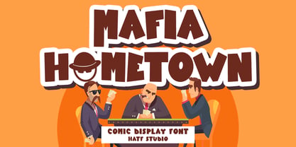 Is a Comic Display Font font with distinctive handwritten characters perfect for branding projects, logos, wedding designs, media posts, advertisements, product packaging, product designs, labels, photography, watermarks, invitations, stationery, and any project who need handwritten dishes. Features : • Character Set A-Z • Numerals & Punctuations (OpenType Standard) • Accents (Multilingual characters) • Ligature.
 - Rellive by Arendxstudio,
$16.00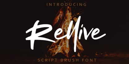 Rellive is a font with distinctive handwritten characters, and perfect for branding projects, logos, wedding designs, media posts, advertisements, product packaging, product designs, labels, photography, watermarks, invitations, stationery, and any project who need handwritten dishes. Features: • Character Set A-Z • Numerals & Punctuations (OpenType Standard) • Accents (Multilingual characters) • Ligature
 - Civic Sans by CozyFonts,
$25.00 A Clean Sans Serif font family with a few stylish glyphs to give extra character e.g., L-R-Q-Z-W-g-t. Usage: Any applications is appropriate especially signs, directions, posters, graphics and use especially in Ads and billboards. There's 13 font variations in Civic Sans Font Family.
 - Pop Cubism by K-Type,
$20.00 The Pop Cubism fonts are inspired by Roy Lichtenstein who combined the strong outlines and benday dots of Pop Art with the fragmented viewpoints and facet line divisions of Cubism. The bold letterforms are derived from a variety of styles, both serif and sans, angular and rounded. Pop Cubism is available in two packages: Pop Cubism Shaded is a single font which contains the lines and dot tones for use in a single color. The Pop Cubism Color Kit contains three matching fonts (Pop Cubism Outline, Pop Cubism Halftone Underlay and Pop Cubism Color Underlay) for overlaying different colors of lines, dot tones, and background color.
 - Albion's Marker No.1 by Greater Albion Typefounders,
$16.50 Albion’s Marker No.1, as the name suggests is the first in a series of ‘Marker Pen’ typefaces- merging good type design practice with deliberately casual and hand-drawn letter forms. Inspired by the great classic typefaces such as Bembo and Caslon, the design of Marker No.1 offers a unique blend of legibility and relaxed randomness.
 - ITC Underscript by ITC,
$29.99Underscript, from designer Claudio Rocha, is an alphabet of capital letters in handwritten style. Each letter has a corresponding alternative form and using both randomly in a text can give it the look of real handwriting. One constant element in the font is its stroke width. The strong figures are even and have rounded corners, lending them a cheerful appearance. All other attributes vary from letter to letter. Wide and narrow, high and low, the figures line themselves up unevenly on the base line. So can Underscript create a dynamic overall image with contrast. Underscript is perfect for cartoons, comics and anything light and carefree. - Belgium Catherine by Almarkha Type,
$25.00 Belgium Catherine – Handwritten Signature Font is a handwritten script font with a Signature Style and classy style, this font is great for your creative projects such as watermark on photography, and perfect for logos & branding, photography, invitation, watermark,advertisements,product designs, stationery, wedding designs,label ,product packaging, special events or anything that need handwritting taste. Belgium Catherine is here to elevate your work to the highest level. Belgium Catherine comes with 2 Style Regular and Slant : uppercase letters, lowercase letters, lowercase , numbers, punctuation, ligature, alternative letters and multilingual support Thank You
 - Mono Spec by Halbfett,
$30.00 Mono-Spec is a monospaced family of sans-serif type. At least in default settings, all characters across the typeface share a common width. That fixed setting is condensed, and the aesthetic style of Mono-Spec’s letterforms is very industrial. A sister family, called Mono-Spec Stencil, is also available. Its design strays away from the mechanical nature of Mono-Spec, and it channels the spirit of resistance and street culture. Mono-Spec ships in two different formats. Depending on your preference, you can install the typeface as a single Variable Font or use the family’s five static OpenType font files instead. Those weights run from Light through Bold. While the static-format fonts offer a good intermediary-step selection, users who install the Variable Font have vastly greater control over their text’s stroke width. The Mono-Spec Variable Font’s weight axis allows users to differentiate between almost 1,000 possible font weights. That enables you to fine-tune your text’s exact appearance on-screen or in print. Whatever format you choose, the Mono-Spec fonts are equipped with several OpenType features. The most striking of these can be activated via a Stylistic Set. That will replace several letters – like “B”, “E”, “F”, “H”, and “I” with double-width alternates. Those alternates take up as much space as two characters placed next to each other otherwise word. The effect of Mono-Spec’s double-width alternates is striking, and their use strikes a strong chord in any display typography applying them.
 - Bloody Charm by PizzaDude.dk,
$20.00 Is it blood, melted ice, water or something slimy? Choose yourself, because Bloody Charm can be used for all purposed that needs something either scary or melting. I've added two versions: Regular and Drips. The Drips versions is (you may have guessed it already!) a bit more drippy than the regular version. Both versions uses contextual alternates, which in this case means that there is 3 different versions of all lowercase letters - and these automatically cycles as you type!
 - Anowy by Product Type,
$17.00 Welcome to the world of Anowy, where handwriting seduces with impressive display dynamics. This font offers seven font styles including Regular for a classic look, Slant for a dynamic slanted touch, Blur for a natural ink writing effect, Smooth for softness, and Shadow for a dramatic feel. The specialty of the Anowy font is Seven Tiered Styles: Explore a variety of seven Anowy style variants to create a unique and attractive design according to your wishes. A Touch of Handwritten Vulnerability: Every character in Anowy provides a touch of seductive handwriting, creating an air of authenticity and humanity in every detail. Anowy is an ideal choice for projects that require a beautiful handwritten touch and a diversity of styles. Whether you're designing promotional materials, greeting cards, or other creative works of art, these fonts bring an unmatched personal element. Do not miss this opportunity! Get Handwritten Fonts for Anowy Looks now and watch how each word becomes a special artistic expression.
 - Ordinary Gothic JNL by Jeff Levine,
$29.00 Ordinary Gothic JNL is a simple, thin "stovepipe" style of hand lettering found on the cover of a piece of sheet music for 1937's "You Can't Stop Me from Dreaming", and is available in both regular and oblique versions. The song was introduced and featured by Guy Lombardo and His Royal Canadians.
 - Eckhardt Dualine JNL by Jeff Levine,
$29.00 While searching online for vintage type inspirations, an image was spotted of an old letterhead for a steel manufacturing company. The hand lettering of the word 'Ludlum' only offered D,L,M and E as visual examples, but from this Jeff Levine has designed Eckhardt Dualine JNL - a Deco-flavored dual-line type font. As with a number of other releases that emulate hand-lettering or sign painting, Jeff has named this font in honor of his good friend, the late Albert Eckhardt, Jr.; who ran Allied Signs in Miami from 1959 until his passing.
 - Gift Wrap JNL by Jeff Levine,
$29.00 Gift Wrap JNL takes a classic wood type display font and cuts it into diagonal striped lines to emulate package wrapping paper. An interesting side effect of the lettering is that at first glance you might perceive the style as being an oblique, but the letters are actually vertical. This typeface is perfect for holidays, birthdays and special events featuring a festive theme.
 - Stitch Warrior by Roland Hüse Design,
$19.00 Stitch Warrior is a a gothic style stitch font. It's made of cross stitches ("x") even the kerning - the distance between the letter pairs varies between 1, 2 or 3 stitches distance. I was trying to be as accurate and close to reality as possible. It can be pefectly used for stitch lettering or text pattern to create visual effects.
 - Alter Gotisch by Alter Littera,
$25.00 This is Alter Littera’s first original design. The font has been created by attempting not to reproduce any historical typeface in particular, but only to re-create the overall forms and style of classic black-letters from different time periods and places. Two specific sources must be acknowledeged nonetheless: (1) the “Black” type from William Caslon’s A Specimen of Printing Types (1785), and (2) the “Caslon Gotisch” type by D. Stempel A.G. (1926). In addition to the usual standard characters for typesetting in modern Western languages, the font includes a comprehensive set of special characters, alternates and ligatures, plus Opentype features, that can be used for typesetting as in antique writings and printings. The glyphs are clean, smooth and definitely readable, so the font will be suitable not only for large titles and headings, but also for full text pages. Specimen, detailed character map, OpenType features, and font samples available at Alter Littera’s The Oldtype “Alter Gotisch” Font Page.
 - Socialite JNL by Jeff Levine,
$29.00Socialite JNL takes its cue from the Art Deco style of the 1930s with its clean, angular lines and stylized letter shapes. - Knight Souls by Ditatype,
$29.00 Knight Souls is a captivating display font inspired by epic medieval adventures. Designed in uppercase, this typeface captures the spirit of heroic quests with its bold and commanding style. The consistent letter proportions of Knight Souls create a sense of balance and harmony throughout the font. This design choice guarantees that every character fits seamlessly together, resulting in a typographic composition that exudes strength and resilience. With sharp endings, Knight Souls adds an element of dynamism and edge to the font. Each letter is defined by precise angles and sharp corners, evoking a sense of power and determination. This feature lends a bold and assertive quality to the font, reflecting the courage and bravery of knights on epic quests. High letter contrast in Knight Souls emphasizes readability and visibility. The distinct difference between thick and thin strokes enhances the visual impact of each character, making them easily distinguishable and captivating to the eye. The high contrast design adds depth and intensity to the font, making it stand out in any game-themed design. You can also enjoy the available features here. Features: Multilingual Supports PUA Encoded Numerals and Punctuations Knight Souls fits in headlines, logos, posters, titles, branding materials, print media, editorial layouts, website headers, and any projects that aim to transport players to a world of valor and fantasy. Find out more ways to use this font by taking a look at the font preview. Thanks for purchasing our fonts. Hopefully, you have a great time using our font. Feel free to contact us anytime for further information or when you have trouble with the font. Thanks a lot and happy designing.
 - John Sans by Storm Type Foundry,
$49.00 The idea of a brand-new grotesk is certainly rather foolish – there are already lots of these typefaces in the world and, quite simply, nothing is more beautiful than the original Gill. The sans-serif chapter of typography is now closed by hundreds of technically perfect imitations of Syntax and Frutiger, which are, however, for the most part based on the cool din-aesthetics. The only chance, when looking for inspiration, is to go very far... A grotesk does not afford such a variety as a serif typeface, it is dull and can soon tire the eye. This is why books are not set in sans serif faces. A grotesk is, however, always welcome for expressing different degrees of emphasis, for headings, marginal notes, captions, registers, in short for any service accompaniment of a book, including its titlings. We also often come across a text in which we want to distinguish the individual speaking or writing persons by the use of different typefaces. The condition is that such grotesk should blend in perfectly with the proportions, colour and above all with the expression of the basic, serif typeface. In the area of non-fiction typography, what we appreciate in sans-serif typefaces is that they are clamorous in inscriptions and economic in the setting. John Sans is to be a modest servant and at the same time an original loudspeaker; it wishes to inhabit libraries of educated persons and to shout from billboards. A year ago we completed the transcription of the typefaces of John Baskerville, whose heritage still stands out vividly in our memory. Baskerville cleverly incorporated certain constructional elements in the design of the individual letters of his typeface. These elements include above all the alternation of softand sharp stroke endings. The frequency of these endings in the text and their rhythm produce a balanced impression. The anchoring of the letters on the surface varies and they do not look monotonous when they are read. We attempted to use these tricks also in the creation of a sans-serif typeface. Except that, if we wished to create a genuine “Baroque grotesk”, all the decorativeness of the original would have to be repeated, which would result in a parody. On the contrary, to achieve a mere contrast with the soft Baskerville it is sufficient to choose any other hard grotesk and not to take a great deal of time over designing a new one. Between these two extremes, we chose a path starting with the construction of an almost monolinear skeleton, to which the elements of Baskerville were carefully attached. After many tests of the text, however, some of the flourishes had to be removed again. Anything that is superfluous or ornamental is against the substance of a grotesk typeface. The monolinear character can be impinged upon in those places where any consistency would become a burden. The fine shading and softening is for the benefit of both legibility and aesthetics. The more marked incisions of all crotches are a characteristic feature of this typeface, especially in the bold designs. The colour of the Text, Medium and Bold designs is commensurate with their serif counterparts. The White and X-Black designs already exceed the framework of book graphics and are suitable for use in advertisements and magazines. The original concept of the italics copying faithfully Baskerville’s morphology turned out to be a blind alley. This design would restrict the independent use of the grotesk typeface. We, therefore, began to model the new italics only after the completion of the upright designs. The features which these new italics and Baskerville have in common are the angle of the slope and the softened sloped strokes of the lower case letters. There are also certain reminiscences in the details (K, k). More complicated are the signs & and @, in the case of which regard is paid to distinguishing, in the design, the upright, sloped @ small caps forms. The one-storey lower-case g and the absence of a descender in the lower-case f contributes to the open and simple expression of the design. Also the inclusion of non-aligning figures in the basic designs and of aligning figures in small caps serves the purpose of harmonization of the sans-serif families with the serif families. Non-aligning figures link up better with lower-case letters in the text. If John Sans looks like many other modern typefaces, it is just as well. It certainly is not to the detriment of a Latin typeface as a means of communication, if different typographers in different places of the world arrive in different ways at a similar result.
 - Goodlife by HVD Fonts,
$30.00 The Goodlife type family is a lovely handlettering collection designed by Hannes von Döhren. It contains six different hand drawn fonts with loads of features and a set of extras such as catchwords, arrows, ornaments & more. With this set and a little bit of love and care it is possible to create beautiful “handmade” graphics. Equipped with automatically exchanging alternates, ligatures, end forms, swash letters and some other features, Goodlife is optimized to feel not just like a font but like true handletterings. Goodlife is made for complex, professional typography. The OpenType fonts have an extended character set to support Central and Eastern European as well as Western European languages.
 - Classic Heritage by Gleb Guralnyk,
$15.00 This vintage typeface named "Classic Heritage" has a steampunk look and was inspired by old-school lettering styles. The 13 stylistic alternate letters can help you to create a unique and interesting text composition.
 - Sylvie by Anastasia Kuznetsova,
$14.00 SYLVIE is a very stylish font with letters that seem to dance and harmoniously intertwine with each other, creating a unique and elegant typographic design. This font is in my collection, inspired by France. French architecture, vintage fonts, modern forms, fashion and their unique lifestyle have all had an impact on this font. Thanks to the contrasting lines and curves, it will give your design the chic and modernity that you are looking for. It is perfect for logos, branding, posters, social media and all other creative projects. It will also highlight your brand. SYLVIE will definitely add attractiveness to your design! I invite you to familiarize yourself with the preliminary images and hope that you will be imbued with my vision of this creative font, which, I am sure, will be suitable for all the interesting projects you are working on. Font Features: A-Z; a-z character set; 1 language (English); numbers and punctuation marks, symbols. Fonts can be opened and used in any software that can read standard fonts, even in MS Word. No special software is required to get started. It is recommended to use it in Adobe Illustrator or Adobe Photoshop. Made with love and magic ♡ Thank you for reading it, and do not hesitate to send me a message if you have any questions! ~ Anastasia
 - Odisean by deFharo,
$24.00 Odisean Fonts and its 3 styles (One, Tech & Small Caps) are ideal for graphic design, editorial, logos and posters. Its rounded finish and marked contrast between antlers evoke the charm of bygone eras. In addition, it has a collection of retro icons accessible through OpenType: Small Caps. Letter proportions are multiples of 8, ensuring exceptional visual harmony, while metrics and kerning use values multiples of 8 for impeccable legibility and aesthetics. Discover Odisean and revive retro nostalgia in your designs. Each Odisean variant comes loaded with a set of alternative letters that allow you to customize and adapt each project to your liking. In addition, you will be able to access an exclusive collection of retro icons through the OpenType feature: Small Caps, adding even more versatility and charm to your creations. - Odisean One will transport you to a bygone era with its retro charm, offering you alternative lyrics that evoke the aesthetic of the golden and happy years. - Odisean Tech for those who love technology and innovation, the font is full of graphic elements and retro transportation icons, which will immerse you in a futuristic world of the past. - Odisean Small Caps bring elegance and versatility to your designs with their small capital letters.
 - Bailamore by 38-lineart,
$19.00 Bailamore is a retro boldscript font. We're pouring the lettering styles into fonts. As much as possible we make this font well integrated with spacing and balance of space. We made 159 ligatures. Activate the ligature mode and you are like being a lettering artist, plus 85 alternates to enrich the feel of lettering. This font consists of 3 fonts, namely regular, outline and shadow. Regular stands alone, while outline and shadow are complementary if you want a 3D extrude impression. Please see the video torial here: https://youtu.be/H71JEgEOows Please try and enjoy the retro bold Bailamore script
 - Blacky by Afdalul Zikri,
$9.00 Blacky is a powerful and elegant display typeface. Inspired by design styles that are currently trending, and this is the answer to the design ideas that you will apply in this modern era, with a thick and strong style in each letter of the Blacky font as it is specialized in the world of design. Blacky has 3 font styles including: -Regular -Semi Rounded -Rounded Blacky works great on posters, social media, headlines, titles, large print - and it works on just about anything because it's a San-Serif font.
 - Old Venexia by Proportional Lime,
$9.99 This is a simple excursion into taking a prototype and recasting it along different lines, emphasizing the spontaneity of a hand cut look. It is primarily meant for the printed page.
 - Aeterna by Dawnland,
$13.00 Hand drawn, sketchy antiqua that come in two font variants: Regular, Small caps with old style figures. Æterna was revised 2012 and now hold a full character set of basic english/latin letters and west european diacritics!
 - Maybug MS by Redcollegiya,
$12.00 Maybug is a Scandinavian font family which makes it great for any children's design: greeting cards, invitations, posters, textile prints or book covers. You can mix letters of all styles to get really funny and unusual compositions.
 - Eutaw Stencil JNL by Jeff Levine,
$29.00 A hand lettered emulation of a Roman stencil type face on the cover of the folio for the Stenso School Set was the basis for Eutaw Stencil JNL, which is available in both regular and oblique versions. The Stenso School Set (circa 1940-41) was comprised of three stencils – two lettering guides and a map of the [then] 48 United States. Developed and patented by Baltimore school teacher Ruth Libauer Hormats, her stencils were the first to offer a system for accurate letter spacing and ease of use. “Eutaw” (as part of the font’s name) is taken from Eutaw Place, the street where Ruth and her husband lived at the time of Stenso’s inception. To the Cherokee, the name means “Creek Indian”.
 - Skagwae by Ingrimayne Type,
$7.95 The characters of Skagwae have no curves, just straight line segments. The letter shapes themselves are fairly standard, but the choppy line segments used to construct them give the fonts a crude, unfinished look that is highlighted at large point sizes. At small point sizes the fonts are surprisingly legible. The family has nine styles. The regular, bold, italic, bold italic, shadow, and shadow inside styles are proportionally spaced. Shadowinside is very similar to regular but is spaced to be used in a layer with the shadow style. SkagwaeMono-Regular and SkagwaeMono-Bold are monospaced versions of the family. A third monospaced style, SkagwaeMono-Rippled, is a distorted version with squiggly lines full of curves.
 - Dupont Serif by Hexagon Foundry,
$20.00 Dupont Serif, a graceful and modern serif font. Embodying clean lines, well-proportioned letterforms, and a unique charm, Dupont Serif stands as a versatile typeface suitable for various applications. The unpretentious nature of Dupont Serif allows it to be employed in a multitude of design scenarios. Offered in 10 weights alongside corresponding oblique characters and 2 style sets.
 - Bravo ND by Neufville Digital,
$29.60 Designed by José María Cerezo, with a geometric style and futuristic touches. A typeface family that offers good results in labeling, posters and big formats. Inspired by art deco with a sci-fi touch, it is a typeface with a strong character and personality. Bravo is a Trademark of BauerTypes SL
 - Sign Stickers JNL by Jeff Levine,
$29.00 In the early 1960s, the Duro Decal Company of Chicago, Illinois added to its line of water-applied decal lettering a retail sign cabinet of die-cut, pressure sensitive vinyl letters and numbers. Four of the six sizes offered for sale were cut from white plastic with a black outline and a secondary gold inline for a tri-color effect. Sign Stickers JNL emulates as closely as possible the look of these nostalgic pieces, complete with the slight shifts in line weight due to hand-cut silk screens and the printing process. For those of you who prefer to make your own multi-colored letters, a three piece fill font set is available for the low price of a single font purchase. Combine the backfill, midfill and frontfill layers for a truly retro look!
 - Barney Script by Mans Greback,
$59.00 Barney Script is a cool baseball typeface. A sporty calligraphy, this retro lettering will be your go-to style for a fresh team logotype or a vintage headline. Drawn and created by Mans Greback in 2022, it has a competitive style and a bold personality. The Barney Script family consists of three professional styles: Regular, Bold and Rounded, complimenting each other for greater design opportunities. Use underscore _ to make a swash. Example: Letter_ Use multiple underscores to make longer swashes. Example: Football____ The font is built with advanced OpenType functionality and has a guaranteed top-notch quality, containing stylistic and contextual alternates, ligatures and more features; all to give you full control and customizability. It has extensive lingual support, covering all Latin-based languages, from Northern Europe to South Africa, from America to South-East Asia. It contains all characters and symbols you'll ever need, including all punctuation and numbers.
 - Kerney Script by Mans Greback,
$59.00 Kerney Script is a cool baseball typeface. A sporty calligraphy, this retro lettering will be your go-to style for a fresh team logotype or a vintage headline. Drawn and created by Mans Greback in 2022, it has a competitive style and a bold personality. The Kerney Script family consists of three professional styles: Regular, Bold and Rounded, complimenting each other for greater design opportunities. Use underscore _ to make a swash. Example: Letter_ Use multiple underscores to make longer swashes. Example: Football____ The font is built with advanced OpenType functionality and has a guaranteed top-notch quality, containing stylistic and contextual alternates, ligatures and more features; all to give you full control and customizability. It has extensive lingual support, covering all Latin-based languages, from Northern Europe to South Africa, from America to South-East Asia. It contains all characters and symbols you'll ever need, including all punctuation and numbers.