10,000 search results (0.029 seconds)
  1. Mr Eaves Modern by Emigre, $59.00
    Mr Eaves is the often requested and finally finished sans-serif companion to Mrs Eaves, one of Emigre’s classic typeface designs. Created by Zuzana Licko, this 2009 addition to the Emigre Type Library expands the versatility of the original Mrs Eaves with two complimentary families: Mr Eaves Sans and Mr Eaves Modern. Mr Eaves was based on the proportions of Mrs Eaves, but Licko took some liberty with its design. One of the main concerns was to avoid creating a typeface that looked like it simply had its serifs cut off. And while it matches Mrs Eaves in weight, color, and armature, Mr Eaves stands as its own typeface with many unique characteristics. The Sans version relates most directly to the original serif version, noticeably in the roman lower case letters a, e, and g, as well as in subtle details such as the angled lead in strokes, the counter forms of the b, d, p, and q, and the flared leg of the capital R, the tail of the Q. The distinctly loose-fitting letter spacing of Mrs Eaves was applied also to the Sans version. This, together with generous built-in line spacing due to a small x-height and extended ascenders and descenders, renders the same kind of lightness and airiness when setting text that is so characteristic of Mrs Eaves. Deviations from the original Mrs Eaves are evident in the overall decrease of contrast, as well as in details such as the flag and tail of the f and j, and the finial of the t, which were shortened to maintain a cleaner, sans serif look. And the lower case c had to be balanced out differently after it lost its top ball terminal. And with the loss of serifs, Mr Eaves set width is slightly narrower. Mr Eaves Italic also carries over many forms from its Mrs Eaves model, most notably the v, w, and z, which are unusually flamboyant for a sans italic design. It also utilizes lead in and terminal tails that are reminiscent of the serif italic. The biggest departure here is the width of the characters. The extra narrow gauge and delicate features seemed more appropriate for the Serif than the Sans. To allow for a comfortable fit, Mr Eaves Italic has a more robust design and wider character width. Meanwhile, the Modern family provides an overall less humanistic look, with simpler and more geometric-looking shapes, most noticeably in the squared-off terminals and symmetric lower case counters. This family has moved furthest from its roots, yet still contains some of Mrs Eaves’ DNA. The Modern Italic is free of tails, and overall the Modern exhibits more repetition of forms, projecting a cleaner look. This provides stronger differentiation from the serif version whenever a more contrasting look is desired. Each version (Sans and Modern) contains its own set of alternates providing unique options for applications such as headlines, word logos, letterheads, pull quotes, and other short text settings. Both the Sans and Modern come in six weights. The simpler forms of a sans-serif provide the opportunity of more weights than do serif letter forms, which are more complex in structure, making it difficult to accommodate additional weight without distortions. Regular and Bold match the original Mrs Eaves weights, while the Heavy provides an additional weight for extra emphasis.
  2. Mr Eaves Sans by Emigre, $59.00
    Mr Eaves is the sans-serif companion to Mrs Eaves, one of Emigre’s classic typeface designs. Created by Zuzana Licko, this 2009 addition to the Emigre Type Library expands the versatility of the original Mrs Eaves with two complementary families: Mr Eaves Sans and Mr Eaves Modern. Mr Eaves was based on the proportions of Mrs Eaves, but Licko took some liberty with its design. One of the main concerns was to avoid creating a typeface that looked like it simply had its serifs cut off. And while it matches Mrs Eaves in weight, color, and armature, Mr Eaves stands as its own typeface with many unique characteristics. The Sans version relates most directly to the original serif version, noticeably in the roman lower case letters a, e, and g, as well as in subtle details such as the angled lead in strokes, the counter forms of the b, d, p, and q, and the flared leg of the capital R, the tail of the Q. The distinctly loose-fitting letter spacing of Mrs Eaves was applied also to the Sans version. This, together with generous built-in line spacing due to a small x-height and extended ascenders and descenders, renders the same kind of lightness and airiness when setting text that is so characteristic of Mrs Eaves. Deviations from the original Mrs Eaves are evident in the overall decrease of contrast, as well as in details such as the flag and tail of the f and j, and the finial of the t, which were shortened to maintain a cleaner, sans serif look. And the lower case c had to be balanced out differently after it lost its top ball terminal. And with the loss of serifs, Mr Eaves set width is slightly narrower. Mr Eaves Italic also carries over many forms from its Mrs Eaves model, most notably the v, w, and z, which are unusually flamboyant for a sans italic design. It also utilizes lead in and terminal tails that are reminiscent of the serif italic. The biggest departure here is the width of the characters. The extra narrow gauge and delicate features seemed more appropriate for the Serif than the Sans. To allow for a comfortable fit, Mr Eaves Italic has a more robust design and wider character width. Meanwhile, the Modern family provides an overall less humanistic look, with simpler and more geometric-looking shapes, most noticeably in the squared-off terminals and symmetric lower case counters. This family has moved furthest from its roots, yet still contains some of Mrs Eaves' DNA. The Modern Italic is free of tails, and overall the Modern exhibits more repetition of forms, projecting a cleaner look. This provides stronger differentiation from the serif version whenever a more contrasting look is desired. Each version (Sans and Modern) contains its own set of alternates providing unique options for applications such as headlines, word logos, letterheads, pull quotes, and other short text settings. Both the Sans and Modern come in three weights. The simpler forms of a sans-serif provide the opportunity of more weights than do serif letter forms, which are more complex in structure, making it difficult to accommodate additional weight without distortions. Regular and Bold match the original Mrs Eaves weights, while the Heavy provides an additional weight for extra emphasis.
  3. Ah, the Grandiose Grantham! Crafted by the whimsical hands of Paul Lloyd Fonts, Grantham is not your average character (pun intended) in the world of typography. Imagine if the letters decided to thr...
  4. As of my last update in April 2023, GAU_font_modern does not appear to be a widely recognized or established font within the typographic or graphic design communities. It's possible that GAU_font_mod...
  5. Ye Old Shire is a font that evokes the rustic charm and storied past of medieval England and the broader British Isles, transporting its audience to an era of knights, folklore, and the textual craft...
  6. The Penelope font, crafted by Dieter Steffmann, stands as a testament to the unique blend of artistic flourish and classical sensibility. This font is remarkably distinct, primarily due to Steffmann'...
  7. As of my last update in April 2023, there isn't a widely recognized or commercially available font specifically known as "Yodle." It's possible that "Yodle" could be a custom or a less-known typeface...
  8. The font Orange Juice is like the wild, energetic friend that brings the party to any design. Crafted by the talented Brittney Murphy, it's as if she dipped her brush in pure sunshine and zest, captu...
  9. Almanac of the Apprentice - Unknown license
  10. WILD AFRICA - Personal use only
  11. Bride Style by Just Font You, $18.00
    Bride Style, A sweet beautiful delicate script font. Inspired from the wedding modern calligraphy style but presented in a fashion editorial way. Perfectly fit for branding, logo, wedding things, greeting cards, fashion, lookbook, moodboard, presentation, imagine the luxury, beautiful, stylish, and casual in the same time.
  12. Koerier by Hanoded, $15.00
    Koerier means 'Courier' in Dutch and is a reference to the classic font it was modeled on. Each glyph was hand drawn, giving the font a unique look and feel, making it an ideal typeface for ads, posters and packaging. Comes with a full range of diacritics.
  13. Martita by GRIN3 (Nowak), $24.00
    Martita is an elegant, handwritten, fully connected script with ligatures to help with flow and readability. Martita can be used for invitations, greeting cards, posters, advertising, weddings, books, menus etc. Language support includes Western, Central and Eastern European character sets, as well as Baltic and Turkish languages.
  14. Posterizer KG Rough by Posterizer KG, $30.00
    Posterizer KG Rough is basically a hand-printed texture version of the Egyptian Slab Serif font Posterizer KG that already exists. Posterizer Kg Rough looks good on substrates with a rustic texture like wood, metal, textile, rough paper. It contains all the Latin and Cyrillic glyphs.
  15. TurvyTopsy by Greater Albion Typefounders, $9.00
    TurvyTopsy offers all the fun of delightful hand-drawn irregularity, captured in a typeface. Designing this was a wonderful exercise in ignoring all the rules of precise geometric construction to which we normally work. These irregular forms somehow achieve a delightful character & legibility all of their own.
  16. Prospect by ParaType, $25.00
    PT Prospect™. An original serif family designed in 1997-2001 by Natalia Vasilyeva and licensed by ParaType. A face of wide proportions and free lettershapes. The serifs have slanted edges. Based partially on the hand lettering of the author. For use in titling and display composition.
  17. Pillow Fort by Fromletterel, $12.00
    Pillow Fort is a quirky handwritten font to energize your designs, this font really fits cute and casual concept. Others than that Pillow Fort also fits the degins that need magical fantasy vibe. This font will be suitable for branding, greeting cards, quotes and other beautiful projects.
  18. California Bound JNL by Jeff Levine, $29.00
    California Bound JNL is based on the hand lettering found on the side of the old California Zephyr passenger trains; the route now being a part of Amtrak. This somewhat unusual Art Deco design is more utilitarian than decorative, yet it still captures the "Streamline Era" perfectly.
  19. Alessyia by Umbra95, $15.00
    Alessyia is a classic style typeface font. This font has classic but at the same time a fresh look. "Alessia family" includes 3 font types: Regular ( Classic and elegant with straight geometric lines ) Grunge ( Dirty and messy ) Retro ( Hand drawn brush font with an uneven texture )
  20. Solitude JNL by Jeff Levine, $29.00
    A piece of vintage sheet music with the hand lettered title "Solitude" is the namesake and inspiration for Solitude JNL. Purely Art Deco in its typographic curves and angles of the period, this typeface typifies the "Streamline" style that permeated designs of the 30s and 40s.
  21. Thomson by Linecreative, $16.00
    Thomson is is an Condensed font with a modern look, It's Perfect for branding, logo design, shirts, name card, magazin layout,headers, or oven large scale artwork Thomson offers you: - Upper and Lowercase characters (All Caps) - Stylistic alternates - Numbers and Punctuation - Multilingual Support (Latin Western Europe)
  22. Unblessed by Gassstype, $27.00
    Unblessed is Horror And Scary Typeface Font with ligature and Multilanguage support dramatic movement. Best for halloween poster, horror poster, childrenbook, cartoon,comic.This font is great for your next creative project such as logos, printed quotes, invitations, cards, product packaging, headers, Logotype, Letterhead, Poster, Label, and etc.
  23. Dale Kids by AdultHumanMale, $12.00
    DaleKids is a fun kiddie style font, a little bit picture book and a little bit comic book too. The font is available in two styles regular and italic. Designed to be playful it looks great on birthday cards and long tome like monologues of cute speak.
  24. Quijibo by Matt Frost, $20.00
    Hand-made slab serif. It’s cute, it’s versatile. It has a decorated version called Quijiboquail and a non-decorated version just called Quijibo. Each comes in three weights, plus italic. Each has 3,000+ kerning pairs. Go to http://facebook.com/frostfoundry to share this and see more!
  25. Thornback by Lauren Ashpole, $15.00
    Thornback is a hand-drawn font that uses quick, scribbled strokes to create it's slightly messy sans-serif characters. The detailed letters make it a good choice for headlines but it's also bold enough to add a homemade touch to smaller text blocks while keeping things legible.
  26. Queeta Brush by Realtype, $16.00
    Queeta inspired by natural brush typeface. Written in fast motion using a little bit dry brush pen. It will give you a fresh and modern design and will look beautiful with offer, magazine mode, offer logo, product packaging, headers, posters, merchandise, social media greeting cards & more.
  27. Heart Strung by PizzaDude.dk, $20.00
    Simple, yet thrilling! Heart Strung is my handmade font! Useful for a wide range of things - such as invitations, greeting cards, headlines, notes and quotes ... and a lot of other things! Comes with swashes for uppercase and ligatures for double lettering - and some lovely swashy alternates! :)
  28. Sugar Melon by Supfonts, $12.00
    Sugar Melon will be perfect for wedding lettering, beautiful frame for your home, book covers, greeting cards, logos, marketing, magazines or anything that requires cute handwritten lettering :) What's inside: Multilingual support Cricut support If you have any questions, please contact me directly or in instagram @superdizigner
  29. The Sherloks by Dikas Studio, $15.00
    Sherlock have 4 Style : Regular, Oblique Regular, Vintage and Oblique Vintage with hand drawn character and opentype feature its very helpfull to get Vintage design. Suitable and applicable to create vintage design, branding, logos, product packaging, invitation, quotes, t-shirt, label poster etc. Caps Only Fonts.
  30. Meadowlark JNL by Jeff Levine, $29.00
    The cover of the 1908 sheet music for "When the Meadow-Larks Are Calling, Annie Laurie" has the title hand lettered in a semi-formal Art Nouveau Roman type design with gentle spurs. This is now available as Meadowlark JNL in both regular and oblique versions.
  31. S Water Jump by Supfonts, $10.00
    Water Jump will be perfect for wedding lettering, beautiful frame for your home, book covers, greeting cards, logos, marketing, magazines or anything that requires cute handwritten lettering :) What's inside: Multilingual support Cricut support If you have any questions, please contact me directly or in instagram @superdizigner
  32. Fd Neueral by Fortunes Co, $-
    Neueral is a semi-round and geometric sans serif font, with flexibility and modern every glyphs, neutral font variable so it is very functional in making logo designs, article, wayfinding, system fonts, branding, business cards and many others. There are 18 fonts including Latin simple ligatures
  33. Wild River by madeDeduk, $17.00
    Hello I'm really excited to introduce Wild River with vintage style font with cool character! Wild River perfect for poster design, book covers, merchandise, fashion campaigns, newsletters, branding, advertising, magazines, greeting cards, album covers, and quote designs and more. Feature Uppercase Lowercase Number & Symbol International Glyphs Ligatures
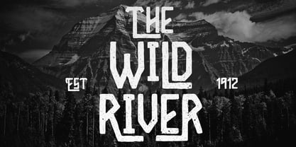
  34. Gumball Stencil by Ana's Fonts, $12.00
    Gumball is a hand drawn font using an old letter ruler. It is a versatile sans serif font, perfect to make a statement in postcards, posters, titles, branding and packaging, etc. The Gumball font family includes four fonts: Gumball, Gumball Italic, Gumball Blackout, Gumball Blackout Italic
  35. Glossy Sheen by Ali Hamidi, $10.00
    Glossy Sheen is a shine layered font. A fun thick font with 4 layers of fonts to choose from! There are shine, shadow and outline that you can pick. This font is perfect for t-shirt, packaging, branding, posters, greeting cards, quotes and so much more.
  36. Realico by Digitype Studio, $17.00
    Realico is a serif display made carefully and gives a unique impression to your text. This font is suitable for titles, logos, and other formal forms such as t-shirts, labels, magazines, books, greeting cards, packaging, fashion, makeup, stationery, novels, labels, or whatever—type of advertising objective.
  37. Rustler Barter by Showup! Typefoundry, $20.00
    RustlerBarter is an elegant display font inspired by the Art Deco era. It perfectly represents vintage aesthetics in a modern and minimalist way. The font includes special uppercase letters, alternate characters, and beautiful ligatures. Furthermore, the font is perfect for elegant logo design, packaging or invitation cards.
  38. Cerita Kids by Beewest Studio, $10.00
    Cerita Kids is Doodle Comic font style. This font is look relax and fun, suitable for comic and Children book. This font is rendered and done by manual hand drawing that digitalized as a font so this font is very natural. Thank you for download this font.
  39. Seacoast by Fikryal, $18.00
    Seacoast is a hand brush font perfect for crafting, branding, invitation, stationery, wedding designs, social media posts, advertisements, product packaging, product designs, label, photography, watermark, special events, or anything. Seacoast comes with a full set of uppercase and lowercase letters, ligatures, multilingual symbols, numerals, and punctuation.
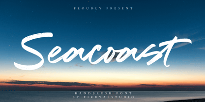
  40. Cuckoo Fat by Very Good Fonts, $19.00
    Cuckoo Fat was first seen in 1988 when I painted it on a record shop's window. Since then this hand lettered font has been there and done that. Cuckoo Fat is a loud and proud, classic and informal display font designed to work well on any job.
Looking for more fonts? Check out our New, Sans, Script, Handwriting fonts or Categories
abstract fontscontact usprivacy policyweb font generator
Processing