10,000 search results
(0.029 seconds)
- Humorist JNL by Jeff Levine,
$29.00 The May 7, 1936 issue of “The Film Daily” carried an ad for the Will Rogers Memorial Hospital Fund. (In August of 1935 Rogers, along with famed aviator Wiley Post died in a plane crash.) While the fundraising for the hospital was a serious event, Rogers is remembered as a humorist, hence the font’s name of Humorist JNL.
 - Andreis by Tipo Pèpel,
$28.00 Andreis is a typeface inspired by the art nouveau shapes that appear in the letters of a metal box, made at the beginning of the 20th century by the company G. De Adréis from Badalona in Spain. Its organic and feminine forms evoke the aesthetics of those years and add elegance to the projects where it is used.
 - Nonstop by PizzaDude is a font that directly embodies the spirit of fun, creativity, and relentless energy. Just like the name suggests, Nonstop carries an unstoppable, dynamic flair that can instant...
- The Friday13 font is an intriguing and distinctive typography choice that evokes a sense of eeriness and suspense, making it an excellent option for projects that aim to captivate and thrill. Its nam...
- Sure, let's dive into the essence of the TekHead PD font. Picture this: a font that seems as if it has been transported straight from a digital realm, where the lines between tech and art blur, creat...
- Ongunkan Lycian by Runic World Tamgacı,
$50.00 Lycia (Lycian: 𐊗𐊕𐊐𐊎𐊆𐊖 Trm̃mis; Greek: Λυκία, Lykia; Turkish: Likya) was a geopolitical region in Anatolia in what are now the provinces of Antalya and Muğla on the southern coast of Turkey, bordering the Mediterranean Sea, and Burdur Province inland. Known to history since the records of ancient Egypt and the Hittite Empire in the Late Bronze Age, it was populated by speakers of the Luwian language group. Written records began to be inscribed in stone in the Lycian language (a later form of Luwian) after Lycia's involuntary incorporation into the Achaemenid Empire in the Iron Age. At that time (546 BC) the Luwian speakers were decimated, and Lycia received an influx of Persian speakers. Ancient sources seem to indicate that an older name of the region was Alope (Ancient Greek: Ἀλόπη, Alópē). Lycia fought for the Persians in the Persian Wars, but on the defeat of the Achaemenid Empire by the Greeks, it became intermittently a free agent. After a brief membership in the Athenian Empire, it seceded and became independent (its treaty with Athens had omitted the usual non-secession clause), was under the Persians again, revolted again, was conquered by Mausolus of Caria, returned to the Persians, and finally fell under Macedonian hegemony upon the defeat of the Persians by Alexander the Great. Due to the influx of Greek speakers and the sparsity of the remaining Lycian speakers, Lycia was rapidly Hellenized under the Macedonians, and the Lycian language disappeared from inscriptions and coinage.
 - Mencken Std by Typofonderie,
$59.00 An American Scotch remixed in 27 fonts Mencken has twenty seven styles, divided into three widths, three optical sizes, romans and italics. Generally, optical size typeface families belong to a same common construction. It falls into the same category of type classification, while presenting different x-heights or contrasts. Mencken is unique because it is designed according to different axis and optical sizes. Firstly, Mencken Text is a low-contrast transitional typeface, designed on an oblique axis, asserting horizontal with featuring open counters. Its capitals follow Didots to better harmonize the rest of the family. On the other side of the spectrum, Mencken Head (and narrow variations) is designed on a vertical axis, high contrast, in a contemporary Didot style. The Mencken is therefore a typeface answering to different sorts of uses, whose design is different according to its uses: from oblique axis in small size to vertical axis in large sizes. Vertical proportions (x-height, capitals height, etc.) were calibrated to be compatible with many Typofonderie typeface families. Lucie Lacava and I followed the idea launched by Matthew Carter few years ago for some of his typefaces intended for publications. From Baltimore Sun’s project to Typofonderie’s Mencken It is a bespoke typeface for American newspaper The Baltimore Sun started at the end of 2004 which marks the beginning of this project. The story started with a simple email exchange with Lucie Lacava then in charge of redesigning the American East Coast newspaper. As usual, she was looking for new typeface options in order to distinguish the redesign that she had started. At the time of its implementation, a survey of the newspaper’s readers has revealed that its previous typeface, drawn in the mid-1990s, was unsatisfactory. The Mencken was well received, some reader responses was particularly enjoyable: “It’s easier to read with the new type even though the type is designed by a French.” Why it is called Mencken? The name Mencken is a tribute to H. L. Mencken’s journalistic contributions to The Sun. According to the London Daily Mail, Mencken ventured beyond the typewriter into the world of typography. Because he felt Americans did not recognize irony when they read it, he proposed the creation of a special typeface to be called Ironics, with the text slanting in the opposite direction from italic types, to indicate the author’s humour. Affirming his irreverence, the Mencken typeface does not offer these typographic gadgets. Henry Louis Mencken (1880 — 1956) was an American journalist, satirist, cultural critic and scholar of American English. Known as the “Sage of Baltimore”, he is regarded as one of the most influential American writers and prose stylists of the first half of the twentieth century. He commented widely on the social scene, literature, music, prominent politicians and contemporary movements. Creative Review Type Annual 2006 Tokyo TDC 2018
 - TT Ricordi Allegria by TypeType,
$29.00 Please note! If you need OTF versions of the fonts, just email us at commercial@typetype.org TT Ricordi Allegria useful links: Specimen | Graphic presentation | Customization options TT Ricordi Allegria is a sleek and intelligent contemporary Florentine grotesque inspired by the half-erased lettering in Basilica di Santa Croce, Florence. TT Ricordi Allegria was drawn by Antonina Zhulkova and reflects in its graphics the transitional stage between the classic serif with varying proportions, gravitating towards the Roman capital type, and the Florentine sans serif. The font is characterized by variability in the proportions of characters, contrast between strokes, wedge-shaped triangular characters, and the absence of traditional serifs. The main visual feature of the typeface is its diversity and the ability, using different stylistic sets, to completely change the character and perception of the typeface. The drawing of the characters from the main set is strict, thanks to which the font looks stern, as if the inscription in the font was really carved out of stone. And with the help of another set, we can add roundness, or even smoothness, to the font. This is due to the fact that the letters (E R K Q J Y in Latin, and Л К Ж Э in Cyrillic) from the second set have either very noticeable "curls" or smooth, rounded "legs". In addition, the typeface includes a set of beautiful ligatures for use in display inscriptions, such as large headlines. An interesting moment when working on the typeface was the creation of the Cyrillic typeset, since the Cyrillic alphabet does not so easily fit into the concept of the Florentine grotesque and stressed semi-serif. The most difficult thing in working on the Cyrillic alphabet was to create a system of spacing for characters, as it was done in the Latin alphabet, and to make sure that when typing in Cyrillic, the drawing of the text remained beautiful. That is why the letters Д Л У Ы appearing in the font family are somewhat unusual to the eye, and the proportions of other characters in Cyrillic are not quite “classic” either. In general, the Cyrillic set looks more display than its Latin prototype, but at the same time it lacks the sense of historicity or legacy of the Soviet past, which often comes to the foreground when working on the design of the Cyrillic alphabet in this type of serifs. TT Ricordi Allegria consists of two weights (Regular and Bold) and one variable font. Each style includes over 750 characters, as well as 19 OpenType features. Interesting features of the typeface include three stylistic sets that greatly change the perception of the font, a set of bright display ligatures, a few neat icons that are suitable for breaking text and will emphasize the visual language of the font. Please note! If you need OTF versions of the fonts, just email us at commercial@typetype.org FOLLOW US: Instagram | Facebook | Website
 - Overline Stencil by WAP Type,
$15.00 Overline Stencil font is perfect for your up coming projects. Such as logo branding, editorial design, fashion, stationery design, sport design, blog design, modern advertising design, card invitation, art quote, home decor, book/cover title, special events and any more.
 - Pen Nib Western JNL by Jeff Levine,
$29.00 Inspired by the hand lettered phrase “the pen is mightier than the sword” in a 1923 promotional blurb for Speedball lettering pens, Pen Nib Western JNL recreates the decorative style of this vintage artistic gem in both regular and oblique versions.
 - Batmeton by Aqeela Studio,
$20.00 Batmeton Script is a free-flowing script font created for packaging products, invitation cards, flyers, mockups, event posters, and anything else that requires high-quality vibes. It has a beautiful and balanced character, that fits well with the large design pool.
 - Compliments by E-phemera,
$20.00 Compliments was inspired by a few hand-lettered words on a 1930s brochure by Western Union entitled “The Yellow Blank is Correct for Every Social Need.” It is now available in OpenType format with contextual alternates for a better script effect.
 - Spooky Witch by Arkrist Letter,
$13.00 Spooky Witch is the latest Halloween font from Arkrist Letter studio. A serif font designed with elegant characters, but looks scary. Spooky Witch font is suitable for design, logo, greeting card, invitation, etc. make your day more spooky with Spooky Witch!
 - Crestwood by Ascender,
$29.99Crestwood is an updated version of an elegant semi-formal script typeface originally released by the Ludlow Type Foundry in 1937. Crestwood is best used at larger sizes, and is wonderful for invitations and greeting cards. Character Set: Latin-1 - Hey Bombshell by Make Media Co,
$12.00 Are you looking for a fun, bouncy lettering set for envelopes, logos, typography, branding and greeting cards?! Well look no further! Created with stationary in mind, Hey Bombshell is sweet, sassy and LOADED with extras to make your work stand out!
 - Society Members by Ali Hamidi,
$10.00 Society Members is a cool, quirky and thick lettered display font. Whether you’re using it for crafts, digital design, presentations, or making greeting cards, this font has the potential to become your favorite go-to font, no matter the occasion!
 - Namex by BaronWNM,
$14.00 Namex is a handwritten font with serifs. It tends to be a slab serif style while maintaining the hand-drawn shape, making it look original and non-standard. We recommend you use this font for retro and warm decoration designs.
 - Juicy Toon Font by Josie Makes Stuff,
$10.00 Juicy toon is the perfect font to add a sense of fun and happiness to your project! Round, bouncy characters are with varying line weight are designed to find the perfect balance between hand-drawn charm and a polished, professional finish.
 - Frontiersman JNL by Jeff Levine,
$29.00 The pages of the Speedball® Lettering Textbook have yielded a number of classic typefaces for digital designers. Frontiersman JNL and Frontiersman Black JNL have the wonderful hand-lettered look that adds just the right touch of nostalgia to any layout.
 - Polythem by Haksen,
$13.00 "Polythem" is a beautiful high bold script font that makes for gorgeous logos, posters, wedding invitations, blog posts, social media, and more! Polythem Script includes ligatures to make everything look totally hand-done, and alternates for each letter. Thanks for visited
 - Paletone by Bale Type,
$15.00 Paletone is hand lettered sans in two style, Regular & Bold. With the organic and handmade feels, you can use this font for any project. This minimalist font also suitable for the project with earth tone color. Also good for quotes.
 - Walentiny by Stringlabs Creative Studio,
$25.00 Walentiny is a Script Font with Handwritten Style. The Walentiny font made with digital brush pen strokes that making this font look authentic. This font is perfect for fashion brand, wedding invitation, business card, logo brand, signature, and then calligraphy.
 - Come Alive by Epiclinez,
$18.00 Introducing Come Alive, a hand-drawn, organic feel brush typeface. With its carefree and playful vibe, this typeface is suitable for logos, apparel, headlines, and more. Add a warm touch to your design projects with this fun and energetic brush typeface.
 - The Heista Killer by Almarkha Type,
$29.00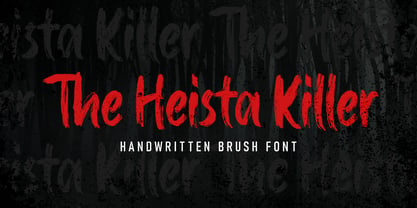 The Heista Killer – Handwritten Brush font with a clear style and dramatic movement this font is great for your next creative project such as logos, printed quotes, invitations, cards, product packaging, headers, Logotype, Letterhead, Poster, Apparel Design, Label, and etc.
 - Stencil Army by WAP Type,
$15.00 stencil army font is perfect for your up coming projects. Such as logo branding, editorial design, fashion, stationery design, sport design, blog design, modern advertising design, card invitation, art quote, home decor, book/cover title, special events and any more.
 - TXT Monique by Illustration Ink,
$3.00Customize your lettering project with this cool and clever font. Download it for fanciful journaling on scrapbook pages and greeting cards. Try it on Halloween party invitations or wherever you might want to add a whimsical touch to a unique publication. - Fanteo by Balevgraph Studio,
$10.00 Fanteo is a cool, modern and neat display font. This font is ideal for writing web designs, business cards, or pretty much anything else that requires a unique touch. What's Included? Uppercase & Lowercase Numbers & Punctuation Regular & Italic Multilingual Support PUA Encoded
 - Thievery by Hanoded,
$15.00 The idea behind Thievery… is that there is no idea behind it. Thievery is just a nice, legible, happy typeface. It is hand made, has lots of curly swirly bits and looks good as well. So… grab it and run!
 - Gingerbread by Alexandra Korolkova,
$30.00 Gingerbread is a soft and sweet holiday font with extended character set, inspired by soft shapes of sweets and bakery. It is good for greeting cards and other holiday stuff. Especially for Christmas it has a dingbats companion font — Gingerbread House.
 - Machineat by Wacaksara co,
$18.00 Machineat is truly inspired by traditional hand painted sign style, with the natural flow and handmade taste this typeface is ready to use for your projects such as Logotype, Letterhead, Poster, Apparel Design, Label, Advertisements, Product designs, Mural, and etc.
 - Hoxie JNL by Jeff Levine,
$29.00Hoxie JNL is based on an example found in an old sign painter's design book from the early 1900s and has been translated to digital form by Jeff Levine. All of the quirks and charm of hand lettering have remained. - Arionna by Stringlabs Creative Studio,
$25.00 Arionna is a Script Font with Calligraphy Style. The Arionna font made with modern digital brush pen strokes that making this font look beautiful. This font is perfect for fashion brand, wedding invitation, business card, logo brand, signature, and then calligraphy.
 - P22 Royalist by IHOF,
$39.95 Royalist Pro is an expanded OpenType font based on "Secretary Hand" from the time of the English Civil War, circa 1632. This Pro version includes over 500 glyphs with alternate characters, ligatures and full Western and Central European Characters sets.
 - Belisha by Letterena Studios,
$9.00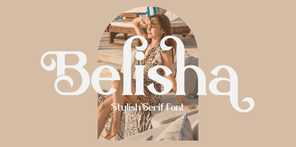 Belisha is a lovely and distinct serif font. It will elevate a wide range of crafting ideas, from cards, to branding, labels and much more. This font is PUA encoded which means you can access all glyphs and swashes with ease!
 - CaliCholo by Graffiti Fonts,
$19.99The CaliCholo font is inspired by the wide array of Chicano styles seen on the bay area and southern California streets. This simple representation is natural & rough in emulation of hand written letters using spray paint. Two alphabets, numbers, symbols. - PlainPensle by Ingrimayne Type,
$14.95 As its name suggests, PlainPensle is a handwriting font that emulates printing and writing with a pencil or ballpoint pen. The plain and bold styles have hand printing that is ordinary and nondescript. The italics and bolditalics contain simple handwritten cursive.
 - Wapstina Love by VType,
$18.00 Wapstina Love is a modern duo font that combines stylish calligraphy with a classic serif font. It comes with one-of-a-kind ligature, making it an ideal font for your blog, logo, social media, branding, poster, quotes, wedding cards etc.
 - Rits Calltown by Zamjump,
$17.00 Rits Calltown is casual script typeface. Perfect for your next creative project such as Logotype, printed quotes, invitations, cards, product packaging, headers, Letterhead, Poster, Apparel Design, Label, and etc. FEATURES : – Uppercase – Lowercase – Number – Multilingual – Opentype FILES INCLUDED : OTF., TTF WOFF file
 - Austy by Cititype,
$14.00 Austy is sophisticated typography that looks authentically handwritten. This typeface comes with 120 ligatures for a natural flow and feel, Use Austy to create stunningly beautiful designs easily. Perfect for logos, Digital signature, branding, business cards, watermarks, and much more!
 - MAISY by Cultivated Mind,
$29.00 A chic and simple geometric hand font. Maisy comes with a set of icons and is perfect for fashion, marketing, books, websites, magazines, film and television. Maisy comes in two font styles (basic/wide) and four weights (light/regular/bold/black).