10,000 search results
(0.029 seconds)
- Bubble float by Fox7,
$10.00 Bubble Float is a cute, easy-to-read, and jolly display font. You can use this font in various projects, such as blog posts, logos, branding, ads, invitations, greeting cards, planners, photo albums, decorations, and much more.
 - Hijrnotes by Mans Greback,
$59.00 Hijrnotes is a quick, handwritten and monolined script font. Big uppercase with a very small lowercase, but it is still elegantly readable. Very good for autography design, name cards, neon signs and quote typography posters and flyers.
 - Baby Born by Nurf Designs,
$14.00 Baby Born is a playful and childish display font. It is suitable for greeting card, birthday invitation, labels, packaging, t-shirt designs, logotypes and much more. Baby Born comes with uppercase, lowercase, numerals, punctuations & multilingual support characters.
 - Mural by Solotype,
$19.95Another caps-only font for which we have designed a lowercase. It was originally brought out in smaller sizes for card work, but proved to be so popular that sizes up to 48 point were soon added. - Brightsome by FHFont,
$18.00 Brightsome is a hand-lettered brush script with OpenType features. It is suitable for design, weddings, events, t-shirts, logos, badges, stickers, and more to make your work awesome. Features: - OpenType Features - PUA Encoded - Multi-Language Support
 - Ginger Mate MS by Redcollegiya,
$8.00 Ginger Mate is a handwritten funny font duo which makes it great for Christmas cards or advertising, as well as for any children's design. Each of these fonts include latin and cyrillic characters, diacritics, numbers and punctuation.
 - Vivala Line by Johannes Hoffmann,
$16.00 Vivala Line is a real italic, and it was inspired by old Polish children's books with its charming hand drawn lettering titles. Fields of application are posters, magazines, packaging design, books, corporate design up to consolidating reading.
 - Brilliant Summer by Typestory,
$15.00 Brilliant Summer is an enchanting handwritten font. This lovely and fresh script font has a wide spectrum of applications ranging from greeting cards to headlines and is guaranteed to add a romantic feel to your next projects.
 - Salt & Pepper by Almarkha Type,
$29.00 Salt & Pepper is cute handwritten, but also Crafty. This versatile script font has a wide range of applications ranging from greeting cards to kids’ crafts, and is guaranteed to add a sweet touch to your next design.
 - Silver Pen by Khurasan,
$8.00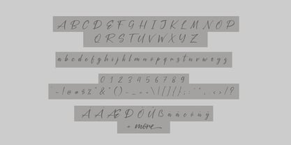 Introducing the Silver Pen script, a font that is very fresh and unique style handmade. Silver Pen script is perfectly suited to logos, signature, stationery, posters, apparel, branding, wedding invitations, cards, tagline, layout design, and much more.
 - The Diamonds by Krntype Studio,
$16.00 The Diamonds is a stylish hand-writen script font. designed to display luxury and shopisticated writing. With this font, you can built an amazing work. Such as stylish luxury branding & logos, packaging, handwritten quotes, merchandising, advertising, etc.
 - MVB Celestia Antiqua by MVB,
$39.00Mark van Bronkhorst designed MVB Celestia Antiqua at a time when font choice was limited. Design was characterized by overuse of the few fonts that came with laser printers. A rustic typeface, recalling the roughness and irregularity of pre-digital printing, was a response to the cold crispness of DTP. MVB Celestia Antiqua holds its own among a large group of other “weathered” serif fonts, in part due to the size of the family: three weights, small caps, italics, and two titling styles. But it's also successful because it's simply drawn well, the contours only as rough as they need to be, enabling text at any size, large or small. - Emy Slab by Latinotype,
$29.00 Emy Slab is a slab serif based on the classical proportions of Egyptian typefaces but with soft terminals that give the font a more friendly and modern look. Emy Slab consists of two subfamilies of 7 weights, ranging from Thin to Black with matching italics, resulting in a total of 28 fonts. The standard version is ideal for editorial design, tiles, books, magazines, corporate design and all types of publications. The Alt version—due to its display features, asymmetric shapes and contemporary appearance—is well suited for logotypes, branding, packaging, and use on web and Tv. Emy Slab contains a set of 440 characters that support 208 different languages.
 - Sintesi Semi by FSdesign-Salmina,
$39.00 Are you looking for a robust, contemporary font with strong personality? Sintesi Semi might be exactly what you are looking for. Sintesi Semi is a hybrid font which manages the “synthesis” between Sans and Serif in its own way. Due to its constant stroke the favorite font of the author is closer to a sans serif and scores with its robustness and contemporary style. Its strong serifs though evoke rather a slab serif font. Sintesi Semi builds together with Sintesi (Serif) and Sintesi Sans an extended family. Prove character too, with Sintesi Semi. Download a free trial version of Sintesi Semi with a reduced character set. Check it out!
 - Just One by Supersemarletter,
$11.00 Just one is a fun and friendly handwritten font. Its casual charm makes it look very simple, easy to read and, ultimately, very versatile. This font will look amazing in any context, whether it’s used on a DIY, outdoor project or as a main title!. Honestly it works perfectly for headlines, logos, posters, packaging, T-shirts and much more. Font Features : • Regular version • Character set A-Z in uppercase and lowercase • Numerals & Punctuation • Accented Characters • Multiple Languages Supported Recommended to use in Adobe Illustrator or Adobe Photoshop with opentype feature. If you have questions, just send me a message and I'm glad to help.
 - Dash Wisher by PizzaDude.dk,
$15.00 The name Dash Wisher is a wordplay. The letters of the font are also quite playful - you never know what comes next, when typing. There is no exact x-heigh, the baseline is jumpy, the descender and ascender are messed up...there are no real rules for Dash Wisher! But with all that in mind, it comes out surprisingly legible, which means it does have a wide range of use. Let your fantasy and imagination break the boundaries and Dash Wisher do the rest - or maybe the other way around! :) I've added both ligatures to substitute double letters and a set of alternate letters as well.
 - Marker by Mix Fonts,
$13.00 Mix Marker is a playful and unique handwritten label font that adds a touch of human flair to your projects. Imagine writing your name on a mailing label with a marker – that’s the fun, casual look and feel of this special font. Each character was handdrawn with a basic everyday marker, and then carefully digitized, cleaned up, and converted into a font. Mix Marker is perfect for adding a handmade touch to DIY themed projects, or for giving your digital designs a handlettered feel. So why wait? Make what’s digital seem handwritten with Mix Marker. Mix Marker includes the dollowing characters: ABCDEFGHIJKLMNOPQRSTUVWXYZ abcdefghijklmnopqrstuvwxyz 0123456789 !@$#%^&*()`~• +=[]:;'”,.\|/?{}<>“”‘’-–—_…°¡¿₱¢€£¥ ÁÀÂÄÃÅĂĀĄÆĆČÇÐÉÈÊËĖĒĘÍÌÎÏĪĮŁŃÑÓÒÔÖÕØŌŐŒŚŠȘȚÚÙÛÜŰŪŲÝŸŹŽŻÞ áàâäãåăāąæćčçðéèêëėēęíìîïīįłńñóòôöõøōőœśšșțúùûüűūųýÿźžżþß
 - Appetite Pro Rounded by Serebryakov,
$39.00 Appetite Pro Rounded is an extension of the world wide popular display fonts Appetite Pro (2016) and Appetite Rounded (2011). Appetite Pro Rounded consists of 10 weights — 5 regular and 5 italic — from Light to Heavy. It’s a multilingual and international rounded font, with a full western latin, cyrilyc (russian, belarusian, ukrainian) and basic Greek support. Appetite Pro Rounded font family special designed made in addition for Appetite Pro. Due to the 10 weights rounded font and 10 weights normal weights palette you can solve a wide variety of professional problems without spending money on extra fonts for titles, sub-titles and main text.
 - Rutherford by Device,
$39.00 Rutherford is clear, robust and authoritative, and reads well at small text sizes while also having the required heft for larger headlines. A wide range of weights makes it a versatile choice for magazines, branding, brochures and advertising. A slightly condensed obround serif with squared stroke terminals. The t, j and f curve around to harmonize with the terminals on the a and g, as does the tail of the Q. The italic incorporates cursive forms on the ends of the lower right and upper left strokes, and uses a single-story a. Includes full European Latin support and alternate designs for the Q and g in all weights.
 - Orbi Sans by ParaType,
$30.00 Orbi Sans was designed as an extension of the font system Orbi released on the end of 2010. It’s a low contrast humanist sans serif of open design with the elements of dynamic nature that inherited from Orbi its elegance and clearness. The faces were coordinated with Orbi on metrics, proportions, weights, and design features. Orbi Sans consists of 4 roman weights with corresponding true italics. It can be used together with Orbi and separately. Due to wide variety of styles the family is very good for books, periodicals, and business papers. The fonts were designed by Natalia Vasilyeva. Released by ParaType in 2011.
 - Bookman Old Style by Monotype,
$40.99 The origins of Bookman Old Style lie in the typeface called Oldstyle Antique, designed by A C Phemister circa 1858 for the Miller and Richard foundry in Edinburgh, Scotland. Many American foundries made versions of this type which eventually became known as Bookman. Monotype Bookman Old Style roman is based on earlier Lanston Monotype and ATF models. The italic has been re drawn following the style of the Oldstyle Antique italics of Miller and Richard. Although called Old Style, the near vertical stress of the face puts it into the transitional category. The Bookman Old Style font family is a legible and robust text face.
 - Mohair Sam NF by Nick's Fonts,
$10.00A collision between some stylin' caps from legendary lettering artist Samuel Welo and a lowercase loosely based on ATF’s Romany Script yields this curious little wonder. Named after a 70s song which averred that all it took to be “the coolest guy what is what am” is to talk fast, walk slow and look good wearing that 'hair. Please note that, due to the exaggerated overhang of the many of the uppercase characters, this font has been optimized for upper- and lowercase uses. Both versions of this font contain the Unicode 1252 (Latin) and Unicode 1250 (Central European) character sets, with localization for Romanian and Moldovan. - Pucky by Just My Type,
$25.00 When teaching font-making at the Art Institute of Tucson, I give my students plenty of lab time to come up with design ideas. I designed Pucky while one class created their fonts. It came about through an idea for a capital A: sort of a triangle with two round sides and a crossbar formed by a circle falling out. (You can see it here.) In drawing that, I hit upon the idea of making the tops of the alphabet sharp and square and the bottoms rounded. (See the whole alphabet here.) Pucky suggests both circus and psychedelia. Hmmmm, does anybody have an “in” at Cirque du Soleil?
 - Colin by Tickbite Type,
$18.99 Colin is a fresh, somewhat futuristic geometric sans serif type with a large x-height that, to me, communicates both seriousness and cheerfulness. It supports 70 languages incl. monotonic Greek and comes in 7 weights with a small number of alternate glyphs (ss01) for more flexibility. It features fractions, old style and tabular figures. Colin works great in titles, displays and short paragraphs. And where does it come from? To be honest, the reason for this font is a selfish one. I wanted a typeface where my initials (n and c) look identical, just rotated by 90 degrees. That didn’t completely work but, hey, it’s pretty close.
 - Monofontis by AlfaBravo,
$25.00 Monofontis is a contemporary, monospaced display typeface full of ligatures and glyphs to keep your designs stylish, modern, and standing out in a crowd. Monofontis typeface has a contrasting character that combines laconic technical forms, extraordinary details, and calligraphic grace, most noticeable in Italic. As a monospaced typeface, Monofontis will be indispensable for magazine titles, headlines, and short text fragments, logos and branding, web and interface design, posters, and advertising due to its unique nature. Furthermore, Monofontis is an excellent match for a tabular design, columns, clear and rigid layouts, and programming code.Monofontis consists of 18 styles: 9 styles in the Basic family, 9 styles in Italics.
 - Vivizza by Julia Visht,
$20.00 Vivizza Bold - Modern, classy and elegant! New stylish multifunctional Serif from Julia Visht! Perfect at large and medium size - Vivizza Bold does well from large eye-catching headlines , to medium headings. Two different models of letter spacing for uppercase and lowercase letters! Carefully constructed built-in opentype kerning pairs to ensure impeccable letter spacing throughout the font. Main features: -Ligatures. Set of opentype ligatures allows to make your design truly unique. -Great for web-design, logo creating, modern branding, posters, headers, advertising and so much more. -Multilingual support. English, German, Italian, French, Danish, Norwegian, Swedish, Italian, Spanish, Filipino, Scottish Gaelic,Indonesian, Irish, Swiss German, Portuguese, Finnish. Stylish Serif for Stylish Projects!
 - Wieynck Fraktur by RMU,
$25.00 Heinrich Wieynck’s blackletter font, carefully redrawn and redesigned for modern use. Due to its proportions, this blackletter font can also be used for body texts. This font contains the letter ‚long s‘ which can be reached in two ways. Either you use the OpenType feature ‚historical forms‘, or you type the summation sign on your keyboard. There are two graphic elements implemented, a corner element and a pearl for framing. The corner can be set by [alt] + [shift] + 1 for the outline, and [alt] + v for the filling. The pearl, set on a path, is accomplished by [alt] + [shift] + p for the outline, and [alt] + p for the filling.
 - Banco by ITC,
$29.00Banco was the first typeface work of French designer Roger Excoffon and was released in 1952. The strong forms look as though they were rolled out of sheet metal and feature upright, tapering strokes. The slight slant, the varying heights of stroke ends, and the relationships between line and curve give Banco font its sense of liveliness and dynamism. Excoffon did not design a matching lower case alphabet for his capitals, but this was accomplished later by Phill Grimshaw, who also designed the light weight. He deliberately 'underdesigned' the lower case forms, producing a more reserved alphabet based on the design ideas of the original. - RyuGothic by StudioJASO,
$42.00 RyuGothic Family is a humanistic interpretation of the Hangul Gothic style. It delivers messages in a soft, calm tone that does not overpower. The narrow counter design of consonants in Hangul and the narrow counter of the Latin lowercase letters are connected to create a sense of structural unity between the two sets of characters. This enables you to read long lines and works well in a variety of media and situations. Each font includes: 2,350 Hangul syllables, the smallest unit for expressing modern Korean; Latin Basic; punctuation; symbols for Korean codepage. Cyrillic, Greek, and Kana alphabets were excluded. The punctuation is designed in the preferred location for Korean typesetting.
 - Slaphappy by Comicraft,
$29.00 Are you feeling a little dazed, silly, or light-headed? Are you talking incoherently as if you've received repeated blows to the head? Would you perhaps describe yourself as punch-drunk? Happy-go-lucky? Have you recently been sleep deprived or are experiencing excessive feelings of fatigue or tiredness? Have you become prone to inane semi-maniacal rambling? Have you been making strange and/or meaningless remarks? Are you demonstrating fits of random and inexplicable behavior? Did you just give yourself a wedgie? Experiencing bouts of uncontrollable laughter -- at your own jokes? Standing on a silver surfboard holding a hot dog and wondering why?! You're off your rocker, dude; Slaphappy!
 - Bubble Block by Sipanji21,
$15.00 Bubble Block" is a 3D layered graffiti font that encompasses solid, shadow, and inner shadow styles, offering the tools to create a three-dimensional appearance in your text. Fonts with layered styles like this are often utilized in graffiti art, posters, or other designs that aim to create a prominent 3D effect. By using the solid, shadow, and inner shadow layers in "Bubble Block," you can add depth and dimension to your text, giving it a dynamic and visually impactful 3D appearance. This font enables you to create text that stands out prominently and grabs attention due to its three-dimensional effect and layered style.
 - Cullion by Greater Albion Typefounders,
$9.95 Cullion is a new departure for Greater Albion, being a modern Fraktur, embodying future trends sch as highly stylised glyphs, a single case of lettering and highly evolved letterforms. At the same time it can trace its inspiration back to blackletter traditions, and is inspired by the sort of ironwork to be found in a medieval portcullis. The resulting typeface can sit happily in traditional, modern or futuristic design work. As the gallery images suggest, it does rather lend itself to work with a 'horror' theme, but it could have many other uses too-even in religious work. Cullion is particularly effective in poster headings.
 - Seabright Monument by Device,
$39.00 During a ‘type walk’ at the 2007 AtypI conference in Brighton, typographer Phil Baines pointed out what he considered to be a particularly egregious example of over-decorative art nouveau lettering on a war memorial. This made me determined to use it as the basis for a font. Released in Opentype, it now features ligatures, swashes and alternates. It’s not certain if the curved top bars on the E and F are a feature of the original design or due to climbers using them as footholds, but I incorporated them anyway. It has recently been used for invitations and supporting print material for formal charity dinners at the House of Lords.
 - Quant by Hoftype,
$49.00 Quant is a contrasted typeface with a fresh and well-reasoned appearance. It owes allegiance to classical structure but is a free design and does not refer to any historical model. Although it has strong qualities as a reading type, its distinct and powerful ductus makes it superb for headlines and in display sizes. Quant is well-equipped for ambitious typography. The Quant family consists of 8 styles, comes in OpenType format with extended language support for more than 40 languages. All weights contain small caps, proportional lining figures, tabular lining figures, proportional old style figures, lining old style figures, matching currency symbols, fraction and scientific numerals.
 - Stripes by profonts,
$41.99 Stripes is a caps only font and does not contain additional ligatures, because there is an easy way to create as many of them as you like. To form a ligature, convert your word or word string into vectors. Activate the corner points of the straight lines (not the round ones) of a letter and drag them over the next or the previous letter. This way you can create any ligature of your own. Beware of overkilling, it could decrease the legibility of your text. Besides the normal J, Stripes contains a stylistic alternate which should be used to avoid ugly gaps between critical letter pairs (see pdf document).
 - Cajoun by Linotype,
$29.99Cajoun is a bold serif face from German designer Hans-Jürgen Ellenberger. The letters sit visually low on their baseline, in part due to their small x-height. Also, the curved portions of the letterforms have an old-style distribution of weight, which pulls the eye downward. This font has a contemporary feel, however, with crisp edges, and some pointy terminals. The typeface also contains old style figures. Cajoun is recommended for use in larger applications, where the eye can get a change to dance along its wide curves. Cajoun was designed in 2002, and is part of the Take Type 5 collection from Linotype GmbH." - Excalibur Sword by Comicraft,
$19.00 The Sword has been Drawn! The Quest for the Holy Grail has begun! When Arthur took the mighty sword of Excalibur from the Lady of the Lake, little did he know of the stories that would be spun, the myths that would be built around him, the Legend of Camelot and the Knights of the Round Table! And The Font. Merlin might have been King Arthur’s sage advisor, a font of wisdom and magicks, but never was Merlin available in postscript, truetype and opentype formats, nor was Lancelot, Arthur’s First Knight suitable for Celtic Display Lettering! See the families related to Excalibur Sword: Excalibur Stone.
 - Bottle Party by PizzaDude.dk,
$20.00 A bottle party is a party where you are supposed to bring whatever you wish you drink. When using my Bottle Party font, you need not bring anything at all! The font does all the partying itself - all you need to do is type, and the contextual alternates makes sure that your text doesn’t repeat the same letters over and over again! How is that? As I said, it happens automatically as you type, because the font cycles through the 4 different versions of each lower-case letter! The font is handmade with a brush feeling to it, legible at even very small sizes and it’s quite full of international characters!
 - English Grotesque by Device,
$39.00 English Grotesque is based on the proportions of an early 20th century signwriter’s sans, emphasising the characteristic idiosyncrasies of type of the period. Sharing a similar Roman circle-and-square construction as Gill Sans or Johnston Railway, it has a wide T and W, a narrow S, and a long-tailed R. The Roman alphabet did not include a lower-case, and therefore early sans-serifs tended to base theirs on handwritten or cursive models, resulting in more even character widths. English Grotesque, by contrast, carries the more characterful proportions of the capitals through to the lower case. Available in six weights, with optional alternative versions for the Q, &, £ and J.
 - Svarajka by Ilhamtaro,
$19.00 SVARAJKA is a classic script font inspired by the old copper plate font with a slight oversimplification of the case so it's less decorative. In addition to being classic, this font is also elegant, so it does not rule out the possibility for a simple and elegant modern design, and it will also be very beautiful for writing letters or as a font for weddings such as invitations or names of the bride and groom. To enable the OpenType Stylistic alternates, you need a program that supports OpenType features such as Adobe Illustrator CS, Adobe Indesign & CorelDraw X6-X7. Guides to access all alternates glyphs : http://adobe.ly/1m1fn4Y Cheers!