10,000 search results
(0.03 seconds)
- Rocktypes by HIRO.std,
$18.00 Rocktypes is Display Font This font describes about about strong, bold, taft, manly, hard, power, stiff, mighty, brave, gallant, rigid. FEATURES - Uppercase letters - Numbering and Punctuations - PUA Encoded Characters - Multilingual Support - Works on PC or Mac USE Rocktypes works great in any branding, logotype, magazines, poster, social media posts, clothing, advertisements, product packaging, product designs, label, company profile, quotes and any projects that need STRONG and BOLD taste. Enjoy using! Thanks. HIRO.std
 - 1880 Kurrentshrift by GLC,
$38.00 This font was inspired by the old form of the so called "Kurrentschrift" German handwriting, based on late medieval cursive. It is also known as "Alte Deutsche schrift" ("Old German script"). It was taught in German schools until 1941, when Adolf Hitler decided to forbid it. As it is a little hard to read, we are proposing here two versions: the "pure" Kurrentschrift, and an adapted "Easy" one, with simplified difficult characters.
 - Black Crow by Fractal Font Factory,
$12.00 Black Crow is a display sans-serif type family includes eight weights. It is influenced by the geometric-style sans-serif faces that were popular during the 1920s and 30s. The styles are based on geometric forms that have been optically corrected for better legibility. Black Crow has a functional look with a hard touch. It is manually hinted and optimized for screens, so it will be a good choice for Websites, eBooks or Apps.
 - Funkboy by PizzaDude.dk,
$20.00 Funkboy looks like something that was made 20 years ago. You know, when Grandmaster Flash was scratching to the beat and graffiti was totally underground. Funkboy was made to look 100% oldschool, and now you can make your own bad-boy oldschool graffiti, using your computer! Comes with two hard knock alternate letters: the peace 'o' + the heart dotted 'i' You will need to use OpenType supporting applications to use the autoligatures.
 - Grifa Slab by deFharo,
$14.00 Grifa Slab is a chunky typeface with thick rounded slab serifs in 4 styles with true italics, ideal for very legible titles and with a hard and smooth aspect at the same time. You can use this font in editorial design for headlines, also for advertising and the design of posters, signs or posters, in all cases readability is guaranteed. The typography has a set of 525 characters (Latin Extended-A) and OpenType functions.
 - Faubourg by Positype,
$39.00 Faubourg marks the first professional typeface release by Marie Boulanger. As much traditional as it is unconventional in its celebration of letterforms, this typeface dances on the page and screen as it moves from a more conventional appearance to monoline and back again. The flowing silk-like undulation only accentuates this distinguishing feature and produces one opportunity after the next for headline settings where the word is as important as the content supporting it.
 - Visum by Hanoded,
$15.00 Visum means Visa in Dutch. The name was inspired by Dutch soccer club Vitesse's rather sad decision to leave Israeli player Dan Mori behind, after he was refused a UAE visa because of his nationality. Visum font is a tall and proud all caps typeface. It comes with alternates for the lower case letters, some ligatures and an impressive language support. Of course, upper and lower case glyphs can be freely interchanged.
 - Pop Flowers by kapitza,
$79.00 Pop Flowers is set of 64 cute graphic flower illustrations derived from Kapitza's graphic pattern font Pop. Pop Flowers marks a new direction in Kapitza's exploration of shapes in nature. While their projects such as Blossomy and We Love Nature Leaves are based on photographs of plants and flowers, Pop Flowers is constructed of graphic shapes. In moving away from 'realistic' forms, Pop Flowers creates a reality of its own that evokes a magical atmosphere.
 - Mrs Eaves by Emigre,
$125.00 This typeface is named after Sarah Eaves, the woman who became John Baskerville’s wife. As Baskerville was setting up his printing and type business, Mrs. Eaves moved in with him as a live-in housekeeper, eventually becoming his wife after the death of her first husband, Mr. Eaves. Like the widows of Caslon, Bodoni, and the daughters of Fournier, Sarah similarly completed the printing of the unfinished volumes that John Baskerville left upon his death.
 - Chola Boba by Authentype,
$14.00 Chola Boba is a friendly font with an innocent and youthful look. This font has best for a lot of print, digital, and net designs. Chola Boba is a font it really is best for any layout project. It is available in nine unique weights with a contented sans serif style. This font will make your textual content readable & without problems recognizable for your audience. So move ahead, use Chola Boba in your subsequent project!
 - Hamada by Linotype,
$29.99 Hamada is a script typeface based on the powerful work of English calligrapher Gaynor Goffe. Hamada captures looseness and charming irregularities of the pen on the page, allowing ink to edge out from the contours and move across curves and letters. Thanks to OpenType, Hamada creates an impression very much like that of real calligraphy. Most of the letters in Hamada have alternate versions; the typeface comes with ligatures, ending swashes, and more.
 - Catalina by Kimmy Design,
$10.00 Earlier this year I visited a bakery in Newport Beach, CA and fell in love with the organic design and typography of the place. Hand-drawn menus, table cards, chalkboards, and wall quotes surrounded the charming spot. It inspired me to create a new font family based on the combination of hand drawn fonts. Included in this package are 5 font families, with 2 graphic ornament fonts. Each font family contains at least a light, medium and bold. Here is a breakdown of what's cookin' at Catalina's Bakery: Catalina Anacapa: Tall and skinny, this font comes in 3 weights for both sans and slab serif styles. It includes contextual alternatives (giving 3 versions of each letter), stylistic alternatives for select letters (A, K, P, Q, R, Y) and also includes Small Caps. Catalina Avalon: Based off Anacapa, this sub family has a high contrasting line weight. It comes in light, regular and bold as well as an inline alternative for both sans and slab serif styles. Avalon also includes opentype features such as contextual alternatives (giving 3 versions of each letter), stylistic alternatives for select letters (A, K, P, Q, R, Y) and small caps for each letter. Catalina Clemente: In a more standard width, Clemente is one of the two sub families that can be used for paragraph text as well as headlines. It's organically geometric in style and comes in ALL CAPS and lowercase, includes upright and custom italics, and has the opentype feature giving 3 versions of each letter. Catalina Script: A great compliment with the display sub-families, Catalina Script rounds out the package with a hand-drawn cursive flair. It includes contextual alternatives (giving 2 variations to each letter) as well as stylistic alternatives for many of the capital and lowercase letters. It has special ligatures for some letter combinations, and titling alternatives for all the capital letters. Catalina Typewriter: The second of the paragraph text sub-families, this typewriter inspired hand-drawn font family works great as either a display or paragraph text. It has contextual alternatives with 3 versions of each letter, and comes in both upright and custom italics versions. Catalina Extras! These two fonts go perfectly with the Catalina Family. They includes borders, frames, arrows, banners, flourishes and more. Catalina Flourish has all of it's options in a light and bold style, to use the light version type all lowercase letters, then to make something bold, used it's uppercase (or shift+) characters. For a breakdown of graphic/letter correlation, see the breakdown PDF. All of Catalina was drawn by the same hand, using the same ink and technique. While they contrast in their type styles, they work together perfectly to create one cohesive font family.
 - New Lincoln Gothic BT by Bitstream,
$50.99New Lincoln Gothic is an elegant sanserif, generous in width and x-height. There are twelve weights ranging from Hairline to UltraBold and an italic for each weight. At the stroke ends are gentle flares, and some of the round characters possess an interesting and distinctive asymmetry. The character set supports Central Europe, and there are three figure sets, extended fractions, superior and inferior numbers, and a few alternates, all accessible via OpenType features. Back in 1965, Thomas Lincoln had an idea for a new sanserif typeface, a homage of sorts, to ancient Roman artisans. The Trajan Column in Rome, erected in 113 AD, has an inscription that is considered to be the basis for western European lettering. Lincoln admired these beautiful letterforms and so, being inspired, he set out to design a new sanserif typeface based on the proportions and subtleties of the letters found in the Trajan Inscription. Lincoln accomplished what he set out to do by creating Lincoln Gothic. The typeface consisted only of capital letters. Lincoln intentionally omitted a lowercase to keep true his reference to the Trajan Inscription, which contains only magiscule specimens. The design won him the first Visual Graphics Corporation (VGC) National Typeface Competition in 1965. The legendary Herb Lubalin even used it to design a promotional poster! All this was back in the day when typositor film strips and photo type were all the rage in setting headlines. Fast forward now to the next millennium. Thomas Lincoln has had a long, illustrious career as a graphic designer. Still, he has one project that feels incomplete; Lincoln Gothic does not have a lowercase. It is the need to finish the design that drives Lincoln to resurrect his prize winning design and create its digital incarnation. Thus, New Lincoln Gothic was born. Lacking the original drawings, Lincoln had to locate some old typositor strips in order to get started. He had them scanned and imported the data into Freehand where he refined the shapes and sketched out a lowercase. He then imported that data into Fontographer, where he worked the glyphs again and refined the spacing, and started generating additional weights and italics. His enthusiasm went unchecked and he created 14 weights! It was about that time that Lincoln contacted Bitstream about publishing the family. Lincoln worked with Bitstream to narrow down the family (only to twelve weights), interpolate the various weights using three masters, and extend the character set to support CE and some alternate figure sets. Bitstream handled the hinting and all production details and built the final CFF OpenType fonts using FontLab Studio 5. - Waylom by Eurotypo,
$26.00 Waylom is based on 19th century letters written in calligraphy. These writings had some glyphs of a height higher than the others, which together with the flowing lines, the elegant curves and the flourishes, gave it a very interesting rhythm and a lot of personality. Using this font you will achieve a very elegant, and warm style. This font is slim, feminine, friendly and sexy. Waylom includes a wide range of latin languages, 720 glyphs with many stylistic variations, initial forms, swashes and ligatures, which you can mix and match to achieve a more interesting effect. I separated the highest glyphs to create Waylom Pro, to which I added some very useful ornaments to improve its possibilities, with a total of 823 glyphs. Waylom is very versatile and is ideal for high-end logos, magazines and book covers, fashion, headlines, cards, posters, websites, and packaging.
 - Mont Rose by Eurotypo,
$24.00 Rose fonts are based on examples published in the book "Script Lettering" written by M. Meijer in 1957. These kind of handmade lettering were served as a point of departure or inspiration for many other designers along the time. These writings had flowing lines, elegant curves and flourishes, which gave him a lot of rhythm and unique personality. Mont Rose is thin, feminine, friendly and sexy, each font contain 637 glyphs with many stylistic variations, swashes and ligatures in all its letters, and a set of interesting catchwords that you can mix and match to achieve a more interesting effect in your design project. They support also, Central, Eastern and Western European languages. Mont Rose are very versatile fonts, ideal for high-end logos, magazines and book covers, fashion, headlines, cards, posters, websites, packaging. Using these fonts you will achieve a very elegant and warm work.
 - Niedermann Grotesk by steve mehallo,
$19.14 With the printing of the Futurist poem “Zang Tumb Tuuum” in 1914, modern art had taken a typographic twist: “words in freedom” (parole in libertà) were now a major part of the art world. The avant garde followed suit. Niedermann Grotesk is based on the everyday type that appeared in early modernist collages, journals and manifestos. It is a peculiar style of lettering—which was originally inspired by the Sachplakat (object poster) work of Lucian Bernhard—and adapted for hot metal in 1908 by Heinz Hoffmann. 100 years ago, the style became a workhorse of the German printing industry. Niedermann Grotesk is an updated variant, referencing the original poster art, each letter carefully drawn with an old brush. Bumpy, bold and blunt—with a suite of alternate characters and a few dingbats—Niedermann Grotesk is perfect for advertising, packaging, poetry, art, protests and retro homage.
 - Mabotim Brush by Creative Lafont,
$10.00 Mabotim Brush Font painted, Fun, modern, multi-purpose and operated bold letters combine letters brushing operates with a natural style. Suitable for review, packaging, titles, posters, t-shirts, logos, quotes, invitation, apparel, wedding, advertising, image overlays, greeting cards and web banners, etc.Get substitute alternate glyphs and characters beginning and end of interest to the composition of your design. Comes with Uppercase and lowercase characters, large set of punctuation glyphs, numerals, supports international languages, stylistic alternates for several key lower case characters And this Font has given PUA unicode (specially coded fonts). Letters replacement can be accessed using a program like Adobe Illustrator and Adobe InDesign OpenType Smart. Adobe Photoshop Corel draw X version, and Microsoft Word. I had a lot of fun designing this font. I hope you have even more fun using it. If you have any questions, please don't hesitate to ask. Thank You for Purchase!
 - Slivowitz by Hanoded,
$15.00 First off, Slivowitz is written with a v (SlivoVitz), rather than a w, but I liked it better with a w. Slivowitz is a plum brandy from Eastern Europe. My father used to be an international truck driver and he often had to go to Eastern Europe. He took all kinds of ‘western’ goods with him to give away (plastic bags, beer, cigarettes - remember, Eastern Europe at the time was still communist!). He always came back with bottles of Slivowitz. I never tasted it, as I was too young, but I liked the name and I decided to name this font after a fond memory! Slivowitz is an easy-going handwritten script font - it looks good on fashion items, book covers and fancy magazines, but greeting cards will look just as great. Comes with a bunch of ligatures, alternates and a whole lotta diacritics!
 - Sam Suliman by K-Type,
$20.00 Sam Suliman is a condensed display face supplied in three weights – Regular, Medium and Bold – plus a set of handy italics (obliques). All six fonts are included in the value family pack. The fonts are inspired by lowercase lettering on a Sarah Vaughan album cover designed by Sam Suliman in 1962, a style which contrasts sharp tight outer corners with soft rounded counters. The letters were perhaps influenced by a Solotype font called Herald Square, but without that font’s aversion to diagonals, and adding distinctive perky ascenders/descenders on the lowercase r, a, u, g and n. The Sam Suliman fonts also add the nubs to d, m, p, and q. Suliman was born in Manchester, England in 1927. After working for McCann Erikson in London, he moved to New York where he took on freelance work designing album covers, particularly celebrated are his striking minimalist designs for jazz records. He moved back to England in the early 1960s, designing many book jackets, film titles and fabrics, also working in Spain and India before settling in Oxford in the 1980s.
 - Ah, LaPerutaFLF, the font that decided it was too cool for the mainstream yet not quite ready for the underground indie scene. Picture this: if fonts had personalities, LaPerutaFLF would be that quie...
- Tandpasta by Bogstav,
$16.00 Tandpasta is danish for toothpaste. I was inspired by an old commercial for toothpaste, and since the only letters I had to work with was "Toothpaste" I had to use my imagination, to come up with the rest. I used a slightly blurry pen, leaving the lines of Tandpasta somewhat uneven, but still legibe.
 - Stefano by Signs of Gold,
$25.00 Stefano is a meld of traditional Roman typeface design and calligraphic hand lettering. It is bold yet refined; elegant yet forceful. Stefano will enhance the urbane and elevate the prosaic.
 - Inline Square JNL by Jeff Levine,
$29.00 Inline Square JNL is modeled from the hand lettered title found on the 1935 sheet music for "Cielito Lindo (Beautiful Heaven)", and is available in both regular and oblique versions.
 - VA Fluttered Lashes by V Anderson Designs,
$14.00 Fluttered Lashes is a handwritten monoline font with both discretionary and standard ligatures to give your products that handwritten feel. It's perfect for greeting cards, fun branding, and crafting files.
 - Artful Nouveau JNL by Jeff Levine,
$29.00 Artful Nouveau JNL was modeled from the hand lettering on the sheet music cover for the 1910 song "Gee, But It's Great to Meet a Friend from Your Home Town".
 - LD Enquirer by Illustration Ink,
$3.00Have you Enquired lately? It's time...so choose the thick lines and slightly uneven character placement of LD Enquirer...perfect for light-hearted scrapbook pages, journaling, greeting cards, and tags. - Rhineland Roman JNL by Jeff Levine,
$29.00 Rhineland Roman JNL was modeled from the hand lettered title of some 1939 German sheet music entitled "Ich Hab'Mir Fur Grinzing", and is available in both regular and oblique versions.
 - Pogba by Mr. Typeman,
$14.00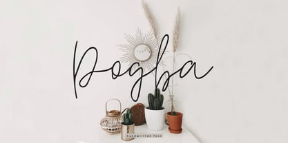 Pogba is a stylish calligraphy font with an amazing and natural style. Pogba is perfect for branding & logo projects, also suitable for packaging, wedding invites and cards and so on.
 - Drexel JNL by Jeff Levine,
$29.00 The bold hand lettered title on the 1940 sheet music for the band piece "Drexel Marching Song" was the inspiration for Drexel JNL; available in both regular and oblique versions.
 - Rose Boutique by Supfonts,
$15.00 Rose Boutique it is cute handwritten chick font with exquisite accents. This font is perfect for branding, cricut projects, wedding invitations, logos, vinyl, svg files, stickers, cards, signs and more!
 - Maristella by Arendxstudio,
$12.00 Maristella is a signature font that is unique, has an elegant style and is wrapped with an original hand stroke so it will be very suitable for your design project
 - The Beast by Ronin Design,
$15.00 The Beast is a modern display font, featuring ligature and alternate will make your design look stunning. This font will work perfect for logo, poster, business card and cover design.
 - Noonvlix by ArashiGames,
$30.00 A font designed in the style of vintage stencil show-cards. Uses bold chunky geometric shapes to form characters. This font is great for creating titles for books and products.
 - Cruisader by ARToni,
$14.00 Cruisader is a cool, fresh and modern display font. This font would be ideal for writing web designs, business cards, or pretty much anything else that requires a unique touch.
 - Houseguest PB by Pink Broccoli,
$14.00 Houseguest is fun, childish, heavyweight offbeat sans serif font with an alternate caps set, and a stylistic alternates to swap in a handful of lowercase styles for a unicase mix.
 - Secret File JNL by Jeff Levine,
$29.00 The stenciled hand lettering in the credits for the 1965 Michael Caine spy thriller “The Ipcress File” inspired Secret File JNL, which is available in both regular and oblique versions.
 - Wonderful JNL by Jeff Levine,
$29.00 A little bit of thick-and-thin Art Deco hand lettering is offered up in Wonderful JNL, based on some promotional text found on an old piece of sheet music.
 - Gabriel Auste by Creaditive Design,
$14.00 Gabriel Auste is a beautiful and refined script font. It has a classy, elegant and modern look that can be used for logos, branding, cards who need a signature touch.
 - Eraser by Turtle Arts,
$20.00Eraser Carved is based on an alphabet set that was hand carved from pencil erasers. A combination of upper and lower case letters makes this a fun and quirky alphabet. - Lets Sparkle by Lucky Type,
$12.00 Let’s Sparkle is a brand-new handwritten font that will be perfect for books, wedding invitations, greeting cards, logos, posters, or anything else that needs a fun and happy look!