10,000 search results
(0.042 seconds)
- Maily by Nathatype,
$29.00 Maily is a display serif font to provide efficient quality, consistency and performance. It shows light, expressive, moving nuances in balanced function and creativity. The font’s main character is the hooks on each letters’ edges like other serif fonts. In addition, it is truly legible because of the wide spaces of the letters with which you may freely apply for any text sizes. You can also enjoy the available features in this font. Features: Stylistic Sets Multilingual Supports PUA Encoded Numerals and Punctuations Maily fits best for various design projects, such as posters, banners, logos, magazine covers, quotes, headings, printed products, invitations, name cards, merchandise, social media, etc. Find out more ways to use this font by taking a look at the font preview. Thanks for purchasing our fonts. Hopefully, you have a great time using our font. Feel free to contact us anytime for further information or when you have trouble with the font. Thanks a lot and happy designing.
 - Pratfall by Jeff Levine,
$29.00 For 138 years, the Milton Bradley Company (of Springfield, Massachusetts) has been the leading producer of board games, toys and educational/instructional materials. The company was acquired by Hasbro in 1984. It was merged with the also-acquired Parker Brothers in 1991 and became Hasbro Games until both brand ID's were dropped in 2009. “The Moving Picture Game” was a 1920s-era board game created by Howard R. Garis (credited as ‘the author of the Uncle Wiggily game’) and capitalized on the still-new motion picture industry. On top of the storage box is the game’s name – hand lettered in a free-flowing Art Nouveau sans serif that more closely resembles the titles found within animated cartoons or in the ‘bubble letters’ a school child doodles on notebook paper. Recreated as a digital typeface, Pratfall JNL (named after the slips, trips and falls taken by silent era film comedians) is available in both regular and oblique versions.
 - Gandur Alte by Blackletra,
$50.00 Gandur is a display textura in three weights, split into two families: Alte — the German word for old — and New . Gandur was inspired by other geometric texturas, specially Max Bittrof’s Element (1933). The design began by adhering to a strict hexagonal grid, but during its development, slowly moved from a purely geometric to a more pen-based design (this is especially true in the heaviest weights). The differences between Alte and New are essentially morphological, with reflections in the character set and OpenType features. Gandur New has a more humanistic, contemporary structure and is more ‘romanized’ then Alte. Gandur New also features small capitals. Gandur Alte, on the other hand, remains truer to historical forms, most notably: S s X x Z z. Gandur Alte also features the long-s, which can be accessed via a Stylistic Set or the glyph palette. (As is historically accurate, a short-s will be used at the end of words automatically when the historical Stylistic Set has been activated).
 - Noobia by Scholtz Fonts,
$19.95 Noobia is a casual, energetic handwritten font, with plenty of movement. Its moving baseline creates a funky, busy, dramatic impression. With its informal, immediate style, Noobia is like a swift swash of text handwritten with a slightly overfilled ink pen. This impression is exaggerated by blobs at the beginning and end of pen strokes. Noobia makes a simple, direct statement, bypassing complexity and superficiality. It's just an in-your-face, immediate font. It 's the font you'd use for a quick, hand drawn note or notice. Noobia comes in three great styles: Noobia Smooth - use it for ad media for anything from sports equipment to slinky lingerie, wine labels to washing powder packaging. Noobia Black - use it anywhere to emphasise Noobia Smooth, and on posters and children's book covers. Noobia Rough - use it for graffiti, music videos, funky clothing hang tags and event posters. Noobia has all the features usually included in a fully professional font. Language support includes all European character sets.
 - Swashington by CounterPoint Type Studio,
$29.99 Inspired by a few letters in a hand-drawn logotype, Swashington is a serif font with both an early 20th Century feel and yet is evocative of the swash fonts of the 1970s as well. The real meat of this typeface comes with using all the swash and ligature variants allowing for an enormous amount of typographic flair. Starting with the original logo, Jason Walcott was moved to develop these interesting letterforms into a full typeface with all the swashy might he could muster. In addition to a comprehensive set of Swash and Alternate letters, there are also over 270 Discretionary Ligatures that can be used to create different possibilities by mixing and matching. Included with the downloaded fonts are two .pdf files showing all the swashes and ligatures, that can be printed and used for easy reference. All of the alternates are available via the Glyph Palette or with OpenType features. The font includes support for all Latin based and Eastern European languages.
 - Amarone by Monotype,
$29.99 Amarone is a spiky calligraphic display typeface with some old fashioned flavour. It was designed by Carl Crossgrove, and includes an extensive set of swash caps which allow for extra drama where needed. Crossgrove wrote each of Amarone's letters by hand using pen and rough paper, and has retained some of this visual texture in the final digital design. The typeface works well at small sizes, but when used at larger sizes this texture comes to the fore. Amarone's elegant, formal character can be modified with its swash caps, which allow the typeface to move from prim and ordered to wildly expressive. Amarone lends itself well to packaging, posters and editorial usage – or in any environment where designers need to evoke times gone by. The Amarone font features an extensive character set with support for over 130 languages, and a range of OpenType typographic features including ligatures, initial and terminal forms, figures, fractions and swashes.
 - Zombie Brush by Ditatype,
$29.00 Zombie Brush is a haunting script font that brings the undead to life with its eerie charm and brush-style appearance. Designed intentionally in large letters, this typeface commands attention and exudes a sense of horror and intrigue. Each letter is meticulously crafted with brush-like strokes, adding a touch of handcrafted artistry to the font. The brush-style appearance of this font evokes a sense of chaos and unpredictability, as if the letters were created by an unsteady hand under the influence of dark forces. The large size of the letters enhances the font's imposing presence, making it impossible to ignore. For the best legibility you can use this font in the bigger text sizes. Enjoy the available features here. Features: Multilingual Supports PUA Encoded Numerals and Punctuations Zombie Brush fits in headlines, logos, movie posters, flyers, branding materials, print media, editorial layouts, headers, and zombie-themed projects. Find out more ways to use this font by taking a look at the font preview. Thanks for purchasing our fonts. Hopefully, you have a great time using our font. Feel free to contact us anytime for further information or when you have trouble with the font. Thanks a lot and happy designing.
 - Armatura by Nechit,
$25.00 Armatura — a bold, sporty font with a modern and futuristic alphabet design. Elevate your design projects to new heights with Armatura's cutting-edge typography, perfect for branding, headings, technology, digital media, movie titles, invitations, signatures, logos, labels, and much more! This modernist capital font is tailor-made for eye-catching headlines and captivating titles. Armatura boasts an extensive character set, including Latin, Cyrillic, and Arabic numerals, making it versatile and adaptable for diverse linguistic and cultural contexts. Key Features: Sporting Boldness: Armatura exudes energy and daring style, capturing attention and infusing dynamic flair into your designs. Versatility at its Best: This font seamlessly fits various projects, from large-scale advertising banners to petite cards. Embrace Technological Edge: Armatura effortlessly integrates with modern technology, ideal for digital and interactive media ventures. Multilingual Support: With Latin and Cyrillic alphabets, plus Arabic numerals, Armatura accommodates a multitude of languages and regions. Expressive Appeal: Its geometric forms and audacious details bring character and distinctiveness to every design element. Unleash the power of Armatura to make your projects stand out, commanding attention with a contemporary touch of uniqueness. This font is a must-have for ambitious and forward-thinking designers seeking to create something exceptional and truly captivating.
 - Fontoddler by CozyFonts,
$20.00 Fontoddler Font Family, This font was created with the personality, in mind, of my two-and-a-half-year-old granddaughter Chloe Bella. I believe strongly that fonts have personalities that’s why we refer to their members as ‘characters’ or to be more accurate, ‘glyphs’. This font is playful, bold, colorful in form and design, a bit irregular, a bit informal, a bit irreverent, a bit humorous, a bit sassy, and a bit independent just like my little one. When used in color Fontoddler sings. She’ll be writing and creating visual words in just the nick of time. At 2 she started recognizing many colors and identifying people, places, animals, and objects and now she’s recognizing letters. I can’t wait for her to understand that this font was designed and named after her. Fontoddler currently exists in 3 styles, Medium, Heavy, and Heavy Outline. Naturally Heavy and Heavy Outline are congruous, ie. They are fitting together. I hope you enjoy and use this 24th font family from Cozyfonts Foundry. It will fit well with greeting cards, signage, birthday parties, holiday occasions, invites, stationary, headlines, logos, posters, cartoons, animation titles, movie titles and even sports events and sports logos. Have fun with this one. Tom Nikosey
 - Durianik - Unknown license

- FarHat - Unknown license

- Wedding by HiH,
$10.00 Wedding Regular was originally designed by Morris Fuller Benton for ATF and released as Wedding Text in 1901. It is a lighter version of his ENGRAVER'S OLD ENGLISH of the same period. Wedding Regular is based on the Textura style of blackletter that continued in popularity in England into the 16th century, long after the Dutch, French and Italians had moved to a Roman model that expressed the Renaissance humanism of the period. Wedding Headline is a still lighter version of the regular text face, suitable for setting larger sizes while still preserving the delicacy of the decorative hairlines. Textura continues in use in England and the United States for newspaper mastheads, gift shop signs, wedding invitations and programs and other applications where a feeling of tradition is desired. I recently saw an 1980ish photo of a “Tubby Isaac” sign in London using textura. I believe Benton’s design captures that feeling without being heavy-handed and still remaining quite readable for eyes accustomed to Roman lettering. Both Wedding Regular and Wedding Headline convey a comfortable familiarity. These two fonts may be purchased together at an attractive discount or they may be purchased separately. The full character set may be found in the pdf file that you can download from the gallery section. The two monks (alt-0172 and alt-0177) are from a set of sixteenth century decorative initial letters by Gering and Renbolt. Please note that there are two different eszetts, the blackletter style at alt-0126 and the antiqua style at the alt-0223.
 - Kate Greenaway's Alphabet by Wiescher Design,
$49.50 Some time ago I bought my smallest book ever: Kate Greenaway’s Alphabet* 57 x 72 mm. I thought it was the sweetest little book I had ever seen. Not knowing about the fame of the designer Kate Greenaway (1846-1901), I put it in some dark drawer and looked at it from time to time. Kate’s books were all outstanding successes in English publishing history; she was an icon of the Victorian era. Some of those books are still being reprinted today. This little gem I had accidentally acquired has become very rare and I have not found any reprints yet. So I thought maybe I could adapt her drawings for use on today’s computers. I ventured to redraw her delicate illustrations, blowing them up 300 percent, being forced to simplify them without losing her touch. It took quite some time! While redrawing them, I discovered that she most certainly drew them in at least three different sessions as well. Then I scanned my drawings and put them in a font. To make the font more usable, I added the ten numerals in Kate’s style; the original does not have those. I hope she would have liked my adaptations. Yours in a very preserving mood, Gert Wiescher. * Kate Greenaway’s Alphabet, edited by George Rutledge & Sons, London and New York, ca. 1885.
 - Ghosttown BC - Personal use only

- Akakios by Nantia.co,
$12.00 Akakios uppercase font is an adorable hand-made typeface with a lot of charisma. From “hand-written” quotes to product packaging, merchandise, and branding projects, this font is so versatile that it can cover them all. Greek character set included.
 - Sage & Pink by Pixel Colours,
$15.00 Sage & Pink is a font lovingly designed to look as close as possible to a natural hand writting. Includes 3 styles of letters to make your designs look uniquely made by hand. A font family that also looks great on logos!
 - Pacific Northwest Letters by Cultivated Mind,
$29.00 Pacific Northwest Letters is a fun, handwritten font by Cultivated Mind. Pacific Northwest has been carefully hand painted and comes in two styles (Regular/Rough). This font includes a set of lower case letters and Pacific Northwest hand painted Labels B.
 - Corazon by HandletterYean,
$10.00 Corazon is a simple, yet cute font. This mono-line serif font shows simplicity, and has happy and fun vibe which can be used for quotations, logos, titles, advertising, business cards, signs, greeting cards, flyers, magazines, t-shirts, and much more!
 - Wondershine by Handpik,
$13.00 wondershine is elegant,beauty and smoothless serif display .This font is suitable for invitation cards, decorations, clothing products, greeting cards and others. This font also has uppercase, lowercase, numeric, puntuation and multilingual. and there are several ligature and stylistic alternate.
 - Hellshock by Comicraft,
$19.00 Check into your local lunatic asylum with this font, etched on the walls of his padded cell by Comicraft's left-handed right-hand man, Dave Lanphear, for Jae Lee's Image comic 'Hellshock'. Artwork from Elephantmen: War Toys by Starkings & Moritat
 - Houseback by Wacaksara co,
$16.00 Houseback is truly inspired by hand-lettering and vintage style, with the natural flow of hand-lettering this typeface is ready to use for your projects such as logotype, letterhead, posters, apparel design, labels, advertisements, product designs, mural, and more.
 - Frazzle by Paul O'Connell,
$9.95 This roughly hand drawn font was created to give that loose scribbled effect look and to imitate a typically hand written style. Designed and produced by Paul O'Connell of POCT, it is a typeface purely for fun to experiment with.
 - Nagotire by HafisHidayat,
$20.00Introducing the elegant and fashionable Nagotire handwritten font, which looks like a signature, this font is purposely made with a quirky alternative. Nagotire is suitable for greeting cards, product packaging, news, invitations, posters, blog posters, branding, business cards, logos, etc. - SCR-N by URW Type Foundry,
$39.99 SCR fonts are screen optimized (also called 'pixel fonts'). Unlike standard fonts (and like the few well-hinted fonts like Verdana or Arial), they give a crisp look on screen at very small sizes, thus increasing legibility. The perfect applications for those fonts are web pages and software user interfaces (computer, cellular phones, console games and any other system that uses a screen interface). Unlike most pixel fonts, SCR fonts contain kerning information. Kerning is the adjustment of space between certain pairs of characters (like 'AV') to make text look more fluid, thus increasing legibility and appeal. To benefit from this feature, auto-kerning must be activated in the application. In Photoshop, kerning must be set to 'Metrics'. Although SCR fonts are optimized for screen, they can be used for print (in Illustrator or Indesign for example) for a decorative 'computer text' effect. In this case, there is no constraint: they can be used as any other font. For screen use (in Photoshop, Fireworks, Flash... ), they have to keep aligned with the screen pixel grid not to look blurred or distorted. To achieve this, here are the guidelines to follow: RESOLUTION If the application permits it (Photoshop, Fireworks), document resolution must be set to 72 pixels per inch. SIZE The font size must be set to 10 (or multiples of 10) points. POSITIONING & ALIGNMENT The reference points of text fields and text blocks (upper left corner for left aligned text, upper right for right aligned text) must be positioned at integer values of pixels. In Photoshop, text can be precisely moved with [Edit Free Transform]. In Flash, movie clips containing text fields must also be positioned at integer values on the stage. Text must be aligned to the left or right only. Center alignment can be simulated with left alignment by adding spaces at the begin of each line. To dispense with the positioning and alignment constraints, text anti-aliasing can be turned off if the application permits it (Photoshop, Flash MX 2004). OTHER SETTINGS Leading (line spacing), tracking (letter spacing), manual kerning and baseline shift must be set either to integer values of points or to multiples of 100 units (depending on the application). Vertical and horizontal scaling must be set to 100%. Faux bold or Faux italic must not be used. The document must neither be resized on export, nor allow resizing (Flash Movies).
 - SCR-I by URW Type Foundry,
$39.99 SCR fonts are screen optimized (also called 'pixel fonts'). Unlike standard fonts (and like the few well-hinted fonts like Verdana or Arial), they give a crisp look on screen at very small sizes, thus increasing legibility. The perfect applications for those fonts are web pages and software user interfaces (computer, cellular phones, console games and any other system that uses a screen interface). Unlike most pixel fonts, SCR fonts contain kerning information. Kerning is the adjustment of space between certain pairs of characters (like 'AV') to make text look more fluid, thus increasing legibility and appeal. To benefit from this feature, auto-kerning must be activated in the application. In Photoshop, kerning must be set to 'Metrics'. Although SCR fonts are optimized for screen, they can be used for print (in Illustrator or Indesign for example) for a decorative 'computer text' effect. In this case, there is no constraint: they can be used as any other font. For screen use (in Photoshop, Fireworks, Flash... ), they have to keep aligned with the screen pixel grid not to look blurred or distorted. To achieve this, here are the guidelines to follow: RESOLUTION If the application permits it (Photoshop, Fireworks), document resolution must be set to 72 pixels per inch. SIZE The font size must be set to 10 (or multiples of 10) points. POSITIONING & ALIGNMENT The reference points of text fields and text blocks (upper left corner for left aligned text, upper right for right aligned text) must be positioned at integer values of pixels. In Photoshop, text can be precisely moved with [Edit Free Transform]. In Flash, movie clips containing text fields must also be positioned at integer values on the stage. Text must be aligned to the left or right only. Center alignment can be simulated with left alignment by adding spaces at the begin of each line. To dispense with the positioning and alignment constraints, text anti-aliasing can be turned off if the application permits it (Photoshop, Flash MX 2004). OTHER SETTINGS Leading (line spacing), tracking (letter spacing), manual kerning and baseline shift must be set either to integer values of points or to multiples of 100 units (depending on the application). Vertical and horizontal scaling must be set to 100%. Faux bold or Faux italic must not be used. The document must neither be resized on export, nor allow resizing (Flash Movies).
 - 6th Aniversario - Personal use only

- Sugar Cake by Larin Type Co,
$12.00 Sugar Cake this is a stunning handwritten font duo with hand-drawn illustrations. Script font includes many alternates, ligatures and swash with them you can create a more complete composition and make it more diverse and individual. A hand-drawn sans serif font will perfectly match the script and complement it. Also included in this font are hand drawn fancy illustrations that will be useful for design and decorate your project. Enjoy using!
 - Smooth Batters by Balpirick,
$15.00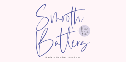 Smooth Batters is a Modern Handwritten Font. Smooth Batters feels equally charming and elegant. It looks stunning on wedding invitations, thank you cards, quotes, greeting cards, logos, business cards and every other design which needs a customized touch. This font is PUA encoded which means you can access all glyphs and swashes with ease! - also multilingual support Enjoy the font, feel free to comment or feedback, send me PM or email. Thank you!
 - Goliath Soldier by Balpirick,
$15.00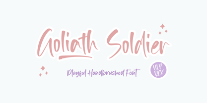 Goliath Soldier is a Playful Handbrushed Font. Goliath Soldier feels equally charming and chic. It looks fun on wedding invitations, thank you cards, quotes, greeting cards, logos, business cards and every other design which needs a customized touch. This font is PUA encoded which means you can access all glyphs and swashes with ease! - also multilingual support - Ligatures & Swash Enjoy the font, feel free to comment or feedback, send me PM or email. Thank you!
 - DeLumary by FadeLine Studio,
$15.00 DeLumary is a new unique and funny display font. This font adopts a bold, cute, firm, and trendy style. Very suitable to meet your various design needs that are trending now. With a style like this, this font will be suitable in use for comics, logos, branding projects, homeware designs, product packaging, mugs, quotes, posters, shopping bags, t-shirts, book covers, name card, invitation cards, greeting cards, and all your other lovely projects.
 - Walbert by FadeLine Studio,
$12.00 Walbert is a bold and bold new display font. This blocky font creates a brave and strong style. It is suitable to meet your various design needs that are currently trending. With a style like this, this font will be suitable in use for comic, logo's, branding projects, homeware designs, product packaging, mugs, quotes, posters, shopping bags, logo's, t-shirts, book covers, name card, invitation cards, greeting cards, and all your other lovely projects.
 - Rogertt by Sulthan Studio,
$10.00 Hi true font connoisseur I introduced my second font Rogertt this is a modern handwriting that is unique and cute ... please try it is definitely fun and you will be happy. good luck.. With a style like this, this font will be suitable in use for logo's, branding projects, homeware designs, product packaging, mugs, quotes, posters, shopping bags, logo's, t-shirts, book covers, name card, invitation cards, greeting cards, and all your other lovely projects.
 - Kintamani by Ably Creative,
$12.00 Kintamani font is a casual handwritten font perfect for design purposes, web, logos, brochures, business cards, online stores, t-shirt designs, mockups, invitation cards, wedding cards, flyers, posters and more. Kintamani font beautiful typographic harmony for a diversity of design projects, including logos & branding, social media posts, advertisements & product designs. This font is PUA encoded which means you can access all of the glyphs and swashes with ease! Make stunning work with Kintamani font!
 - Challans by Heinzel Std,
$19.00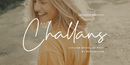 Challans is a flowing handwritten font, described by an elegant touch, perfect for your favorite projects. It looks stunning on wedding invitations, thank you cards, quotes, greeting cards, logos, business cards and every other design which needs a handwritten touch. Fall in love with its incredibly distinct and timeless style and use it to create spectacular designs! Challans Features : Uppercase and Lowercase Numerical and Punctuation PUA Encoded Multilingual Language Easy To Use
 - Better Smile by Heinzel Std,
$19.00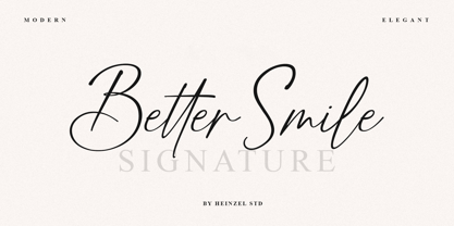 Better Smile Signature is a flowing handwritten font, described by an elegant touch, perfect for your favorite projects. It looks stunning on wedding invitations, thank you cards, quotes, greeting cards, logos, business cards and every other design which needs a handwritten touch. Fall in love with its incredibly distinct and timeless style and use it to create spectacular designs! Better Smile Features : Uppercase and Lowercase Numerical and Punctuation Ligatures PUA Encoded Multilingual Support
 - PM Doorbuster Script by Paper Moon Type & Graphic Supply,
$20.00 A new font inspired by vintage hand-painted paper grocery store signs. The Doorbuster Collection is based on retro hand-painted paper signs primarily seen in grocery stores from the 1920s through the 1970s. We meticulously hand-drew each font, modeling the spacing and uneven baseline found in vintage sign painting. The purposely organic ascenders and descenders, along with a huge set of ligatures/contextual alternates to avoid the same letters repeating when paired, give it a real hand-lettered look. Doorbuster Script is perfect for both vintage-inspired and contemporary marketing, branding, and packaging designs. Check out a few of the samples included in the thumbnails above.
 - Weaver - Unknown license

- WHISPERS CALLIGRAPHY_DEMO_essential_BOLD - Personal use only

- Versal - Personal use only

- Melbylon - 100% free


