10,000 search results
(0.02 seconds)
- Funky Nouveau JNL by Jeff Levine,
$29.00 The free-form Art Nouveau hand lettering for the 1905 song "Will You Love Me in December as You Do in May" was the design model for Funky Nouveau JNL, which is available in both regular and oblique versions. Since the 1960s hippie counterculture embraced elements of the Art Nouveau period in their art and design, it seemed only fitting to use the term "Funky Nouveau" in the fontís name as an homage to both eras.
 - Dopestar by 38-lineart,
$15.00 Street art has become so inspiring that it's been featured on a range of mediums from advertising to album art. Thanks to the emergence of street art in the mainstream media. Dopestar is a heavy font that has a bold grafitti feel whilst being super clear to read, Dopestar is certainly versatile. Dopestar is a great typeface for display and it comes with a full set of characters with loads of variants and all the punctuation you'll need.
 - Futurex Phat Outline - Unknown license

- KG I And Love And You by Kimberly Geswein,
$5.00 Conversation hearts! Use ALL CAPS for even lettering. For bouncy letters, alternate uPpEr and LoWeR cases to make the letters bounce up and down.
 - Makiritare by John Moore Type Foundry,
$29.95 Makiritare is a display font for headlines that originates from a research work on pure geometry of great simplicity from a Venezuelan ethnicity artisanal form from men called Makiritare or Yecuana. These rivers sailors and architects of the jungle live in the village of Santa Maria de Erebato on the border with Brazil. Despite having a prodigious symbolism in their art, they didn't have until recently a font that is tailored to your expression. It all started with a trip to the Amazon in 1976 with the notion of creating my thesis as a graphic design student. In 1992 I created the first letterform that was evolving to a more elaborate version being presented and selected at the International Typography Biennial Letras Latinas in 2006. Today JMTF presents Makiritare with a more complete and mature family of three weights, alternative characters, small caps, ordinals and ligatures. Makiritare fits any application that have an innovative and modernist purposes. Recommended for titles or short phrases, with striking large-scale use.
 - The Blendhes by YdhraStudio,
$25.00 We introduce our new script font called Blendhes. Blendhes is a strong bold script font inspired from Vintage baseball sport design. Blendhes has a standart OpenType Features. With the OpenType Features, Blendhes gives you so many options to create something awesome. Mix and match the alternate characters to add an attractive message to your design. Blendhes is great for Logotype, Branding Design, Logo Design, Badges, Digital Lettering Arts, T-Shirt/Apparel, Poster, Magazine, Signs, Advertising Design, and any vintage design needs. Blendhes Features : - Upper and Lowercase Standard Characters, Punctuation, Numerals. - Opentype Features such as Standard Ligature, Discretionary Ligature, Ornament (Trail and Swash), Contextual Alternates and Stylistic Set (ss01 - ss07). - Fully accessible without additional design software. - Includes a range of multilingual characters. You can access all those alternate characters by using a program that supports OpenType features such as Adobe Illustrator CS, Adobe Indesign & CorelDraw X6-X7. Guides to access all alternates glyphs : http://adobe.ly/1m1fn4Y Please, Feel free to contact me by e-mail yyudhara@gmail.com for any question about my font, Extended License document and more.
 - Barn Dance JNL by Jeff Levine,
$29.00 The hand lettered title on the 1945 sheet music for the song "Louisiana Hayride" is an Art Deco design with a nod to the preceding Art Nouveau era. It is now available as Barn Dance JNL, which is available in both regular and oblique versions.
 - Parenting JNL by Jeff Levine,
$29.00 Parenting JNL is a stylized Art Deco sans serif type design originally found on a vintage WPA (Works Progress Administration) poster designed by the Federal Art Project and touting the topic of "The Job of Being a Parent". Available in regular and oblique versions.
 - Shakila by Alifinart Studio,
$17.00 Shakila Script is a handwritten font created at the end of March 2021. It is a unique bold font with a pretty and charming casual style with many variants of beautiful swashes, as well as an alternative to capital letters. Shakila is a lovely and delicate font duo (script and sans serif), that exudes elegance and class. This font was particularly crafted for those who need a beautiful and refreshing look to their designs. Also, this font is perfect for branding projects, logo, product designs, invitation cards, wedding cards, stationery designs, advertisements, label, photography, blogging, social media or watermark. Key Features: - Multilingual Accents - Alternative capital letters - Stylistic Alternates up to 20 choices - Has a heart connected feature for a-z and A-Z letters - Available shortcut for Stylistic Alternate by simply adding "period" (.) and “number” (1-20) to each letter. - Has lots of ligatures so the letters connect well together - Has OpenType and PUA Encodes features. This font has a total of 885 glyphs, including capital letters, uppercase alternates, lowercase, numeral and punctuation, multilingual accents, beginning and ending swashes for lowercase, and includes a large number of stylistic alternates and heart swashes (for lowercase-lowercase and uppercase-uppercase). The advantage of the Shakila Script font compared to other fonts is that the alternative capital characters are in 1 font file, so it will make it easier for you to work. Therefore, you are free to choose it as you like, especially this font has the OpenType and PUA Encodes features which means you can access all of the glyphs and swashes with ease. As I mentioned earlier, Shakila Script has a large number of Stylistic Alternates features, up to 14 options for letter a-z and up to 20 options for letter b d h k l. In fact, there is also a swash feature in the form of a connected for the combination of each lowercase-lowercase and uppercase-uppercase letters. Interestingly, you can activate all Stylistic Alternates that are owned by each letter, just by typing; letter + period + number. For example: a.1 a.2 a.3 or b.1 b.2 b.3 and so on. As for activating the heart connected for each letter a-z or A-Z is quite easy. Namely by simply typing; letter + underscore + underscore + letter. For example: a__a or A__A and so on. Shakila Script is a Font Duo pack that pairs with Shakila Sans. The two were created at about the same time, but made in separate file packages. The reason I created this font duo is to make your projects more harmonious and unique. At the end of the sentence, Shakila Font Duo is a very authentic and amazing. If there are things you want to ask, don't hesitate to contact my email. For complete details, please visit my Behance profile. Alifinart Studio alifinart@gmail.com Thank you.
 - Electric Hermes AOE - Unknown license

- Summer Landscape by Selvia Design,
$15.00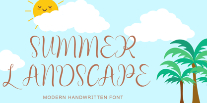 "Summer Landscape" is a beautiful and unique handwritten font. This font is equipped with uppercase, lowercase, numerals, punctuation, signatures, and multilingual support. It is suitable for summer, holidays, vacations, traveling, Father's Day, graduation, the 4th of July, and others.
 - Billetha by Yoga Letter,
$18.00 "Billetha" is a beautiful handwritten font decorated with love. This font is very suitable for Christmas, Valentine's Day, weddings, engagements, branding, and others. Equipped with uppercase letters, lowercase letters, numerals, punctuation, swash, titling, uppercase alternates, ligatures, and multilingual support
 - Simply Royal by Gleb Guralnyk,
$14.00 Introducing a vintage font Simply Royal. This typeface has a victorian medieval look. It's an all caps typeface with decorative classic style. Simply royal has three layer fonts for more conenient recoloring. Thank you and have a nice day!
 - White Mellow by Stringlabs Creative Studio,
$25.00 White Mellow is a modern, fun script font, created by using an authentic handwritten pen. Clean and a little bit quirky, this font is the perfect fit for all of your logos, branding, social media, and crafty DIY projects.
 - Benjamin by Solotype,
$19.95Fonts without curved lines were quite popular in Victorian times. We drew this one back in the days of T-squares and triangles, and based it on a type that we felt could stand to be improved. (Arrogant, eh?) - Slimpick by IbeyDesign,
$15.00 Slimpick Brush Stroke Font results out of a stunning pairing of a brush pen and pencil that makes it look incredibly endearing and authentic. Use this gorgeous and unique this handwritten font to bring any DIY project to life!
 - Roundhead by Solotype,
$19.95A surprisingly modern looking condensed sans serif issued by Mackellar, Smiths & Jordan foundry in 1887. Its narrow width makes it useful for long copy headlines. Designed by the freelance type cutter Charles Beeler who did many fonts for Mackellar. - Occidental Tourist JNL by Jeff Levine,
$29.00Occidental Tourist JNL is based on a set of die-cut cardboard letters used by teachers. They were primarily found on classroom bulletin boards or felt boards. The font's name is a pun on the movie The Accidental Tourist. - Baudi by MKGD,
$13.00 Bauhaus is a style of art that was born in Weimar Germany in the early part of the 20th century. The font that bears the bauhaus name was constructed in accordance with this style by making use of spheres and squares with little or no added flourishes. Since this typeface was already minimalistic in appearance, it was difficult to produce a similarly styled font. So I went back to bauhaus’ architectural roots for inspiration. The result contains a more detailed composition, but is still focused on the basic aesthetics that continue to make bauhaus a popular art form. Baudi has a glyph count of 388 and supports the following languages Afrikaans, Albanian, Asu, Basque, Bemba, Bena, Bosnian, Catalan, Chiga, Colognian, Cornish, Croatian, Czech, Danish, Embu, English, Esperanto, Estonian, Faroese, Filipino, Finnish, French, Friulian, Galician, German, Gusii, Hungarian, Icelandic, Indonesian, Irish, Italian, Kabuverdianu, Kalaallisut, Kalenjin, Kamba, Kikuyu, Kinyarwanda, Latvian, Lithuanian, Low German, Lower Sorbian, Luo, Luxembourgish, Luyia, Machame, Makhuwa-Meetto, Makonde, Malagasy, Malay, Maltese, Manx, Meru, Morisyen, North Ndebele, Norwegian Bokmål, Norwegian Nynorsk, Nyankole, Oromo, Polish, Portuguese, Romanian, Romansh, Rombo, Rundi, Rwa, Samburu, Sango, Sangu, Scottish Gaelic, Sena, Shambala, Shona, Slovak, Slovenian, Soga, Somali, Spanish, Swahili, Swedish, Swiss German, Taita, Teso, Turkmen, Upper Sorbian, Vunjo, Walser, Zulu
 - Futurex Slab - Unknown license

- Futurex Metal-gear Bold - Unknown license

- Tin Birdhouse - Unknown license

- Roosk by DearType,
$39.00 Roosk is a round, reverse-contrast serif designed for display usages. It bears a 70s influence as well as a subtle western vibe, although it’s more rounded and chunky. The font is a single weight, Caps only and sports a set of 450+ glyphs and some cute symbols such as hearts and floral hearts. Roosk has Cyrillic and All European Languages Support and is best suited for posters, headlines, editorial, merchandise and packaging.
 - Tuesday Jingle by Attype Studio,
$13.00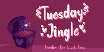 Tuesday Jingle is an exquisite font for Valentine theme design, with dingbats heart on character "{}[]" Fall in love with it and bring your projects to the highest levels! Tuesday Jingle is perfect for branding, logo, invitation, stationery, social media post, product packaging, merchandise, blog design, game titles, cute style design, Book/Cover Title and more. What's Included : - Tuesday Jingle.otf - Heart dingbats on character "{}[]" - Multilingual Support --- Hope you enjoy with our font! Attype Studio
 - FourJuly by Ingrimayne Type,
$7.95 FourJuly contains three patriotic fonts that might be fun to use in July. They are also very hard to read, but perhaps not as hard as the somewhat similar letters in the fonts of FlagDay. FourJuly A has square, blocky letters with star interiors. FourJuly G and FourJuly H add diagonal stripes. FourJuly G and FourJuly H can be layered on top of FourJuly A to create bicolored letters. See the example here.
 - Times Sans Serif - Unknown license

- Jolgoria in Town - Personal use only

- Love Notes JNL by Jeff Levine,
$29.00 Love Notes JNL is a total reworking of one of Jeff Levine's old freeware fonts. This revised version has an alphabet set jogged left and right in different upper and lower case variations. Playing around with the shift key will bring you the optimum results. On the left and right parenthesis keys are blank hearts logged left and right, and the corresponding fill fonts are on the bracket keys. (NOTE: You may have to do some manual adjustments, as the overlay placement can vary slightly in some programs.) There are numerals as well, and scattered around the keyboard are classic "message hearts" - just like in the boxes of candy. A backfill glyph for the numerals and message hearts is on the backslash key.
 - Divina Proportione by Intellecta Design,
$29.00 Divina Proportione is based from the original studies from Luca Pacioli. Luca Pacioli was born in 1446 or 1447 in Sansepolcro (Tuscany) where he received an abbaco education. Luca Pacioli was born in 1446 or 1447 in Sansepolcro (Tuscany) where he received an abbaco education. [This was education in the vernacular (i.e. the local tongue) rather than Latin and focused on the knowledge required of merchants.] He moved to Venice around 1464 where he continued his own education while working as a tutor to the three sons of a merchant. It was during this period that he wrote his first book -- a treatise on arithmetic for the three boys he was tutoring. Between 1472 and 1475, he became a Franciscan friar. In 1475, he started teaching in Perugia and wrote a comprehensive abbaco textbook in the vernacular for his students during 1477 and 1478. It is thought that he then started teaching university mathematics (rather than abbaco) and he did so in a number of Italian universities, including Perugia, holding the first chair in mathematics in two of them. He also continued to work as a private abbaco tutor of mathematics and was, in fact, instructed to stop teaching at this level in Sansepolcro in 1491. In 1494, his first book to be printed, Summa de arithmetica, geometria, proportioni et proportionalita, was published in Venice. In 1497, he accepted an invitation from Lodovico Sforza ("Il Moro") to work in Milan. There he met, collaborated with, lived with, and taught mathematics to Leonardo da Vinci. In 1499, Pacioli and Leonardo were forced to flee Milan when Louis XII of France seized the city and drove their patron out. Their paths appear to have finally separated around 1506. Pacioli died aged 70 in 1517, most likely in Sansepolcro where it is thought he had spent much of his final years. De divina proportione (written in Milan in 1496–98, published in Venice in 1509). Two versions of the original manuscript are extant, one in the Biblioteca Ambrosiana in Milan, the other in the Bibliothèque Publique et Universitaire in Geneva. The subject was mathematical and artistic proportion, especially the mathematics of the golden ratio and its application in architecture. Leonardo da Vinci drew the illustrations of the regular solids in De divina proportione while he lived with and took mathematics lessons from Pacioli. Leonardo's drawings are probably the first illustrations of skeletonic solids, an easy distinction between front and back. The work also discusses the use of perspective by painters such as Piero della Francesca, Melozzo da Forlì, and Marco Palmezzano. As a side note, the "M" logo used by the Metropolitan Museum of Art in New York City is taken from De divina proportione. “ The Ancients, having taken into consideration the rigorous construction of the human body, elaborated all their works, as especially their holy temples, according to these proportions; for they found here the two principal figures without which no project is possible: the perfection of the circle, the principle of all regular bodies, and the equilateral square. ” —De divina proportione
 - Warlock - Unknown license

- Nuclear Standard by Zang-O-Fonts,
$25.00Strong, hard lines inspired the name of this font, based on the "nuclear standard" set by the U.S. and the Soviets during the cold war. - Judlebug by Atlantic Fonts,
$26.00 Confident, endearing and youthful, Judlebug is brimming with personality that’s hard to deny. Now available in 3 weights, Judlebug is ready to light things up!
 - Sheepdog by Aaron Design,
$9.95Sheepdog is a whimsical handwriting font originally created for use in greeting cards and to combat the propagation of ! Use it to your hearts content. - HeartMatrixed by Ingrimayne Type,
$12.95 HeartMatrixed is based on a matrix of dots in the shape of little hearts. It uses the same design pattern for placing dots as Dottie.
 - Phil Yeh by Comicraft,
$19.00 Since 1985, Cartoonists Across America & The World have been promoting literacy, creativity, the arts, and other positive issues using cartoons and humor. Founder Phil Yeh and his band of artists -- including Comicraft President and First (Flying) Tiger, Richard Starkings -- create books, paint murals, take part in school assemblies, conventions, conferences and other public events for all ages throughout the world! Cartoonists Across America & The World have worked in partnership with the Center for The Book in The Library of Congress and other organizations all over the world. They have painted more than 1000 murals in 49 of the United States as well as in Canada, Mexico, Italy, England, France, Germany, Hungary, The Netherlands, China, Taiwan, Singapore, and the Cayman Islands. So we made Phil a font 'cause he's a noble soul. Avoid Extinction -- Read, Reuse, Reduce and Recycle!
 - Naive Inline by S&C Type,
$8.00 Naïve Inline is a layered serif handwritten font designed by Fanny Coulez and Julien Saurin in Paris. Our goal was to draw a font with finely irregular lines that give a human and whimsical feeling. We designed three weights to assure a good readability whatever the size. They can be enhanced with five different interior patterns and three shadows to improve your designs and bring a charming and unusual feeling. To do so, you can simply superimpose the layers with a compatible software like Photoshop, the weight above and the pattern(s) below, then choose a color for each. This font is part of our Naïve superfamily that contains lot of variations: Line, Inline, Serif, Sans Serif, and a special Art Deco one. Just click on our foundry name to see them all! We hope you will enjoy our work. Merci beaucoup!
 - Bredagh by Tony Fahy Font Foundry,
$25.00 Bredagh (pronounced Braid-ah) is a happy font! It can bring a smile to your face, yet is at one with science and mathematics and the Arts. The first presentation is in a Poetry book. Overall, it is a strong and capable font. The organic nature of the font Breadgh is in Nature itself, with the roundels as found in the cross-section of a tree, for example, both circular and rounded oblong shapes, influencing. Accordingly, some of the characters are of a condensed nature and some are not. The lower case does not have the condensed aspects but the numerals do. In the creation of Bredagh, it was the dynamic between all of these that was part of the challenge. And to make them all work together subtly to be in overall harmony—was the ultimate challenge.
 - ITC Oldrichium by ITC,
$29.99Spirited, unaffected and buoyant, the ITC Oldrichium type family pays homage to the calligraphy and typeface designs of Czech designer Oldrich Menhart. “I came upon one of Menhart's typefaces over a decade ago,” says George Thompson, designer of ITC Oldrichium. “I've been collecting examples of his work ever since.” Thompson was born in Chicago and grew up in north-west Indiana. “While I've been an educator and general graphic designer for over 30 years, lettering and type design have always been an important part of my work,” he says. Thompson now spends much of his free time designing typefaces. ITC Oldrichium is a subtle melding of the shapes and proportions of Menhart's Manuscript typeface, the energetic strokes of his calligraphy, and Thompson's own design skills. The result is a distinctive, powerful, and exceptionally versatile typeface family. Available in light, regular, demi bold and bold weights, with corresponding italics for all but the bold, ITC Oldrichium is comfortable setting both text and display copy. In addition to the basic weights, Thompson has created an Engraved version for those times when an especially powerful statement is called for. - Calaveras by Design is Culture,
$29.00 In August of 2009, I was commissioned by Zoo York, a New York City based skateboard company, to visit Buenos Aires to study and document street typography. As soon as my taxi driver took the bustling street Entre Ríos, it was clear that the city and I were going to be good friends. Many of the independently owned businesses on Entre Ríos are adorned with handmade signage. These signs are painted in a style called Fileteado which is a century-old Argentinian type of lettering and floral ornamentation. Nowadays, Fileteado is still a prominent part of the city’s landscape, coloring the façades of restaurants, bars and coffee shops. Calaveras and Diablitos are two new typefaces that were inspired by Fileteado. Stylistically, the fonts are a return to a rhythmic and playful sensibility reminiscent of Vitrina and Cuba, two fonts that I designed in 1996. Along with dynamism and dance, these new fonts incorporate a rigor and functionality essential to labelling any font a ‘workhorse.’ The names Calaveras and Diablitos, came from the name of a song by the infamous Buenos Aires rock band, Los Fabulosos Cadillacs. —Pablo A. Medina
 - Diablitos by Design is Culture,
$29.00 In August of 2009, I was commissioned by Zoo York, a New York City based skateboard company, to visit Buenos Aires to study and document street typography. As soon as my taxi driver took the bustling street Entre Ríos, it was clear that the city and I were going to be good friends. Many of the independently owned businesses on Entre Ríos are adorned with handmade signage. These signs are painted in a style called Fileteado which is a century-old Argentinian type of lettering and floral ornamentation. Nowadays, Fileteado is still a prominent part of the city’s landscape, coloring the façades of restaurants, bars and coffee shops. Calaveras and Diablitos are two new typefaces that were inspired by Fileteado. Stylistically, the fonts are a return to a rhythmic and playful sensibility reminiscent of Vitrina and Cuba, two fonts that I designed in 1996. Along with dynamism and dance, these new fonts incorporate a rigor and functionality essential to labelling any font a ‘workhorse.’ The names Calaveras and Diablitos, came from the name of a song by the infamous Buenos Aires rock band, Los Fabulosos Cadillacs. —Pablo A. Medina


