10,000 search results
(0.022 seconds)
- Beroga - Unknown license

- Elb-Tunnel - 100% free

- Boster by Rhd Studio,
$20.00 Boster is a stylish modern calligraphy font with a chic casual style. It's perfect for branding, wedding invitations and cards, and maybe for red wine labels. The booster includes a beautiful full set of upper and lower case letters, numbers, assorted punctuation marks. All lowercase letters include start and end strokes, providing a realistic handwriting style. What did you get, honey? To use beautiful strokes, you need a program that supports OpenType features such as Adobe Illustrator CS, Adobe Photoshop CC, Adobe Indesign, and Corel Draw. but if your software doesn't have Glyphs panel, you can install additional font swash file: Thank you and have a nice day, Gulya
 - Xenois Serif by Linotype,
$29.99“Drawing letters is my passion,” says Erik Faulhaber, the designer of the Xenois typeface family. Pronounced “zeeno-is,” the design distills character shapes into what Faulhaber believes are their purest forms. “I studied many typefaces, carefully examining their structure, before I began drawing Xenois. Then I actually wrote out a detailed design brief establishing the goals for my design.” - Swordtail by Type Innovations,
$39.00 A friend bought me a Chinese calligraphic brush set in a beautifully decorated box. I started to letter the alphabet on parchment, in my own hand, using quick strokes and found the resulting script had an interesting energy to it. After further refinement in my font application software 'Swordtail' was born. A great free-hand script.
 - Night Delivery by Kitchen Table Type Foundry,
$15.00 Since I live in a hamlet without any facilities whatsoever, I order a lot online. Most deliveries are done during daytime, but some companies prefer to deliver my stuff at night. When I was drawing out the glyphs for this font (using my Chinese ink and a broken paint stirrer), the door bell rang. It was a Night Delivery…
 - Fabrice by Fabulous Rice,
$30.00 Fabrice is a font based on my handwriting, which has been reworked to be turned into a font. I write differently with each pen I use, and this font corresponds to my handwriting while using a pen I refill myself with special inks. It contains a wide range of characters, and will be readable anywhere, yet different!
 - Meritoriously by Haksen,
$14.00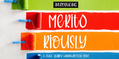 Introduce my New Product "Meritoriously" a cute quirky handwritten font. Very suitable for greeting cards, branding materials, business cards, quotes, posters, and more! These fonts are perfect for all brand :) Features : - UpperCase & Lowercase Numerals & Punctuations - Ligatures Multilingual characters (AÀÁÂÃÄÅCÇDÐEÈÉÊËIÌÍÎÏNÑOØÒÓÔÕÖUÙÜÚÛWYÝŸŸÆßÞàáâãäåæçèéêëìíîïðñòóôõöøùúûüýÿ) PUA ENCODEDZIP INCLUDED: Thanks for visited and Please contact me if you have any questions. My Best, Haksen
 - Dirty Money SRF by Stella Roberts Fonts,
$25.00 Dirty Money SRF is a novelty font with a limited character set emulating the lettering found on U.S. currency. The typeface was designed by Brad O. Nelson of the Brain Eaters Font Company. The net profits from my font sales help defer medical expenses for my siblings, who both suffer with Cystic Fibrosis and diabetes. Thank you.
 - Mostly Bonny by Haksen,
$12.00 Introduce my New Product "Bonny" The new fresh handmade script font. Very suitable for greeting cards, branding materials, business cards, quotes, posters, and more! These fonts are perfect for all brand :) Features : - UpperCase & Lowercase Numerals & Punctuations - Ligatures Multilingual characters (AÀÁÂÃÄÅCÇDÐEÈÉÊËIÌÍÎÏNÑOØÒÓÔÕÖUÙÜÚÛWYÝŸŸÆŒßÞàáâãäåæçèéêëìíîïðñòóôõöøùúûüýÿ) PUA ENCODEDZIP INCLUDED Thanks for visited and Please contact me if you have any questions. My Best, Haksen
 - Instant Protest by Hanoded,
$10.00 Instant Protest is a font I made with a broken satay skewer and Chinese ink. Yes, like so many of my fonts, but these particular tools are my favourites! It is a slightly cursive, yet very legible font. It comes with serious language support (Greek, Vietnamese, etc) and some cool contextual alternates that cycle as you type.
 - Devama SRF by Stella Roberts Fonts,
$25.00 Devama SRF was designed by Typodermic's Ray Larabie and provided for Stella Roberts Fonts. Available in Regular, Backlash and Forward, this typeface evokes a retro-80s look while still remaining clean and fresh. The net profits from my font sales help defer medical expenses for my siblings, who both suffer with Cystic Fibrosis and diabetes. Thank you.
 - Xenois Semi by Linotype,
$29.99“Drawing letters is my passion,” says Erik Faulhaber, the designer of the Xenois typeface family. Pronounced “zeeno-is,” the design distills character shapes into what Faulhaber believes are their purest forms. “I studied many typefaces, carefully examining their structure, before I began drawing Xenois. Then I actually wrote out a detailed design brief establishing the goals for my design.” - Xenois Sans by Linotype,
$29.99 “Drawing letters is my passion,” says Erik Faulhaber, the designer of the Xenois typeface family. Pronounced “zeeno-is,” the design distills character shapes into what Faulhaber believes are their purest forms. “I studied many typefaces, carefully examining their structure, before I began drawing Xenois. Then I actually wrote out a detailed design brief establishing the goals for my design.”
 - Sunny Weather by Hanoded,
$15.00 Spring is in the air! My chickens are broody and are sitting on an ever increasing pile of eggs; my fruit trees are budding and the sun is shining! Sunny Weather is a happy kind of font: it was handwritten, using a Sharpie pen. It comes with double letter ligatures and a good dose of vitamin D!
 - Cori by HiH,
$8.00 You wrote on your school notebooks, didn't you. Of course, just about everyone did. And those that didn't are probably in therapy trying to overcome the repression and guilt. Balloon letters are fun, easy to draw and have a light-hearted presence. With little autonomy, what young person can resist the opportunity to make a public, personal statement on their notebook. Guess what! Adults do it too - with our cars, our houses, our toys, our accessories and so on. And how "grown-up" are we really? Anyway, my niece, Cori, made this nice, colorful, hand-drawn birthday card. It was so vibrant and fun - in warm circus colors - that I could not resist making it into a font. Use it for positive, fun stuff, stuff with a light touch - an invitation for an informal party perhaps, but probably not a formal dinner at the White House. This font is not comfortable in a bowtie. But don't be fooled. Casual as Cori is, you can set at least twelve major European languages with it, in addition to English: Albanian, Danish, Dutch, Finnish, French, German, Hungarian, Italian, Norwegian, Portuguese, Spanish and Swedish. Cori Valentine adds a decorative Valentine border to the upper case of Cori. By leaving out the bow in the upper center of the border we were able to fit the border around the accented caps. Similarly, we omitted the butterfly for the Ccedilla glyph. Blank versions of the regular border & the bowless border are provided at positions 135 & 137 in case you want to put a border around your signature or something like that. Just for reference, the letterforms for Cori Valentine are 75% the size as the regular Cori font. We would like to assure you that it is permissible to use Cori Valentine to create a romantic card, flyer or note during any month with less the 32 days.
 - Cosmic Sans by Zachary Mazur,
$15.00 Cosmic Sans was my first font ever created for a school project. The class I made this font for was my Advanced Typography and was a semester project. I really couldn't think of a title for this font, until one of my good friends said, "Why don't you name it Cosmic Sans?" I searched the internet for any other fonts with that name, and sure enough there wasn't. Thus the name stuck. This font is more or less a display font, thus every secondary character was not created. I hope you enjoy this font and much as I have while creating it!
 - Brasika Display by Nurrontype,
$14.00 Hello my name is Brasika Display, a fun, funk and swirly font. I was designed with versatility, easy to adapt to your needs. I'm playful enough to make you happy. Just look my styistic and anatomy, it's cool, isn't it ? You can put me in your logo project. Or your magazine title. In your Christmas greetings card, wedding invitation, perhaps use me in your Instagram feeds, Youtube title, and many more, you name it. All my friends called me Polyglat, because I'm speaking and understand many languages. I'm Brasika, buy me now, and I will help you to ignite your next project.
 - Mr. Mamoulian by Comicraft,
$19.00 “In some way I was Mr Mamoulian, and someone else was writing and drawing this stuff. He kept sending me these pages. I had to sign my name and pass them off as my own. I had no choice. He was holding my aged mother hostage, you see. I told him when the pages were due and he somehow got them to me. Sometimes he left them in secret locations. I don't remember them at all.” -- Brian Bolland Mr. Mamoulian has four weights with automatic alternating uppercase letters, Crossbar I Technology, and European, Vietnamese & Cyrillic language support.
 - TA Father 60 by Tural Alisoy,
$15.00 Since 2017, I have been improving my font creating skills. In the same year, I went through my father's notes and decided to make a font with his handwriting style. I completed the initial version with a lower number of glyphs in 2018. It supported only basic Latin, Turkish, and Azerbaijani alphabets. On the 15th of January 2021, my dad will turn 60. I am planning to finalize the updated version of the Father font by then. 584 glyph, 100+ Languages Set. Multilingual support: Latin basic, Latin Extended, Cyrillic, Central Europe, Turkish, Romanian, Euro, West European diacritics
 - Alles Kaputt by Kitchen Table Type Foundry,
$16.00 Alles Kaputt means ‘everything’s broken’ in German. I always wonder why my stuff breaks so easily, especially my mobile phones (I have had 7 in the last two years). Maybe I am careless, but I believe that there is a more or less scientific explanation that chaos and destruction are far easier than harmony and creation. I am no scientist, so don’t take my word for it! Alles Kaputt is a nice script font. I made it with a felt tip pen I borrowed from the kids. Use it for texts on product packaging, book covers and websites. Or, whatever you fancy!
 - Sabana by fragTYPE,
$20.00 Sabana is my first step in font design. A font that is born from the organic, from a creative process that starts from improvisation as a result of my training as an artist. To design Sabana I asked myself the question, why not make a font that emulates my own writing? as I found it fun to see my handwriting on a computer. This font can be used in a wide range of projects such as editorial design, motion graphics, web, advertising and branding where emulating handwriting is a necessity. The font has coverage for more than 200 languages ??derived of the latin alphabet in addition to Cyrillic. Sabana is where I come from, where I am from, a constant on the horizon that is occasionally interrupted by vertical lines and that together make a perfect visual symphony.
 - Steiner - Unknown license

- Better Vinegar by Sohel Studio,
$16.00 Better Vinegar is a Modern vintage serif typeface with beautiful ligatures, Unique alternative , multilingual support with perfect kerning. This typeface is perfect for an elegant & luxury logo , classy editorial design, women's magazine, fashion brand , cosmetic brand, fashion promotion , modern advertising design, invitation card, art quote, home decoration , book/cover titles, special events, and much more. Better Vinegar Features: · 5 Weights font (Regular,Italic,Outline,Bold,Thin) · Uppercase And Lowercase · Alternates And Ligatures · Numerals & Punctuation · Accented characters · Multilingual Support · Unicode PUA Encoded Thanks and have a wonderful day .
 - Asta by LLW Studio,
$16.00 Asta, named after the adorable pup in the “Thin Man” movies from the 1930‘s and early ‘40‘s, is an Art Deco / Streamline Moderne all-caps display font. Inspired by forms from the iconic machinery of the day like trains and autos, Asta has a heavy and masculine proportion, a cut-in “grille” effect and a slight slant which emphasizes its moderne roots. Fantastic for illustration or retro applications like antique product “logos,” signs and vintage packaging, or for a fun & funky ‘70‘s Disco look.
 - Collateral Damage by Chank,
$59.00Collateral Damage is a classic splatter font from the earlier days of the internet. A consistent fan favorite since its initial release in 1999, this ink-dripping font was inspired by the gonzo art of Ralph Steadman. It looks hand-painted, like graffiti. Or crazy scary, like splattered blood. It was made by designer Chris Hunt who lives in the Canadian North with the polar bears. After years as a Chank.com exclusive, it is now available at MyFonts for your personal or commercial use. - Celtic-BA by Bannigan Artworks,
$19.95This is my interpretation of the writing in ancient Celtic manuscripts such as the Book of Kells. - Sadey Ann by Borges Lettering,
$35.00 A nice delicate script made for my little girl, Sadey. This penline script has 26 alternate characters.
 - Rosa Love by PizzaDude.dk,
$20.00Rosa Love is a laid back and legible handwritten font. Dedicated with love to my daughter, Rosa! - Easy Game by PizzaDude.dk,
$18.00 Easy Game is my laid back, easy to read, fun to watch comic and all-purpose font!
 - Drum Shake by PizzaDude.dk,
$16.00 Drum Shake is my friendly, all-caps comicbook font - ready to serve and protect your next design!
 - LTC Holiday Ornaments by Lanston Type Co.,
$24.95 Assembled for those less commercialized holidays, LTC Holiday Ornaments features over 80 printers' ornaments from Lanston Monotype and other historical foundries such as BBS and ATF. Holidays include Easter, Valentine's Day, St. Patrick's Day, April Fool's Day, Thanksgiving and 4th of July. There¹s even a pirate to represent international "Talk Like a Pirate" day. LTC Holiday Ornaments joins the Lanston Collection alongside the popular LTC Halloween and Christmas Ornaments. LTC Holiday Ornaments contains additional Halloween and Christmas ornaments as well.
 - Compasso by Plau,
$30.00 The idea that mathematical precision and the supposed "purity" of geometric forms are part of the discourse of us graphic designers is not new. Studying typography for some time now and learning about all the small alterations and adjustments that this geometry undergoes to better adapt to the imperfect human eye, I found myself with a new way of seeing things. Compasso is, in a way, a result of my growth as a designer. Established and recognized fonts like Futura, Avenir, and their predecessors (including Tempo - published by the Ludlow foundry in the early 20th century) informed the result of Compasso at some level. Others opened my mind to possibilities. Mallory, Azo Sans, the font designed for Audi by Bold Monday, and many other contemporary sans-serif fonts that left me speechless are also responsible for details present in this font. From the first sketch, the family grew on both sides, gaining condensed and extended counterparts. From there - and from a brilliant insight from designer Nicole Rauen - I learned that Compasso was not about geometry. Compasso is about rhythm. It's about the rhythmic movement that provides a foundation, supports, and also makes you dance and swing. My musical taste is too eclectic, I can go from classical to funk in less than two songs on Spotify. Compasso is also eclectic. It's a font to take your project anywhere, a record to listen to on any occasion.
 - Progeny by Type Associates,
$35.00 Progeny is a single-stroke freehand informal script that began life as a logo for a fast food company. That logo was rejected but when I added a suite of swash caps and a few extra ligatures and my trademark underlines it all started to come together as a font. Then I used it successfully for another logo and I proceeded to complete the weight variations that emerged during the first logo design, rounding the lighter weights to give a more friendly, softer look. That treatment didn't suit the bold weight but sharp corners did not detract from the robust, legible headliner that emerged. All weights work in all-lowercase, all-capitals, lowers with swash or regular initial caps and surprisingly – in all-caps with swash initials.
 - Morning Cookie by Bogstav,
$17.00 Yet again, a font inspired by my work as a kindergarten teacher! The other day, I had a conversation with some of the kids, about what they ate for breakfast. Some had oatmeal, some bread and others yogurt. But this kid - he insisted that every morning, his mother would serve him cookies, “morning cookies”. It sounded too good to be true, and when I asked his mother, it turned out that “cookies” were actually bread, but to make it sound more appetising, they called it cookies! The letters are rounded and in some way quite naive, but still clear and legible. With an extreme ascender and descender, the font stands out with its oddities. I’ve added 3 different versions of each lowercase letter!
 - Bombelli Light Hand by Wiescher Design,
$39.50 Bombelli is a font that looks like it has been handwritten by a meticulous architect in one of those hand-drawn blueprints of the old days. I chose the name to honor one of my ex-bosses -- a graphic designer-architect who taught me a lot of things when I was young and needed the money. One of the things he taught me – and probably the most important one – was to always be on time in the morning. He never said a word about me being late, but it worked. He taught me about being meticulous in detail and many other things I only appreciated much later. This clear and straightforward font deserves bearing his name. Your grateful type designer Gert Wiescher
 - Halewyn by Hanoded,
$15.00 Heer Halewijn (The Song of Lord Halewijn) is a 13th century Dutch folk tale which survives in folk ballad. The story tells of a man called Halewijn, who lives in the woods and who lures pretty women with his songs (whom he then kills). One day a princess visits Halewijn, but when he wants to kill her, she requests he remove his robe, so as not to stain it with her blood. He obliges and when he is undressing, the princess seizes his sword and chops off his head. Halewyn is a handmade font, which was loosely based on my Languedoc font and Garamond. Use it for product packaging, books and posters. Comes in 4 weights (with italics) and a ballad full of diacritics.
 - Areplos by Storm Type Foundry,
$53.00To design a text typeface "at the top with, at the bottom without" serifs was an idea which crossed my mind at the end of the sixties. I started from the fact that what one reads in the Latin alphabet is mainly the upper half of the letters, where good distinguishableness of the individual signs, and therefore, also good legibility, is aided by serifs. The first tests of the design, by which I checked up whether the basic principle could be used also for the then current technology of setting - for double-sign matrices -, were carried out in 1970. During the first half of the seventies I created first the basic design, then also the slanted Roman and the medium types. These drawings were not very successful. My greatest concern during this initial phase was the upper case A. I had to design it in such a way that the basic principle should be adhered to and the new alphabet, at the same time, should not look too complicated. The necessary prerequisite for a design of a new alphabet for double-sign matrices, i.e. to draw each letter of all the three fonts to the same width, did not agree with this typeface. What came to the greatest harm were the two styles used for emphasis: the italics even more than the medium type. That is why I fundamentally remodelled the basic design in 1980. In the course of this work I tried to forget about the previous technological limitations and to respect only the requirements then placed on typefaces intended for photosetting. As a matter of fact, this was not very difficult; this typeface was from the very beginning conceived in such a way as to have a large x-height of lower-case letters and upper serifs that could be joined without any problems in condensed setting. I gave much more thought to the proportional relations of the individual letters, the continuity of their outer and inner silhouettes, than to the requirements of their production. The greatest number of problems arose in the colour balancing of the individual signs, as it was necessary to achieve that the upper half of each letter should have a visual counterbalance in its lower, simpler half. Specifically, this meant to find the correct shape and degree of thickening of the lower parts of the letters. These had to counterbalance the upper parts of the letters emphasized by serifs, yet they should not look too romantic or decorative, for otherwise the typeface might lose its sober character. Also the shape, length and thickness of the upper serifs had to be resolved differently than in the previous design. In the seventies and at the beginning of the eighties a typeface conceived in this way, let alone one intended for setting of common texts in magazines and books, was to all intents and purposes an experiment with an uncertain end. At this time, before typographic postmodernism, it was not the custom to abandon in such typefaces the clear-cut formal categories, let alone to attempt to combine the serif and sans serif principles in a single design. I had already designed the basic, starting, alphabets of lower case and upper case letters with the intention to derive further styles from them, differing in colour and proportions. These fonts were not to serve merely for emphasis in the context of the basic design, but were to function, especially the bold versions, also as independent display alphabets. At this stage of my work it was, for a change, the upper case L that presented the greatest problem. Its lower left part had to counterbalance the symmetrical two-sided serif in the upper half of the letter. The ITC Company submitted this design to text tests, which, in their view, were successful. The director of this company Aaron Burns then invited me to add further styles, in order to create an entire, extensive typeface family. At that time, without the possibility to use a computer and given my other considerable workload, this was a task I could not manage. I tried to come back to this, by then already very large project, several times, but every time some other, at the moment very urgent, work diverted me from it. At the beginning of the nineties several alphabets appeared which were based on the same principle. It seemed to me that to continue working on my semi-finished designs was pointless. They were, therefore, abandoned until the spring of 2005, when František Štorm digitalized the basic design. František gave the typeface the working title Areplos and this name stuck. Then he made me add small capitals and the entire bold type, inducing me at the same time to consider what to do with the italics in order that they might be at least a little italic in character, and not merely slanted Roman alphabets, as was my original intention. In the course of the subsequent summer holidays, when the weather was bad, we met in his little cottage in South Bohemia, between two ponds, and resuscitated this more than twenty-five-years-old typeface. It was like this: We were drinking good tea, František worked on the computer, added accents and some remaining signs, inclined and interpolated, while I was looking over his shoulder. There is hardly any typeface that originated in a more harmonious setting. Solpera, summer 2005 I first encountered this typeface at the exhibition of Contemporary Czech Type Design in 1982. It was there, in the Portheim Summer Palace in Prague, that I, at the age of sixteen, decided to become a typographer. Having no knowledge about the technologies, the rules of construction of an alphabet or about cultural connections, I perceived Jan Solpera's typeface as the acme of excellence. Now, many years after, replete with experience of revitalization of typefaces of both living and deceased Czech type designers, I am able to compare their differing approaches. Jan Solpera put up a fight against the digital technology and exerted creative pressure to counteract my rather loose approach. Jan prepared dozens of fresh pencil drawings on thin sketching paper in which he elaborated in detail all the style-creating elements of the alphabet. I can say with full responsibility that I have never worked on anything as meticulous as the design of the Areplos typeface. I did not invent this name; it is the name of Jan Solpera's miniature publishing house, in which he issued for example an enchanting series of memoirs of a certain shopkeeper of Jindrichuv Hradec. The idea that the publishing house and the typeface might have the same name crossed my mind instinctively as a symbol of the original designation of Areplos - to serve for text setting. What you can see here originated in Trebon and in a cottage outside the village of Domanín - I even wanted to rename my firm to The Trebon Type Foundry. When mists enfold the pond and gloom pervades one's soul, the so-called typographic weather sets in - the time to sit, peer at the monitor and click the mouse, as also our students who were present would attest. Areplos is reminiscent of the essential inspirational period of a whole generation of Czech type designers - of the seventies and eighties, which were, however, at the same time the incubation period of my generation. I believe that this typeface will be received favourably, for it represents the better aspect of the eighties. Today, at the time when the infection by ITC typefaces has not been quite cured yet, it does absolutely no harm to remind ourselves of the high quality and timeless typefaces designed then in this country.In technical terms, this family consists of two times four OpenType designs, with five types of figures, ligatures and small capitals as well as an extensive assortment of both eastern and western diacritics. I can see as a basic text typeface of smaller periodicals and informative job-prints, a typeface usable for posters and programmes of various events, but also for corporate identity. Štorm, summer 2005 - Compendium by Sudtipos,
$99.00 Compendium is a sequel to my Burgues font from 2007. Actually it is more like a prequel to Burgues. Before Louis Madarasz awed the American Southeast with his disciplined corners and wild hairlines, Platt Rogers Spencer, up in Ohio, had laid down a style all his own, a style that would eventually become the groundwork for the veering calligraphic method that was later defined and developed by Madarasz. After I wrote the above paragraph, I was so surprised by it, particularly by the first two sentences, that I stopped and had to think about it for a week. Why a sequel/prequel? Am I subconsciously joining the ranks of typeface-as-brand designers? Are the tools I build finally taking control of me? Am I having to resort to “milking it” now? Not exactly. Even though the current trend of extending older popular typefaces can play tricks with a type designer’s mind, and maybe even send him into strange directions of planning, my purpose is not the extension of something popular. My purpose is presenting a more comprehensive picture as I keep coming to terms with my obsession with 19th century American penmanship. Those who already know my work probably have an idea about how obsessive I can be about presenting a complete and detailed image of the past through today’s eyes. So it is not hard to understand my need to expand on the Burgues concept in order to reach a fuller picture of how American calligraphy evolved in the 19th century. Burgues was really all about Madarasz, so much so that it bypasses the genius of those who came before him. Compendium seeks to put Madarasz’s work in a better chronological perspective, to show the rounds that led to the sharps, so to speak. And it is nearly criminal to ignore Spencer’s work, simply because it had a much wider influence on the scope of calligraphy in general. While Madarasz’s work managed to survive only through a handful of his students, Spencer’s work was disseminated throughout America by his children after he died in 1867. The Spencer sons were taught by their father and were great calligraphers themselves. They would pass the elegant Spencerian method on to thousands of American penmen and sign painters. Though Compendium has a naturally more normalized, Spencerian flow, its elegance, expressiveness, movement and precision are no less adventurous than Burgues. Nearing 700 glyphs, its character set contains plenty of variation in each letter, and many ornaments for letter beginnings, endings, and some that can even serve to envelope entire words with swashy calligraphic wonder. Those who love to explore typefaces in detail will be rewarded, thanks to OpenType. I am so in love with the technology now that it’s becoming harder for me to let go of a typeface and call it finished. You probably have noticed by now that my fascination with old calligraphy has not excluded my being influenced by modern design trends. This booklet is an example of this fusion of influences. I am living 150 years after the Spencers, so different contextualization and usage perspectives are inevitable. Here the photography of Gonzalo Aguilar join the digital branchings of Compendium to form visuals that dance and wave like the arms of humanity have been doing since time eternal. I hope you like Compendium and find it useful. I'm all Spencered out for now, but at one point, for history’s sake, I will make this a trilogy. When the hairline-and-swash bug visits me again, you will be the first to know. The PDF specimen was designed with the wonderful photography of Gonzalo Aguilar from Mexico. Please download it here http://new.myfonts.com/artwork?id=47049&subdir=original
 - ITC Christoph's Quill by ITC,
$29.99ITC Christoph's Quill is just about everything you could want in a typeface: it's distinctive, beautiful, and exceptionally versatile. According to designer Russell Bean, ITC Christoph's Quill is the culmination of experimentation with a graphics tablet that spanned several years. Then one day, as if by magic, it all just fell into place. The design seemed to flow from my pen." Bean was born in Australia and, except for a brief stint with a photo-lettering firm in Southern California, has spent most of his career working down under. "I can recall a deep fascination for the written word," he says. "Even before learning to spell, read or write, I think I recognized that this was a means of visual communication." Bean's first job was in a small ad agency as a trainee in the production department, where he learned art techniques and how to handle print, as well as "the value of visual impressions," he says. His career path meandered from one design job to another, but always in the general direction of fonts and typefaces. Today, his workload consists of logo design commissions, font editing, typography and print production consultation to a select group of loyal clients - still leaving time, notes Bean, "to pursue my type design ambitions." ITC Christoph's Quill began life as a simple, visually striking font of caps, lowercase, punctuation and numerals. To this Bean added a bold weight, for when a little more strength is desirable. Next came a flock of alternate characters. Finally, Bean drew a set of decorative caps, a suite of logos, and a sprinkling of beginning and ending swashes. The net result is a type family that can add a signature flourish to a vast range of projects: from invitations and menus to logos, signage, packaging and more."


