10,000 search results
(0.018 seconds)
- Di Mare by Ksenia Belobrova,
$49.00 Di Mare is a layered script inspired by Italian restaurant and cafe signs. It’s about delicious food and the joyful atmosphere of traveling: freedom, sea, fresh wind and warm sun. This font family has three styles: Regular, Line, Shadow. You can combine and overlay them to get different effects. Di Mare works well for menu, packaging, clothes, signs, magazines, and as a starting point for lettering and logos. Di Mare is designed with hundreds of contextual alternates and ligatures. It makes all connections look natural and harmonious. Di Mare supports most European languages, has small capitals, numbers, fractions, currency and mathematical signs. All contextual alternates are built into the “Liga” feature that is turned on by default. However, when your work with typeface, please make sure that “Liga” is turned on.
 - KR Love Letters - Unknown license

- Throw My Hands Up in the Air - Personal use only

- Throw My Hands Up In The Air by Kimberly Geswein,
$5.00 Cute, messy (yet still legible) teen girl handwriting with flair.
 - Play Day - Personal Use - Personal use only

- GA Clock Dial Round - Unknown license

- 7 days fat rotated - Unknown license

- Lewis F. Day 191 - Unknown license

- KR Apple A Day - Unknown license

- 7 days fat oblique - Unknown license

- Day Of The Tentacle - Unknown license

- PF DIN Display Pro by Parachute,
$79.00 While DIN Display seems to retain DIN’s basic characteristics, it shines with its sharper corners and contemporary look. Completed in 2002, it was first released and published in Parachute’s award-winning 2003 catalog and immediately was a hit. It has been used successfully in magazines, corporate applications and packaging in fields such as music, fashion, technology, visual arts. The ‘Pro’ series has been enhanced with more weights, multilingual support and opentype features in all different styles. Specifically, this superfamily supports simultaneously Latin, Greek and Cyrillic, while each one of its 15 weights contains 1197 glyphs and 20 opentype features. Additionally, every font in this superfamily has been completed with 270 copyright-free symbols, some of which have been proposed by several international organizations. This is a set of very useful daily symbols for packaging, branding and advertising. Symbols for public areas, environment, transportation, computers, fabric care and urban life.
 - FF DIN Paneuropean Variable by FontFont,
$629.99 FF DIN: the famous, faithful and first revival of DIN 1451. FF DIN originates in the lettering models from the German standard DIN 1451, and is considered the perfect standard typeface due to methodical and engineered design. FF DIN Variable offers you more FF DIN than ever before. Pushing font technology to its limits, Variable fonts provide creatives a tool to dial in hyper specific variations which thrive in any design space. FF DIN Variable take bold steps in engineering, which the typefaces behaviour which brings in FF DIN’s technical look-and-feel into the smooth and almost organic world of Variable Fonts. Available in both upright and italic styles, there is a lot more FF DIN to discover with new era of type technology. FF DIN Italic is a sloped roman style, however it is optically corrected – slightly thinner, slightly narrower. As a result, FF DIN Italic stands out subtly. FF DIN Variable stays faithful to its parent’s DNA, the utmost care was taken to ensure that the new instances of FF DIN Variable remained consistent with all the well-known weights. Precision is the mantra of FF DIN, the FF DIN Variable is no exception to this design philosophy. Produce exquisitely fine-tuned typography and expressive animated headlines for any design. Infinite styles, intelligent, and powerful.
 - PF DIN Text Universal by Parachute,
$165.00 DIN Text Universal is the most advanced DIN superfamily ever. It combines the powerful DIN Text Pro with DIN Text Arabic bringing the number of glyphs to 3320 per font. In fact, this set of fonts contains the most complete and powerful array of arabic features commercially available. It supports all variations of the Arabic script such as Persian, Urdu and Pashto. It is also enhanced with 30 advanced opentype features and kerning for all languages. The four major scripts Latin, Arabic, Cyrillic and Greek are now matched across the design of the whole family, respecting at the same time each one's modern cultural identity. With its vast array of weights, the extended support for numerous languages, its careful and detailed design, it will prove to be extremely valuable for many complex corporate projects and corporations which operate internationally.
 - FF DIN Slab Variable by FontFont,
$419.99 FF DIN: the famous, faithful and first revival of DIN 1451. FF DIN originates in the lettering models from the German standard DIN 1451, and is considered the perfect standard typeface due to methodical and engineered design. FF DIN Slab is a robust compliment to the FF DIN family. Designed by Antonia Cornelius and Albert-Jan Pool, it offer designers tools to create greater rhythm and design depth. FF DIN Slab’s proportions have been meticulously aligned with its Sans origins, offering the perfect balance between positive and negative space. The serifs are assertive, sturdy and balanced, they are engineered to emphasis a strong horizontal flow through text, a grounded utility and assurance in headlines. The result of this attention to detail is a typeface that harmonizes beautifully with other FF DIN styles. Pushing font technology to its limits, FF DIN Slab is also available as a Variable font. Allowing creatives to design hyper specific variations which thrive in any design space, and even seamlessly animate movement from one state to the next. FF DIN Slab distinctively carries on its parent’s DNA, speaks the same native language — but with a strong peculiar dialect. It expands the DIN family worthily — independent but integrated — and opens totally new possibilities of uses with the whole DIN family.
 - Day And Collins Logotypes by Jeremia Adatte,
$20.00 Please Note: as this is a picture-only font, there are no latin alpha/numeric glyphs. Each wood type manufacturer had their own selection of original Logotypes or Catchwords designs. These are taken right from the original source material, an extremely rare 1910 catalog of an English wood type maker called Day & Collins in London. As the name says it, these words are intended to attract attention, to spice up posters, packaging or advertisement designs. I made these available for the digital age, leaving the original texture of printed wood type at the highest detail possible.
 - Three Day Pass JNL by Jeff Levine,
$29.00Three Day Pass JNL is another addition to the large collection of stencil fonts from Jeff Levine. This design was based on a 1980s clone of a popular lettering guide first sold in the 1950s. To the untrained eye, many of the stencil designs look the same - but there are subtle nuances in the shapes of the letters and numbers that makes each font unique and slightly different. - Have a Nice Day by Cultivated Mind,
$20.00 Have A Nice Day is a handwritten font created by Cindy Kinash. This font features three font styles (Basic/Tall/Wide) and comes in three weights (Light/Regular/Bold). All three font styles can be used together as one unique and fun font! This font also includes a set of fun hand drawn ornaments like smiley faces, flowers, leaves, insects, frames, captions, desserts, food, clouds, and catchwords that will surely brighten your day! Enjoy!
 - PF DIN Stencil Pro by Parachute,
$65.00 DIN Stencil Pro on Behance. DIN Stencil Pro: Specimen Manual PDF. Despite the fact that over the years several designers have manually created stencil lettering based on DIN for various projects, there had never been a professional digital stencil version of a DIN-based typeface until 2010 when the original DIN Stencil was first released. The Pro version was released in 2014 and adds multiscript support for Cyrillic and Greek. DIN Stencil Pro was based on its original counterpart DIN Text Pro and was particularly designed to address contemporary projects, by incorporating elements and weights which are akin to industries such as fashion, music, video, architecture, sports and communications. Traditionally, stencils have been used extensively for military equipment, goods packaging, transportation, shop signs, seed sacks and prison uniforms. In the old days, stencilled markings of ownership were printed on personal possessions, while stencilled signatures on shirts were typical of 19th century stencilling. Two companies dominated the market in the mid-twentieth century: the Marsh Stencil Machine Company in the United States and the Sächsische Metall Schablonen Fabrik in Germany. Ever since the late 1930s, it was the German Sächsische Metall Schablonen Fabrik which used heavily the new DIN 1451 standard font (introduced in 1936), attempting to overthrow the reign of the Didot-style modern roman which was at the time the most common stencil letter in Germany. These letters were manufactured mainly as individual zinc stencils which could be ordered in sizes between 10 and 100mm. The DIN Stencil family manages to preserve several traditional stencil features, but introduces additional modernities which enhance its pleasing characteristics which make it an ideal choice for a large number of contemporary projects. Furthermore, the spacing attributes of the glyphs were redefined and legibility was improved by revising the shape of the letterforms. The DIN Stencil Pro family is an enhanced version of the popular DIN Stencil. It consists of 8 diverse weights from the elegant Hairline to the muscular Black and supports Latin, Cyrillic, Greek, Eastern European, Turkish and Baltic. The new version 3.0 includes several additions such the recently unicode encoded character of the German uppercase Eszett (ẞ), the Russian currency symbol for Rouble (₽), Ukrainian Hryvnia (₴), Azeri and Kazakh letterforms.
 - FF DIN Stencil Variable by FontFont,
$524.99FF DIN: the famous, faithful and first revival of DIN 1451. FF DIN originates in the lettering models from the German standard DIN 1451, and is considered the perfect standard typeface due to the methodical and engineered nature of its design. The FF DIN family breathes an atmosphere of versatility and authority, FF DIN Stencil follows the same design principles with extra flair. The bridges are arranged vertically, which usually replaces the thinnest parts of the strokes — offering depth in your headlines. Go loud and scale up, as the weights get heavier, the width of the bridges skillfully expand and contract, enabling FF DIN Stencil to provide confidence in volume, and in any chosen style. Also made available as a Variable font, creatives can design hyper specific variations to thrive in any design space, and even to animate movement from one state to the next. Get innovative with the entire FF DIN family, FF DIN Stencil’s spacing and kerning is identical to FF DIN, this enables swapping between any FF DIN font without changes in word length or line breaks. For true FF DIN fans, FF DIN Slab and FF DIN Stencil designed by Albert-Jan Pool, Antonia Cornelius and Achaz Reuss, can be seen as harmonious companions to the FF DIN family, rather than alternatives. Bestowed with its parents distinctive DNA, all the FF DIN extensions open up new possibility with their own unique qualities, but stay true to the FF DIN design philosophy of engineered precision. - Dip Pen Deco JNL by Jeff Levine,
$29.00 The hand lettered title on the cover of the 1938 sheet music for “If It Rains – Who Cares” featured a condensed Art Deco typeface made with a round nib pen. The square shaped characters with rounded corners were a perfect subject for a digital font revival, and are now available as Dip Pen Deco JNL, in both regular and oblique versions.
 - FF A Lazy Day by FontFont,
$30.99 German type designer Simone May created this display FontFont in 1995. The font is ideally suited for festive occasions and poster and billboard projects. FF A Lazy Day provides advanced typographical support with features such as ligatures and comes with tabular lining figures.
 - Play Day Stencil JNL by Jeff Levine,
$29.00 The typography on a 1964 children’s activity book published by Whitman entitled “Build with Stencils” was in a bold, condensed design. The only problem was that the ‘rails’ [the parts that divide a letter into stencil pieces] were too narrow and would disappear at smaller point sizes. Widening the ‘rails’ just a bit greatly improved the appearance of the stencil characters. Play Day Stencil JNL is now available in both regular and oblique versions. In its day, the Whitman Publishing Company of Racine, Wisconsin published dozens of activity books for children, including a number of them with stencils. The company was a division of Western Publishers from the early 1900s through the 1970s, but went through a number of sales and name changes. Currently [as Whitman once again] it is owned by Anderson Press, and is known for its line of coin folders and books on coin collecting.
 - Have A Great Day by Roland Hüse Design,
$10.00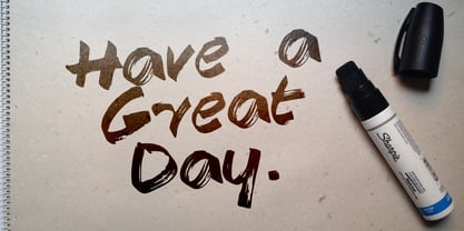
- Beautiful Day Script Duo by Letterfreshstudio,
$12.00 Beautiful Day Script Font DUO is a new modern script font with an irregular base line. Trendy and feminine style. Beautiful Day Script looks beautiful in wedding invitations, thank-you cards, quotes, greeting cards, logos, business cards, and more. Perfect for use in ink or watercolors. Including initial letters and terminals, alternatives and support for many languages. To activate the OpenType Stylistic alternative, you need a program that supports OpenType features such as Adobe Illustrator CS, Adobe Indesign & CorelDraw X6-X7, Microsoft Word 2010 or newer versions. There are additional ways to access alternatives / swash, using Character Map (Windows), Nexus Fonts (Windows), Font Books (Mac) or software programs such as PopChar (for Windows and Mac). How to access all alternative characters: https: //www.youtube.com/watch? v = Go9vacoYmBw https: //www.youtube.com/watch? v = XzwjMkbB-wQ Need help or have questions, let me know. I am happy to help :) Thank you & Congratulations on the Design!
 - PF DIN Stencil B by Parachute,
$43.00 This is a new version of our popular DIN Stencil family designed with a wider cut than the original. This overcomes the diminishing effect of the stencil at smaller sizes where the cuts tend to disappear, whereas it makes a bold statement at display sizes. Traditionally, stencils have been used extensively for military equipment, goods packaging, transportation, shop signs, seed sacks and prison uniforms. In the old days, stencilled markings of ownership were printed on personal possessions, while stencilled signatures on shirts were typical of 19th century stencilling. DIN Stencil B manages to preserve several traditional stencil features, but introduces additional modernities which enhance its pleasing characteristics and make it an ideal choice for a large number of contemporary projects. It consists of 7 diverse weights from Extra Thin to Black. This version supports Latin, Cyrillic, Eastern European, Turkish and Baltic. DIN Stencil B includes several additions such the recently unicode encoded character of the German uppercase Eszett (ẞ), the Russian currency symbol for Rouble (₽), Ukrainian Hryvnia (₴), Azeri and Kazakh letterforms.
 - Celebrate The Day Pro by CheapProFonts,
$10.00 The freeflowing and quite feminine style of this script appealed to me, but it needed a bit of taming. Quite a few of the letterforms have been normalized - to better accommodate the diacritics. :) All fonts from CheapProFonts have very extensive language support: They contain some unusual diacritic letters (some of which are contained in the Latin Extended-B Unicode block) supporting: Cornish, Filipino (Tagalog), Guarani, Luxembourgian, Malagasy, Romanian, Ulithian and Welsh. They also contain all glyphs in the Latin Extended-A Unicode block (which among others cover the Central European and Baltic areas) supporting: Afrikaans, Belarusian (Lacinka), Bosnian, Catalan, Chichewa, Croatian, Czech, Dutch, Esperanto, Greenlandic, Hungarian, Kashubian, Kurdish (Kurmanji), Latvian, Lithuanian, Maltese, Maori, Polish, Saami (Inari), Saami (North), Serbian (latin), Slovak(ian), Slovene, Sorbian (Lower), Sorbian (Upper), Turkish and Turkmen. And they of course contain all the usual "western" glyphs supporting: Albanian, Basque, Breton, Chamorro, Danish, Estonian, Faroese, Finnish, French, Frisian, Galican, German, Icelandic, Indonesian, Irish (Gaelic), Italian, Northern Sotho, Norwegian, Occitan, Portuguese, Rhaeto-Romance, Sami (Lule), Sami (South), Scots (Gaelic), Spanish, Swedish, Tswana, Walloon and Yapese.
 - PF DIN Text Arabic by Parachute,
$145.00 This Arabic typeface is one of Parachute’s most involved text typefaces. For the first time -back in 2010- a contemporary Arabic equivalent to a comprehensive DIN series of fonts was available. In fact, this set of fonts contains the most complete and powerful array of Arabic features commercially today. It comes in eight weights and includes Latin. Based on the DIN Text Pro superfamily, Parachute® released -in collaboration with designer Hasan Abu Afash- 2 new versions. DIN Text Arabic is the basic Arabic version which includes Latin and supports all variations of the Arabic script such as Persian, Urdu and Pashto. The second version DIN Text Universal is the most advanced DIN superfamily ever. It combines the powerful DIN Text Pro with DIN Text Arabic bringing the number of glyphs to 3320 per font. It is also enhanced with 30 advanced opentype features and kerning for all languages. Altogether it supports hundreds of languages, proving to be an essential tool for corporations which operate internationally. The whole family consists of eight weights from extra black to hairline. DIN Text Arabic is featured in the recent book Arabesque 2 by Gestalten.
 - KR Silly Art Holiday - Unknown license

- KR Silly Art People - Unknown license

- KR Silly Art Dings - Unknown license

- Arts And Crafts JY by JY&A,
$39.00 - Art Of Japanese Calligraphy by Okaycat,
$29.95 Art of Japanese Calligraphy is a Kanji font. This is a collaboration with experienced calligrapher, Shigeru Nomura. Developed directly from the hand-written Kanji (Japanese/Chinese Characters). Perfect for anywhere authentic Kanji is needed.
 - DGS Art Deco Greek by dgsdesigns,
$10.00 DGS Art Deco Greek is a unique typeface breaking all boundaries available in Latin and Greek scripts. It can be used in a wide range of projects including invitations, theatre and cinematic productions, branding, logos , adverts and much more.
 - TA Bankslab Art Nouveau by Tural Alisoy,
$40.00 TA Bankslab graphic presentation at Behance The building of the Northern Bank of St. Petersburg's Baku branch was built in 1903-1905. It was the first Art Nouveau-style building in Baku, Azerbaijan. Later the bank was transformed into the Russian-Asian Bank. After the oil boom in Baku in the 19th century, branches of many banks and new banks were opened in the city. The branch of the Northern Bank of St. Petersburg was among the first banks that was opened in Baku. N.Bayev was the architect of the building for the branch of the Northern Bank of St. Petersburg located at Gorchakovskaya 3 in 1903-1905. The building currently houses the Central Branch of the International Bank of Azerbaijan. My purpose in writing this is not to copy and paste the information from Wikipedia. What attracted me to the building was the word "Банкъ" (Bank) written in Cyrillic letters, which was also used in Azerbaijan during the Soviet era. The exact date of the writing is not known. Every time I pass by this building, I always thought of creating a font of this writing someday. I had taken a photo of the building and saved it on my phone. I did a lot of research on the font and asked a lot of people. However, some did not provide information at all and some said they did not have any information. I was interested in the history of this font but I do not know if this font really existed or it was created by the architect out of nowhere. If there was such a history of this font, I wanted to recreate this font and make it available. If not, I had to create it from scratch in the same way, using only existing letters on the building. Finally, I made up my mind and decided to develop the font with all letters I have got. It was difficult to create a font based on the word, Банкъ. Because in the appearance of the letters, the midline of the letters on A, H, K was very distinct, both in the form of inclination and in more precise degrees. The serif part of the letters, the height of the upper and lower sides, differed from each other. I don't know whether it was done this way when the building was constructed or it happened over time. I prepared and kept the initial version of the font. I took a break for a while. I started digging on the story of the font again. Meanwhile, I was researching and got inspired by similar fonts. Unfortunately, my research on the font's history did not yield any results. I decided to continue finishing up the font. After developing the demo, I created the font by keeping certain parts of these differences in the letters. In addition, I had to consider the development of letters in the Cyrillic, as well as the Latin alphabet, over the past period. Thus, I began to look at the appearance of slab-serif or serif fonts of that time. In general, as I gain more experience in developing fonts, I try to focus on the precision of the design for each font. In recent years, I specifically paid attention to this matter. YouTube channel and articles by Alexandra K.'s of ParaType, as well as, information and samples from TypeType and Fontfabric studios on the Cyrillic alphabet were quite useful. I gathered data regarding the Latin alphabet from various credible sources. I do not know if I could accomplish what I aimed at but I know one thing that I could develop the font. Maybe someday I'll have to revise this font. For now, I share it with you. I created the font in 10 styles. 7 weight from Thin to Extra Black, an Outline, Shadow, and Art Nouveau. The Art Nouveau style was inspired by the texture in the background used for the text on the building. The texture I applied to capital letters adds beauty to the font. If you like the font feel free to use it or simply let me know if your current alphabet doesn't support this font.
 - Flat10 Arts And Crafts by Dharma Type,
$9.99 This 8-bit pixel font is designed with respect for 80s game designers and the pixel font pioneers in middle 90s. Use at size 10 pixels or multiples of 10 and anti-alias off is recommended. List of our Pixel Font Project. ·Flat10 Antique ·Flat10 Artdeco ·Flat10 Arts&Crafts ·Flat10 fraktur ·Flat10 Holy ·Flat10 Holly ·Flat10 Segments ·Flat10 Stencil ·Flat20 Gothic ·Flat20 Headline ·Flat20 Hippies ·Flat20 Streamer ·Behrensmeyer Vigesimals ·Civilite Vigesimals
 - Plinc Beaux Arts Didot by House Industries,
$33.00 Firmin Didot is credited with establishing the Modern genre of serif typefaces, of which Beaux Arts Didots stands as an exemplary model. Like the French neoclassical architecture of its namesake, Beaux Arts has all the hallmarks of the early nineteenth-century style: a clear and confident construction consisting of simple yet strong lines. Use it for elegant and formal settings, or when a direct typographic tone is desired. Mix it with styles of similar sensibilities such as Plinc Hanover and Davison Spencerian. Digitized from the original Photo-Lettering film matrix in 2014 by Jean-Baptiste Levée. BEAUX ARTS DIDOT CREDITS: Typeface Design: Photo-Lettering Staff Typeface Digitization: Jean-Baptiste Levée Typeface Production: Ben Kiel Typeface Direction: Ken Barber Like all good subversives, House Industries hides in plain sight while amplifying the look, feel and style of the world’s most interesting brands, products and people. Based in Delaware, visually influencing the world.
 - Futura Black Art Deco by URW Type Foundry,
$39.99 - Arts And Crafts-GS by Bannigan Artworks,
$19.95The Arts And Crafts-GS font is loosely inspired by the lettering of Charles Rennie Mackintosh (1868 - 1928) of the Glasgow School, from which Jessie receive her training. - French Art Initials JNL by Jeff Levine,
$29.00The source for these hand-drawn initials was an early 20th Century French alphabet book whose pages were displayed online at an image sharing site. This style typifies the Art Nouveau period, and makes a wonderful paragraph starter or "drop cap" for your printed projects. Some users may still want to compose headlines with this font, but be aware there are no punctuation marks, accents or kerning - just the twenty-six initials.


