10,000 search results
(0.037 seconds)
- Mellony by Alit Design,
$12.00 Introducing Mellony brush script font which has a elegant hand lettering brush style. So it looks naturally handmade, the Mellony family is unique because it has more choice of characters, like a swash, end characters and many more. This font is best used for your design project that has the concept of fun, girly, romantic and elegant. Can also be applied to the design of a logotype, header website, wedding logo, romantic design, make some lettering a quote, t-shirt design etc. Mellony family font has two font styles that are similar but a different character, namely Mellony regular and Mellony dry brush. The Mellony family deserve to be one of your fonts collections, because it is unique, elegant and has many options of alternative glyphs for your fresh designs. Thank you and enjoy :)
 - Expectation by Linotype,
$29.99Making a Christmas card takes a lot of work! Finding the right typeface can be tough, too. Have you ever spent hours searching for the right one? Well, in 2003, instead of spending hours searching, German designer Guido Bittner made his own. Expectation was first used on the Christmas card for Bittner's Wiesbaden design studio. This delicate series of letters maintains a handwritten feel, in part because it began as a digitalization of Bittner’s own handwriting. Expectation Swash includes additional swash letters, which can be paired with regular version of Expectation to create superior effects. Perhaps it is already time for you to begin working on next year’s holiday cards. Let these fonts be the starting port for your inspiration! Expectation was a winner in the 2003 International Type Design Contest, sponsored by Linotype GmbH. - Carpenter Script by GroupType,
$19.95 Carpenter® is a beautiful script perfectly suited for invitations and announcements. Created by James West, the design was a facsimile of the penmanship of Mr. Carpenter of R. Hoe & Co. and released by the Cleveland Type Foundry as one weight in 1882. It is now also available in SemiBold and Bold. The style of this script is very reminiscent of formal handwriting popular in the late 19 and early 20th centuries. It is graceful with formal structure. Its x-height is very small, with unusually long ascenders and descenders. Although there are many script fonts available, Carpenter is a historical design with a truly unique personality that will add a truly unique look and feel to your design. From GroupType™, Carpenter is available in TrueType and OpenType.
 - AJSHA by Fontex,
$49.00 AJSHA font, even though being our newest font, is inspired by ancient Japanese and Chinese culture, eastern style of life of about 5000 years before present day, when honor and a good sword were respected. Japanese special sword Katana is known to be handcrafted to be extremely sharp and deadly. Therefore, the shapes of the AJSHA font accompanies the moves of a Katana master when he uses the power of his sword. The font comes in two styles, light and medium. Medium is a bit bolder style while the exact bold or strong version lacks due to the fact that the font's lines needed to be sharp as a swordsman's cuts. We expect this font to be a great asset tool for top-notch designer companies that put quality before everything else.
 - VLNL Wasabi Turbo by VetteLetters,
$35.00 Wasabi is one of the key ingredients in the Japanese kitchen. Also known as japanese horseradish, it is an extremely spicy condiment made out of the graded root of the Wasabi plant. Its spiciness is different than that of a chili pepper though, more like a hot mustard. The spicy taste shoots right through your nose, but does not last for long. Wasabi is traditionally used in sushi and sashimi dishes, soba noodles, and in a number of Japanese snack foods. Equally sharp and stingy, VLNL Wasabi Turbo was designed by Donald Roos. Despite its japanese outward appearance, the font has its origin in lettering found on a German book. It is hot, and edgy like a samurai sword. Wasabi Turbo will stand out as headline and logo!
 - Moments by DearType,
$35.00 Moments is a charming font family inspired by all those moments in life that make us smile. As usual, it is a combo of an informal script, two handmade sans variations and some extras to spice up your designs. The script has 1300+ lovely glyphs with lots of stylistic variations, ligatures and swashes, which you can mix and match for a more interesting effect. The dancing baseline makes it very casual and full of personality, thus a great addition to every design project. Moments is versatile and can be used on cards, posters, merchandise, book covers, websites, packaging, and basically anywhere you like. The overall feel of the font is warm, elegant and informal and it is perfect if you want to convey a sense of friendliness and style.
 - Magical Journey by Letterhanna Studio,
$19.00 "Magical Journey" is a captivating handwritten script font that invites you to embark on a whimsical adventure through its enchanting curves and graceful strokes. This font encapsulates the essence of imagination and wonder, as if each letter carries the secrets of a fantastical realm waiting to be explored.
 - Octagone Monogram by MonogramBros,
$8.00 Octagon Monogram is a perfect Octagon shaped monogram font consisting of 52 letters and 1 frame. Octagon Monogram Font comes with font files in OTF format. With just a single font file you will be able to create beautiful monograms in just a matter of minutes after the purchase!
 - RMU Herkules by RMU,
$25.00 At the end of the 19th century, the fin de siècle, both Bauer and Berthold released ‚Herkules‘, a heavy Art Nouveau font for ads and posters. This font was carefully redesigned and makes it a great font in Jugendstil surroundings and a splendid partner of the Carlsbad font family.
 - Giddelham by wearecolt,
$29.00 Giddelham is classy curvy and italic. A bold set of characters which flow in to an elegant, simple flourish. Giddelham offers several ligatures to help the flow and shape of your words. Giddelham is ideal for titles, subheadings and makes for a great start point for a sexy logo.
 - Hugedelia by Invasi Studio,
$19.00 This modern handwritten brush script is stylish and fresh. Featuring a touch of class and a fabulous brush style. It has a huge and sophisticated look, so we named it Hugedelia. The font offers tons of ligatures and multi-language support, which adds more naturalness to the application.
 - Oak Ridge JNL by Jeff Levine,
$29.00Oak Ridge JNL gives a Westernized treatment to Flivver JNL; which in turn is a serif derivative of Two Reeler JNL. Although all three fonts come from the same root source—inter-title cards from an old Charlie Chaplin movie, they each take on a personality of their own. - Rinat by Samtype,
$34.00 This hebrew typeface is inspired in prayer books from the beginning of the XX century. You can apply modern hebrew marks like Kamats Katan, Sheva Na, Dagesh Chazak and Cholam Chaser. It's a classic style with the most modern of a digital font technology and a easy lecture.
 - MD Pen by Margarita Dyakovich,
$12.00 MD pen is a unique handwritten sans serif font family ( based on MD Grotesque) with a feel of elegance and with high readability. It’s versatile and can be used for a big variety of design projects. Perfect for any simple text. Each style includes Latin and Cyrillic character set.
 - Round Branch Monogram by MonogramBros,
$12.00 Round Branch Monogram Font is a perfect shaped monogram font consisting of 52 letters. With just a single font file you will be able to create beautiful monograms in just a matter of minutes after the purchase! Round Branch Monogram Font comes with font file in OTF format.
 - Andovai by Eurotypo,
$39.00 Andovai, a modern Roman cursive family, fast and slightly aggressive as today's Rome, deriving its name in Roman dialect of the phrase "Ma 'ndo vai...", the meaning of which in Italian is "Dove vai?" (Where are you going?) ... in a game to define a current and irreverent gestural typography.
 - Keswah by Twinletter,
$15.00 Keswah is a calligraphic display font inspired by the heritage of Middle Eastern typography. Each letter is carefully drawn by hand and then digitized to add subtle stroke variations. This font is suitable for a variety of your design needs, especially for designs that require a middle eastern theme
 - MNRagnala by Mantra Naga Studio,
$20.00 MNRagnala is a display serif typeface that boasts a versatile collection of 18 font families, encompassing 9 weight weights and 2 unique styles. With an inherent blend of elegance and boldness, this font exudes a commanding presence, making it an ideal choice for branding endeavors and diverse design requirements.
 - Resolution by Emil Kozole,
$29.99 Resolution is a modern monospaced typeface with 4 weights. The typeface is a satire of rendering of early screens and inherited its name through this sentiment. Since screen resolution is getting higher, this font is a memorial to low resolution screens. Resolution is also an excellent programmer’s choice.
 - Chilia by Craft Supply Co,
$15.00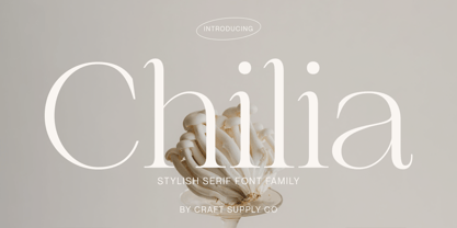 Chilia is a stylish serif font where contemporary upper serifs meet a feminine allure, making it ideal for beauty and display purposes. With its unique blend of modern and elegant features, Chilia adds a touch of sophistication with eye-catching presence that perfect for captivating displays that demand attention.
 - Bajt Rounded by Fontsphere,
$12.00 BAJT Rounded is a futuristic all-caps display font. It was created as a rounded version of the BAJT Font. Use for awesome display, illustrations, posters, logos, t-shirts, titles, and much more.. The font includes multilingual support (Latin-1), uppercase letters, numerals and a large range of punctuation.
 - Joanne Script BH by BluHead Studio,
$25.00 Joanne Script BH is based on the handwriting of a BluHead friend. This fun design has a sharp, angular feel which lends itself to casual messages, greeting cards, post its, journals, you name it! Plus, a large complement of characters allows you to send your thoughts in multiple languages.
 - India Echo by Vic Fieger,
$6.99India Echo was simply derived from doodling on a whiteboard with a dry erase marker. The aim of the exercise was to create a string of writing that looked foreign enough to be an alien script, angular enough to appear to be futuristic, and familiar enough to be legible. - Catshape by RodrigoTypo,
$45.00 Catshape is a font of dingbats, which in combinations with uppercase and lowercase you can generate multiple characters with different textures. In addition to a set of ornaments and a font called Alquitran Stencil, it was designed for different graphics. I hope you can have fun with this font!
 - Pleasure by ITC,
$29.99Pleasure is the work of German designer Holger Seeling, a condensed open sans serif typeface featuring a shadow behind each character. Its geometric forms are flexible and best used closely spaced. Pleasure reflects no particular time or setting and is therefore ideal for a wide variety of headline applications. - Hondo by Fontasmic,
$16.99 The Hondo fonts are a collection of ultrabold slab serif typefaces with a dynamic look. Accented with decorative and functional inktraps and complete with Slant and Backslant styles, this heavyweight has a high performance racey feel to it. Ideal for titling, poster work, logos, and small bits of copy.
 - Vuvuzela NF by Nick's Fonts,
$10.00A signpainter's chapbook called this style Show Card Casual, although "casual" might be understating the case a bit. Guaranteed to put some fun, and a wee bit of mischief, into your headlines. Both versions of this font include the complete Latin 1252 and Central European 1250 character sets. - Onick by Wordshape,
$- While researching the history of Onitsuka Tiger's branding and graphic design, I came across an odd, yet highly appealing piece of custom lettering on the company's ONICK ski boots from the 1970s. Reminiscent of aspects of the typeface Black-Out by Eli Carrico (released by my type foundry Wordshape), yet vertically compressed with razor-sliced counters and odd stencil element that makes up one of the legs of the "K", the ONICK lettering is a potential source for an intriguing modular font. I immediately thought of Ryoichi Tsunekawa as a potential collaborator to bring this piece of lettering to full-fledged life in the contemporary context. Based in Nagoya, Tsunekawa runs an independent type foundry called Dharma Type, including three specialized foundry sub-labels: Flat-It, devoted to display lettering; Prop-A-Ganda, a series of fonts inspired by and based on retro propaganda posters, movie posters, retail sign lettering & advertisements in the early 20th century; and Holiday Type, a series of decorative and retro scripts for holiday use. The past year has seen a flurry of notice of his work abroad, having been featured in both MyFonts' "Creative Characters" and YouWorkForThem's newsletter. As the work of most Japanese type designers is almost wholly unnoticed abroad, for Tsunekawa to be interviewed by two of the most popular type distribution companies in the world is definitely something beyond the norm. Perhaps it is because he works independently, or perhaps it is due to the charm and friendliness with which his typefaces are infused. Either way, this attention is both welcome and appreciated. Beyond mere charm, Tsunekawa's work is nuanced, detailed, and accessible due to its high level of finish. His fonts stand apart from his contemporaries in Latin typeface design in Japan due to his fascination with pop, vernacular and historical lettering from "non-pure" sources- whereas type designers like Kunihiko Okano and Akira Kobayashi have spent years analyzing the essence of Western letterform construction and unlocking the essence of Latin forms, Tsunekawa views surface and the awkward nature of his sources as being of value, as well. His irreverence for the formal doctrines of history imbue his typeface designs with a rugged inventiveness that would be missed by most- glyphs without source designs are guessed at and approximated, often in a manner wildly divergent from what Western eyes would assume. It is in these moments that I find sheer delight in Tsunekawa’s work and what make me most pleased to invite him aboard Neojaponisme and Onitsuka Tiger’s type development project. His assorted typefaces show an eclecticism in finish and as holistic systems- Tsunekawa's return email to me about the proposed type project showed a digital sketch of how a completed typeface family from the source lettering might look, rendered with an effortlessness and dedication to detail that belies a skilled craftsperson. Further development showed Tsunekawa’s rigor- the typeface in development rapidly featured glyphs ignored by many: a full set of fractions, Eastern European diacritics and accents, superior and inferior numerals, alternate characters, and custom ligatures - all designed with regulated, detailed spacing. ONICK is a typeface Tsunekawa should be proud of- an homage to a moment in history rendered in the absolute best fashion. We are proud to present it to the world! --Ian Lynam
 - ITC Bolthole by ITC,
$29.99I fell in love at the age of twelve in Wales, recalls Bernard Philpot. "My father brought me to a small graveyard in the Welsh hills to show me two headstones carved by the great Eric Gill. I instantly fell in love with the beauty of the carving and the perfection of the letterforms. I still go back to marvel at these works of art." However, the ITC Bolthole™ design, Philpot's first commercial typographic endeavor, is quite unlike the works of Eric Gill that first captured his heart. Bolthole is a craggy sans serif with a definite grumpy attitude. It's not terribly legible, and, if more than a few words are set in the design, it's not very readable. To round out its cranky personality, Bolthole does not like to be set in small sizes. Like Cheez Whiz® and bullfights, you either love or hate this typeface. But whichever emotion dominates, there is no denying that Bolthole has a personality to be reckoned with - one with ample magnetism to ensure reader attraction. If used to set brief blocks of display copy, the typeface makes a powerful statement. Bolthole was originally designed to complement a whimsical ad for the Royal Society for the Prevention of Cruelty to Animals. As Philpot recalls, "although the ad didn't win any awards, the type attracted some very positive comments for its original look and feel." Philpot studied graphic design and typography at the London School of Printing, and soon after graduation found himself working in a large advertising agency in London. According to Philpot, "After designing type for everything from packaging to ads, I thought it time to convert one of my designs into a complete font - and Bolthole was born." ITC Bolthole could very well be the Shrek™ of typeface design - which might not be such a bad thing." - News Gothic by ParaType,
$30.00A Bitstream version of News Gothic that was created by Morris Fuller Benton for American Typefounders and first appeared in 1908. There is the standard American sanserif of the first two thirds of the twentieth century with narrow proportions and a large x-height. Despite, or perhaps because of, the font’s unconventional relationships in proportion and form, News Gothic has long been a popular typeface for almost any use. Cyrillic version developed for ParaType in 2005 by Dmitry Kirsanov. Greek extension designed by Dmitry Kirsanov in 2009. - Shàngó Chiseled by CastleType,
$59.00 Based on the elegant and somewhat delicate Shàngó "Classic", Shàngó Chiseled goes to the other extreme with a bold and emphatic design that continues the legacy of the beautiful classic proportions of Dr. Schneidler's original titling typeface. Warm, cheerful, open, and sensitively masculine, Shàngó Chiseled can give you the impact you need. Perfect for an embossed look, or of classic lettering in stone. A complete character set that supports most European languages. Shàngó Chiseled is a member of the extended Shàngó family (Classic, Chiseled, Sans, Gothic).
 - Desert Sands JNL by Jeff Levine,
$29.00 The February 19, 1923 issue of The Film Daily contained an ad for Mack Sennett's new Ben Turpin comedy entitled "The Shriek of Araby". No doubt this was a spoof of the popular Rudolph Valentino film "The Sheik". The ad tries to emulate Mideastern or Arabic typography via a standard Western alphabet. It somewhat captures the flavor, but its free-form hand lettering comes off as more of a novelty-type style. This is now available digitally as Desert Sands JNL in both regular and oblique versions.
 - Inoxida by Sudtipos,
$59.00 Inoxida is Oxida's softer and more graceful sister. While Oxida has become quite the common sighting on the packaging of vegetables and organic foods, Inoxida now comes to fit the bill for food packaging that can benefit from more sophisticated script lettering. Inoxida is not just a softening of Oxida’s slightly rough edges. It is a complete reworking of the way its letters were constructed, and the introduction of a smoother size relationship between uppercase and lowercase. Designed by Koziupa and digitized by Ale Paul.
 - Azorath by Sryga,
$22.00 Introducing Azorath, a groundbreaking typeface that marries the bold, unyielding lines of brutalist architecture with graceful fluidity and gentle curves. Azorath's unique design defies convention, capturing attention with its juxtaposition of strength and elegance. Each glyph, meticulously crafted, tells a story of innovation and versatility, making it perfect for both powerful headlines and delicate text. Azorath is your canvas for creating captivating narratives that leave a lasting impression. Elevate your projects with Azorath, where raw power meets graceful finesse in the world of typography.
 - Tritone by Champagne Design,
$17.00 Tritone is a serif old style typeface display. The design is inspired by the Art Noveau style, which taken from the facade of a bathing establishment and reinterpreted it. The beauty of the font lies in it is classic and unique shapes and forms that characterise it, and for this comprises only two weights, for the dedication to the forms. The font expresses beauty and tradition, but in a lyrical context it can express the power of opera, because of it is powerful and elegant design.
 - Amorinda OT by Sudtipos,
$59.00 Amorinda is a connected script that manages to be wild and disciplined at the same time. It can scream wildly within a design or smoothly blend in to make it more human. With its versatile character and a complete set of alternates, Amorinda is the perfect display face for everything from product branding to signage. This 2007 version of Amorinda is now available in OpenType format to expand possibilities of use with lots of alternates when used with OpenType-aware applications such as Adobe Creative Suite.
 - Boilerplate by Wundes,
$18.00Gritty heat-forge stamped metally goodness. Can withstand up to 255 pounds of pressure psi, it even says so right on the graphic. This is a fun display font inspired by the stamped text on barbells, sewer drains, and of course boiler-plates, not that we see many of those anymore, but I digress... This font contains all the standard sub-255 unicode characters, plus a few extras for flavor. Apply this font with liberal amounts of axle grease and she should last ya a lifetime. - Pen Elegant JNL by Jeff Levine,
$29.00 A 1918 lettering instruction book by William Hugh Gordon presented a number of lettering styles that were geared toward sign and show card painters along with tips and tricks regarding the correct construction of such signs for maximum effect. One pen lettered Roman alphabet with a beautiful set of numerals has been recreated digitally as Pen Elegant JNL, which is available in both regular and oblique versions. To note, Gordon was the co-inventor of the Speedball lettering pen with Ross F. George in 1915.
 - Architype Bayer by The Foundry,
$99.00 Architype Universal is a collection of avant-garde typefaces deriving mainly from the work of artists/designers of the inter-war years, whose ideals underpin the design philosophies of the modernist movement in Europe. Their ‘universal’, ‘single alphabet’ theory limits the character sets. Architype Bayer was drawn from Bauhaus Archiv sketches for a minimal sans typeface that was created in 1925 by Herbert Bayer, based on his single-alphabet student thesis. This ‘universal’ alphabet was designed for exclusive Bauhaus use, but never cut as a typeface.
 - Dewhirst Display by Greater Albion Typefounders,
$16.00 There is a particular charm about traditional, hand executed sign writing. There is also something magical about watching an experienced sign writer at work with his sign writer's dagger (don't worry, it's a specially shaped paintbrush), watching the elegant lettering formed by deft brushstrokes. The Dewhirst family of five decorative faces is inspired by an elegant specimen of just such hand painted sign writing seen while I was out and about one day. Use this family of five faces to add a special touch of flair.