10,000 search results
(0.033 seconds)
- Human Sans by Ian Farnam,
$20.00 Human Sans is a humanist sans serif font created as an experiment. The goal, how much a simple substitution of a small set of characters could change a font's nature. In its base form, Human Sans is a humanist sans serif geared toward text. However, through stylistic sets, it can adopt a myriad of different visual styles. This includes geometric alternates, uncials alternates, contextual swash caps, and the high and low midlines, typically seen in Art Deco lettering. These features are combinable for whatever look you may need. Human Sans comes with a full set of diacritics, in 9 weights and corresponding Italics.
 - Friar by Ascender,
$29.99 Friar Pro is a revival of Frederic W. Goudy's "Friar" typeface. Goudy described this typeface design as a 'typographic solecism' as it combines a lowercase of half-uncial forms from the 4th through 7th centuries with an uppercase of square capitals from the 4th century. Steve Matteson developed the font as a tribute to Goudy and his joy of typographic exploration. Steve created a complete character set with OpenType typographic enhancements to give the font an authentic appearance to the original. Friar Pro is a beautiful design which imparts a scribal appearance to any document including greeting cards, certificates and official papers.
 - White Signature by Lunas Type,
$19.00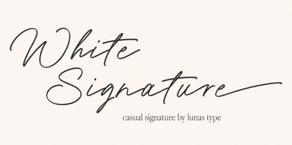 Introducing, White Signature! A versatile and captivating font that combines the casual charm of handwriting with the elegance of a signature style. This font is designed to elevate various design needs, offering a perfect balance between approachability and sophistication. With its fluid letterforms and relaxed strokes, White Signature brings a sense of authenticity and personality to any project. Whether used for branding, invitations, packaging, or social media graphics, this font adds a touch of refinement and individuality. Let White Signature be your go-to choice for creating designs that exude a casual yet elegant vibe, making a lasting impression on your audience.
 - Vandalismo 26 by CostaType,
$10.00 The type “Vandalismo 26” is a tribute to the calligraphy style that 'screams' over the front of the buildings in the center of São Paulo/Brazil. This underground calligraphy, known as "pichação" or "pixo”, is a movement that expresses disagreement and rejection against the system. For some critics, this “vandalism” is considered to be the most disruptive and conceptual contemporary art today. It is a type to be used in headlines. Vandalismo 26 is a mix of the chaotic pixo style representing the nonconformity of a generation. It is a protest to the system in a typographic format.
 - Dramatico Script by Ana's Fonts,
$12.00 Dramatico is a script font family inspired by vintage handwritten postcards and notes. Perfect for any design that needs a vintage calligraphy look, Dramatico was handmade using a real dip pen and ink. Use it in signatures and logos, notes and quotes, social media posts, and branding and packaging. Dramatico includes: Ligatures for a more natural text Swashes for most of the lower-case letters A set of ornaments to decorate your text A set of extras (lines, scribbles, arrows, splatters, etc) to add a grungier look to your vintage designs Bonus! Underlined and Strikethrough versions of the script font
 - Hollow Roachian Futhark - 100% free

- Milonguita by Sudtipos,
$49.00 Milonga is one of the most characteristic dances of Argentina and it is usually compared to Tango. However, couples perform shorter and more energetic movements when dancing to the beat of Milonga. In addition, while Tango evokes the idea of nostalgia and reminiscence, Milonga conjures up more light-hearted memories in people's minds. Milonguita was designed so that readers can experience the passion and spontaneity of this dancing style through words. Users can play with the upwards and downwards patterns of the letters creating different images and textures and thus, making texts flow smoothly and naturally, just as a warm piece of Milonga would. The irregularity of the strokes conveys emotions and establishes a bond between the font and the sensitivity of the writer. The result will be a typographic combination of elegance, energy and rhythm which will surely reach the heart of the reader. Milonguita comes in all font formats, including a Opentype version plenty of built-in alternates and a simulated random code. Digitized by Alejandro Paul.
 - Josef K Patterns by Juliasys,
$9.60 Franz Kafka’s manuscripts have always been a source of inspiration for designer Julia Sysmäläinen. At first she was just interested in literary aspects but later she noticed that content and visual form can not be separated in the work of this ingenious writer. Analyzing Kafka’s handwriting at the Berlin National Library, Julia was inspired to design the typeface FF Mister – by now a well known classic. Over the years, FF Mister K became a handsome typeface family and even produced offspring: the Josef K Patterns. Some of Kafka’s most expressive letterforms were the starting point for these decorative ornaments. How do the Patterns work? Outlines and fillings correspond to the uppercase and the lowercase letters on your keyboard. You can use them separately or layer them on top of each other. If you write a line of “pattern-text” in lowercase and repeat it underneath in uppercase you get a row of fillings followed by a row of outlines. Now you can color them and then set line space = 0 to get a single line of layered colored ornaments. Alternatively, activating OpenType / stylistic set / stylistic alternates will also unite the two lines to a single layered line. Further magic can be done with OpenType / contextual alternates turned on. On the gallery page of this font family is a downloadable Josef K Patterns.pdf with an alphabetical overview of forms. Hundreds of patterns are possible … we’d love to see some of yours and present them here on the website!
 - Whitenow by Proportional Lime,
$15.99 In the year 1528 Pierre Attaignant led a revolution in music printing. His method of once-press moveable type, greatly simplifying the original 3 impression process developed by Petrucci, remained in use till near the end of the 17th century. The method could only realize one line of music per staff, and the introduction of barlines as a common means of aligning multiple staves brought this method to a close after nearly two centuries of use. This font is meant to allow the printing of music using that method with the notation of that era. It is largely based on an exemplar printed by Snodham of London.
 - Linotype Tetria by Linotype,
$29.99Tetria was designed by Martin Jagodzinski, who says that the font came from the need for a compact, constructivist typeface. Tetria combines the expression of simplicity of the 'norm' typefaces like DIN Mittelschrift with elements of Old Face typefaces which optimize legibility. It therefore contains old style figures and a larger stroke contrast, which makes the font legible even in smaller point sizes." Sources of inspiration for Tetria were the designs of Joost Schmidt and Herbert Bayer as well as the norm typefaces. The name comes from the Greek word for 'four', tetra. "Four is the number of many simple and useful objects, four wheels on a car, four corners of a book. Also, the basic forms of Tetria come from the simple geometric form of the square." The space-saving Tetria is well-suited to a variety of uses, from corporate typeface to text to display on posters, flyers or onscreen." - Excalibur SCF by Scholtz Fonts,
$21.00 Let it be known that this font is named for Excalibur, King Arthur's Magic Sword. The font is derived from a note that Arthur hastily penned to his Queen, Guinevere, during a lull in one of his many battles against the Saxons. Arthur's armour was so hefty that he could not easily seat himself, and so to pen his letter to Guinevere he plunged his legendary sword Excalibur into the marshy soil on which he had been fighting and thereby steadied his writing hand with the hasp of his magical sword. This ancient and battle-weary font is based on the writing from a fragment of that original document. It has been heralded by modern scholars as "grunge" writing of great antiquity. The font Excalibur SCF contains a full character set and it is professionally letterspaced and kerned. Use this font to create a feeling of haste, of authentic ancient history, of magical times, of chivalry, of dragons and of brave battles fought.
 - Singel by Fontfabric,
$35.00 Singel is a neoclassical serif with semi-condensed proportions. As a contemporary interpretation, this typeface combines the rationalist modulated stroke with an elegant silhouette and crisp serifs. The altogether splendid appearance of Singel, completed with a full set of Small Capitals and true form of italics makes it perfect for any luxurious and graceful design. Other aspects of its characteristics include the consistency of 10 styles from Light to Bold; a coverage of Extended Latin and Cyrillic with span for more than 130 languages; a flawless functionality and support of many OpenType features, such as localizations, tabular numerals, inferiors and superiors, numerators & denominators, fractions, case sensitivity etc. Features: • Over 900 glyphs in 10 styles (Light to Bold); • Extended Latin and Cyrillic for more than 130 languages; • Tall x-height and Semi-Condensed proportions; • High contrast and modulated stroke with vertical stress; • Neoclassical characteristics and moderate apertures; • Full set of Small Capitals; • True form of italics; • Coverage of multiple OpenType features; • Suitable for wide design purposes.
 - Left Hand BA by Bannigan Artworks,
$19.95This typeface is of the unique handwriting of a left-handed person. - Amantea Script by Create Big Supply,
$25.00 Experience the enchanting allure of Amantea Script, a stunning and delicate font that embodies elegance and grace in every stroke. With its thin and flowing style, this script font captures the essence of sophistication, making it the perfect choice for a wide range of design projects. Amantea Script is a true gem for those seeking to create captivating wedding invitations that leave a lasting impression. Its intricate and graceful curves evoke a sense of romance and beauty, adding a touch of magic to any special occasion. The versatility of this font extends beyond weddings, as it effortlessly enhances stationary art, creating stunning pieces that exude refinement and style. In the realm of digital design, Amantea Script shines on social media platforms, effortlessly captivating audiences with its captivating charm. Whether it's engaging posts, inspiring quotes, or eye-catching advertisements, this font adds an element of sophistication and allure that commands attention. With its extensive language support, Amantea Script opens up a world of possibilities. From English to Spanish, French to German, and beyond, you can seamlessly incorporate this font into your projects, ensuring that your message reaches a global audience. Amantea Script comes complete with a wide range of features, including alternate characters and ligatures, allowing you to create unique and personalized designs. The font is PUA encoded, providing easy access to a plethora of stunning glyphs that add depth and flair to your creations.
 - Gloriance by Mevstory Studio,
$25.00 Gloriance is a classic serif font adapted from the art deco style, a visual style that emerged in the 1920s and 1930s. This font is characterized by bold geometric shapes, a symmetrical design, and a sense of modernity and glamour. Gloriance is designed to have a distinctive classic impression with the presence of decorative elements such as extended lines, neat and tidy decorative shapes and types. These decorative elements can add a sense of sophistication and luxury to text. With a wide selection of alternates and ligatures, you can create a variety of styles and play with this unique fonts. This typeface is perfect for an elegant logo, jewelry stuff, packaging, magazine design, fashion brand, classic stuff, poster, flyer, wedding invitation, quotes, or simply as a stylish text overlay to any background image.
 - Megans by Sealoung,
$17.00 Imagine a slender serif font that effortlessly combines classic elegance with modern sophistication. This font features delicate, fine lines that evoke a sense of refinement and grace. Its letters are meticulously crafted, and it comes with a range of ligatures and alternate characters that add a unique touch to your design projects. These ligatures and alternates seamlessly blend together, creating a harmonious and seamless flow of text. Whether you're working on a vintage-inspired poster or a contemporary wedding invitation, this font's ligatures and alternates will allow you to infuse a touch of artistic flair into your designs, making it the perfect choice for those seeking a balance of tradition and innovation. Included : Uppercase & Lowercase Numeral & Punctuation Ligatures & Alternates Multilingual Support PUA Encode Thank you for visiting our shop and happy designing.
 - Cacao by Wiescher Design,
$39.50 Cacao is another one of my "found fonts". I found this one in an old advertising for a French cocoa drink. Since I am a vervent lover of cocoa, I will give you my recipe for a normal coffee mug full of delicious hot cocoa. Mix three heaped teaspoons of sugar with one and a half to two teaspoons of finest cocoa powder. Then add a little cold milk, stir, add a little cold milk, stir, and so on until you have a mushy creamy consistency. Now slowly add - always stirring - boiling hot water til the cup is almost full. Top with a little liquid cream and enjoy! If you have a package design job, use my Cacao font and stir in some creativity. Your sweet-tooth designer, Gert Wiescher.
 - Ah, Toonish! If a font could wear a brightly colored, oversized bow tie and dance at the edge of a page, Toonish would be the first in line, tapping its serifs and winking at the cursor. Imagine divi...
- Khakoy by Twinletter,
$13.00 Introducing “Khakoy Font” – Unleash Playful Creativity! Dive into a world of limitless imagination with Khakoy Font, your ultimate tool for injecting a playful spirit into your designs. Khakoy Font is the embodiment of joy and whimsy in typography. Crafted to spark delight, it’s your go-to choice for projects that demand a dash of fun and a pinch of mischief. With its lively and distinct characters, Khakoy Font invites you to explore the playful side of design. It’s a font that ensures your message is conveyed with a contagious sense of playfulness, captivating your audience instantly. Designed to ignite creativity, Khakoy Font adds a touch of amusement to your projects. From cheerful posters to charming children’s books, this font is your partner in crafting designs that leave a lasting, joyful impression. Let your designs break free from the ordinary and embrace the vibrant spirit of Khakoy Font. Elevate your creative game, infuse humor and light-heartedness into your work, and watch your designs come alive with this delightful typeface. Discover the magic of Khakoy Font today! – PUA Encoded Characters – Fully accessible without additional design software.
 - Nestine by Craft Supply Co,
$20.00 Introducing Nestine – Elegant Sans Serif High Contrast Elegance Nestine – Elegant Sans Serif is more than just a font; it’s a visual masterpiece with high contrast that effortlessly exudes an air of elegance and luxury. The Epitome of Elegance Moreover, Nestine epitomizes elegance. Its striking contrast between thick and thin lines creates a visual appeal that is both refined and sophisticated, making it the perfect choice for luxury designs that demand attention. A Minimalist Marvel Nestine’s high contrast design is a minimalist marvel. It relies on the purity of its design to convey sophistication and elegance, proving that simplicity can be the essence of opulence. Ideal for Luxury Design Additionally, Nestine is tailor-made for luxury design projects. From high-end branding to upscale packaging, it adds a touch of opulence and refinement that leaves a lasting impression of sophistication. In Conclusion In summary, Nestine – Elegant Sans Serif is the epitome of high-contrast elegance. It’s the font that effortlessly combines the art of sophistication and luxury. With Nestine, your designs achieve a minimalist yet opulent quality that captivates the viewer, leaving an indelible mark of refined taste and aesthetic beauty.
 - Regua by Tipos do aCASO,
$2.90Play like a child with letter forms, fill the gaps of a stencil with a ballpoint pen and work this to generate a digital type. Régua (Ruler, in Portuguese) is the result of a typographical joke with the upper cases made by Buggy, a Brazilian typographer, in 1998. - Waika by Hazztype,
$16.00 Waika is a modern sans serif font that seamlessly blends a rounded aesthetic with condensed proportions, resulting in a contemporary and versatile typeface. Its smooth curves and absence of serifs contribute to a clean and friendly appearance, making it suitable for a wide range of applications. The deep inktrap adds a touch of sophistication and uniqueness to each character, ensuring legibility and visual appeal in various design contexts. Waika is a dynamic choice for projects seeking a balance between modernity and approachability.
 - Rue Display by Winnie Tan,
$29.00 Rue is an organic, casually ornamental, narrow-faced sans serif. It is a display type structured with random traces of calligraphic tendencies. It does not begin with any noble ideals, other than to mediate between the muse of imagination and the act of realization. The spirited and exploratory design is the materialization of a feeling about fonts as a family of organisms taking on a life of its own, in work and play. Rue is the epitome of vanity and indulgence which seems to purpose itself well in aesthetics, wellness and botanicals. Its whimsical quality also suggests applications in the form of gifts and ornamentation. In retrospect, Rue was conceived as a typeface, used as an image and discovered as an ornament. It comes in 5 weights of light, regular, medium, semibold and bold, and their matching italics. Rue Display was published in 2010 by TypeTogether. http://www.behance.net/gallery/Rue/373854
 - Ongunkan France Glozel Runic by Runic World Tamgacı,
$100.00 In March 2010, Émile Fradin, a modest peasant farmer from central France, died at the age of 103. To his grave he took the secret behind one of the most controversial archaeological discoveries of the 20th century. A discovery which put into question the very origins of the written word and the paternity of European culture. It was the uncovering of peculiar artefacts would come to be known as the Glozel runes. The discovery of the Glozel runes On the first day of March 1924, a not yet 18-year-old Fradin was ploughing his family’s field in the hamlet of Glozel, when his cow stumbled into a hole. When he and his grandfather, Claude, looked closer, they discovered a mass of broken stone, under which lay an underground chamber. Within, they discovered pottery fragments, carved bones, and a peculiar clay tablet covered in bizarre characters that neither of the two could decipher. The family requested a subsidy for excavation works to be carried out, but were refused by the regional authority. With that disappointment, it seemed as though the discovery would fade into obscurity. However, the following year, news of Fradin’s unusual clay tablet reached the ears of the physician and amateur archeologist, Antonin Morlet. By the end of May 1925, Morlet began the first of his excavations.4 Within the first two years alone, he had amassed some 3,000 finds.
 - Triump Rough by Latinotype,
$20.00 The Triump Rough typeface comes with 2 different subfamilies: Blur, a soft, delicate font with a vintage and hipster feel that gives your design a breath of fresh air; and Rock, a strong, hard font in upper and lower case well-suited for high-impact headlines. This version provides a wide variety of OpenType features, such as ligatures, alternates and catchwords as well as a series of ornaments and extras, which help give your artwork a different look!
 - Springwood by Hanoded,
$12.00 Spring is in the air! At least, where I live. My two pear trees are in bloom, bees are buzzing and everything turns a brighter shade of green. Time for a new and fresh font package with a spring-inspired name! Springwood is a handmade set of fonts, ranging from a fat display font to a messy script font. Use it for your freshest ideas, your coolest designs or just anything that needs a bit of springtime.
 - Worker by Ndiscover,
$29.00 Worker is a versatile family of geometric fonts with a sturdy industrial feel. It has a vintage flavor and conveys a professional and technical look. It has 5 styles with matching slants and a generous language support. Worker works very well in branding and headlines, but also renders peculiarly well in short strings of text. This design has great personality having the power to create a whole universe of meaning resorting only to a few letters.
 - Blue Goblet by insigne,
$19.99 Blue Goblet is a script developed for the pending illustrated children’s book from Portland Studios, The Blue Goblet. The font has grown to a comprehensive system, with a wide array of ornaments available. Blue Goblet is usable in a wide range of settings, and includes a full complement of OpenType features and a more playful alternate. Blue Goblet is a collaboration between Portland Studios and insigne. It was designed by Cory Godbey and digitized by Jeremy Dooley.
 - Donkeyman by Hanoded,
$15.00 A Donkeyman is a person who is in charge of a ship’s engine room. I didn’t know this, but when I was looking for a nice name for this font, I sort of stumbled upon it. Donkeyman font is quite a useful font: it is a handmade, all-caps font that comes with two sets of alternate glyphs. The alternates cycle as you type, creating a ‘random’ effect. Comes with extensive language support, including Sami and Vietnamese.
 - Buddies by Sudtipos,
$59.00 Buddies, designed by Guille Vizzari, is a script font that was initially born as a piece of lettering. It is the result of an experiment between brush pen and pencil, and in this way, Buddies takes the imprint of the brush, the freshness of sign painting, and some (or a lot) of quirks by the author. The font at times enjoys dancing in titles and short lines of text, pouring rhythm and movements through its lowercase various x-height sets. Buddies also has a vast uppercase set with daring and atypical shapes that surprisingly function beautifully for composing short all-caps texts; messages are brought to life with awesome personality, ideal for packaging, fashion or even editorial. Buddies is a friendly font, a humble invitation to the brush letters universe, but from an unpredictable point of view.
 - Patika by Plasebo Studio,
$29.00 Patika Typeface is a contemporary neo-grotesque font that combines modern aesthetics with functional legibility. Inspired by the timeless elegance of classic typefaces such as Helvetica, Futura, and Avant Garde, Patika offers a fresh take on the genre with its unique blend of clean lines, balanced proportions, and subtle details. Designed with utmost care and precision, Patika Typeface achieves a harmonious balance between width and height, particularly in its lowercase letters, ensuring optimal legibility across various sizes and applications. Its versatile nature makes it an ideal choice for a wide range of typographic needs, from eye-catching headlines to extensive blocks of text. Equipped with a comprehensive set of OpenType features, including alternative glyphs, fractions, arrows, ligatures, and more, Patika offers designers an array of tools to enhance their typographic compositions and add a touch of uniqueness to their designs.
 - Corbert by The Northern Block,
$- Initially released in 2013 Corbert was a big hit and was named one of the most popular fonts of the year by MyFonts. Following on from its success the design is updated and remastered to meet the latest standards of The Northern Block and to satisfy critical issues put forward by the most demanding of users. A geometric sans serif typeface influenced by Bauhaus and the early modernist era. Precise shapes are optically adjusted to create a clear, natural typeface with excellent legibility. Corbert is a regular, self-evident design that works well across a wide range of applications. Details include nine weights with matching italics and over 540 characters per style. Opentype features consist of five variations of numerals, including inferiors, superiors, fractions, alternative lowercase a, e and g, and language support covering Western, South, and Central Europe.
 - Bredagh by Tony Fahy Font Foundry,
$25.00 Bredagh (pronounced Braid-ah) is a happy font! It can bring a smile to your face, yet is at one with science and mathematics and the Arts. The first presentation is in a Poetry book. Overall, it is a strong and capable font. The organic nature of the font Breadgh is in Nature itself, with the roundels as found in the cross-section of a tree, for example, both circular and rounded oblong shapes, influencing. Accordingly, some of the characters are of a condensed nature and some are not. The lower case does not have the condensed aspects but the numerals do. In the creation of Bredagh, it was the dynamic between all of these that was part of the challenge. And to make them all work together subtly to be in overall harmony—was the ultimate challenge.
 - Barbou by Besnowed,
$19.99 Barbou was originally cut in 1925 by Monotype as a counterpart to Fournier, siblings that were different in design but both based on the work of Pierre-Simon Fournier. Whether by choice, accident or oversight, Fournier was preserved digitally, and Barbou was lost to history. Barbou was notably used by Stanley Morrison, in particular as the face of The Fleuron. I fell in love with Barbou when I saw it, and knew that I wanted to bring it to a new generation of designers and readers. This is a revival of Barbou, a faithful recutting with new weights, characters and many of the best features that modern font technology brings. Particular attention was paid to the original Monotype Barbou 178 specimen sheet. Originally only available in a single weight, Barbou has been recut with a variable weight, providing a large degree of flexibility between Regular and Bold. Barbou excels as a comfortable reading face for books, and the variable weight allows you to fine tune the darkness and texture of the page in a way never before possible. Barbou has a distinctive softness, and this revival of Barbou preserves much of the effect the medium of metal type had on the letterforms. This results in a subtly rounded yet defined type, elegant not worn, with the utmost attention and respect to the smallest of details. Barbou was originally cut with disparate x-heights for roman and italic, and this revival of Barbou features both the original italic, as well as a new italic redesigned at the same height as the roman. In Fournier’s time, roman and italic would not be mixed on the same line, but the type must change to meet the needs of a new generation. Barbou also features unique ligatures and alternates, old style numbers, small caps and a full Greek alphabet. Barbou is perfect for books and anywhere a comfortable reading face is required, and excels in flexibility.
 - Inked Classic by Adam Ladd,
$25.00 Inked Classic is hand-inked with a mix of strong lines and a classic feel. While it has a personal touch, it also conveys a sense of modernism with the didone influence. Great for display and works in smaller text settings.
 - Dschoyphul by Ingrimayne Type,
$9.95 Dschoyphul is a serifed typeface that was crudely drawn with a pen. It is sloppy and irregular. It was one of several efforts to draw a serifed typeface by pen; see also SarahfSlob, which contains a complete family of styles.
 - Coffee Bar JNL by Jeff Levine,
$29.00 An image of the wide, Art Deco influenced lettering of a sign over a coffee bar inside a Jacksonville, Florida Lovett’s Supermarket (a predecessor to Winn-Dixie) inspired the namesake font Coffee Bar JNL – available in both regular and oblique versions.
 - Lady Cleo by Solotype,
$19.95This started out to be a font with an Egyptian hieroglyphic look, but took a detour just beyond the first pyramid. A young lady we know said many of the letters reminded her of the hooks on a bra strap. Whatever. - Quirkley JNL by Jeff Levine,
$29.00When a type design job needs a bit of snap, yet needs to remain unconventional, think of Quirkley JNL. Its name speaks volumes - a bold, quirky sans serif - great for headlines and display work. - Rickety Stairs by Ali Hamidi,
$10.00 Rickety Stairs is a cute and neat handwritten font. This adaptable font will look great on a variety of design ideas. It will add a fun and friendly touch to each of your projects!
