10,000 search results
(0.191 seconds)
- Quiky by Scratch Design,
$10.00 Introducing our Quiky! A playful, hand lettered font. It has smooth lines, a heavy weight, sweet curves and a lot of character that you can name it. Quiky suits for your design such as invitation design, stationery, branding, blog design, advertising design, card, art quote, home decor, book title, special events and more. This font also includes Latin Characters for language support.
 - Facto by The Northern Block,
$39.00 A simple, mechanical typeface without distractions. Slightly condensed curves are developed from a compact grid layout to produce a crisp, fresh and legible type family. The unadorned letterforms work perfectly with complex information-based applications such as user interfaces, mobile devices and websites. Details include six weights with italics, 480 characters, five variations of numerals, stylistic alternatives, manually edited kerning and Opentype features.
 - Sol Supremo by Prestige Artsy Studio,
$19.00 Introducing "Sol Supremo," a stunning all caps serif font that combines elegance and modernity with a touch of nostalgia. With its clean lines and confident curves, this aesthetic typeface brings a fresh perspective to any design project. Whether it's for a sleek logo, striking headlines, or stylish print materials, Elevate adds a touch of sophistication, elevating your visuals to the next level.
 - Bodoni Elegant by Alan Meeks,
$45.00 Whenever I went to use Bodoni I could never quite find a version I was happy with, so I designed my own incorporating, hopefully, the best of all the others. I decided to make a slight curve on the uprights, rather like Optima, because I thought this added touch of elegance which many of the others lacked....hence the name.
 - Botuna Merisa by IbraCreative,
$23.00 Botuna Merisa is an exquisitely elegant script typeface that radiates sophistication and grace. With its fluid and refined letterforms, Botuna Merisa captures the essence of timeless beauty and classic charm. The delicate curves and ornate details of this typeface add a sense of opulence and refinement, making it the perfect choice for high-end branding, wedding invitations, and upscale packaging.
 - RM Hunky by Ray Meadows,
$19.00 This distinctive chunky design has a wide range of possibilities as a display face. With a nod towards Deco this strong, bold and well balanced font has a wide range of uses. Due to the nature of this design there may be a very slight lack of smoothness to the curves at extremely large point sizes (around 200 pt and above).
 - Rustea by Yukita Creative,
$12.00 If you are looking for a typeface that is both different and stylish, Rustea is a perfect choice. With its combination of modern and vintage curves, this typeface is perfect for creating eye-catching designs that will stand out from the crowd. Affordable and versatile Multilingual support and complete character set Get one font for any occasion Support for 31 languages File OTF
 - Rainbow Marbles by Aestherica Studio,
$14.00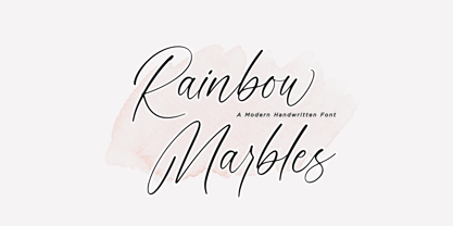 This is Rainbow Marbles by Aestherica Studio. Rainbow Marbles is a minimalist and elegant with unique curves and flowing modern script font. Rainbow Marbles is perfect for product packaging, branding project, megazine, social media, wedding, or just used to express words above the background. Rainbow Marbles also multilingual support. Enjoy the font, feel free to comment or feedback, send me PM or email.
 - Romancio by IKIIKOWRK,
$19.00 Proudly present Romancio - Romantic Type, created by ikiiko. Romancio is a decorative serif typeface that inspired by the spirit of Roman design. A perfect choice for projects that call for a touch of elegance and originality. Elegant flourishes and delicate curves abound, which evokes the refinement of old Roman art. Each character is painstakingly designed to capture the elegance of classic Roman letterforms.
 - RM Celtic by Ray Meadows,
$19.00 RM Celtic is derived from a mix of Uncial, Carolingian, Insular and Half-Uncial characters that, together, provide a legible and useable font with a touch of that old Celtic magic. Due to the modular nature of this design there may be a slight lack of smoothness to the curves at very large point sizes (around 100 pt and above).
 - October Wish by Subectype,
$16.00 October Wish is a casual handwritten font with bold handwriting style. Each stroke and curve of this font is unique charm that effortlessly enhances any project, from invitations to digital designs. Adding an authentic touch that resonates across diverse themes and mediums. Elevate your creations and evoke a sense of artful individuality as you harness the power of these versatile handwritten fonts.
 - Pellegrie Signature by Krakenbox Studio,
$17.00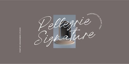 Pellegrie Signature is a fashionable sophisticated signature-style script with its own unique curves and an elegant inky flow.. Its elegant, classy, and modern look makes it a fantastic choice for fashion, signature, album covers logos, branding, magazines, social media posts, advertisement, and many more. Use this display font to add that special cool touch to any design idea you can think of!
 - Sunday Rain by Krakenbox Studio,
$17.00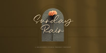 Sunday Rain is a fashionable sophisticated-style script with its own unique curves and an elegant inky flow.. Its elegant, classy, and modern look makes it a fantastic choice for fashion, signature, album covers logos, branding, magazines, social media posts, advertisement, and many more. Use this display font to add that special cool touch to any design idea you can think of!
 - Aligha by Zane Studio,
$20.00 Introducing the new Elegant Modern Serif!!! Aligha is a modern, elegant and classy serif typeface, best suited for displaying titles, logos, branding, magazines, product packaging and invitations. Shiny comes with clean lines and smooth curves that add an extra touch of class to any project. Aligha is built with OpenType features and includes 110 ligatures, alternatives, numbers, punctuation, and also supports other languages.
 - Futura ND Alternate by Neufville Digital,
$45.25 The genuine Futura takes up Paul Renner’s earliest sketches and brings back to life the original stylistic alternatives of the letters a, g, m, and n. Another of its peculiarities is the curved ends of the j, l, and t. It retains its genetic heritage, maintaining a perfect geometry, but with a fresher air than ever. Futura is a Trademark of BauerTypes SL
 - Morage by RagamKata,
$14.00 Introducing Morage, the ultimate font for all your Y2K design needs! With its pixelated aesthetic and bubble-inspired curves, Morage captures the retro-futuristic vibe of the turn of the millennium. Perfect for logos, headlines, or any other design element that needs a touch of Y2K flair, Morage is a versatile and eye-catching font that will make your work stand out.
 - Gossamer by Scholtz Fonts,
$19.95 Gossamer is a delicate, wispy font, with extravagant caps and controlled, softly curved lower case characters. It is reminiscent of fantasy and fairy lore, and wonderfully evokes the magic of childhood. Use Gossamer for Christmas cards, for wedding stationery, for cosmetics and clothing, for romance and enchantment. Gossamer has standard OpenType features, and language support includes all European character sets.
 - On The Line by Thaddeus Typographic Center,
$15.00On the line is a slanted stylistic script display typeface, with elegant features, beautiful curves and artistic forms all well balanced. Refined rough shapes combined with precise elegant strokes complement the personality of this typeface. A hybrid handmade round script, that evokes a quintessence of tradition while keeping its modern design esthetics. Ideal for brochure design, menus, invitations, package design, and advertising. - Oblygasi by Wildan Type,
$14.00 Oblygasi is a modern serif font with a unique ligature and aletrnate style. A simple serif with a touch of curves on the top and bottom of the stemp gives a special impression. Combaine with high contrast and slat style perfect for feminine logo signs, fashion heads & editorial designs, branding projects, Clothing Branding, packaging, magazine headings, advertising, T-shirts, postcards and much more.
 - Gellatick by Ardian Nuvianto,
$23.00 Gellatick is a charming and whimsical script font that brings a delightful handwritten feel to any design. With its playful curves and bouncy letterforms, this font is perfect for adding a touch of joy and friendliness to your projects. Whether you're designing greeting cards, invitations, or social media graphics, Gellatick will infuse your creations with a sense of warmth and personality.
 - Elbrush by Garisman Studio,
$20.00 Elbrush combines attractive curves with a fresh urban edge; delivering a stylish script which is guaranteed to add an eye-catching appeal to your logo designs, brand imagery, handwritten quotes, product packaging, merchandise, social media posts, and more. What included? - Simple installation -Work for PC and MAC - Multilingual Support (available for 23 Languages) - Support for Adobe Illustrator, Photoshop, Corel Draw, or Procreate
 - Barrage by RagamKata,
$14.00 Barrage Display Font Barrage presents a modern take on typeface design, merging cheerful boldness with artistic touches. Each letter is meticulously shaped, striking a balance between confidence and elegance. The box-like lines provide a sturdy foundation, while the subtle curves add a delightful creative flair. With its lively boldness and delicate lines, Barrage conveys courage and a positive personality.
 - Reznik by The Northern Block,
$32.00 A compact sans serif with a technical origin. Each character was drafted out from a grid template and then refined through the application of subtle curved detailing. The result is a precise, contemporary typeface best suited to identity, mobile and video game development. Details include 9 weights with italics, 500 characters, 5 variations of numerals, stylistic alternatives, manually edited kerning and Opentype features.
 - Gesego by Twinletter,
$18.00 Introducing our newest font called Gasego, this font will bring a unique touch to your design, Gasego Groovy font is one of the right choices. With precise curves and soft lines, this fun font is sure to add something special to your designs. It’s never too late to start incorporating this cool font into your work, so don’t wait and use it now!
 - Missy Voya by Creativemedialab,
$20.00 Introducing Missy Voya. The unique and fashionable font with tons of alternative characters and ligatures. This Versatile family consists of 8 weights, multilingual support, numbers, and currency symbols. The straight lines combined with a slight curve make Missy Voya look minimalist and elegant. Try uppercase for a simple look. Missy Voya is perfect for website header, logo, Instagram story, or fashion-related branding.
 - Breathney by MJB Letters,
$19.00 Breathney a beautiful, natural handwritten font that exudes charm. With its soft, curved lines, it captures the uniqueness of human handwriting, adding a personal touch to graphic designs. Ideal for feminine, friendly projects like wedding invites, logos, and posters, Breathney brings warmth and authenticity. Enhance your designs with its gentle, organic aesthetic, conveying a heartfelt message. File Included : Ligature PUA Encoded Multilanguage Support
 - Springsteel by Paragraph,
$21.00 Introducing Springsteel, a new display sans serif with an unusual construction: curved lines on the outside with only a few straight lines on the inside. The resulting typeface shows a great deal of tension and dynamics. Preferably, it should be used at larger sizes, at smaller sizes only for special effects. It was spaced and kerned by Igino Marini/iKern.
 - Raeling by Volcano Type,
$19.00Raeling is a display font inspired by a visit to Luxembourg, capturing shadows falling intricately from park railings appearing as broken-script lettering. A mixture of manmade / natural, traditional / new, ugly / beautiful reflecting the paradox and contradictions of the city. A single curve and stroke developed into a grid block from which characters emerged and broke free of their barriers and conformity. - ABSD Elena Verlin by Abesede Studio,
$18.00 It has a lovely, refined appearance. This letter displays an unique and curving style. The gorgeous and elegant Elena Verlin Font is perfect for any project you are working on. This font is ideal for use on invitations for weddings, birthdays, anniversaries, and other special events. Because it can be applied on logos and products, it's also ideal for branding.
 - Rase Grimm by Graffiti Fonts,
$24.99 The Grimm family is a blackletter inspired graffiti style built for headline and display. The family includes 3 variants: Grimm Regular & Grimm Curves both utilize traditional upper & lowercase letters while the Grimm Fat variation is an all-caps style. All 3 styles include initial, terminal & isolated letter variations as contextual alternates as well as a number of stylistic alternates, ligatures & other embellishments.
 - Etched Fractals by Typotheticals,
$6.00Drawn in Illustrator, this plain sans serif was created in 2004. - Tombola by RMU,
$30.00 Inspired by painted letters of Otto Heim, "Tombola" reflects in a charming way the feelings of the Roaring Twenties, especially in advertisement and in the creation of posters.
 - Xtra Sans by Typolar,
$58.00 In its characteristics Xtra Sans is a combination of modern grotesks/grotesques and traditional calligraphy. Its upright and compact letterforms generate a sturdy effect as in the early 20th century grotesks Nobel, Kabel or Erbar. On the contrary, dynamic inside forms (counters) give the characters a fluent appearance. As a result, Xtra Sans stands out in large size, while remaining highly legible in small and long text. In 2007 Xtra Sans received a Certificate of Excellence in Type Design from Type Directors Club, New York. In 2002, still unpublished, it was awarded a bronze prize at the Morisawa Awards, Tokyo.
 - Versal - Personal use only

- Syphon Spritz - Personal use only

- Artful Dodger by Hanoded,
$15.00 The Artful Dodger is a character in Charles Dickens' Oliver Twist. Dickens wrote his books in the Victorian Era, which also gave birth to a beautiful and extensively used typeface called Clarendon. The typeface was developed by Robert Besley and first published in 1845. Artful Dodger was modeled on the glyphs found in a 1865 book, which was typeset in Clarendon. Artful Dodger has not been 'cleaned', so the glyphs look rough and worn, just like the book I found them in.
 - Clarendon LT by Linotype,
$40.99The first slab serif fonts appeared at the beginning of industrialization in Great Britain in 1820. Clarendon and Ionic became the names for this new development in England, known as English Egyptienne elsewhere in Europe. Clarendon is also the name of a particular font of this style, which, thanks to its clear, objective and timeless forms, never lost its contemporary feel. In small point sizes Clarendon is still a legible font and in larger print, its individual style attracts attention. - Clarendon by Linotype,
$29.99 The first slab serif fonts appeared at the beginning of industrialization in Great Britain in 1820. Clarendon and Ionic became the names for this new development in England, known as English Egyptienne elsewhere in Europe. Clarendon is also the name of a particular font of this style, which, thanks to its clear, objective and timeless forms, never lost its contemporary feel. In small point sizes Clarendon is still a legible font and in larger print, its individual style attracts attention.
 - Varsity Show JNL by Jeff Levine,
$29.00 In the last scene of the movie trailer for 1937’s “Varsity Show”, the movie’s title is hand lettered in a bold, condensed chamfer font with semi-serifs. This is now available digitally in the namesake font “Varsity Show JNL” – in both regular and oblique versions.
 - Haldenweg by Graphicfresh,
$25.00 Introducing the new font in retro style. An adaptation of the life of the design industry in the 80s and 90s. We made this so you can reminisce in a classic style. This font looks classic, but a modern and elegant impression is still embedded in it.

