10,000 search results
(0.86 seconds)
- Malik by Zetafonts,
$39.00 Taking its name from the arabic word for "king", Malik is a flared sans serif typeface family designed in 2020 by Andrea Tartarelli. The designer wanted to find a way to bridge the classical letterforms of Roman Old Style typefaces with the readability of contemporary sans typefaces. This was achieved by using the so-called flared serif that emerges gradually from the stem of the letter, ending in a sharp angle. It's something that also reminds of the peculiar shapes of the Simoncini Method, invented by italian type designer Francesco Simoncini to get a sharper definition of letterforms. To this blend of classical elegance and modernist expertise, Malik adds the calligraphic influence of modern masters like Frederic Goudy or Ed Benguiat, visible in signature details like the reverse contrast uppercase B, or the calligraphic lowercase k. Malik also means "owner", and this font surely wants to rule the page. It manages to be extremely readable when used in body text size, but looks surprising and expressive in display use. The inclusion of the Malik Heavy Display weight, with its black texture balanced by deep inktraps, allows for striking logo design. The weight range of the family is extremely wide, including a Book alternative to the Regular weight for fine-tuning readability, a range of light display weights and a solid choice of bold weights for branding, all coming with matching true italics. The 16 cuts of Malik have been equipped with all the features you need to solve your editorial and design challenges, including a wide language coverage (thanks to over one thousand latin and cyrillic characters) and a complete set of open type features (including small capitals, positional numbers, case sensitive forms). Alternate characters and stylistic sets allow you to fine-tune your editorial and branding design by choosing variant letter shapes. Malik is the typeface for everyone who wants to design like a king...or like he doesn't care who the king is!
 - Romely by Din Studio,
$25.00 If you’re looking for a gorgeous font to attract your audiences or customers then we’ve got the font for you! Introducing Romely- A Sans Serif Font This handmade font typeface with modern style looks very interesting for loads of different projects and promotions. It is perfect to be used on your website, for your social media branding, Pinterest banners, printed products, and more! Features: Multilingual Support PUA Encoded Numerals and Punctuation Thank you for downloading premium fonts from Din Studio
 - Chicago Makers by Din Studio,
$25.00 Hi, Everyone! If you’re looking for a gorgeous font to attract your audiences or customers then we’ve got the font for you! Chicago Makers- A Serif Font This handmade font typeface with modern style looks very interesting for loads of different projects and promotions. It is perfect to be used on your website, for your social media branding, Pinterest banners, printed products, and more! Features: Multilingual Support PUA Encoded Numerals and Punctuation Thank you for downloading premium fonts from Din Studio
 - Magelo by Din Studio,
$25.00 Hi, Everyone! If you’re looking for a gorgeous font to attract your audiences or customers then we’ve got the font for you! Introducing Magelo - A Serif Font This handmade font typeface with modern style looks very interesting for loads of different projects and promotions. It is perfect to be used on your website, for your social media branding, Pinterest banners, printed products, and more! Features: Multilingual Support PUA Encoded Numerals and Punctuation Thank you for downloading premium fonts from Din Studio
 - Miguel by Din Studio,
$25.00 Hi, Everyone! If you’re looking for a gorgeous font to attract your audiences or customers then we’ve got the font for you! Introducing Miguel- A Serif Font This handmade font typeface with modern style looks very interesting for loads of different projects and promotions. It is perfect to be used on your website, for your social media branding, Pinterest banners, printed products, and more! Features: Multilingual Support PUA Encoded Numerals and Punctuation Thank you for downloading premium fonts from Din Studio
 - Cyritech by Tadiar,
$12.00 Cyritech is stylish futuristic geometric tech Three Fonts' Family designed for such areas as hi-tech, future, sport, space, army, games and many others. The feature of this font that it has serifs of triangle shape, that allows organic letters' connection, which makes it interesting and unique. Multilingual support (Latin extended). It is designed for header and text both.
 - Klop by Invasi Studio,
$19.00 Klop is a display typeface with a bloated and fat appearance. Combining this with round corners and a natural shape, Klop has a quirky and endearing appearance. You can use alternative glyphs to create a different appearance for your design. The Klop font is ideal for branding projects or packaging that need a modern and playful feel.
 - Avegas Royale by Java Pep,
$15.00 Avegas Royale font is modern sans serif font that is made in 4 styles regular, italic, bold, and bold-italic. The shape is made to contrast curves and lines between light and thick so that it looks more stylish and stands out. This font that perfect for logo, headline, advertising, quote text, invitation card, branding identity, and more.
 - Brideway by MJType,
$15.00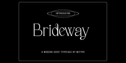 Brideway Typeface is a serif font that combines elegance and simplicity in its letter shapes, with playful ligatures to enhance its legibility. Use this font to create unique and sophisticated logos, headlines for your next project, designs for posters, t-shirts and business cards. Bridger Typeface is a versatile font that can elevate the look of any design project.
 - Sawah by Din Studio,
$29.00 Sawah is a modern and elegant display font. It celebrates abstract shapes in all their eclectic beauty. This font will look truly outstanding in a wide range of contexts. It is the best for logos, branding and quotes. Featured : Accents (Multilingual characters) PUA encoded Numerals and Punctuation (OpenType Standard) Thank you for downloading premium font from Din Studio.
 - Diazy by Salamahtype,
$17.00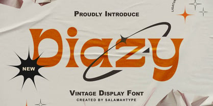 Diazy is a unique font with a modern or classic style, its beautiful shape makes the letters beautiful to look at. This font is perfect for branding projects, film/movie projects, logo designs, social media, advertising, product packaging, product designs, labels, photography, watermarks, invitations, stationery, or anything else where you want to add a touch of vintage class.
 - Fox Sans Pro by TipografiaRamis,
$39.00 Fox Sans Pro – an upgraded version of Fox Sans TRF (2008), with careful refinements to glyph shapes and extension of glyph amounts, which enabled support of more Latin languages as well as support of Cyrillic. Four more styles have been added to the original six styles. This typeface is released in OpenType format with some OpenType features.
 - Stovepipe Stencil JNL by Jeff Levine,
$29.00 Stovepipe Stencil JNL was not directly designed from a vintage source, but it does draw its influences from classic sans serif lettering of the past. Even its name borrows (somewhat gratuitously) from the "stovepipe" lettering so popular with sign painters. True stovepipe letters tend to be squarer with rounded corners, but the name has also been loosely associated with some tall, condensed type styles. The typeface is available in both regular and oblique versions.
 - Straight Forward by IKIIKOWRK,
$19.00 Proudly present Straight Forward - Mixed Type, created by ikiiko. Straight Forward is a mixed sans serif font type, with wide to condensed characters. Straight Forward has 3 alternative letter shapes that have been mixed and can be played by changing the alternate types. This font is available in 2 types of color for Uppercase and outline for Lowercase. This type is very suitable for making a streetwear brand, poster or magazine layout, fashion design, quotes, or simply as a stylish text overlay to any background image. What's Included? All Caps Glyphs 2 Styles (Color & Outline) Number & Punctuation 3 Type Alternates + Bonus Ligature Multilingual Support Works on PC & Mac Enjoy our font and if you have any questions, you can contact us by email : ikiikowrk@gmail.com
 - Hyper Fatos by Bisou,
$15.00 Crafted with passion in La Chaux-de-Fonds, Switzerland, the Hyper Fatos typography was born in a moment of pure delight as the creator (Bisou) indulged in a delicious pizza. Inspired by the excitement and satisfaction that come from the most indulgent culinary pleasures, he designed this unique typography to capture the essence of gluttony and the irresistibility of the most appetizing dishes. Hyper Fatos was meticulously crafted to evoke an undeniable sense of indulgence. Its boldness and rounded forms bring to mind juicy hamburgers, crispy fries, and donuts overflowing with icing. It's the perfect typography for fast-food restaurant signs, tantalizing menus, or even advertising campaigns for giant burgers and decadent milkshakes. Picture Hyper Fatos in bright letters above a hot dog stand, and you'll see lovers of greasy food rushing to satisfy their most voracious cravings. This typography is the ultimate choice to whet your customers' appetites and encourage them to indulge in culinary delight.
 - Jessie by Turtle Arts,
$20.00Jessie's Letter is based on an old typed letter by Kerrie's great step grandmother. This letter was undated, but we think it must have been from the 1920s or so. Jessie wasn't much for punctuation, so there aren't any of those pesky question marks and exclamation points. But, she did make mistakes in her typing, so we've included cross outs and strange resulting characters to make up for the lack of everyday punctuation. Maybe Jessie wanted to visit Paris, or maybe she secretly made paintings in her back yard, or maybe she dreamed of painting her house bright pink. Well, maybe not, but it's fun to dream... - Polthena by Keristyper Studio,
$14.00 Polthena is a brush script typeface created by skilled hands which makes it look very refined. Its subtle shapes make this font suitable for all your projects. Polthena Brush Script is perfect for branding projects, logos, wedding designs, social media posts, advertisements, product packaging, product designs, label, photography, watermark, invitation, stationery and any projects that need handwriting taste. Polthena Font multilingual support: Afrikaans, Albanian, Catalan, Danish, Dutch, English, Estonian, French, Finnish, German, Icelandic, Indonesian, Italian, Malay, Norwegian, Portuguese, Spanish, Swedish, Zulu, and many more. What’s Included : Standard & Multilingual glyphs Ligature Works on PC & Mac Simple installations Accessible in Adobe Illustrator, Adobe Photoshop, Adobe InDesign, and even work on Microsoft Word. Hope you enjoy our font!
 - Hutson by Keristyper Studio,
$14.00 Hutson is a brush script typeface created by skilled hands which makes it look very refined. Its subtle shapes make this font suitable for all your projects. Hutson Brush Script is perfect for branding projects, logos, wedding designs, social media posts, advertisements, product packaging, product designs, label, photography, watermark, invitation, stationery, and any projects that need handwriting taste. Hutson Font multilingual support: Afrikaans, Albanian, Catalan, Danish, Dutch, English, Estonian, French, Finnish, German, Icelandic, Indonesian, Italian, Malay, Norwegian, Portuguese, Spanish, Swedish, Zulu, and many more. What’s Included : Web Fonts Standard & Multilingual glyphs Ligature Works on PC & Mac Simple installations Accessible in Adobe Illustrator, Adobe Photoshop, Adobe InDesign, and even work on Microsoft Word. Hope you enjoy our font!
 - Hologram by Kazer Studio,
$4.00 Hologram is a font inspired by a combination of the future and the past. The intention was to design a font that was most effective when applied to Largely Displayed text like Headings, rather than for smaller extended bodies of text. There are 3 distinctive styles offered in the Hologram font family. Each style contains over 350+ Glyphs per style with support for up to 26 Languages as well as specialised kerning & spacing. Display Sans: This style is the cleanest of the 3 fonts. There are no serifs attached to the ends of the strokes, although the stroke weight is varied from thick to thin depending on the letters. Display Serif: This style contains modern serifs at the ends of most character strokes that give more structure to the shapes. A majority of the serifs are horizontal in direction with few characters containing vertical serif details. Display Wedge: The most Bold of all is the Wedge Serif style offered. Featuring thick and thin triangular serifs at the ends of character strokes. This style is most effective in Large Displays & Titling uses. Designed by KAZER STUDIO
 - Refinu by Twinletter,
$17.00 This font is really interesting for you to use in various sorts of your projects, your project will be good and draw a lot of people’s attention. Refinu san serif font with a unique shape but still comfortable and easy to read. This font is also quite versatile and simple to use, allowing you to complete your tasks swiftly. But, more importantly, using this typeface will ensure that your project is remembered by your entire audience. of course, your various design projects will be perfect and extraordinary if you use this font because this font is equipped with a font family, both for titles and subtitles and sentence text, start using our fonts for your extraordinary projects.
 - Garamond Premier by Adobe,
$35.00Claude Garamond (ca. 1480-1561) cut types for the Parisian scholar-printer Robert Estienne in the first part of the sixteenth century, basing his romans on the types cut by Francesco Griffo for Venetian printer Aldus Manutius in 1495. Garamond refined his romans in later versions, adding his own concepts as he developed his skills as a punchcutter. After his death in 1561, the Garamond punches made their way to the printing office of Christoph Plantin in Antwerp, where they were used by Plantin for many decades, and still exist in the Plantin-Moretus museum. Other Garamond punches went to the Frankfurt foundry of Egenolff-Berner, who issued a specimen in 1592 that became an important source of information about the Garamond types for later scholars and designers. In 1621, sixty years after Garamond's death, the French printer Jean Jannon (1580-1635) issued a specimen of typefaces that had some characteristics similar to the Garamond designs, though his letters were more asymmetrical and irregular in slope and axis. Jannon's types disappeared from use for about two hundred years, but were re-discovered in the French national printing office in 1825, when they were wrongly attributed to Claude Garamond. Their true origin was not to be revealed until the 1927 research of Beatrice Warde. In the early 1900s, Jannon's types were used to print a history of printing in France, which brought new attention to French typography and the Garamond" types. This sparked the beginning of modern revivals; some based on the mistaken model from Jannon's types, and others on the original Garamond types. Italics for Garamond fonts have sometimes been based on those cut by Robert Granjon (1513-1589), who worked for Plantin and whose types are also on the Egenolff-Berner specimen. Linotype has several versions of the Garamond typefaces. Though they vary in design and model of origin, they are all considered to be distinctive representations of French Renaissance style; easily recognizable by their elegance and readability. Garamond Pemiere Pro was designed by Robert Slimbach, and released in 2005." - Rutherford by Device,
$39.00 Rutherford is clear, robust and authoritative, and reads well at small text sizes while also having the required heft for larger headlines. A wide range of weights makes it a versatile choice for magazines, branding, brochures and advertising. A slightly condensed obround serif with squared stroke terminals. The t, j and f curve around to harmonize with the terminals on the a and g, as does the tail of the Q. The italic incorporates cursive forms on the ends of the lower right and upper left strokes, and uses a single-story a. Includes full European Latin support and alternate designs for the Q and g in all weights.
 - Park West JNL by Jeff Levine,
$29.00 The thin, stylish Art Deco slab serif lettering featured on the cover of the 1934 sheet music for “Then I’ll be Tired of You” inspired the digital type face Park West JNL, which is available in both regular and oblique versions. Central Park West has always been the upscale area for affluent New Yorkers, but in the Great Depression years of the 1930s the mystique of the well-to-do held an even stronger significance.
 - Mr Palker Dadson by Letterhead Studio-YG,
$35.00 Mr Palker Dadson — has appeared in a natural evolution of the Palker-Palkerson family. Its closest relative - burly slab serif Mr Palker Dad. This generation is more stout than the previous one. One may even be brave enough to use them for composing small texts. Notably Mr Parker Dad has become one of the frequently sold typefaces on the «Peterburg. The city speaks» map as it is highly readable while remaining extremely tight. Mr Parker Dadson has all the features of P&P’s family.
 - Ah, the elusive Font called Font, a font so enigmatic and self-referential it has become the meta of all typography. Picture, if you will, a typeface caught in an identity crisis, perpetually ponderi...
- Gloria Monoline by IM Studio,
$15.00 Gloria Monoline is a text serif with an editorial focus designed by Ikhsan Maulana. The idea for a typography job came from a design school letter-making exercise: Get a pair of scissors and some large sheets of paper, and start cutting. The resulting letters and the act of cutting them from paper inform the type design process, resulting in strong, simple shapes and open, inviting textures. The tone is crisp and straightforward. The classic letterforms, with a playful touch, give the design a personality that is both practical and spontaneous. The text weight is capable of adjusting copies at various sizes to print and render clearly on screen. Its lightest and heaviest weights work best at display sizes. Great care has been taken to save typists time with OpenType features including contextual punctuation and symbols to match case-sensitive, lower-case, and all-caps settings, as well as set images set for each use.
 - MVB Dovetail by MVB,
$79.00 MVB Dovetail is an editorially focused text serif designed by David Sudweeks. The working idea for the typeface came from a design school letter-making exercise: Take a pair of scissors and a few large sheets of paper, and start cutting. The resulting letters and the action itself of cutting them out of paper informed the type design process, producing strong, simple shapes and an open, inviting texture. Dovetail’s tone is crisp and straightforward. Its classic letterforms, set off with a touch of playfulness, give the design both a practical and spontaneous personality. The text weights capably set copy at a variety of sizes for print and render crisply on screen. Its lightest and heaviest weights perform best at display sizes. Care has been taken to save the typographer’s time with OpenType features including contextual punctuation and symbols to fit mixed-case, small-caps, and all-caps settings, as well as figure sets tuned to each use.
 - Gotti by Resistenza,
$39.00 Introducing Gotti. Where Timeless Precision Meets Seventies Flair We are thrilled to unveil our latest creation, Gotti font family, born and meticulously crafted during an inspiring journey to Goteborg. This typeface seamlessly fuses the Bauhaus essence with the spirited vibes of the seventies, resulting in a font that's not just a visual treat but a design experience. Gotti draws its creative fuel from the geometric elegance of the Bauhaus movement, prioritising functional simplicity and razor-sharp lines. However, its design journey doesn't end there. Imbued with the unmistakable energy of the Seventies, Gotti emerges as a font family that encapsulates both nostalgic charm and contemporary boldness. At its core, Gotti boasts a geometric skeleton that has been intricately designed to redefine precision. Ranging from light to black, the weight variations offer a broad spectrum of expressive possibilities. Gotti is perfect for display use, advertising, and branding, it transforms your creative vision into a visual masterpiece. Stand out with confidence, whether it's a captivating logo, a compelling headline, or an unforgettable advertisement. Elevate your brand identity with Gotti. It brings strategic branding to life, communicating sophistication and modernity. Your advertising materials become memorable works of art, leaving a lasting impression on your audience. Curious about the magic Gotti can bring to your designs? Our showcase reveals real-world applications, demonstrating its adaptability and aesthetic appeal. See for yourself how this font family turns ordinary designs into extraordinary visual experiences. Follow us on social media for updates, inspiration, and a glimpse behind the scenes. Have questions or just want to share your thoughts? We're here for you!
 - Glize by Linecreative,
$16.00 Introducing "Glize" – a dynamic and bold oblique typeface designed to infuse your projects with an unmistakable sense of speed, strength, and sharpness. Crafted with precision, this font exudes a powerful and energetic vibe, making it an ideal choice for projects centered around superhero themes, sports, esports, and other high-energy contexts. The bold strokes of "Glize" create a commanding presence, instantly capturing attention and conveying a sense of forceful momentum. The oblique angles add a dynamic slant, enhancing the font's overall sense of motion and agility. Each character is meticulously shaped to embody a sleek and streamlined aesthetic, contributing to the font's ability to convey a feeling of speed and intensity. Whether you're designing a logo for an esports team, crafting promotional materials for a high-impact sporting event, or working on a project that demands a bold and powerful visual identity, "Glize" is the perfect companion. Its bold oblique design ensures that your message is delivered with vigor, leaving a lasting impression on your audience. Elevate your designs with the striking and forceful character of "Glize" – where bold meets speed, and strength meets style.
 - Salsero by Plau,
$49.00 Cabrón, listen. Nosotros made a new fuente (only one file, cabrón, not super family – it can be variable, you just have to stretch it). Compra te, just buy it, or get it via Adobe Fonts. Go for it, amigo. Salsero hablas spanish en primero lugar, pero many other languages. German, english, french and most gringo languages tu cabeza can think of. Salsero has contraste invertido and all kinds of crazy curves, curvas locas, amigo. If you compreende this text, then you surely have compatibilidade, compatibility with Salsero, cabrón. No doubt you will like this fuente full of happy and not so happy mistakes, erritos.
 - Rue Display by Winnie Tan,
$29.00 Rue is an organic, casually ornamental, narrow-faced sans serif. It is a display type structured with random traces of calligraphic tendencies. It does not begin with any noble ideals, other than to mediate between the muse of imagination and the act of realization. The spirited and exploratory design is the materialization of a feeling about fonts as a family of organisms taking on a life of its own, in work and play. Rue is the epitome of vanity and indulgence which seems to purpose itself well in aesthetics, wellness and botanicals. Its whimsical quality also suggests applications in the form of gifts and ornamentation. In retrospect, Rue was conceived as a typeface, used as an image and discovered as an ornament. It comes in 5 weights of light, regular, medium, semibold and bold, and their matching italics. Rue Display was published in 2010 by TypeTogether. http://www.behance.net/gallery/Rue/373854
 - Florisa by limitype,
$10.00 Florisa is a typeface inspired by the unique shape of flower petals, which are made into unique letters. Florisa can be used for displays, headlines, logos etc. Florisa comes with capital letters, numbers and some symbols, and line version
 - Bestial by Paul Dersidan,
$23.00 Bestial is a strong, clean, all-caps ornamental typeface outlined by simple, primitive shapes. It is best suited for massive headlines, fashion editorials, album covers, logo design or any other experimental project. The complete character set has 380 glyphs.
 - Epically by Zamjump,
$17.00 EPICALLY is a futuristic style font with a unique style and touch, inspired by the Modern theme while maintaining simplicity and unique shapes. Great to use in your projects related to games, future technology, space travel, virtual reality & more!
 - Tritone by Champagne Design,
$17.00 Tritone is a serif old style typeface display. The design is inspired by the Art Noveau style, which taken from the facade of a bathing establishment and reinterpreted it. The beauty of the font lies in it is classic and unique shapes and forms that characterise it, and for this comprises only two weights, for the dedication to the forms. The font expresses beauty and tradition, but in a lyrical context it can express the power of opera, because of it is powerful and elegant design.
 - AM Godina by Errea Type,
$10.00 Godina was born from the interest in learning and deepening in the basic forms and how they are combined to compose a typographic system. The name, a tribute to the town of La Almunia de Doña Godina, the town for which the author of the typography connects. La Almunia is a crossroads in the typography designer's travels, a link between his family and friends. It combines the scent of a straight and modular typeface with sinuous and curved shapes, which make it a fun and playful typeface.
 - Main Feature JNL by Jeff Levine,
$29.00 Main Feature JNL is patterned after the plastic letters found on theater marquees. As an extra bonus, the | (bar) key has the phrase "double feature", the ^ (ascii circumflex) has the word "and" and the ~ (ascii tilde) has the phrase "with" for anyone doing a theater marquee mock-up.
 - Pistoletto by Etewut,
$22.00 Introducing Pistoletto script. I was inspired by works of Roy Lichtenstein and Michelangelo Pistoletto. There are 4 fonts that in different combinations make interesting results: Background, Black, Highlight, Regular. Each style supports European languages. Basic latin has uppercase alternates, two lowercase alternates, many ligatures and swashes. I used for display pictures following works of Roy Lichtenstein: Pistol (1964), Engagement Ring (1961), Oh, Jeff...I Love You, Too...But... (1964), Seductive Girl, Yellow Brushstroke I (1965), Brushstroke (1965).
 - Side Note Variable by Jamie Clarke Type,
$199.00 Hello! I’m SideNote Variable. I specialize in: Annotations Headings Friendly dialogue Social media marketing Looking both smart & casual I’m perfect for descriptions and explanatory text. Use me to deliver tricky information in a helpful, reassuring manner. I look friendly and relaxed but professional enough to make you look awesome. I add personality to otherwise dry information making it fun and easier to understand. I come with all sorts of useful features, like emoji, arrows, and underlines.
 - Ballpoint by FontJuice,
$15.00 Ballpoint font family was designed by David Fox in 2021 for the FontJuice™ foundry. A rounded sans serif style, Ballpoint has a simplicity which does not reject traditional forms . It is non ornamental and non emotional, just clearly presentable. This font is suitable for logotype, brand, packaging, quotes, music poster, t-shirt, cover book and more custom design. More specifically, whilst the heavier weights are best used for display in advertising, the lighter weights remain readable in text. Ballpoint features uppercase, lowercase, numeral, punctuation & symbol, multilingual support.