10,000 search results
(0.25 seconds)
- P22 Glaser Babyteeth by P22 Type Foundry,
$24.95 In 2019, P22 Type Foundry met with Milton Glaser (1929–2020) to initiate the official digital series of typefaces designed by Glaser in the 1960s and 70s. P22 Glaser Babyteeth is the first family released in the series. According to Glaser: “The inspiration for my Babyteeth type face came from this sign I photographed in Mexico City. It’s an advertisement for a tailor. The E was drawn as only someone unfamiliar with the alphabet could have conceived. Yet it is completely legible. I tried to invent the rest of the alphabet consistent with this model.” P22 Glaser Babyteeth was based on original drawings and phototype proofs from the Milton Glaser Studios archives. Over the years there have been many typefaces that borrowed heavily from the Glaser designs, but these are the only official Babyteeth fonts approved by Milton Glaser Studio and the Estate of Milton Glaser. The solid and open versions are designed to overlap for two-color font effects and can even be mixed and matched for multi layer chromatic treatments. Babyteeth includes an expanded character set to support the majority of Latin languages.
 - Voluta Script by Adobe,
$35.00Voluta Script is the work of Austrian designer Viktor Solt, created for use in a guide to the Austrian Gallery at Castle Belvedere. A volute (Latin voluta") is a spiral or scroll-shaped ornament used in the Baroque architecture of Castle Belvedere, similar to the swashes in this typeface. The castle was the historic residence of Prince Eugene of Savoy, one of the great military commanders of the 18th century and a prominent figure in Austrian history. When asked to create a typeface based on the calligraphy of the period to illustrate Eugene's epic, Solt turned for inspiration to Kurrent writing, a cursive blackletter style. Solt created a hybrid style that embodies the rhythm and basic forms of its ancestors, with large capitals, dark vertical strokes, and flourished beginning and ending characters. The typeface was designed to be used in sizes of 24 points and greater. Voluta Script allows designers to evoke the Baroque era or to lend a hint of majestic grace to contemporary typesetting." - Pop Tune JNL by Jeff Levine,
$29.00 Pop Tune JNL comes from the hand-lettered title on sheet music for "Does Your Heart Beat for Me?". This 1940s hit was co-written and made famous by Russ Morgan and His Orchestra. Many vintage pieces of sheet music employed hand-lettered titles and cartoon illustrations to emphasize the topic of the song itself.
 - Riveruta by Andfonts,
$14.00 Working as a graphic designer for a long time, I realized importance of alternates. Riveruta is a modern typeface designed especially for those who like to experiment with letters. Lots of alternative letters help in creating logos or names. Create your own unique combination using different options. Suitable for any business, this font is gender neutral and should appeal to most people.
 - Core Sans WHH Sub NR by S-Core,
$15.00The Core Sans NR Family is a part of the Core Sans Series, such as Core Sans N, Core Sans N SC, Core Sans M, and Core Sans G. This family is the rounded version of Core Sans N family. Letters in the Core Sans NR Family are designed with genuine neo-grotesque and neutral shapes without any decorative distractions. The spaces between individual letter forms are precisely adjusted to create the perfect typesetting. The Core Sans NR Family consists of 3 widths (Condensed, Normal, Extended), 9 weights (Thin, ExtraLight, Light, Regular, Medium, Bold, ExtraBold, Heavy, Black), and Italics for each format. It also supports WGL4, which provides a wide range of character sets (CE, Greek, Cyrillic and Eastern European characters). Each font includes support for Tabular numbers, Arrows, Box drawings, Geometric shapes, Block elements, Mathematical operators, Miscellaneous symbols and Opentype Features such as Proportional Figures, Numerators, Denominators, Superscript, Scientific Inferiors, Subscript, Fractions and Standard Ligatures. The Core Sans NR Family provides both OpenType (.OTF) and TrueType (.TTF) versions in the same package. We highly recommend it for use in books, web pages, screen displays, and so on. - Core Sans NR by S-Core,
$15.00 The Core Sans NR Family is a part of the Core Sans Series, such as Core Sans N, Core Sans N SC, Core Sans M, and Core Sans G. This family is the rounded version of Core Sans N family. Letters in the Core Sans NR Family are designed with genuine neo-grotesque and neutral shapes without any decorative distractions. The spaces between individual letter forms are precisely adjusted to create the perfect typesetting. The Core Sans NR Family consists of 3 widths (Condensed, Normal, Extended), 9 weights (Thin, ExtraLight, Light, Regular, Medium, Bold, ExtraBold, Heavy, Black), and Italics for each format. It also supports WGL4, which provides a wide range of character sets (CE, Greek, Cyrillic and Eastern European characters). Each font includes support for Tabular numbers, Arrows, Box drawings, Geometric shapes, Block elements, Mathematical operators, Miscellaneous symbols and Opentype Features such as Proportional Figures, Numerators, Denominators, Superscript, Scientific Inferiors, Subscript, Fractions and Standard Ligatures. The Core Sans NR Family provides both OpenType (.OTF) and TrueType (.TTF) versions in the same package. We highly recommend it for use in books, web pages, screen displays, and so on.
 - Core Sans WHH Head NR by S-Core,
$15.00The Core Sans NR Family is a part of the Core Sans Series, such as Core Sans N, Core Sans N SC, Core Sans M, and Core Sans G. This family is the rounded version of Core Sans N family. Letters in the Core Sans NR Family are designed with genuine neo-grotesque and neutral shapes without any decorative distractions. The spaces between individual letter forms are precisely adjusted to create the perfect typesetting. The Core Sans NR Family consists of 3 widths (Condensed, Normal, Extended), 9 weights (Thin, ExtraLight, Light, Regular, Medium, Bold, ExtraBold, Heavy, Black), and Italics for each format. It also supports WGL4, which provides a wide range of character sets (CE, Greek, Cyrillic and Eastern European characters). Each font includes support for Tabular numbers, Arrows, Box drawings, Geometric shapes, Block elements, Mathematical operators, Miscellaneous symbols and Opentype Features such as Proportional Figures, Numerators, Denominators, Superscript, Scientific Inferiors, Subscript, Fractions and Standard Ligatures. The Core Sans NR Family provides both OpenType (.OTF) and TrueType (.TTF) versions in the same package. We highly recommend it for use in books, web pages, screen displays, and so on. - Malden Sans by Monotype,
$49.00 Malden Sans is a mischievous grotesque sans serif with charming details that gives designers a solid typographic voice. It was created by Michele Patanè with regular and condensed widths, as a utilitarian typeface family for print and digital environments. It was originally designed as part of a type system for cinema magazines, and embodies the devil-may care attitude of the silver screen. Designer Michele Patanè looked back to an earlier era of typography to create the typeface, embracing unusual details, rather than ironing them out. “There is a very naive way of using typography in the 30s and 40s, something not as clean as how it’s used in the late 50s and 60s when everything passed through a rationalisation of the typographic palette,” he explains. “In film magazines you can still see a bit of roughness, and I like that.” This is a design that’s desperate to be used in editorial environments, and has been created to stand up to lower quality paper. It would be equally at home on posters, packaging, and even in digital environments where designers are looking for something more expressive than another geometric sans serif. Malden Sans includes a Normal and Condensed range, with 7 weights in the normal and 6 in the Condensed, both including italics.
 - Shishka Bob NF by Nick's Fonts,
$10.00Here’s another offering based on the calligraphic capers of Paul Carlyle and Gus Oring, originally presented as a representation of The Exotic. It’s a lot of fun, too. Both versions of this font contain complete Unicode 1252 (Latin) and Unicode 1250 (Central European) character sets, with localization for Romanian and Moldovan. - Scissorgirl by Type-Ø-Tones,
$40.00 Scissorgirl by Julia Friese and Clare Keogh OpenType, 1 style Scsissorgirl is the crafty work of Ms. Julia Friese and Clare Keogh with the unselfish help of Josema Urós. Following Cortada path, this is a new fresh cut-out typeface, made not with vectors but real scsissor strokes on cardboard.
 - Mahameru by NamelaType,
$29.00 Mahameru is the name of the peak of Mount Semeru, mean "The Great Mountain" in Sanskrit. This font gives a firm and soft character, with the terminal point on straight and curved strokes. The family has 9 weights ranging from Thin to Black and offers a lot of features flexibility that will help you find the best typographic color for your project.
 - Perron by Fontforecast,
$39.00 Meet the successor of our bestselling design kit 'Chameleon': Perron. The concept of designing multiple contrasting designs under the same name was first introduced by Fontforecast in TyfoonSans and TyfoonScript. Two font families that were designed to complement each other. And that's exactly what this new release does. With the three designs in Perron, which means 'platform' in dutch, you will be able to take your design projects where ever you want them to go. This flexible kit consists of 7 fonts in three basic designs, and when combined Perron No1, No2 and No3 reïnforce each others charm. This offers great potential for creating lively layouts for many different projects, e.g. invites, menu's, magazines, brochures, packaging, greeting cards, T-shirts, etc. Perron No1 is a serif display font with large and small Caps. This font requires an Opentype savvy application to reach its full potential. Turn on contextual alternates and beginning and ending characters are replaced by their alternative versions, as you type. Stylistic sets and swashes offer even more variations. Perron No1 comes in two versions: No1 and No1 Shade. They can be used separate or layered for a colorful or shaded effect (if your application allows you to stack text frames). Perron No2 is a charming handwritten font, with slightly rough contours, that was added for an extra personal touch. It comes in regular and Italic. Perron No3 is a clean, tall and very skinny font family. It has large and small Caps and comes in three weights: Light, Regular and Bold. Because of its clean appearance No3 adds a modern touch to the design kit.
 - Boister Black Pro by CheapProFonts,
$10.00 I loved the look of this font so much that I couldn't resist reworking it - although it probably had the most basic character set I've ever used as a starting point. But here it is in its complete, professional, multilingual state. I hope this wonderful swashbuckling font now finds many new users and uses. Celebrate! ALL fonts from CheapProFonts have very extensive language support: They contain some unusual diacritic letters (some of which are contained in the Latin Extended-B Unicode block) supporting: Cornish, Filipino (Tagalog), Guarani, Luxembourgian, Malagasy, Romanian, Ulithian and Welsh. They also contain all glyphs in the Latin Extended-A Unicode block (which among others cover the Central European and Baltic areas) supporting: Afrikaans, Belarusian (Lacinka), Bosnian, Catalan, Chichewa, Croatian, Czech, Dutch, Esperanto, Greenlandic, Hungarian, Kashubian, Kurdish (Kurmanji), Latvian, Lithuanian, Maltese, Maori, Polish, Saami (Inari), Saami (North), Serbian (latin), Slovak(ian), Slovene, Sorbian (Lower), Sorbian (Upper), Turkish and Turkmen. And they of course contain all the usual "western" glyphs supporting: Albanian, Basque, Breton, Chamorro, Danish, Estonian, Faroese, Finnish, French, Frisian, Galican, German, Icelandic, Indonesian, Irish (Gaelic), Italian, Northern Sotho, Norwegian, Occitan, Portuguese, Rhaeto-Romance, Sami (Lule), Sami (South), Scots (Gaelic), Spanish, Swedish, Tswana, Walloon and Yapese.
 - Alloca Mono by Daniel Gamage,
$29.99 To break from the rigidity of a typical monospaced font, Alloca includes weights that go above and beyond. From the wire-thin to the ultra-bold, you’ll be able to do a lot with one monospaced family. With OpenType features like slashed zeros, old style numerals, and case-sensitive forms, Alloca is versatile. It's great for displaying code, showcasing data, or even flowing your body copy. It has broad language support, too, with localized forms for Vietnamese, Polish, Catalan, and Dutch, to name a few.
 - Able by T-26,
$39.00The history of Able’s connection with the Harry Potter phenomenon is really up in the air. It’s a catch-22 in this business - you either promote your own work and negotiate expensive exclusive licenses, or you work with a promoter and sell your designs to anyone and everyone. It could have been an in-house designer at Rowling’s publisher, Scholastic, or a freelancer who proposed Able for the headings and such. The responsible party licensed it from T26, and JK Rowling’s storytelling made it a star. (I suppose it’s ironic that there’s a whole lot of unwritten history in the typography business.) Able’s rise to fame really is a classic love story between reading and type design. If the books weren’t so popular, Able might still be waiting for some Mexican fast food chain to pick it up for packaging design. The movie deal certainly made the font all the more recognizable, what with its merchandising campaign. Popularity can also cripple a great decorative face. It’s always being recognized as “The Harry Potter Font.” It might just have to wait a few decades for the Potter phenomenon to subside to be freed from the “Chamber of Pigeonholed Fonts.” In the meantime, I’m sure that a lot of fledgling graphic design apprentices are reading their new Potter books, being charmed by the idea of type design when they’re not turning the pages too fast to notice. - Arabetics Detroit by Arabetics,
$39.00 Arabetics Detroit is a monoshape font family with a fixed single shape per each Arabic Unicode character. This font family supports all Arabetic scripts covered by Unicode Standards 6.1, and the latest Arabic Supplement and Extended-A Unicode blocks, including support for Quranic texts. It includes three weights: regular, bold, and light, each of which has normal and left-slanted (Italic) versions. The design of this font family follows the Arabetics Mutamathil style design principles utilizing varying x-heights and no glyph substitutions. The Mutamathil type style was introduced by the designer more than 15 years ago. The Arabetics Detroit font family includes all required Lam-Alif ligatures in addition to all soft vowel diacritics (harakat), which are selectively positioned with most of them appearing on similar high and low levels—top left corner—to clearly distinguish them from the letters. The Tatweel or Kashida lengthening character is a zero-width glyph.
 - Matrona by Hubert Jocham Type,
$39.00 When letterpress started with the Gutenberg Bible, the typeface was like a texture. Before humanism, type did not really need to be legible. The letters were rather drawn in an ornamental way. It filled a space. My idea for Matrona was to create a similar structure. I wanted it to be very bold and still as legible as possible. The result was a headline typeface that can fill spaces. You can even fill it with a picture. Or you create an ornament with contents. There are 3 weights to extend the usage to different sizes.
 - Lightbox 21 by Protimient,
$21.00 Lightbox 21 is a radical update of my previous version of a geometric sans serif. The design of the original Lightbox was fundamentally based on the idea of incorporating the proportions of the ‘Golden Ratio’ into each letterform; Lightbox 21 greatly improves on this concept by entirely abandoning it. The result is a much more readable, ‘natural’ typeface that retains elements of the original without being bound to it. Overall, Lightbox 21 has been designed to convey that classic feel of a geometric sans that makes the genre so tremendously enduring and versatile, as well as providing an effortless sense of class to whatever they are applied. Primarily intended for editorial work (i.e. short to medium length texts) or display settings, Lightbox 21 has a reasonably extensive character set, including support for Vietnamese, many currency symbols, arrows, and small caps. It also has OpenType support for nut fractions (via a stylistic set) and a barred alternate uppercase i and an alternate curled j.
 - Fleurons Four by Wiescher Design,
$39.50 Fleurons are embellishments and here is my fourth round. I found some nice old ones and made some new. These go very well with my scripts Nadine and Ellida!!! Yours once more in a beautiful mood, Gert Wiescher
 - LTC Italian Old Style by Lanston Type Co.,
$39.95LTC Italian Old Style is not to be confused with the English Monotype font also called Italian Old Style, which is an earlier design from 1911 based on William Morris’s Golden Type that is based on Nicholas Jenson’s Roman face. Goudy went back to Jenson’s original Roman and other Renaissance Roman faces for his inspiration and the result is what many consider to be the best Renaissance face adapted for modern use. Bruce Rogers was one of the biggest admirers of Italian Old Style and designed the original specimen book for Italian Old Style in 1924 using his trademark ornament arrangement. These ornaments are now contained in the pro versions of the Roman styles—Regular Pro and Light Pro. With most digitizations of old metal typefaces, one source size is often used as reference (as was Goudy’s method for his own cuttings of his Village foundry types) so that all sizes refer to one set of original artwork. The original hot metal fonts made by Lanston Monotype (from Goudy’s drawings) and other manufacturers used two or three masters for different size ranges to have optimal relative weights—smaller type sizes would need proportionally thicker lines to not appear thin and larger sizes would require thinner lines to not appear to bulky. The variations in size ranges can also be affected by the size of the cutter head in making the master patterns. The light weights of LTC Italian Old Style were digitized from larger display sizes (14, 18, 24, 30, 36 pt) and the regular weights were digitized from smaller composition sizes (8,10,12 pt). The fitting for the regular weights is noticeably looser to allow for better setting at small sizes. Very few font revivals take this approach. Italian Old Style, originally designed by Frederic Goudy in 1924, was digitized by Paul Hunt in 2007. In 2013, it has been updated by James Grieshaber and is now offered as a Pro font. The newly expanded Pro font includes all of the original ligatures, plus small caps and expanded language coverage in all 4 Pro styles. - ArgentaBobbed by Ingrimayne Type,
$5.00ArgentaBobbed is an informal, "hand-printing" font with little balls that some people, often children, like to add to the ends of strokes. Maybe it could be called a ball-serif or dot-serif font. The family has six members. Each of the two weights, plain and bold, have oblique styles. There are also two variants: ArgentaBobbed-Wig is squiggly handwriting with the dots, and ArgentaBobbed-Squish is condensed handwriting with dots. - Office Visit JNL by Jeff Levine,
$29.00 Dan Hardie, a Miami-based graphic artist and creative consultant at Mutiny, Inc. shared an image he’d spotted online of some interesting signage formerly on the front of the Miami Medical Building. Comprised of hand-cut metal characters (with a thoroughly avant-garde “Art Deco meets Modernist” approach), this instantly became a font design idea unusual and quirky enough to develop as a digital typeface. The end result is Office Visit JNL, which is available in both regular and oblique versions.
 - Pascual Ferry by Comicraft,
$39.00 The slick and sexy letterforms of Ace ACTION COMICS artist, Pascual Ferry, are the latest to join our MASTERS OF COMIC BOOK ART font line. Pascual's work on the SUPERGIRLS storyline in ACTION made us want to lick each page -- but, y'know, not when anyone was looking... we know they're just comic book characters, they're not REAL and we don't fancy them or anything -- Uhhh... so we were delighted when Pascual invited us to create this stylin' sans souciant family of fonts for him. All we asked for in return was this smokin' alternate cover for the next issue of HIP FLASK... Hey, don't lick your monitor, you might get an electric shock...
 - Segoe Print by Microsoft Corporation,
$39.00The Miramonte™ Pro Family was designed by Steve Matteson in 2006 as a friendly sans serif design suitable for user-interface design, corporate branding and publishing. The name means 'behold the mountains' in Spanish, suggesting the rustic, unrefined type design. Miramonte™ Pro Family is based on Stanislav Marso's humanist sans serif released by Graphotechna in 1960. This revival includes a cursive style italic rather than a sloped roman. Miramonte Pro Family includes an extensive character set for publishing Central and Eastern European languages. Its OpenType features include the euro symbol, alternates, old style figures, proprtional lining figures, diagonal fractions, stacked fractions, superscript/subscript and scientific inferiors. Character Set: Latin-1, CE, OpenType Pro features. View Miramonte Pro Type Specimen (PDF)NOTE: An OpenType-savvy application such as Adobe Creative Suite, Mellel or QuarkXPress is required to access the OpenType typographic features. - Cuthick by GuseType,
$12.00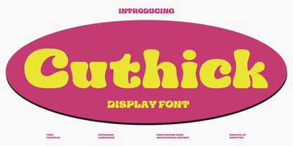 Cuthick is a display font that made based on thick lines, this font has a chubby and cute shape. You can use this font in playful, retro, and vintage style designs. This font can be use for a variety of projects or artwork such as sticker, headline, branding, product label, poster, logotype, magazine, and many more. Feature: - Kerning - Alternative Style and Ligature - Uppercase and Lowercase Letters - Numeral - Punctuation and Symbols - Multilingual Supports
 - LC Trinidad by Compañía Tipográfica de Chile,
$34.00 Lc Trinidad is the result of a series of wonderings regarding geometric Sans Serif typography design, in particular; Futura of Paul Renner. A “conversation” arose between me and the designer – actually there was no conversation, it is an euphemism for “I saw his designs, I draw them and discussed with myself some of his decisions – that ended up being the origin of this font firsts glyphs: A, H, N, O, R and S. I started with uppercase letters, and here is when Rudolf Koch with Kabel and his “Das schreibbuchlein” joined the conversation. This is how I could develop some alternative lowercase letters so as to illustrate this imaginary discussion. The result is a sans serif, geometric, modern typeface with classical Roman proportion in the uppercase letters; two stylistic sets for lowercase letters (setKoch and setRenner), rational, open and sharp ends. It is ideal to form titles, medium length texts, branding, exhibitions and animations. The family consists of 9 weight variants and their corresponding oblique versions and small caps. With more than 900 glyphs, it covers more than 190 Latin languages and together with its Opentype functions it creates a modern and versatile family. Besides, it has powerful OpenType features for each style, including stylistic sets, extended language support, ligatures, contextual alternates, lining figures, oldstyle figures, small caps numbers, arrows, fractions, superscripts, subscripts and many more.
 - Lahab by Arabetics,
$39.00 A connected typeface design with a calligraphic flavor. The Lahab (Arabic for flame) font family employs visual features from the Arabic Diwani Calligraphy. It has six members, normal, bold, and light, all of which come in two styles, regular and left-slanted italic styles. This font family design follows the guidelines of Mutamathil Taqlidi type style with one glyph for every basic Arabic Unicode character or letter, as defined in the latest Unicode Standards, and one additional final form glyph, for the freely-connecting letters in traditional Arabic cursive text. Lahab employs variable x-height values. It includes only the Lam-Alif ligatures. Soft-vowel diacritic marks, harakat, are selectively positioned. Most of them appear by default on the same level, following a letter, to ensure that they would not interfere visually with letters. Tatweel is a zero-width glyph. Keying the tatweel key before Alif-Lam-Lam-Ha will display the Allah ligature. Lahab includes both Arabic and Arabic-Indic numerals, in addition to standard punctuations.
 - ITC Surfboard by ITC,
$29.99Some words from the designer... The bold, playful element is everything in ITC Surfboard. West coast designer Teri Kahan was inspired by California's surfing lifestyle, and the letters of this alphabet dance along the writing line. The vitality of ITC Surfboard comes from the tension between its very free shapes and the precise edges and angles that create them. This all-capital font has deliberately tight spacing and works best in large sizes. Also included are fun, abstract surf/sail graphics. - Sanggar by Gatype,
$12.00 The newest Sanggar serif font, which is iconic and skilled with many unique alternative styles, based on our experience as graphic designers working in many companies, we are often asked to design logos with a unique style but with an elegant shape. So, we tried to create a Studio type and create this font to get the idea out. It is perfect for BRANDING and LOGO DESIGN. You will get a classy, elegant, and of course unique logo with this font. Important information: To access the alternatives, you must have access to an older version of Photoshop to copy/paste the glyphs from the included PSD, OR the Glyphs Panel, which can be found in Photoshop CC or any Version of Adobe Illustrator.
 - Anselm Sans by Storm Type Foundry,
$63.00One of the good practices of today’s type foundries is that they release their type families as systems including both serif and sans serif type. Usually, the sources of inspiration need to be well tried with time and practice, since production of a type family is such a laborious and complex process. From the beginning, it needs to be clear that the result will be suited for universal use. Such systems, complete with the broad, multi-lingual variations permitted by the OpenType format, have become the elementary, default instrument of visual communication. Non-Latin scripts are useful for a wide scope of academic publications, for packaging and corporate systems alike. And what about outdoor advertisement designated for markets in developing countries? Cyrillics and Greek have become an integral part of our OpenType font systems. Maybe you noticed that the sans serif cuts have richer variety of the light – black scale. This is due to the fact that sans serif families tend to be less susceptible to deformities in form, and thus they are able to retain their original character throughout the full range of weights. On the other hand, the nature of serifed, contrasted cuts does not permit such extremes without sacrificing their characteristic features. Both weights were drawn by hand, only the Medium cut has been interpolated. Anselm Ten is a unique family of four cuts, slightly strengthened and adjusted for the setting in sizes around 10 pt and smaller, as its name indicates. The ancestry of Anselm goes back to Jannon, a slightly modified Old Style Roman. I drew Serapion back in 1997, so its spirit is youthful, a bit frisky, and it is charmed by romantic, playful details. Anselm succeeds it after ten years of evolution, it is a sober, reliable laborer, immune to all eccentricities. The most significant difference between Sebastian/Serapion and Anselm is the raised x-height of lowercase, which makes it ideal for applications in extensive texts. Our goal was to create an all-round type family, equally suitable for poetry, magazines, books, posters, and information systems. - Anselm Serif by Storm Type Foundry,
$63.00 One of the good practices of today’s type foundries is that they release their type families as systems including both serif and sans serif type. Usually, the sources of inspiration need to be well tried with time and practice, since production of a type family is such a laborious and complex process. From the beginning, it needs to be clear that the result will be suited for universal use. Such systems, complete with the broad, multi-lingual variations permitted by the OpenType format, have become the elementary, default instrument of visual communication. Non-Latin scripts are useful for a wide scope of academic publications, for packaging and corporate systems alike. And what about outdoor advertisement designated for markets in developing countries? Cyrillics and Greek have become an integral part of our OpenType font systems. Maybe you noticed that the sans serif cuts have richer variety of the light – black scale. This is due to the fact that sans serif families tend to be less susceptible to deformities in form, and thus they are able to retain their original character throughout the full range of weights. On the other hand, the nature of serifed, contrasted cuts does not permit such extremes without sacrificing their characteristic features. Both weights were drawn by hand, only the Medium cut has been interpolated. Anselm Ten is a unique family of four cuts, slightly strengthened and adjusted for the setting in sizes around 10 pt and smaller, as its name indicates. The ancestry of Anselm goes back to Jannon , a slightly modified Old Style Roman. I drew Serapion back in 1997, so its spirit is youthful, a bit frisky, and it is charmed by romantic, playful details. Anselm succeeds it after ten years of evolution, it is a sober, reliable laborer, immune to all eccentricities. The most significant difference between Sebastian/Serapion and Anselm is the raised x-height of lowercase, which makes it ideal for applications in extensive texts. Our goal was to create an all-round type family, equally suitable for poetry, magazines, books, posters, and information systems.
 - St Transmission by Stereotypes,
$19.00 St Transmission was one of the first ambitious projects for Stereotypes. Building a complete family with a lot of weights along with the italics. Transmission supports extended Latin character set, plus Cyrillic and Greek.
 - Nevins Hand by Scriptorium,
$24.00Nevins Hand is our first release of a new collection of fonts based on the designs of Peter Nevins, a San Francisco poster artist who does hand-lettered fonts in the Art Nouveau tradition. - Lunisolar by Hanoded,
$15.00 Lunisolar, according to the dictionary, means “of or caused by both the sun and the moon”. I liked the name, therefore I used it! Lunisolar is quite an interesting font: it is fat(tish) and rough, very neat and legible. It could be used for product packaging, book covers and starships. Comes with an abundance of diacritics.
 - Hoodie by TypeUnion,
$25.00 Hoodie was born out of a love for retro Americana and vintage signs but designed with a contemporary fresh twist that makes the font a true attention seeker. The font is made up of 7 weights, plus 3 fun specials (dots, lines and shade) that create a multitude of uses and options. From logos to packaging and everything in between, Hoodie will be an attention grabber in all types of layouts and placements. Hoodie has features such as extensive language support, case sensitive characters, ligatures and number options (Denominator, Numerator, Superior and Inferiors), making it a truly versatile font.
 - Zeogari by Phoenix Group,
$13.00 Zeogari is a classic style font that has a combination of serif and sans-serif forms, this font depicts a sense of love and loneliness, in addition, the Zeogari font has a bold shape with strong characters.
 - Jazz Age by Studio K,
$45.00 Jazz Age is inspired by the Golden Age of Jazz, the Twenties and Thirties. Think Scott and Zelda Fitzgerald, cocktails, flappers and the whole Art Deco thing. Oh, and don't forget the radios, by which I mean old Bakelite valve or tube radios with their grilles and fretwork. This font is a celebration of them too.
 - Magic Forest by Radoselsky,
$11.00 This font is designed by me for the use in my friend´s invitation for her childrens birthday party. I hope you can use it in yours.
 - Ongunkan Latin Techno by Runic World Tamgacı,
$50.00 This font in the form of stylized techno, which I developed over my Ongunkan Modern Latin font, created a different perspective visually. Use it in good works.
 - Circe Rounded by ParaType,
$40.00 Circe Rounded is an extension for a popular Circe typeface, with rounded terminals. Bold and ExtraBold faces have two variants with different radius of the roundings. Circe Rounded is even more friendly than the original Circe. The typeface is designed by Alexandra Korolkova and Alexander Lubovenko and released by ParaType in 2015. It is known that the Circe typeface is distinguished by mild and humanist nature being formally a geometric sans-serif. However, as an experiment we decided to make it even softer: Circe now has a version with rounded terminals — Circe Rounded. Rounding is generally regarded as a mechanical operation, but in this case a lot of manual adjustment was needed because of the humanist nature and peculiarities of type design. Moreover, the two bold styles now have two options: a basic one is slightly rounded and an alternate one is fully rounded. In Circe Rounded we decided to dismiss characters with swashes that are rather inappropriate in such a rounded font, but the stylistic sets and alternate characters are remaining. Rounded terminals make an open and friendly typeface even more childish. For example, in quite large point sizes (because the x-height is still not big) it can be used as a body type in infant books. Circe Rounded, similar to Circe, has alternative forms of lowercase characters, which are called “infant” and are used in publications for children’s reading. However, a humanist basis is preserved alongside with its softness and it does not allow it to be as “plasticine” as many other rounded fonts. Two of the most obvious areas of possible application of Circe Rounded are everything for children and everything edible, especially all that is sweet and puff. However, we believe that there are other options.