10,000 search results
(0.05 seconds)
- Diary Amily by MrLetters,
$15.00 I would like to present a font that I named after "Amily's Diary". This font was inspired by the handwriting in a beautiful woman's diary. So don't hesitate to use this font for a loving design! Diary Amily Script is perfect for branding, wedding invitations, magazines, mugs, business cards, quotes, posters, and many more that you can use on your big project will be very beautiful. Diary Amily Script is equipped with the OpenType features and has many glyphs. With so many glyphs, you will be able to choose letters to your liking. There are lots of variations and choices for each letter, so you can customize your design choices and also support other languages. This font is very suitable for use with programs that support OpenType features such as Adobe Photoshop Cs / Adobe Photoshop CC, Adobe Illustrator CS / Adobe Illustrator CC, Adobe Indesign, and Corel Draw and many more programs that support OpenType. If you have any questions, don't hesitate to contact me via email: hello.mrletters@gmail.com
 - Aventena by Mokatype Studio,
$24.00Aventena is display sans, inspired by blackletter basic writing system. There is a lot of twist from the basic form, that makes Aventena look simple and yet legible. So you can explore, combine, and create designs such as posters, headlines, interfaces, merch, etc. This is single-weight font only, this font is better used for headlines. If you need a multi-weight of this font, just tell us! What's you get : Standard glyphs Ligatures (Opentype features) Web Font International Accent Works on PC & Mac Simple installations Accessible in Adobe Illustrator, Adobe Photoshop, Adobe InDesign, and even work on Microsoft Word. PUA Encoded Characters - Fully accessible without additional design software. Fonts include multilingual support Image used: All photographs/pictures/vectors used in the preview are not included, they are intended for illustration only. Thank You - Moyenage by Storm Type Foundry,
$55.00Blackletter typefaces follow certain fixed rules, both in respect to their forms and to the orthography. Possibly, they were a reaction to the half-developed Carolingian minuscule which was soon to end in the Latin script. Narrow, ordered script was to replace the round, hesitant and shattered shapes of letters in order to simplify writing, to unify the meaning of individual letters, and to save some parchment, too. Opposed to the practice common in monasterial scriptoriums where Uncial, Irish and Carolingian inspiration flew freely and as a result, the styles of writing differed in each monastery, the blackletter type was to define one, common standard. It was to express spiritual verticality, in perfect tune with the architecture of the Gothic era. Typography became an integral part of the overall style of the period. The pointed arch and the blackletter type were the vanguard of the spectacular transformation from the Middle Ages towards the modern era, they were a celebration of a time when works of art were not signed by their makers yet. Some unfortunate souls keep linking blackletter solely with Germany and the Third Reich, while the truth is that its direct predecessor, the Gothic minuscule, evolved mostly in France. Even Hitler himself indicated blackletter type obsolete in the age of steel, iron and concrete – thus making a significant contribution to the spreading of the Latin script in Germany. Once we leave our prejudice aside, we find that the shapes of blackletter type have exceptional potential, unheard of in sans-serif letterforms. The lower case letters fit into an imaginary rectangle which is easily extended both upwards and sideways. In its scope and in the name itself, the Moyenage type family project is to celebrate the diversity of the Middle Ages. I begun realizing the urge to design my own blackletter when visiting the beer gardens of Munich and while walking through the villages of rural Austria. The letters from the notice boards of inns are scented with spring air, with the flowers of cudweed, with white sausage and weissbier. The crooked calligraphic hooks and beaks seem to imitate the hearty yodeling of local drinkers and the rustle of the giant skirts of girls who distribute the giant wreaths of beer jugs. Moyenage is, however, a modern replica of blackletter, so it contains some otherwise unacceptable Latin script elements in upper case. I chose these keeping the modern reader in mind, striving for better legibility. The font is drawn as if written with a flat pen or brush, and with the ambition to, perhaps, serve as a calligraphic model. In medium width, the face is surprisingly well legible; it is perfect for menus as well as posters and CD covers for some of the heavier kinds of music. It has five types of numerals and also a set of Cyrillic script, symbolising the lovelorn union of Germans and Russians in the 20th century. Thus, it is well suited for the setting of bilingual texts of the German classic literature, which, according to the ancient rules, must not be set in Latin script. - Combinado by My Creative Land,
$20.00 Please welcome a new Combinado Font Family that has it all: elegant display sans serif and serif fonts in three weights each; a modern calligraphy script that looks beautiful next to them; a sans serif font designed specifically for the best on-screen reading experience, which comes in two weights (for now! more to come); and the last but not least - Design Elements font that has more than 70 elements to compliment your designs. This font family is very universal and you can use it everywhere: websites, instagram ads, magazines, books, cards and invitation designs, as well as in all possible personal design project that do not fit in any of the listed categories! Enjoy!
 - Naive Inline Sans by S&C Type,
$8.00 Naïve Inline Sans is a layered sans serif handwritten font designed by Fanny Coulez and Julien Saurin in Paris. Our goal was to draw a font with finely irregular lines that give a human and whimsical feeling. We designed three weights to assure a good readability whatever the size. They can be enhanced with five different interior patterns and three shadows to improve your designs and bring a charming and unusual feeling. To do so, you can simply superimpose the layers with a compatible software like Photoshop, the weight above and the pattern(s) below, then choose a color for each. This font is part of our Naïve superfamily that contains lot of variations: Line, Inline, Serif, Sans Serif, and a special Art Deco one. Just click on our foundry name to see them all! We hope you will enjoy our work. Merci beaucoup!
 - Wave by Jennifer Delaney Designs,
$23.00 WAVE is characterized by curved lines and intricate details. Each character was individually made in Illustrator and Type Tool using my original illustrations. Wave is a decorative font best used for titles or short bursts of texts in large point settings. The typeface is based on the uppercase letterforms, but I have also created lowercase letters, numbers, and glyphs. The motion lines used in the making of Wave mirror an art deco-style. Inspired by an illustration of a large wave, I was fascinated that by using only lines and solid colors we as artists can depict the translucency and ever-changing movement of waves. I began by delicately sketching out all of the letters using graph paper and micron pens. My work always begins with traditional media. I'm an illustrator, freelance artist, and graphic designer from Chicago, IL. I studied at Texas Christian University, and received my Bachelors of Arts in Graphic Design from Columbia College Chicago. Visit www.jennyddesigns.com for more! :)
 - Dortmunder Ecke by Hanoded,
$15.00 Dortmunder Ecke ("Dortmund Corner") is a clean, all caps font inspired by Cubism. It really has nothing to do with the city in Germany, but the name stuck and I kept it that way. Comes with a square amount of diacritics.
 - Ruff N Ready by Typadelic,
$14.95 Ruff N Ready is a little bit rough around the edges and is ready for use on any project! This font has an innocent charm about it but is a bit of a non-conformist. Is it a serif font? Sans serif? A script font? It’s all of those and more! It’s legible enough to be used for body copy but holds its own in a headline or title. You’ll find a few unusual ligatures in the font and some fun alternates. I hope you enjoy using Ruff N Ready as much as I enjoyed designing it!
 - Retro Morely by Typeskets,
$17.00 I want to introduce this cool font, namely (Retro Morely) which is a Bold script font with a charming touch of Retro style, this font also looks interesting because I added some alternative features that you can use, don't forget to add extrude style in it to make it look more Attractive for your designs, this font is suitable for those of you who want a design that displays an old-fashioned side but is still relevant for a charming modern look. there's nothing wrong if you feel all the experience of using this font in your designs, make this font as one of the font collections on your computer what will you get : Retro Morely Retro Morely Extrude Alternates Features PUA encoded We hope you enjoy this font! please feel free to comment if you have any thoughts or feedback. Thanks for purchasing and happy creating! :)
 - Mayblossom by Hanoded,
$15.00 Mayblossom was named after an old French fairytale (The Princess Mayblossom),which is quite similar to the tale of Sleeping Beauty. Mayblossom font is a fairytale font. It was made with a magic wand (with a Unicorn hair core) onto centuries old parchment. The font was then blessed by 12 lovely fairies. Of course, I had the evil thirteenth one kidnapped before she could cast her spell. In other words, if your work requires a certain lightness, a pinch of fairy dust and a sprinkling of magic, then Mayblossom is your best pick.
 - Medieval Leaves by Kaer,
$19.00 Once I found a pretty H letter initial on an ancient book. The letter was illuminated by beautiful engraved leaves. Based on it, I designed A-Z and 0-9 sets and assembled Medieval Leaves font. Medieval Leaves font family has Regular and Colored styles. It's all you need to precisely imitate medieval style text. Use this font as a decorative element at the beginning of a paragraph or section, other part of the paragraph should be in regular black letter font. You’ll get Drop Caps & Numbers set. --- *You can use color fonts in PS CC 2017+, AI CC 2018+, ID CC 2019+, macOS 10.14 Mojave+ * *Please note that the Canva & Corel doesn't support color fonts!* *Please download this test file with only A letter ( https://www.dropbox.com/s/03e7i78j4bz4mnm/MedievalLeaves-Test.otf?dl=0 ) to check your app & system.* --- Please feel free to request any help you need: kaer.pro@gmail.com Best, Roman.
 - Han Zi by ParaType,
$25.00 The display typeface that is based on the shapes of traditional Chinese hieroglyphic characters. Designing the font for imitations in the Chinese style the author nevertheless demonstrates serious attitude and thoroughness using the table of keys of the regular Kaishu script. As a result the font looks stylistically authentic and genuine. The typeface was designed by Aleksandra Egorova, the young type designer from St. Petersburg, and released by ParaType in 2008 .
 - Badhorse by Angga Mahardika,
$15.00 I created this font in 2016 with the name “Burtons”, and now here I am turning it into “Badhorse”. If you’re looking for the perfect touch of vintage flair for a design project, Badhorse is an exceptional choice. Pairing a rustic serif with a decorative handwritten script, Badhorse offers two distinct type designs that complement one another beautifully. This font duo is effective on product packaging, particularly for wares that prefer a handcrafted, artisan approach to their finished presentation. Badhorse is ideal for strong branding, identity, and logo design, as its letter forms effortlessly express a tone of familiarity, reliability, and timelessness. Advertising spreads and menu layouts will also take advantage of this modern classic, conjuring a sense of nostalgia and comfort in the viewer. Badhorse offers stylistic alternates and ligatures through OpenType, as well as symbols, punctuation, and international characters for additional language support.
 - Pema by Designpiraten,
$65.00 Pema – a contemporary Tibetan sans serif encoded in the Unicode standard. This is the first Tibetan typeface influenced by western sans serif fonts. It was designed especially to match multilingual purposes. The rather calligraphic Tibetan scripts did not match with the design aesthetics of western and Indian fonts and so I came up with the idea to design a “modern” Tibetan sans serif. Pema comes in two weights, Regular and Bold, each equipped with almost 1.300 glyphs.
 - Illustrator - Unknown license

- Disruptor's Script by Piñata,
$15.00 Disruptor's Script is the alter ego of our previous project Gentlemen's Script. Unlike the Gentlemen's Script, the new font is an elegant rebel and defies traditions. The font is painted with a brush pen, which is especially noticeable in the characteristic shabbiness and different thicknesses of the strokes. While the Gentlemen's Script is an embodiment of a classic costume, dress shoes and an expensive watch, Disruptor's Script is a fashionable suit, sneakers, an iWatch and a tattoo that peeks from under the shirt. The font retained the incline, speed and overall sense of dynamics inherent in Gentlemen's Script, but got a bit more chaotic and unpredictable. This is especially noticeable in the newly added shabbiness, elongated extenders, a large number of contextual alternates and different ligatures. For some high-frequency letters (10 for the Latin alphabet and 10 for the Cyrillic alphabet), we painted alternative versions that are substituted in the word instead of the standard characters when following our preceding certain groups of letters. In addition, in the Disruptor's Script you can find functional ligatures, including some of the frequently occurring two- and three-letter combinations. All these solutions dilute the monotonous line of the set, add a bit of unpredictability to the font and a touch of chaos to inscriptions. To fully enjoy usage of the font, we recommend that you always keep the features contextual alternates (calt) and standard ligatures (liga) turned on. If you do not have access to applications that support OpenType features, it does not matter—even without these features you can use and enjoy our font!
 - paintbrushdd by Matthias Luh,
$49.00 paintbrushdd was created using a real paintbrush. It is available in 4 styles including almost 3000 characters (Latin, Greek, Cyrillic, Coptic, symbols, shapes, mathematical expressions and so on). The main focus is on authenticity: The font literally looks like someone just painted it onto your artwork with a paintbrush! Just to name some examples, it is recommended for headlines, posters, t-shirts, computer graphics, and for any other purpose that need less than about 1000 words (due to the complexity of the font and the brush details).
 - Xaver Grotesk by Xaver Design Studio,
$25.00 Xaver Grotesk Variable, a font that emerged in the creative landscape of 2023, stands as a testament to contemporary typographic innovation. This font is not just a mere collection of characters but a meticulously crafted expression of modernity and sophistication. Its genesis was driven by a desire to infuse the typographic realm with a fresh take on the classic grotesque style while embodying a technical allure that whispers of a slightly futuristic essence. At its core, Xaver Grotesk is a testament to the marriage of form and function. The deliberate choice of monospacing adds a unique rhythm and structure to the font, instilling it with a sense of order and balance. The low capital height introduces a distinctive visual characteristic, creating an unconventional yet captivating silhouette that stands out in various design contexts. One of the font's most striking features lies in its letter design. Each character is meticulously sculpted, bearing angular and horizontal traits that not only convey a sense of modernity but also evoke a hint of technological precision. These angular and horizontal elements work in tandem, shaping the font's overall personality and lending it a forward-thinking edge. The fusion of these elements—monospacing, low capital height, and angular/horizontal letter design—creates a harmonious interplay that sets Xaver Grotesk apart. It's not merely a collection of letters; it's an experience, a visual journey that captivates and engages the viewer. Whether used in digital interfaces, printed materials, or other design mediums, this font transcends its utilitarian purpose to become an artistic statement in itself.
 - Hadriano by Monotype,
$29.99When traveling in Paris, American designer Frederic W. Goudy did a rubbing of a second century marble inscription he found in the Louvre. After ruminating on these letterforms for several years, he drew a titling typeface in 1918, all around the letters P, R, and E. He called the new face Hadriano" as that name was in the original inscription. Robert Wiebking cut the matrices, and the Continental Typefounders Association released the font. Goudy designed a lowercase at the request of Monotype in 1930, though he didn't really like the idea of adding lowercase to an inscriptional letterform. The lowercase looks much like some of Goudy's other Roman faces. Compugraphic added more weights in the late 1970s, and made the shapes more cohesive. Hadriano has nicely cupped serifs and sturdy, generous body shapes. Distinctive individual letters include the cap A and Q, and the lowercase e, g, and z. Hadriano™ is an excellent choice for impressive headings and vigorous display lines." - Kuba by Scholtz Fonts,
$19.00KubaApplique is a bold and exciting African font that makes use of the interplay of black and white shapes -- reminiscent of the Kuba cloths that are made and used by the Bakuba tribe. Typified by a balance between dark and light areas, the characters reflect the ethos of Africa. Kuba applique contains the full range of upper and lower case characters, all punctuation and special characters as well as the accented characters used in the major European languages. Because the way in which the individual letters fit together is so important in Kuba Applique, I took especial care of the kerning and spacing of characters. The font is intended to be used as a display font. - Dave Gibbons by Comicraft,
$49.00 How can we possibly call our line of celebrity fonts the MASTERS OF COMIC BOOK ART if it doesn't include a font based on the remarkable work of comic’s renaissance gentleman, artist/writer/colorist/letterer, Dave Gibbons?! Based on Dave’s easy-on-the-eye hand lettering, this is the font Dave himself uses to letter projects such as STAR WARS: VADER'S QUEST, MARTHA WASHINGTON & BATMAN: BLACK & WHITE. Other guys may imitate him, but the original is still the greatest! Get in with the In Crowd and check out the font created by Mister Fontastic for Dave Gibbons Original Graphic Novel, The, ah, The Originals. Yes, Dave Gibbons now comes in lower case, it’s not just what he does when he gets back from the off license. Be sure and pick up The Originals from Amazon -- now available in paperback, and probably still available as a hard case, much like Dave. After the crack about the beer above, I'm guessing you'll find me with a broken spine in the remainder pile. See the family related to Dave Gibbons: Dave Gibbons Journal & Dave Gibbons Lower .
 - Mymra by TipografiaRamis,
$35.00 Mymra fonts – an upgraded version of Mymra Forte and Mymra Mono (2009), with a careful re-dress of glyph shapes, and the extension of glyph amounts – which enables support of more Latin languages. One more weight – Black – has been added to the original three of Mymra Forte fonts. Fonts are intended for use in a vast variety of publications.
 - Morning Routine by Supfonts,
$12.00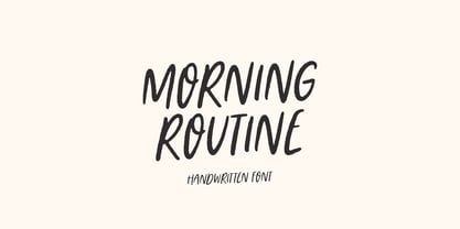 Morning Routine is a handwritten display font perfect for creating quotes, logos, or just adding a handwritten touch to any project! Font is an open type with clean shapes and precise kerning. It includes ligatures encoded by the PUA. Language support: All European languages Don't forget to subscribe so you don't miss out on the new awesome fonts Dima
 - Hasan Ghada Rectangle by Hiba Studio,
$59.00 Hasan Ghada Rectangle is a developed version of Hasan Ghada with a rectangle feel. It supports Arabic, Persian and Urdu. Hasan Ghada is an Arabic display typeface. It is useful for titles and graphic projects. The font is based on the simple lines of Modern Kufi calligraphy with new ideas for rectangle shapes and geometric feel.
 - Roses Bolero TP by Authentype,
$12.00 Roses Bolero TP Elegant Sans Serif is a sans serif font with full set of uppercase and lowercase letters, multilingual symbols, numerals, punctuation and ligatures. Roses Bolero elegant sans serif font classic and elegant style for poster design, magazines, beauty branding with a flower-shaped asterisk glyph suitable for your beautiful and elegant design concept. Features Standard glyphs uppercase and lowercase letters Numerals, a large range of punctuation and ligatures. Lowercase letters include ending swashes. Works on PC & Mac. Simple installations, accessible in the Adobe Illustrator, Adobe Photoshop, Adobe InDesign, even work on Microsoft Word. PUA Encoded Characters – Fully accessible without additional design software. Fonts include multilingual support for; ä ö ü Ä Ö Ü ß ¿ ¡ ________________________________________________________________________________________________________________________________________________ Image used : All photographs/pictures/logo/vector used in the preview are not included, they are intended for illustration purpose only. Thank you for your purchase! Hope you enjoy with our font! Designers: Ekayasa.
 - Ioana by Octopi,
$20.00 Ioana is an inoffensive, slightly quirky, slightly fattened sans serif font. It has a full character set as well as ligatures, small caps, superiors, inferiors, numerators, denominators and auto-fractions. Ioana came about as a direct result of 3 previous, private commissions that were all based on an artists hand-writing. For Ioana, I wanted a more regimented (but not boring) sans serif that could be used for headlines, posters and flyers with larger body text. Ioana Lighter is an inoffensive, slightly quirky, slightly lighter sans serif font. It is the lighter weight of Ioana and has a full character set as well as ligatures, small caps, superiors, inferiors, numerators, denominators, old style figures and auto-fractions. These OpenType fonts have support for CE languages and I hope you like it.
 - Kurilian by Wooden Type Fonts,
$15.00 A very unusual type based on wooden type designs of the 19th century, lacking lower case which may not have been designed for this font.
 - Cambalache by JVB Fonts,
$35.00 The idea for Cambalache was conceived back in 2008 and was to create a geometrical font based on tangential modules into structure. The serif would be arranged, looking to approach to the lettering shapes. The creative concept has a feel from the mid-30s of last century, reaching a taste of retro and vintage style. Includes oldstyle numbers, slashed zero, standard and discretional ligatures.
 - Ribbonshoe by Curvature Creations,
$10.00 My font Ribbonshoe is created with Power Point shapes Block Arc and Punched Tape and they resemble ribbons and horse shoes. This font is very unique, stylish and very attractive to the eye.
 - Affable by Scholtz Fonts,
$21.00 An elegant, contemporary and quirky handwriting font inspired by fonts such as Satisfaction and Nothing. There are many handwriting fonts out there, almost all of them tending to highlight the individuality of a particular person's handwriting. I wanted to go beyond this. What I've always wanted was to write in an elegant, casual yet legible style: something which my own hand often refuses to do. So I set out to produce the handwriting of my dreams - this font. While it doesn't match my dreams 100%, it certainly comes close! Affable comes in three styles, Affable Regular, Affable Blak and Affable Lite. The Affable family is fully professional, carefully letterspaced and kerned. All upper and lower case characters, punctuation, numerals and accented characters are present.
 - Thirsty Spine by PizzaDude.dk,
$17.00 Here's a creative font for your crafts, postcards, posters, book covers or perhaps your next birthday invitation! Thirsty Spine covers a lot of needs, where a crazy handmade look is needed. Each letter has 5 different versions, all with it's own charm. I did very little when digitizing this font, and that in order to keep the genuine pen strokes.
 - MBF Hourglass by Moonbandit,
$10.00 a display typeface inspired by the elegant and exotic shape of hourglass. This typeface is perfect if you are in need of a fresh new elegant, rich and expensive feel. This font is filled with unique shaped glyph and several alternate letters. This typeface also comes with 2 styles, regular and connected. Switch in between according to your liking.
 - Wasted Youth by Wing's Art Studio,
$12.00 Wasted Youth: A 90s Grunge Inspired Brush Font by Wingsart Studio Wasted Youth is a versatile brush font with shades of grunge, punk and horror. The font comes in three styles including a clean-edged original, plus two additional versions drawn with inky brush and marker pen. It takes inspiration from 90s grunge bands, with a hand-made punk aesthetic that’s equally at home in music videos, album covers, horror movies and skate culture. It aims to combine the best of these popular looks into one versatile font. Along with its unique uppercase and lowercase characters, Wasted Youth also comes with a host of custom ligatures, underlines and alternatives, along with numerals, punctuation and language support. It’s a truly flexible font that can be shaped into titles and headlines that look authentically hand-made. Try it on t-shirts, posters, stickers, movie titles, YouTube videos and more! Check out my visuals to see it in action.
 - Taca by Rúben R Dias,
$42.00 Taca is a typeface built around a shape that Portuguese designer Rúben R Dias calls a “squircle” — neither square nor circle. We usually associate the rounded, convex box with the television screens of the 1960s and Aldo Novarese’s classic typeface, Eurostile. But whereas Eurostile is cold and machined, Taca is warm and rugged, as if it was molded from clay or carved from stone. Taca’s organic nature is also derived from another unique feature: rounded crotches at the right angles where perpendicular strokes meet. This subtle finish, along with blunt stroke endings, softens the otherwise rigid skeleton. With such a strong conceptual vision, Taca could be relegated to the bin of experimental designs, severely limited in their application. But that fate is usually born of a less experienced maker. As a teacher, designer, and letterpress printer, Dias is a type user, keenly aware of the functional requirements of good type. Taca is therefore not a slave to its concept, but a working font family, effective in various sizes and environments. Its lettershapes break away from the base shape whenever it makes sense for legibility, while still maintaining the flavor of the design as a whole. That said, a set of squircle-shaped alternates give the user the flexibility to get more stylized if the situation calls for it. Fitting to its functional aims, Taca has many of the features one expects of a proper text font: upper and lowercase figures, case-sensitive punctuation, and Extended Latin language support. The simplicity, openness, and squareness of Taca’s forms also make it an ideal design for the pixel grid of screen displays.
 - Prosaic Std by Typofonderie,
$59.00 A Postmodern vernacular sanserif in 8 fonts Prosaic designed by Aurélien Vret is a Postmodern typographic tribute to the french vernacular signs created by local producers in order to directly market their products visible along the roads. These signs drawn with a brush on artisanal billboards do not respect any typographic rules. The construction of these letterforms is hybrid and does not respect any ductus. Nevertheless the use of certain tools provokes a certain mechanism in the development of letter shapes. It’s after many experiments with a flat brush, that’s these letterforms have been reconstructed and perfected by Aurélien Vret. This is the starting point for the development of an easily reproducible sanserif with different contemporary writing tools. From non-typographical references of Prosaic towards readability innovation The influence of the tool is revealed in the letterforms: angular counterforms contrasting to the smoothed external shapes. This formal contrast gives to Prosaic a good legibility in small sizes. These internal angles indirectly influenced by the tool, open the counterforms. In the past, to deal with phototype limitations in typeface production, some foundries modified the final design by adding ink traps. In our high resolution digital world, these ink traps — now fashionable among some designers — have little or no effect when literally added to any design. Should one see in it a tribute to the previous limitations? Difficult to say. Meanwhile, there are typeface designers such as Ladislas Mandel, Roger Excoffon, and Gerard Unger who have long tried to push the limits of readability by opening the counters of their typefaces. Whatever the technology, such design research for a large counters have a positive impact on visual perception of typefaces in a small body text. The innovative design of counter-forms of the Prosaic appears in this second approach. Itself reinforced by an exaggerated x-height as if attempting to go beyond the formal limits of the Latin typography. It is interesting to note how the analysis of a non-typographical letters process has led to the development of a new typographic concept by improving legibility in small sizes. Disconnected to typical typographic roots in its elaboration, Prosaic is somewhat unclassifiable. The formal result could easily be described as a sturdy Postmodern humanistic sanserif! Humanistic sanserif because of its open endings. Sturdy because of its monumental x-height, featuring a “finish” mixing structured endings details. The visual interplay of angles and roundness produces a design without concessions. Finally, Prosaic is Postmodern in the sense it is a skeptical interpretation of vernacular sign paintings. Starting from a reconstruction of them in order to re-structure new forms with the objective of designing a new typeface. Referring to typographic analogy, the Prosaic Black is comparable to the Antique Olive Nord, while the thinner versions can refer to Frutiger or some versions of the Ladislas Mandel typefaces intended for telephone directories. Prosaic, a Postmodern vernacular sanserif Prosaic is radical, because it comes from a long artistic reflection of its designer, Aurélien Vret, as well a multidisciplinary artist. The Prosaic is also a dual tone typeface because it helps to serve the readability in very small sizes and brings a sturdy typographic power to large sizes. Prosaic, a Postmodern vernacular sanserif
 - Vala by Monotype,
$29.99 Vala™ dances across printed pages and shines on screen. This is a high-energy design that blends the grace of an English Roundhand script with the gravitas of an extra bold Bodoni. There is even a bit of romance in the design. Vala speaks with a resonant voice – and knows few bounds. The typeface enhances print headlines, subheads, cover art and packaging. The design also brings its distinctive melding of verve and poise to banners, headings, navigational links and branding in web sites, blog posts, games and apps. Oscar Guerrero found inspiration for Vala in shop window lettering near his home in Bogotá, Colombia. “The capital A, R and V caught my attention and I photographed the window for future reference,” he explains. “Later I started to draw more letters inspired by the ones in the window.” Guerrero admits that he has always admired the work of Giambattista Bodoni and allowed his classic Didone designs to infuse Vala. Striking contrast in stroke weights, lively ball-terminals and a large x-height give Vala the grace and force of a Waikiki wave. Not satisfied with just a basic character set, Guerrero also took advantage of OpenType’s capabilities and drew a complete set of swash capitals, a bevy of fancy ligatures, and a suite of lowercase alternative designs. The result is that Vala easily emulates custom lettering in posters, headlines and logotypes. The “romantic” part of Vala? Guerrero dedicated the design to his girlfriend, Valentina, and named it after her.
 - Shmulkas by Fontsoon,
$9.00 Nu?! Vhat else vould you font?! Introduction to the first kosher vant...er...font! Yes, our Board certified rabbis made all the proper blessings so you can use this font guilt free. Just kidding, what's Jewish without a schmear of guilt. This font borrows its style from the 2nd. Avenue Deli all the way down to Guss Pickles on Essex street. If pastrami on white bread with ketchup is for you, this font is NOT. Its strictly pastrami on rye with mustard and slaw on the side.
 - Film P2 by Fontsphere,
$12.00 Film-P2 is an Ultra Condensed sans serif display typeface designed by Bartosz Panek. It is the follower of the geometric 'Film Poster' (https://www.myfonts.com/fonts/fontsphere/film-poster/) which was inspired by futuristic movie posters. In Film-P2, the letter design is more neutral, the font is more versatile, but no less expressive, which was one of the assumptions of the project. This allows many different application possibilities. In titles, headings, longer text compositions, bold and custom juxtapositions, and in many different formats. The differences in the width of the letters in the narrow, regular, wide versions are not significant, they are fairly balanced, but they give a lot of variation depending on the method of application and design characteristics, e.g. text size, background type, etc. The entire Film-P2 family offers many creative possibilities in graphic design, branding, printing and website design. Each font include multilingual support, numerals and a large range of special characters.
 - Rooney by Jan Fromm,
$45.00 Rooney is based mainly on old-style serif construction principles, such as the angle of stress, the open letterforms and the medium contrast, which lends the typeface a serious feel. Nonetheless Rooney is equipped with rounded shapes and soft curves that add a warm and smooth overall impression. Rooney combines these two different approaches: It has distinctive, original letterforms, but remains very readable and versatile. It includes six weights from Light to Black and Italics. The Rooney family comes with a Pro version, which is intended for professional designers. It contains lots of OpenType features such as small caps, ligatures, different figure sets and alternate glyphs. With around 840 glyphs, Rooney Pro is a powerful tool for any kind of typographical task.
 - Mastro Sans by Ndiscover,
$39.00 Mastro™ Sans is a contemporary humanist sans serif and the sans version of Mastro. The lowercase shapes are simple yet distinct, its organic design (specially the italic) are based on different stroke modulation ideas combined into a coherent whole. The uppercase is inspired in roman capital proportions yet keeping the lowercase stroke modulation. Mastro™ Sans has a total of 16 styles and it covers a large set of languages. It also has many Opentype features, such as small caps, superscript numbers and letters, old style and lining figures, tabular figures, case sensitive forms, fractions and more. It is a design with a lot of personality while being versatile. You can use it in branding, editorial, web and video.
