7,526 search results
(0.027 seconds)
- Kings Valley by Fenotype,
$19.00 King’s Valley is an elegant serif typeface with plenty of features. It’s equipped with Standard Ligatures and Swash, Stylistic and Titling Alternates for more showy designs. Access the alternates from OpenType panel in any OpenType savvy program, or seek them from Glyphs / Character -window.
 - Lamarkie by Hishand Studio,
$15.00 Introducing Lamarkie, a classic yet modern typeface with lots of style. For those who are needing a touch of elegany, stylish, classy, chic, and modernity for your design, this font was created for you!. Complete with ligatures alternates regular italic hollow icon kerning multilingual support
 - Bubble Bobble by Almarkha Type,
$29.00 Bubble Bobble is such a Fun & Playful Font. Use it for any project that needs a cheerful and playful look! Perfect for labels, quotes, posters, DIY projects, branding, packaging, greeting cards, websites, photos, photography kids, window art, scrapbooking, tags and so much more! Thank you
 - BearButte by Ingrimayne Type,
$11.95 BearButteT is a square-serifed typeface. The bold version was developed first as a display typeface, and the rest of the family followed. A fifth member of the family includes swash caps on the upper-case keys and small caps on the lower-case keys.
 - Quiet Time by ParaType,
$25.00The font was developed as a part of a corporate identity project for a pillow shop on the base of existing logo. It’s an attempt to reflect the space of a dream -- virtual reality where objects don’t have solid shapes, but present just hardly noticed disappearing contours. This idea determines the design of letters that resemble illustrations rather then alphabetical symbols and are based on ultra thin stems. The font was designed by Elena Kolesnikova and released by ParaType in 2009. - Country Western Swing by FontMesa,
$30.00Country Western is a revival of the classic William Page font known as Clarendon Ornamented originally designed in 1859 and again in 1877 by Vanderburgh & Wells. This version combines the best of both versions and adds something new. New to this font are the lowercase, italic, swash and script versions plus Greek and Cyrillic character sets. Keeping with the original theme from 1859 Fill fonts are available for the Ornamented and Open faced versions of this font. Greek, Cyrillic, Central and Eastern European characters sets are supported in the Windows TrueType and OpenType formats. The Windows and Mac PostScript Type1 versions of this font, however, do not support Greek, Cyrillic, Central and Eastern European characters sets. - Coriander by Adobe,
$29.00Coriander is the work of British designer Timothy Donaldson. It started out as a doodle one afternoon Donaldson was bored and uninspired. He wrote the word Coriander" and was then distracted by the sun beating through an adjacent window. He taped the writing paper up on the window as a shade. He took it down a few months later, folded it up, and stuck it in his pocket. When the piece of paper fell out of his pocket a week later, he was inspied to draw the rest of the characters, two alphabets in his sketchbook. The final digitized characters were created by Donaldson using a Wacom tablet and later refined on the screen." - Rithalica Jope Babes by Akrtype Studio,
$19.00 Presenting Riethalica Jope Babes luxury chic handwritten font Handwriting that is light and made as natural as possible to give the impression of pure digitalized handwriting, So that in its use it can give the true beauty of handwriting. And suitable for use in various media such as advertisements, web templates, invitations, social media templates, posters, weddings, and many more Riethalica Jope Babes luxury chic handwritten font include ligatures, capital letters and alternate letters. You need a program that supports OpenType features like Adobe Illustrator, Adobe Photoshop CC, Adobe Indesign and Corel Draw. and you can also access alternative flying machines via Font Book (Mac users) or Windows Character Map (Windows users).
 - Country Western by FontMesa,
$25.00Country Western is a revival of the classic William Page font known as Clarendon Ornamented originally designed in 1859 and again in 1877 by Vanderburgh & Wells. This version combines the best of both versions and adds something new. New to this font are the lowercase, italic, swash and script versions plus Greek and Cyrillic character sets. Keeping with the original theme from 1859 Fill fonts are available for the Ornamented and Open faced versions of this font. Greek, Cyrillic, Central and Eastern European characters sets are supported in the Windows TrueType and OpenType formats. The Windows and Mac PostScript Type1 versions of this font, however, do not support Greek, Cyrillic, Central and Eastern European characters sets. - Billgates by Hrz Studio,
$15.00 Billgates Script including alternative characters, ligatures and various language support. With the OpenType feature with an alternative style and elegant binder. The OpenType feature does not function automatically, but you can access it manually and for the best results needed for your creativity in combining these Glyph variations. and also a touch of ornament makes this font look elegant. Files include: To enable the OpenType Stylistic alternates, you need a program that supports OpenType features such as Adobe Illustrator CS, Adobe Indesign & CorelDraw X6-X7, Microsoft Word 2010 or later versions. (Windows), Font Book (Mac) or a software program such as PopChar (for Windows and Mac). If you need help or advice, please contact me Thank you for watching!
 - DangeR NighT by Absonstype,
$19.00 DANGER NIGH is the horror display typeface with high contrast all caps style looks and feel nice balanced. Honestly it works perfectly for headlines, logos, posters, packaging, T-shirts and much more. Recommended to use in Adobe Illustrator or Adobe Photoshop with opentype feature. Ligatures feature is default setting in Adobe Illustrator or Adobe Photoshop in Uppercase character. So when you want not to use the ligatures. Open glyphs panel : In Adobe Photoshop choose tool Window Character and then please click fi symbol In Adobe Illustrator choose tool Window Type Open Type and then please click fi symbol If you have questions, just send me a message and I’m glad to help. Have a great day, Absonstype
 - Everleigh Script by Hrz Studio,
$17.00 Everleigh Script including alternative characters, ligatures and various language support. With the OpenType feature with an alternative style and elegant binder. The OpenType feature does not function automatically, but you can access it manually and for the best results needed for your creativity in combining these Glyph variations. and also a touch of ornament makes this font look elegant. Files include: To enable the OpenType Stylistic alternates, you need a program that supports OpenType features such as Adobe Illustrator CS, Adobe Indesign & CorelDraw X6-X7, Microsoft Word 2010 or later versions. (Windows), Font Book (Mac) or a software program such as PopChar (for Windows and Mac). If you need help or advice, please contact me Thank you for watching!
 - Gleams Serif Playful by Alandya TypeFoundry,
$19.00 The Gleams serif playful display is unique, this font and is equipped with multilingual to be able to handle most typographic applications ranging. will be perfect and look luxurious for many projects such as fashion, magazines, logos, branding, photography, invitations, quotes, blog headings, posters, advertisements, postcards, etc. The Gleams serif playful include ligatures, capital letters and lowercase alternate letters. You need a program that supports OpenType features like Adobe Illustrator, Adobe Photoshop CC, Adobe Indesign and Corel Draw. and you can also access alternative flying machines via Font Book (Mac users) or Windows Character Map (Windows users). For sans style please check at https://www.myfonts.com/fonts/alandya-typefoundry/gleams-sans-display Happy Designing . . .
 - HS Alhandasi by Hiba Studio,
$59.00 HS Alhandasi is an Arabic display typeface. It is useful for book titles and graphic projects where a contemporary, streamlined look is desired. The font is based on the simple lines of modern and simplified Kufi calligraphy, that support Arabic, Persian and Urdu. This font was created in the beginning as regular weight in 2007 for use in technical and engineering company. The company tends to follow the geometrical shape with equal dimensions in both vertical and horizontal storks. There is also a tendency to make all characters to be similar to oval shape with the impression that they are all geometrical and clear. I followed that with two other weights in 2011, thin and bold.
 - Alien League - Unknown license

- Debugger by Dharma Type,
$9.99 Debugger is a futuristic, sicentific, digital family of next-generation monospaced fonts for developing, programming, coding, and table layout. Some desirable features in monospaced fonts are listed below. 1.Easy to distinguish 2.Easy to identify 3.Easy to read Debugger has very distinguishing letterforms for confusable letters such as Zero&Oh, One&I, and Two&Z. A lot of ingenuity makes this family very distinguishable. Italics have somewhat large inclination angle to be distinguished from their Roman. For the same reason, Italics are slightly lighter than Romans. Italic is not cursive Italic. It is near the slanted Roman. This is an intentional design to identify Italic letters. Cursive is not suitable for programming font. Octagonal and diagonal letterform is good for sci-fi, digital projects. Common elements for each letterform makes harmony and a sense of unity. Debugger supports almost all Latin languages. Try this all-new experiment.
 - Mottle by NONBook,
$8.99 Mottle is a strong, chiseled typeface made to help you stand out from the crowd. Gnarled after patterns found in nature such as marble, tree bark, and the brindled coats of animals, Mottle exudes a unique, natural, yet man made look. Great for display use such as logos, movie and album covers, and signage, Mottle gives off a feeling that is old yet new, gothic yet modern. Mottle supports over 30 languages, featuring over 400 glyphs and 500 OpenType kerning pairs. The Dollar, Euro, Yen, and Pound symbols are included, as well as Extended Diagonal Fractions support, and the Estimated Symbol. Language support for Basic Latin English, Western European Diacritics, Afrikaans, Basque, Breton, Catalan, Croatian, Czech, Danish, Dutch, English, Estonian, Finnish, French, Gaelic, German, Hungarian, Icelandic, Indonesian, Irish, Italian, Latvian, Lithuanian, Norwegian, Polish, Portuguese, Romanian, Saami (Southern), Serbian, Slovak, Slovenian, Spanish, Swahili, Swedish, and Turkish.
 - Gothiks Round by Blackletra,
$50.00 Gothiks Round is the rounded version of Gothiks. It is a narrow 6-weight display sans-serif influenced by Texturas. The rhythm and verticality of Texturas can be easily identified on the letters with diagonal strokes like A N M K k V v W w X x Y y Z z: here they are all vertical. This kind of morphology was chosen because it accepts condensation in a very natural way, giving to this sans-serif a very unique personality. The intermediate weights can be used for short texts while extreme weights are excellent for big sizes. It has an extensive character set—with extensive language support—and many OpenType features like fractions, small capitals and different figure sets. Default figures align with lowercase. The typeface’s name refers to the plural of the word Gothic, which in turn can refer to both sans-serifs or Blackletter, depending on geographic location.
 - Mountain by Volcano Type,
$29.00Mountain is a digital revival and extension of Teutonia, an old metal typeface released by the Roos & Junge type foundry (Offenbach am Main, Germany) in 1902. Teutonia’s design was popular during both the Art Nouveau and the Constructivist eras, where similar letterforms could be seen as far away as the Soviet Union. Although it slipped under the radar during the 1930s and 40s, this style feels extremely contemporary today. Mountain’s underlying geometric feeling is reminiscent of pixels and grids, suiting it for application with music and art, as well as history. Yet this typeface is not as static as it seems at first glance; playful diagonals—like those seen on the capitals D, L, P, and W—enliven the otherwise stern horizontal and vertical motion. Teutonia was a simple upper and lowercase display type. Mountain adds upon these by adding small caps and obliqued italic companions, rounding out this typographic toolkit. - Patrima by Juri Zaech,
$30.00 Patrima is a contemporary typeface with roots in the past. Specifically in the late nineteen hundreds where decorative type applications were en vogue and dimensional aspects and shadings where heavily used. Patrima takes simplified cues from these designs to make the typeface contemporary and versatile. Its base is a squarish Sans which expands through diagonal hatching to a three dimensional body. The hatching is wide enough for screen applications down to 24pt while remaining detailed for decorative purposes in larger sizes. Patrima’s different styles can be layered for chromatic results or used – complementary – alongside. As a decorative typeface it lends itself to display applications and eclectic logo designs, it brings a vintage touch to any branding project and elevates contemporary editorial layouts. Patrima comes with a set of catchwords which enrich its typographic texture even further. They are easily accessible through OpenType’s Discretionary Ligatures feature.
 - Cushy by Jeff Kahn,
$- Cushy is a versatile san serif font that’s stuffed with numerous plush swashes and unique alternates. But it’s not limited to display use only. Cushy is well suited for text or display applications. Cushy’s large “x” height, square proportions, and generous even weight enhance its legibility in all point sizes. The font’s bold personality radiates friendliness and warmth. Clean classic proportions lend it authority and vigor. Cushy bends around corners and flows throughout. You won't find any sharp corners. The diagonal strokes possess a subtle arch and enhance its characteristics. Available in 8 styles with multiple weights: Thin, Light, Regular, Bold, including italics. Cushy includes stylistic sets, stylistic alternates, swashes, ligatures & discretionary ligatures, and foreign language diacritic glyph support. Cushy provides 40 distinctive swash options, 17 ligatures, and 13 alternates. Weights include Thin, Light, Regular, Bold, with italics. Cushy is suited for corporate ID, retail, magazines, books, brochures, websites, logotypes, etc.
 - Big Stripes Mono by Ingrimayne Type,
$9.00 BigStripesMono is another typeface family from IngrimayneType that explores the possibilities of alternating letters sets. The family is monospaced with four fonts: a base or solid style, an outlined style, and two styles in which each character is cut diagonally and the halves are separated to form two characters. These split styles are not designed to be used alone but layered with the base style, outlined style, or both to form colorful lettering with an unusual striped appearance. The stripe is not apparent in single letters but only in words or lines of text. For best results use an application that supports the OpenType feature Contextual Alternatives (calt) to alternate the letters of the split styles. The four styles can be combined in several ways to create unusual lettering appropriate for titles, headlines, and similar uses. And if one wants a bold, monospaced, sans-serif face, BigStripesMono has that too.
 - Norden Display by Asgeir Pedersen,
$19.99 The name Norden means “the Nordic”, as in the geographical area or its countries. Inspired by the simplicity of Nordic and Scandinavian design, the Norden fonts give you clarity of expression, beyond the usual geometric look and feel of traditional sans-serifs. Open and spacious, the shapes of the glyphs play both with and against each other. Round and soft versus square and solid, a basic curve versus a straight line, creating a detached yet distinct style of expression, from the light-as-air Hairline to dark and Bold. The Display variant has diagonal as well as slightly rounded ends, similar to the Standard version but with and edge, so to say. As its name suggests, this font is intended for use in headlines and/or for small chunks of text at medium and large sizes. Norden comes in three variants: Standard, Round and Display.
 - Juvenis by Storm Type Foundry,
$32.00Designs of characters that are almost forty years old can be already restored like a historical alphabet – by transferring them exactly into the computer with all their details. But, of course, it would not be Josef Tyfa, if he did not redesign the entire alphabet, and to such an extent that all that has remained from the original was practically the name. Tyfa published a sans-serif alphabet under the title Juvenis already in the second half of the past century. The type face had a large x-height of lower-case letters, a rather economizing design and one-sided serifs which were very daring for their time. In 1979 Tyfa returned to the idea of Juvenis, modified the letter “g” into a one-storey form, narrowed the design of the characters even further and added a bold and an inclined variant. This type face also shows the influence of Jaroslav Benda, evident in the open forms of the crotches of the diagonal strokes. Towards the end of 2001 the author presented a pile of tracing paper with dozens of variants of letter forms, but mainly with a new, more contemporary approach: the design is more open, the details softer, the figures and non-alphabetical characters in the entire set are more integral. The original intention to create a type face for printing children’s books thus became even more emphasized. Nevertheless, Juvenis with its new proportions far exceeds its original purpose. In the summer of 2002 we inserted all of this “into the machine” and designed new italics. The final computer form was completed in November 2002. All the twelve designs are divided into six variants of differing boldness with the corresponding italics. The darkness of the individual sizes does not increase linearly, but follows a curve which rises more steeply towards the boldest extreme. The human eye, on the contrary, perceives the darkening as a more fluent process, and the neighbouring designs are better graded. The x-height of lower-case letters is extraordinarily large, so that the printed type face in the size of nine points is perceived rather as “ten points” and at the same time the line spacing is not too dense. A further ingenious optical trick of Josef Tyfa is the figures, which are designed as moderately non-aligning ones. Thus an imaginary third horizontal is created in the proportional scheme of the entire type face family, which supports legibility and suitably supplements the original intention to create a children’s type face with elements of playfulness. The same applies to the overall soft expression of the alphabet. The serifs are varied; their balancing, however, is well-considered: the ascender of the lower-case “d” has no serif and the letter appears poor, while, for example, the letter “y”, or “x”, looks complicated. The only serif to be found in upper-case letters is in “J”, where it is used exclusively for the purpose of balancing the rounded descender. These anomalies, however, fit perfectly into the structure of any smoothly running text and shift Juvenis towards an original, contemporary expression. Tyfa also offers three alternative lower-case letters *. In the case of the letter “g” the designer follows the one-storey form he had contemplated in the eighties, while in “k” he returns to the Benda inspiration and in “u” adds a lower serif as a reminder of the calligraphic principle. It is above all the italics that are faithful to the tradition of handwritten lettering. The fairly complicated “k” is probably the strongest characteristic feature of Juvenis; all the diagonals in “z”, “v”, “w”, “y” are slightly flamboyant, and this also applies to the upper-case letters A, V, W, Y. Juvenis blends excellently with drawn illustrations, for it itself is modelled in a very creative way. Due to its unmistakable optical effect, however, it will find application not only in children’s literature, but also in orientation systems, on posters, in magazines and long short-stories. - Sehatie by Sapre Studio,
$12.00 Sehatie Script is a contemporary calligraphy font that dances up and down the baseline. which comes with a wonderful alternative. It has a casual and elegant touch. This font is PUA encoded which means you can access all the glyphs and sweeps easily! Works perfectly for logos, fashion, stationery, printing press, magazines, menus, books, invitations, wedding/greeting cards, packaging, labels, clothing, marketing, etc. Sehatie Script features 580+ glyphs and 350 alternate characters. includes initial and terminal letters, alternatives, ligatures and multiple language support. Files include: Sehatie Script One (otf) Sehatie Script Two (otf) Sehatie Script Three (otf) Sehatie Script Four (otf) To enable the OpenType Stylistic alternative, you need a program that supports OpenType features such as Adobe Illustrator CS, Adobe Indesign & CorelDraw X6-X7, Microsoft Word 2010 or a later version. and there are additional ways to access alternatives/swashes, using the Character Map (Windows), Nexus Font (Windows), Font Book (Mac) or a software program such as PopChar (for Windows and Mac). How to Access Alternate Characters in Photoshop CC. https://www.youtube.com/watch?v=xFlMwARHusY How to access all alternative characters using Adobe Illustrator: https://www.youtube.com/watch?v=XzwjMkbB-wQ How to access all alternative characters, using the Windows Character Map with Photoshop: https://www.youtube.com/watch?v=Go9vacoYmBw How to use the font style set in Microsoft Word 2010 or later versions: https://youtu.be/x1A_ilsBsGs How to Use OpenType Fonts in Silhouette Studio or Cricut Design Space: http://cuttingforbusiness.com/2016/01/28/how-to-use-opentype-fonts-in-silhouette-studio-or-cricut-design-space/
 - Acarau Display by Tipogra Fio,
$30.00 Acarau is a 6 fonts display typeface with high reverse contrast—since from Roman capitals and calligraphy, usually Latin alphabet letters have thiner horizontal steams and thicker verticals, these features being optical or visual—quite adequate for logos, headlines and posters. Moreover, the style of the typeface is inspired by Italics form factor: lowercase letters having less strokes to make their shapes; A has one story; E has one stroke shape, such as K, G, Y and Z; F has a descent. To give it more calligraphic feeling, there is contrast for uppercases as well, this is very perceived by the diagonal letters like A, K, M, N, V, W, X, Y and Z. J also has a descent. Q and R have natural swashes, but they have alternates in case the costumer want to go for more usual forms—including accent marked letters. Acarau is a 12 months project, the contrast for uppercases were increasing as the process was made. In the middle it is found suitable blend the letter shapes with the history of Brazilian music from the 70’s and 80’s, since the font has a tropical, warm, spicy and nostalgic feeling. Songs from bands and singers that emerged on Rio de Janeiro like Paralamas do Sucesso, Cazuza, Lulu Santos and Kid Abelha bring the beach accent and rhythm that this font has. OpenType features complement the set, which has Multi-Lingual support for a comprehensive Latin set, including Vietnamese—meaning more than 640 glyphs: Case-Sensitive forms, so symbols can properly align to uppercase letters; Ligatures, to better reading for z_y and L_I, and style for s_s, w_w_w; also for ease arrows and punctuation typing; Stylistic Set 1: two story a—including accent marked letters; Stylistic Set 2: two story g—including accent marked letters; Stylistic Set 3: diagonal (usual) z—including accent marked letters; Stylistic Set 4: flower i and j dots; Contextual alternates; Terminal forms, for R and Q; Ordinals.
 - Combine by Andinistas,
$49.00 Combine, designed by Carlos Fabian Camargo G, is powerful and attractive, multi-layered chromatic type family that consists of 12 fonts, typographically grouped in two logics: “Script and Caps”, so that they could be colored separately or in group. Both designed with contrasting optical techniques and combinable at the same time. The unforgettable central idea of Combine was inspired by unique types of speedball letters designed by ancient artists in Canadian posters of shows and fairs in 1930. This is why its Typographical tools work independently or in group, resulting in highly polished designs that need fonts with coupled effusiveness. Their combined resources offer guaranteed distinguishing letters with shadow effects and worn, in order to help enhance their expressiveness. Combine is excellent in any project on paper or screen as it has more than 2100 glyphs and features of OpenType distributed strategically in fonts easy to use. SEE BELOW THE MAIN ADVANTAGES: • Combine Script & Shadow: It offers incredible case sensitive fluency and eloquence drawn with vertical cursive letters with ornamental non-stop excitement and complementation. It also has a variety of significant upward and downward, alternative strokes combined with its vintage ties that also give authenticity to their designs. • Combine Caps 1,2,3 & Shadow1,2: Guarantees you a colorful horizontal area of narrow case with 2 types of shadows, sound and other shade with diagonal stripes. Its geometric uniformity gives a friendly, open and subtle character by Typographic and special resources and visual properties coloring layers separately or in groups. In addition, its 2 layers of skeletal illuminations, adding internal lines and simultaneously contributing to play perfect confrontation and contrast with their geometric ideas and aesthetics for special attention. • Combine Words & Shadow: It can be used to design a perfect tone in each one of the 50 slogans written diagonally, making a brilliant feeling suggestive seductive style. Compatibility and flexibility works by monoline thin cursive strokes ideal for featured items with and without shade. Combine was selected at the Bienal Tipos Latinos 2016
 - HK Modular by Hanken Design Co.,
$45.00 HK Modular stands out as a versatile and adaptable typeface that finds its strength in serving as an impactful display, title, or poster font. Its design allows for effective use in spanning entire pages, highlighting article titles, and designing logos. With a regular cut and rounded-corner design, HK Modular strikes a harmonious balance between sleekness and approachability. This dual nature of the typeface allows it to seamlessly blend sharp, defined edges with a touch of softness, making it suitable for a wide range of design contexts.
 - Flipante by Resistenza,
$39.00 Our condensed to extended font is perfect for multiple uses, from branding to packaging designs. Its extendable and variable design makes it great for all kinds of projects. Its tubular shapes, ink traps and juicy curves make it both aesthetic and functional. Its condensation also allows a great flexibility, allowing you to adapt it to any project's need. Its versatility also makes it great for both print and digital projects. With this font's easy to use features, your designs will look good on any project or medium.
 - Artnoova by Popskraft,
$18.00 The Artnoova typeface combines the inimitable mastery of the great styles of the early twentieth century and at the same time looks organic among modern ones. Like the famous Art Deco typeface, Artnoova is designed for a strong yet elegant typography. In addition, a balanced set of capital letters allows you to type large sections of text. All this allows the Artnoova font to be used in almost any area of design, such as corporate identity, typography, posters, web design and other design areas.
 - SbB Intermodal Stencil by Sketchbook B,
$9.00 Inspired by stenciled lettering on crates and shipping containers, Intermodal is a 18-typeface family consisting of six widths and corresponding italics in two different angles. Intermodal uses only vertical stencil cuts— creating a dynamic rhythm and a unique, industrial feel. The variable font allows for customization of weight, slant and stencil opening size. 18 fonts Six widths: A-F Regular and two different oblique angles Tabular Opentype Numbers and an alternate "9" Variable font allows you to change weight, slant and stencil opening size
 - Print Partners JNL by Jeff Levine,
$29.00 The vast variety of vintage letterpress illustrations representing many different eras and art styles allows for yet another volume of cartoons, embellishments, ornaments and stock cuts contained within Print Partners JNL.
 - Friandise by JBFoundry,
$19.90 Do not believe that Friandise is reserved for the chocolate enthusiasts. It’s a pair of fonts which will allow you to ally simplicity and frivolity, sweetness and hardness, discretion and show.
 - Acta Variable by DSType,
$350.00 Acta Variable is a clean and fresh type system that remains conservative enough for newspaper setting. The complete Acta Variable allows the possibility to modify the Weight and Optical size axis.
 - Melatti by Awanstudio,
$15.00 Melatti allows you to create stunning and easy hand-lettering in an instant. Ideal for the logo, quotes, wedding, product label/packaging, fashion, letter, advertising, invitation, poster, merchandise, greeting cards, etc.
 - Holy Nativity by Seemly Fonts,
$12.00 Holy Nativity is a simple lettered handwritten font; it's a celebration of warmth and joy. Its unique handwritten style invites endless possibilities for your design projects, allowing your creativity to shine.
 - Angelin Love by Letterara,
$12.00 Angelin Love is a gorgeous script font, beautiful and romantic. This font looks perfect for Valentine’s Day designs, or for other romantically inclined styles and projects. To stay up to date for my latest job, follow me and let’s be friends because there will be many promos.
 - Salmander Bentols Script by Maulana Creative,
$13.00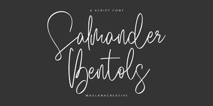 Give your designs an authentic handcrafted feel. "Salmander Bentols Script" is perfectly suited to signature, stationery, logos, typography quotes, magazine or book covers, website headers, clothing, branding, packaging design and more. Salmander Bentols Script contains: - Ligatures - Multilingual Support and is easy to instal Mac and Windows.
 - Avergent by Variatype,
$16.00 ABOUT THIS FONT Avergent is a simple display sans font that designed for modern corporate branding, copy ads, and much more. FONT FEATURES - Additional Accents - Stylistic Alternates - Cyrillic Support - Ligatures - 95 Languages SOFTWARE RECOMMENDATION - Adobe Photoshop - Adobe Illustrator - Adobe InDesign - Affinity Designer OS COMPATIBILITY - Mac OS - Windows
 - Fortune Coin by Gassstype,
$25.00 Fortune Coin is a Cartoon Display Font with alot of ligature. it will make your designs look modern, unique and fun. It’s perfect for labels, quotes, posters, DIY projects, branding, packaging, greeting cards, websites, photos, photography overlays, signs, window art, scrapbooking, tags and so much more!
