10,000 search results
(0.121 seconds)
- Proza Display by Bureau Roffa,
$39.00 Proza Display is the eye-catching counterpart of Proza, consisting of 12 styles (6 weights + italics). Together, Proza and Proza Display form a large family of 24 styles, which are all equipped with plenty of language support and opentype features. Proza Display was made to function especially well at large sizes, drawing the reader's attention with its beautiful and slightly eccentric shapes. Its large character set (support for 200+ languages) and opentype features make sure that Proza Display doesn't let you down, while its classy design helps you to make a visual impact.
 - Chicago Ornaments by HiH,
$6.00 Chicago Ornaments is a collection of decorative cuts cast by the Chicago Type Foundry of Marder, Luse & Co. of 139-141 Monroe Street in Chicago, Illinois. This collection was shown in their 1890 Price List. According to William E. Loy, at least some of them were designed by William F. Capitain. Chicago was one of the innovative Midwest type foundries, introducing the American Point System. These designs represent the late Victorian period. After 1890, with the posters of Jules Cheret taking Paris by storm, Art Nouveau gradually began to displace Victorian style. In type design, both styles competed against each other until about the end of the century. Designers may want to consider using these ornaments when using Victorian style typefaces, like our Cruickshank, Edison and Freak - as well as faces by others such as Karnac, Kismet and Quaint Gothic. Included in the font are a set of Dormer-inspired caps, numerals and a few other glyphs - also from the Victorian period.
 - Grand Atlantic by Fenotype,
$35.00 Grand Atlantic is a powerful display package by Fenotype. It’s a genuine Brush script packed with features and Swoosh extras and it’s a striking condensed flared serif in two weights, designed with the same sharp edges on the flares as the Brush. Together they make stunning logotypes, posters or headlines. On top of that there’s a “Printed” version of each. Printed versions are the same but with rugged outlines and a print texture. Grand Atlantic is great for creating powerful identities for artisanal coffee brands, craft beer, organic juice or a sports teams. Grand Atlantic Brush is equipped with Standard Ligatures and Contextual alternates that help keeping the connections between letters smooth. They’re automatically on as you should normally keep them. On top of that Grand Atlantic Brush has Stylistic, Titling and Swash Alternates for standard characters if you need more ornamental letters and if you want to break up the rectangular word shapes. There’s even more alternates in the glyph palette, making it total more than 600 glyphs. Grand Atlantic Swoosh contains 52 shapes designed to go with the Brush. There’s many “terminal swashes” that you can put in the end of a word and it will connect to the last letter, and swirl under the word from there.
 - DIY Fantasy Stamp by TypoGraphicDesign,
$19.00 The typeface DIY Fantasy Stamp is designed in 2020 for the font foundry Typo Graphic Design by Manuel Viergutz. The display typeface is inspired by the crafts of 20s and 40s. The basis for this authentic stamp font was a letter case with a rubber stamp from Simplex. This analog character set of 85 stamps, was digitally extended to 500+ glyphs. 5 font-styles (Sharp, Dirty, Rough, Invert, Heavy) with 546 glyphs (Adobe Latin 3) incl. decorative extras like icons, arrows, dingbats, emojis, symbols, geometric shapes, catchwords, decorative ligatures (type the word #LOVE for ❤ or #SMILE for ☺ as OpenType-Feature dlig) and stylistic alternates (4 stylistic sets). For use in logos, magazines, posters, advertisement plus as webfont for decorative headlines. The font works best for display size. Have fun with this font & use the DEMO-FONT (with reduced glyph-set) FOR FREE! Font Specifications ■ Font Name: DIY Fantasy Stamp ■ Font Weights: Sharp, Dirty, Rough, Invert, Heavy + DEMO (with reduced glyph-set) ■ Font Category: Display for headline size ■ Glyph Set: 546 glyphs (Adobe Latin 3) ■ Specials: Decorative extras like arrows, emojis, ornaments, geometric shapes, catchwords, decorative ligatures (type the word #LOVE for ❤ or #SMILE for ☺ as OpenType Feature. dlig) and stylistic alternates (4 stylistic sets) ■ Design Date: 2020 ■ Type Designer: Manuel Viergutz
 - Quell by Underscore,
$35.00 Quell is a novel attempt to bridge the gap between geometrically constructed shapes on the one hand, and modulated strokes and subtle calligraphic influence on the other hand. The visual tension in Quell stems from conflict between two tendencies: The perfectly round shapes are geometrically constructed, yet the contrast of stroke widths and oblique line terminations suggest calligraphic roots. How this dualism affects typographic impression is up to designers and typographers using Quell — as variable font the seamless transition between modulated contrast and linear appearance offers unique typographic possibilities. Linear appearance gives the text a solid and compelling voice, whereas the modulated styles convey elegance, vibrance and a delicate tone. Quell is suited to display setting, headlines, way finding and identity. The combination of linear and contrast variants provides typographic range to convey different stance while rooted in the same visual heritage. In short paragraph typesetting the fonts have a modern look and characterful tone, but should not be overused for longer texts. Quell has been in development for over a year, and is the proud third release under the Underscore label. Released in 2018 this design by Johannes Neumeier is available from the Underscore webshop as well as selected retailers.
 - Hydrargyrum by Type Minds,
$15.00 Hydrargyrum is the Latin form of a Greek word meaning "liquid silver" - mercury. The Hydrargyrum typefaces are designed with characteristics both of a metal and a liquid. The basic shapes of the letters are generally rigid and rectangular (particularly in style C), but the forms are enhanced by fluid curves and gently rounded corners. Hydrargyrum is not recommended for use at small sizes or in lengthy passages of text. It performs best in display-sized settings. Hydrargyrum consists of three styles, each in medium and semibold weights with matching obliques. The A style features solid, standard letterforms including the two-story a and g. Style B substitutes the a, g, M, and N (and related glyphs including numero and trademark symbols) for alternate shapes. The third subfamily takes the rectangular theme to an extreme, eliminating as many slanted strokes as possible from the letterforms. This makes some C-style letters ambiguous with one another, such as the U's and V's. As such, the C style is best used carefully even at larger sizes. The Hydrargyrum fonts are style linked within each style subfamily with, for example, Hydrargyrum A Medium as the regular style, Hydrargyrum A Medium Oblique as the italic, Hydrargyrum A SemiBold as the bold option, etc.
 - Nextir by Ditatype,
$25.00 Nextir is an extraordinary brush sans serif font that commands attention and redefines modern typography. Designed with large letters and a thick weight, its distinctive square letter shapes are the epitome of strength and contemporary style. What sets Nextir apart from the ordinary is its brush detailing. This unique blend of brush strokes and sans serif elements adds a layer of organic texture to the font. The combination of large letters, thick weight, square shapes, and brush detailing creates a font that makes a striking statement with a contemporary edge. When you need a typeface that combines strength with artistic expression, Nextir is the perfect choice to infuse your designs with boldness, modernity, and a touch of handcrafted elegance. You can also enjoy the features here. Features: Multilingual Supports PUA Encoded Numerals and Punctuations Nextir fits in headlines, logos, posters, flyers, branding materials, print media, editorial layouts, and many more designs. Find out more ways to use this font by taking a look at the font preview. Thanks for purchasing our fonts. Hopefully, you have a great time using our font. Feel free to contact us anytime for further information or when you have trouble with the font. Thanks a lot and happy designing.
 - Metal Cry by Fabulous Rice,
$25.00 Metal Cry is a font family that was inspired by countless hours spent playing video games, watching old movies or reading comic books. And even more hours closely analysing the design of all these things. The art of creating beautiful letters has slowly declined with the rise of the digital age and its solid-colour, 2D fonts. And most of the time, the care given to typography in cultural products just isn't what it used to be anymore. This was the inspiration for Metal Cry, a family of 4 layerable fonts that can bring a feeling of depth to its letters, and offers endless possible combinations. Metal Cry Outlands is the basic shape of all the characters, it can be used as the bright side of the bevel. Metal Cry Front is the inline border font that can be used as the front side of the bevel. Metal Cry Shadow can be used as the dark side of the bevel. Metal Cry Depth can be used to flash out the inside shape of the letter. But of course, any font can be combined with any other font(s) to obtain various results. The planets in the above visuals are courtesy of 3D artist Thomas Veyrat / veyratom.com
 - Core Sans GS by S-Core,
$29.00 The Core Sans GS Family is a rounded version of Core Sans G and a part of the Core Sans Series such as Core Sans N, M, A, E, D. Core Sans GS is constructed of straight, circular or square shapes. These geometric shapes are inspired by classic geometric sans (Futura, Avenir, Avant Garde etc.). Every stem is a rectangle or a straight line and every letter, lowercase or uppercase, seems to be in perfect geometric form and even weighted. The small x-height makes readability clean and clear. Core Sans G can be used equally well in headings or in body copy. The Core Sans GS Family consists of 9 weights (Thin, Extra Light, Light, Regular, Medium, Bold, Extra Bold, Heavy, Black) with maching Italics. It also includes alternate characters (a,g,t) and a bunch of ligatures. The Core Sans GS provides a wide range of character sets to support (Cyrillic, Central and Eastern European characters) and advanced typographical support with features such as proportional Figures, tabular Figures, numerators, denominators, superscript, scientific Inferiors, subscript, fractions, standard ligatures, discretionary ligatures and stylistic alternates. Core Sans G is an ideal font family for use in magazines, web pages, screens, displays, and so on.
 - Haboro Slab Soft by insigne,
$32.99 Haboro Slab Soft is a scion of the Haboro hyperfamily. This concept powers through with its well built, accommodating nature. Haboro Slab Soft’s serifs are rounded, giving it a softer look. The Haboro hyperfamily is a comprehensive design suite that provides solutions for many projects. The iconic angled wedge makes this family ideal for apparel, packaging, apps, corporate identities and advertising campaigns. Subfamilies in the hyperfamily include the original Haboro, a Didone face, Haboro Sans, Serif, Soft, and Slab. The Haboro hyperfamily is known for its ability to make your copy appear clear and simple. The Haboro typeface is built on a common underlying model. It has the same cap height, the same x-height, and the same basic character shape. This unification of shape and proportion results in a complementary set of typefaces. Haboro Slab Soft’s wide variety of ligatures and OpenType alternatives give your message the clarity it deserves. The Haboro Slab Soft family includes seven weights, from Thin to ExBold, three widths, and matching italics. There are over 550 glyphs per style and support for over 70 Latin-based languages. Haboro Slab Soft includes features such as small caps, ligatures, fractions, and alternatives. Haboro Slab Soft is there when you need to present information in a clear and friendly fashion.
 - Tumbasan by Look Minus Today,
$16.00 Introducing Tumbasan - Modern Minimalist Sans Serif by Look Minus Today. Tumbasan is designed with a modern and minimalist aesthetic in mind. This versatile font is perfect for all design needs, from print materials to digital media. Geometric shapes give it a contemporary feel that will add a touch of sophistication to any project. The font's design is based on a simple and legible sans serif style, with just the right balance of thickness and spacing to ensure clarity and ease of reading. Its simple, elegant lines and smooth curves make it a great choice for a variety of design applications, including branding, advertising, packaging, and editorial design. Our modern and minimalist sans serif font is a versatile and stylish choice for any design project. Its clean lines, geometric shapes, and legibility make it an excellent choice for a wide range of applications, while its modern aesthetic ensures it will stand out and make a bold statement in any design. Features: - Uppercase - Lowercase - Alternates & Ligatures - Numerals & Punctuation - Multilingual & Symbol - HOW TO ACCESS ALTERNATE CHARACTERS - Open glyphs panel: In Adobe Illustrator go to Window - Type – glyphs In Adobe Photoshop go to Window – glyphs For any further questions or assistance, please feel free to contact us at look.minus.today@gmail.com Thank you and have a nice day!
 - Walonka by TripleHely,
$18.00 Hello! Let me introduce Walonka – a modern calligraphy font. With its natural, elegant shapes Walonka is the perfect choice for logos, branding, web, blog headlines, invitations, magazine and book design, product packaging – or for any text on postcards and on your favorite photos. Walonka includes: a standard set of characters with wide multilingual support: Western-, Central- and Eastern-European, Baltic, Turkish, Latin-type Africans, and Asian (94 languages in total) two additional character sets: lowercase letters with alternates shapes and lowercase letters without a connection stroke - for the position at the end of a word another two additional lowercase character sets – initial and final swashed forms 75 ligatures for double letters and frequent combinations Walonka has a large number of embedded context-dependent auto-replacement features that give the text a natural, handwritten look and correct inharmonious combinations of letters. These features work well in many apps (even simple ones like Notepad/TextEdit), and if you need to customize their application – you could use programs that support OpenType features (for example, Adobe apps or CorelDraw). All these additional glyphs are PUA-encoded, so if your software does not support OpenType — you could access them through Character Map (Windows) or Font Book (Mac). I hope you will like Walonka and create great designs with it!
 - Phiz by Shinntype,
$29.00 Phiz is a diverse suite of 28 decorative fonts based on Figgins Sans Extra Bold. Classic (10 fonts), Rounded (7 fonts), Rough (4 fonts) and Particles (7 fonts). The Rough and Particles styles emerge as a unique niche—neither imitating distressed printing (e.g. the “rusty” look), nor casual, hand-drawn styles. These type designs are conceived and executed as complex algorithmically-generated graphic procedures, in which repetitive elements have been artfully applied to the Sans capitals, and manually nuanced. As such they also differ substantially from textured glyph shapes that have been cut out from larger pattern fields, for the constituent particles are disposed in relation to the specific shape of each character they define. The caps-with-small-caps format was chosen for two reasons. Firstly, titling display usage is predominantly capitals, and secondly, rather like optical scaling, having the same resolution of texture available in two different “sizes” (upper and lower case) should prove useful in the hierarchy of page layout—not primarily for setting upper and lower case text as caps-with-small-capitals, although this is of course an option. All figures and major symbols (punctuation and currency) are provided in both cap and small cap height.
 - Arabesque by Scholtz Fonts,
$15.00 Arabesque is a romantic, ornamental font, in which intertwining, flowing lines and generous loops enhance the beauty of the basic shapes. Arabesque successfully combines legibility with a decorative, sumptuous style. In its European interpretation it was also called "Moresque". The font "Ability" was the origin of Arabesque, however, numerous, subtle changes set it apart. Arabesque, is characterised by a small x-height and relatively large ascenders and descenders (loops). The loops are created out of two or three delicate, intertwined lines that contrast with the much less expansive bowls and shapes of the lowercase letters. The capitals, more complex and composed of intertwined lines, echo the elegance of the loops on the lowercase letters. As a result of these changes "Arabesque" is both more readable, controlled and extravagant than "Ability". Suggestions for use: - wedding stationery - greeting cards - valentines day media - beauty products media - lingerie tags - women's magazine pages - classical music media - award certificates - magazine pages The font is fully professional: carefully letterspaced and kerned. It contains over 235 characters - (upper and lower case characters, punctuation, numerals, symbols and accented characters are present). It has all the accented characters used in the major European languages. Arabesque works well in Application packages such as Microsoft Word that do not support professional kerning.
 - Circulo by MMD Fonts,
$6.29 Bound to rules, unbound in the usage. Hyper geometric, and minimal contrast. Circulo V1 is based on a font project I originally started because of a client I had. I wanted to create a display and text font for their product design brand, which is all about reducing the amount of necessary materials and production steps. Before I started the course at tipo-g it was called -“REDUCE“ and was more or less finished. The concept was based on the name. How far can letter shapes be reduced to their core geometric concepts and still be identified as letters? But in a way, it lacked a unique approach and was just a generic geometric Sans Serif with a lack of finesse. There was already a glimpse of characteristics visible which would later define Circulo V1. The high focus on geometric shapes was not of the same severity, and the angle on the stems was less intense. Those, as I call them, fake serifs turned out to be a significant factor in legibility and the characteristic of the font. Besides those changes and improvements, I decided to implicate a new feature to the concept, a condensed style. I quickly realised that it is impossible to keep my perfect circles and half-circles in this style without breaking my rules for the font. This „problem“ turned out to be the most crucial feature of the condensed set. Circular-based Letters will ignore the rules and boundaries of the condensed style and stay as they are. This feature allows the user to create a unique rhythm in their texts, and if you use the variable font, you can decide how intense this rhythm will be. In this situation, the user can choose which letters are allowed to keep their shapes and which will be put in their condensed corset. All, some or none of them, you decide.
 - Open Book ING by Ingrimayne Type,
$9.00 OpenBookING is a gimmick or novelty font that has letters on pages of a book. It is caps only and monospaced. The letters on the upper-case keys are on the left-handed pages of an open book and the letters on the lower-case keys are the same letters but on the right-handed pages of an open book. One could alternate upper and lower case keys to get letters on complete books, but the Opentype feature of contextual alternatives (calt) does this automatically. Several previous typefaces from IngrimayneType used the calt feature to alternate shapes that fit together in an interlocking pattern, such as alternating concave and convex shapes. OpenBookING uses the calt feature in a different way, to alternate two halves of a symmetrical shape. To provide two copies of numbers and common symbols, some non-alphabetical characters are unavailable because their slots were taken by the second form of the number or common symbol. If stylistic set one (ss01) is turned on, spaces are replaced with empty pages. This may leave you with unwanted spaces at the end of lines, and to eliminate them, turn off the feature (or change the font) for these spaces. The empty pages can be used in a layer to add color to the text. There is also a second set of empty pages with a filled page that can also be used in layers. (See poster for examples.) These pages are on the (logicalnot multiply) and (register divide) characters for the first set and on the (ordmasculine ellipsis) and (macron trademark) keys for the second set. Finally, OpenBookING has a large set of accented characters if anyone should need them. The letters used on the books were derived from the font Myhota-Bold. For a related typeface of letters on book covers, see NewLibrary. OpenBookING has limited uses and is priced accordingly.
 - Linkpen Primary by Linkpen Handwriting Fonts,
$10.00 Linkpen Primary is a font family for teaching handwriting. It is designed to be used by teachers and parents to help children or adult learners practice their handwriting, at home or at school. Linkpen Primary gives you endless possibilities for creating your own educational resources - worksheets, signs, labels, etc. - to appeal to your learners and get them interested and passionate about learning to write. This versatile font family contains 24 styles, each with special features that support learning to write. For ultimate flexibility, styles are available with and without guide lines, and in regular and italic versions. The styles can each be purchased separately or as a complete family value pack. The letter shapes have been designed to be clear, simple and easy to read. There are 12 print styles designed for beginners or younger children, to allow them to practice writing the letter shapes. The print fonts all come in Regular, Guide, Dotted, Dotted Guide, Outline, and Arrow styles, to give learners different ways to build their confidence creating the letter shapes. There are 12 Join fonts, for when your learners are ready to progress onto joined up handwriting. The Join fonts automatically join up as you type on your computer, tablet, or interactive whiteboard, producing beautiful, neat, clear joined up text for your classroom or home resources. The Join fonts come in Regular and Dotted styles, as well as a special Connect style which highlights the join between letters, to help your learners make the transition from printed writing to joined up. The Join fonts are created with OpenType Contextual Alternate rules, which ensure that the joins are always formed correctly, depending on the context of each letter within a word. Compatible with Microsoft Word and Publisher 2010 onwards (desktop version), SMART Notebook 18 onwards, Pages and Keynote for iOS, TextEdit for macOS, LibreOffice 6, Notepad for Windows, and Promethean ActivInspire Version 2.21 onwards.
 - Savage Adventure by Pedro Teixeira,
$14.00 Savage Adventure, a bold, modern and informal font with personality.
 - Novera by René Bieder,
$29.00 The Novera family is a sharp geometric sans in ten weights plus matching italics, available in two versions – Modern and Classic. It has a contemporary, approachable and multifunctional yet characteristic design, that comes with an extensive glyphs set of 1000+ glyphs per font, meeting all typographic demands. The Design Vertical terminals, circular shapes and angular apexes – Novera truely breathes geometry! But the concept goes beyond the application of rational geometry. The intension was to create a highly legible family suitable for every day usage inspired by the work of Paul Renner, Eric Gill or Jakob Erbar, combining the geometric with the human and the functional with the unconventional. Although Novera is inspired by the past, its appearance is unmistakingly modern. Modern vs Classic Novera is available in two versions - Modern and Classic - born from the same source file but with different characters set as default. This creates subtle but effective distinctions such as the double-storey a (Novera Modern) which is optimized for legibility in longer text paragraphs, as opposed to the single-storey a (Novera Classic) which allows a purely geometric appearance. Another distinguishing feature are the ascenders on Novera Mondern, which extend above the cap height for an elegant presence, compared to the ascenders on Novera Classic, ending at the cap height, for a compact and helvetica-flavored look. Novera Modern was intended for usage in body copy, whereas Novera Classic was planned for headlines, short paragraphs or logos, but both versions can be used vice versa too, of course. Alternate Characters To maintain neutrality and a modern appearance, the standard character set largely dispenses with idiosyncratic forms. This is in contrast to the alternative forms with the gill-like lowercase letters g and t as well as a traditional shape of S and the German ligature t/z, which traces back to old German spellings. Also inspired by German poster designs from the early 20th century are the elongated i-dots and dieresis-dots that can create eye-catchers in headlines or logos. By the way, both versions, Novera Modern and Classic, can be created via stylistic set 1, 17 and 18. Opentype Features and Symbols The family comes with many opentype features to support modern typesetting. This includes ligatures, different number sets or alternative shapes for texts set in all caps. If you like arrows and other shapes, you will love Novera! The family has a built-in extensive symbols-set including 48 different arrows and various geometric shapes or icons. Weights With its 40 styles and 1000+ glyphs per font, the Novera family covers all thinkable design scenarios from branding to web, app or editorial usage. It blends in perfectly in text heavy paragraphs with its mid-weights like Light, Regular, Medium or Bold or stands out like a monument in headlines and posters with its extreme weights like Thin, ExtraLight, Black or Ultra. Testfonts If you like to test the fonts before buying the full version, please follow the link below. Please note, all test fonts are available for evaluation purposes only and contain a limited character set! A commercial license for the full version must be purchased separately. Please send a mail to contact@renebieder.com for more information. Download the test fonts here: https://www.renebieder.com/test-fonts
 - Skillwize by Olivetype,
$18.00 Grow your imagination, this font is for you. Skillwize is a bold and fun typeface. This playful, thick font is perfect for your next design project. It will give you the personality you've been looking for. Skillwize is fresh, creative and has a little bit of everything: it's casual, yet serious; soft yet hard; and made for everyone. Use Skillwize for product packaging, posters, newsletters, invitations, blog posts, headlines - any design where you want to stand out with your creativity. Try it out today! So what’s included : Basic Latin Uppercase and Lowercase Numbers, symbols, and punctuations Multilingual Support. Accented Characters : ÀÁÂÃÄÅÆÇÈÉÊËÌÍÎÏÑÒÓÔÕÖØŒŠÙÚÛÜŸÝŽàáâãäåæçèéêëìíîïñòóôõöøœšùúûüýÿžß PUA Encoded and fully accessible without additional design software Simple Installations, works on PC & Mac Thank You. We hope you enjoy our fonts.
 - Farmer's Marker by Citrus Branding,
$3.99 Farmer's Marker is an ode to the hobby-farmer and their honest and hardworking (but not too serious) lifestyle. The font reflects a vision of a farmer who quickly scrawls down her produce (72 Eggs + 20L of Milk + 2kg Honey) before she heads off to the market to do her best to sell what she has farmed. It is a casual, freehand, marker script that doesn't take itself too seriously. It is hand drawn by me, then meticulously perfected in Illustrator while leaving in just enough small imperfections that the font retains it's humanistic, hand-drawn and personal feel. The font will lend itself perfectly to rustic restaurant menu's, organic branding and packaging, social media content, child-centric design, travel posters, humanitarian organisations and much more.
 - Bezar - Personal use only

- Respective - Personal use only

- Volga - Personal use only

- Adolf William by Wildan Type,
$10.00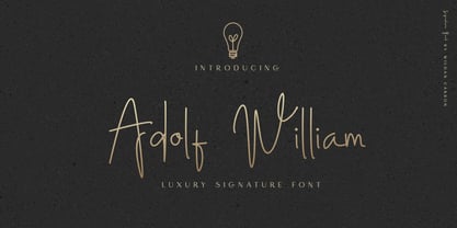 Adolf William is a handwritten signature script with a natural & stylish flow. This collection of scripts is perfect for personal branding. It was made with the intention to be used by Photographers as a watermark for Photography Business,personal branding & wedding invitations to advertising
 - Kopius by Kontour Type,
$50.00 The Kopius™ family is a contemporary serif type that features friendly characteristics with round, open counters conveying a relaxed ambiance. The robustness of the characters supports a wide variety of applications including editorial and display use. The uniquely defined novel glyph construction and serif shapes convey an allusion to a brush stroke that bestows a contemporary, texture-rich appearance entirely in tune with functionality. The top and bottom slightly curved stems imply flow and reading direction. Kopius is an exuberant family with a genuinely multifaceted repertoire. This upbeat type comes with a multitude of weights to satisfy any fanciful appetite for a colorful typographic palette. With packaging solutions in mind the family includes sets of expandable and combinable box heading material for a boundless range of adjusted composites. In addition, pertinent labels, weight-adjusted arrows, and word logos complete the Kopius family. OpenType provides advanced layout features including figure sets, small caps, fractions, and more. Herbert Thannhaeuser’s Liberta, an Antiqua type family designed for the East German type foundry VEB Typoart between the middle to end 1950s, has stirred the initial inspiring force for Kopius. Baskerville-like open and modern typeface proportions further characterize Kopius’ letter dimensions. With its affable yet serious demeanor, Kopius is confidently assuming numerous tasks.
 - Denedo by Andinistas,
$19.95Just like the M.C. Escher impossible figures and optical illusions, "Denedo" is a font that is impossible to construct in three dimensions because it only exists as a drawing. This font is based on the "0, 1, 2, 3, 4, 5, 6, 7, 8, 9" characters of one of the alphabets published by Nedo Mion Ferrario in the "Letromaquia" exhibition that was shown in Caracas, Venezuela in the 70's. The reason why I chose to restore and complete this font is that unique and exceptional personality that each word acquires when it is written with this alphabet. Denedo is a typographic family in three styles: Denedo 1A, 1B and 1C. When mixing them in big sizes you will emphasize the balance and incongruity of its shapes, providing originality and a unique identity to every word. All of the 3 variations include a complete character set with the lower and upper case letters, numbers, accents, diacritic signs, punctuation and monetary signs. All the fonts included in this family are available in Open Type format and are perfectly compatible with Mac and PC. I want to express my sincere gratitude to all my friends at Typophile who supported and motivated me during the final stages in the development of this font. - NS Blackbooks Victorian by Novi Souldado,
$35.00 Reminiscing the old era of historical books (seriously, that old), circa 19th century. We crafted the letters by connecting the dots from the past with research for every flow, ornaments, look, and feel, to precisely aim for that perfect shape. Ephemera Blackbooks are born with a dark and robust personality. Feel the European historical mood right away, even with just typing it with your keyboard. You don't even realize when the design is done cause we make it so easy as a one-click-time-machine to your works using Ephemera Blackbooks font. It will be a perfect armory for a vintage headline, old book cover concept, sign, posters, playing cards deck design, vintage labels, beer labels, bar decoration, apparel, merchandising, you name it. OTF Features : Stylistic Set 01 to 07 and Ligature Glyph Count : 355 glyphs Language support : Afrikaans, Albanian, AsuBasque, Bemba, Bena, Breton, Catalan, Chiga, Cornish, Danish, Dutch, English, Estonian, Faroese, Filipino, Finnish, French, Friulian, Galician, German, Gusii, Indonesian, Irish, Italian, Kabuverdianu, Kalenjin, Kinyarwanda, Luo, Luxembourgish, Luyia, Machame, Makhuwa-Meetto, Makonde, Malagasy, Manx, Morisyen, North Ndebele, Norwegian, Bokmål, Norwegian Nynorsk, Nyankole, Oromo, Portuguese, Quechua, Romansh, Rombo, Rundi, Rwa, Samburu, Sango, Sangu, Scottish Gaelic, Sena, Shambala, Shona, Soga, Somali, Spanish, Swahili, Swedish, Swiss German, Taita, Teso, Uzbek (Latin), Volapük, VunjoZulu
 - Couture Facile by Nathatype,
$29.00 Adding some beauty touches and perfect, unique styles to your designs, without which your designs will be incomplete and ignored, may be tough work and time-consuming. Therefore, Couture Facile is here to help you. Couture Facile is a handwriting-like script font to add combinations of beauty and styles to your designs properly. Its dissimilar, more natural shapes looking spontaneously written are the font’s main characters. In addition, its letters’ details show high contrasts in curvy, sharp scratches on the letters’ edges. Couture Facile shows personal, elegant, creative impressions to the designs and is suitable to apply for either big or small text sizes due to its great legibility. You can also enjoy the available features here. Features: Stylistic Sets Ligatures Multilingual Supports PUA Encoded Numerals and Punctuations Couture Facile fits best for various design projects, such as brandings, headings, magazine covers, quotes, invitations, greeting cards, printed products, merchandise, social media, etc. Find out more ways to use this font by taking a look at the font preview. Thanks for purchasing our fonts. Hopefully, you have a great time using our font. Feel free to contact us anytime for further information or when you have trouble with the font. Thanks a lot and happy designing.
 - Echo Soul by Set Sail Studios,
$14.00 Introducing Echo Soul; a free-flowing and carefree brush font duo, hand painted with love. Echo Soul speaks from the heart and doesn't hold back. With elongated brush strokes and a natural flow, it's the perfect choice for handwritten quotes, product packaging, and logo designs with a personal and affectionate touch. The Echo Soul family consists of; 1. Echo Soul • A handwritten script font containing upper & lowercase characters, numerals and a large range of punctuation. 2. Echo Soul Alt • This is a second version of Echo Soul, with a completely new set of lowercase characters. If you wanted to avoid letters looking the same each time to recreate a custom-made style, or try a different word shape, simply switch to this font for an additional layout option. 3. Echo Soul Sans • An all-caps font containing uppercase-only characters, perfect for supporting text to compliment the Echo Soul Script font. Also includes numerals and a large range of punctuation. Stylistic Alternates • Are also available for several lowercase characters - these have elongated tails and look great when placed at the end of a word. These can be used by turning on 'Stylistic Alternates' in OpenType capable software, or accessing via a Glyphs panel.
 - FS Matthew by Fontsmith,
$80.00 Developed for screen For not the first time, Fontsmith was commissioned to develop a font for one of the UK’s terrestrial TV channels. The product was a clearly-defined three-weight family. When italics were added, it became FS Matthew, a clean, stylish, structured sans serif with swooping, open curves and a bright, lively personality. Southbank Inspiration for many of the forms of FS Matthew came from details found within the modernist buildings and architecture of London’s Southbank, such as the Royal Festival Hall. During the font’s gestation, Jason had found himself at London Studios, a TV studio on Southbank, and a wander around the neighbouring arts buildings proved thought-provoking. The result was a font with a very British character: solid forms that provide the platform for innovation and distinctiveness. Feelgood efficiency FS Matthew’s trademark is efficiency with a feelgood factor: disciplined enough for corporate identities, websites and signing systems, and colourful enough for logotypes and advertising. Its versatility and excellent legibility are achieved via some unexpected details: the reaching curves of the “g” and “y”; the simple shape of the “u”; an off-kilter “k”; generous counters; and a slightly condensed aspect that makes FS Matthew a space-saver in text or title sizes.
 - Lugo by Eurotypo,
$90.00 The font "Lugo" is a heavy typeface designed for use in headlines and caption text. Their design has a strong visual impact, a persuasive and seductive personality throughout its organic shapes. This is a versatile and expressive font. Lugo can create an appealing atmosphere, conveying a gamut of message and emotions. It is well suited in the jobbing areas like packaging, logotypes, magazines, web pages and advertising, etc. Lugo has all the advantages of OpenType features that allow a variety of combinations: You may choose to set types in connected or unconnected ways, being used as body text or headlines for its good legibility, visual impact and accurate kerning. It has more than thousand glyphs: swashes, standard and discretional ligatures, stylistics and contextual alternates, old style numerals, word ending and tails. It has also an extended character set to support Central and Eastern European as well as Western European languages. Lugo is a city in northwestern Spain in the autonomous community of Galicia. The Celtic name Lug suggests that it may have been a sacred site. Augustus founded the Roman town of Lucus Augusti in 15-13 BCE following the pacification of this region. It is the only city in the world to be surrounded by completely intact Roman walls.
 - Pobla by Tipo Pèpel,
$22.00 Optimum readability in small bodies with scarce interlining, under poor printing conditions such as in newspapers, where velocity and bad quality’s irregular surface papers, truly distort strokes was the challenge taken. Pobla was designed with this in mind, hence Patau present a hybrid between the conventional strokes of a serif’s classical roman type and markedly “fractured” forms inside, providing a unique personality to this typographic family, where calligraphic’s humanistic axis is visibly broken with the straight axis of the fabricated letters. Subtle details in the serifs, give it a modern look to a classic skeleton. Very pronounced ink traps get the shapes rounded in the printed product to artificially increase the average medium-eye and promote reading in the small sizes it was designed for. An absolutely handwriting look for the italics, where the rupture of the stroke marks a white’s subtle change to only whisper in the printing surface a slight difference, but without fuss and so not to break the rhythm of reading. And as we are used to, a complete set of OpenType features, where you will find small caps, fractions, ligatures, old numerals and tabular, discretionary ligatures and support for 220 languages; and all available in twelve weights to meet the needs of any newspaper printing.
 - Peleguer by Tipo Pèpel,
$22.00 Peleguer typeface is the reinterpretation of the characters that the valencias goldsmiths Peleguer Manuel, father and son had opened and merged between 1779 and 1783 on behalf of the Royal Economic Society of Friends of the Land of Valencia “in order to create a Factory letters. Then during that time, reached 6 degrees of open letters (small pica, pica, gross pica, text, great primer and double pica). It appears that the letters never were done, and were themselves Manuel Peleguer who kept the punches and dies, leading to create a foundry-printing which only came out 5 or 6 books or documents for the single year of 1784 . One of these books, “Praise in the solemn funeral service …” made with the degree of “gross pica” samples were selected to take the characters for subsequent drawings on the following parameters for the unity and a contemporary look to the source: Keep the proportions of the original source (but unifying the shapes of the serifs, as these were different according to repose at baseline or in descending order). Match the counterforms and match the fallen traces from the cursive. En short, “catch” the formal essence of the source and following update current typographic design criteria to achieve a source with good legibility and subtle personality.
 - Rough Hearts by Nathatype,
$29.00 Do you want a handwriting style font in consistent, professional displays? Well, finding such fonts can be tough and time-consuming work. Therefore, Rough Hearts is here for your perfect choice. Rough Hearts is a font in a handwriting style with different, more natural shapes looking like spontaneously written letters. Each letter detail is made in swinging styles and this font also has high letter contrast, which means the thickness and thinness differences of the lines on each letter can be clearly seen. This font produces personal and creative impressions resulting in its legibility and attractiveness to apply for simply interesting design projects. You can use this font for big text sizes to be greatly legible and also enjoy the available features here. Features: Alternates Ligatures Stylistic Sets Multilingual Supports PUA Encoded Numerals and Punctuations Rough Hearts fits best for various design projects, such as brandings, headings, magazine covers, quotes, printed products, invitations, greeting cards, name cards, merchandise, social media, etc. Find out more ways to use this font by taking a look at the font preview. Thanks for purchasing our fonts. Hopefully, you have a great time using our font. Feel free to contact us anytime for further information or when you have trouble with the font. Thanks a lot and happy designing.
 - Med Splode - Unknown license

- Ligne Claire - 100% free

- New Alphabet - Unknown license

- DarkPix - Personal use only

- Pullchain - Personal use only


