10,000 search results
(0.034 seconds)
- Digitize - Unknown license
- Block Plus - Unknown license
- Lower Face - Unknown license
- gridbreak sans - Unknown license
- Tristeak Ribbon - Unknown license
- BiggerBetterFasterStrongerPeter - Unknown license
- Patriot by Barnbrook Fonts,
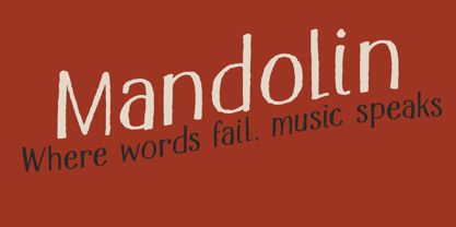
$30.00Patriot is the sans-serif version of Exocet and, like Exocet, is based upon early Greek and Roman stone-carving, yet it adheres more closely to the shared historical source material. Patriot was developed to include unique forms and alternative characters, becoming a striking original typeface in its own right. - Mandolin by Hanoded,
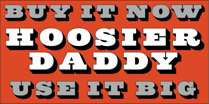
$15.00 - Hoosier Daddy by Parkinson,
$20.00 - Chevalier LP by LetterPerfect,
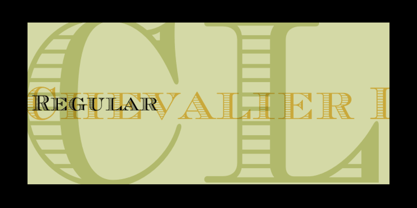
$39.00Chevalier LP is a revived decorative face with a European lineage. Its patterned and shaded 'fatface' letterforms exhibit the continent's 19th century fascination with elaborate engraving techniques, often used on currency as a deterrent against counterfeiting. It is not without reason that Chevalier conjures up images of bank notes and finance. - Prima Sans by Bitstream,
$29.99Prima is a series of fonts designed at Bitstream by Jim Lyles (Sans and Serif) and Sue Zafarana (Sans Mono), released in 1998. The fonts have been tuned to give exceptionally good quality at low screen resolutions. The fonts are therefore suitable for sustained use in browsers and other applications where users read for long periods from the screen. Of course, Prima looks great printed out too. - 1769 by Almarena,
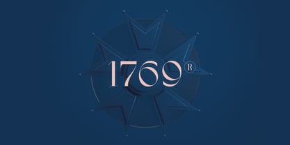
$22.001769® Display is an elegant and modern serif typeface inspired by the history of France and more particularly the Romantic movement (1700s and 1800s). The roundness of its characters and its numerous ligatures reflect the grace, refinement and sensitivity that were omnipresent during the 18th century. Its name refers to the birth of Napoleon Bonaparte, the fascinating or revolting emperor, the emblematic figure of this period. - Relampago NF by Nick's Fonts,
$10.00This distinctive titling face is based on Elegant Lichte, designed by Hans Möhring for D. Stempel in 1928, with the helpful addition of a lowercase not found in the original. It functions equally well as either a period piece or a contemporary masterpiece. Both versions include the complete Latin 1252, Central European 1250 and Turkish 1254 character sets, as wellas localization for Moldovan and Romanian. - Prima Serif by Bitstream,
$29.99Prima is a series of fonts designed at Bitstream by Jim Lyles (Sans and Serif) and Sue Zafarana (Sans Mono), released in 1998. The fonts have been tuned to give exceptionally good quality at low screen resolutions. The fonts are therefore suitable for sustained use in browsers and other applications where users read for long periods from the screen. Of course, Prima looks great printed out too. - Display Digits One by Gerald Gallo,
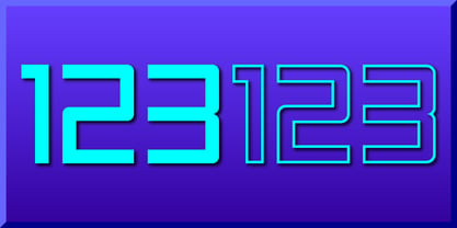
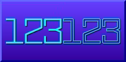
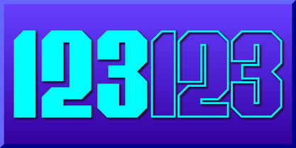
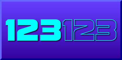
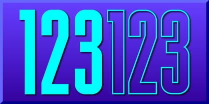
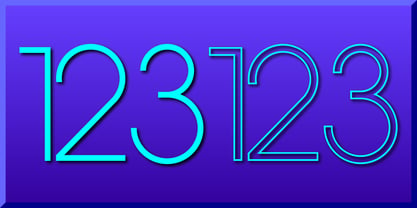
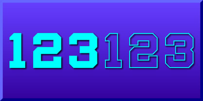
$20.00Display Digits One is a display number font with eight sets of variations of the same digits. The digits 0 through 9, with period and comma in appropriate variations, are prepared as (1) solid, (2) outline, (3) solid with contour outline, (4) outline with 3-D shadow, (5) 3-D shadow only, (6) outline with drop shadow, (7) positive in circle, (8) negative in circle. - Display Digits Six by Gerald Gallo,
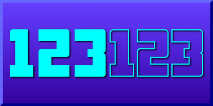
$20.00Display Digits Six is a display number font with eight sets of variations of the same digits. The digits 0 through 9, with period and comma in appropriate variations, are prepared as (1) solid, (2) outline, (3) solid with contour outline, (4) outline with 3-D shadow, (5) 3-D shadow only, (6) outline with drop shadow, (7) positive in circle, (8) negative in circle. - Johabu by Monotype,
$29.99Johabu is based on Gebrochene Fraktur, a lighter softer sort of type, compared to the German forms of the same period. Johabu was drawn by Johannes Bureus, around 1620, cut and cast by Peter van Selow in Stockholm. Johannes Bureus, archaeologist and linguist, designed and let Selow cast runes in 1598, and he became the first Swedish keeper, archivist, of the National Record Office State Archives. - Display Digits Four by Gerald Gallo,
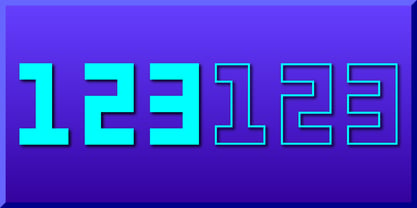
$20.00Display Digits Four is a display number font with eight sets of variations of the same digits. The digits 0 through 9, with period and comma in appropriate variations, are prepared as (1) solid, (2) outline, (3) solid with contour outline, (4) outline with 3-D shadow, (5) 3-D shadow only, (6) outline with drop shadow, (7) positive in circle, (8) negative in circle. - Ink Spots JNL by Jeff Levine,
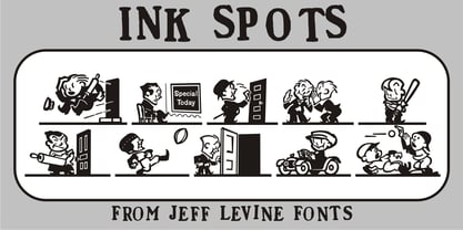
$29.00For decades, spot illustrations - whether by hot type, photoengraving, clip art or (in later years) digital means provided decorative and often lighthearted breaks in reading printed copy. This collection of twenty-six cartoon images has been meticulously re-drawn in digital format from 1920s-1930s era source material. By adding a simple caption underneath a design, your ad copy can be enhanced with these wonderful period pieces. - Wittenbach by Scriptorium,
$18.00Wittenbach is based on lettering by Rudolf Koch which really embodies the essence of classic gothic-style poster lettering of the 1920s. It brings together the traditional style of gothic lettering and a strong, more modern sensibility characteristic of Koch's work and his era. It is very vertical and stylized, but also extraordinarily attractive without the harshness of many of the designs of that period. - Gjallarhorn by Scriptorium,
$18.00Gjallarhorn is based on uncial-style lettering by artist Willy Pogany from his titles for Padraig Colum's classic collection of Scandinavian myths, The Children of Odin. It has various peculiar letter forms, and the font includes two or more different versions of many of the characters. An excellent example of stylized hand lettering by one of the great decorative artists of the Art Nouveau period. - Granville by Greater Albion Typefounders,
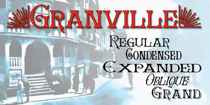
$14.95Granville, is inspired by traditional British (and transatlantic) shop signage. It's an elaborate confection, drawing on Roman and Blackletter influences and is ideal to give any project an instant Victorian feel. Granville is offered in Regular, Condensed and Expanded widths as well as an oblique form and a yet more decorative 'Grand' form. These faces are especially suitable for posters, period advertising, Chapter headings and signage. - Display Digits Seven by Gerald Gallo,
$20.00Display Digits Seven is a display number font with eight sets of variations of the same digits. The digits 0 through 9, with period and comma in appropriate variations, are prepared as (1) solid, (2) outline, (3) solid with contour outline, (4) outline with 3-D shadow, (5) 3-D shadow only, (6) outline with drop shadow, (7) positive in circle, (8) negative in circle. - Renard Moderne NF by Nick's Fonts,
$10.00Twentieth Century Poster, designed by Sol Hess for Lanston Monotype in the 1940s, provided the inspiration for this family of faces. Although, historically, the design falls outside the time period normally considered the Art Deco era, its sensibilities are pure Art Moderne. Both versions of this font contain the Unicode 1252 (Latin) and Unicode 1250 (Central European) character sets, with localization for Romanian and Moldovan. - SK Sistematica by Shriftovik,
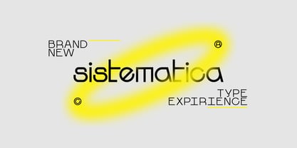
$32.00SK Sistematica is a unique modular geometric font. It combines the experimental features of the constructivist period and the strict consistency inherent in the grotesques. SK Sistematica is adapted to modern needs and technologies, which allows it to be easily combined with current design trends. The font is suitable for a wide range of applications: from corporate identification to advertising graphics, from web design to typographic design. - Display Digits Nine by Gerald Gallo,
$20.00Display Digits Nine is a display number font with eight sets of variations of the same digits. The digits 0 through 9, with period and comma in appropriate variations, are prepared as (1) solid, (2) outline, (3) solid with contour outline, (4) outline with 3-D shadow, (5) 3-D shadow only, (6) outline with drop shadow, (7) positive in circle, (8) negative in circle. - 1585 Flowery by GLC,
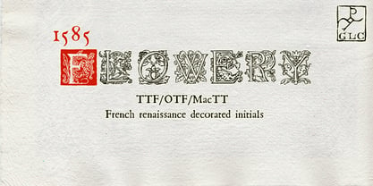
$20.00This set of initial letters was inspired from French renaissance decorated letters. Unfortunately, we don't know where they were in use, or who was the punchcutter, our models were coming from a late XIXth century copy. Note: The letters I and J, U and V are not different. It is not a mistake, but it is the exact reflection of what was customary during the period. - Century Old Style by Linotype,
$29.99In 1894, Linn Boyd Benton finished a commission for a new text typeface with the American periodical, Century magazine. Century is typical of the neorenaissance movement in typography at the end of the 19th century. Morris Fuller Benton drew a number of versions of the font for the font foundry, American Typefounders, and Century was later taken up by the firms Linotype, Intertype and Monotype. - Display Digits Ten by Gerald Gallo,
$20.00Display Digits Ten is a display number font with eight sets of variations of the same digits. The digits 0 through 9, with period and comma in appropriate variations, are prepared as (1) solid, (2) outline, (3) solid with contour outline, (4) outline with 3-D shadow, (5) 3-D shadow only, (6) outline with drop shadow, (7) positive in circle, (8) negative in circle. - Display Digits Five by Gerald Gallo,
$20.00Display Digits Five is a display number font with eight sets of variations of the same digits. The digits 0 through 9, with period and comma in appropriate variations, are prepared as (1) solid, (2) outline, (3) solid with contour outline, (4) outline with 3-D shadow, (5) 3-D shadow only, (6) outline with drop shadow, (7) positive in circle, (8) negative in circle. - Brave Eighty One by Alit Design,
$12.00Brave Eighty One is inspired by futuristic design concepts and space-like design concepts. This font is good for future, modern, space, sports, bold and speed themed designs. This font is perfect for collecting on your computer for up-and-coming design projects or work in progress, because the Brave Eighty One has no trending period, and will always look cool whatever year it is. - Nuevo Litho by Hackberry Font Foundry,
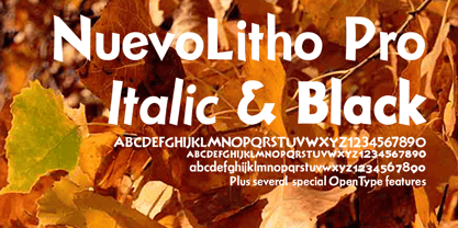
$24.95NuevoLitho is my first successful font design. It was designed for use in the heads and subheads of my first book, “Printing in a Digital World” back in 1994. It’s a very loosened play on Lithos, Carol Twombly’s fashionable font of the period. However, I added a complete lowercase set, several special characters, and all the other fun stuff I do with my fonts. - Bordeaux by ITC,
$40.99David Quay designed Bordeaux to exhibit characteristics common in the typefaces of the Romantic era, the period which produced the novels of Victor Hugo, the music of Berlioz and the fairy tales of Hans Christian Andersen. Bordeaux displays the emotive quality one associates with the times. The font is intended for titles and headlines and combines well with Syntax for the body of the text. - Art Deco Flowery Initials by Celebrity Fontz,
$19.99Art Deco Flowery Initials is a collection of richly decorated Art Deco letters set on a background of vines and blooming flowers. Includes one set of A-Z ornamental initials conveniently assigned to both the upper and lower case alphabet characters. Perfect for starting off the beginning of paragraphs in artistic publications, storybooks, fairy tales, and texts conveying the feel of the Art Deco period. - Leibniz Fraktur by RMU,
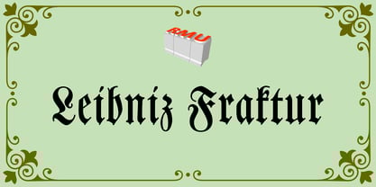
$25.00In the middle of 18th century Leibniz Fraktur appeared in German print shops. This blackletter font with its great x-height preserved the then fashioned trunk in many of its uppercase letters. It was a cast font of Genzsch & Heyse, Hamburg. Leibniz Fraktur contains a bunch of useful ligatures, and by typing 'N', 'o' and period plus activating the Ordinals feature you get an oldstyle number-sign. - Display Digits Eight by Gerald Gallo,
$20.00Display Digits Eight is a display number font with eight sets of variations of the same digits. The digits 0 through 9, with period and comma in appropriate variations, are prepared as (1) solid, (2) outline, (3) solid with contour outline, (4) outline with 3-D shadow, (5) 3-D shadow only, (6) outline with drop shadow, (7) positive in circle, (8) negative in circle. - Hoyer Script by RMU,
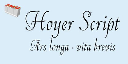
$30.00Hoyer Script™ is a fresh redesign of Hans Hoyer’s Schoenschrift, a slender vintage italic with a calligraphic touch. This font should be used like my blackletter fonts. It means that the s-key is occupied by the long s, and the round s lies on the #-key. By typing N, o, and period plus activating Ordinals feature you will get an old-style number sign. - Kelyon by Valentino Vergan,
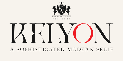
$16.00Kelyon is a sophisticated and modern serif, inspired by the late Middle Ages and early renaissance period. Kelyon was designed with a very thin hairline and long serifs, this reflects the charm and feel of the 14th century. With over 60 stylistic ligatures, Kelyon is great for headlines and short to medium texts. Kelyon is compatible with 93 languages and contains 439 glyphs, including several alternatives. - Ambergate by Greater Albion Typefounders,
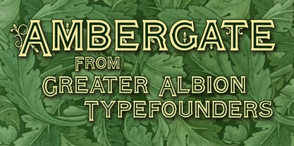
$19.00Ambergate is a new typeface family redolent of the late 19th and early 20th centuries. It’s a display family of four small capitals roman faces, incised and elaborated with filigree scrollwork. The four typefaces which comprise the family recapture the elegance of traditional flourished sign writing and make and provide ideal lettering for period inspired design work such as posters, signage and book covers. - Display Digits Two by Gerald Gallo,
$20.00Display Digits Two is a display number font with eight sets of variations of the same digits. The digits 0 through 9, with period and comma in appropriate variations, are prepared as (1) solid, (2) outline, (3) solid with contour outline, (4) outline with 3-D shadow, (5) 3-D shadow only, (6) outline with drop shadow, (7) positive in circle, (8) negative in circle.


