10,000 search results
(0.144 seconds)
- Itoxina by FSdesign-Salmina,
$39.00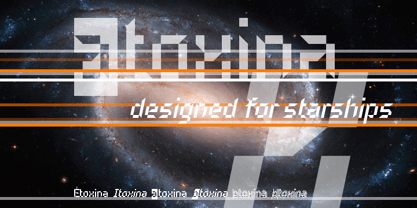 Itoxina is designed especially for the burgeoning market of starships and other space cruisers. Itoxina has been developed with the contribution of experts in navigation through space and time. The fonts are ideal for internal and external use (including zero-g and occasional bursts of cosmic rays), and with their simplified forms are expected to survive well in non-linear galaxies. With their unusual diagonal half-pixels the fonts are striking as abstract designs at astronomical sizes, where small text may be placed within the black holes formed inside the letters. On explicit suggestion of Mr. Spock true capital letters have been added.
 - Sassoon Felt by Sassoon-Williams,
$48.00 Sassoon Felt’s more casual letterforms can be used either as informal text or for the teaching of reading and handwriting; having the letterforms most taught in UK schools. These fonts are an educators alternative to Comic Sans (from Microsoft) and Chalkboard (from Apple), which are more appropriate for ‘Print’ style writing in United States Elementary schools and may also be appropriate for parts of Australia, which can be identified usually by crucifix t, diagonal y downstroke, short f, two-stroke and there may be more. Free to download resources: How to access Stylistic Sets of alternative letters in these fonts
 - Monckeberg by Latinotype,
$29.00 Monckeberg is an expressive font with a strong personality which is based on 15th century classic Venetian typefaces. High contrast between thin and thick strokes, calligraphic features and diagonal stress are its most striking characteristics. Monckeberg is ideal for short text and paragraphs, and specially designed for logos, branding, editorial design and web use. Monckeberg consists of 2 subfamilies of 9 weights, from Thin to Heavy, with matching italics, resulting in a total of 36 fonts. The basic family is classic and elegant while the alternative version allows for greater design freedom. Monckeberg contains 511 characters that support over 200 Latin-based languages.
 - Grobek by Latinotype,
$25.00 Grobek is a serif typeface inspired by Garamond and American Typewriter fonts as well as classic 15th century typefaces. Its main features are a diagonal stress and soft curved teardrop shape terminals. Grobek comes in 8 weights, from Thin to Heavy, with matching italics- 32 styles in all. The font consists of 2 subfamilies: the basic family is classic yet contemporary while the alternative version has a stronger personality and allows more design freedom. Grobek is ideal for short text and paragraphs, and specially designed for logos, branding, editorial design and web use. This font contains 576 characters that support over 200 Latin-based languages.
 - Vanguardia by Latinotype,
$29.00 Vanguardia is an expressive and modern monolinear serif family, which thanks to its low contrast it differentiates itself from traditional serif fonts. Its strikingly exaggerated terminals such as in the letters a, e, c, and C, S, G and E, etc. Together with its diagonal cuts, gives it a very unique character. It is ideal for logos, branding, packaging, high-impact titles, labels, liquor and beverage packaging, as well as use in web, film and television. Vanguardia comes with 8 weights, from fine to black, and matching italics, resulting in a total of 16 fonts. Each font style supports more than 200 Latin languages, Vanguardia also includes a basic Cyrillic set.
 - Galaxus by Sharkshock,
$115.00 Galaxus is an edgy display font defined by its tight spacing, sleekness, and short descenders. Curvature is limited throughout the character set with straightened lines dominating the interior. Traditional diagonals in capitals like M, N, W and Y are given the straight treatment to maintain vertical emphasis. This styling along with the contrast between thick and thin make for a unique look. Galaxus would work well in a logo, on sports apparel, or in a video game. This family is equipped with Basic Latin, Extended Latin, diacritics, punctuation, kerning, and comes in 4 versions.
 - Haverj by ParaType,
$30.00 An original typeface designed for ParaType in 2004 by Armenian designer Manvel Shmavonyan. Based on the lettering created in 1970s by outstanding Armenian type designer Henrik Mnatsakanyan (1923-2001) of the same name. In Armenian ‘Haverj’ means ‘Eternally’. The face resembles many regular text serif fonts but elements like serifs and terminals make it eccentric and a little bit funny. The shape of diagonal legs in capital K and R resembles book lettering of the 1950s—60s. Using it in text, advertising and display typography may lead to surprising effects.
 - Big Jim Roberts SRF by Stella Roberts Fonts,
$25.00 Big Jim Roberts was my dad. A dedicated family man who taught us about faith, values and love is missed by our family. Jim just about did it all. He was a military man, a police officer, a power company engineer and a photographer. This typeface (which is comprised of a bold lower-case alphabet) has a 70s retro feel. Jim might have like it. The net profits from my font sales help defer medical expenses for my siblings, who both suffer with Cystic Fibrosis and diabetes. Thank you.
 - Vintage Reclame by Putracetol,
$32.00 Vintage Reclame is a vintage script font. As the name suggests, this font is inspired by classic billboards/boards. Besides that, I also combine it with a script style and it's a little irregular in its shape / bouncy style. I strengthen the vintage/retro impression with the character ligatures, there are 140 ligatures in this font. But if you want to use this font with a neater impression, you can disable this ligature feature. This font is perfect for projects with vintage/retro and classic themes. But this font is also suitable for logos, branding, greeting cards, invitation cards, advertisements, titles, healines, book titles, stickers, packaging, quotes, posters, t-shirts/apparel, billboards and others. This font is also support multi language.
 - Btoxina by FSdesign-Salmina,
$39.00 Btoxina is a free interpretation of the theme pixel font. With its technological feeling, it reflects the spirit of our age. By designing the font Filippo Salmina, the author, has been inspired by the signage used in starships. Btoxina is grid-based but it differs from classical screen fonts by the use of diagonal lines. It is characterized by the renouncement of the use of capital letters in favor of using negative letters and by the automatic generation of ligatures. The typeface is available in two different styles: Atoxina (regular) and Btoxina (italic). Btoxina is especially suited for headlines in cool or experimental typography; be careful though, this font is toxic, we deny any responsibility for its use!
 - Display Hatched by Greater Albion Typefounders,
$16.50 Display Hatched is ideal for posters with an industrial theme and is designed as a complement to Greater Albion’s “Singwriter Standard” typeface. All glyphs are diagonally shaded giving just a delicate touch of ‘industrial edge’ which is so ‘on trend’ at the moment. Display Hatched includes small capitals and title forms, as well as three forms of numerals. Bring a little industrial grit to your next project!
 - Anarckhie by Ingrimayne Type,
$12.95 Anarckhie is a decorative slab-serifed typeface with a calligraphic origin. The horizontal elements of the upper-case letters are below their midpoint, and the x-height of the lower-case letters is unusually small. There is some variation in the weights of the horizontal, vertical, and diagonal elements. The small x-height makes this typeface appear smaller than its point size would indicate.
 - Road Stencil by Wundes,
$15.00Road Stencil is a font based on painted street markings. The letters are stretched roughly six times their normal height so that when viewed from an angle, the text is seen as proportional. If you're looking to Photoshop a street scene, this is your font. This is an all caps font, but the letters were copied to lower-case for convenience. In these forms, I've preferred to use horizontal and diagonal dividers instead of verticals which can weaken the fonts readability. This font embodies a pleasant aesthetic while maintaining a coherent and believable feel. Check out the 'Rough' version of this font, which has more of a 'drawn on asphalt' look. The rough version's lower case letters have eroded alternates. - Belgique NF by Nick's Fonts,
$10.00Here's another example from the William H. Page Company, originally called French Clarendon XXX Condensed No. 117. This version dials up the contrast, making it suitable for tight headlines in large sizes. Both versions of this font support the Latin 1252, Central European 1250, Turkish 1254 and Baltic 1257 codepages. - Mordings JNL by Jeff Levine,
$29.00Mordings JNL is an odd-lot collection of images. These assorted dingbats are leftover art that never quite made it to one particular dingbat font category, but together comprise an eclectic assortment. Topics range from weather to vintage-style restaurant menu icons to decorative embellishments to an old-fashioned telephone dial. - EFCO Osbert by Ilham Herry,
$19.00 Meet Osbert, the font that effortlessly marries vintage charm with a contemporary flair. Imagine the nostalgic allure of old tin labels, now reimagined with a fresh twist. With its playful flared serifs and diagonal bars, Osbert brings a touch of modern to classic aesthetics. Boasting a whopping 15 static styles and a variable font, Osbert offers a playground of possibilities for designers. And with three distinct sub-families - text, regular, and display - finding that perfect balance in your designs has never been easier, whether you're crafting some typographic badges, editorial, logo, branding, poster, print, signage, etc. So go ahead, let Osbert add a touch of timeless coolness to your next project!
 - Aptly by Shinntype,
$30.00 The concept is “Geo-Soft”: characters are constructed from arcs of circle connected by orthogonal straight lines, with few diagonals and nary a sharp corner. The effect has an engaging tension, as soft edges are carefully balanced against rigorous structure. All four of the main weights, including italics, have exactly the same metrics. Beyond these basic styles, suitable for both text and headline, there are additional display fonts—Extra Bold and Black for density, and College, Rust, Rough and Medium Shadow for decorative detail. As options, minuscule-form “a” and “e” are provided at cap height for the classic unicase style, in all 14 fonts.
 - Nula by Tour De Force,
$25.00 Nula is humanist sans serif family equipped with 22 font files - 11 weights and italics - from Thin to Heavy. It is modern, functional and distinctive, ideal for multiple purposes. Curvy diagonal stems and endings characterize Nula as typeface with lively elegant and soft touch, but stable, well structured typeface at same time. Nula font family is fully legible in any size and with it's variety of weights recommends itself for publishing or online magazine. Nula includes stylistic alternate letters, tabular and old style numerals, fractions, numerators and denominators, alternate forms of numerals and bunch of applicable symbols with arrows that are exchangeable in all weights, following weight thickens.
 - Yearling by Chank,
$99.00 The Yearling fonts are inspired by old propaganda poster letter forms of the 20th century. However, they're also intended to work well in modern communications as well. Yearling was originally created to look good via fax (LOL!), and because it's based on a very rigid grid (like pixels on your screen), this font family also works well on smartphones and modern tablets, too. Short on curves and diagonals, these letterforms are a celebration of horizontal and vertical. But most importantly, this font is simple and clean and clear and direct. Nothing fancy here, just the facts, as modern as can be. Recently updated with extra language support for many voices across the world.
 - Ctoxina by FSdesign-Salmina,
$39.00 The Ctoxina family is growing. Due to the success the author decided to add an outline version of the font. The typeface is now available in 6 different styles: light, light italic, regular, italic, bold and bold italic. The Atoxina family is designed especially for the burgeoning market of starships and other space cruisers. The fonts are ideal for internal and external use (including zero-g and occasional bursts of cosmic rays), and with their simplified forms are expected to survive well in non-linear galaxies. With their unusual diagonal half-pixels the fonts are striking as abstract designs at astronomical sizes, where small text may be placed within the black holes formed inside the letters.
 - Monotype Goudy Catalogue by Monotype,
$29.99Originally designed for American Type Founders, Goudy drew inspiration from the classical old style faces for Goudy Old Style. Round characters have a strong diagonal stress, ascenders are fairly long but descenders are very short. Goudy bold was introduced in 1920; this was designed by Morris Fuller Benton. This typeface has been particularly popular in America where it is extensively used in advertising, book jackets, for labels and packaging. - Macbeth by Linotype,
$29.99 Macbeth is a heavy, condensed Art Deco-style typeface from Linotype. Macbeth includes some particularly noteworthy diagonal elements -- these enliven the design and give typeface its overall character. Macbeth should be used for music-oriented applications, or anything that is both reminiscent of the early 20th Century and a bit spooky. The letters in Macbeth are quite similar to display style found on Frankenstein posters, and those of other early films.
 - Disoluta - Personal use only

- LOVE-BOX - Personal use only

- Indulta SemiSerif - Personal use only

- Monserga FFP - Personal use only

- Lido STF - Personal use only

- Arabolical, designed by BenTagain, is a striking font that stands out for its unique blend of traditional Arabic calligraphic art and modern design elements. This font is a visual feast, merging the ...
- Femi SRF by Stella Roberts Fonts,
$25.00 People often come into your life and make a significant impression that lasts a lifetime. Be they friend, family member or relationship partner, such people are rare and endearing. Sadly, we lose many of these individuals before their time. Femi SRF is dedicated to one such person who was in Stella's life and whose memory will live on long past the duration of his mortal existence. Like Femi himself, this typeface offers a touch of bold elegance and discipline. The net profits from my font sales help defer medical expenses for my siblings, who both suffer with Cystic Fibrosis and diabetes. Thank you.
 - Lucemita - Personal use only

- Orden by ParaType,
$30.00 PT Orden™ was designed by Oleg Karpinsky in 2000-2001 and licensed by ParaType. Orden is a genuine Cyrillic typeface, it contains antique Cyrillic letter forms such as d, z, N with a diagonal stroke, symmetrical Y ,× and Ù, rare in modern typography. Another specialties: one alphabet and old style figures. Lower case consists of upper case letters except for some alternative variants of the capitals. For use in advertising and display typography.
 - FF Marselis Serif by FontFont,
$58.99FF Marselis crossbreeds geometric and humanistic forms, creating a freshly dynamic sans serif family. All of the counters in the typeface are open; this aids readers’ eyes quickly flow across lines of text, without experiencing hang-ups. Certain superfluous strokes have been eliminated – there are no spurs on the b or q, for instance. The alphabet’s diagonals all bow outwards slightly, adding flavor to the “A”, “K”, “R”, “V”, “W”, “X”, “Y” and “Z”. - NOh Carbone by OhType!,
$32.00 NOh CARBONE is a serif typeface with more than 250 glyphs, including Capitals, Small Letters, Numbers & Special glyphs and Punctuation. Appropriate for medium and large formats, its high contrast, strong features & aggressive and unconventional diagonal endow it with great elegance and give it distinction over other types of the same style. This typeface is adapted to different topics and applications, is easily modifiable and capable of generating a clear and direct message.
 - Hisham by Linotype,
$187.99Hisham is a modern Arabic headline face, designed by the Lebanese calligrapher, Ahmed Maged, originally for Linotype-Hell Ltd. The Hisham design has a distinctive style with a strong baseline, relieved by strategic cut-away effects, which is counterbalanced by the bold vertical strokes and some strong diagonals. This somewhat compact font adds a new style to the range of Linotype’s Arabic headline fonts. This OpenType font includes Latin glyphs from Optima Extra Black, allowing users to set text in both most Western European and Arabic languages without switching between fonts. Hisham incorporates the Basic Latin character set and the Arabic character set, which supports Arabic, Persian, and Urdu. The font also includes tabular and proportional Arabic, Persian, and Urdu numerals, as well as a set of tabular European (Latin) numerals. - Aziga by Eclectotype,
$40.00 In a typeface category that has been sorely under-represented until now, Aziga is a high (occasionally reversed) contrast, postmodern, deconstructed-reconstructed, serifless (mostly), fashion didone! Aziga lends itself to being set loud and proud, and the consistent angles throughout the glyphs make it a good candidate for more abstract typographic compositions. For the really graphically inclined (excuse the pun) a rotation of 66° will make the main diagonals in the font horizontal and vertical. Cool right? Features include stylistic and contextual alternates, ligatures and case sensitive forms. This is an unusual font, that’s for sure, but give it a try and you'll be rewarded with layouts that really stand out from the crowd.
 - Rival by Mostardesign,
$25.00 Rival – A serif font family with contemporary distinctive signs Rival is a modern serif font family inspired by characters drawn with a round nib, it has many distinctive signs such as broken curves, slightly curved downstrokes, curved diagonals, and curved, slanted axes. All these typographic tokens gives Rival a modern and contemporary aspect for all kinds of graphic projects. It comes in 7 weights with corresponding italics and it’s suited for multiple purposes including display and editorial use, especially for advertising, long text, packaging and branding. Rival provides advanced typographical support with OpenType features such as small caps, ligatures, discretionary ligatures, old style figures, case-sensitive forms, slashed zero, fractions, and pro kerning.
 - Blackberry by Los Andes,
$25.00 Blackberry is a display typographical family inspired on the design of vintage packaging, old fashion ads and show business marketing campaigns. This font brings back Woodtype characteristics such as angular serifs, and light and diagonal curves, which make it a fresh and current proposal for contemporary design needs. Blackberry has a dynamic system of layers that include 3D extrusions, shadows, outline and inline graphics, as well as a series of dingbats and flags. The system is supported for over 200 Latin-based languages. In total, the 10 Blackberry fonts provide a wide array of combinations and possibilities for high impact graphics, such as labels, packaging, posters, branding, record and movie covers, among others.
 - Dislope Display by Slope Type Foundry,
$15.00 Are you looking for a sleek, clean, and futuristic font for your projects? Dislope Display is the font for you! Dislope Display is a geometric sans serif typeface with mono-weight strokes and distinctive, fluid diagonals. Futuristic and dystopian films, TV series, and games inspired its minimal yet striking characteristics. Its simplicity makes it easily adaptable to the needs of even the most specialized projects. Dislope Display's carefully adjusted spacing and kerning ensure amazing-looking titles, headings, logotypes, and all other medium to large-form text. Each weight has a complete, comprehensive glyph set of 183 glyphs, and the family has a total of 549 glyphs. Dislope Display can be used in any text-manipulating program once installed.
 - Foros by ParaType,
$30.00 Foros(tm) is a modern humanist sanserif font family of 8 styles. Each style contains beside many other alternatives of upper and lowercase letters a 'unicase' character set. Foros is a development of a modern pattern of rough geometric shapes in combination with open humanistic forms that produces a mixture of obstinacy and delicacy. Quadratic shapes of ovals bring stability and firmness, but angular terminals of diagonals in several letters together with curved junctions of bowls with verticals stems add emotions and elegance. Such variety in image make it possible to use the fonts in different kinds of display typography. Foros type family was designed by Oleg Karpinsky. Released by ParaType in 2013.
 - Aloalla by Putracetol,
$28.00 Aloalla is Decorative Retro Sans Serif Font. This font also goes into a classic style, with a neat and soft shape. There is a rough/texture version too. I strengthen the vintage/retro impression with the character ligatures, there are 118 ligatures in this font. But if you want to use this font with a neater impression, you can disable this ligature feature. This font is perfect for projects with vintage/retro and classic themes. But this font is also suitable for logos, branding, greeting cards, invitation cards, advertisements, titles, healines, book titles, stickers, packaging, quotes, posters, t-shirts/apparel, billboards and others. This font is also support multi language. To access the alternate glyphs, you need a program that supports OpenType features such as Adobe Illustrator CS, Adobe Photoshop CC, Adobe Indesign and Corel Draw.


