10,000 search results
(0.298 seconds)
- Helvetica Hebrew by Linotype,
$65.00Helvetica is one of the most famous and popular typefaces in the world. It lends an air of lucid efficiency to any typographic message with its clean, no-nonsense shapes. The original typeface was called Neue Haas Grotesk, and was designed in 1957 by Max Miedinger for the Haas'sche Schriftgiesserei (Haas Type Foundry) in Switzerland. In 1960 the name was changed to Helvetica (an adaptation of Helvetia", the Latin name for Switzerland). Over the years, the Helvetica family was expanded to include many different weights, but these were not as well coordinated with each other as they might have been. In 1983, D. Stempel AG and Linotype re-designed and digitized Neue Helvetica and updated it into a cohesive font family. At the beginning of the 21st Century, Linotype again released an updated design of Helvetica, the Helvetica World typeface family. This family is much smaller in terms of its number of fonts, but each font makes up for this in terms of language support. Helvetica World supports a number of languages and writing systems from all over the globe. Today, the original Helvetica family consists of 34 different font weights. 20 weights are available in Central European versions, supporting the languages of Central and Eastern Europe. 20 weights are also available in Cyrillic versions, and four are available in Greek versions. Many customers ask us what good non-Latin typefaces can be mixed with Helvetica. Fortunately, Helvetica already has Greek and Cyrillic versions, and Helvetica World includes a specially-designed Hebrew Helvetica in its OpenType character set. Helvetica has also been extende to Georgian and a special "eText" version has been designed with larger xheight and opened counters for the use in small point sizes and on E-reader devices. But Linotype also offers a number of CJK fonts that can be matched with Helvetica. Chinese fonts that pair well with Helvetica: DF Hei (Simplified Chinese) DF Hei (Traditional Chinese) DF Li Hei (Traditional Chinese) DFP Hei (Simplified Chinese) Japanese fonts that pair well with Helvetica: DF Gothic DF Gothic P DFHS Gothic Korean fonts that pair well with Helvetica: DFK Gothic" - Helvetica Thai by Linotype,
$149.00Helvetica is one of the most famous and popular typefaces in the world. It lends an air of lucid efficiency to any typographic message with its clean, no-nonsense shapes. The original typeface was called Neue Haas Grotesk, and was designed in 1957 by Max Miedinger for the Haas'sche Schriftgiesserei (Haas Type Foundry) in Switzerland. In 1960 the name was changed to Helvetica (an adaptation of Helvetia", the Latin name for Switzerland). Over the years, the Helvetica family was expanded to include many different weights, but these were not as well coordinated with each other as they might have been. In 1983, D. Stempel AG and Linotype re-designed and digitized Neue Helvetica and updated it into a cohesive font family. At the beginning of the 21st Century, Linotype again released an updated design of Helvetica, the Helvetica World typeface family. This family is much smaller in terms of its number of fonts, but each font makes up for this in terms of language support. Helvetica World supports a number of languages and writing systems from all over the globe. Today, the original Helvetica family consists of 34 different font weights. 20 weights are available in Central European versions, supporting the languages of Central and Eastern Europe. 20 weights are also available in Cyrillic versions, and four are available in Greek versions. Many customers ask us what good non-Latin typefaces can be mixed with Helvetica. Fortunately, Helvetica already has Greek and Cyrillic versions, and Helvetica World includes a specially-designed Hebrew Helvetica in its OpenType character set. Helvetica has also been extende to Georgian and a special "eText" version has been designed with larger xheight and opened counters for the use in small point sizes and on E-reader devices. But Linotype also offers a number of CJK fonts that can be matched with Helvetica. Chinese fonts that pair well with Helvetica: DF Hei (Simplified Chinese) DF Hei (Traditional Chinese) DF Li Hei (Traditional Chinese) DFP Hei (Simplified Chinese) Japanese fonts that pair well with Helvetica: DF Gothic DF Gothic P DFHS Gothic Korean fonts that pair well with Helvetica: DFK Gothic" - Helvetica Monospaced Paneuropean by Linotype,
$89.00Helvetica is one of the most famous and popular typefaces in the world. It lends an air of lucid efficiency to any typographic message with its clean, no-nonsense shapes. The original typeface was called Neue Haas Grotesk, and was designed in 1957 by Max Miedinger for the Haas'sche Schriftgiesserei (Haas Type Foundry) in Switzerland. In 1960 the name was changed to Helvetica (an adaptation of Helvetia", the Latin name for Switzerland). Over the years, the Helvetica family was expanded to include many different weights, but these were not as well coordinated with each other as they might have been. In 1983, D. Stempel AG and Linotype re-designed and digitized Neue Helvetica and updated it into a cohesive font family. At the beginning of the 21st Century, Linotype again released an updated design of Helvetica, the Helvetica World typeface family. This family is much smaller in terms of its number of fonts, but each font makes up for this in terms of language support. Helvetica World supports a number of languages and writing systems from all over the globe. Today, the original Helvetica family consists of 34 different font weights. 20 weights are available in Central European versions, supporting the languages of Central and Eastern Europe. 20 weights are also available in Cyrillic versions, and four are available in Greek versions. Many customers ask us what good non-Latin typefaces can be mixed with Helvetica. Fortunately, Helvetica already has Greek and Cyrillic versions, and Helvetica World includes a specially-designed Hebrew Helvetica in its OpenType character set. Helvetica has also been extende to Georgian and a special "eText" version has been designed with larger xheight and opened counters for the use in small point sizes and on E-reader devices. But Linotype also offers a number of CJK fonts that can be matched with Helvetica. Chinese fonts that pair well with Helvetica: DF Hei (Simplified Chinese) DF Hei (Traditional Chinese) DF Li Hei (Traditional Chinese) DFP Hei (Simplified Chinese) Japanese fonts that pair well with Helvetica: DF Gothic DF Gothic P DFHS Gothic Korean fonts that pair well with Helvetica: DFK Gothic" - M XiangHe Hei TC Variable by Monotype,
$1,049.99The M XiangHe Hei Traditional Chinese typeface merges traditional brush strokes with modern letterforms to carefully balance traditional calligraphy with humanist design. Named for the smooth movements of a flying crane, the M XiangHe Hei typeface is designed to glide across the page, and features strokes that are partly derived from the Kaishu calligraphic style – an everyday script which dates back hundreds of years. Seol Sans features Neue Frutiger for its Latin glyphs, and works harmoniously with Neue Frutiger World and Monotype’s CJK typefaces Tazugane Info (Japanese) and Seol Sans (Korean). M XiangHe Hei is a great choice for global brands using sans serif Latin typefaces looking to maintain their visual identity, and communicate with a consistent tone of voice with Traditional Chinese.¶ - M XiangHe Hei SC Pro by Monotype,
$187.99The M XiangHe Hei Simplified Chinese typeface merges traditional brush strokes with modern letterforms to carefully balance traditional calligraphy with humanist design. Named for the smooth movements of a flying crane, the M XiangHe Hei typeface is designed to glide across the page, and features strokes that are partly derived from the Kaishu calligraphic style – an everyday script which dates back hundreds of years. Seol Sans features Neue Frutiger for its Latin glyphs, and works harmoniously with Neue Frutiger World and Monotype’s CJK typefaces Tazugane Info (Japanese) and Seol Sans (Korean). M XiangHe Hei is a great choice for global brands using sans serif Latin typefaces looking to maintain their visual identity, and communicate with a consistent tone of voice with Simplified Chinese. - M XiangHe Hei SC Std by Monotype,
$187.99 The M XiangHe Hei Simplified Chinese typeface merges traditional brush strokes with modern letterforms to carefully balance traditional calligraphy with humanist design. Named for the smooth movements of a flying crane, the M XiangHe Hei typeface is designed to glide across the page, and features strokes that are partly derived from the Kaishu calligraphic style – an everyday script which dates back hundreds of years. M XiangHe Hei SC features Neue Frutiger for its Latin glyphs, and works harmoniously Neue Frutiger World and Monotype’s CJK typefaces: Tazugane Gothic (Japanese) and Seol Sans (Korean). M XiangHe Hei SC is a great choice for global brands using sans serif Latin typefaces looking to maintain their visual identity, and communicate with a consistent tone of voice with Simplified Chinese. The M XiangHe Hei SC Std fonts have over 8,000 glyphs, and support the GB2312 character set for Simplified Chinese.
 - Qebab Shadow FFP - Personal use only

- La Pejina ffp - Personal use only

- Yacarena Ultra FFP - Personal use only

- Tabaiba wild ffp - Personal use only

- PT Chocolate Dip - Unknown license

- Dip Pen JNL by Jeff Levine,
$29.00 Answer Songs have been around for [probably] just as long as there have been songs. 1917's "If I Catch the Guy Who Wrote Poor Butterfly" was the answer to the 1916 hit "Poor Butterfly" [by Raymond Hubbell and John Golden], which in turn was inspired by the Puccini opera "Madame Butterfly". "Poor Butterfly" was so popular that this "answer" tune had as part of its lyrics "That melody haunts me in my sleep; it seems to creep." Nonetheless, the sheet music for William Jerome and Arthur Green's comic lament had the title hand lettered with an oval nib lettering pen and is now availably as a digital type face called Dip Pen JNL.
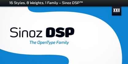
 - XXII Sinoz DSP by Doubletwo Studios,
$-
- Chinta Retro Font by Khoir,
$15.00 Launched Chinta, new serif type modern fonts wrapped in a soft classic touch combined with crooked and crooked alternative fonts, will make it one of the conveniences to explore various types of designs. With a soft touch but does not leave an elegant impression, this font is suitable for using logos, food design, weddings, branding needs, posters, emblems, advertising and much more. so what are you waiting for? FEATURES CHINTA ONE CHINTA TWO So what are you waiting for? immediately purchase this font.
 - He's Dead Jim - Unknown license

- Key Tab Metal - 100% free

- Hel Grotesk Gothiq - Personal use only

- Hemi Head 426 - Unknown license

- They Killed Kenny! - Unknown license

- Key Largo JNL by Jeff Levine,
$29.00Key Largo JNL is a serif treatment of the lettering found in Gummed Letters JNL. - M Hei3 HK by Monotype HK,
$523.99 Monotype Hei3 HK is a modulated and transitional Chinese design with structure, diǎn, piē and nà carry Song style, while horizontal & vertical strokes are relatively simple. This mix of ancient and modern elements with low contrast is something that you can find in wood carving: rigid while balanced with softness.
 - LDJ Hen Hand by Illustration Ink,
$3.00 - Mother Hen AOE by Astigmatic,
$19.95 Mother Hen is an offbeat comic latin typestyle full of quirkiness and bounce. Inspired by the 1965 Looney Tunes cartoon titled “Highway Runnery”, this typeface has all of the spunk of its source. The end result, a lively tribute to its origin, easy to read and fun to look at, a perfect typeface for childrens' books, advertisements, and playful designs!
 - They Live Brush by Alphabet Agency,
$14.00 They Live Brush font is inspired by the 80's cult classic movie They Live logo. The font is ideal for use in designs that you include a bold brush font in a cool way. The font has a graffiti feel that can allow you to express yourself with some attitude. The font is an all capital letters font. The font contains 128 characters.
 - Alto Rey NF by Nick's Fonts,
$10.00 Originally issued by the Palmer and Rey Type Foundry of San Francisco in 1884, this typeface bore the name Octagon Condensed, and is as fresh today as it was way back when. Both versions of this font support the Latin 1252, Central European 1250, Turkish 1254 and Baltic 1257 codepages.
 - Danger Girl Hex by Comicraft,
$19.00 A dangerous charm. A death hex. A summoning. An Invocation. An enchantment. An incantation to raise the dead. A supernatural chant. Be careful what you spell out with this font, you might get what you wish for...
 - Oh Hex JNL by Jeff Levine,
$29.00 An Art Deco “thick and thin” novelty type design based on the hexagon shape was found within the pages of “La Lettre Dans le Decor & La Publicite Modernes” - a 1930s-era French alphabet collection. The title somewhat translates to “The Letter in Modern Decor and Advertising”). Named Oh Hex JNL, it is now available in both regular and oblique versions.
 - M Hei3 PRC by Monotype HK,
$523.99 Monotype Hei3 PRC is a modulated and transitional Chinese design with structure, diǎn, piē and nà carry Song style, while horizontal & vertical strokes are relatively simple. This mix of ancient and modern elements with low contrast is something that you can find in wood carving: rigid while balanced with softness
 - M Bei HK by Monotype HK,
$523.99 M Bei HK is a handwritten style Traditional Chinese typeface. Handwritten font designs are derived directly from hand-drawn lettering or handwriting using analogue tools. Handwritten style Traditional Chinese fonts can include typefaces that reference or reinterpret traditional calligraphy, using classical exemplars by calligraphic masters.
 - P22 Hoy Pro by IHOF,
$39.95 Hoy is a decorative font whose name derives from one of the Orkney Islands. Inspired by the wonderful encounter between the Celtic and Norse cultures in this specific geographic location, the font has adapted some of the features of the Insular half-uncial. It is playful and relaxed, and easily recognizable by its roundness.
 - Wood Bonnet Antique No.7 by astype,
$41.00 Wood Bonnet Antique No.7 is based on real vintage wood type blocks from Switzerland. The very distressed letters give a warm analogue vintage charm on printing. These kind of wood type letters were very common and often named by generic names like Roman, French or Antique followed by a catalog number. But these letters have some very quirky details hard to find else were. » pdf specimen « The font offers up to five glyph variations of all the Latin base letters, figures and some additional letters. An OpenType glyph-rotator is programmed to emulate the randomness of old school printing on live typing. All dingbats of the specimen file are included in the font data too.
 - DF Temple - Unknown license

- FP Quality by Fontpartners,
$29.00 FP Quality is a extended stencil typeface with a slightly and rounded outline and classic shapes. The font contains only Uppercase, and is available in two versions.
 - DF Daantje by Dutchfonts,
$16.00The DF-Daantje is an icon font based on a brisk black creature: our Fell Terrier ‘Daantje’. - DF Mercat by Dutchfonts,
$30.00 DF Mercat is a tribute to the famous marketplace situated at ‘La Rambla’ in Barcelona's historic centre. It is a picture font containing over 240 illustrations of fish, crustacean, clams, poultry, game, meat, sausages, herbs, vegetables, fruit, bread, butter, a variety of cheese, wines and spirits, small dishes, drinks (coffee, beer, soft drinks), ice cream, pastry, etc.
 - DF Dudok by Dutchfonts,
$33.00 The DF Dudok is a minimal bitmap typeface which works very well in small sizes both on your screen and on paper. I am connected in a culinary way with the architects’ name W.M. Dudok. It was the first restaurant where I cooked under the critical eye of my chef Gerhard Braun. (Now La Stanza in Rotterdam) Well, it is incidently getting into my typeface work, the cook, the architect, his wife and...who knows
 - DF Camino by Dutchfonts,
$33.00 DF Camino is a revised mid 20th century geometric sanserif which guides you from somewhere to elsewhere. And beyond.
 - FP Silly by Fontpartners,
$29.00 Silly, as the name suggest, is a somewhat silly font with uppercase letters and it is based on the characteristic expression of the stencil shape. FP Silly is available in two versions, with either rounded or angular shapes.
 - DF Pommes by Dutchfonts,
$16.00 The Pommes font originates from my mid seventies potato punchcuttings at artschool. Since I’m living in a potato republic (NE of the province of Groningen) I got inspired to continue. I prepared this culinary alphabet as a tribute to this wonderful allround vegetable. Belgian and French recipies helped me in selecting and cutting/cooking the 6 styles. The Pommes-Dauphine Ultra Heavy (too much eggs added) can be used as a layer behind the Pommes-Dauphine.
 - FP Stage by Fontpartners,
$29.00 FP Stage was inspired by old Victorian theater posters and corresponding typographic designs.


