10,000 search results
(0.407 seconds)
- Oz Handicraft BT WGL by Bitstream,
$50.99Oswald Cooper is best known for his emblematic Cooper Black™ typeface. Although he was responsible for several other fonts of roman design, Cooper never drew a sans serif typeface. But that didn’t stop George Ryan from creating one. Ryan saw a sans serif example of Cooper’s lettering in an old book and decided that it deserved to be made into a typeface. Ryan’s initial plan was to make a single-weight typeface that closely matched the slender and condensed proportions of the original lettering. While the resulting Oz Handicraft™ typeface proved to be very popular, Ryan was not satisfied with the limited offering. So, between other projects – and over many years – Ryan worked on expanding the design’s range. The completed family includes light, semi bold and bold weights to complement the original design, plus a matching suite of four “wide” designs, which are closer to normal proportions. Fonts of Oz Handicraft include a Pan-European character set that supports most Central European and many Eastern European languages. - Burgues Script by Sudtipos,
$99.00 Burgues Script is an ode to the late 19th century American calligrapher Louis Madarasz, whose legendary pen has inspired schools of penmanship for over 100 years. His talent has caused some people to call him “the most skillful penman the world has ever known.” I use the word ‘ode’ in a colloquially ambitious manner. If I was an actual poet, my words would be about things I desire but cannot attain, objects of utter beauty that make me wallow in humility, or people of enormous talent who look down at me from the clouds of genius. But I don’t write poems. My work consists of letters drawn to fit together, that become an element of someone’s visual poetry. I am the poet’s assistant, so to speak. Once in a while, the assistant persists on what the subject of the poem will be. And occasionally, the poet gives in to the persistence. I hope you, visual poet, find my persistence justified in this case. The two main sources for Burgues were the calligraphy examples shown in Zaner Bloser’s The Secret of the Skill of Madarasz: His Philosophy and Penmanship Masterpieces, and C. W. Jones’s Lessons in Advanced Engraver’s Script Penmanship by L. Madarasz. These two references were the cornerstone for the concept I was trying to work with. I did have to change many of the letters in order to be able to produce digital calligraphy that can flow flexibly and offered the user a variety of options, while maintaining its attractive appearance. To this end, many ligatures and swashes were made, as well as full flourished sets of letters for use at the beginnings or endings of words and sentences. All of this has been tied together with OpenType and tested thoroughly within today’s standard design and desktop publishing software. After working with digital scripts for so long, at one point I thought that Burgues Script would become a bit of a chore to complete. I also thought that, like with most other scripts, the process would regularize itself after a while and be reduced to a mechanical habit. Surprisingly, and fortunately for me, this did not happen. The past holds as many surprises as the future. Madarasz’s method of penmanship was fascinating and challenging to translate into the strict, mathematically oriented language of the computer. It seems that the extremely high contrast of the forms, coupled with the required flow and connectivity of such lettering, will always be hard work for any visual artist to produce, even with the aide of a powerful machine. I can only imagine what steady nerves and discipline Madarasz must have had to be able to produce fully flourished and sublimely connected words and sentences on a whim. When I think of Madarasz producing a flourished calligraphic logotype in a few seconds, and try to reconcile that with the timelines of my or my colleagues’ work in identity and packaging design, the mind reels. Such blinding talent from over a hundred years ago. Burgues is the Spanish word for Bourgeois. In the end, I hope Burgues Script will serve you well when a flourished word or sentence is required for a design project. One of the wonders of the computer age is the ability to visually conjure up the past, serving both the present and the future. With Burgues, you have a piece of “the most skillful penman the world has ever known,” at your service. Burgues received important awards such as a Certificate of Excellence TDC2 2008 and a Certificate of Excellence at the Bienal Tipos Latinos 2008.
 - Shakila by Alifinart Studio,
$17.00 Shakila Script is a handwritten font created at the end of March 2021. It is a unique bold font with a pretty and charming casual style with many variants of beautiful swashes, as well as an alternative to capital letters. Shakila is a lovely and delicate font duo (script and sans serif), that exudes elegance and class. This font was particularly crafted for those who need a beautiful and refreshing look to their designs. Also, this font is perfect for branding projects, logo, product designs, invitation cards, wedding cards, stationery designs, advertisements, label, photography, blogging, social media or watermark. Key Features: - Multilingual Accents - Alternative capital letters - Stylistic Alternates up to 20 choices - Has a heart connected feature for a-z and A-Z letters - Available shortcut for Stylistic Alternate by simply adding "period" (.) and “number” (1-20) to each letter. - Has lots of ligatures so the letters connect well together - Has OpenType and PUA Encodes features. This font has a total of 885 glyphs, including capital letters, uppercase alternates, lowercase, numeral and punctuation, multilingual accents, beginning and ending swashes for lowercase, and includes a large number of stylistic alternates and heart swashes (for lowercase-lowercase and uppercase-uppercase). The advantage of the Shakila Script font compared to other fonts is that the alternative capital characters are in 1 font file, so it will make it easier for you to work. Therefore, you are free to choose it as you like, especially this font has the OpenType and PUA Encodes features which means you can access all of the glyphs and swashes with ease. As I mentioned earlier, Shakila Script has a large number of Stylistic Alternates features, up to 14 options for letter a-z and up to 20 options for letter b d h k l. In fact, there is also a swash feature in the form of a connected for the combination of each lowercase-lowercase and uppercase-uppercase letters. Interestingly, you can activate all Stylistic Alternates that are owned by each letter, just by typing; letter + period + number. For example: a.1 a.2 a.3 or b.1 b.2 b.3 and so on. As for activating the heart connected for each letter a-z or A-Z is quite easy. Namely by simply typing; letter + underscore + underscore + letter. For example: a__a or A__A and so on. Shakila Script is a Font Duo pack that pairs with Shakila Sans. The two were created at about the same time, but made in separate file packages. The reason I created this font duo is to make your projects more harmonious and unique. At the end of the sentence, Shakila Font Duo is a very authentic and amazing. If there are things you want to ask, don't hesitate to contact my email. For complete details, please visit my Behance profile. Alifinart Studio alifinart@gmail.com Thank you.
 - Vendetta by Emigre,
$69.00 The famous roman type cut in Venice by Nicolas Jenson, and used in 1470 for his printing of the tract, De Evangelica Praeparatione, Eusebius, has usually been declared the seminal and definitive representative of a class of types known as Venetian Old Style. The Jenson type is thought to have been the primary model for types that immediately followed. Subsequent 15th-century Venetian Old Style types, cut by other punchcutters in Venice and elsewhere in Italy, are also worthy of study, but have been largely neglected by 20th-century type designers. There were many versions of Venetian Old Style types produced in the final quarter of the quattrocento. The exact number is unknown, but numerous printed examples survive, though the actual types, matrices, and punches are long gone. All these types are not, however, conspicuously Jensonian in character. Each shows a liberal amount of individuality, inconsistency, and eccentricity. My fascination with these historical types began in the 1970s and eventually led to the production of my first text typeface, Iowan Old Style (Bitstream, 1991). Sometime in the early 1990s, I started doodling letters for another Venetian typeface. The letters were pieced together from sections of circles and squares. The n, a standard lowercase control character in a text typeface, came first. Its most unusual feature was its head serif, a bisected quadrant of a circle. My aim was to see if its sharp beak would work with blunt, rectangular, foot serifs. Next, I wanted to see if I could construct a set of capital letters by following a similar design system. Rectangular serifs, or what we today call "slab serifs," were common in early roman printing types, particularly text types cut in Italy before 1500. Slab serifs are evident on both lowercase and uppercase characters in roman types of the Incunabula period, but they are seen mainly at the feet of the lowercase letters. The head serifs on lowercase letters of early roman types were usually angled. They were not arched, like mine. Oddly, there seems to be no actual historical precedent for my approach. Another characteristic of my arched serif is that the side opposite the arch is flat, not concave. Arched, concave serifs were used extensively in early italic types, a genre which first appeared more than a quarter century after roman types. Their forms followed humanistic cursive writing, common in Italy since before movable type was used there. Initially, italic characters were all lowercase, set with upright capitals (a practice I much admire and would like to see revived). Sloped italic capitals were not introduced until the middle of the sixteenth century, and they have very little to do with the evolution of humanist scripts. In contrast to the cursive writing on which italic types were based, formal book hands used by humanist scholars to transcribe classical texts served as a source of inspiration for the lowercase letters of the first roman types cut in Italy. While book hands were not as informal as cursive scripts, they still had features which could be said to be more calligraphic than geometric in detail. Over time, though, the copied vestiges of calligraphy virtually disappeared from roman fonts, and type became more rational. This profound change in the way type developed was also due in part to popular interest in the classical inscriptions of Roman antiquity. Imperial Roman letters, or majuscules, became models for the capital letters in nearly all early roman printing types. So it was, that the first letters in my typeface arose from pondering how shapes of lowercase letters and capital letters relate to one another in terms of classical ideals and geometric proportions, two pinnacles in a range of artistic notions which emerged during the Italian Renaissance. Indeed, such ideas are interesting to explore, but in the field of type design they often lead to dead ends. It is generally acknowledged, for instance, that pure geometry, as a strict approach to type design, has limitations. No roman alphabet, based solely on the circle and square, has ever been ideal for continuous reading. This much, I knew from the start. In the course of developing my typeface for text, innumerable compromises were made. Even though the finished letterforms retain a measure of geometric structure, they were modified again and again to improve their performance en masse. Each modification caused further deviation from my original scheme, and gave every font a slightly different direction. In the lower case letters especially, I made countless variations, and diverged significantly from my original plan. For example, not all the arcs remained radial, and they were designed to vary from font to font. Such variety added to the individuality of each style. The counters of many letters are described by intersecting arcs or angled facets, and the bowls are not round. In the capitals, angular bracketing was used practically everywhere stems and serifs meet, accentuating the terseness of the characters. As a result of all my tinkering, the entire family took on a kind of rich, familiar, coarseness - akin to roman types of the late 1400s. In his book, Printing Types D. B. Updike wrote: "Almost all Italian roman fonts in the last half of the fifteenth century had an air of "security" and generous ease extremely agreeable to the eye. Indeed, there is nothing better than fine Italian roman type in the whole history of typography." It does seem a shame that only in the 20th century have revivals of these beautiful types found acceptance in the English language. For four centuries (circa 1500 - circa 1900) Venetian Old Style faces were definitely not in favor in any living language. Recently, though, reinterpretations of early Italian printing types have been returning with a vengeance. The name Vendetta, which as an Italian sound I like, struck me as being a word that could be taken to signifiy a comeback of types designed in the Venetian style. In closing, I should add that a large measure of Vendetta's overall character comes from a synthesis of ideas, old and new. Hallmarks of roman type design from the Incunabula period are blended with contemporary concerns for the optimal display of letterforms on computer screens. Vendetta is thus not a historical revival. It is instead an indirect but personal digital homage to the roman types of punchcutters whose work was influenced by the example Jenson set in 1470. John Downer.
 - SF Cross by Fonts66,
$16.00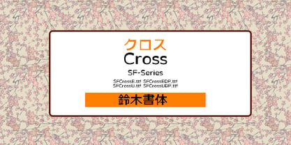 Expressive style for logos and eye catches, titles. 表現力の強い書体。ロゴやアイキャッチ、タイトルに最適。 縦画と横画の太さがほぼ同じのゴシック体の基本を崩して、太さをアトランダムに組み合わせデザインしたのがクロスです。 おやっと思わせるスタイルがアッピール度を高めてアイキャッチを生かしたロゴタイプやヘッドラインなどに適しています。 DPは仮名を大きくし多セットでより強い印象になります。
 - Rugklacht J - Unknown license

- Little Mess by Gleb Guralnyk,
$12.00 Hi! Introducing this handcrafted calligraphic script named "Little Mess". It's made with a calligraphic pen in a casual rough style. It has a multilingual support and several ligatures. Thank you and have a great day!
 - Eckhardt Centerline JNL by Jeff Levine,
$29.00 This typeface is one of a number of sign painter-oriented fonts named in honor of Jeff Levine's good friend Albert Eckhardt, Jr. (who ran Allied Signs in Miami Florida from 1959 until his passing).
 - P22 Broadwindsor by IHOF,
$24.95 Broadwindsor is part of the "Staunton Script Family" of fonts designed by Ted Staunton for his historic novel. The Broadwindsor font is a neatly written script with capitals and lower case in a close relationship.
 - Nouveau Arts JNL by Jeff Levine,
$29.00 The hand lettered title on sheet music for 1915's novelty song "Gasoline Gus and His Jitney Bus" by Byron Gay and Charley Brown offered up the lettering style which is now Nouveau Arts JNL.
 - Argo Supernova by Eliezer Grawe,
$9.00 Argo Supernova is a sans serif font, inspired by science fiction titles. Delicate on the thinest weights, strong on the thickest ones, it is perfect for modern branding and logo design, editorial design, web design, packaging and various other projects. Argo Supernova has a geometric and open structure, with shapes that create a solid texture on the page. Its large x-height produces good reading in long texts and its peculiarities, such as curved bars and endings, generate a strong presence in titles. The Argo Supernova family consists of 8 weights with matching italics, with Extended Latin character set. The italics makes use of more curves and smoothness, creating an interesting variation in design. • 16 styles: 8 weights + 8 italics; • 602 glyphs in each weight; • Special SS02 feature: "bend" alternates for majority of caps characters with curved details; • OpenType features: Access All Alternates, Stylistic Alternates, Standard Ligatures, Discretionary Ligatures, Numerators, Denominators, Fractions, Superior and Inferior Numbers, Kerning, Localized Forms, Lining Figures, Oldstyle Figures, Proportional Figures, Tabular Figures, Slashed Zero, Stylistic Set 1 to 6. • Supporting 219 latin based languages, which are spoken in different 212 countries.
 - Claudius - Unknown license

- Lina Serif by Caroline Herr,
$18.00 Lina Serif is an antiqua balanced between classic and modern. The design focused on the combination of flowing shapes and partially edged transitions, that give Lina her character. The font plays with a high line contrast in combination with dynamic shapes. This makes Lina a casually elegant display font. The terminals remind on floral shapes. Lina gives your design a human, natural touch. Lina Serif is available in 4 weights or as variable font with infinitely variable interpolation of weight.
 - Jean Paul Fraktur by RMU,
$25.00A typographic treasure, originated at the end of the 18th and the beginning of the 19th century, had been brought back to life. With its charming touch it makes a wonderful font for poems, bookcovers, reprints and other historically relevant projects. To get access to all ligatures, it is recommended to activate both Standard and Discretionary Ligatures; the round s you find on the # key, and typing the combination N-o-period and activating the OT feature Ordinals gets you the numero sign. - Kloi BT by Bitstream,
$50.99Boris Mahovac has adapted a friend’s handwriting in this new font called Kloi (pronounced Chlo – ee). It has a very casual feel and includes alternative swash glyphs of some key characters as well as some extra ligatures. Taking advantage of the ligature and contextual swash features in OpenType, the alternate glyphs automatically replace the standard glyphs when appropriate, creating a very unique look. Available in PostScript OpenType format, Kloi’s extended glyph set covers the Western and Central European, Baltic and Turkish languages. - Wirophant by Youngtype,
$18.00 Wirophant are modern font sets featuring an organic, dynamic and energetic style. They can be used for a variety of purposes, such as titles, signatures, logos, correspondence, wedding invitations, letterheads, nameplates, labels, newsletters, posters, badges and much more. To enable the OpenType Stylistic alternative, you need a program that supports OpenType features such as Adobe Illustrator CS, Adobe Indesign & CorelDraw X6-X7, Microsoft Word 2010 or a later version. Contains full set: Uppercase Lowercase Ligatures Punctuation number multilingual support. Thank You
 - Butter Cookie by Bogstav,
$15.00 Did you ever taste a Butter Cookie that you didn't like? I bet the answer is no. It hasn't happened to me yet. Actually I did have a butter cookie and a cup of coffee while finishing this font - and it was great! :) The font, Butter Cookie, is a playful and whimsical comic font. Like magic, the letters change as you type - but that is really not magic, but the contextual alternates...they automatically cycles through the 3 different versions as you type!
 - Fluid by Paulo Goode,
$20.00 This frivolous 6-font typeface was inspired by playing with my food one evening. I began to wonder what it would be like to draw a typeface with a pipette and liquid... the result is Fluid. A key feature are the contextual alternates that substitute an alternate second glyph when typing double letters, this gives a more natural feel to the resulting text. It’s a fun typeface from my back catalogue that was originally released in June 2018. Enjoy playing!
 - Spoon by Dharma Type,
$19.99 Spoon is a fresh and contemporary sans-serif that can be used in wide range of project. Its skeleton of letterform is geometrically-based and minimal but the body was designed with a touch of humanistic outlines as though they were handwritten. This not only make the font clean, legible and functional, but also make it possible to give natural, friendly and soft impressions. Spoon comes in seven weights with matching italics and includes diacritics for most European in each weight.
 - Lia Berta by Lia Baratz Fonts,
$40.00 Berta font is a typeface design that is inspired by vintage typographical styles. This font have a classic, timeless feel with distinctive details like, flourished lines, and varied stroke widths. They are commonly used in design projects that require a historical or nostalgic touch, such as wedding invitations, posters, book covers, and more. With a vintage font, designers can add a touch of sophistication and elegance to their work while also evoking a sense of bygone eras. Support both English and Hebrew letters
 - Positive Feature by PizzaDude.dk,
$15.00 Positive Feature is a handmade, layered font. All layers come with contextual alternates, which means you have 4 different versions of each lowercase letter to play around with. What's cool about the two layer versions is that they mix in a lovely way! Try typing your text with layer 1, copy/paste layer 2 on top in a different color - perhaps even alter the transparency a bit...and all of a sudden a nice effect sees the light of day!
 - Czesko by Sharkshock,
$125.00 Tall, dark, and handsome; Czesko is a fancy display serif with a timeless, yet elegant look. The repetition of key features ensures contrast in line weight to provide high visibility at smaller sizes. Vertical emphasis and tight spacing make it a good choice for areas with limited workspace. Try all caps for a luxury logo or branding in the fashion industry. Other suggested uses include magazines or movie posters. Basic Latin, extended Latin, diacritics, Cyrillic, punctuation, fractions, ligatures, and kerning are all included.
 - Fatz by Good Java Studio,
$20.00 Fatz is the perfect font for all your fun designs. The main font file is equipped with ordinary characters. Everything is made with the bold and smooth brush, and everything is the same size as Hello Balls, so you can be sure they will work well together! It is suitable for you to use in making t-shirt design, quote, label, packaging, logo type, or long writing. Because we have compiled kerning and matrices that are tailored to your needs.
 - Venettica Script by Letterhend,
$16.00 Please meet Venettica Signature, a romantic script typeface. As you can see, this typeface has elegant look with natural feel. The swashes make the font looks even more unique. You can play around and mix and match the swashes, combining into a great signature! They works perfect for you who needs a typeface for headline, logotype, apparel, invitation, branding, packaging, advertising etc. This typeface is comes in uppercase, lowercase, punctuation, symbols, numerals, stylistic set alternate, ligatures, etc also support multilingual.
 - Graceful by Alcode,
$23.00 Graceful is a classic font, I built it with my relaxed hands, designing a classic font with modern elements in it, which makes it particularly suitable for wedding media, book covers, greeting cards, logos, branding, business cards and certificates, in fact for any design work that requires a classic, formal and luxury feel. Try Graceful, enjoy the richness of OpenType features and let her fun and elegant excitement make you happy and enhance your creativity! You can use this font very easily.
 - King Sky by Graphicxell,
$19.00 inspired by the famous minimalist logo perfect for the purposes of designing templates, brochures, videos, advertising branding, logos, invitation, layout design, elegant crafting, beauty design and other What's Included : + Standard glyphs + International Accent + Works on PC & Mac + Simple installations Accessible in the Adobe Illustrator, Adobe Photoshop, Corel Draw. PUA Encoded Characters - Fully accessible without additional design software. Fonts include multilingual support Image used : All photographs/pictures/vector used in the preview are not included, they are intended for illustration purpose only. Thank You
 - Cortese by Hanoded,
$15.00 As usual, I stumbled upon a great 1971 Italian movie poster when looking for something else. The poster for “La Morte Cammina Con I Tacchi Alti” (directed by Luciano Ercoli), was made by an unknown artist and comes with a great font. Cortese was based on this movie poster font, but as I started working on the glyphs, I figured they would even look better in ligatures. So here it is: Cortese font - complete with 135 ligatures, accents and even Greek and Cyrillic!
 - Partizano Serif by deFharo,
$22.00 Geometric typography with serif, extra condensed retro look and very elegant for use in publications, graphic design and advertising where you need an exclusive typography with great horizontal space saving for headlines and paragraph texts. It has a complete set of capital letters and numbers and monetary symbols in small caps, also alternative letters such as the 'A' capital letter or the lowercase 'a' type alpha. Use the following keys to write the bitcoin symbol and the partisan icon: b #, a #
 - Hello Hiltown by Good Java Studio,
$20.00 Introducing Hello Hiltown - Playfull Condensed Hello Hiltown is the perfect font for all your fun and minimalism designs. The main font file is equipped with ordinary characters. Everything is made with the funny brush. So you can be sure they will work well together! It is suitable for you to use in making t-shirt design, quote, label, packaging, logo type, or long writing. Because we have compiled kerning and matrices that are tailored to your needs. Caps Only Fonts.
 - F2F BoneR by Linotype,
$29.99Stefan Hauser designed the fun font F2F BoneR in 1996 for the trendy German techno magazine Frontpage. Other technofonts designed for this magazine are available under the label Face2Face (F2F) from Linotype. The basic forms of BoneR are similar to those of a classic italic, however they display an unusual degree of slant to the right. Some letters were consciously made awkwardly thick, making the overall look spontaneous and spotted. The fun font BoneR is suitable for short and middle length texts. - Energize by Burntilldead,
$10.00 Energize is a sports font family with 3 weight (thin, regular, bold) & various styles of outline - extrude. The Italic styles bring another vibe of speed. This font family is built to bring active looks, racing, workouts, and other athletic activities. Its shape is rooted in the the competitive sports spirit. The Idea is to bring the dynamic shape mixed with weight , elevating athletic performance through progressive innovation of font, so whenever people see the font they think of hard work and sports.
 - BMF Planets Pi by BuyMyFonts,
$25.00BMF Planets Pi is part of the BMF Symbols Collection, a gorgeous, versatile and highly original family of symbols (drawings, icons, pictograms). Planets Pi is a playful visualisation of outer space and its visitors, such as astronauts, rockets and Martians. They series will come in handy when you open a bar, discotheque or beach club with a ‘space-related’ theme; when you write a book on planets; when you want to decorate a mug, curtain, or wallpaper for space-loving children. - Enjoy Notes by RagamKata,
$14.00 For those ultra natural-looking handwritten, jotted down notes, say hello to Enjoy Notes! Designed to look casual and carefree, but with business to take care of :) The characters consist of uppercase letters, but they differ in style for the uppercase and lowercase keystrokes, to make the font appear more like natural handwriting. Opentype double-letter ligatures are built in for you too, just turn on your ligatures setting in your design app , to see them appear as you type
 - Circling Vultures BB by Blambot,
$6.00 Circling Vultures is an old west slab serif font offered in degrees of aging; Circling Vultures BB is clean, with sharp edges and lines, Circling Vultures Decay BB has rounded corners and distressed lines, Circling Vultures Rot BB is the most worn out option in the set, with flecks of missing "ink" apparent. Each option comes with two variants; a standard upper/lowercase, and an option with smaller caps in the lowercase keys for a total of six fonts in the set.
 - ALS Kraft by Art. Lebedev Studio,
$63.00 A simple rough font. Kraft is a rough techno-style sans serif meant for setting text in all capitals. Instead of lowercase letters there are capitals of smaller height but with the same stroke width. They make tighter type. Characters are pressed really close together which creates the visual rhythm of very narrow and very wide openings. The wide strokes allow free use of graphics. This font is designed for putting on coarse surfaces, for breaking, crumbing, scratching, or making stencils on concrete.
 - Pax by Linotype,
$29.99Pax is clearly a didone, using Vox classification. The contrast between the thin lines and the thicker ones is noticeable, as you would expect from a didone. The basic form is relatively narrow, therefore I designed another Pax, slightly wider and darker, and called it Pax #2. Otherwise they are more or less identical. Pax is Latin for peace, on everyone's want list in 1995 - as well as every single year before and after that. Pax was released in 1995. - Water Splash by Putracetol,
$21.00 Water Splash is a unique display font. This font is inspired by the water splash shape. There are 3 directions for the splash water (direction to the left, up and down and to the right), and they are alternate from this lowercase font. With these variations, it will make it easier for you to create creativity for your project. Water Splash would be perfect for branding, logo, product, title, quotes, doodle, comic, books, greeting cards, toys, posters, baby clothing, picture books, etc.
 - Sombrieul by Greater Albion Typefounders,
$38.00 Sombrieul is Greater Albion’s greatest and grandest Edwardian display typeface yet. Just the thing for any project with a late 19th/early 20th century inspiration. Sombrieul has a LOT of opentype features:- stylistic alternates, ligatures, discretionary ligatures, small capitals, title forms, swash capitals, old-style and lining numerals, numeral title forms. Of course, these features don’t allow for infinite variability in appearance, there must be some limits after all! They do allow for a lot of variety, however! There are over 1,000 glyphs...
 - Wandering Pencil by Hanoded,
$15.00 I have a lot of pencils, but when I need one, they seem to have grown legs and have disappeared! When I decided I wanted to create a pencil font, it took me a long time to find the right pencil for the job! Wandering Pencil is a nice, handmade font. It is a bit shaky, a bit rough, but it does have class and will look nice on your designs! Comes with diacritics and double letter ligatures for the lower case.
 - Burger Shake by Bogstav,
$17.00 A burger and a shake - the classic companions! Mix those two and you get the Burger Shake - it may not sound very delicious, but the thought of mixing two nice things is great...or something! :) Anyway, the Burger Shake font is about having fun in a legible way. The letters are slightly uneven and rough here and there, and has this nice handmade organic feeling. I've added 5 slightly different versions of each letter, and they automatically cycle as you type!

