10,000 search results
(0.05 seconds)
- School Age by Jeff Levine,
$29.00 The “Trixy Toy Educator” was a 1930s-era set of letters and numbers (along with a few animal shapes) for teaching children, and was manufactured by the Durrel Company of Gardner, Massachusetts. Die cut from thick cardboard, the 40 piece set also included a rack to display the characters, presumably for little ones to practice the correct order of the alphabet and basic numerals or to spell simple words like ‘dog’ or ‘cat’. Whomever came up with the idea, they used the most rudimentary and unusual ‘type design’ shapes in the A-Z and 0-9, but they were just odd enough to inspire a digital type version of them. School Age JNL is available in both regular and oblique versions.
 - Aarde by Scholtz Fonts,
$19.00This is the definitive standard African font. It combines wonderful readability with tremendous panache. The fact that it has a full character set (UPPER and lower case), all punctuation and all special characters, means that it can be used in just about any African design context. If you had only one African font in your arsenal, it would have to be Aarde Black. The name "Aarde" means "earth" and refers to the gutsy, earthy character of the letterforms. It includes a full character set: characters for English, French, Italian, German, and Portuguese. The numerals are mono-spaced, and are very readable so that they will line up correctly in columns of figures. The letters of the alphabet are correctly kerned so that they appear correctly in text. - Byblos by Wiescher Design,
$39.50 “Byblos” is the name of a town in Lebanon and the name of a famous hotel in St. Tropez. Some time ago I discovered their original logo in an old french magazine, just 5 by 3 centimeters small without any text, address, telephone number not even a picture. They did not need that, that’s how famous the hotel and its old logo was. Well they abandoned their identity when the place was sold to a big chain – I think. But the logotype, just those five letters inspired me to this new font. It evokes times past and has a little Bauhaus in it – as well as a really modern touch, all depends on the way you use it. Your strange typedesigner Gert Wiescher
 - Greenleaf by Oddsorts,
$39.00 Meet Greenleaf, a display family that blends elegant art deco details, extensive linguistic support, and technically innovative features to create a bold impression that’s ideal for branding, signage, packaging, invitations, and so much more. Greenleaf’s “Pro” fonts support over three hundred sixty languages to reach the broadest possible audience. Meanwhile, its decorative companions expand the family’s expressive potential. They effortlessly create banners, chains, frames, and patterns — and include chromatic fonts which can be set in two colors without layers or special design software. Download the user guide to see Greenleaf’s many features and discover how the fonts actively help you take advantage of all they have to offer. Enjoy! Greenleaf is a trademark of Charles Gibbons / Oddsorts and may be registered in certain jurisdictions.
 - Lirio by Eurotypo,
$48.00 Lirio is a decorative and expressive typeface, it’s elegant yet eccentrically handwritten font. Lirio is presented in two versions: Regular and Slanted. They have many advantages of the OpenType futures to choose from: stylistic alternates, swashes, contextual alternates, and a full set of standard and discretional ligatures. Lirio supports all diacritics for CE languages; they come also with a huge variety of ornaments, underlines, beginnings and word endings that will allow you to work in a creative way. Lirio can fit into many clients’ design brief. They've been specially thought to use in packaging design, children books, advertising, logotypes, greeting cards, restaurants, web sites and much more. These fonts may enlarge your graphic capabilities and your work can be more competitive.
 - Makalu by Juraj Chrastina,
$29.00 Makalu is a funny flower font inspired by the lovely drawings of the famous illustrator Zdeněk Miler (best known for his small mole). His flowers are at the same time cartoony and realistic. Enjoy this choice of 27 original and distinctive illustrations while creating your designs.
 - Architect by Australian Type Foundry,
$30.00Based on the text on architect's plans. The designer asked friends and relatives for the plans for their house extensions, and he studied plans in the public library, then blended the best features of all the characters he could find. Architect was designed originally in 1999. - Persia BT by Bitstream,
$50.99Masoud Nejabati has drawn upon his capable calligraphic skills to create this typeface. Persia represents his first latin-based design. This gentle and finely rendered script reveals Nejabati's extensive background in Islamic calligraphic art. The slight back slant further enhances the appearance of hand-scribed pen calligraphy. - Runa Serif by Monotype,
$29.99Swedish designer Lennart Hansson began designing letterforms at the age of 20, and since then his exceptional calligraphic artwork has been on exhibit throughout the world. Hansson won the Nordic Typeface Competition in Copenhagen for his typeface Runa Serif, inspired by the forms of ancient Viking runes. - Envelove by Sudtipos,
$39.00 «Envelove» is the brand new typographic challenge handwritten by Yani Arabena and designed along with Guille Vizzari and Ale Paul, for Sudtipos. It all started as a game for Yani. A carefree and spontaneous calligraphy, making use of the pointed nib with black ink, exploring its expressive possibilities pressing against paper. With time that nib turned into her dearest tool to flow through her writing, breeding this particular style of hers that let her trespass the barrier that kept personal and professional passions apart. All that inspiration is present in «Envelove», a play on words that reflects the love of letters. An expressive free-and-easy typeface that follows no formal calligraphic model and lets itself go with the meaning of words, rhythm and sensations. «Envelove» successfully joins three different fonts, «Envelove Script»—free, spontaneous and unique of its kind—going together with «Envelove Caps»—an uppercase style that builds controlled but dynamic words thanks to its alternates and ligatures, and to its own true Small Caps set as well—and «Envelove Icons», ideal to decorate and bring to life any written message. «Envelove» encourages you to write as if you have a nib, ink and an envelope. It invites you to take part in other worlds like a magic cocktail, a summer night, a long-awaited reunion, a first dance, a dish cooked with your own hands. The fashion world, gourmet, stationery, scrapbooking and everyone where a Handmade or Handcrafted feel is craved for, save a special place for «Envelove». (The illustration series that are shown with «Envelove» were made by the incredible Argentine illustrator Eugenia Mello.)
 - Geometry Script Pro by CheapProFonts,
$10.00 The Geometry Pro family has been designed to be the final word in purely geometric fonts, and this rounded Script sub-family is a nod to the 50s style of connected logomarks. Words set with both the Regular and the Alternate (with its more flourished capitals and alternate stem connections) can be extended by using the underscore character between letters. You can freely mix and match glyphs from both fonts to create a little bit of variety, and finding that perfect combination. For a matching set of capitals (and disconnected lowercase letters): check out the Regular weights of the Geometry Soft Pro family. All the Geometry Pro fonts are strictly geometric (as drawn with a compass and a ruler fixed to 90 and 45 degree angles) but they are not slavishly modular. ALL fonts from CheapProFonts have very extensive language support: They contain some unusual diacritic letters (some of which are contained in the Latin Extended-B Unicode block) supporting: Cornish, Filipino (Tagalog), Guarani, Luxembourgian, Malagasy, Romanian, Ulithian and Welsh. They also contain all glyphs in the Latin Extended-A Unicode block (which among others cover the Central European and Baltic areas) supporting: Afrikaans, Belarusian (Lacinka), Bosnian, Catalan, Chichewa, Croatian, Czech, Dutch, Esperanto, Greenlandic, Hungarian, Kashubian, Kurdish (Kurmanji), Latvian, Lithuanian, Maltese, Maori, Polish, Saami (Inari), Saami (North), Serbian (latin), Slovak(ian), Slovene, Sorbian (Lower), Sorbian (Upper), Turkish and Turkmen. And they of course contain all the usual "western" glyphs supporting: Albanian, Basque, Breton, Chamorro, Danish, Estonian, Faroese, Finnish, French, Frisian, Galican, German, Icelandic, Indonesian, Irish (Gaelic), Italian, Northern Sotho, Norwegian, Occitan, Portuguese, Rhaeto-Romance, Sami (Lule), Sami (South), Scots (Gaelic), Spanish, Swedish, Tswana, Walloon and Yapese.
 - Genotype BRK Pro by CheapProFonts,
$10.00 A stylistic and square outline font suitable for headlines and logos. The original font contained no diacritics at all, so I have designed these to match. I also made the descenders on "g/j/p/q/y" a bit longer - so they would balance better with the letters with diacritics below the letter... I redesigned the "t", but have included the original "t" as an alternate, available via your programs' glyph palette or using the OpenType functions "Stylistic Alternates"/"ss01". Genotype S BRK Pro is the perfect companion for Genotype H BRK Pro (The H stands for Hollow and the S stands for Solid). Can be used as a fill for its companion (using layers), but is also quite a usable font on its own. ALL fonts from CheapProFonts have very extensive language support: They contain some unusual diacritic letters (some of which are contained in the Latin Extended-B Unicode block) supporting: Cornish, Filipino (Tagalog), Guarani, Luxembourgian, Malagasy, Romanian, Ulithian and Welsh. They also contain all glyphs in the Latin Extended-A Unicode block (which among others cover the Central European and Baltic areas) supporting: Afrikaans, Belarusian (Lacinka), Bosnian, Catalan, Chichewa, Croatian, Czech, Dutch, Esperanto, Greenlandic, Hungarian, Kashubian, Kurdish (Kurmanji), Latvian, Lithuanian, Maltese, Maori, Polish, Saami (Inari), Saami (North), Serbian (latin), Slovak(ian), Slovene, Sorbian (Lower), Sorbian (Upper), Turkish and Turkmen. And they of course contain all the usual "western" glyphs supporting: Albanian, Basque, Breton, Chamorro, Danish, Estonian, Faroese, Finnish, French, Frisian, Galican, German, Icelandic, Indonesian, Irish (Gaelic), Italian, Northern Sotho, Norwegian, Occitan, Portuguese, Rhaeto-Romance, Sami (Lule), Sami (South), Scots (Gaelic), Spanish, Swedish, Tswana, Walloon and Yapese.
 - Bethlehem Ephrath by HiH,
$10.00 One menorah that I have long found particularly appealing was named The Tree of Life Menorah, a replica of which I gave as a gift one holiday to a kindly old couple who were neighbors and became friends. It had a simple, organic elegance that I see in the best of Art Nouveau sculpture. To me personally, Judeism is a celebration of life, like the triumph of the flower that blossoms in the crack of the city sidewalk. Just as Hanukkah celebrates the rededication of the temple and the miracle of the oil, it celebrates the victorious quest for freedom of the Hebrew people led by Judah Maccabee. Hanukkah represents determination and courage and faith — and it represents the presence of God in the lives of His people. It is interesting to note that the founding of the Albanian nation in the early twentieth century grew out of the resistance of the Albanian people to the imposition of Greek language and culture in the aftermath of the dissolution of the Ottoman Empire. The typeface, HADASSAH, designed by Henri Friedlander (1904-1996), is my favorite Hebrew typeface. Thirty years in the crafting, I believe it is unsurpassed for its shear beauty, combining a subtle modulation of stroke with a simplicity and clarity of form. No doubt, that is why it has become so popular. For me, the Sîyn/Shîyn characters are especially satisfying. For a Hanukkah message in Hebrew, I would choose HADASSAH LIGHT for a headline and print it as large as I could. If, however, you are looking for a friendly, warm face for a seasonal message in a roman-letter based language, may I suggest BETHLEHEM EPHRATH. It will be as comfortable as a bulky, hand-knit sweater on a frosty afternoon and reflects the solid, encompassing, family orientation of this holiday. It was on the way to Ephrath that Jacob’s beloved wife Rachel gave birth to Benjamin and then died from her labor. It was to Ephrath that Naomi and Ruth returned and in Ephrath that we have the wonderful, heart-warming story of the marriage between Ruth and her Redeemer-Kinsman, Boaz. And it was to Ephrath that prophet, Samuel, went to find a new king and there in Ephrath that the prophet annointed a small shepherd boy named David. The Proverbs tell us to seek wisdom. Never underestimate the impact you have on others. Words of kindness can change people’s lives. The Talmud says that the highest form of wisdom is kindness. Be wise this holiday season. The font BETHLEHEM EPHRATH is based on the typeface Accent with the permission of URW++ of Hamburg, Germany. Like most display fonts, it is most effective at 18 points and larger. Like most script fonts, it is most effective when set with both upper and lower case. Although this font is readable in all caps (many scripts are not), that does not make it a good idea. Do so only with caution.
 - Fairplex by Emigre,
$49.00 Zuzana Licko's goal for Fairplex was to create a text face which would achieve legibility by avoiding contrast, especially in the Book weight. As a result of its low contrast, the Fairplex Book weight is somewhat reminiscent of a sans serif, yet the slight serifs preserve the recognition of serif letterforms. When creating the accompanying weights, the challenge was to balance the contrast and stem weight with the serifs. To provide a comprehensive family, Licko wanted the boldest weight to be quite heavy. This meant that the "Black" weight would need more contrast than the Book weight in order to avoid clogging up. But harmonizing the serifs proved difficult. The initial serif treatments she tried didn't stand up to the robust character of the Black weight. Several months passed without much progress, and then one evening she attended a talk by Alastair Johnston on his book "Alphabets to Order," a survey of nineteenth century type specimens. Johnston pointed out that slab serifs (also known as "Egyptians") are really more of a variation on sans serifs than on serif designs. In other words, slab serif type is more akin to sans-serif type with serifs added on than it is to a version of serif type. This sparked the idea that the solution to her serif problem for Fairplex Black might be a slab serif treatment. After all, the Book weight already shared features of sans-serif types. Shortly after this came the idea to angle the serifs. This was suggested by her husband, and was probably conjured up from his years of subconscious assimilation of the S. F. Giants logo while watching baseball, and reinforced by a similar serif treatment in John Downer's recent Council typeface design. The angled serifs added visual interest to the otherwise austere slab serifs. The intermediate weights were then derived by interpolating the Book and Black, with the exception of several characters, such as the "n," which required specially designed features to avoid collisions of serifs, and to yield a pleasing weight balance. A range of weights was interpolated before deciding on the Medium and Bold weights.
 - Juicy by Positype,
$22.00 Juicy is different… in a good way. An art deco-inspired, high-contrast, upright semi-script, layered typeface best describes the playful letterforms that make up Juicy Pro (semi-connected) and Juicy Simple (unconnected). Great care has been taken to provide a wide complement of options and intelligent letter combinations thanks to OpenType. And that’s right, Juicy *is* a layered semi-script typeface. Pro and Simple variants provide a full character set (yep, lowercase). Pro variants include a wide variety of Stylistic, Swash, and Titling Alternates to really allow the expressiveness of the typeface shine… and all characters are available in the layered font counterparts… no shortcuts were taken on the delivery of this typographic chimera.
 - SD Quainton by Sawdust,
$35.00 SD Quainton was created in 2016 by Jonathan Quainton the co-founder of graphic design studio Sawdust. With a harmonious blend of Didone and Bauhaus elements Quainton embarks on a fresh and innovative direction. Drawing inspiration from revered typefaces like Bodoni and Didot, SD Quainton evokes the same sense of awe that captivated its creator. Designed with specific contexts in mind, SD Quainton finds its perfect home in the realms of fashion, retail, and premium products, where its captivating charm can truly shine. Although ideally suited for eye-catching headlines and titles due to its delicate strokes, the possibilities of where this remarkable typeface may find its place are as limitless as the designer's imagination.
 - Bumpy Ride by Hanoded,
$16.00 I live in a small hamlet near the Rhine river. It is a sleepy little town and it doesn’t have any facilities. For groceries I need to go to the next town. The only road leading to that town has been closed for half a year, because of ‘maintenance’, so doing groceries got a lot trickier. The fastest way to travel is through yet another hamlet in the forest, on a very narrow road with extremely bumpy shoulders. Yes, you’ve guessed it: it is a Bumpy Ride. Bumpy Ride was made using a so called Brush Pen. It comes with all the accents and a sweet set of alternates for the lower case letters.
 - Lemongrass by Nova Type Foundry,
$30.00 Lemongrass is a connected script typeface for display use. It was inspired by brush lettering and the sea and the strong winds that exist in Porto. These winds are called "nortada", which was also the developing name of the font. It has low contrast and smooth connections to get a good rhythm in the text. Lemongrass can be used for branding and packaging where it will shine, but it can also be used in small texts creating beautiful content. Lemongrass has lots of ligatures, swashes and alternative shapes that will allow making your brand unique. It supports most western European languages making it a more useful display font. Lemongrass Caps comes to complement the main style.
 - Angelik by Mysterylab,
$22.00 Graphic designers, meet Angelik: a stylish typeface that you can really put through its paces. This unique font can bring one of its multiple personalities to a wide variety of design challenges. It’s a louder and prouder version of a typical assertive editorial-style bold serif headline font. But it can also really shine as a great choice for logos and branding, spanning a variety of vibes and styles. Works superbly in a high-fashion context, as well as in lowbrow surf-skate-ski-snowboard gear branding, or perhaps as an understated – yet exotic – vacation travel poster font. With its finely-tuned contouring, extensive kerning, and a multilingual character set, Angelik will not let you down.
 - Royal Tropic by Tom Chalky,
$18.00 Proudly Introducing ‘Royal Tropic‘ – An expressive, quick dry stroke, signature style brush script font. With multilingual support, ligatures, and an extra slanted style. Royal Tropic is great for when you want to grab attention, especially within print design; Packaging, branding, posters, book cover design, etc. The goal was to create a fast-flowing, legible script font with enough personality to take center stage and shine, and I think the end result has delivered exactly that! TIP: Through trial and error, I feel Royal Tropic works best with clean serif/sans-serif fonts. Any other 'handwritten' fonts can disturb the rough/clean contrast, taking with it some of the impact of your design.
 - Brillian by Fontex,
$29.00 A lot of time and effort has been put into the process of creating the Brillian Font. A careful analysis of the current font market and overly increasing customer needs have shaped Brillian’s final appearance and content. We don't have a precise target audience for Brillian, since the amazing amount and structure of the chosen characters enables a very wide utilization. Its look and feel came from a different designing approach, so that it can successfully satisfy the needs of even the neediest. Shining with calm and dignity, while in the roots being aggressive, it has successfully connected classic and modern styles - representing its largest value. A most complete set of Cyrillic, Greek and Latin characters included.
 - Las Palmas by Fenotype,
$20.00 Las Palmas is a vintage type collection with print texture. • Brush - Two weights of a connected Brush Script with Contextual and Swash Alternates • Pen - A connected monoline Script with Contextual and Swash Alternates • Slab - Two weights of a chunky Slab Serif with rounded corners, Bold has the same proportions but fuller texture. • Condensed - A bold and tight condensed Sans Serif with rounded corners. Las Palmas fonts are designed to work together - in pairs or more. Las Palmas is great for branding, posters or any display use. If you need a clean version of Las Palmas try Steak And Cheese by Fenotype. All fonts are PUA encoded and have a wide language support.
 - Samsekrat by IbraCreative,
$17.00 Samsekrat is an authentic serif typeface that exudes timeless elegance and sophistication. With its meticulously crafted letterforms, Samsekrat strikes a harmonious balance between tradition and modernity, making it versatile for a range of design applications. The serifs are distinct and refined, lending a classic aesthetic to the typeface, while subtle nuances in letter spacing and stroke weights contribute to its overall grace. Samsekrat’s authenticity shines through in its attention to detail, capturing the essence of traditional serif typography while maintaining a contemporary edge. This typeface is a testament to the craftsmanship and artistry behind authentic design, making it a compelling choice for projects that demand a touch of refined character and enduring style.
 - Promea by YXType,
$19.00 Promea is a Grotesk font meticulously designed with precise engineering in mind. Its amount of kerning, support for tabular/proportional figures, small caps, slashed zero, and fractions will make sure it performs well in all types of environments. Even the auto-centering colon among numbers will make your typography shine! The stylistic inktraps combined with low x-height and high contrast will surely bring you the sharpest typographic experience ever. The font is perfect for text environments like magazines, but it excels at displaying its full range of characteristics. Features: Smallcaps Tabular & proportional figures Small figures & fractions Slashed zero Double/single-story a & g Colon auto-centering vertically among figures (e.g. 10:00)
 - Caprizant by Laura Worthington,
$29.00 Caprizant is a lively, upright script based on letters inked with a pointed pen. For display settings, titles, and identity work, Caprizant shines with even more energy and elegance. Customize it using one of the 337 swashes, three sets of capitals, and 20 ornaments. Alternates of every letter create a fully connected or unconnected look, plus dozens of ligatures, and contextual alternates provide a convincingly human variation. See what’s included! http://bit.ly/1RGYIl1 *NOTE* Basic versions DO NOT include swashes, alternates or ornaments These fonts have been specially coded for access of all the swashes, alternates and ornaments without the need for professional design software! Info and instructions here: http://lauraworthingtontype.com/faqs/
 - Kari Display by Positype,
$49.00 Kari Display is the product of a long standing idea I had to give the well-received Positype typeface, Kari, plastic surgery. Just referring to giving a typeface plastic surgery, or letter lipo, stuck in the back of my head until I was able to pick the project up. The ultimate objective was to refine Kari Display to a point where each glyph was expressed as simple as possible... and in that simplicity a sexiness would appear. Kari is a beautiful script, but it is very 'controlled' and orderly and I wanted Kari Display to break that mold with much more movement, curviness, greater modulation and a more elegant feel on the page. I did not want to take it too far, limiting the use of the typeface, but rather opted for a delicate balance of thick and thin against the added movement of the glyphs. The wealth of sketches and proposed variants during the concepting phase was encouraging and I really pushed to add as many alternate characters, ligatures, swashes (and more) as I possibly could. Just about every character has at least one or more alternates AND the complete offering of alternates completely covers a wide range of Latin-based language groups including Central European diacritics. If you are using any type of OpenType enabled application, then the Kari Display Pro typefaces are the way to go. They include everything found in the 3 separate variants for each style as well as entirely expanding offering of additional swash and ligature sets.
 - Abominio by Unio Creative Solutions,
$9.00 Abominio is a captivating display typeface featuring an innovative design of recurring chiseled forms. This font aims to capture the spirit of maximalism culture, offering a valuable asset for consumer-oriented designs, allowing them to stand out in a in a sea of competitors. With its bold and experimental appearance, Abominio remains true to the letters of the Latin alphabet. This unique characteristic is well-suited to capture and hold the attention of easily distracted viewers, extending their focus for a few more vital seconds. Designers now have the opportunity to explore their creativity, creating both refined and daring combinations for eye-catching headlines, titles, or graphic design projects that aim to convey strength and artistic innovation. Specifications: - Included: Abominio Regular, Abominio Oblique, Abominio Variable - Multi language support (Central, Eastern, Western European Languages) - OpenType Features Thanks for viewing, Unio.
 - Aquawax Pro by Zetafonts,
$39.00 Aquawax Pro PDF Specimen Aquawax Graphic Project on Behance Created as a custom brand typeface in 2008 by Francesco Canovaro, Aquawax is one of Zetafonts most successful typefaces - having been chosen, among the others, by Warner Bros for the design of the logo for the Aquaman movie. Its logo design roots are obvious in the design details, from the blade-like tail of the Q and the fin-like right leg of the K to the intentionally reversed uppercase W, as well as the rounded edges softening the stark modernist lettershapes. While this details make the typeface extremely suitable for logo and display design, especially in the bolder weights, the open, geometric forms of the letters and a generous x-height make it extremely readable at small sizes, making it perfect for body text and webfont use. In 2019 the family was completely redesigned by the Zetafonts team, expanding the original glyph set to include Cyrillic and Greek and adding three extra weights and italics to the original six weights, for a total of 27 weights (including 9 pictograms). The restored and revamped version, named Aquawax Pro, also includes full Open Type features for Positional Figures, Stylistic Alternates, Discretionary Ligatures and Small Caps, and adds to the typeface new alternate glyph shapes, accessible as Stylistic Alternates. Optimized for maximum screen readability, it covers over 200 languages that use the Latin, Cyrillic and Greek alphabet, with full range of accents and diacritics.
 - Fibra One by Los Andes,
$26.00 Fibra One looks like a “soft” version of the Fibra font, but it is actually more than that—the second part of its name suggests that it is a reinterpretation of the original typeface. While this new version maintains the overall structure of Fibra and influence of the Avant Garde font, its shapes are different from those found in its predecessor—Fibra One features both soft corners and smooth transition between curved and straight sections. This gives the font a more dynamic and playful personality. Fibra One keeps the original contrast between curves and straight lines in glyphs such as ’n’ and ‘h’ (not found in rounded glyphs such as ‘a’ and ‘d’); details of display characters (e.g. three upper terminals in ‘W’ and projection off the stem in ‘A’); and exaggerated terminal in ‘R’. All these features give Fibra One a strong personality—a typeface that ‘gives you the chills’. Fibra One was specially designed for display use. The font has a very generous x-height that allows for use in corporate text, thanks to its good readability. Fibra One comes with 2 subfamilies—a more ’normal’ Basic family, with a smaller amount of stylistic features, for use in subheadings or any other type of text that requires formality, and an Alt family that shows off the true potential of the font, making it the perfect choice for magazine headlines, posters and logotypes.
 - Trump Script by Canada Type,
$29.95 One of the earliest fonts published by Canada Type was Tiger Script, Phil Rutter's digitization of Jaguar, Georg Trump's 1967 wild calligraphic brush face. In 2010, when the font was revisited for an update, it was shown that it too light for applications under 24 pt, and too irregular for applications over 64 pt. So the face was redigitized from scratch. This new digitization brings a more seamless contour and a much steadier stroke, and much better outlines for use at both extremes of scaling. Language support was also greatly expanded, and many alternates and ligatures were added to the redigitized character set. The name was also changed to Trump Script, to better reflect the origins of the design. Trump Script is a master calligrapher's hand producing very uncommon jolts and bursts of sharpness. It showcases some of the most suprising letter forms ever drawn, like the very unique treatments of B, K, W, Y and Z. In the lowercase one can see the cattiest g ever made, and some of the wildest shapes in the f, j, p, y and z. Trump Script comes in all popular formats. The TrueType and PostScript packages are comprised of two fonts. The OpenType version, Trump Script Pro, combines both fonts into one, and includes features for intelligent substitution in software that supports advanced typography. Language support includes Western, Central and Eastern European character sets, as well as Baltic, Esperanto, Maltese, Turkish, and Celtic/Welsh languages.
 - DynaGrotesk by Storm Type Foundry,
$55.00 The most exciting new feature of DynaGotesk is the Vintage Italics stylistic set, which activates the decorative forms. It includes the looped "w", curved ascenders and descenders of many lowercase letters. These can significantly change the feel of a poster or invitation. DynaGrotesk may look like a revival of an old typeface, but it is not. It uses only some historical reminiscences, sharp edges and curved shapes, but it’s completely original design aimed at ease of use. The bigger the size, the more evident and pronounced are the spicy details. In smaller and even smallest sizes it’s appearance is qieter, very well suited even for long portions of text. DynaGrotesk was created in 1995 with the use of Multiple Master interpolation. But the MM fonts never achieved the desired application in industry, so designers returned back to single fonts. Over the following decades, the font was modified several times as an old house, and the present re-animation includes the Variable font format. Since its first release in the mid-nineties, it is widely used in all areas of graphic industry from small publishing to international corporate identity. The warm character of DynaGrotesk derives from early sans-serif typefaces, those which appeared before Helvetica. All 60 styles contain common OTF features like Small Caps, various sorts of figures, ligatures, Cyrillics, Greek, and full Latin diacritics. Perfect for branding systems and corporate identities, lettering, as well as cultural posters and catalogs.
 - Simple Serenity by Set Sail Studios,
$26.00 Discover an exquisitely elegant modern typography pairing with the Simple Serenity Font Duo. This beautiful set combines a contemporary take on a classic serif with a clean & modern fine calligraphy script—creating the perfect pair for stunning logos, wedding designs, quotes, display text and more. This font family includes; Simple Serenity Script • A clean, elegant hand-drawn script font containing upper & lowercase characters, all punctuation and numerals. Contains 50 ligatures to help the text flow naturally and add a custom-made feel. Includes 9 alternate characters for d,k,f,g,h,i,j,t,y which have extra flourishes. Also includes beginning and end swashes for every lowercase letter. Simple Serenity Serif • A modern take on a classic serif font. Contains uppercase-only characters, all punctuation & numerals. Includes 14 ligatures for extra flair and uniqueness, as well as 10 alternate characters for Q,A,M,E,R,K,U,F,H,W. Using Ligatures and Alternates; Both fonts contain a number of 'Standard Ligatures' (unique double-letter pairings) and 'Stylistic Alternates' (alternative letter designs) to provide you with more customisation options. Make sure these functions are switched on in your software in order to access these characters. You can also access these characters via a Glyphs panel. This is available on most Adobe software & Affinity Designer. Language Support; Both fonts support English, French, Italian, Spanish, Portuguese, German, Swedish, Norwegian, Danish, Dutch, Finnish, Indonesian, Malay, Hungarian, Polish, Turkish, Icelandic, Slovenian
 - Parisine Std by Typofonderie,
$59.00 Ultra legible forceful sanserif in 32 fonts Parisine was born as official parisian métro signage typeface. This family of typefaces has become over years one of the symbols of Paris the Johnston for the London Underground or the Helvetica for the New York Subway. The Parisine was created to accompany travelers in their daily use: ultra-readable, friendly, human while the context is a priori hostile. Meanwhile, Parisine is now a workhorse and economical sanserif font family, highly legible, who can be considered as a more human alternative to the industrial-mechanical Din typeface family. More human, but not fancy: No strange “swashy” f, or cursive v, w etc. on the italics, to keep certain expected regularity, important for information design, signages, and any subjects where legibility, sobriety came first. Born as signage typeface family, the various widths and weights permit a wider range of applications. In editorial projects, the Compress version will enhances your headlines, banners, allowing ultra large settings on pages. The Narrow version will be useful as direct compagnon mixed to standard width version when the space is limited. The various Parisine typeface subfamilies Parisine is organised in various widths and subsets, from the original family Parisine, Parisine Gris featuring lighter versions of the usual weights and italics, Parisine Clair featuring extra light styles, to Parisine Sombre with his darker and extremly black weights as we can seen in Frutiger Black or Antique Olive Nord. Many years of adjustments were necessary to refine this complex family. Initially, Parisine was designed by Jean François Porchez in 1996 for Ratp to solely fulfil the unique needs of signage legibility. Parisine remain the official corporate typeface of the public transport in Paris, the worldwide capital for tourism, and now integral part of the French touch. Directly related, Parisine Office was initially created for Ratp’s internal and external communication, Parisine Office is available at Typofonderie too. Not connected with Ratp and public transports, Parisine Plus was created as an informal version of Parisine. Parisine: Introducing narrow and compressed families About Parisine Parisine helps Parisians catch the right bus Observateur du design star of 2007
 - HG Heisei Minchotai by RICOH,
$199.00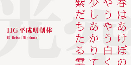 平成明朝体は、ワープロやDTPの普及にともなうフォント需要の高まりに対して供給が遅れていたため、文字フォント開発・普及センターの指揮のもと、製作された、本文用の明朝体です。デザインは、リョービイマジクスが担当。横組み適性を考慮し、視覚的重心が低めになっています。可読性のため、ふところは広めに、また、低解像度出力機での使用を考慮し、直線を多用したシンプルなデザインになっています。
 - Odile by Kontour Type,
$50.00 Odile is a text typeface with bracketed head and bracket-free bottom lower case serifs, a quality that counters rigidness most traditional slab serif typefaces possess. This contemporary design draws inspiration from an experimental typeface named Charter originally designed by the American book and type designer William Addision Dwiggins. It consisted of an informal lowercase alphabet, a narrow seemingly non-inclined vertical letter with script attributes, featuring non-joining letterforms. Dwiggins’ contemplated Charter as the italic companion to Arcadia, Experimental No. 221. The Charter project progressed sporadic stalled during the Second World War and came to a halt in 1955. Charter remained incomplete and was never commercially released. Assessing Charter’s whimsical design, its fragments were rethought and developed into a comprehensive text family. Odile Upright Italic reveals recognizable similarities shared by Dwiggin’s Charter and defines the design approach for the family. The steep calligraphic outstroke and low junctions off the stem as in the upright italic “n” or “r”, for example, are gradually lessened in the italic and moved up for the roman weights. The six optically balanced weights range from the delicate Light to stark Black, accompanied by display variants with feminine flair and ardent Ornaments. Two sorts of Initials, one amplified with interweaving swashes, the other more restrained, both are clearly derived from the Upright Italic. This mid-contrast serif offers a wide range of tools for text and display typographies with a palette of strict to playful. This family shines in magazine, book and display use. The graceful serifed type harmonizes perfectly with Elido, Odile’s sans companion. Sans and serif share the family array and OpenType features in perfect tune. Odile offers an extensive character set, numerous OT features including roman and italic Small Caps, five sets of numerals, alluring ligatures, and many more. OT stylistic variants (with accents) offer a one-story “a” for the roman weights, alternate “g” and “s” designs for the italics, and a variant “s” for the Upright Italic.
 - ITC Oldbook by ITC,
$29.99For some time, Eric de Berranger had wanted to create a distressed typeface design - one that gave the appearance of antique printing and showed signs of wear, yet was still highly readable. He was busy designing a new face called Maxime, when an idea struck: I realized that I could use these lettershapes as the basis for my antique typeface," he says. The two faces ended up being designed in tandem. While ITC Oldbook clearly captures the flavor of aged, uneven and imperfect printing, it also meets de Berranger's goal of being exceptionally readable in text sizes. Beginning with well-drawn characters was the key, and these were carefully modeled into the distressed forms. "The process was more difficult than I originally thought," says de Berranger. "The antique letters had to be tested and modified several times to work correctly." ITC Oldbook elegantly simulates antique printing in both text and display sizes. And while stroke weights are uneven and curves are irregular, the design has remarkably even color when set in blocks of text copy. Add to this the design's inherent legibility, and ITC Oldbook acquires a range far beyond replication of things old; it's suitable for any project that calls for warm and weathered typography. ITC Oldbook is available in roman and bold weights with complementary italic designs. Small caps, old style figures and a suite of alternate characters and ornaments provide additional flexibility and personality to the design." - Lux by URW Type Foundry,
$35.99 Many times, when a new creative process is starting, it is triggered by an everyday action or item. In this case, the looks of a lady’s watch inspired Michael Herold to create his new typeface LUX. The sight of the chronograph sparked associations of the 1950s in Mr. Herold: While this decade was predominantly dominated by brush and feather scripts, there was also a bloom of strict and modern architecture. This special mix of strength and retro style is exactly what Michael Herold is trying to capture in his LUX. The result is a typeface which is perfectly suitable for use on book covers, posters and claims – thanks to its striking impression. The name LUX, Latin for light, is inspired by the high bright-dark contrast within the individual characters. Oft sind es alltägliche Gegenstände, die das Bestreben eines neuen kreativen Prozesses auslösen. So entspringt auch die Inspiration zur Erschaffung der LUX von Michael Herold dem Anblick einer Damenuhr. Der Chronograph löste bei Herrn Herold Assoziationen zu den 1950er Jahren aus: Während diese Zeit hauptsächlich von Schreibschriften aus Federn und Pinseln beherrscht wurde, nahm auch die streng und modern anmutende Architektur starken Einfluss auf die Epoche. Diese Mischung aus Strenge und 50er Jahre Retro-Stil soll in der LUX zum Ausdruck kommen. Das Ergebnis ist eine Schrift, die sich mit ihrer plakativen Wirkung perfekt für Buchumschläge, Poster und Claims eignet. Namensgebend war der starke hell-dunkel Kontrast innerhalb der Schrift – festgehalten in dem lateinischen Wort für Licht.
 - Serena by Canada Type,
$24.95The story of Serena is a unique one among revivals. Serena was neither a metal face nor a film one. In fact it never went anywhere beyond Stefan Schlesinger’s 1940-41 initial sketches (which he called Saranna). A year later, while working with Dick Dooijes on the Rondo typeface, Schlesinger was sent to a concentration camp where he died, along with any material prospects for the gorgeous letters he'd drawn. The only sketches left of Schlesinger’s Saranna work are found in the archives of the Drukkerij Trio (the owner of which was Schlesinger’s brother-in-law). The sketches were done in pencil and ink over pencil on four sheets of paper. And now Hans van Maanen revives Schlesinger’s spirit as closely as the drawings permit, and elaborately expands the work to cover a multitude of codepages and languages. It took more than 65 years for Schlesinger’s drawings to see the light, so van Maanen made sure to bring them to life stylishly and respectfully. Serena embodies the peace and calm rarely ever found in mainstream calligraphy or other genres of display type. With upright elegance and a slight Eastern touch, this typeface expertly bridges the gracefully casual with the deeply spiritual. The light and soft letter forms add a pleasant, breezy element to anything they touch. When used sparingly in titling or display, Serena is like a sigh of desire, rare but quite memorable and very appreciated. - ITC Leawood by ITC,
$29.99 ITC Leawood was begun by designer Les Usherwood and finished by his talented staff at Typsettra in Toronto, Canada, after his untimely death. A similar calligraphic series to ITC Usherwood, following alternative options, the typeface features small, well-defined serifs which aid legibility and allow for close spacing.
 - Ladoni by Diogo Pisoeiro,
$15.00 This typeface is inspired on Bodoni, but this is like his gross sister, because it has angles instead of curves. Is a typeface with personality, strong and robust but at the same time sweet with his italics. This typeface has 5 weights, regular, italic, bold, poster and poster italic.